Create animated bar chart races using matplotlib

Project description
Bar Chart Race


Make animated bar chart races in Python with matplotlib.
Official Documentation
Visit the bar_chart_race official documentation for detailed usage instructions.
Installation
Install with either:
pip install bar_chart_raceconda install -c conda-forge bar_chart_race
Quickstart
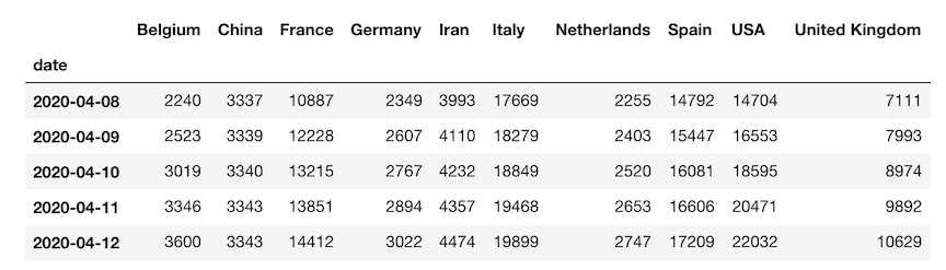
Must begin with a pandas DataFrame containing 'wide' data where:
- Every row represents a single period of time
- Each column holds the value for a particular category
- The index contains the time component (optional)
The data below is an example of properly formatted data. It shows total deaths from COVID-19 for several countries by date.
Main function - bar_chart_race
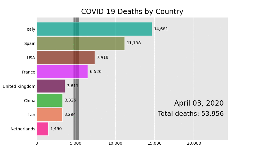
There is one main function, bar_chart_race, which we use to recreate the above video. All parameters are shown with their default value except for filename and title.
import bar_chart_race as bcr
df = bcr.load_dataset('covid19_tutorial')
bcr.bar_chart_race(
    df=df,
    filename='covid19_horiz.mp4',
    orientation='h',
    sort='desc',
    n_bars=6,
    fixed_order=False,
    fixed_max=True,
    steps_per_period=10,
    interpolate_period=False,
    label_bars=True,
    bar_size=.95,
    period_label={'x': .99, 'y': .25, 'ha': 'right', 'va': 'center'},
    period_fmt='%B %d, %Y',
    period_summary_func=lambda v, r: {'x': .99, 'y': .18,
                                      's': f'Total deaths: {v.nlargest(6).sum():,.0f}',
                                      'ha': 'right', 'size': 8, 'family': 'Courier New'},
    perpendicular_bar_func='median',
    period_length=500,
    figsize=(5, 3),
    dpi=144,
    cmap='dark12',
    title='COVID-19 Deaths by Country',
    title_size='',
    bar_label_size=7,
    tick_label_size=7,
    shared_fontdict={'family' : 'Helvetica', 'color' : '.1'},
    scale='linear',
    writer=None,
    fig=None,
    bar_kwargs={'alpha': .7},
    filter_column_colors=False)
Save animation to disk or return HTML
Leave the filename parameter as None to return the animation as HTML. If you are running a Jupyter Notebook, it will automatically be embedded into it.
bcr.bar_chart_race(df=df, filename=None)
Customization
There are many options to customize the bar chart race to get the animation you desire. Below, we have an animation where the maximum x-value and order of the bars are set for the entire duration. A custom summary label and perpendicular bar of median is also added.
def period_summary(values, ranks):
top2 = values.nlargest(2)
leader = top2.index[0]
lead = top2.iloc[0] - top2.iloc[1]
s = f'{leader} by {lead:.0f}'
return {'s': s, 'x': .95, 'y': .07, 'ha': 'right', 'size': 8}
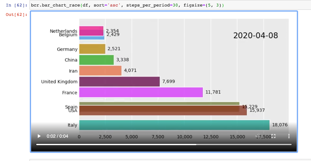
bcr.bar_chart_race(df_baseball, period_length=1000,
fixed_max=True, fixed_order=True, n_bars=10,
figsize=(5, 3), period_fmt='Season {x:,.0f}',
title='Top 10 Home Run Hitters by Season Played')


Download files
Download the file for your platform. If you're not sure which to choose, learn more about installing packages.
Source Distribution
Built Distribution
Filter files by name, interpreter, ABI, and platform.
If you're not sure about the file name format, learn more about wheel file names.
Copy a direct link to the current filters
File details
Details for the file bar_chart_race-0.1.0.tar.gz.
File metadata
- Download URL: bar_chart_race-0.1.0.tar.gz
- Upload date:
- Size: 155.0 kB
- Tags: Source
- Uploaded using Trusted Publishing? No
- Uploaded via: twine/3.1.1 pkginfo/1.5.0.1 requests/2.23.0 setuptools/46.4.0.post20200518 requests-toolbelt/0.9.1 tqdm/4.46.0 CPython/3.8.3
File hashes
| Algorithm | Hash digest | |
|---|---|---|
| SHA256 |
4c5554d0991548e43ce9226a28b8dae5a7f7a9955f5523ba36364d61d4701b1b
|
|
| MD5 |
93b4fab89700b1baec41ac6a6a75c4ac
|
|
| BLAKE2b-256 |
95dea7143a557e82e28310f4ca6eb7d42f6bfd76dcf7bb731ae58a41afb8b330
|
File details
Details for the file bar_chart_race-0.1.0-py3-none-any.whl.
File metadata
- Download URL: bar_chart_race-0.1.0-py3-none-any.whl
- Upload date:
- Size: 156.8 kB
- Tags: Python 3
- Uploaded using Trusted Publishing? No
- Uploaded via: twine/3.1.1 pkginfo/1.5.0.1 requests/2.23.0 setuptools/46.4.0.post20200518 requests-toolbelt/0.9.1 tqdm/4.46.0 CPython/3.8.3
File hashes
| Algorithm | Hash digest | |
|---|---|---|
| SHA256 |
e5233f3e4e92029e02d2c0ef8de89c16eed384ab07f9a7413041b5d2122477df
|
|
| MD5 |
33ba1654364d291b09ecdd5117338460
|
|
| BLAKE2b-256 |
0901f6d1a1a0978b39560843c54be7349804d7d2faef0a869acd7c8a6fc920b0
|


