Finance plotting

Project description
Finance Plot
Plotting financial data in Python for the most part sucks. mpl_finance is horribly slow -- and plotly too -- when displaying 100k candlesticks or more.
Meet Finance Plotter, or finplot! It utilizes pyqtgraph underneath, which to my surprise was an excellent library. Finance Plot is built to immitate matplotlib's api, but with better default looks and much better performance.
Also included is some zooming+scaling logic, so you won't get that "panning all over the place" feeling as one normally finds in most non-finance plot libraries. Plus manual line drawing, where each line segment shows % and time change.
The left mouse button pans, the mouse wheel zooms, and holding Ctrl allows you to draw lines.
Easy installation
$ pip install finplot
Example
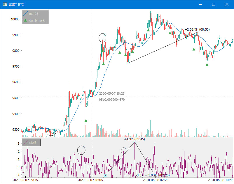
This 25-liner pulls some BitCoin data off of Bittrex and shows the above:
import finplot as fplt
import numpy as np
import pandas as pd
import requests

# pull some data
symbol = 'USDT-BTC'
url = 'https://bittrex.com/Api/v2.0/pub/market/GetTicks?marketName=%s&tickInterval=fiveMin' % symbol
data = requests.get(url).json()

# format it in pandas
df = pd.DataFrame(data['result'])
df = df.rename(columns={'T':'time', 'O':'open', 'C':'close', 'H':'high', 'L':'low', 'V':'volume'})
df = df.astype({'time':'datetime64[ns]'})

# create three plots
ax,ax2,ax3 = fplt.create_plot(symbol, rows=3)

# plot candle sticks
candles = df[['time','open','close','high','low']]
fplt.candlestick_ochl(candles, ax=ax)

# put an MA in there
fplt.plot(df['time'], df['close'].rolling(25).mean(), ax=ax, color='#00f', legend='ma-25')

# place some dumb markers
hi_wicks = df['high'] - df[['open','close']].T.max()
df.loc[(hi_wicks>hi_wicks.quantile(0.99)), 'marker'] = df['high']
fplt.plot(df['time'], df['marker'], ax=ax, color='#000', style='v', legend='dumb mark')

# draw some random crap on our second plot
fplt.plot(df['time'], np.random.normal(size=len(df)), ax=ax2, color='#927', legend='stuff')
fplt.set_y_range(ax2, -1.4, +1.7) # fix y-axis range

# finally a volume bar chart in our third plot
volumes = df[['time','open','close','volume']]
fplt.volume_ocv(volumes, ax=ax3)

# we're done
fplt.show()
Realtime updating with realistic indicator
Included in this repo are a 40-liner Bitfinex example and a slightly longer BitMEX websocket example, which both update in realtime with Bitcoin/Dollar pulled from the exchange. They also shows realistic and useful indicators (TD Sequential for BFX and Bollinger Bands for BitMEX).
Enjoy!
Release history Release notifications | RSS feed


Download files
Download the file for your platform. If you're not sure which to choose, learn more about installing packages.


