A basic package to turn plots into gifs (currently in beta phase).

Project description
gify_plot
A simple Python package to turn your plots into gifs (Matplotlib, Seabron, Plotly).
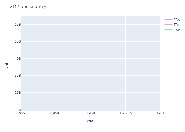
This is the output of the example provided in "How to use it".
How to install it
pip install gify_plot
How to use it
# WARNING:

# Using more than 5/7 categories ends with a cluttered result.
# The fewer, the better.

# The following csv can be freely downlaoded at https://www.kaggle.com/datasets/sazidthe1/world-gdp-data?select=gdp_data.csv

df=pd.read_csv("gdp_data.csv")
temp_df=df[(df["country_name"].isin(["Italy","Spain","France","Germany"]))]
gify_plot(temp_df,
           plot_type="line", plot_library="px", name="test_output",
           plot_title="GDP per country", xaxis_title="year", yaxis_title="value", category="country_code",
           save_frames=False
          )
OUTPUT: It ouputs a list of png in the dedicated folder, along with the resulting gif.
Args
Mandatory
- original_df:pd.DataFrame ==> a dataset containing at least three columns:
- xaxis_title (i.e., an int in YYYY format OR strings in 'YYYY-MM-DD' format ;a range >= 20 years is suggested)
- yaxis_title (i.e., a list of int or float )
- category (i.e., categorical variables, n groups <=7 suggested)
- plot_type:str ==> The plot_type changes according to plot_library
- plot_library:str ==> plt | sns | px (short forms for matplotlib.pyplot, seaborn and plotly.express)
- name:str ==> The name of pngs and gif given as output,
- plot_title:str
- xaxis_title:str ==> The name of the column with x values
- yaxis_title:str ==> The name of the column with y values
Optional
- colors = ["blue","red","green","orange","violet","yellow","black","brown","cyan"] ==> it must have at least the same length of groups provided in the data
- duration = 100 ==> The delay in skipping to the next frame in ms
- loop = 0
- save_frames = True ==> If False, delete all png files that have been used to create the gif
- sort_on_x = True
- tick_interval = it scales across x values, default 7.
Supported libraries and plots:
- plt (i.e., matplotlib.pyplot):
- line
- bar
- scatter
- stackplot (no legend)
- sns (i.e., seaborn):
- lineplot
- scatterplot
- barplot
- px (i.e., plotly.express):
- line
- scatter
- area
- bar
Release history Release notifications | RSS feed


Download files
Download the file for your platform. If you're not sure which to choose, learn more about installing packages.
Source Distribution
Built Distribution
Filter files by name, interpreter, ABI, and platform.
If you're not sure about the file name format, learn more about wheel file names.
Copy a direct link to the current filters
File details
Details for the file gify_plot-0.0.14.tar.gz.
File metadata
- Download URL: gify_plot-0.0.14.tar.gz
- Upload date:
- Size: 5.1 kB
- Tags: Source
- Uploaded using Trusted Publishing? No
- Uploaded via: twine/4.0.2 CPython/3.10.9
File hashes
| Algorithm | Hash digest | |
|---|---|---|
| SHA256 |
cc5fc8d70f332f3b5983355f93baab779603417fb5bcfa5123e7633c5abf4ce3
|
|
| MD5 |
2cb16a35f27989e34334d584d93d5d60
|
|
| BLAKE2b-256 |
e53600dd186c2de5899387a718b368170deab06a8ed3de79dd62771b9183ec08
|
File details
Details for the file gify_plot-0.0.14-py3-none-any.whl.
File metadata
- Download URL: gify_plot-0.0.14-py3-none-any.whl
- Upload date:
- Size: 7.3 kB
- Tags: Python 3
- Uploaded using Trusted Publishing? No
- Uploaded via: twine/4.0.2 CPython/3.10.9
File hashes
| Algorithm | Hash digest | |
|---|---|---|
| SHA256 |
16ddba1fef155fb8275dcbfd82ca8862203cfc4de17e08c5c1e44e5efb5e2d28
|
|
| MD5 |
8cb87ee9ffc3d771d7bdcaa97fc738f2
|
|
| BLAKE2b-256 |
39733216dd63a3f2f71491cc1f14bb59ac855be58322f47af39bbf2cebf55eb8
|


