Components to use with or without the Hydralit package.
Project description
Hydralit Components 
A package of Streamlit components that can be used directly or with the Hydralit library.
Current Components
-
Navbar
-
Option Bar
-
Info Card
-
Progress Bar
-
Loaders
-
Experimental
Installing Hydralit Components
Hydralit can be installed from PyPI:
pip install -U hydralit_components
New in version 1.0.9
- Added new component, info_card

import streamlit as st
import hydralit_components as hc

#can apply customisation to almost all the properties of the card, including the progress bar
theme_bad = {'bgcolor': '#FFF0F0','title_color': 'red','content_color': 'red','icon_color': 'red', 'icon': 'fa fa-times-circle'}
theme_neutral = {'bgcolor': '#f9f9f9','title_color': 'orange','content_color': 'orange','icon_color': 'orange', 'icon': 'fa fa-question-circle'}
theme_good = {'bgcolor': '#EFF8F7','title_color': 'green','content_color': 'green','icon_color': 'green', 'icon': 'fa fa-check-circle'}

cc = st.columns(4)

with cc[0]:
 # can just use 'good', 'bad', 'neutral' sentiment to auto color the card
 hc.info_card(title='Some heading GOOD', content='All good!', sentiment='good',bar_value=77)

with cc[1]:
 hc.info_card(title='Some BAD BAD', content='This is really bad',bar_value=12,theme_override=theme_bad)

with cc[2]:
 hc.info_card(title='Some NEURAL', content='Oh yeah, sure.', sentiment='neutral',bar_value=55)

with cc[3]:
 #customise the the theming for a neutral content
 hc.info_card(title='Some NEURAL',content='Maybe...',key='sec',bar_value=5,theme_override=theme_neutral)
- Added new component, option_bar

import streamlit as st
import hydralit_components as hc

# define what option labels and icons to display
option_data = [
   {'icon': "bi bi-hand-thumbs-up", 'label':"Agree"},
   {'icon':"fa fa-question-circle",'label':"Unsure"},
   {'icon': "bi bi-hand-thumbs-down", 'label':"Disagree"},
]

# override the theme, else it will use the Streamlit applied theme
over_theme = {'txc_inactive': 'white','menu_background':'purple','txc_active':'yellow','option_active':'blue'}
font_fmt = {'font-class':'h2','font-size':'150%'}

# display a horizontal version of the option bar
op = hc.option_bar(option_definition=option_data,title='Feedback Response',key='PrimaryOption',override_theme=over_theme,font_styling=font_fmt,horizontal_orientation=True)

# display a version version of the option bar
op2 = hc.option_bar(option_definition=option_data,title='Feedback Response',key='PrimaryOption',override_theme=over_theme,font_styling=font_fmt,horizontal_orientation=False)
- Added new component, progress_bar

import streamlit as st
import hydralit_components as hc

# can apply customisation to almost all the properties 0f the progress ba
override_theme_1 = {'bgcolor': '#EFF8F7','progress_color': 'green'}
override_theme_2 = {'bgcolor': 'green','content_color': 'white','progress_color': 'red'}
override_theme_3 = {'content_color': 'red','progress_color': 'orange'}

# can just use 'good', 'bad', 'neutral' sentiment to auto color the bar
hc.progress_bar(25,'Something something')
hc.progress_bar(35,'Something something',sentiment='good')
hc.progress_bar(95,'Something something',sentiment='neutral')
hc.progress_bar(47,'Something something',sentiment='bad')

# customise the the theming for a neutral content
hc.progress_bar(5,'Something something - 1a',key='pa1',override_theme=override_theme_1)
hc.progress_bar(35,'Something something - 2a',key='pa2',sentiment='good',override_theme=override_theme_2)
hc.progress_bar(95,'Something something - 3a',key='pa3',sentiment='neutral')
hc.progress_bar(47,'Something something - 4a',key='pa4',sentiment='bad',override_theme=override_theme_3)
New in version 1.0.7
- More visual appearence improvements for the Navbar, including a much nicer non-animated mode.

- Removed the background effect on all loaders (as everyone hated it).
- Can completely customise the Home and Logout entries on the Navbar as well as the other entires.

- Full support for Font Awesome and BootStrap icons offline for Navbar entries, as well as all emojis.
- Full support for all versions of Streamlit up to current (1.4.0).
New in version 1.0.6 (navbar updates)
NOTE: Since everyone complained about the "jumping navbar", it is now pinned to the top of the page, it is no longer sticky. If you want a sticky, non-jumping, with the Streamlit hamburger navbar all in one magical solution, keep asking Streamlit, since they have already stated they are looking to implement this feature themselves and Hydralit and Hydralit Components can go F^%& itself according to the way I've been treated by the Streamlit team. So if you have any issues with the way the navbar works, raise an issue or talk to Streamlit.
You can have jumpy navbar that is sticky, or non-jumping navbar that is pinned to the top, ask Streamlit for both.
- Changed the sticky behaviour (if you want it at the top, like Streamlit ordering, declare it first) NOTE: The
sticky_navparameter moves the navbar to the top of the window, usesticky_mode = 'sticky'orsticky_mode = 'pinned'if you want it to be sticky, but it will be jumpy or pinned and not jumpy. If you want the Streamlit hamburger menu to appear with the navbar usehide_streamlit_markers=False - Can co-exist with the Streamlit hamburger menu now, as well as the status indicators (running/stop..)
- Improved the centering and appearance
- Can toggle the Streamlit markers on/off independantly of the sticky nav setting
- Bug fix with intial value with label and id provided (Thanks Daveography!)
New in version 1.0.5
- Can toggle navbar animation on/off
- Tighten up the navbar animation
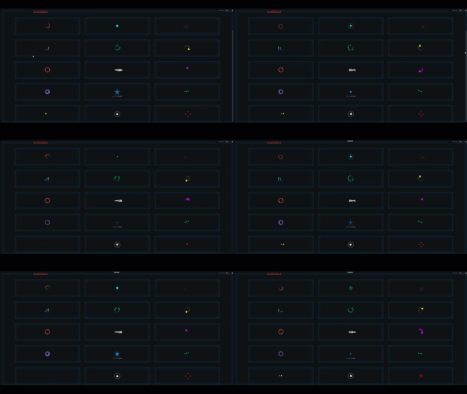
- Add over 20 custom loaders that work the same as the built-in spinner
- An ability to enable experimental features to allow for previously disallowed code injection (like javascript)
- Added a modified version of the existing Streamlit cookie manager to allow for better use in multi-app environments
New in version 1.0.3
- Enable sticky menu mode (pin to top of the window)
- Animated dropdown menu entries to support complex navigation
- Offline support
- Added support for fontawesome icons
- Full collapse in mobile view (the burger is back!)
Features
- Full theme color support
- Full container support (can put on sidebar too)
- Responsive layout
- Use Bootstrap icons or emojis or nothing
- Configure Response values when clicked
- Assign tooltips
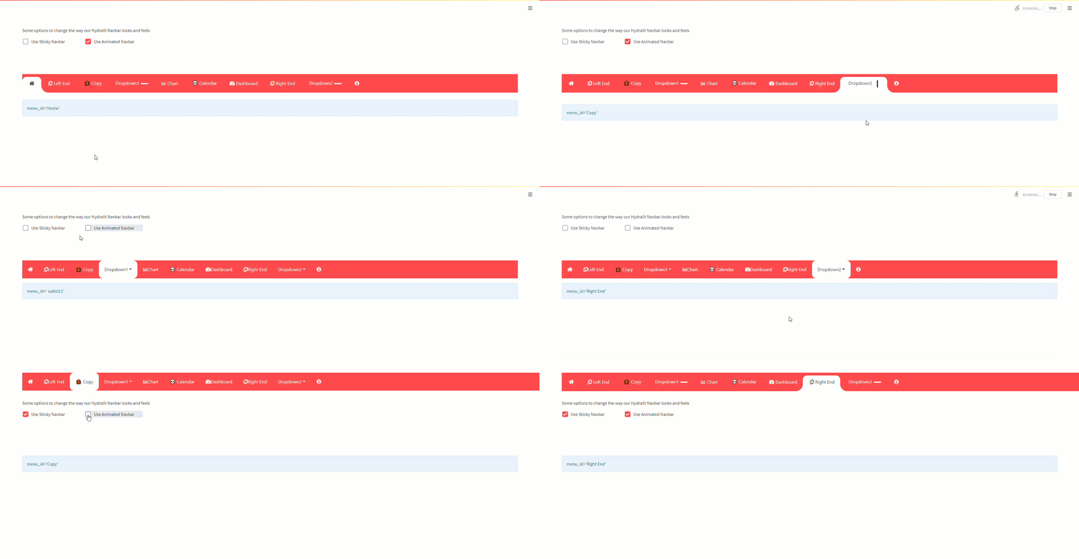
Navbar Demo

Navbar Modes
Pinned Mode

Sticky (jumpy) Mode

Regular Mode

A very quick example of how to modify the menu items and to show we can put it on the main page, sidebar or within a container, up to you.
import streamlit as st
import hydralit_components as hc
import datetime

#make it look nice from the start
st.set_page_config(layout='wide',initial_sidebar_state='collapsed',)

# specify the primary menu definition
menu_data = [
    {'icon': "far fa-copy", 'label':"Left End"},
    {'id':'Copy','icon':"🐙",'label':"Copy"},
    {'icon': "fa-solid fa-radar",'label':"Dropdown1", 'submenu':[{'id':' subid11','icon': "fa fa-paperclip", 'label':"Sub-item 1"},{'id':'subid12','icon': "💀", 'label':"Sub-item 2"},{'id':'subid13','icon': "fa fa-database", 'label':"Sub-item 3"}]},
    {'icon': "far fa-chart-bar", 'label':"Chart"},#no tooltip message
    {'id':' Crazy return value 💀','icon': "💀", 'label':"Calendar"},
    {'icon': "fas fa-tachometer-alt", 'label':"Dashboard",'ttip':"I'm the Dashboard tooltip!"}, #can add a tooltip message
    {'icon': "far fa-copy", 'label':"Right End"},
    {'icon': "fa-solid fa-radar",'label':"Dropdown2", 'submenu':[{'label':"Sub-item 1", 'icon': "fa fa-meh"},{'label':"Sub-item 2"},{'icon':'🙉','label':"Sub-item 3",}]},
]

over_theme = {'txc_inactive': '#FFFFFF'}
menu_id = hc.nav_bar(
    menu_definition=menu_data,
    override_theme=over_theme,
    home_name='Home',
    login_name='Logout',
    hide_streamlit_markers=False, #will show the st hamburger as well as the navbar now!
    sticky_nav=True, #at the top or not
    sticky_mode='pinned', #jumpy or not-jumpy, but sticky or pinned
)

if st.button('click me'):
  st.info('You clicked at: {}'.format(datetime.datetime.now()))


if st.sidebar.button('click me too'):
  st.info('You clicked at: {}'.format(datetime.datetime.now()))

#get the id of the menu item clicked
st.info(f"{menu_id}")
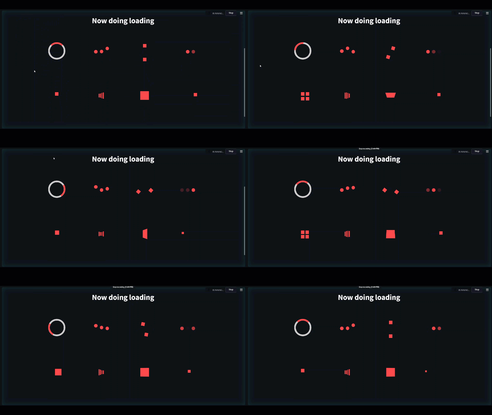
HyLoader


A very quick example of how to use the load to wrap your long running code
import hydralit_components as hc
import time

# a dedicated single loader
with hc.HyLoader('Now doing loading',hc.Loaders.pulse_bars,):
    time.sleep(5)

# for 3 loaders from the standard loader group
with hc.HyLoader('Now doing loading',hc.Loaders.standard_loaders,index=[3,0,5]):
    time.sleep(5)

# for 1 (index=5) from the standard loader group
with hc.HyLoader('Now doing loading',hc.Loaders.standard_loaders,index=5):
    time.sleep(5)

# for 4 replications of the same loader (index=2) from the standard loader group
with hc.HyLoader('Now doing loading',hc.Loaders.standard_loaders,index=[2,2,2,2]):
    time.sleep(5)
Experimental
An example of injecting code into the Streamlit application that previously would not have worked.
NOTE: You need to force reload (browser refresh) the entire page after the experiemntal features have been enabled (you will see a notification in the terminal) to ensure the additions have been loaded into the web page.
import hydralit_components as hc
import streamlit as st
hc.hydralit_experimental(True)
modal_code = """
<div>
<!-- Button trigger modal -->
<button type="button" class="btn btn-primary" data-toggle="modal" data-target="#exampleModal">
Hydralit Components Experimental Demo!
</button>
<!-- Modal -->
<div class="modal fade" id="exampleModal" tabindex="-1" role="dialog" aria-labelledby="exampleModalLabel" aria-hidden="true">
<div class="modal-dialog" role="document">
<div class="modal-content">
<div class="modal-header">
<h5 class="modal-title" id="exampleModalLabel">Modal Popup Form!</h5>
<button type="button" class="close" data-dismiss="modal" aria-label="Close">
<span aria-hidden="true">×</span>
</button>
</div>
<div class="modal-body">
<div class="container">
<h2>Pure JS+HTML Form</h2>
<form class="form-horizontal" action="/">
<div class="form-group">
<label class="control-label col-sm-2" for="email">Email:</label>
<div class="col-sm-10">
<input type="email" class="form-control" id="email" placeholder="Enter email" name="email">
</div>
</div>
<div class="form-group">
<label class="control-label col-sm-2" for="pwd">Password:</label>
<div class="col-sm-10">
<input type="password" class="form-control" id="pwd" placeholder="Enter password" name="pwd">
</div>
</div>
<div class="form-group">
<div class="col-sm-offset-2 col-sm-10">
<div class="checkbox">
<label><input type="checkbox" name="remember"> Remember me</label>
</div>
</div>
</div>
<div class="form-group">
<div class="col-sm-offset-2 col-sm-10">
<button type="submit" class="btn btn-default">Submit</button>
</div>
</div>
</form>
</div>
</div>
<div class="modal-footer">
<button type="button" class="btn btn-secondary" data-dismiss="modal">Close</button>
<button type="button" class="btn btn-primary">Save changes</button>
</div>
</div>
</div>
</div>
</div>
"""
st.markdown(modal_code,unsafe_allow_html=True)
query_param = st.experimental_get_query_params()
if query_param:
st.write('We caputred these values from the experimental modal form using Javascript + HTML + Streamlit + Hydralit Components.')
st.write(query_param)
Project details
Release history Release notifications | RSS feed
Download files
Download the file for your platform. If you're not sure which to choose, learn more about installing packages.
Source Distribution
File details
Details for the file hydralit_components-1.0.10.tar.gz.
File metadata
- Download URL: hydralit_components-1.0.10.tar.gz
- Upload date:
- Size: 20.1 MB
- Tags: Source
- Uploaded using Trusted Publishing? No
- Uploaded via: twine/4.0.1 CPython/3.10.1
File hashes
| Algorithm | Hash digest | |
|---|---|---|
| SHA256 |
aeae8c9531451a5b93df9f4df208b4cb159b1a0ccf523f2a45d633e64b700496
|
|
| MD5 |
0dd0ad1a084caa55025438e8136ba5fd
|
|
| BLAKE2b-256 |
844099260734802473351ef025b3a3e2106d0abfcce1b360485b0faa3ffb6d87
|


