A wrapper of plolty which makes adding widget much more easy (and lazy)

Project description
lazyplotly
A wrapper of interactive visualization package plotly. Sometimes we are just too lazy to make nested dictionary. Especially creating dropdown menus or slide bars is a way too exhuasting. Moreover, variables of different kind of chart are renamed into a single taxonomy.
What is simplified as easy as possible
- creating widgets such as dropdown menu or a slider bar
- combine different type of charts together into subplots
- automatically calculate grid rows and columns of subplots
- configuring different type of variable, using them in a single taxonomy
- initiate settings for jupyter notebook users
Installation
$ pip install plotly lazyplotly
Quick Start
import lazyplotly as lp
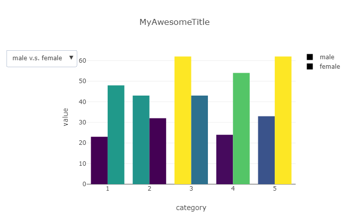
# using list data type to fit
bar_1 = lp.bar(x=[1,2,3,4,5], y=[23,43,62,24,33], cmap=lp.cmap[16], name='male')
# using dataframe to fit
df = dict(x=[1,2,3,4,5],y=[48,32,43,54,62])
bar_2 = lp.bar(x='x', y='y', df=df, cmap=lp.cmap[16], name='female')
# combine all charts into dropdown menu, and save as a html file
lp.dropdown(
datas = [[bar_1,bar_2],[bar_2, bar_1]],
btn_labels = ['male v.s. female','female v.s. male'],
xlabel = 'category', ylabel='value', title='MyAwesomeTitle',
output = 'MyAwesomePlot.html'
)
Custom extension
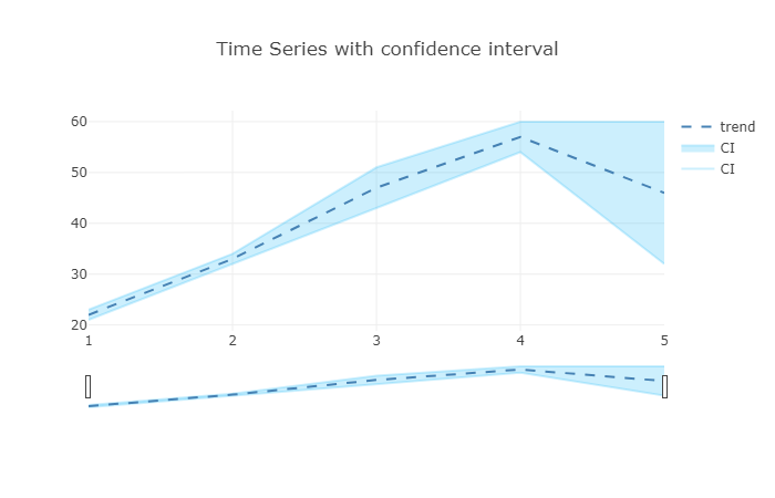
# using dataframe object by setting xy variables with column name
df = dict(order=[1,2,3,4,5],trend=[22,33,47,57,46],lower=[21,32,43,54,32],upper=[23,34,51,60,60])
area = lp.area(x='order', y='lower', y2='upper', df=df, color='rgba(0,176,246,0.2)', name='CI')
line = lp.line(x='order', y='trend', df=df)
line['line'] = dict(dash = 'dash', color='steelblue')

# add output variable to export as a html file
lp.plot(
    data = [area, line],
    rangeslider = True,
    layout = dict(title='Time Series with confidence interval'), # layout extension
    config = dict(displayModeBar=True), # util icons on right top side
)
Subplot
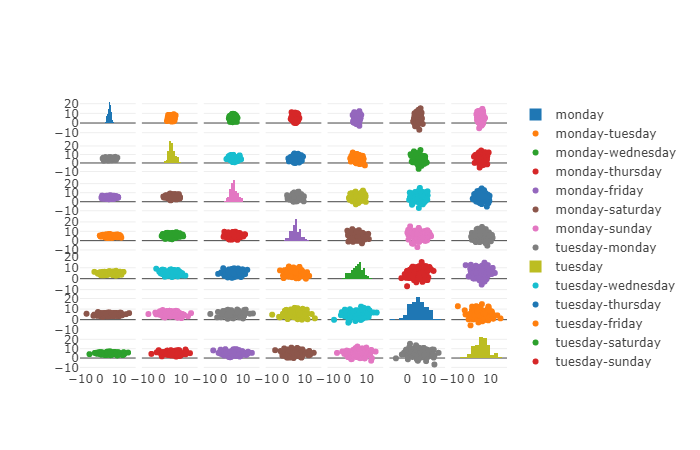
import numpy as np
import pandas as pd
df = pd.DataFrame(dict(
monday = np.random.normal(5, 1, 100),
tuesday = np.random.normal(5, 1.5, 100),
wednesday = np.random.normal(5, 2, 100),
thursday = np.random.normal(5, 2.5, 100),
friday = np.random.normal(5, 3, 100),
saturday = np.random.normal(5, 3.5, 100),
sunday = np.random.normal(5, 4, 100),
))
data = []
for x in df.columns:
for y in df.columns:
if x==y:
data.append(lp.histogram(x=df[x], name=x))
else:
data.append(lp.scatter(x=df[x], y=df[y], name=f'{x}-{y}'))
# making subplot
lp.plot(data, rows=7)
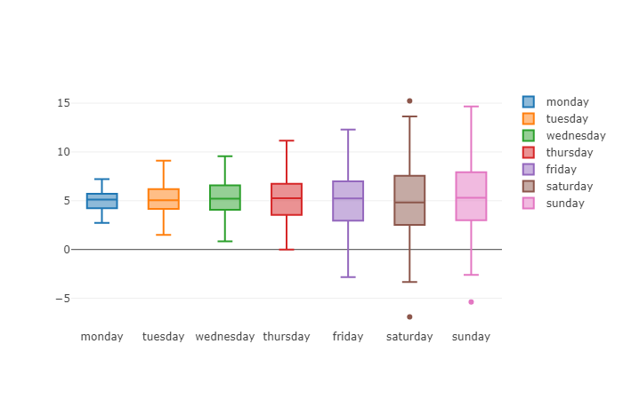
# or a boxplot collection
lp.plot([lp.box(y=df[col], name=col) for col in df.columns])
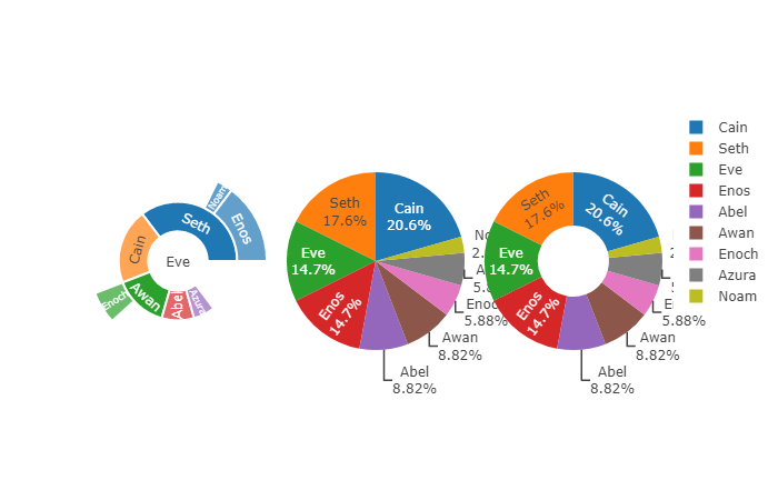
Sunburst, Pie, Donut
df = dict(
    parents = ['', 'Eve', 'Eve', 'Seth', 'Seth', 'Eve', 'Eve', 'Awan', 'Eve' ],
    labels = ['Eve', 'Cain', 'Seth', 'Enos', 'Noam', 'Abel', 'Awan', 'Enoch', 'Azura'],
    values = [10, 14, 12, 10, 2, 6, 6, 4, 4]
)
sunburst = lp.pie(x='parents',x2='labels',y='values', df=df)
pie = lp.pie(x='labels', y='values', df=df)
donut = lp.pie(x='labels', y='values', df=df, hole=0.4)
lp.plot([sunburst, pie, donut], cols=3)
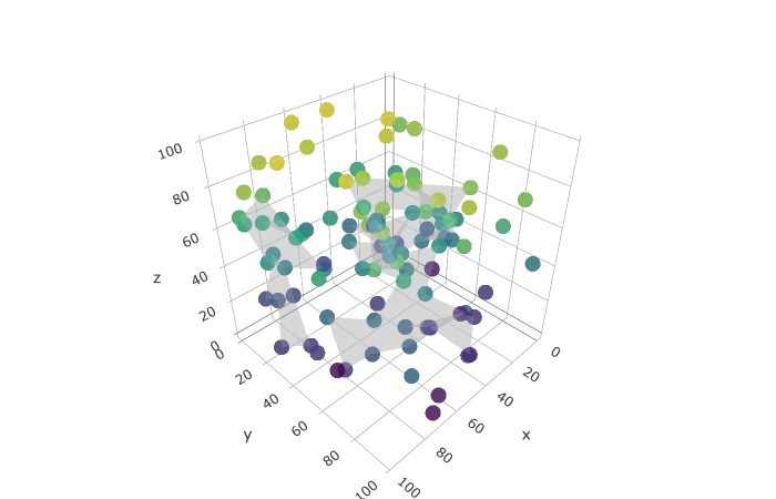
3D scatter
import numpy as np
df = dict(
    x=np.random.randint(100,size=100),
    y=np.random.randint(100,size=100),
    z=np.random.randint(100,size=100)
)
scatter3d = lp.scatter3d(x='x',y='y',z='z', df=df, cmap=lp.cmap[16])
mesh3d = lp.mesh3d(x='x',y='y',z='z', df=df, color=lp.color[0])
lp.plot([scatter3d,mesh3d], no_padding=True)
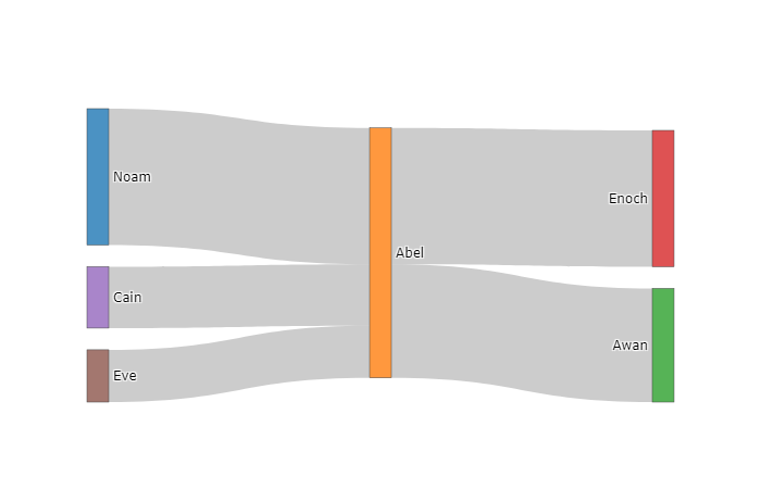
Sankey Diagram
# sankey diagram
df = dict(
    origin=['Eve', 'Cain', 'Abel', 'Abel', 'Noam'],
    destin=['Abel', 'Abel', 'Awan', 'Enoch', 'Abel'],
    count=[23,27,50,60,60]
)
sankey = lp.sankey(x='origin', y='destin', z='count', df=df)
lp.plot(sankey)
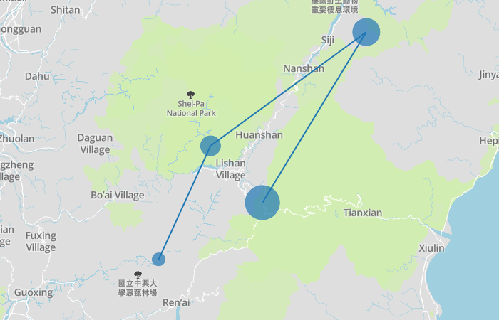
Map
token = 'your mapbox api access token, get your own one at https://account.mapbox.com/'
df = dict(
    lon=[121.1,121.2,121.5,121.3],
    lat=[24.1,24.3,24.5,24.2],
    volume=[20,30,40,50],
    stop=['A','B','C','detail information about bus stop D']
)
scattermapbox = lp.scattermapbox(x='lon',y='lat',z='volume',tooltip='stop',name='bus route',df=df)
scattermapbox['mode'] = 'markers+lines'
lp.mapbox(scattermapbox,token=token,zoom=9)
APIs
lp.cmap     # show all colorscales available in plotly
lp.color    # show all defined css color name in plotly
plot(data=[], layout=dict, output=bool, config=dict,cols=int, rows=int,
    rangeslider=bool,no_padding=bool, title=str, xlabel=str, ylabel=str)
dropdown(datas=[[]], btn_labels=[], layout=dict, output=bool, config=dict,
    no_padding=bool, title=str, xlabel=str, ylabel=str)
slider(datas=[[]], prefix=str, layout=dict, output=bool, config=dict,
    no_padding=bool, title=str, xlabel=str, ylabel=str)
bar(x, y, df, name, color, cmap)
scatter(x, y, df, name, color)
scatter3d(x, y, z, df, name, color, cmap)
line(x, y, df, name, color)
line3d(x, y, z, df, name, color)
area(x, y, y2, df, name, color)
area3d(x, y, z, df, name, color)
mesh3d(x, y, z, df, name, color)
box(y, df, name, color)
histogram(x, df, name, color, <int>bins, <bool>cum, <bool>prob)
pie(x, x2, y, df, name, hole, color)
heatmap(df, cmap)
sankey(x, y, z, df)
scattermapbox(x, y, z, tooltip, df, name)
mapbox(data, token, zoom, output, config)
Release history Release notifications | RSS feed


Download files
Download the file for your platform. If you're not sure which to choose, learn more about installing packages.
Source Distribution
Built Distribution
Filter files by name, interpreter, ABI, and platform.
If you're not sure about the file name format, learn more about wheel file names.
Copy a direct link to the current filters
File details
Details for the file lazyplotly-1.2.tar.gz.
File metadata
- Download URL: lazyplotly-1.2.tar.gz
- Upload date:
- Size: 7.1 kB
- Tags: Source
- Uploaded using Trusted Publishing? No
- Uploaded via: twine/1.13.0 pkginfo/1.5.0.1 requests/2.22.0 setuptools/41.0.1 requests-toolbelt/0.9.1 tqdm/4.32.1 CPython/3.6.8
File hashes
| Algorithm | Hash digest | |
|---|---|---|
| SHA256 |
de6e4e74a165246ed0c6a6e17fea7a57195011a8c79b323814b43fa51071ce94
|
|
| MD5 |
024480efc57209f6463da7effdb39fda
|
|
| BLAKE2b-256 |
3679df4df1eb9425fd46f6ee95f96f4ec8c702418674a4d65eab4815eff0c18e
|
File details
Details for the file lazyplotly-1.2-py3-none-any.whl.
File metadata
- Download URL: lazyplotly-1.2-py3-none-any.whl
- Upload date:
- Size: 6.9 kB
- Tags: Python 3
- Uploaded using Trusted Publishing? No
- Uploaded via: twine/1.13.0 pkginfo/1.5.0.1 requests/2.22.0 setuptools/41.0.1 requests-toolbelt/0.9.1 tqdm/4.32.1 CPython/3.6.8
File hashes
| Algorithm | Hash digest | |
|---|---|---|
| SHA256 |
df458733118765f974354e66a93fa8e176a56bb3793e9eb755af179da8d4d026
|
|
| MD5 |
24aedd76f4c831c5686598f484ded129
|
|
| BLAKE2b-256 |
02b6cf5f098b0b93a8c6f848ae536641e1250f01b8c648f9efda82e434a7eba5
|


