Professional Python Graphs for Scientific Papers


Project description

Data Visualisation - CRUISE Group
Leader: Dr Wei Shao
Associated Leader: Dr Nan Gao
Team Member: Zhiqiu Chen, Ying Guo, Lanzhou Jiang, Junwei Ye, Haoran Ma, Zhengyuan Xu, Ziyan Peng
Professional Python graphs for Scientific Papers
These visualisation codes show visualization modules by Seaborn and Matplotlib of Python. The codes were written by Cruise Group of RMIT University. Please refer to the following contents for details. If you're not into reading lenghty explanations at all, feel free to jump right into the commented code.
Dependencies
If you want to run the codes, you need to install some other Python libraries in addition to Seaborn and Matplotlib, which have been marked in the codes section.
Install
The latest stable release (and required dependencies) can be installed from PyPI:
pip install paperviz
You may instead want to use the development version from Github:
pip install git+https://github.com/swsamleo/Paper-Viz.git
Paper-Viz is also available from Anaconda and can be installed with conda:
conda install paperviz
Development
Paper-Viz development takes place on Github: https://github.com/swsamleo/Paper-Viz
Documentation
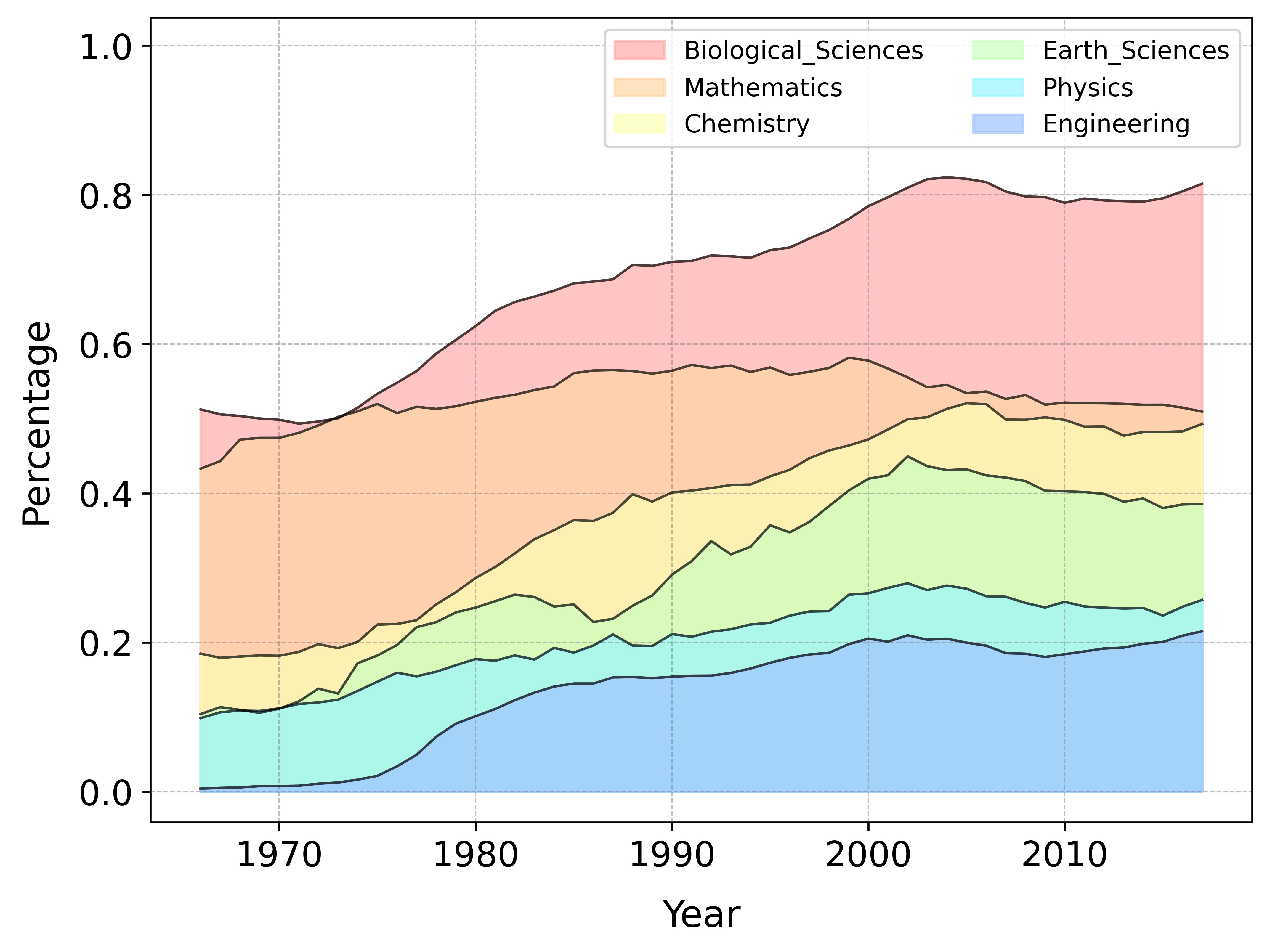
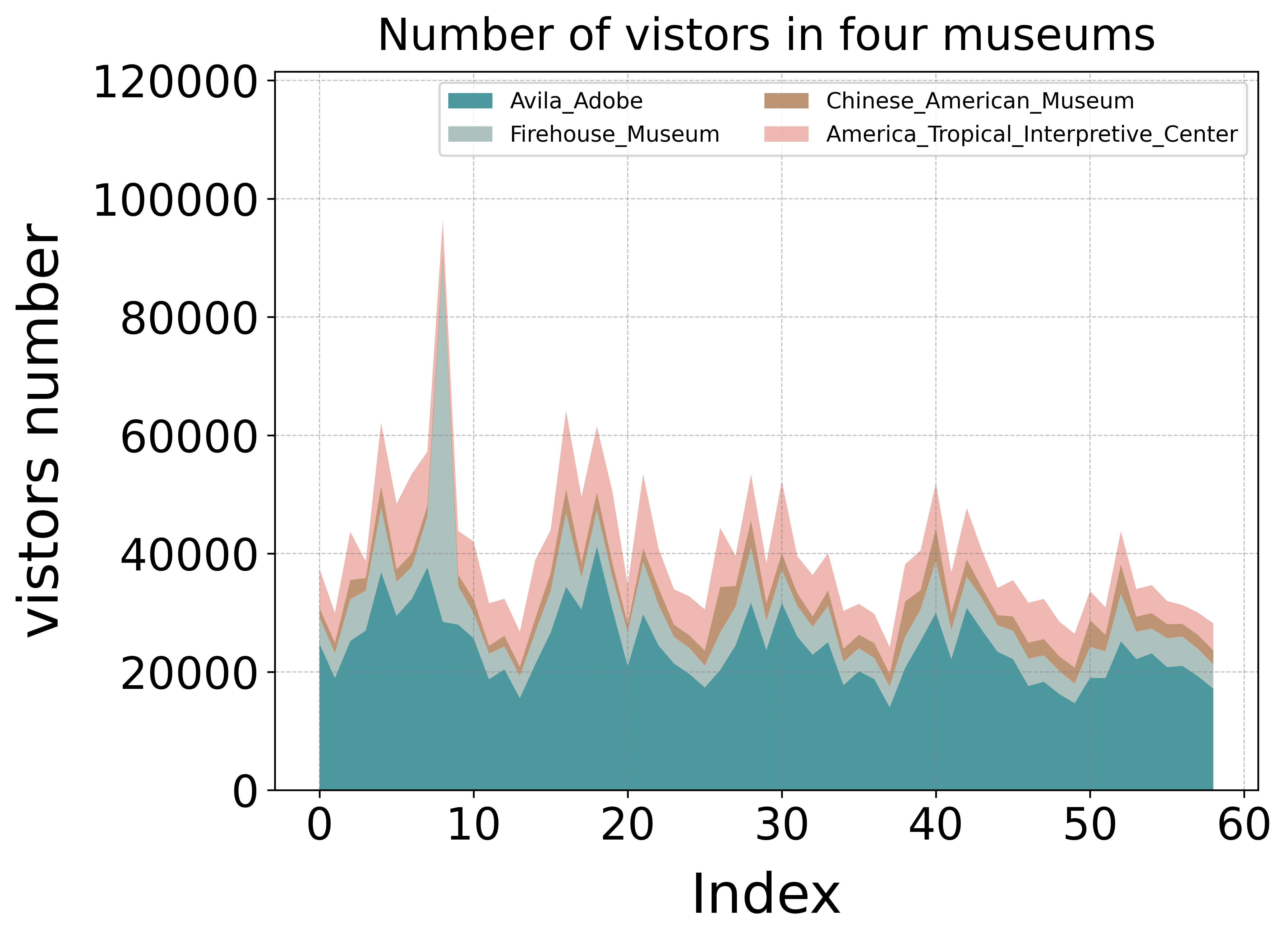
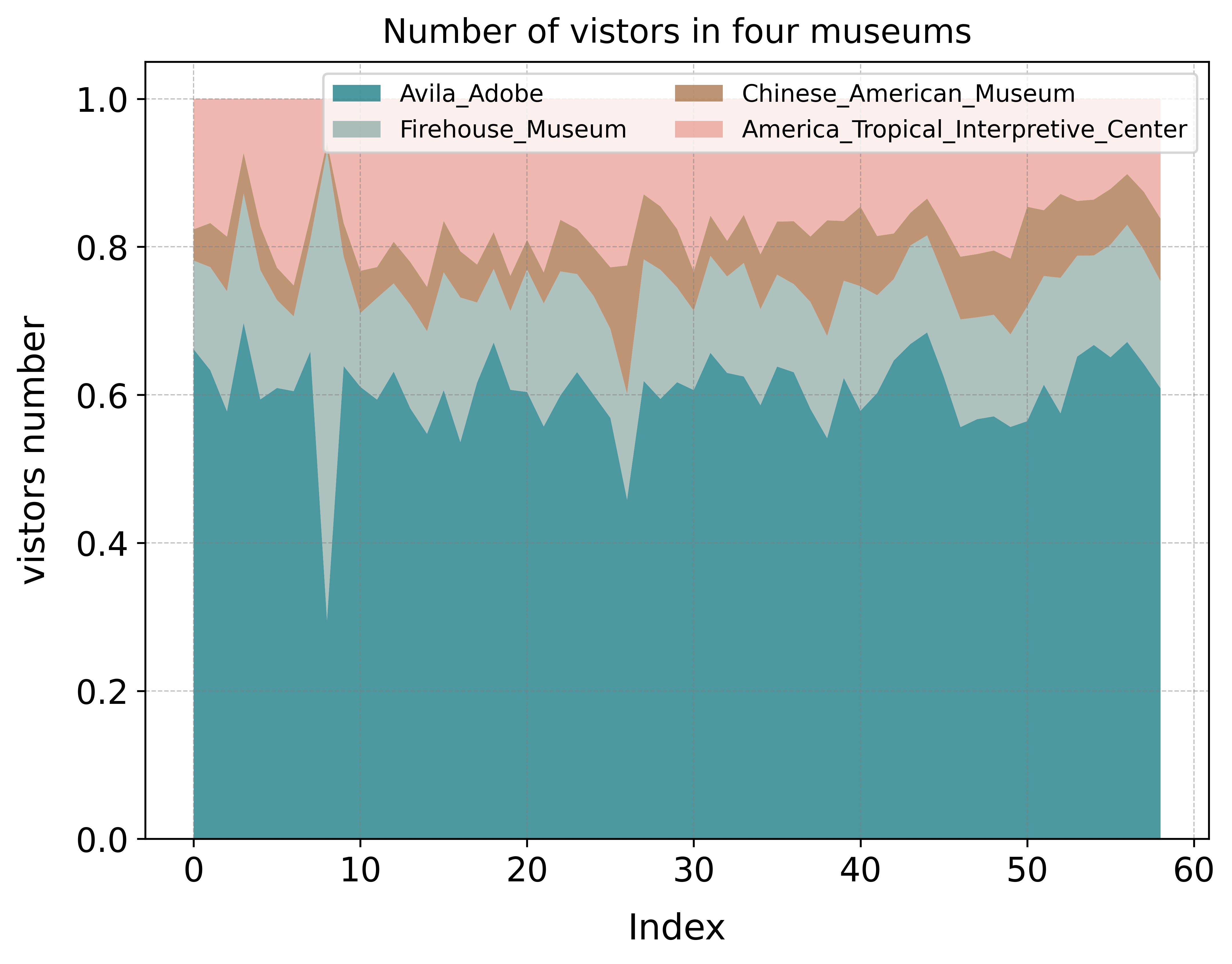
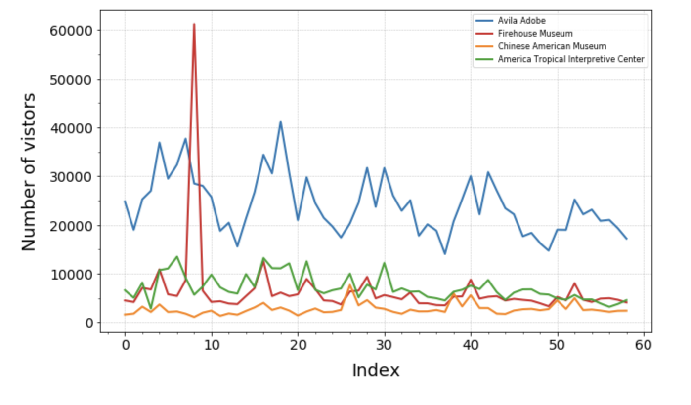
Area Chart
By coloring the area between the axis and the line, the area map not only emphasizes the peaks and valleys, but also emphasizes the duration of the high and low points. The longer the high point lasts, the larger the area under the line. The stacked area plot can show the total value and item values, the percentage area chart can show the percentage of each item.
- Multi-item area chart
- Stacked area chart
- Percentange area chart
from paperviz.area.area import Area_plot

file_name = "museum_visitors_line.csv"
a = Area_plot(file_name)
a.area(file_name)
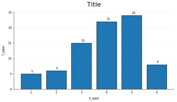
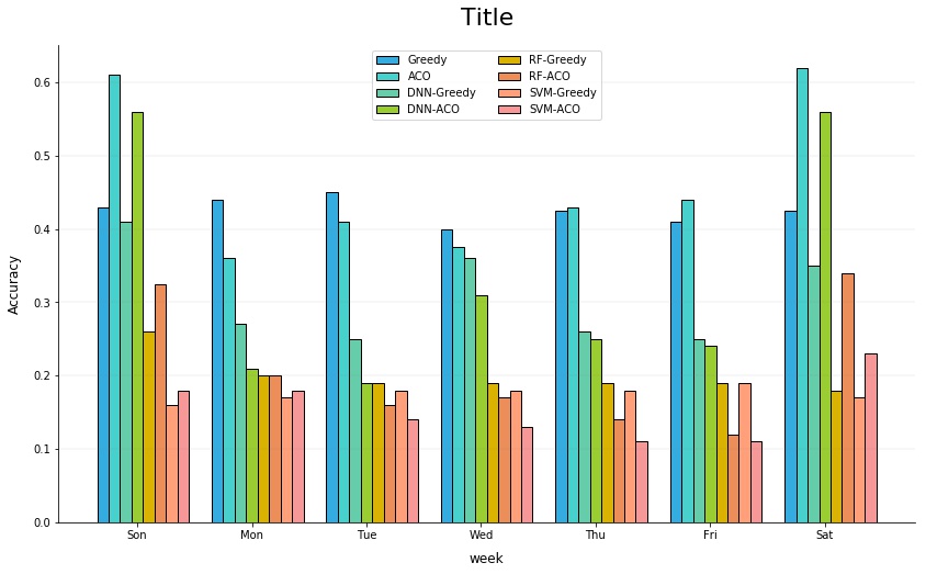
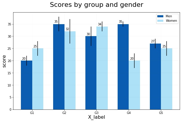
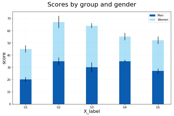
Bar Chart
A bar chart is a classic way to visualise items based on counting or any given indicator.
- Single item bar chart
- Multi-item grouped bar chart
- Error bar chart with two groups
- Stacked bar chart with two groups
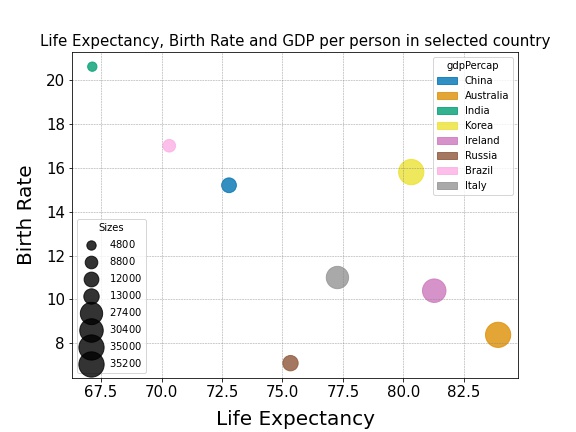
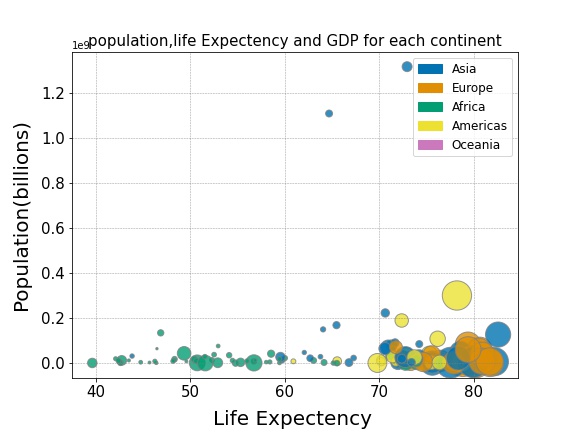
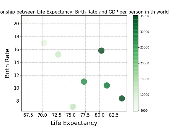
Bubble Plot
A bubble chart is a variation of a scatter chart in which the data points are replaced with bubbles, and an additional dimension of the data is represented in the size of the bubbles. Just like a scatter chart, a bubble chart does not use a category axis — both horizontal and vertical axes are value axes.
- Bubble chart with each bubble name and sizes
- Multi-item bubble plot with categorical colors
- Bubble plot with a color map
from from paperviz.bubble.bubble import Bubble

file_name = "bubble_gdp.xlsx"
b = Bubble(file_name)
b.bubble_plot(file_name)
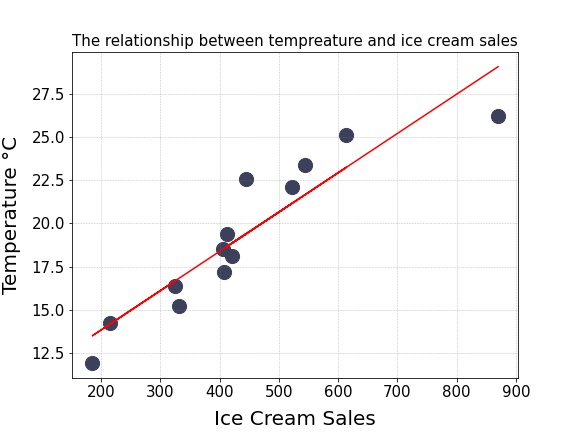
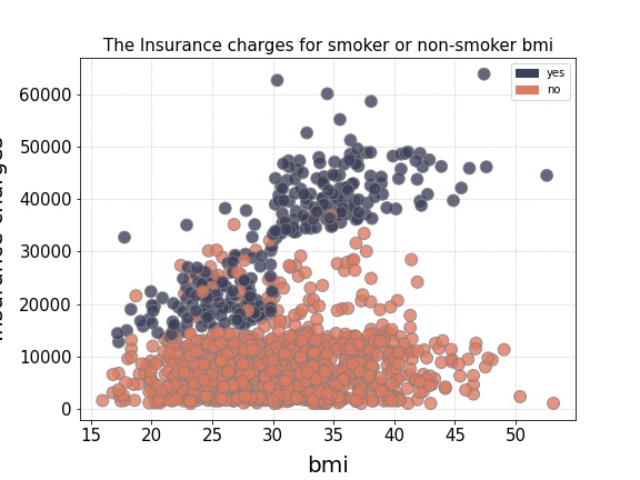
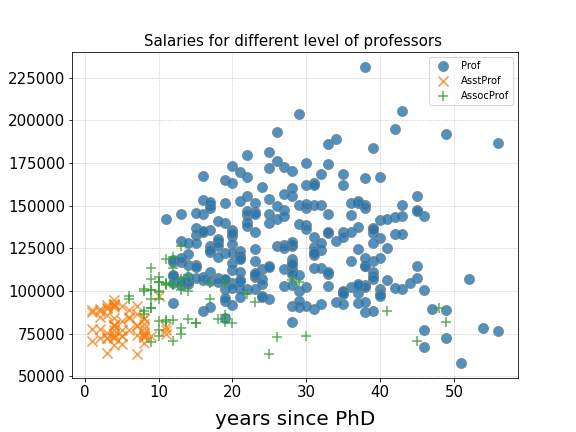
Scatter Plot
A scatter plot is a basic chart used to study the relationship between two variables. If you have multiple groups in your data, you might want to visualize each group in a different color.
- Single item scatter plot with trend line
- Multi-item scatter plot
- Scatter plot with multi-mark
from scatter import Scatter

file_name = 'ice_cream.xlsx'
a = Scatter(file_name)
a.scatter_plot(file='ice_cream.xlsx')
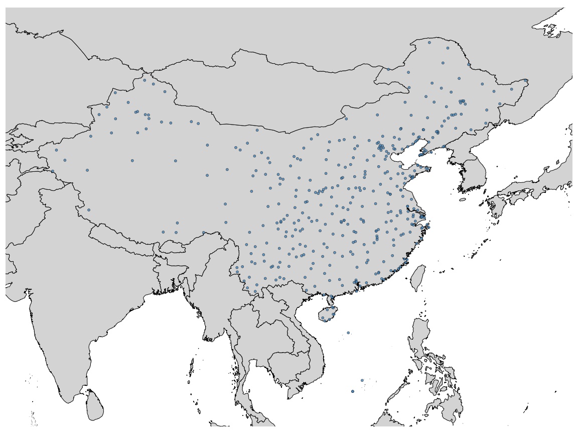
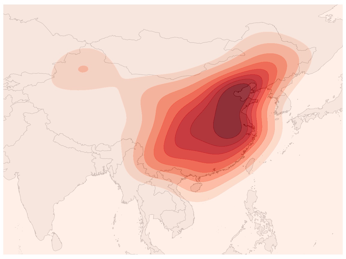
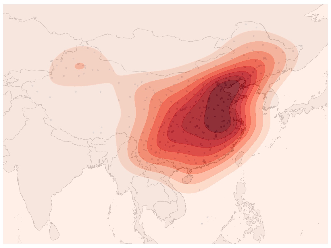
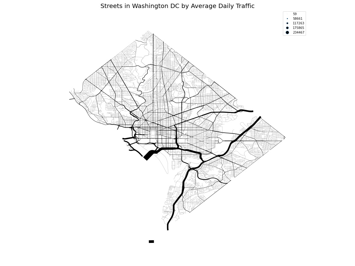
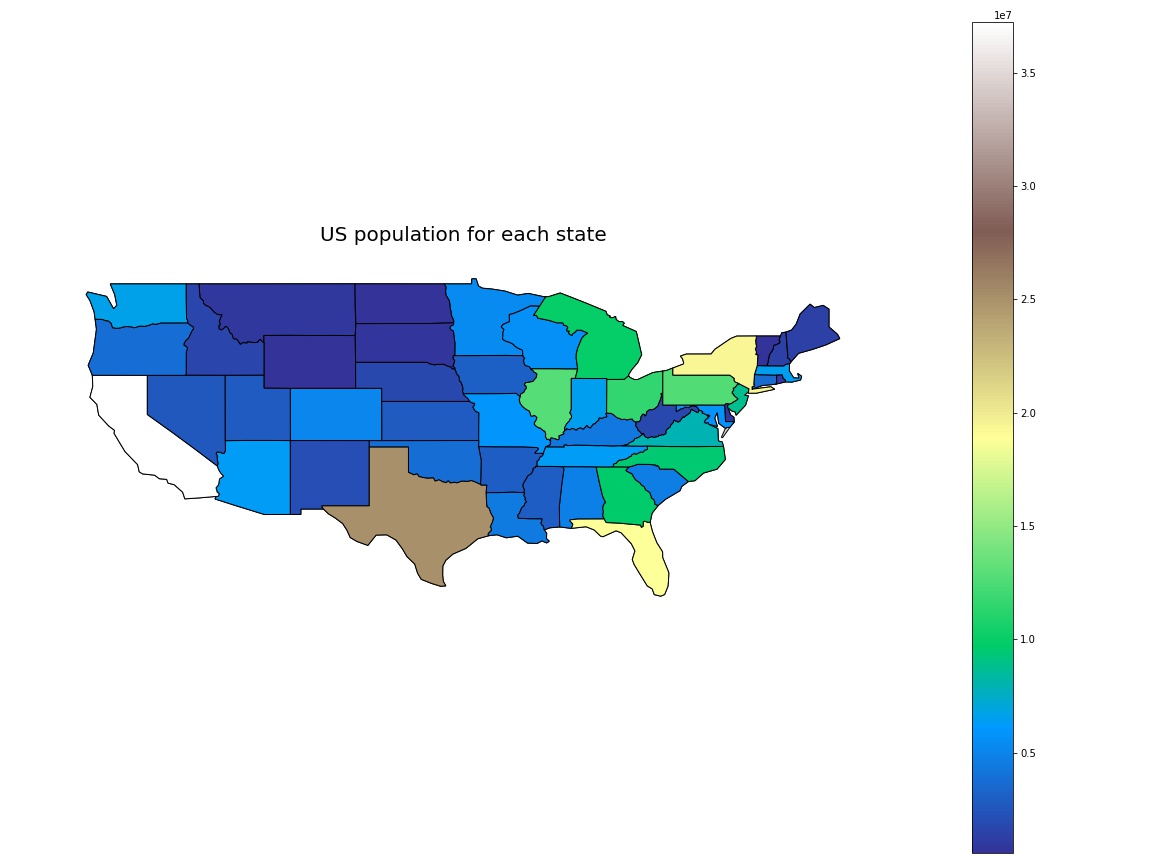
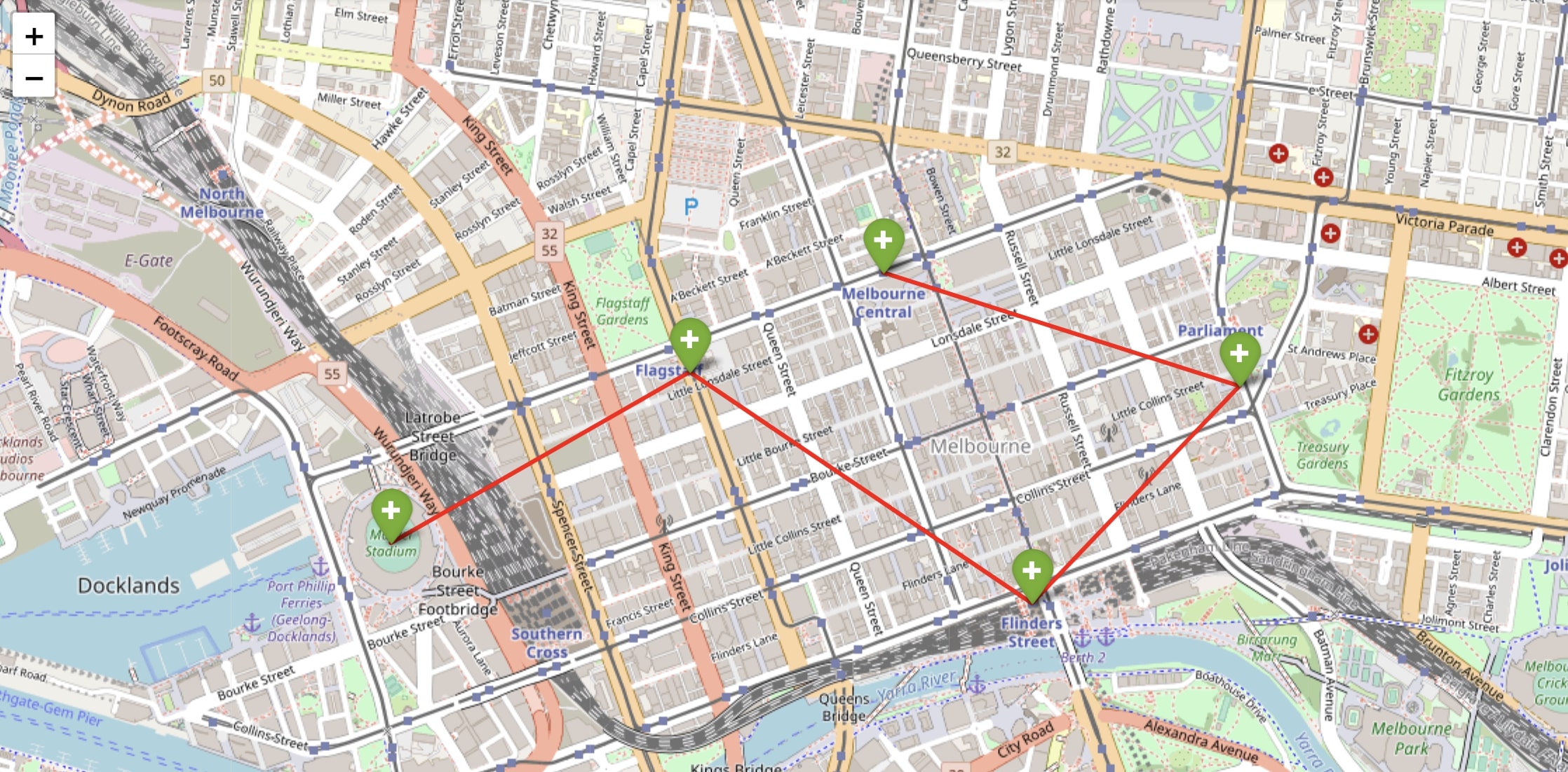
Map
Maps have been used for a long time to help people navigate on road journeys or comprehend the closeness of one site to another. The material on maps, as well as the maps themselves, have become digitized, interactive, and more attractive as they have been integrated into data analysis and reporting. Seeing location data mapped and integrated in visualizations has increased comprehension and provided a useful, fresh context for more people.
- Point Map
- KDE(Kernel density estimation) Map
- Point and KDE(Kernel density estimation) Map
- Sankey Map
- Choropleth Map
- Route Map
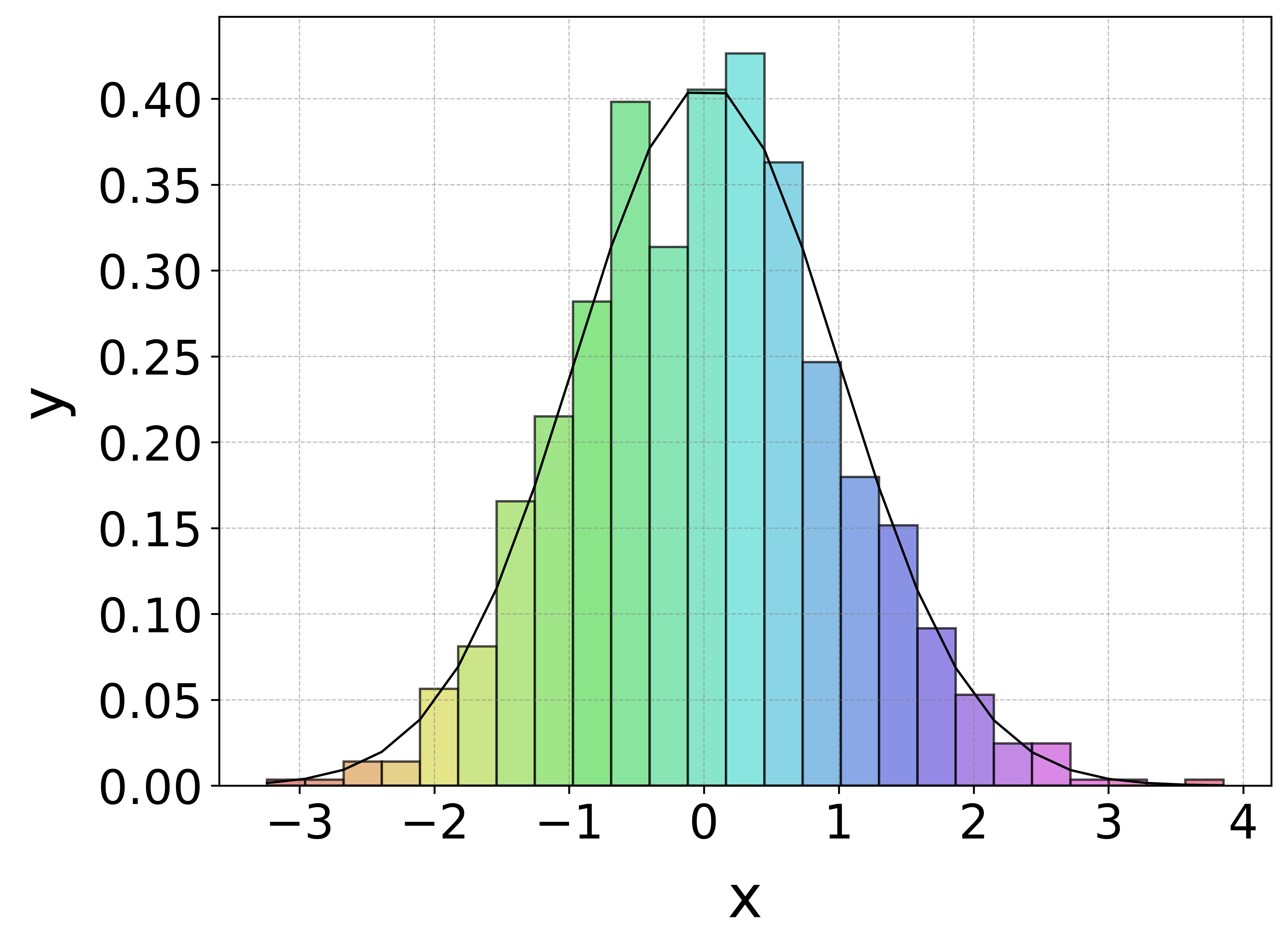
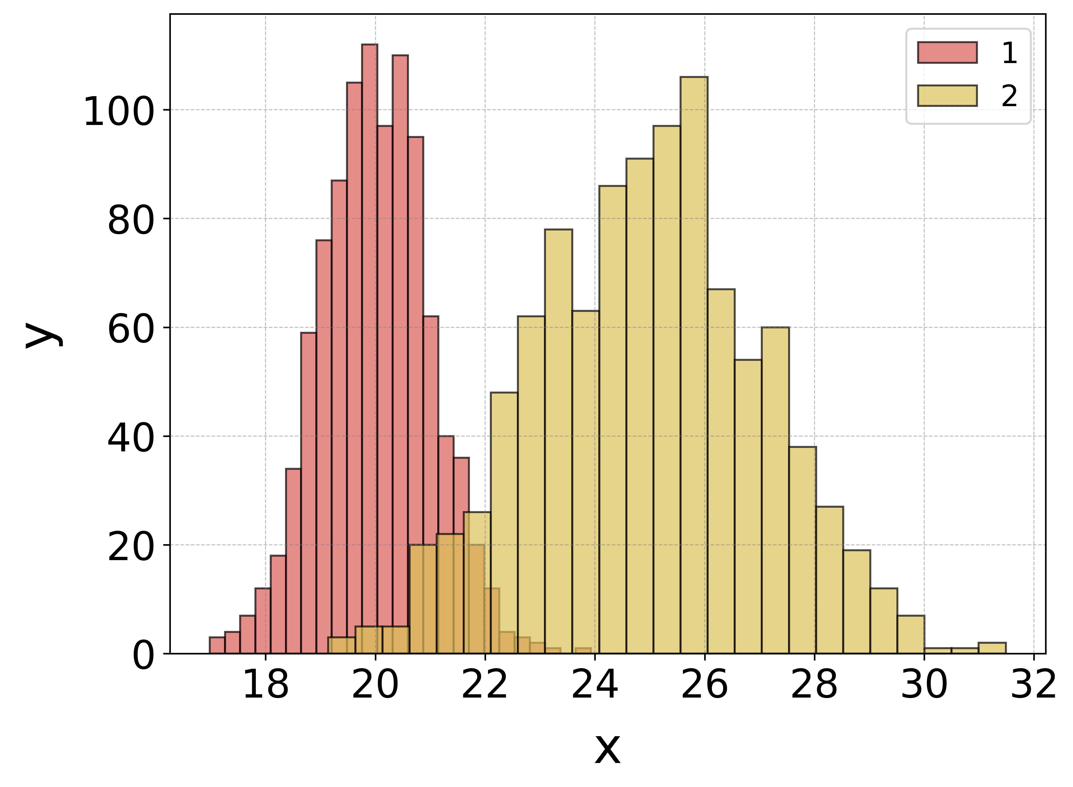
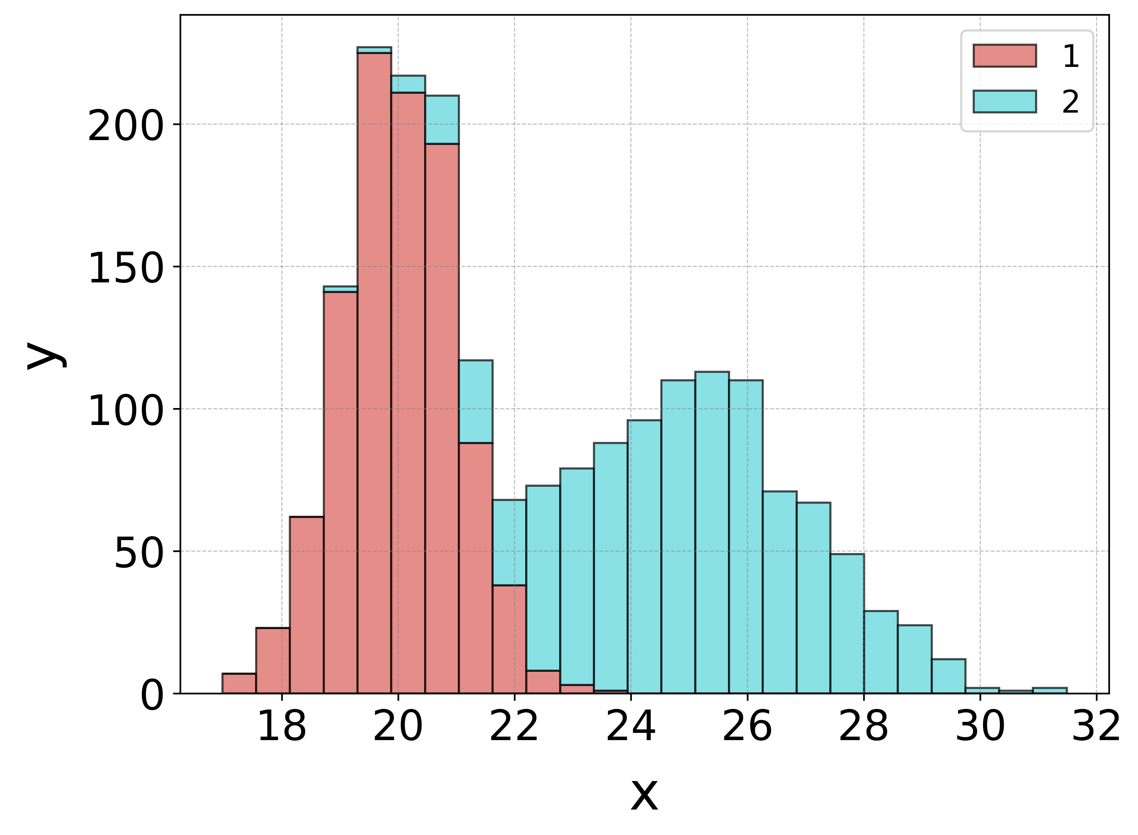
Histogram
A histogram is a graphical display of data using bars of different heights. In a histogram, each bar groups numbers into ranges. Taller bars show that more data falls in that range. A histogram displays the shape and spread of continuous sample data. The height can mean density or actual value.
- Single item histogram with a density curve
- Multi-item histogram which height means actual value
- Stacked histogram
from histogram import hist_plot

file_name = "2.xlsx"
a = hist_plot(file_name)
a.hist(file_name)
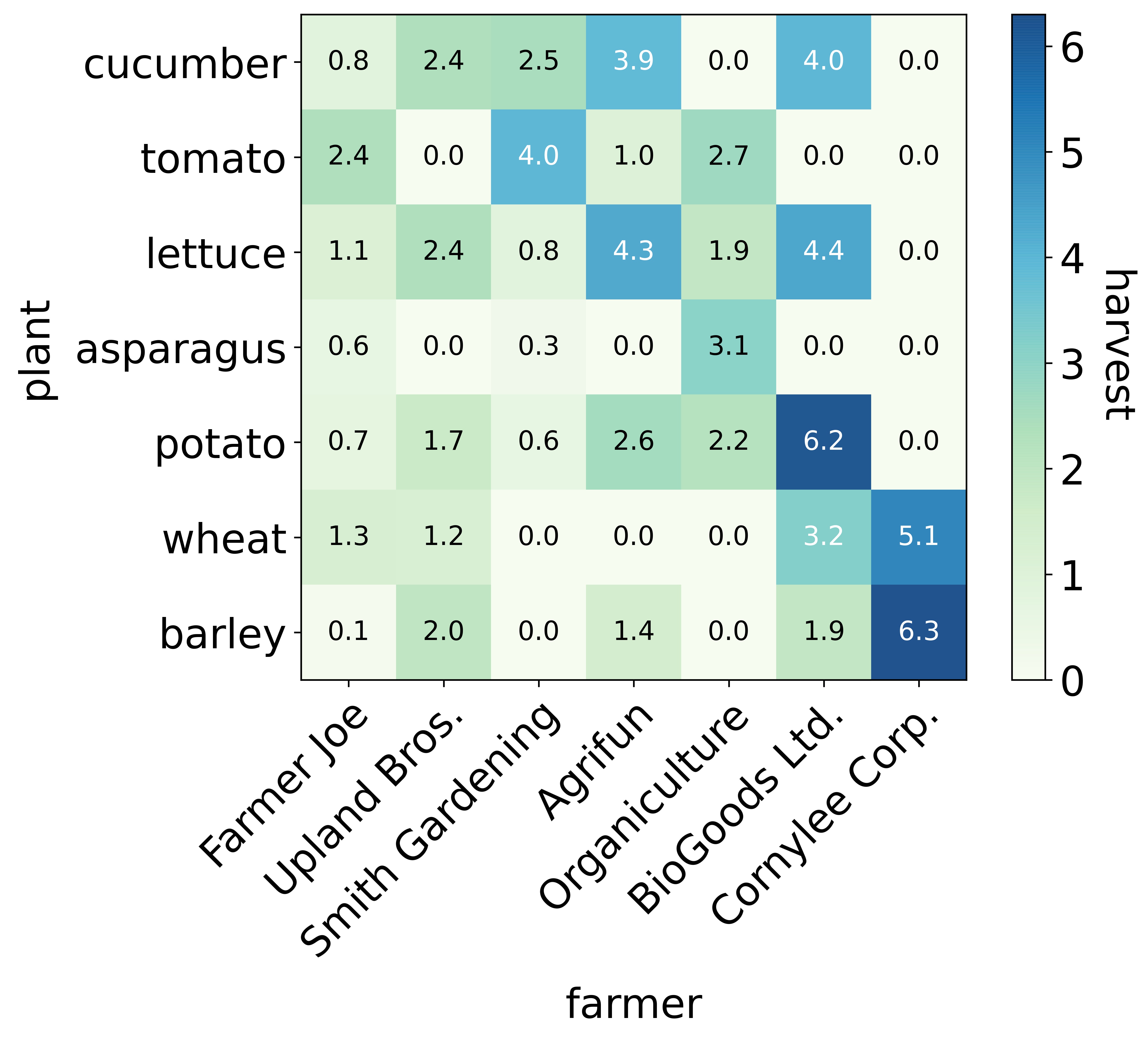
Heatmap
A heatmap is a graphical representation of data where the individual values contained in a matrix are represented as colors.
- Heatmap with values in blue to yellow colours
from heatmap import heat_map

file_name = '1.xlsx'
a = heat_map(file_name)
a.heat( file='1.xlsx')
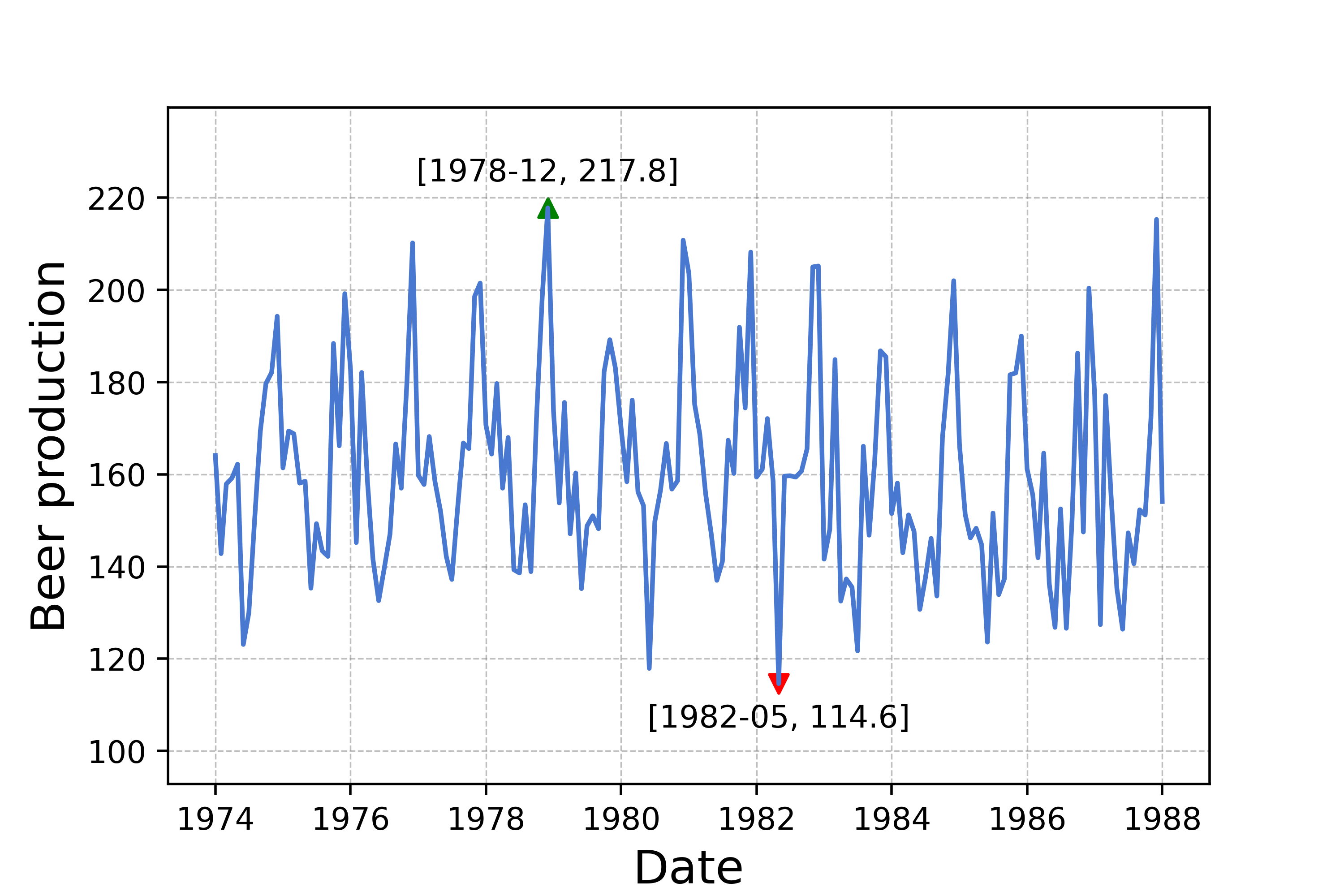
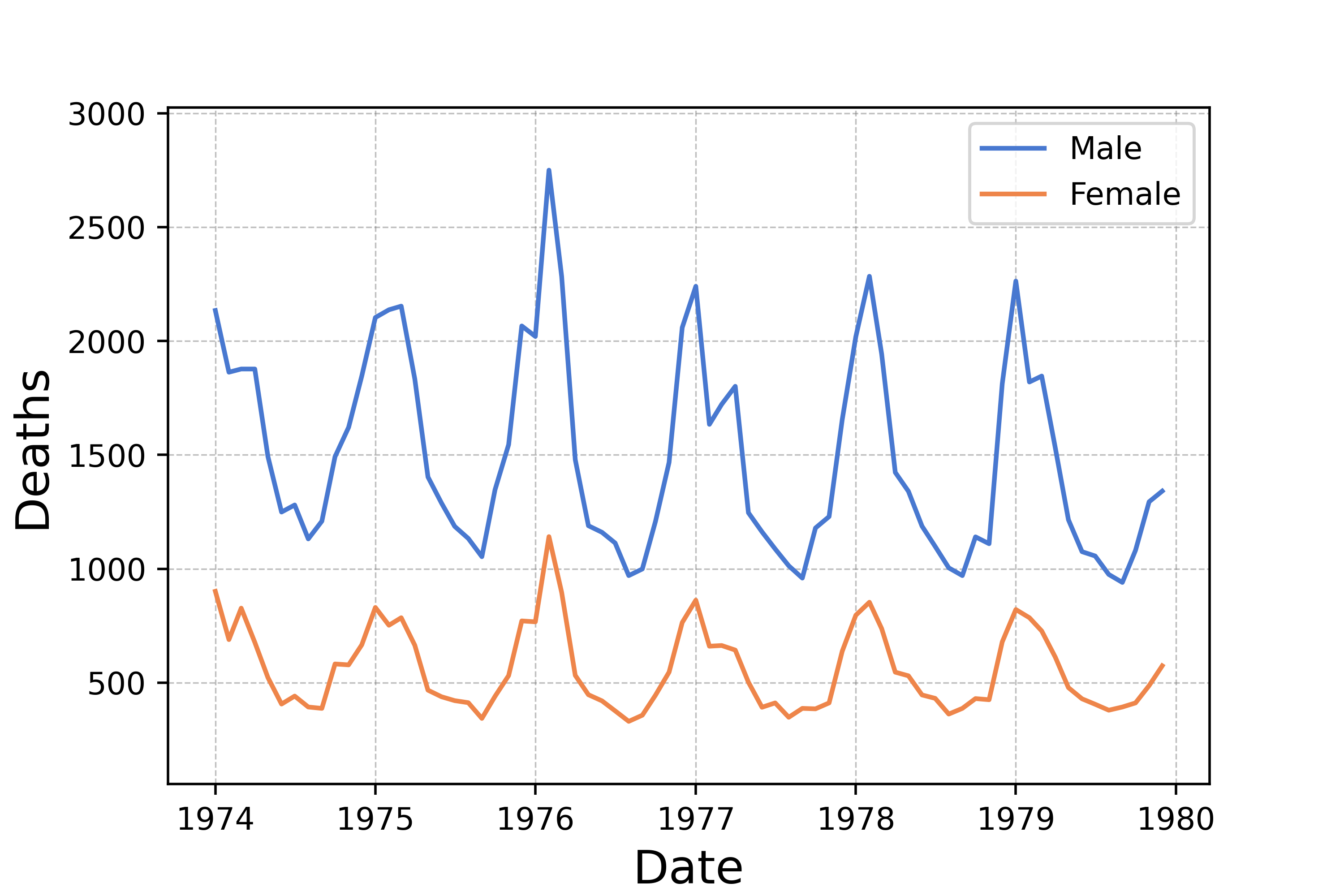
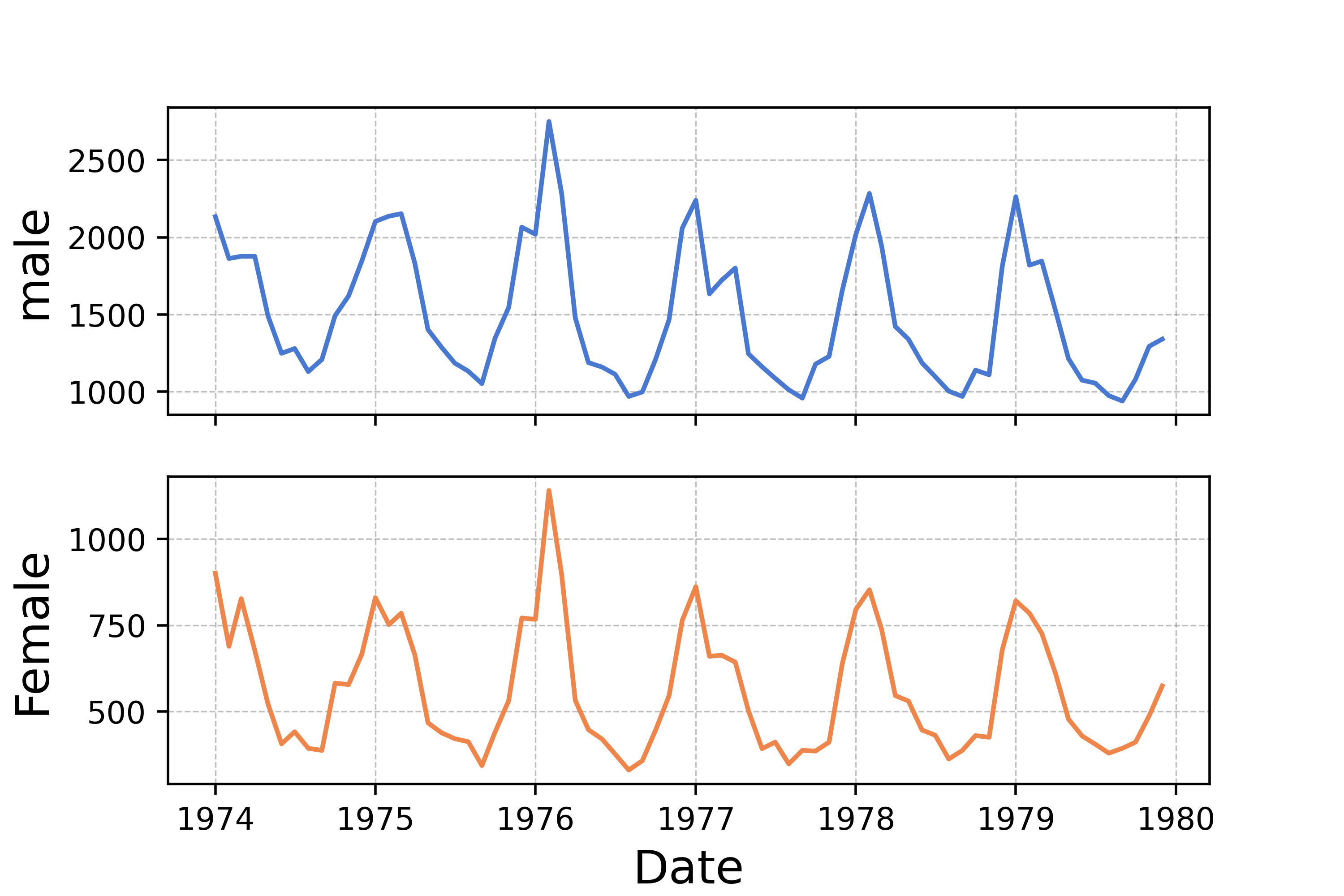
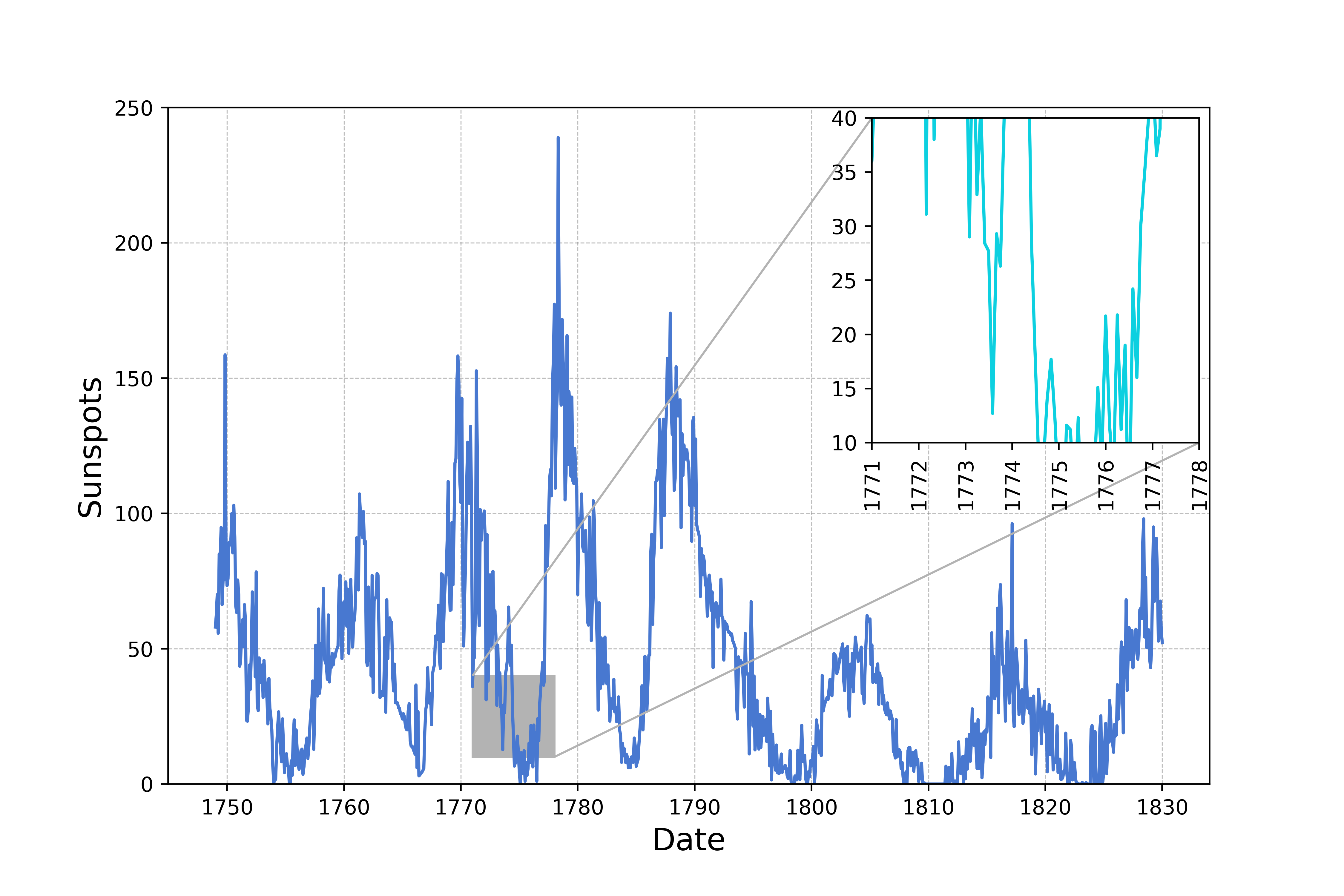
Time Series Plot
Time series plots are used to show how a given metric changes over time.
- Time series plot with maximum, minimum values
- Time series plot with peaks and troughs
- Time series plot with multivariables
- Time series plot with multiple plots
- Time series plot with regional zoom-in
from time_series import TimeSeries

file_name = "mortality.csv"
ts = TimeSeries(file_name)
ts.plot()

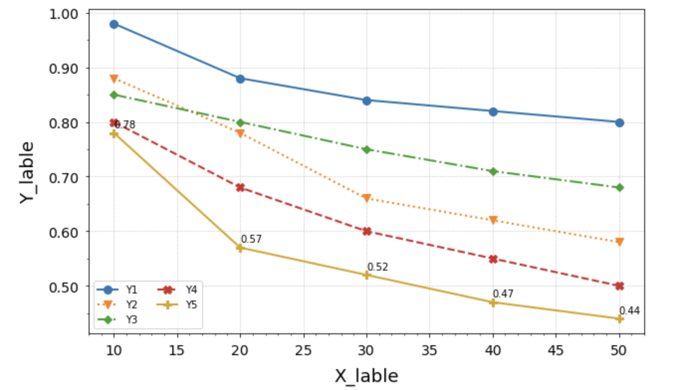
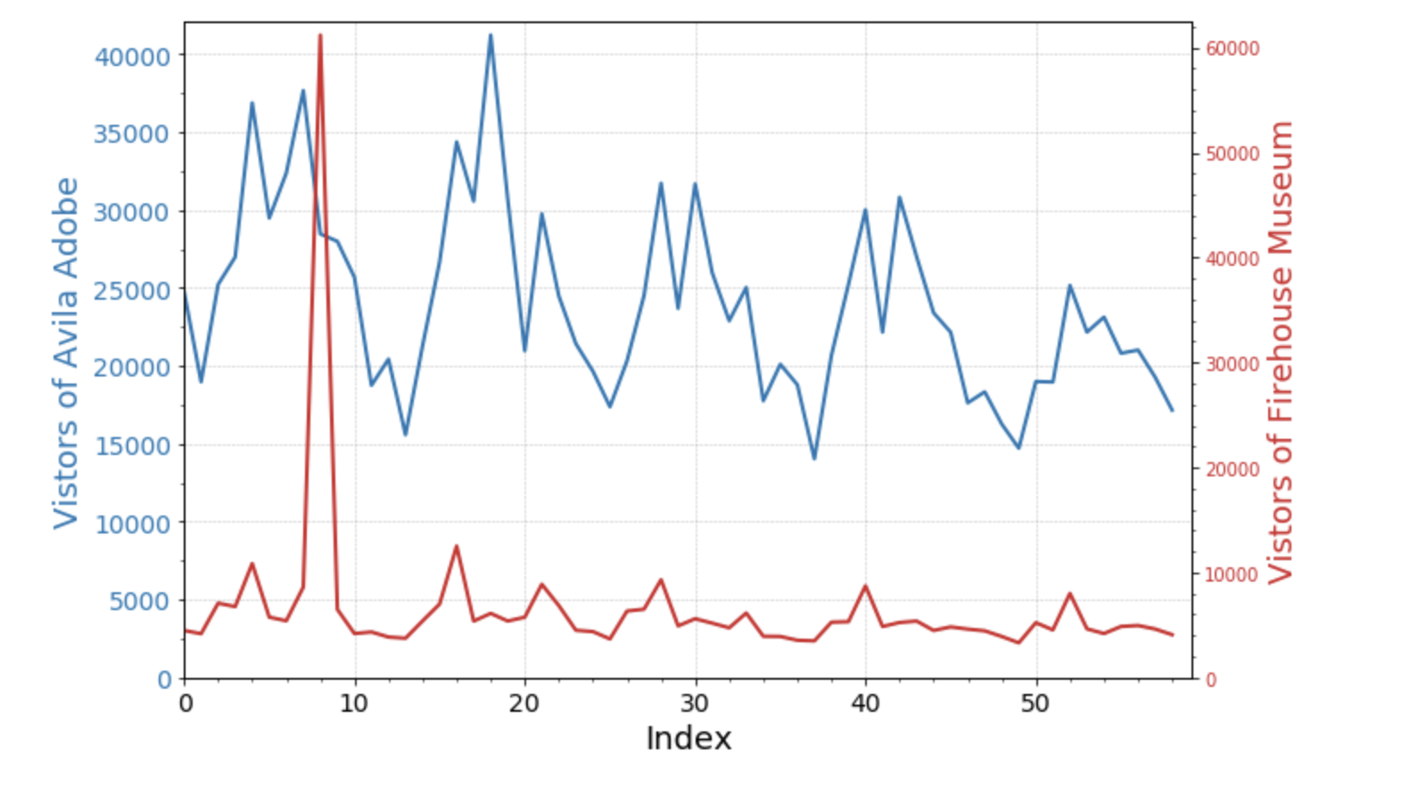
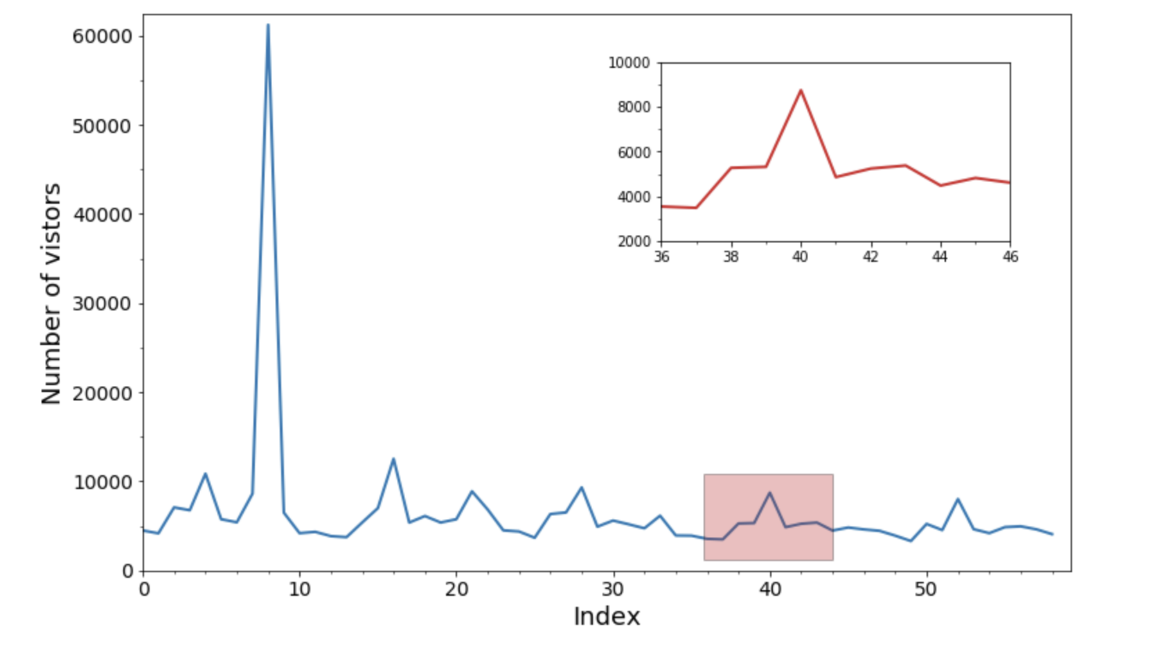
Line Chart
A line chart or line plot or line graph or curve chart is a type of chart which displays information as a series of data points called 'markers' connected by straight line segments. It is a basic type of chart common in many fields.
- Multi-line chart
- Multi-item line chart with categorical colours and marks
- Double axis line chart
- Insetplot line chart
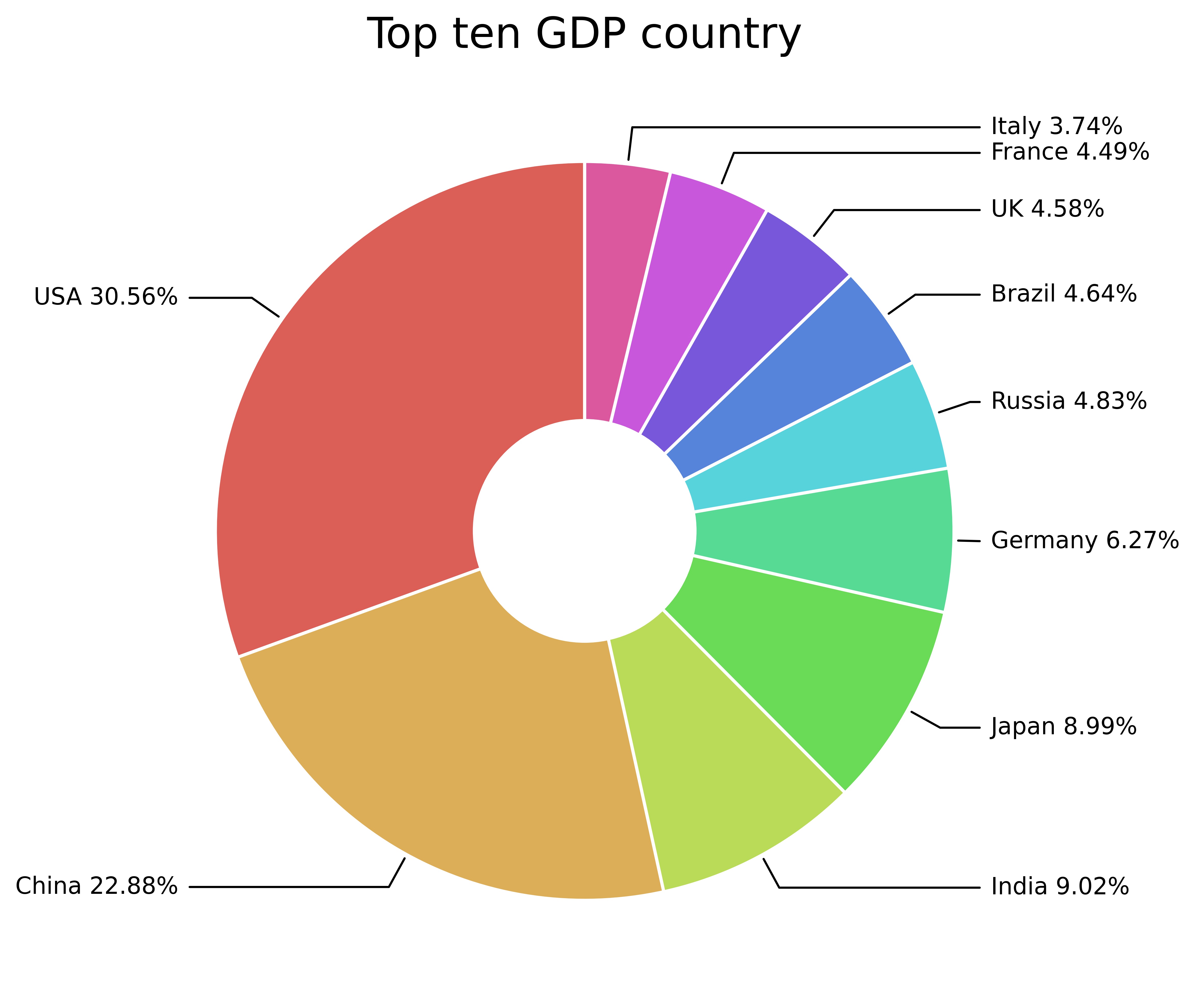
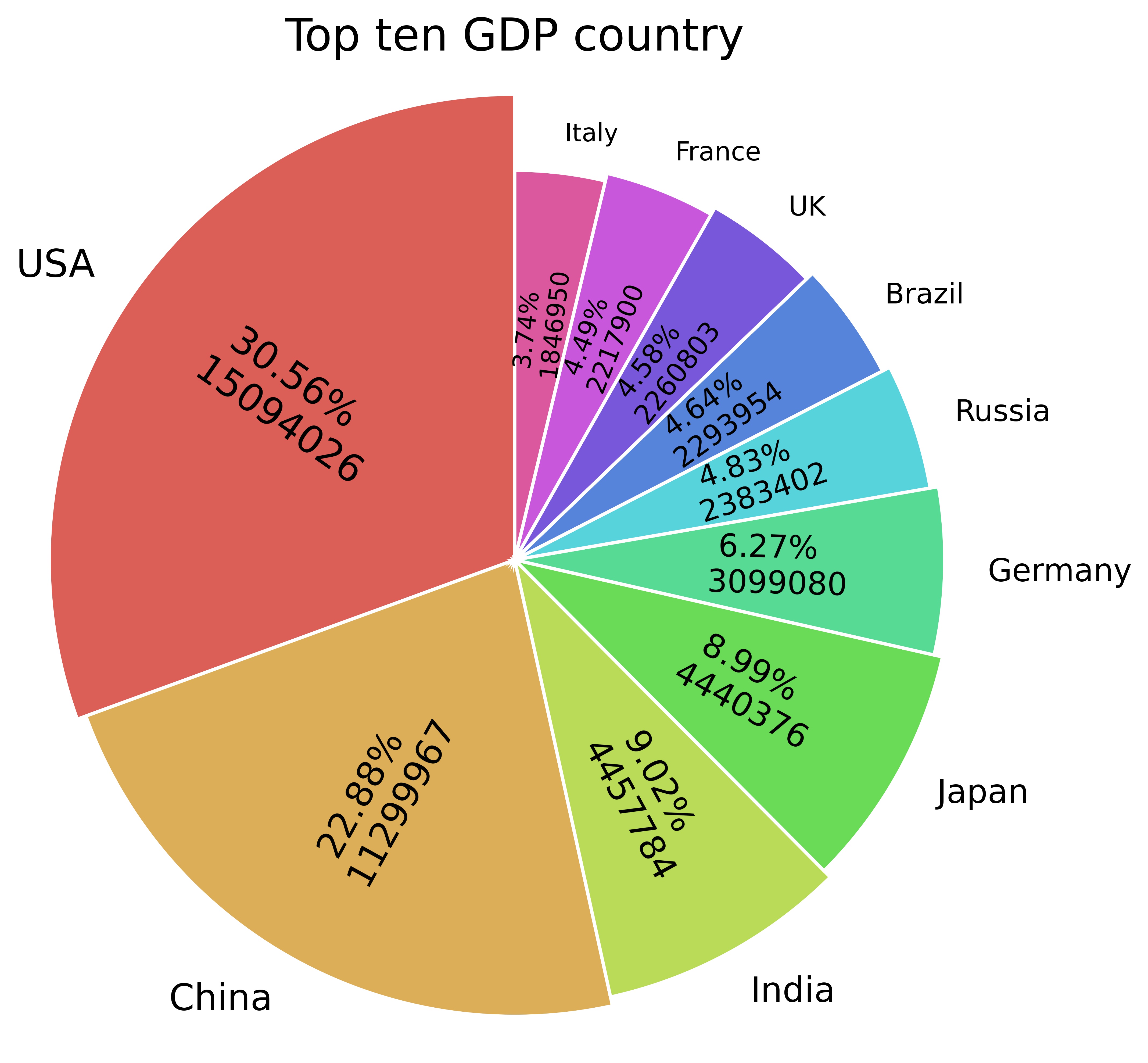
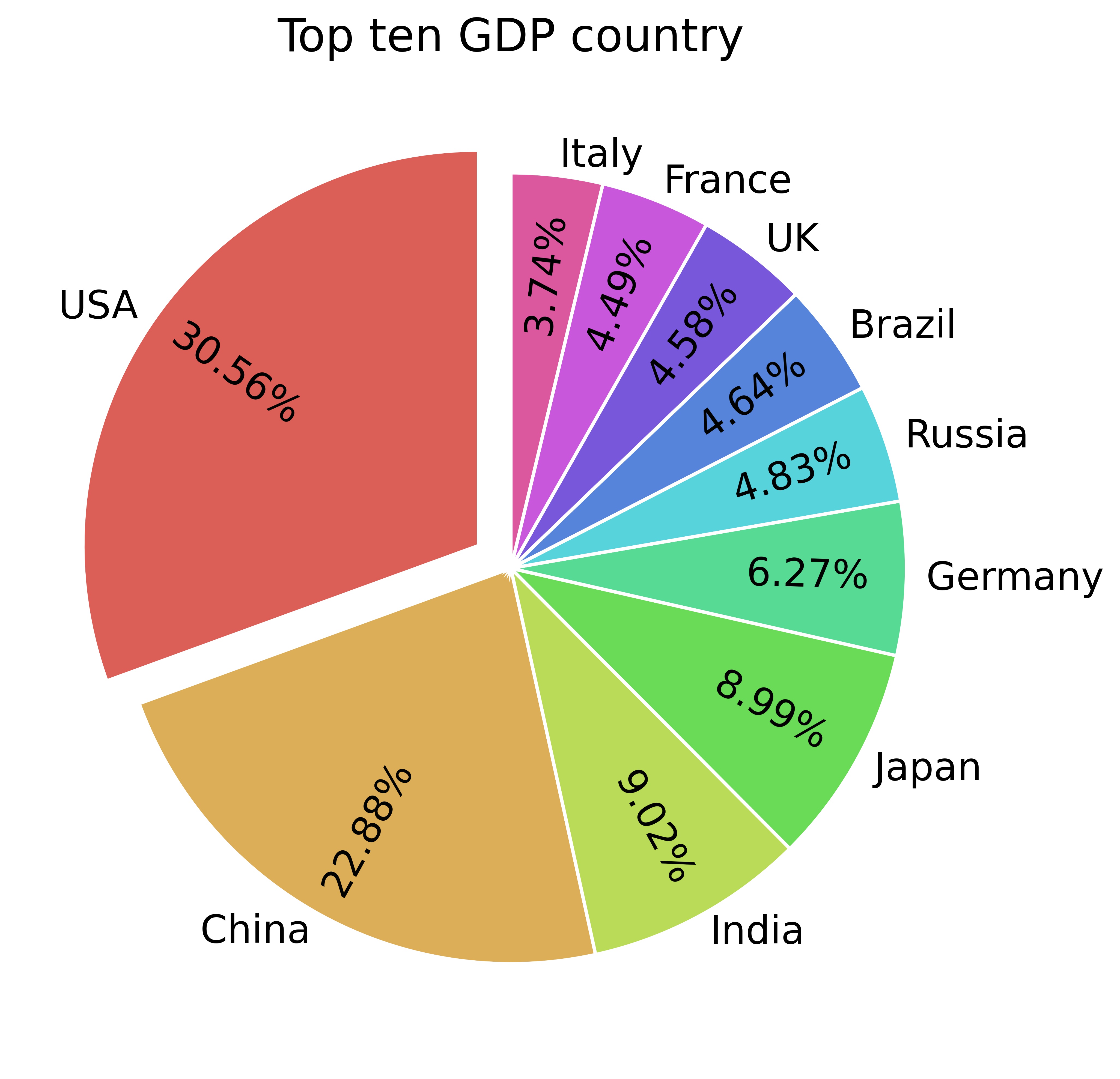
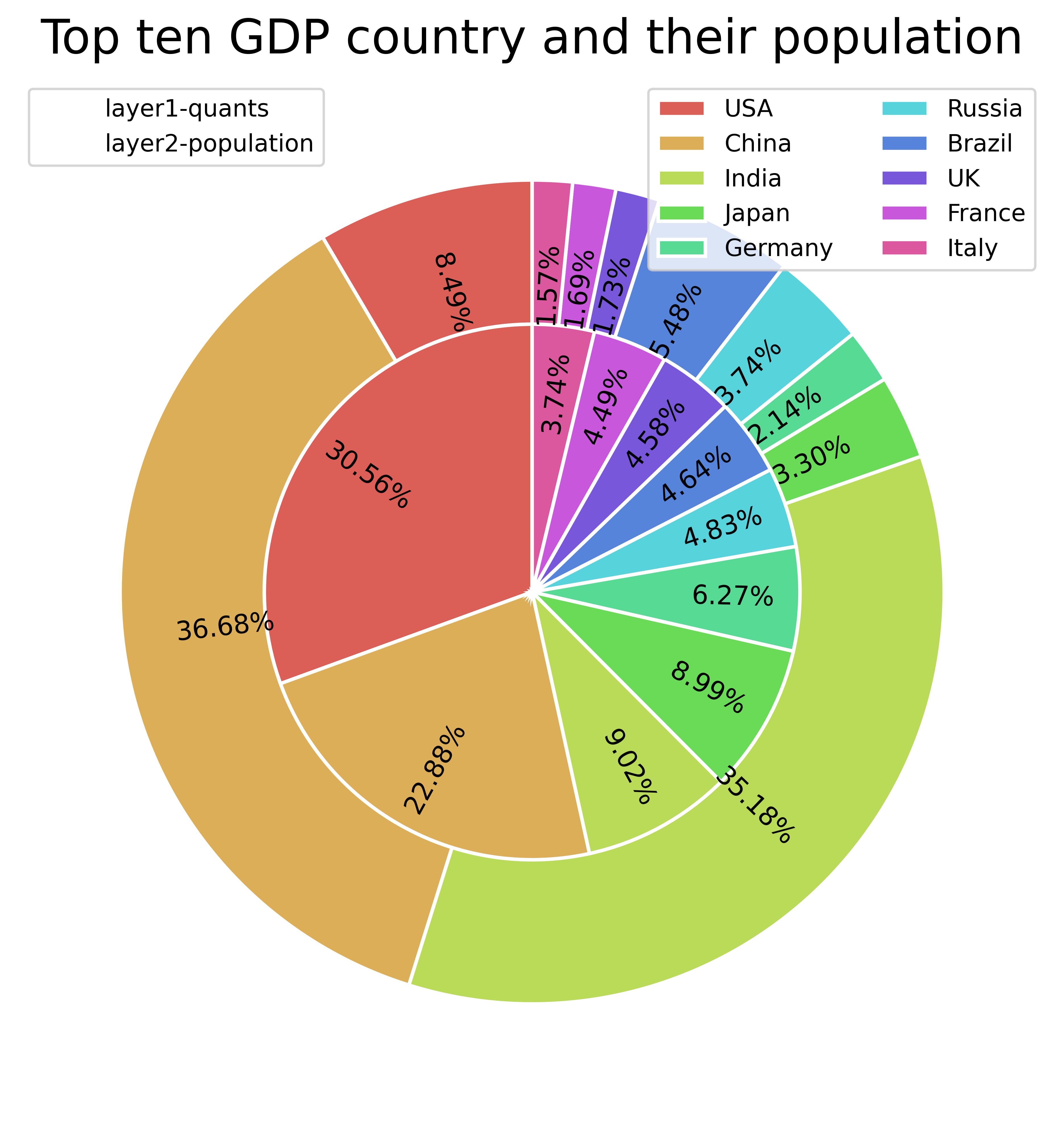
Pie Chart
A pie chart is the classic way of displaying composition. However, it is generally not recommended now because sometimes the area of the pie would be misleading. Therefore, if you want to use a pie chart, it is highly recommended to explicitly note the percentage or number of each part in the pie chart.
- Pie chart with outside annotation
- Pie chart with percentage marked on and changable radius and font size
- Pie chart with some labels exploration
- Multi-layer pie chart
from pie import Pie_plot

file_name = '1.xlsx'
a = Pie_plot(file_name)
a.Pie(file_name )
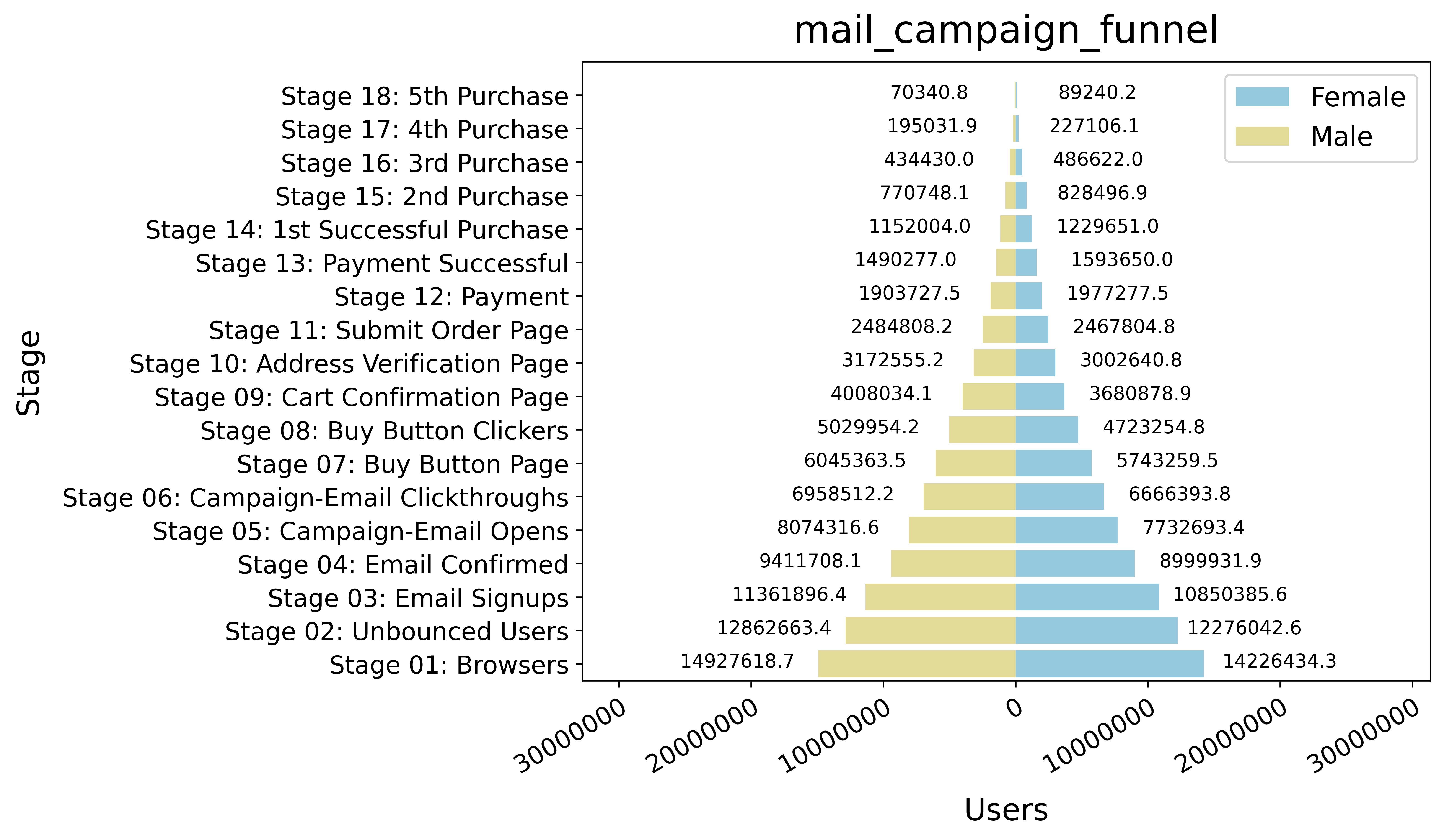
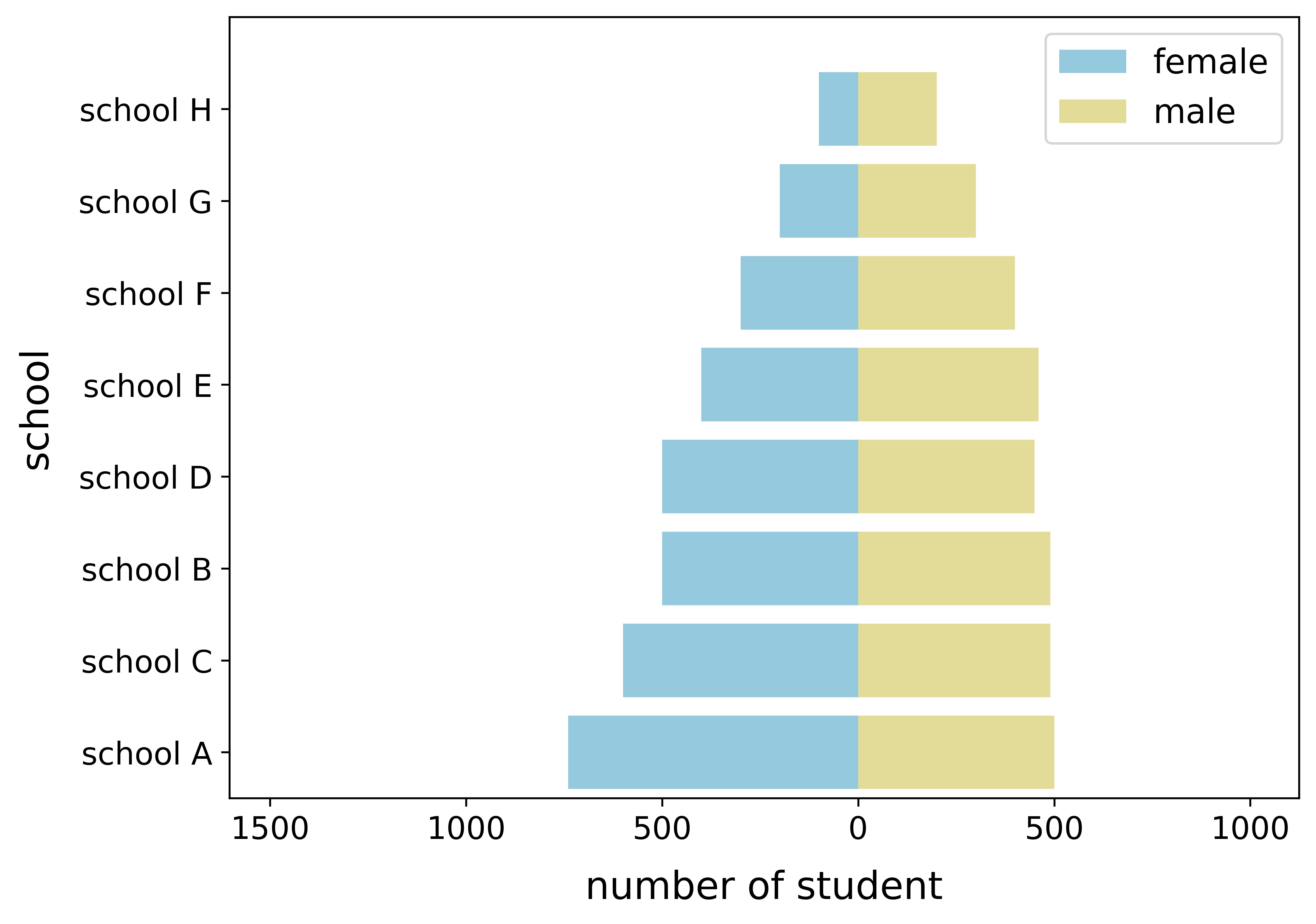
Pyramid Chart
The pyramid can be used to show the distribution of groups sorted by number, or it can be used to show the step-by-step filtering of the population.
- Pyramid with actual value annotation
- Pyramid with sort functions
from pyramid import pyramid

file_name = 'email_campaign_funnel.csv'
a = pyramid(file_name)
a.pyramid(file='email_campaign_funnel.csv')
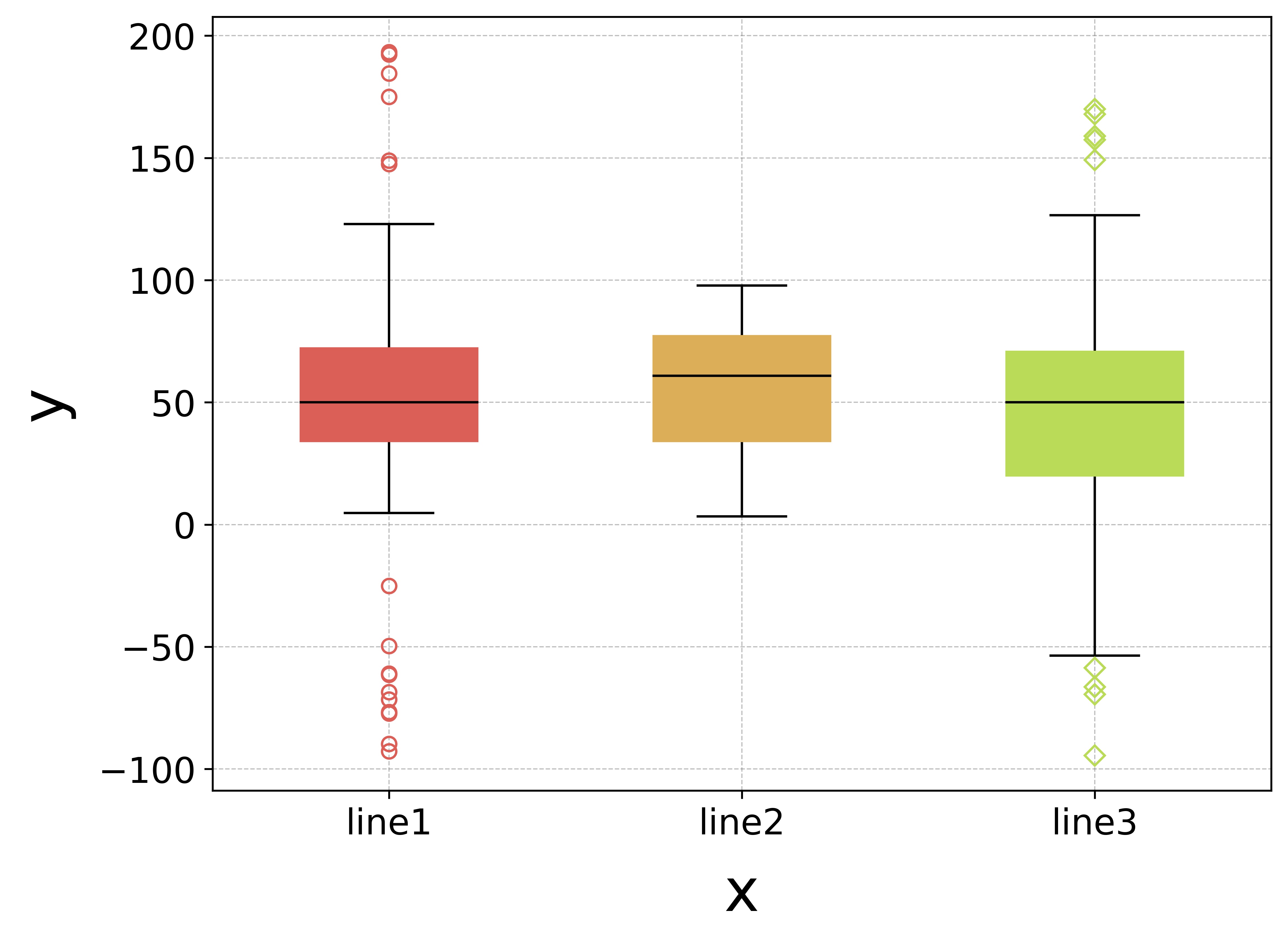
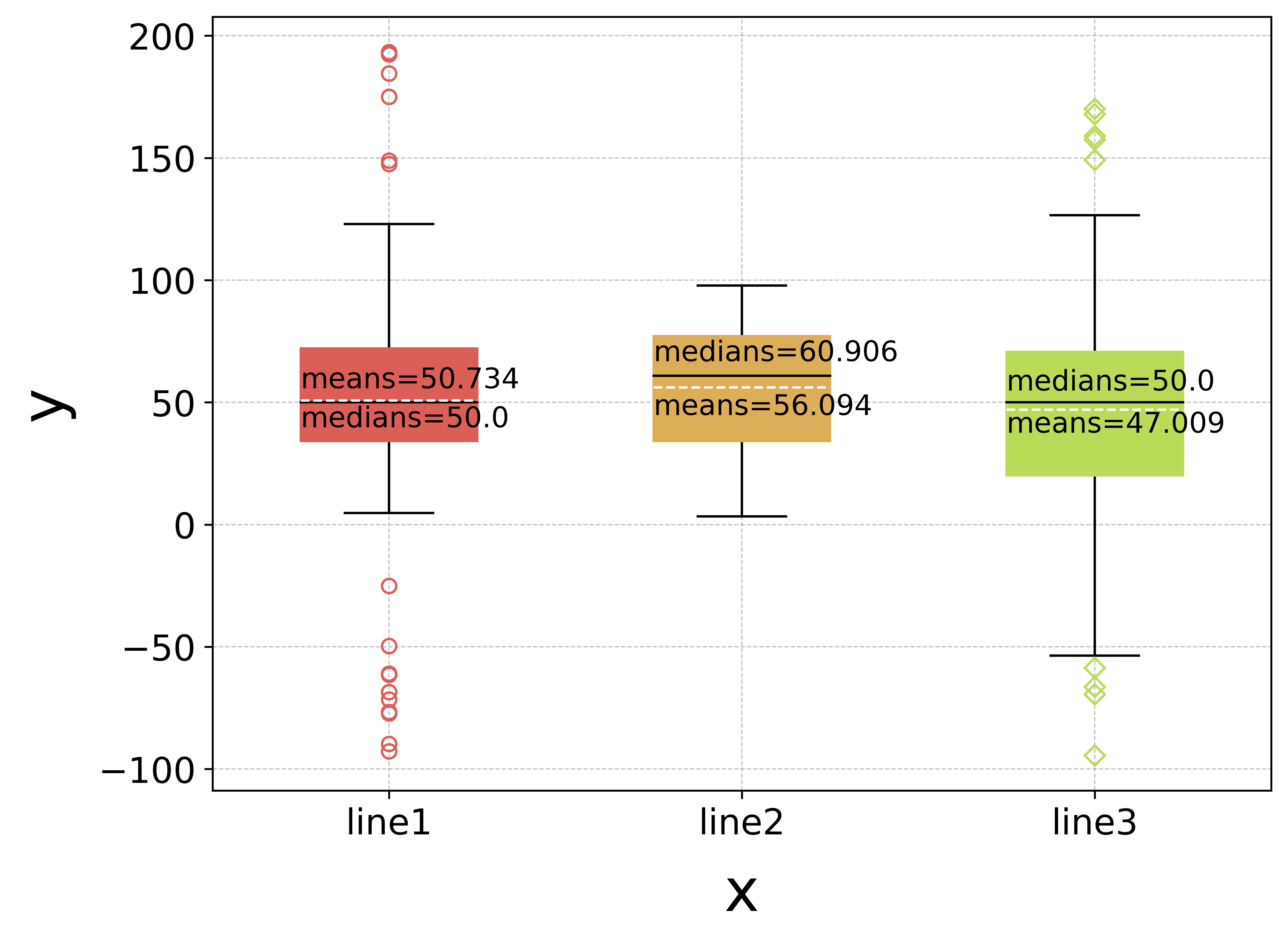
Box Plot
A box plot or boxplot is a method for graphically depicting groups of numerical data through their quartiles. Displays the five-number summary of a set of data. The five-number summary is the minimum, first quartile, median, third quartile, and maximum.
- Multi-item box plot
- Multi-item box plot with annotation
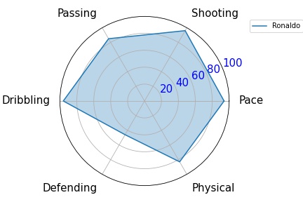
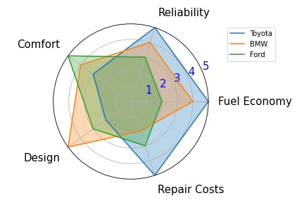
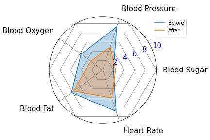
Radar Chart
A radar chart is a graphical method of displaying multivariate data in the form of a two-dimensional chart of three or more quantitative variables represented on axes starting from the same point. The relative position and angle of the axes is typically uninformative.
- Radar chart with single groups
- Radar chart with multiple groups
- Spider chart with multiple groups
from radar import Radar

file_name = 'ronaldo.xlsx'
a = Radar(file_name)
a.radar_plot(file_name)
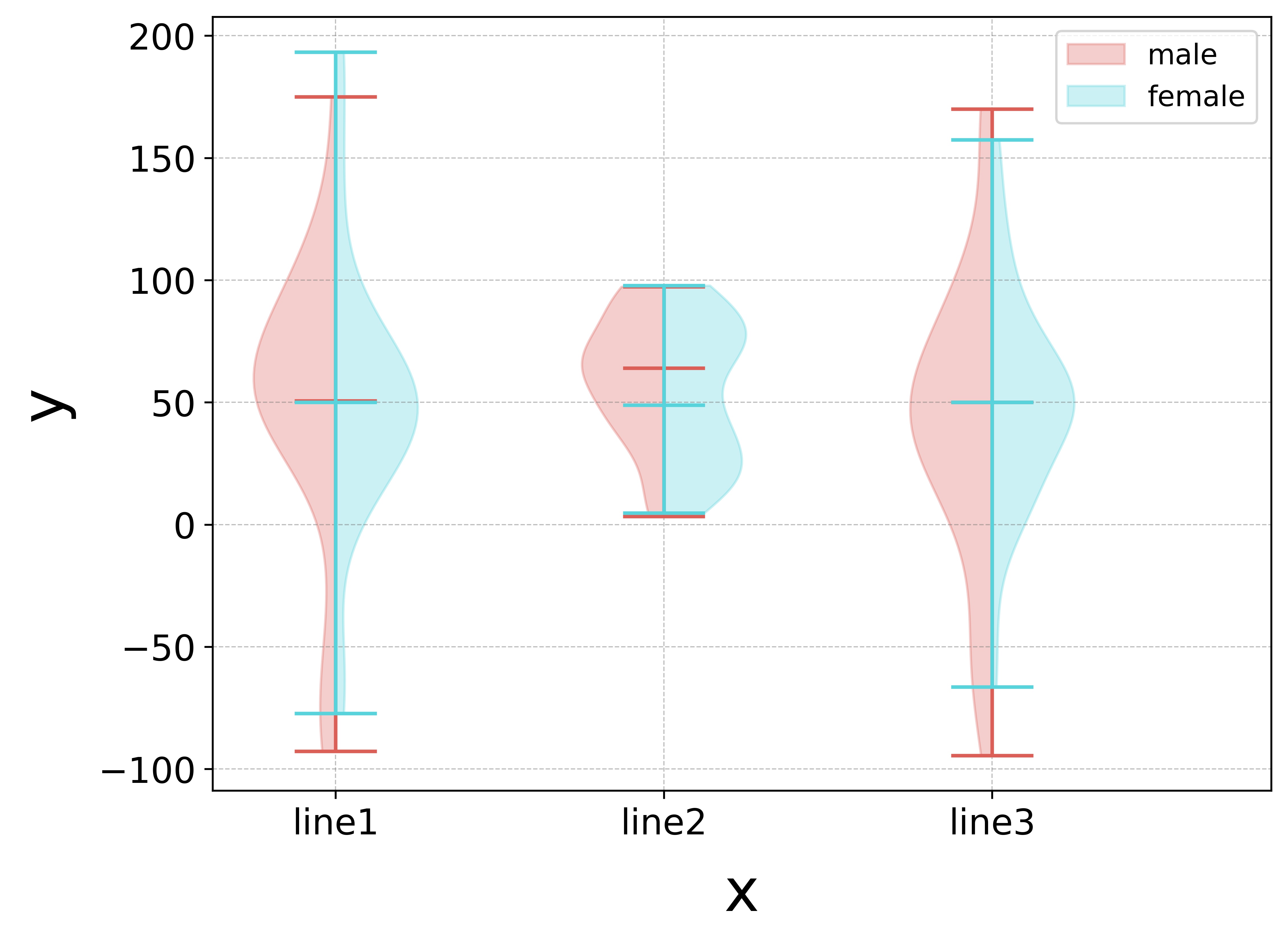
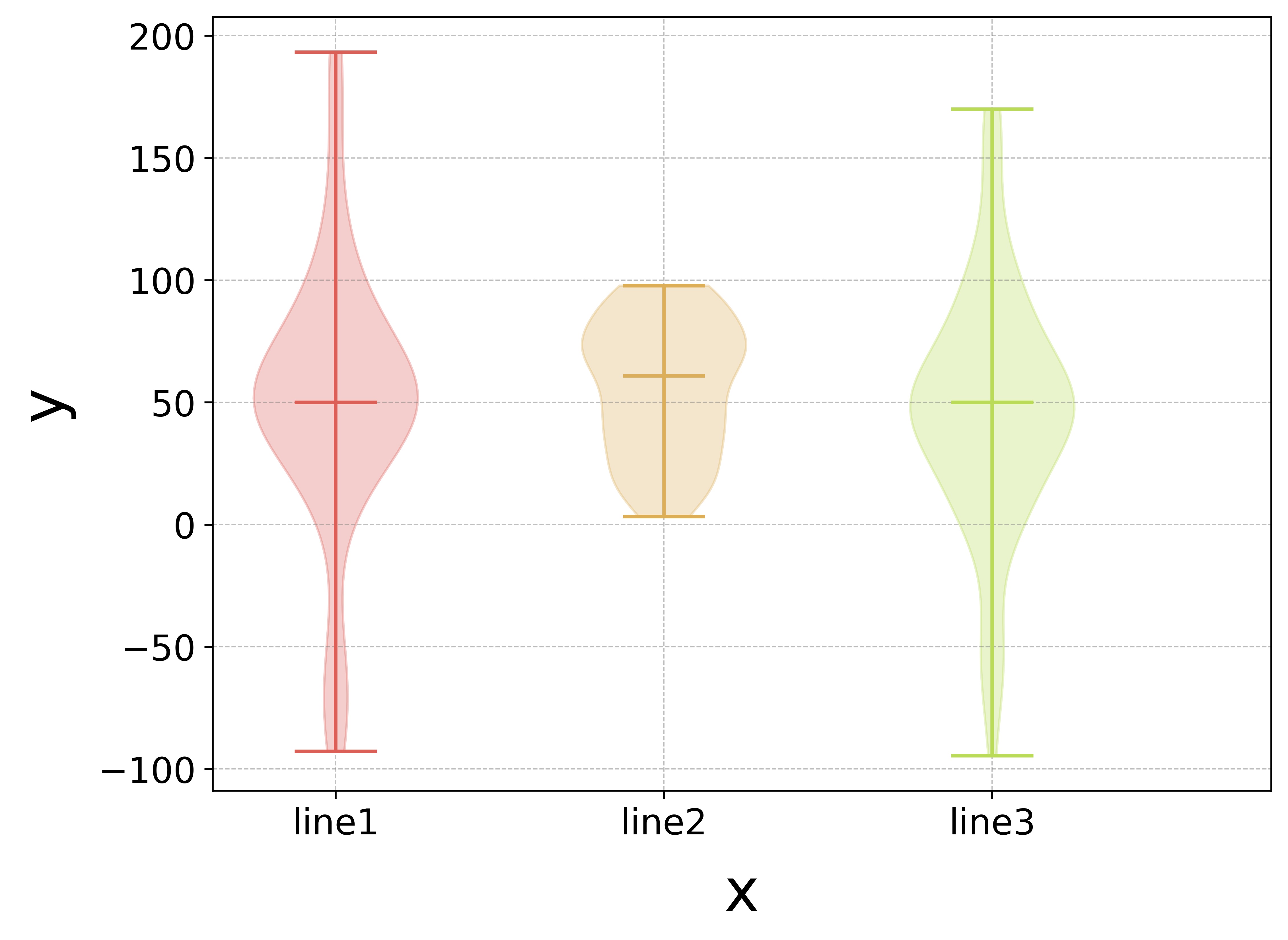
Violin Plot
A violin plot is a method of plotting numeric data. It is similar to a box plot, with the addition of a rotated kernel density plot on each side.
- Violin plot
- category violin plot
from violin import Violin_plot

file_name = '4.xlsx'
a = Violin_plot(file_name)
a.Violin(file='4.xlsx')
Release history Release notifications | RSS feed


Download files
Download the file for your platform. If you're not sure which to choose, learn more about installing packages.
Source Distribution
File details
Details for the file paperviz-0.0.10.13.tar.gz.
File metadata
- Download URL: paperviz-0.0.10.13.tar.gz
- Upload date:
- Size: 142.2 kB
- Tags: Source
- Uploaded using Trusted Publishing? No
- Uploaded via: twine/4.0.1 CPython/3.7.6
File hashes
| Algorithm | Hash digest | |
|---|---|---|
| SHA256 |
f2f0bc02142c136be5e80373d20be21aa6c9bdd0c5b46f72d46191288cc208cd
|
|
| MD5 |
cc16c965ab2700676d98870435c6c872
|
|
| BLAKE2b-256 |
6533888ad96d2358560fb19f98374f78369695393b685f0876771c28a0a7b7b2
|


