Plot in the terminal using braille dots.
Project description
Plotille
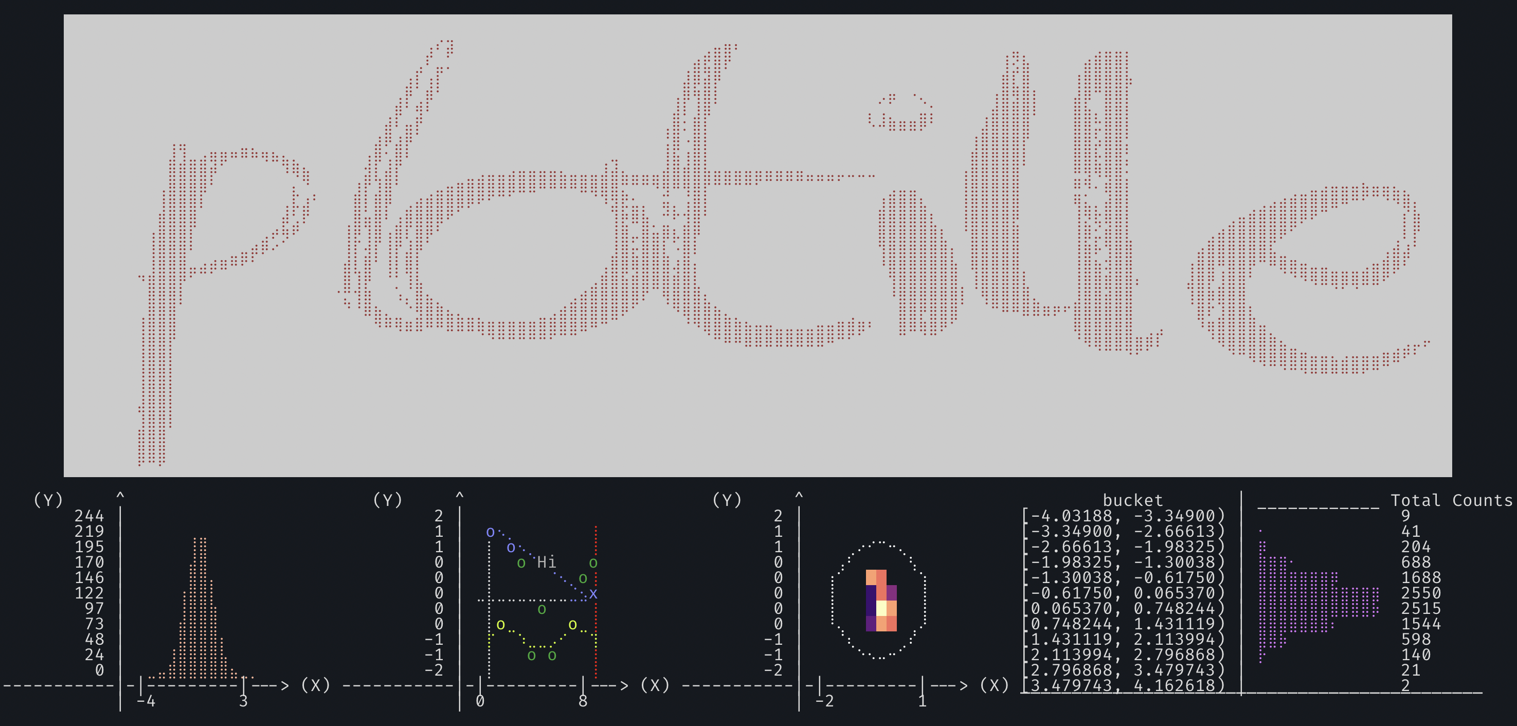
Plots, scatter plots, histograms and heatmaps in the terminal using braille dots, and foreground and background colors - with no dependencies. Make complex figures using the Figure class or make fast and simple plots using graphing function - similar to a very small sibling to matplotlib. Or use the canvas to plot dots, lines and images yourself.
Install:
pip install plotille
Similar to other libraries:
- like drawille, but focused on graphing – plus X/Y-axis.
- like termplot, but with braille (finer dots), left to right histogram and linear interpolation for plotting function.
- like termgraph (not on pypi), but very different style.
- like terminalplot, but with braille, X/Y-axis, histogram, linear interpolation.
Basic support for timeseries plotting is provided with release 3.2: for any X or Y values you can also add datetime.datetime or numpy.datetime64 values. Labels are generated respecting the difference of x_limits and y_limits.
Support for heatmaps using background colors for figures and displaying images binary with braille, or in color with background colors using the canvas - provided with release 4.0
If you are still using python 2.7, please use plotille v4 or before. With v5 I am dropping support for python 2.7, as the effort to maintain the discontinued version is too much.
Documentation
In [1]: import plotille
In [2]: import numpy as np
In [3]: X = np.sort(np.random.normal(size=1000))
Figure
To construct plots the recommended way is to use a Figure:
In [4]: plotille.Figure?
Init signature: plotille.Figure() -> None
Docstring:
Figure class to compose multiple plots.

Within a Figure you can easily compose many plots, assign labels to plots
and define the properties of the underlying Canvas. Possible properties that
can be defined are:

    width, height: int           Define the number of characters in X / Y direction
                                 which are used for plotting.
    x_limits: DataValue          Define the X limits of the reference coordinate system,
                                 that will be plotted.
    y_limits: DataValue          Define the Y limits of the reference coordinate system,
                                 that will be plotted.
    color_mode: str              Define the used color mode. See `plotille.color()`.
    with_colors: bool            Define, whether to use colors at all.
    background: ColorDefinition  Define the background color.
    x_label, y_label: str        Define the X / Y axis label.```

Basically, you create a `Figure`, define the properties and add your plots. Using the `show()` function, the `Figure` generates the plot using a new canvas:

```python
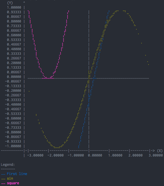
In [13] fig = plotille.Figure()
In [14] fig.width = 60
In [15] fig.height = 30
In [16] fig.set_x_limits(min_=-3, max_=3)
In [17] fig.set_y_limits(min_=-1, max_=1)
In [18] fig.color_mode = 'byte'
In [19] fig.plot([-0.5, 1], [-1, 1], lc=25, label='First line')
In [20] fig.scatter(X, np.sin(X), lc=100, label='sin')
In [21] fig.plot(X, (X+2)**2 , lc=200, label='square')
In [22] print(fig.show(legend=True))
The available plotting functions are:
# create a plot with linear interpolation between points
Figure.plot(self, X, Y, lc=None, interp='linear', label=None, marker=None)
# create a scatter plot with no interpolation between points
Figure.scatter(self, X, Y, lc=None, label=None, marker=None)
# create a histogram over X
Figure.histogram(self, X, bins=160, lc=None)
# print texts at coordinates X, Y
Figure.text(self, X, Y, texts, lc=None)

# The following functions use relative coordinates on the canvas
# i.e. all coordinates are \in [0, 1]
# plot a vertical line at x
Figure.axvline(self, x, ymin=0, ymax=1, lc=None)
# plot a vertical rectangle from (xmin,ymin) to (xmax, ymax).
Figure.axvspan(self, xmin, xmax, ymin=0, ymax=1, lc=None)
# plot a horizontal line at y
Figure.axhline(self, y, xmin=0, xmax=1, lc=None)
# plot a horizontal rectangle from (xmin,ymin) to (xmax, ymax).
Figure.axhspan(self, ymin, ymax, xmin=0, xmax=1, lc=None)

# Display data as an image, i.e. on a 2D regular raster.
Figure.imgshow(self, X, cmap=None)
Other interesting functions are:
# remove all plots, texts, spans and images from the figure
Figure.clear(self)
# Create a canvas, plot the registered plots and return the string for displaying the plot
Figure.show(self, legend=False)
Please have a look at the examples/ folder.
Graphing
There are some utility functions for fast graphing of single plots.
Plot
In [4]: plotille.plot?
Signature:
plotille.plot(
    X: Sequence[float | int] | Sequence[datetime.datetime],
    Y: Sequence[float | int] | Sequence[datetime.datetime],
    width: int = 80,
    height: int = 40,
    X_label: str = 'X',
    Y_label: str = 'Y',
    linesep: str = '\n',
    interp: Optional[Literal['linear']] = 'linear',
    x_min: float | int | datetime.datetime | None = None,
    x_max: float | int | datetime.datetime | None = None,
    y_min: float | int | datetime.datetime | None = None,
    y_max: float | int | datetime.datetime | None = None,
    lc: Union[str, int, ColorNames, tuple[int, int, int], Sequence[int], NoneType] = None,
    bg: Union[str, int, ColorNames, tuple[int, int, int], Sequence[int], NoneType] = None,
    color_mode: Literal['names', 'byte', 'rgb'] = 'names',
    origin: bool = True,
    marker: str | None = None,
) -> str
Docstring:
Create plot with X , Y values and linear interpolation between points

Parameters:
    X: List[float]         X values.
    Y: List[float]         Y values. X and Y must have the same number of entries.
    width: int             The number of characters for the width (columns) of the
                           canvas.
    height: int            The number of characters for the hight (rows) of the
                           canvas.
    X_label: str           Label for X-axis.
    Y_label: str           Label for Y-axis. max 8 characters.    linesep: str           The requested line separator. default: os.linesep
    linesep: str           The requested line separator. default: os.linesep
    interp: Optional[str]  Specify interpolation; values None, 'linear'
    x_min, x_max: float    Limits for the displayed X values.
    y_min, y_max: float    Limits for the displayed Y values.
    lc: ColorDefinition           Give the line color.
    bg: ColorDefinition           Give the background color.
    color_mode: ColorMode        Specify color input mode; 'names' (default), 'byte' or
                           'rgb' see plotille.color.__docs__
    origin: bool           Whether to print the origin. default: True
    marker: str            Instead of braille dots set a marker char for actual
                           values.

Returns:
    str: plot over `X`, `Y`.

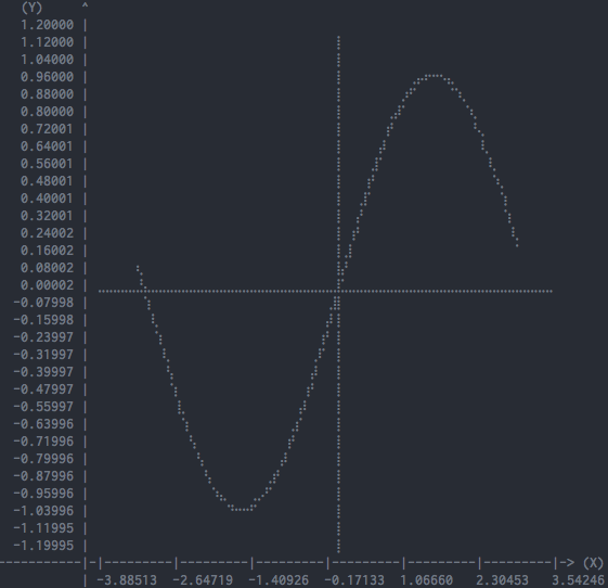
In [5]: print(plotille.plot(X, np.sin(X), height=30, width=60))
Scatter
In [6]: plotille.scatter?
Signature:
plotille.scatter(
    X: Sequence[float | int] | Sequence[datetime.datetime],
    Y: Sequence[float | int] | Sequence[datetime.datetime],
    width: int = 80,
    height: int = 40,
    X_label: str = 'X',
    Y_label: str = 'Y',
    linesep: str = '\n',
    x_min: float | int | datetime.datetime | None = None,
    x_max: float | int | datetime.datetime | None = None,
    y_min: float | int | datetime.datetime | None = None,
    y_max: float | int | datetime.datetime | None = None,
    lc: Union[str, int, ColorNames, tuple[int, int, int], Sequence[int], NoneType] = None,
    bg: Union[str, int, ColorNames, tuple[int, int, int], Sequence[int], NoneType] = None,
    color_mode: Literal['names', 'byte', 'rgb'] = 'names',
    origin: bool = True,
    marker: str | None = None,
) -> str
Docstring:
Create scatter plot with X , Y values

Basically plotting without interpolation:
    `plot(X, Y, ... , interp=None)`

Parameters:
    X: List[float]       X values.
    Y: List[float]       Y values. X and Y must have the same number of entries.
    width: int           The number of characters for the width (columns) of the
                         canvas.
    height: int          The number of characters for the hight (rows) of the
                         canvas.    X_label: str         Label for X-axis.
    X_label: str         Label for X-axis.
    Y_label: str         Label for Y-axis. max 8 characters.
    linesep: str         The requested line separator. default: os.linesep
    x_min, x_max: float  Limits for the displayed X values.
    y_min, y_max: float  Limits for the displayed Y values.
    lc: ColorDefinition         Give the line color.
    bg: ColorDefinition         Give the background color.
    color_mode: ColorMode      Specify color input mode; 'names' (default), 'byte' or
                         'rgb' see plotille.color.__docs__
    origin: bool         Whether to print the origin. default: True
    marker: str          Instead of braille dots set a marker char.

Returns:
    str: scatter plot over `X`, `Y`.

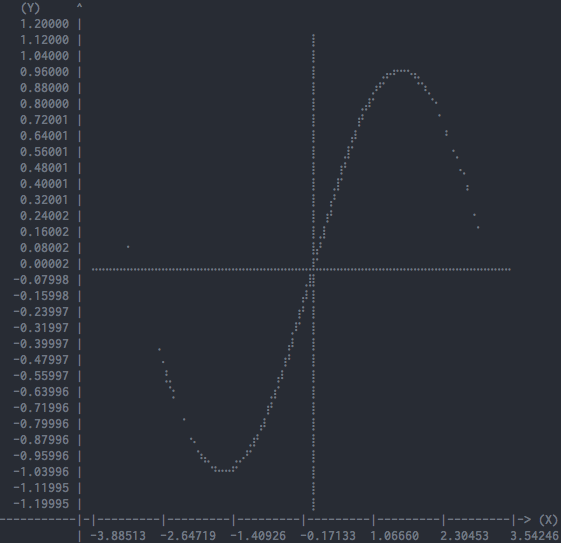
In [7]: print(plotille.scatter(X, np.sin(X), height=30, width=60))
Hist
Inspired by crappyhist (link is gone, but I made a gist).
In [8]: plotille.hist?
Signature:
plotille.hist(
    X: Sequence[float | int] | Sequence[datetime.datetime],
    bins: int = 40,
    width: int = 80,
    log_scale: bool = False,
    linesep: str = '\n',
    lc: Union[str, int, ColorNames, tuple[int, int, int], Sequence[int], NoneType] = None,
    bg: Union[str, int, ColorNames, tuple[int, int, int], Sequence[int], NoneType] = None,
    color_mode: Literal['names', 'byte', 'rgb'] = 'names',
) -> str
Docstring:
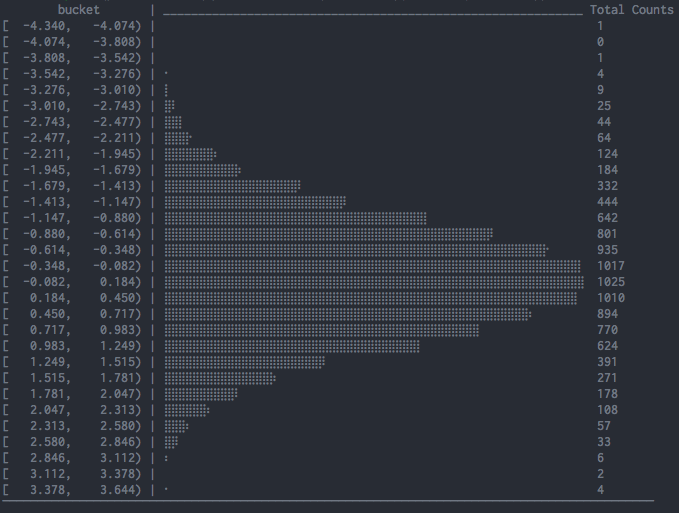
Create histogram over `X` from left to right

The values on the left are the center of the bucket, i.e. `(bin[i] + bin[i+1]) / 2`.
The values on the right are the total counts of this bucket.

Parameters:
    X: List[float]       The items to count over.
    bins: int            The number of bins to put X entries in (rows).
    width: int           The number of characters for the width (columns).
    log_scale: bool      Scale the histogram with `log` function.
    linesep: str         The requested line separator. default: os.linesep
    lc: ColorDefinition         Give the line color.
    bg: ColorDefinition         Give the background color.
    color_mode: ColorMode      Specify color input mode; 'names' (default), 'byte' or
                         'rgb' see plotille.color.__docs__

Returns:
    str: histogram over `X` from left to right.

In [9]: print(plotille.hist(np.random.normal(size=10000)))
Hist (aggregated)
This function allows you to create a histogram when your data is already aggregated (aka you don't have access to raw values, but you have access to bins and counts for each bin).
This comes handy when working with APIs such as OpenTelemetry Metrics API where views such as ExplicitBucketHistogramAggregation only expose access to aggregated values (counts for each bin / bucket).
In [8]: plotille.hist_aggregated?
Signature:
plotille.hist_aggregated(
    counts: list[int],
    bins: Sequence[float],
    width: int = 80,
    log_scale: bool = False,
    linesep: str = '\n',
    lc: Union[str, int, ColorNames, tuple[int, int, int], Sequence[int], NoneType] = None,
    bg: Union[str, int, ColorNames, tuple[int, int, int], Sequence[int], NoneType] = None,
    color_mode: Literal['names', 'byte', 'rgb'] = 'names',
    meta: plotille._data_metadata.DataMetadata | None = None,
) -> str
Docstring:
Create histogram for aggregated data.

Parameters:
    counts: List[int]         Counts for each bucket.
    bins: List[float]         Limits for the bins for the provided counts: limits for
                              bin `i` are `[bins[i], bins[i+1])`.
                              Hence, `len(bins) == len(counts) + 1`.
    width: int                The number of characters for the width (columns).
    log_scale: bool           Scale the histogram with `log` function.
    linesep: str              The requested line separator. default: os.linesep
    lc: ColorDefinition       Give the line color.
    bg: ColorDefinition       Give the background color.
    color_mode: ColorMode     Specify color input mode; 'names' (default), 'byte' or
                              'rgb' see plotille.color.__docs__
    meta: DataMetadata | None For conversion of datetime values.
Returns:
    str: histogram over `X` from left to right.

In [9]: counts = [1945, 0, 0, 0, 0, 0, 10555, 798, 0, 28351, 0]
In [10]: bins = [float('-inf'), 10, 50, 100, 200, 300, 500, 800, 1000, 2000, 10000, float('+inf')]
In [11]: print(plotille.hist_aggregated(counts, bins))
Keep in mind that there must always be n+1 bins (n is a total number of count values, 11 in the example above).
In this example the first bin is from [-inf, 10) with a count of 1945 and the last bin is from [10000, +inf] with a count of 0.
Histogram
There is also another more 'usual' histogram function available:
In [10]: plotille.histogram?
Signature:
plotille.histogram(
    X: Sequence[float | int] | Sequence[datetime.datetime],
    bins: int = 160,
    width: int = 80,
    height: int = 40,
    X_label: str = 'X',
    Y_label: str = 'Counts',
    linesep: str = '\n',
    x_min: float | int | datetime.datetime | None = None,
    x_max: float | int | datetime.datetime | None = None,
    y_min: float | int | datetime.datetime | None = None,
    y_max: float | int | datetime.datetime | None = None,
    lc: Union[str, int, ColorNames, tuple[int, int, int], Sequence[int], NoneType] = None,
    bg: Union[str, int, ColorNames, tuple[int, int, int], Sequence[int], NoneType] = None,
    color_mode: Literal['names', 'byte', 'rgb'] = 'names',
) -> str
Docstring:
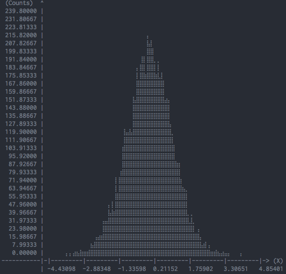
Create histogram over `X`

In contrast to `hist`, this is the more `usual` histogram from bottom
to up. The X-axis represents the values in `X` and the Y-axis is the
corresponding frequency.

Parameters:
    X: List[float]       The items to count over.
    bins: int            The number of bins to put X entries in (columns).
    height: int          The number of characters for the height (rows).
    X_label: str         Label for X-axis.
    Y_label: str         Label for Y-axis. max 8 characters.
    linesep: str         The requested line separator. default: os.linesep
    x_min, x_max: float  Limits for the displayed X values.
    y_min, y_max: float  Limits for the displayed Y values.
    lc: ColorDefinition         Give the line color.
    bg: ColorDefinition         Give the background color.
    color_mode: ColorMode      Specify color input mode; 'names' (default), 'byte' or
                         'rgb' see plotille.color.__docs__

Returns:
    str: histogram over `X`.

In [11]: print(plotille.histogram(np.random.normal(size=10000)))
Canvas
The underlying plotting area is modeled as the Canvas class:
In [12]:  plotille.Canvas?
Init signature:
plotille.Canvas(
    width: int,
    height: int,
    xmin: Union[float, int] = 0,
    ymin: Union[float, int] = 0,
    xmax: Union[float, int] = 1,
    ymax: Union[float, int] = 1,
    background: Union[str, int, ColorNames, tuple[int, int, int], Sequence[int], NoneType] = None,
    **color_kwargs: Any,
) -> None
Docstring:
A canvas object for plotting braille dots

A Canvas object has a `width` x `height` characters large canvas, in which it
can plot indivitual braille point, lines out of braille points, rectangles,...
Since a full braille character has 2 x 4 dots (⣿), the canvas has `width` * 2,
`height` * 4 dots to plot into in total.

It maintains two coordinate systems: a reference system with the limits (xmin, ymin)
in the lower left corner to (xmax, ymax) in the upper right corner is transformed
into the canvas discrete, i.e. dots, coordinate system (0, 0) to (`width` * 2,
`height` * 4). It does so transparently to clients of the Canvas, i.e. all plotting
functions only accept coordinates in the reference system. If the coordinates are
outside the reference system, they are not plotted.
Init docstring:
Initiate a Canvas object

Parameters:
    width: int            The number of characters for the width (columns) of
                          the canvas.
    height: int           The number of characters for the hight (rows) of the
                          canvas.
    xmin, ymin: float     Lower left corner of reference system.
    xmax, ymax: float     Upper right corner of reference system.
    background: multiple  Background color of the canvas.
    **color_kwargs:       More arguments to the color-function.
                          See `plotille.color()`.

Returns:
    Canvas object
The most interesting functions are:
point:
In [11]: plotille.Canvas.point?
Signature:
plotille.Canvas.point(
    self,
    x: Union[float, int],
    y: Union[float, int],
    set_: bool = True,
    color: Union[str, int, ColorNames, tuple[int, int, int], Sequence[int], NoneType] = None,
    marker: str | None = None,
) -> None
Docstring:
Put a point into the canvas at (x, y) [reference coordinate system]

Parameters:
    x: float         x-coordinate on reference system.
    y: float         y-coordinate on reference system.
    set_: bool       Whether to plot or remove the point.
    color: multiple  Color of the point.
    marker: str      Instead of braille dots set a marker char.
line:
In [14]: plotille.Canvas.line?
Signature:
plotille.Canvas.line(
    self,
    x0: Union[float, int],
    y0: Union[float, int],
    x1: Union[float, int],
    y1: Union[float, int],
    set_: bool = True,
    color: Union[str, int, ColorNames, tuple[int, int, int], Sequence[int], NoneType] = None,
) -> None
Docstring:
Plot line between point (x0, y0) and (x1, y1) [reference coordinate system].

Parameters:
    x0, y0: float    Point 0
    x1, y1: float    Point 1
    set_: bool       Whether to plot or remove the line.
    color: multiple  Color of the line.
rect:
In [15]: plotille.Canvas.rect?
Signature:
plotille.Canvas.rect(
    self,
    xmin: Union[float, int],
    ymin: Union[float, int],
    xmax: Union[float, int],
    ymax: Union[float, int],
    set_: bool = True,
    color: Union[str, int, ColorNames, tuple[int, int, int], Sequence[int], NoneType] = None,
) -> None
Docstring:
Plot rectangle with bbox (xmin, ymin) and (xmax, ymax).

In the reference coordinate system.

Parameters:
    xmin, ymin: float  Lower left corner of rectangle.
    xmax, ymax: float  Upper right corner of rectangle.
    set_: bool         Whether to plot or remove the rect.
    color: multiple    Color of the rect.
text:
In [16]: plotille.Canvas.text?
Signature:
plotille.Canvas.text(
    self,
    x: Union[float, int],
    y: Union[float, int],
    text: str,
    set_: bool = True,
    color: Union[str, int, ColorNames, tuple[int, int, int], Sequence[int], NoneType] = None,
) -> None
Docstring:
Put some text into the canvas at (x, y) [reference coordinate system]

Parameters:
    x: float         x-coordinate on reference system.
    y: float         y-coordinate on reference system.
    set_: bool       Whether to set the text or clear the characters.
    text: str        The text to add.
    color: multiple  Color of the point.
braille_image:
In [17]: plotille.Canvas.braille_image?
Signature:
plotille.Canvas.braille_image(
    self,
    pixels: Sequence[int],
    threshold: int = 127,
    inverse: bool = False,
    color: Union[str, int, ColorNames, tuple[int, int, int], Sequence[int], NoneType] = None,
    set_: bool = True,
) -> None
Docstring:
Print an image using braille dots into the canvas.

The pixels and braille dots in the canvas are a 1-to-1 mapping, hence
a 80 x 80 pixel image will need a 40 x 20 canvas.

Example:
    from PIL import Image
    import plotille as plt

    img = Image.open("/path/to/image")
    img = img.convert('L')
    img = img.resize((80, 80))
    cvs = plt.Canvas(40, 20)
    cvs.braille_image(img.getdata(), 125)
    print(cvs.plot())

Parameters:
    pixels: list[number]  All pixels of the image in one list.
    threshold: float      All pixels above this threshold will be
                          drawn.
    inverse: bool         Whether to invert the image.
    color: multiple       Color of the point.
    set_: bool            Whether to plot or remove the dots.
image:
In [18]: plotille.Canvas.image?
Signature:
plotille.Canvas.image(
    self,
    pixels: Sequence[tuple[int, int, int] | Sequence[int] | None],
    set_: bool = True,
) -> None
Docstring:
Print an image using background colors into the canvas.

The pixels of the image and the characters in the canvas are a
1-to-1 mapping, hence a 80 x 80 image will need a 80 x 80 canvas.

Example:
    from PIL import Image
    import plotille as plt

    img = Image.open("/path/to/image")
    img = img.convert('RGB')
    img = img.resize((40, 40))
    cvs = plt.Canvas(40, 40, mode='rgb')
    cvs.image(img.getdata())
    print(cvs.plot())

Parameters:
    pixels: list[(R,G,B)]  All pixels of the image in one list.
    set_: bool             Whether to plot or remove the background
                           colors.
plot:
In [16]: plotille.Canvas.plot?
Signature: plotille.Canvas.plot(self, linesep: str = '\n') -> str
Docstring:
Transform canvas into `print`-able string

Parameters:
    linesep: str  The requested line separator. default: os.linesep

Returns:
    unicode: The canvas as a string.
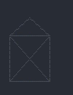
You can use it for example to plot a house in the terminal:
In [17]: c = Canvas(width=40, height=20)
In [18]: c.rect(0.1, 0.1, 0.6, 0.6)
In [19]: c.line(0.1, 0.1, 0.6, 0.6)
In [20]: c.line(0.1, 0.6, 0.6, 0.1)
In [21]: c.line(0.1, 0.6, 0.35, 0.8)
In [22]: c.line(0.35, 0.8, 0.6, 0.6)
In [23]: print(c.plot())
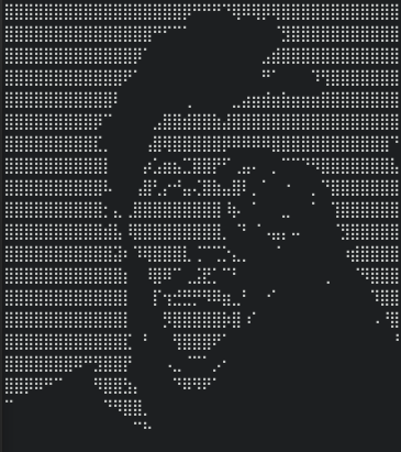
Or you could render images with braille dots:
In [24]: img = Image.open('https://github.com/tammoippen/plotille/raw/master/imgs/ich.jpg')
In [25]: img = img.convert('L')
In [26]: img = img.resize((80, 80))
In [27]: cvs = Canvas(40, 20)
In [28]: cvs.braille_image(img.getdata())
In [29]: print(cvs.plot())
Or you could render images with the background color of characters:
In [24]: img = Image.open('https://github.com/tammoippen/plotille/raw/master/imgs/ich.jpg')
In [25]: img = img.convert('RGB')
In [25]: img = img.resize((80, 40))
In [27]: cvs = Canvas(80, 40, mode="rgb")
In [28]: cvs.image(img.getdata())
In [29]: print(cvs.plot())
Stargazers over time
Project details
Release history Release notifications | RSS feed
Download files
Download the file for your platform. If you're not sure which to choose, learn more about installing packages.
Source Distribution
Built Distribution
Filter files by name, interpreter, ABI, and platform.
If you're not sure about the file name format, learn more about wheel file names.
Copy a direct link to the current filters
File details
Details for the file plotille-6.0.5.tar.gz.
File metadata
- Download URL: plotille-6.0.5.tar.gz
- Upload date:
- Size: 58.2 kB
- Tags: Source
- Uploaded using Trusted Publishing? No
- Uploaded via: uv/0.10.3 {"installer":{"name":"uv","version":"0.10.3","subcommand":["publish"]},"python":null,"implementation":{"name":null,"version":null},"distro":{"name":"Ubuntu","version":"24.04","id":"noble","libc":null},"system":{"name":null,"release":null},"cpu":null,"openssl_version":null,"setuptools_version":null,"rustc_version":null,"ci":true}
File hashes
| Algorithm | Hash digest | |
|---|---|---|
| SHA256 |
26d2cef5d4feb8632c9710442ad49fc57f9d5b20881c21ac7954c76208b5600b
|
|
| MD5 |
dd7e621347114edf673544cc5dbf5f22
|
|
| BLAKE2b-256 |
4651a6093145179139e7dffc01aa499b0169c91154a743197a3fd16252a9e90d
|
File details
Details for the file plotille-6.0.5-py3-none-any.whl.
File metadata
- Download URL: plotille-6.0.5-py3-none-any.whl
- Upload date:
- Size: 62.5 kB
- Tags: Python 3
- Uploaded using Trusted Publishing? No
- Uploaded via: uv/0.10.3 {"installer":{"name":"uv","version":"0.10.3","subcommand":["publish"]},"python":null,"implementation":{"name":null,"version":null},"distro":{"name":"Ubuntu","version":"24.04","id":"noble","libc":null},"system":{"name":null,"release":null},"cpu":null,"openssl_version":null,"setuptools_version":null,"rustc_version":null,"ci":true}
File hashes
| Algorithm | Hash digest | |
|---|---|---|
| SHA256 |
c35be42f8aa080853904d123894194a5ea7e095bdeb76d7b61fd41c89cdeaeee
|
|
| MD5 |
5e4e89c7df307ca438ee622a58baee1d
|
|
| BLAKE2b-256 |
08b7a098cacb7f81f617157cb9c9c7c5ac66b6ac886075722d443e8e25b5a4b8
|


