A command line visualization utility for SQL using Pandas library in Python.

Project description
GitHub Page
============
Pandas-via-psql (ppsqlviz) is a command line visualization utility for SQL using Pandas library in Python.
Please visit the GitHub page [ppsqlviz](http://vatsan.github.io/pandas_via_psql/) for a complete tutorial.
PSQL + Pandas Awesomeness
==========================
[Pandas](http://pandas.pydata.org/) is a popular library in Python that is commonly used for data analysis and it provides Python equivalent of the R dataframe that is fundamental to data analysis. Some engineers and data scientists however are increasingly adopting SQL based libraries for building large scale machine learning algorithms. [MADlib](http://madlib.net) is one such library for scalable, parallel, in-database machine learning.
While there are commercial tools to visualize data that reside in databases (example: Tableau), often what's missing in a Big Data scientist's arsenal is a command line tool to be able to quickly visualize the output of a SQL query, without having to switch to a commercial tool or have to use a wrapper to a SQL engine. The pandas_via_psql (ppsqlviz) will show you how simple it is to redirect the output of a SQL query to some boilerplate Pandas's plotting functions, to quickly visualize the data from the command line.
Pre-Requisites
==============
ppsqlviz depends on the Pandas python library. You should also have [PSQL](http://www.postgresql.org/docs/8.1/static/app-psql.html) or a similar SQL command line interface to connect to your database and also ensure that you have password-less access to your remote database (set up SSH keys appropriately).
I recommend you download [Anaconda Python](https://store.continuum.io/cshop/anaconda/) from the nice folks at [Continuum Analytics](http://continuum.io/). It's got most of the essential Python scientific computing libraries pre-packaged and with [conda](http://bokeh.pydata.org/) you can save a lot of pain in installing python libraries. It also makes creating and managing virtual environments a piece of cake!
Installation
=============
You can install install ppsqlviz through pip
```
pip install ppsqlviz
```
This will install the dependent library (Pandas) if you don't already have that. I strongly encourage you use Anaconda Python to avoid going down the rabbit hole of PyData stack dependency nightmares.
Datasets Used
==============
For this demo, I'm using two publicly available datasets.
* [The UCI wine quality dataset](http://archive.ics.uci.edu/ml/datasets/Wine+Quality) - Here is a sampling of rows from this dataset:
```
alcohol | mmalic_acid | ash | alcalinity_of_ash | magnesium | total_phenols | flavanoids | nonflavanoid_phenols | proanthocyanins | color_intensity | hue | od280 | proline | quality
---------+-------------+------+-------------------+-----------+---------------+------------+----------------------+-----------------+-----------------+-------+-------+---------+---------
1 | 14.23 | 1.71 | 2.43 | 15.6 | 127 | 2.8 | 3.06 | 0.28 | 2.29 | 5.64 | 1.04 | 3.92 | 1065
1 | 13.2 | 1.78 | 2.14 | 11.2 | 100 | 2.65 | 2.76 | 0.26 | 1.28 | 4.38 | 1.05 | 3.4 | 1050
1 | 13.16 | 2.36 | 2.67 | 18.6 | 101 | 2.8 | 3.24 | 0.3 | 2.81 | 5.68 | 1.03 | 3.17 | 1185
1 | 14.37 | 1.95 | 2.5 | 16.8 | 113 | 3.85 | 3.49 | 0.24 | 2.18 | 7.8 | 0.86 | 3.45 | 1480
1 | 13.24 | 2.59 | 2.87 | 21 | 118 | 2.8 | 2.69 | 0.39 | 1.82 | 4.32 | 1.04 | 2.93 | 735
1 | 14.2 | 1.76 | 2.45 | 15.2 | 112 | 3.27 | 3.39 | 0.34 | 1.97 | 6.75 | 1.05 | 2.85 | 1450
1 | 14.39 | 1.87 | 2.45 | 14.6 | 96 | 2.5 | 2.52 | 0.3 | 1.98 | 5.25 | 1.02 | 3.58 | 1290
1 | 14.06 | 2.15 | 2.61 | 17.6 | 121 | 2.6 | 2.51 | 0.31 | 1.25 | 5.05 | 1.06 | 3.58 | 1295
1 | 14.83 | 1.64 | 2.17 | 14 | 97 | 2.8 | 2.98 | 0.29 | 1.98 | 5.2 | 1.08 | 2.85 | 1045
1 | 13.86 | 1.35 | 2.27 | 16 | 98 | 2.98 | 3.15 | 0.22 | 1.85 | 7.22 | 1.01 | 3.55 | 1045
1 | 14.1 | 2.16 | 2.3 | 18 | 105 | 2.95 | 3.32 | 0.22 | 2.38 | 5.75 | 1.25 | 3.17 | 1510
1 | 14.12 | 1.48 | 2.32 | 16.8 | 95 | 2.2 | 2.43 | 0.26 | 1.57 | 5 | 1.17 | 2.82 | 1280
1 | 13.75 | 1.73 | 2.41 | 16 | 89 | 2.6 | 2.76 | 0.29 | 1.81 | 5.6 | 1.15 | 2.9 | 1320
1 | 14.75 | 1.73 | 2.39 | 11.4 | 91 | 3.1 | 3.69 | 0.43 | 2.81 | 5.4 | 1.25 | 2.73 | 1150
1 | 14.38 | 1.87 | 2.38 | 12 | 102 | 3.3 | 3.64 | 0.29 | 2.96 | 7.5 | 1.2 | 3 | 1547
1 | 13.63 | 1.81 | 2.7 | 17.2 | 112 | 2.85 | 2.91 | 0.3 | 1.46 | 7.3 | 1.28 | 2.88 | 1310
```
* [The S&P daily prices dataset](http://finance.yahoo.com/q/hp?s=%5EGSPC+Historical+Prices) - Here is a sampling of rows from this dataset:
```
dt | open | high | low | close | volume | adj_close
------------+---------+---------+---------+---------+------------+-----------
2013-09-27 | 1695.52 | 1695.52 | 1687.11 | 1691.75 | 2951700000 | 1691.75
2012-04-23 | 1378.53 | 1378.53 | 1358.79 | 1366.94 | 3654860000 | 1366.94
2012-01-18 | 1293.65 | 1308.11 | 1290.99 | 1308.04 | 4096160000 | 1308.04
2011-09-07 | 1165.85 | 1198.62 | 1165.85 | 1198.62 | 4441040000 | 1198.62
2011-06-03 | 1312.94 | 1312.94 | 1297.9 | 1300.16 | 3505030000 | 1300.16
2011-03-31 | 1327.44 | 1329.77 | 1325.03 | 1325.83 | 3566270000 | 1325.83
2010-12-28 | 1259.1 | 1259.9 | 1256.22 | 1258.51 | 2478450000 | 1258.51
2010-09-23 | 1131.1 | 1136.77 | 1122.79 | 1124.83 | 3847850000 | 1124.83
2010-07-21 | 1086.67 | 1088.96 | 1065.25 | 1069.59 | 4747180000 | 1069.59
2010-05-13 | 1170.04 | 1173.57 | 1156.14 | 1157.44 | 4870640000 | 1157.44
2010-03-10 | 1140.22 | 1148.26 | 1140.09 | 1145.61 | 5469120000 | 1145.61
2009-12-04 | 1100.43 | 1119.13 | 1096.52 | 1105.98 | 5781140000 | 1105.98
2009-07-24 | 972.16 | 979.79 | 965.95 | 979.26 | 4458300000 | 979.26
2009-02-09 | 868.24 | 875.01 | 861.65 | 869.89 | 5574370000 | 869.89
2008-11-05 | 1001.84 | 1001.84 | 949.86 | 952.77 | 5426640000 | 952.77
2008-09-02 | 1287.83 | 1303.04 | 1272.2 | 1277.58 | 4783560000 | 1277.58
2008-04-30 | 1391.22 | 1404.57 | 1384.25 | 1385.59 | 4508890000 | 1385.59
2008-01-25 | 1357.32 | 1368.56 | 1327.5 | 1330.61 | 4882250000 | 1330.61
2007-09-14 | 1483.95 | 1485.99 | 1473.18 | 1484.25 | 2641740000 | 1484.25
```
Usage
======
Invoke Pandas plotting functions by piping in the output from a psql query.
You can re-use this boiler-plate code for Scatter Plots, Box Plots, Histograms and Time Series Plots on your tables.
Scatter Matrix
===============
This is pretty useful when you are interested in analyzing the correlation between a bunch of features in a dataset, particularly in their correlation with the target attribute/label. You might then perform feature selection based on a visual output of the correlations.
Here is how the scatter matrix can be created on the UCI Wine Quality Dataset
```
home$ psql -d vatsandb -h dca -U gpadmin -c 'select * from wine;' | python -m 'ppsqlviz.plotter' scatter
```
Here is the output ![Scatter Matrix of all features from the Wine Quality Dataset]
(https://raw.githubusercontent.com/vatsan/pandas_via_psql/master/plots/scatter_matrix.png)
Hexbin Plots
=============
Scatter plots sometimes may not reveal the underlying relationship between the dimensions when multiple points overlap.
For this reason, it is better to look at a 2-d histogram or a hex-bin plot. We can tap into `matplotlib's` hexbin plot for this.
You could invoke it from your command line like so:
```
home$ psql -d vatsandb -h dca -U gpadmin -c 'select ash, flavanoids from wine;' | python -m 'ppsqlviz.plotter' hexbin
```
Here is the output ![Hexbin plot of Ash vs. Flavanoids from Wine Quality Dataset]
(https://raw.githubusercontent.com/vatsan/pandas_via_psql/master/plots/hexbin.png)
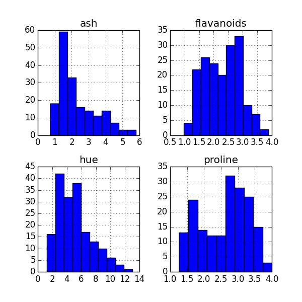
Histogram Plot
==============
To get a quick glimpse of the distribution of the data in your columns, a histogram plot of all columns is quite useful.
You could invoke it from your command line like so:
```
home$ psql -d vatsandb -h dca -U gpadmin -c 'select ash, flavanoids, hue, proline from wine;' | python -m 'ppsqlviz.plotter' hist
```
Here is the output
Density Plot
=============
In place of binning your data, you might consider plotting the density directly.
You could invoke it from your command line like so:
```
home$ psql -d vatsandb -h dca -U gpadmin -c 'select ash, flavanoids, hue, proline from wine;' | python -m 'ppsqlviz.plotter' density
```
Here is the output 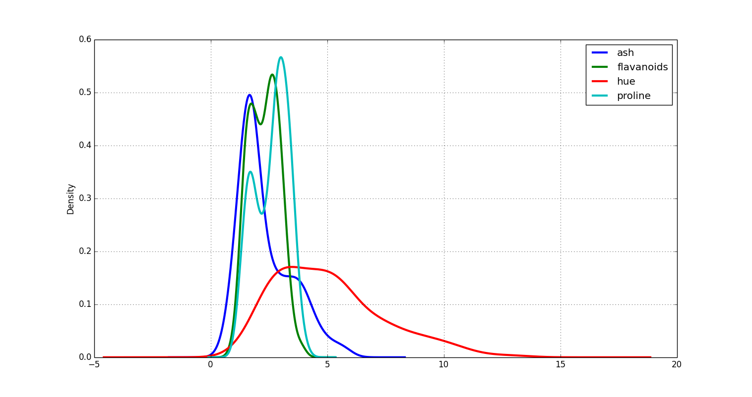
Box Plot
=========
Box plots are useful in visually getting a feel for the quartile ranges of numerical columns in your dataset. You could invoke it from your command line like so:
```
home$ psql -d vatsandb -h dca -U gpadmin -c 'select ash, flavanoids, hue, proline from wine;' | python -m 'ppsqlviz.plotter' box
```
Here is the output 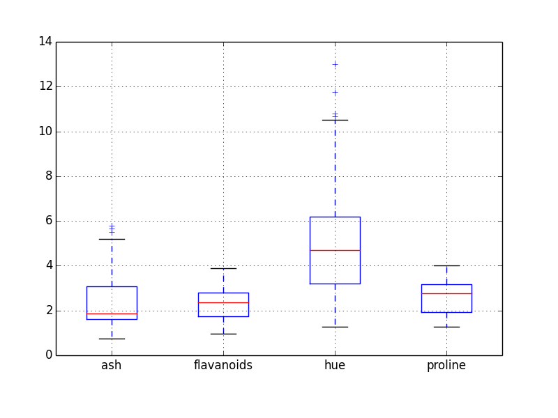
Time Series Plot
=================
Again, Pandas has an impressive collection of functions for time series analysis but to quickly visualize a time series, you can run the following from your command line:
```
home$ psql -d vatsandb -h dca -U gpadmin -c 'select dt, high, low from sandp_prices where dt > 1998 order by dt;' | python -m 'ppsqlviz.plotter' tseries
```
Here is the output 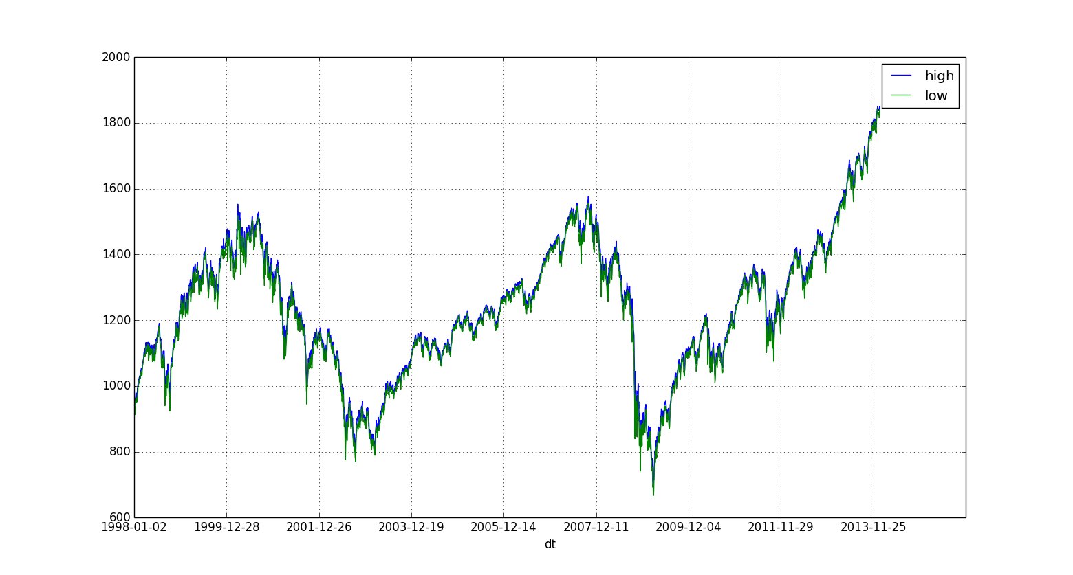
Bar Plot
==================
Bar plots are typically used to plot binned data, where the data is binned according to user specified bins. This support is provided in pandas-via-psql. The data table is expected to comprise of two array columns of the same length, one each for the x and y axes. You can plot a bar plot by running the following from your command line:
```
home$ psql -d <dbname> -h <hostname> -U gpadmin -c 'select x*10 as binCenter, random()*100 as count from generate_series(1, 100) x;' | python -m 'ppsqlviz.plotter' bar
```
The first column always has to be the x axis (bin center).
Here's the output 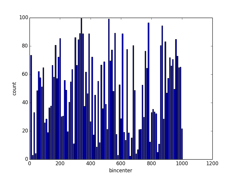
Image Rendering
===================
Pandas also has a great set of tools for viewing images: grayscale or RGB, which can be quite handy when working on image processing or computer vision in SQL. For example, to check a binary mask after thresholding or the weights output by a deep learning algorithm, it is much easier to visualize an image than to interpret a table of intensity values.
To view an image whose intensity values are stored in a table, simply select the height and width of the image (number of rows & columns) followed by a vector of intensity values ordered by row, then column. For example, to view this 270x360 pixel grayscale image, you can run the following from your command line:
```
home$ psql -d vatsandb -h dca -U gpadmin -c 'select 270 as rows, 360 as cols, intensity_values from sample_image;' | python -m 'ppsqlviz.plotter' image
```
Here is the output 
Similarly, to view an RGB image, provide the image height and width followed by a vector of intensity values ordered by row, then column, then color. To view a sample RGB image you can run the following from your comman line:
```
home$ psql -d vatsandb -h dca -U gpadmin -c 'select max(row)+1, max(col)+1, array[array_agg(red_intensity order by row,col), array_agg(green_intensity order by row,col), array_agg(blue_intensity order by row,col)] from (select * from sample_RGB_image order by row,col)t;' | python -m 'ppsqlviz.plotter' imageRGB
```
Here is the output 
Author
=======
Please email questions and feedback to [Srivatsan Ramanujam](https://github.com/vatsan/) at vatsan.cs@utexas.edu
Contributors
==============
Thanks to [Ailey Crow](https://github.com/ailey) and [Gautam Muralidhar](https://github.com/gautamsm) for their contributions.
============
Pandas-via-psql (ppsqlviz) is a command line visualization utility for SQL using Pandas library in Python.
Please visit the GitHub page [ppsqlviz](http://vatsan.github.io/pandas_via_psql/) for a complete tutorial.
PSQL + Pandas Awesomeness
==========================
[Pandas](http://pandas.pydata.org/) is a popular library in Python that is commonly used for data analysis and it provides Python equivalent of the R dataframe that is fundamental to data analysis. Some engineers and data scientists however are increasingly adopting SQL based libraries for building large scale machine learning algorithms. [MADlib](http://madlib.net) is one such library for scalable, parallel, in-database machine learning.
While there are commercial tools to visualize data that reside in databases (example: Tableau), often what's missing in a Big Data scientist's arsenal is a command line tool to be able to quickly visualize the output of a SQL query, without having to switch to a commercial tool or have to use a wrapper to a SQL engine. The pandas_via_psql (ppsqlviz) will show you how simple it is to redirect the output of a SQL query to some boilerplate Pandas's plotting functions, to quickly visualize the data from the command line.
Pre-Requisites
==============
ppsqlviz depends on the Pandas python library. You should also have [PSQL](http://www.postgresql.org/docs/8.1/static/app-psql.html) or a similar SQL command line interface to connect to your database and also ensure that you have password-less access to your remote database (set up SSH keys appropriately).
I recommend you download [Anaconda Python](https://store.continuum.io/cshop/anaconda/) from the nice folks at [Continuum Analytics](http://continuum.io/). It's got most of the essential Python scientific computing libraries pre-packaged and with [conda](http://bokeh.pydata.org/) you can save a lot of pain in installing python libraries. It also makes creating and managing virtual environments a piece of cake!
Installation
=============
You can install install ppsqlviz through pip
```
pip install ppsqlviz
```
This will install the dependent library (Pandas) if you don't already have that. I strongly encourage you use Anaconda Python to avoid going down the rabbit hole of PyData stack dependency nightmares.
Datasets Used
==============
For this demo, I'm using two publicly available datasets.
* [The UCI wine quality dataset](http://archive.ics.uci.edu/ml/datasets/Wine+Quality) - Here is a sampling of rows from this dataset:
```
alcohol | mmalic_acid | ash | alcalinity_of_ash | magnesium | total_phenols | flavanoids | nonflavanoid_phenols | proanthocyanins | color_intensity | hue | od280 | proline | quality
---------+-------------+------+-------------------+-----------+---------------+------------+----------------------+-----------------+-----------------+-------+-------+---------+---------
1 | 14.23 | 1.71 | 2.43 | 15.6 | 127 | 2.8 | 3.06 | 0.28 | 2.29 | 5.64 | 1.04 | 3.92 | 1065
1 | 13.2 | 1.78 | 2.14 | 11.2 | 100 | 2.65 | 2.76 | 0.26 | 1.28 | 4.38 | 1.05 | 3.4 | 1050
1 | 13.16 | 2.36 | 2.67 | 18.6 | 101 | 2.8 | 3.24 | 0.3 | 2.81 | 5.68 | 1.03 | 3.17 | 1185
1 | 14.37 | 1.95 | 2.5 | 16.8 | 113 | 3.85 | 3.49 | 0.24 | 2.18 | 7.8 | 0.86 | 3.45 | 1480
1 | 13.24 | 2.59 | 2.87 | 21 | 118 | 2.8 | 2.69 | 0.39 | 1.82 | 4.32 | 1.04 | 2.93 | 735
1 | 14.2 | 1.76 | 2.45 | 15.2 | 112 | 3.27 | 3.39 | 0.34 | 1.97 | 6.75 | 1.05 | 2.85 | 1450
1 | 14.39 | 1.87 | 2.45 | 14.6 | 96 | 2.5 | 2.52 | 0.3 | 1.98 | 5.25 | 1.02 | 3.58 | 1290
1 | 14.06 | 2.15 | 2.61 | 17.6 | 121 | 2.6 | 2.51 | 0.31 | 1.25 | 5.05 | 1.06 | 3.58 | 1295
1 | 14.83 | 1.64 | 2.17 | 14 | 97 | 2.8 | 2.98 | 0.29 | 1.98 | 5.2 | 1.08 | 2.85 | 1045
1 | 13.86 | 1.35 | 2.27 | 16 | 98 | 2.98 | 3.15 | 0.22 | 1.85 | 7.22 | 1.01 | 3.55 | 1045
1 | 14.1 | 2.16 | 2.3 | 18 | 105 | 2.95 | 3.32 | 0.22 | 2.38 | 5.75 | 1.25 | 3.17 | 1510
1 | 14.12 | 1.48 | 2.32 | 16.8 | 95 | 2.2 | 2.43 | 0.26 | 1.57 | 5 | 1.17 | 2.82 | 1280
1 | 13.75 | 1.73 | 2.41 | 16 | 89 | 2.6 | 2.76 | 0.29 | 1.81 | 5.6 | 1.15 | 2.9 | 1320
1 | 14.75 | 1.73 | 2.39 | 11.4 | 91 | 3.1 | 3.69 | 0.43 | 2.81 | 5.4 | 1.25 | 2.73 | 1150
1 | 14.38 | 1.87 | 2.38 | 12 | 102 | 3.3 | 3.64 | 0.29 | 2.96 | 7.5 | 1.2 | 3 | 1547
1 | 13.63 | 1.81 | 2.7 | 17.2 | 112 | 2.85 | 2.91 | 0.3 | 1.46 | 7.3 | 1.28 | 2.88 | 1310
```
* [The S&P daily prices dataset](http://finance.yahoo.com/q/hp?s=%5EGSPC+Historical+Prices) - Here is a sampling of rows from this dataset:
```
dt | open | high | low | close | volume | adj_close
------------+---------+---------+---------+---------+------------+-----------
2013-09-27 | 1695.52 | 1695.52 | 1687.11 | 1691.75 | 2951700000 | 1691.75
2012-04-23 | 1378.53 | 1378.53 | 1358.79 | 1366.94 | 3654860000 | 1366.94
2012-01-18 | 1293.65 | 1308.11 | 1290.99 | 1308.04 | 4096160000 | 1308.04
2011-09-07 | 1165.85 | 1198.62 | 1165.85 | 1198.62 | 4441040000 | 1198.62
2011-06-03 | 1312.94 | 1312.94 | 1297.9 | 1300.16 | 3505030000 | 1300.16
2011-03-31 | 1327.44 | 1329.77 | 1325.03 | 1325.83 | 3566270000 | 1325.83
2010-12-28 | 1259.1 | 1259.9 | 1256.22 | 1258.51 | 2478450000 | 1258.51
2010-09-23 | 1131.1 | 1136.77 | 1122.79 | 1124.83 | 3847850000 | 1124.83
2010-07-21 | 1086.67 | 1088.96 | 1065.25 | 1069.59 | 4747180000 | 1069.59
2010-05-13 | 1170.04 | 1173.57 | 1156.14 | 1157.44 | 4870640000 | 1157.44
2010-03-10 | 1140.22 | 1148.26 | 1140.09 | 1145.61 | 5469120000 | 1145.61
2009-12-04 | 1100.43 | 1119.13 | 1096.52 | 1105.98 | 5781140000 | 1105.98
2009-07-24 | 972.16 | 979.79 | 965.95 | 979.26 | 4458300000 | 979.26
2009-02-09 | 868.24 | 875.01 | 861.65 | 869.89 | 5574370000 | 869.89
2008-11-05 | 1001.84 | 1001.84 | 949.86 | 952.77 | 5426640000 | 952.77
2008-09-02 | 1287.83 | 1303.04 | 1272.2 | 1277.58 | 4783560000 | 1277.58
2008-04-30 | 1391.22 | 1404.57 | 1384.25 | 1385.59 | 4508890000 | 1385.59
2008-01-25 | 1357.32 | 1368.56 | 1327.5 | 1330.61 | 4882250000 | 1330.61
2007-09-14 | 1483.95 | 1485.99 | 1473.18 | 1484.25 | 2641740000 | 1484.25
```
Usage
======
Invoke Pandas plotting functions by piping in the output from a psql query.
You can re-use this boiler-plate code for Scatter Plots, Box Plots, Histograms and Time Series Plots on your tables.
Scatter Matrix
===============
This is pretty useful when you are interested in analyzing the correlation between a bunch of features in a dataset, particularly in their correlation with the target attribute/label. You might then perform feature selection based on a visual output of the correlations.
Here is how the scatter matrix can be created on the UCI Wine Quality Dataset
```
home$ psql -d vatsandb -h dca -U gpadmin -c 'select * from wine;' | python -m 'ppsqlviz.plotter' scatter
```
Here is the output ![Scatter Matrix of all features from the Wine Quality Dataset]
(https://raw.githubusercontent.com/vatsan/pandas_via_psql/master/plots/scatter_matrix.png)
Hexbin Plots
=============
Scatter plots sometimes may not reveal the underlying relationship between the dimensions when multiple points overlap.
For this reason, it is better to look at a 2-d histogram or a hex-bin plot. We can tap into `matplotlib's` hexbin plot for this.
You could invoke it from your command line like so:
```
home$ psql -d vatsandb -h dca -U gpadmin -c 'select ash, flavanoids from wine;' | python -m 'ppsqlviz.plotter' hexbin
```
Here is the output ![Hexbin plot of Ash vs. Flavanoids from Wine Quality Dataset]
(https://raw.githubusercontent.com/vatsan/pandas_via_psql/master/plots/hexbin.png)
Histogram Plot
==============
To get a quick glimpse of the distribution of the data in your columns, a histogram plot of all columns is quite useful.
You could invoke it from your command line like so:
```
home$ psql -d vatsandb -h dca -U gpadmin -c 'select ash, flavanoids, hue, proline from wine;' | python -m 'ppsqlviz.plotter' hist
```
Here is the output

Density Plot
=============
In place of binning your data, you might consider plotting the density directly.
You could invoke it from your command line like so:
```
home$ psql -d vatsandb -h dca -U gpadmin -c 'select ash, flavanoids, hue, proline from wine;' | python -m 'ppsqlviz.plotter' density
```
Here is the output 
Box Plot
=========
Box plots are useful in visually getting a feel for the quartile ranges of numerical columns in your dataset. You could invoke it from your command line like so:
```
home$ psql -d vatsandb -h dca -U gpadmin -c 'select ash, flavanoids, hue, proline from wine;' | python -m 'ppsqlviz.plotter' box
```
Here is the output 
Time Series Plot
=================
Again, Pandas has an impressive collection of functions for time series analysis but to quickly visualize a time series, you can run the following from your command line:
```
home$ psql -d vatsandb -h dca -U gpadmin -c 'select dt, high, low from sandp_prices where dt > 1998 order by dt;' | python -m 'ppsqlviz.plotter' tseries
```
Here is the output 
Bar Plot
==================
Bar plots are typically used to plot binned data, where the data is binned according to user specified bins. This support is provided in pandas-via-psql. The data table is expected to comprise of two array columns of the same length, one each for the x and y axes. You can plot a bar plot by running the following from your command line:
```
home$ psql -d <dbname> -h <hostname> -U gpadmin -c 'select x*10 as binCenter, random()*100 as count from generate_series(1, 100) x;' | python -m 'ppsqlviz.plotter' bar
```
The first column always has to be the x axis (bin center).
Here's the output 
Image Rendering
===================
Pandas also has a great set of tools for viewing images: grayscale or RGB, which can be quite handy when working on image processing or computer vision in SQL. For example, to check a binary mask after thresholding or the weights output by a deep learning algorithm, it is much easier to visualize an image than to interpret a table of intensity values.
To view an image whose intensity values are stored in a table, simply select the height and width of the image (number of rows & columns) followed by a vector of intensity values ordered by row, then column. For example, to view this 270x360 pixel grayscale image, you can run the following from your command line:
```
home$ psql -d vatsandb -h dca -U gpadmin -c 'select 270 as rows, 360 as cols, intensity_values from sample_image;' | python -m 'ppsqlviz.plotter' image
```
Here is the output 
Similarly, to view an RGB image, provide the image height and width followed by a vector of intensity values ordered by row, then column, then color. To view a sample RGB image you can run the following from your comman line:
```
home$ psql -d vatsandb -h dca -U gpadmin -c 'select max(row)+1, max(col)+1, array[array_agg(red_intensity order by row,col), array_agg(green_intensity order by row,col), array_agg(blue_intensity order by row,col)] from (select * from sample_RGB_image order by row,col)t;' | python -m 'ppsqlviz.plotter' imageRGB
```
Here is the output 
Author
=======
Please email questions and feedback to [Srivatsan Ramanujam](https://github.com/vatsan/) at vatsan.cs@utexas.edu
Contributors
==============
Thanks to [Ailey Crow](https://github.com/ailey) and [Gautam Muralidhar](https://github.com/gautamsm) for their contributions.
Release history Release notifications | RSS feed


Download files
Download the file for your platform. If you're not sure which to choose, learn more about installing packages.
Source Distribution
ppsqlviz-1.0.1.tar.gz
(10.0 kB
view details)
File details
Details for the file ppsqlviz-1.0.1.tar.gz.
File metadata
- Download URL: ppsqlviz-1.0.1.tar.gz
- Upload date:
- Size: 10.0 kB
- Tags: Source
- Uploaded using Trusted Publishing? No
File hashes
| Algorithm | Hash digest | |
|---|---|---|
| SHA256 |
d1b9d1a5d04cd427063a51cc0c251705c8548b4b2b4efa1a7e4cc89dd78b47e5
|
|
| MD5 |
00d792b0e78fdbb7161ac76d9383155f
|
|
| BLAKE2b-256 |
75c91548d73162e05b59dea5869db95f373dae8a2ce422ebb9754c1ddfa71736
|


