py-gnuplot is a python plot tools based on gnuplot.

Project description
Gnuplot is a powerful command-line driven graphing utility for many platforms. To leverage the powful gnuplot to plot beautiful image in efficicent way in python, we port gnuplot to python.
We develop set()/unset() function to set or unset gnuplot plotting style, plot()/splot() to operate gnuplot plot or splot command, cmd() to execute any commands that coulnd’t be done by the above functions. They are intuative and gnuplot users can swith to py-gnuplot naturally. By this means we can do what gnuplot do.
But for plotting python generated data the above functions are not enough. We develop plot_data()/splot_data() to plot data generated in python.
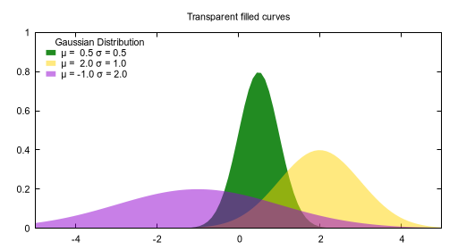
Here is a quick examples to generate the right image with only basic functions, more examples which plot python generated data are coming in later sections.
#!/usr/bin/env python3
#coding=utf8
from pygnuplot import gnuplot

#py-gnuplot: A quick demo, You need 4 steps to plot, at most cases step2
#and step3 can be omitted.

#1) Ceate a gnuplot context. Set plotting style at initialization
g = gnuplot.Gnuplot(terminal = 'pngcairo transparent enhanced ' +
        'font "arial,8" fontscale 1.0 size 512, 280 ',
        output = '"quick_example.png"',
        style = ["fill transparent solid 0.50 noborder",
            "data lines",
            "function filledcurves y1=0"],
        key = 'title "Gaussian Distribution" center fixed left top vertical '+
        'Left reverse enhanced autotitle nobox noinvert samplen 1 ' +
        'spacing 1 width 0 height 0',
        title = '"Transparent filled curves"',
        xrange = '[ -5.00000 : 5.00000 ] noreverse nowriteback',
        yrange = '[ 0.00000 : 1.00000 ] noreverse nowriteback')

#2) Set plotting style whenever needed.

#3) Expressions and caculations
g.cmd('Gauss(x,mu,sigma) = 1./(sigma*sqrt(2*pi)) * exp( -(x-mu)**2 / (2*sigma**2) )',
        'd1(x) = Gauss(x, 0.5, 0.5)',
        'd2(x) = Gauss(x,  2.,  1.)',
        'd3(x) = Gauss(x, -1.,  2.)')

#4) Plotting
g.plot('d1(x) fs solid 1.0 lc rgb "forest-green" title "μ =  0.5 σ = 0.5"',
        'd2(x) lc rgb "gold" title "μ =  2.0 σ = 1.0"',
        'd3(x) lc rgb "dark-violet" title "μ = -1.0 σ = 2.0"')
more examples:
examples |
plot function |
plot file |
splot function |
splot file |
multiplot |
figure |
|||||
gnuplot script |
|||||
py-gnuplot script |
|||||
py-gnuplot quick mode |
N/A(too complicated) |
||||
py-gnuplot data generated in python |
N/A |
N/A |
N/A |
Let’s see the detail.
1. Introduction
As we know, to plot a image in gnuplot we do:
Enter gnuplot conext;
Set plotting style;
Define some expressions;
Plotting.
We translate gnuplot’s main function into python ones, and each one do the same thing as gnuplot. As in quick_example.py we also have 4 steps to plot an image:
#Constructor
g = gnuplot.Gnuplot()
#Set plotting style
g.set()
#Expressions and caculations
g.cmd()
#Plotting
g.plot()
1.1 constructor
Defenition:
def __init__(self, *args, log = False, **kwargs):
    '''
    *args: The flag parameter in gnuplot
    log: If print the gnuplot log
    **kwargs: the flag that need to be set. You can also set them in the set() function.
    '''
When call g = gnuplot.Gnuplot(), we can set the plot style in conctruction:
#1) Ceate a gnuplot context. Set plotting style at initialization
g = gnuplot.Gnuplot(terminal = 'pngcairo transparent enhanced ' +
        'font "arial,8" fontscale 1.0 size 512, 280 ',
        output = '"quick_example.png"',
        style = ["fill transparent solid 0.50 noborder",
            "data lines",
            "function filledcurves y1=0"],
        key = 'title "Gaussian Distribution" center fixed left top vertical '+
        'Left reverse enhanced autotitle nobox noinvert samplen 1 ' +
        'spacing 1 width 0 height 0',
        title = '"Transparent filled curves"',
        xrange = '[ -5.00000 : 5.00000 ] noreverse nowriteback',
        yrange = '[ 0.00000 : 1.00000 ] noreverse nowriteback')
All the parameters are from gnuplot, excpet the new added “log = False” to control the plot log. For example, we call the following line in gnuplot:
set terminal pngcairo transparent enhanced font "arial,8" fontscale 1.0 size 512, 280
Then in py-gnuplot we can set it as:
terminal = 'pngcairo transparent enhanced font "arial,8" fontscale 1.0 size 512, 280'
Or we can set the plot style later with set(), log is True by default and you can set it to False to disable the log output.
#1) Ceate a gnuplot context. Set plotting style at initialization
g = gnuplot.Gnuplot(log = False)
g.set(terminal = 'pngcairo transparent enhanced ' +
        'font "arial,8" fontscale 1.0 size 512, 280 ',
        output = '"quick_example.png"',
        style = ["fill transparent solid 0.50 noborder",
            "data lines",
            "function filledcurves y1=0"],
        key = 'title "Gaussian Distribution" center fixed left top vertical '+
        'Left reverse enhanced autotitle nobox noinvert samplen 1 ' +
        'spacing 1 width 0 height 0',
        title = '"Transparent filled curves"',
        xrange = '[ -5.00000 : 5.00000 ] noreverse nowriteback',
        yrange = '[ 0.00000 : 1.00000 ] noreverse nowriteback')
1.2 Set()/unset()
Defenition:
def set(self, *args, **kwargs):
    '''
    *args: options without value
    *kwargs: options with value. The set and unset commands may optionally
             contain an iteration clause, so the arg could be list.
    '''
def unset(self, *items):
    '''
    *args: options that need to be unset
    '''
After enter gnuplot context, normally we need to set the plotting style. For example we need to set the terminal and output at first in gnuplt as following:
set terminal pngcairo  transparent enhanced font "arial,8" fontscale 1.0 size 512, 280
set output 'transparent.2.png'
Then we translate the set into set() function as following, please not that all the elment are stirng, so must add extra quoto and it would be passed to gnuplot without any change. Pleae note that all the parameters must be string since it would be passed to gnuplot without any change. You need to change them to string if they are not:
#Set plotting style
g.set(terminal = 'pngcairo transparent enhanced font "arial,8" fontscale 1.0 size 512, 280 ',
        output = '"quick_example.png"',
        ...
        )
For unset we have flexible ways to do that, for exampes the following ways are the same:
#gnuplot unset
unset colorbox

#py-gnuplot means1
g.unset(colorbox)

#py-gnuplot means2
g.set(colorbox = None)

#py-gnuplot means3
g.set(nocolorbox = "")
1.3 cmd()
Defenition:
def cmd(self, *args):
    '''
    *args: all the line that need to pass to gnuplot. It could be a
    list of lines, or a paragraph; Lines starting with "#" would be
    omitted. Every line should be a clause that could be executed in
    gnuplot.
    '''
Sometimes before plot we need define some variable or caculations, call cmd() functions to do:
#gnuplot
Gauss(x,mu,sigma) = 1./(sigma*sqrt(2*pi)) * exp( -(x-mu)**2 / (2*sigma**2) )
d1(x) = Gauss(x, 0.5, 0.5)
d2(x) = Gauss(x,  2.,  1.)
d3(x) = Gauss(x, -1.,  2.)

#py-gnuplot
g.cmd('Gauss(x,mu,sigma) = 1./(sigma*sqrt(2*pi)) * exp( -(x-mu)**2 / (2*sigma**2) )',
        'd1(x) = Gauss(x, 0.5, 0.5)',
        'd2(x) = Gauss(x,  2.,  1.)',
        'd3(x) = Gauss(x, -1.,  2.)')
As we see, all statement in cmd() would be translated the same statement in gnuplot. By this way we can execute any gnuplot statement.
1.4 plot()/splot()
Definition:
def plot(self, *items, **kwargs):
    '''
    *items: The list of plot command;
    **kwargs: The options that would be set before the plot command.
    '''
def splot(self, *items, **kwargs):
    '''
    *items: The list of plot command;
    **kwargs: The options that would be set before the plot command.
    '''
Every plot/splot command would be a parameter in plot()/splot() functions. Like set()/unset(), all the parameters must be string since it would be pas sed to gnuplot without any change. You need to change them to string if they are not:
#gnplot
plot d1(x) fs solid 1.0 lc rgb "forest-green" title "μ =  0.5 σ = 0.5", \
 d2(x) lc rgb "gold" title "μ =  2.0 σ = 1.0", \
 d3(x) lc rgb "dark-violet" title "μ = -1.0 σ = 2.0"

#py-gnplot
g.plot('d1(x) fs solid 1.0 lc rgb "forest-green" title "μ =  0.5 σ = 0.5"',
        'd2(x) lc rgb "gold" title "μ =  2.0 σ = 1.0"',
        'd3(x) lc rgb "dark-violet" title "μ = -1.0 σ = 2.0"')
1.5 plot_data()/splot_data()
Definition:
def plot_data(self, data, *items, **kwargs):
    '''
    data: The data that need to be plotted. It's either the string of list
    or the Pnadas Dataframe, if it's Pnadas Dataframe it would be converted
    to string by data.to_csv(). Note that we will execut a extra command
    "set datafile separator "," to fit the data format of csv.
    *items: The list of plot command;
    **kwargs: The options that would be set before the plot command.
    '''
def splot_data(self, data, *items, **kwargs):
    '''
    data: The data that need to be plotted. It's either the string of list
    or the Pnadas Dataframe, if it's Pnadas Dataframe it would be converted
    to string by data.to_csv(). Note that we will execut a extra command
    "set datafile separator "," to fit the data format of csv.
    *items: The list of plot command;
    **kwargs: The options that would be set before the plot command.
    '''
With above functions: constructor, Set()/unset(), plot()/splot(), we can do what gnuplot do, but it cannot plot python generated data. It’s hard to implement the new functions with the existing gnuplot command, so we develop two new functions: plot_data()/splot_data(). They are much like plot()/splot(), the only difference is:
plot()/splot() take function(filename) in every plot command.
plot_data()/splot_data() take the dataframe as the first parameter, while remove function(filename) in every plot commmand
for examples:
#plot(): 'finance.dat' is in plot command
g.plot("'finance.dat' using 0:($6/10000) notitle with impulses lt 3",
       "'finance.dat' using 0:($7/10000) notitle with lines lt 1")

#plot_data(): the first parameter must be dataframe, every plot
#command doesn't take the data.
g.plot_data(df,
        'using 0:($6/10000) notitle with impulses lt 3',
        'using 0:($7/10000) notitle with lines lt 1')
See histograms.2.py and histograms.2.py for differences.
1.6 multiplot
To plot multiplot, you must set multiplot at first as in gnuplot. Here is examples.
1.7 quick mode
For some easy case, we can combine the following step into one.
Enter gnuplot conext;
Set plotting style;
Define some expressions;
Plotting.
For examples:
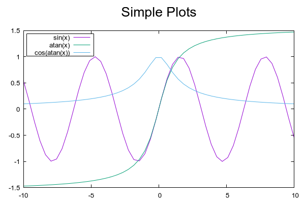
#!/usr/bin/env python3
#coding=utf8
from pygnuplot import gnuplot

gnuplot.plot('[-10:10] sin(x)',
       'atan(x)',
       'cos(atan(x))',
       terminal = 'pngcairo font "arial,10" fontscale 1.0 size 600, 400',
       output = '"simple.1.png"',
       key = 'fixed left top vertical Right noreverse enhanced autotitle box lt black linewidth 1.000 dashtype solid',
       samples = '50, 50',
       title = '"Simple Plots" font ",20" textcolor lt -1 norotate',
       xrange = '[ * : * ] noreverse writeback',
       x2range = '[ * : * ] noreverse writeback',
       yrange = '[ * : * ] noreverse writeback',
       y2range = '[ * : * ] noreverse writeback',
       zrange = '[ * : * ] noreverse writeback',
       cbrange = '[ * : * ] noreverse writeback',
       rrange = '[ * : * ] noreverse writeback',
       colorbox = 'vertical origin screen 0.9, 0.2 size screen 0.05, 0.6 front noinvert bdefault')
#!/usr/bin/env python3
#coding=utf8
from pygnuplot import gnuplot
import pandas as pd
#https://ayapin-film.sakura.ne.jp/Gnuplot/Pm3d/Part1/whale.html
gnuplot.splot('"examples/whale.dat" w pm3d',
term = 'pngcairo size 480,480',
out = '"whale.png"',
style = 'line 100 lw 0.1 lc "black"',
pm3d = 'depth hidden3d ls 100',
cbrange = '[-0.5:0.5]',
palette = 'rgb -3,-3,-3',
colorbox = None,
border = None,
key = None,
zrange = '[-2:2]',
tics = None,
view = '60,185,1.5')#!/usr/bin/env python3
#coding=utf8
from pygnuplot import gnuplot
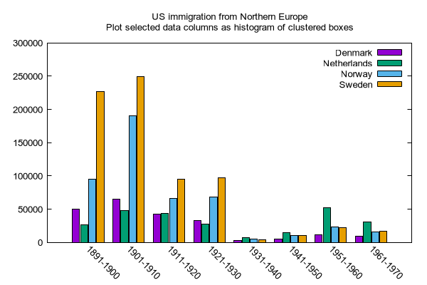
import pandas as pd
df = pd.read_csv('examples/immigration.dat', index_col = 0, sep='\t', comment='#')
gnuplot.plot_data(df,
'using 2:xtic(1), for [i=3:22] "" using i ',
terminal = 'pngcairo transparent enhanced font "arial,10" fontscale 1.0 size 600, 400 ',
output = '"histograms.1.png"',
key = 'fixed right top vertical Right noreverse noenhanced autotitle nobox',
style = 'data linespoints',
datafile = ' missing "-"',
xtics = 'border in scale 1,0.5 nomirror rotate by -45 autojustify norangelimit',
title = '"US immigration from Europe by decade"')#!/usr/bin/env python3
#coding=utf8
from pygnuplot import gnuplot
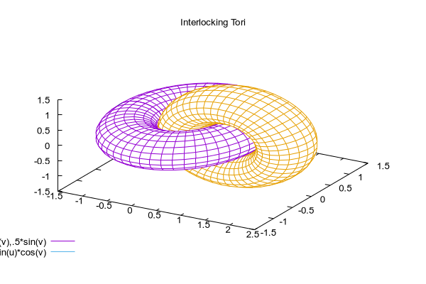
#py-gnuplot: https://gnuplot.sourceforge.net/demo/surface2.9.gnu
gnuplot.splot('cos(u)+.5*cos(u)*cos(v),sin(u)+.5*sin(u)*cos(v),.5*sin(v) with lines',
'1+cos(u)+.5*cos(u)*cos(v),.5*sin(v),sin(u)+.5*sin(u)*cos(v) with lines',
terminal = 'pngcairo enhanced font "arial,10" fontscale 1.0 size 600, 400 ',
output = '"surface2.9.png"',
dummy = 'u, v',
key = 'bmargin center horizontal Right noreverse enhanced autotitle nobox',
style = ['data lines'],
parametric = '',
view = '50, 30, 1, 1',
isosamples = '50, 20',
hidden3d = 'back offset 1 trianglepattern 3 undefined 1 altdiagonal bentover',
xyplane = 'relative 0',
title = '"Interlocking Tori" ',
urange = '[ -3.14159 : 3.14159 ] noreverse nowriteback',
vrange = '[ -3.14159 : 3.14159 ] noreverse nowriteback')2. Examples
2.1 plot/splot function
#!/usr/bin/env python3
#coding=utf8
from pygnuplot import gnuplot

#py-gnuplot: https://gnuplot.sourceforge.net/demo_6.0/simple.html

#Ceate a gnuplot context. with "log = True" to print the gnuplot execute log.
g = gnuplot.Gnuplot(terminal = 'pngcairo font "arial,10" fontscale 1.0 size 600, 400',
       output = '"simple.1.png"',
       key = 'fixed left top vertical Right noreverse enhanced autotitle box lt black linewidth 1.000 dashtype solid',
       samples = '50, 50',
       title = '"Simple Plots" font ",20" textcolor lt -1 norotate',
       xrange = '[ * : * ] noreverse writeback',
       x2range = '[ * : * ] noreverse writeback',
       yrange = '[ * : * ] noreverse writeback',
       y2range = '[ * : * ] noreverse writeback',
       zrange = '[ * : * ] noreverse writeback',
       cbrange = '[ * : * ] noreverse writeback',
       rrange = '[ * : * ] noreverse writeback',
       colorbox = 'vertical origin screen 0.9, 0.2 size screen 0.05, 0.6 front  noinvert bdefault')

#Set plotting style

#Expressions and caculations
g.cmd("NO_ANIMATION = 1")

#Plotting
g.plot("[-10:10] sin(x)", "atan(x)", "cos(atan(x))")
This is the output:
#!/usr/bin/env python3
#coding=utf8
from pygnuplot import gnuplot

#py-gnuplot: https://gnuplot.sourceforge.net/demo_6.0/simple.html

#Ceate a gnuplot context. with "log = True" to print the gnuplot execute log.
g = gnuplot.Gnuplot(terminal = 'pngcairo  transparent enhanced font "arial,10" fontscale 1.0 size 600, 400',
        output = "'surface2.9.png'",
        dummy = 'u, v',
        key = 'bmargin center horizontal Right noreverse enhanced autotitle nobox',
        parametric = '',
        view = '50, 30, 1, 1',
        isosamples = '50, 20',
        hidden3d = 'back offset 1 trianglepattern 3 undefined 1 altdiagonal bentover',
        style = ['data lines'],
        xyplane = 'relative 0',
        title = '"Interlocking Tori" ',
        urange = '[ -3.14159 : 3.14159 ] noreverse nowriteback',
        vrange = '[ -3.14159 : 3.14159 ] noreverse nowriteback',
        colorbox = 'vertical origin screen 0.9, 0.2 size screen 0.05, 0.6 front  noinvert bdefault')

#Set plotting style

#Expressions and caculations
g.cmd("NO_ANIMATION = 1")

#Plotting
g.splot("cos(u)+.5*cos(u)*cos(v)",
        "sin(u)+.5*sin(u)*cos(v)",
        ".5*sin(v) with lines",
        "1+cos(u)+.5*cos(u)*cos(v)",
        ".5*sin(v),sin(u)+.5*sin(u)*cos(v) with lines",
        )
This is the output:
2.2 plot/splot file
#!/usr/bin/env python3
#coding=utf8
from pygnuplot import gnuplot
import pandas as pd

#Histograms demo example comes from
#https://gnuplot.sourceforge.net/demo_6.0/histograms.2.gnu

#1) Ceate a gnuplot context
g = gnuplot.Gnuplot(terminal = 'pngcairo  transparent enhanced font "arial,10" fontscale 1.0 size 600, 400',
        output = "'histograms.2.png'",
        boxwidth = '0.9 absolute',
        style = ['fill   solid 1.00 border lt -1',
            'histogram clustered gap 1 title textcolor lt -1',
            'data histograms' ],
        key = 'fixed right top vertical Right noreverse noenhanced autotitle nobox',
        datafile = "missing '-'",
        xtics = ["border in scale 0,0 nomirror rotate by -45  autojustify",
            "norangelimit ",
            " ()"],
        title = '"US immigration from Northern Europe\\nPlot selected data columns as histogram of clustered boxes"',
        xrange = '[ * : * ] noreverse writeback',
        x2range = '[ * : * ] noreverse writeback',
        yrange  = '[ 0.00000 : 300000. ] noreverse writeback',
        y2range = '[ * : * ] noreverse writeback',
        zrange = '[ * : * ] noreverse writeback',
        cbrange = '[ * : * ] noreverse writeback',
        rrange = '[ * : * ] noreverse writeback',
        colorbox = 'vertical origin screen 0.9, 0.2 size screen 0.05, 0.6 front  noinvert bdefault')

#2) Set plotting style

#3) Expressions and caculations
g.cmd("NO_ANIMATION = 1")

#4) Plotting
g.plot("'examples/immigration.dat' using 6:xtic(1) ti col",
        "'' u 12 ti col",
        "'' u 13 ti col",
        "'' u 14 ti col")
This is the output:
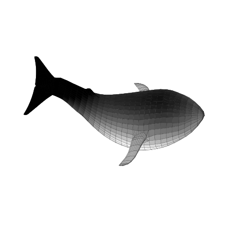
Another example is to splot a pm3d image:
#!/usr/bin/env python3
#coding=utf8
from pygnuplot import gnuplot

#Whale example comes from
#https://ayapin-film.sakura.ne.jp/Gnuplot/Pm3d/Part1/whale.html

#Ceate a gnuplot context
g = gnuplot.Gnuplot(log = True)

#Set plotting style
g.set(term = 'pngcairo size 480,480',
        output = '"whale.png"',
        style = 'line 100 lw 0.1 lc "black"',
        pm3d = 'depth hidden3d ls 100',
        cbrange = '[-0.5:0.5]',
        palette = 'rgb -3,-3,-3',
        colorbox = None,
        border   = None,
        key = None,
        zrange = '[-2:2]',
        tics  = None,
        view = '60,185,1.5')

#No Expressions

#Plotting
g.splot('"examples/whale.dat" w pm3d')
The generated image is as below:
2.3 plot/splot python generated data
#!/usr/bin/env python3
#coding=utf8
from pygnuplot import gnuplot
import pandas as pd

#Histograms demo example comes from
#https://gnuplot.sourceforge.net/demo_6.0/histograms.2.gnu

#1) Ceate a gnuplot context
g = gnuplot.Gnuplot(log = True)

#2) Set plotting style
g.set(terminal = 'pngcairo  transparent enhanced font "arial,10" fontscale 1.0 size 600, 400',
        output = "'histograms.2.png'",
        boxwidth = '0.9 absolute',
        style = ['fill   solid 1.00 border lt -1',
            'histogram clustered gap 1 title textcolor lt -1',
            'data histograms' ],
        key = 'fixed right top vertical Right noreverse noenhanced autotitle nobox',
        datafile = "missing '-'",
        xtics = ["border in scale 0,0 nomirror rotate by -45  autojustify",
            "norangelimit ",
            " ()"],
        title = '"US immigration from Northern Europe\\nPlot selected data columns as histogram of clustered boxes"',
        xrange = '[ * : * ] noreverse writeback',
        x2range = '[ * : * ] noreverse writeback',
        yrange  = '[ 0.00000 : 300000. ] noreverse writeback',
        y2range = '[ * : * ] noreverse writeback',
        zrange = '[ * : * ] noreverse writeback',
        cbrange = '[ * : * ] noreverse writeback',
        rrange = '[ * : * ] noreverse writeback',
        colorbox = 'vertical origin screen 0.9, 0.2 size screen 0.05, 0.6 front  noinvert bdefault')

#3) Expressions and caculations
g.cmd("NO_ANIMATION = 1")
#The original example is plotting file, it's easy. To demonstrate plotting
#data generated in python, we transform the data into df for demonstration.
df = pd.read_csv('examples/immigration.dat', index_col = 0, sep='\t', comment='#')

#4) Plotting
g.plot_data(df,
        'using 6:xtic(1) ti col',
        'u 12 ti col',
        'u 13 ti col',
        'u 14 ti col')
The generated image is as below:
2.4 multiplot examples
#!/usr/bin/env python3
#coding=utf8
from pygnuplot import gnuplot
import pandas as pd
#Transparent demo example comes from
#https://gnuplot.sourceforge.net/demo_6.0/finance.html
#Ceate a gnuplot context
g = gnuplot.Gnuplot(log = True)
#Set plotting style
g.set(output = "'finance.13.png'",
term = 'pngcairo transparent enhanced font "arial,8" fontscale 1.0 size 660, 320',
label = ['1 "Acme Widgets" at graph 0.5, graph 0.9 center front',
'2 "Courtesy of Bollinger Capital" at graph 0.01, 0.07',
'3 " www.BollingerBands.com" at graph 0.01, 0.03'],
logscale = 'y',
yrange = '[75:105]',
ytics = '(105, 100, 95, 90, 85, 80)',
xrange = '[50:253]',
grid = '',
lmargin = '9',
rmargin = '2',
format = 'x ""',
xtics = '(66, 87, 109, 130, 151, 174, 193, 215, 235)',
multiplot = True)
#3) Expressions and caculations
#4) Plotting: Since multiplot = True, we plot two subplot
g.plot("'finance.dat' using 0:2:3:4:5 notitle with candlesticks lt 8",
"'finance.dat' using 0:9 notitle with lines lt 3",
"'finance.dat' using 0:10 notitle with lines lt 1",
"'finance.dat' using 0:11 notitle with lines lt 2",
"'finance.dat' using 0:8 axes x1y2 notitle with lines lt 4",
title = '"Change to candlesticks"',
size = ' 1, 0.7',
origin = '0, 0.3',
bmargin = '0',
ylabel = '"price" offset 1')
g.plot("'finance.dat' using 0:($6/10000) notitle with impulses lt 3",
"'finance.dat' using 0:($7/10000) notitle with lines lt 1",
bmargin = '',
format = ['x', 'y "%1.0f"'],
size = '1.0, 0.3',
origin = '0.0, 0.0',
tmargin = '0',
nologscale = 'y',
autoscale = 'y',
ytics = '500',
xtics = '("6/03" 66, "7/03" 87, "8/03" 109, "9/03" 130, "10/03" 151, "11/03" 174, "12/03" 193, "1/04" 215, "2/04" 235)',
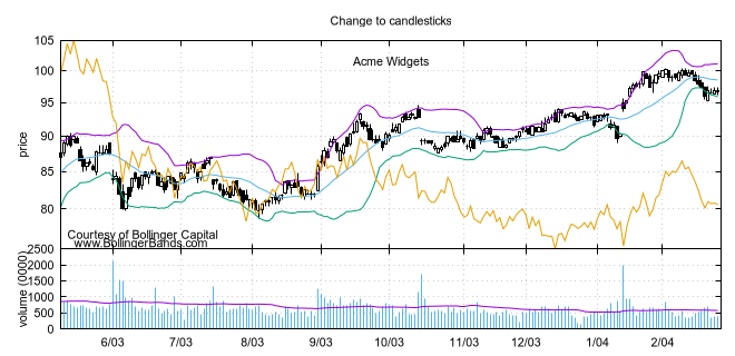
ylabel = '"volume (0000)" offset 1')#!/usr/bin/env python3
#coding=utf8
from pygnuplot import gnuplot
import pandas as pd
#Transparent demo example comes from
#https://gnuplot.sourceforge.net/demo_6.0/finance.html
#Ceate a gnuplot context
g = gnuplot.Gnuplot(log = True)
#Set plotting style
g.set(output = "'finance.13.png'",
term = 'pngcairo transparent enhanced font "arial,8" fontscale 1.0 size 660, 320',
label = ['1 "Acme Widgets" at graph 0.5, graph 0.9 center front',
'2 "Courtesy of Bollinger Capital" at graph 0.01, 0.07',
'3 " www.BollingerBands.com" at graph 0.01, 0.03'],
logscale = 'y',
yrange = '[75:105]',
ytics = '(105, 100, 95, 90, 85, 80)',
xrange = '[50:253]',
grid = '',
lmargin = '9',
rmargin = '2',
format = 'x ""',
xtics = '(66, 87, 109, 130, 151, 174, 193, 215, 235)',
multiplot = True)
#3) Expressions and caculations
#A demostration to generate pandas data frame data in python.
df = pd.read_csv('examples/finance.dat',
sep='\t',
index_col = 0,
parse_dates = True,
names = ['date', 'open','high','low','close', 'volume','volume_m50',
'intensity','close_ma20','upper','lower '])
#4) Plotting: Since multiplot = True, we plot two subplot
g.plot_data(df,
'using 0:2:3:4:5 notitle with candlesticks lt 8',
'using 0:9 notitle with lines lt 3',
'using 0:10 notitle with lines lt 1',
'using 0:11 notitle with lines lt 2',
'using 0:8 axes x1y2 notitle with lines lt 4',
title = '"Change to candlesticks"',
size = ' 1, 0.7',
origin = '0, 0.3',
bmargin = '0',
ylabel = '"price" offset 1')
g.plot_data(df,
'using 0:($6/10000) notitle with impulses lt 3',
'using 0:($7/10000) notitle with lines lt 1',
bmargin = '',
format = ['x', 'y "%1.0f"'],
size = '1.0, 0.3',
origin = '0.0, 0.0',
tmargin = '0',
nologscale = 'y',
autoscale = 'y',
ytics = '500',
xtics = '("6/03" 66, "7/03" 87, "8/03" 109, "9/03" 130, "10/03" 151, "11/03" 174, "12/03" 193, "1/04" 215, "2/04" 235)',
ylabel = '"volume (0000)" offset 1')Both script generate the same output image:
2.5 Examples port from matplotlib
Just for fun, I translate some examples in matplotlib to py-gnuplot:
2.5.1 Stacked bar chart
#!/usr/bin/env python3
#coding=utf8
from pygnuplot import gnuplot
import pandas as pd

# data is from https://matplotlib.org/gallery/lines_bars_and_markers/bar_stacked.html#sphx-glr-gallery-lines-bars-and-markers-bar-stacked-py
#https://matplotlib.org/_downloads/2ac62a2edbb00a99e8a853b17387ef14/bar_stacked.py
labels = ['G1', 'G2', 'G3', 'G4', 'G5']
men_means = [20, 35, 30, 35, 27]
women_means = [25, 32, 34, 20, 25]
men_std = [2, 3, 4, 1, 2]
women_std = [3, 5, 2, 3, 3]
width = 0.35       # the width of the bars: can also be len(x) sequence

# Plot programme:
df = pd.DataFrame({'men_means': men_means,
    'women_means': women_means,
    'men_std': men_std,
    'women_std': women_std}, index = labels)
#print(df)
gnuplot.plot_data(df,
        'using :($2 + $3):5:xtic(1) with boxerror title "women" lc "dark-orange"',
        'using :2:4 with boxerror title "men" lc "royalblue"',
        style = ['data boxplot', 'fill solid 0.5 border -1'],
        boxwidth = '%s' %(width),
        xrange = '[0.5:5.5]',
        ylabel = '"Scores"',
        title = '"Scores by group and gender"',
        output = '"sphx_glr_bar_stacked_001.png"',
        terminal = 'pngcairo size 640, 480')
This is the output:
2.5.2 Grouped bar chart with labels
#!/usr/bin/env python3
#coding=utf8
from pygnuplot import gnuplot
import pandas as pd

# data is from https://matplotlib.org/gallery/lines_bars_and_markers/barchart.html#sphx-glr-gallery-lines-bars-and-markers-barchart-py
labels = ['G1', 'G2', 'G3', 'G4', 'G5']
men_means = [20, 34, 30, 35, 27]
women_means = [25, 32, 34, 20, 25]
width = 0.35  # the width of the bars

# Plot programme:
df = pd.DataFrame({'men': men_means, 'women': women_means},
        index = labels)
df.index.name = 'label'
#print(df)
gnuplot.plot_data(df,
        'using 2:xticlabels(1) title columnheader(2) lc "web-blue"',
        'using 3:xticlabels(1) title columnheader(3) lc "orange"',
        'using ($0-0.2):($2+1):2 with labels notitle column',
        'using ($0+0.2):($3+1):3 with labels notitle column',
        title = '"Scores by group and gender"',
        xrange = '[-0.5:4.5]',
        yrange = '[0:38]',
        ylabel = '"Scores"',
        style = ['data histogram',
                 'histogram cluster gap 1',
                 'fill solid border -1',
                 'textbox transparent'],
        output = '"sphx_glr_barchart_001.png"',
        terminal = 'pngcairo size 640, 480')
This is the output:
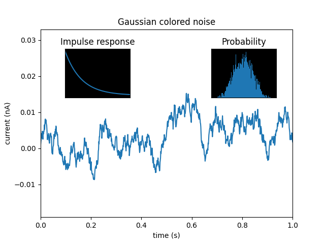
2.5.3 Multiplot Axes Demo
#!/usr/bin/env python3
#coding=utf8
from pygnuplot import gnuplot
import pandas as pd
import numpy as np

#https://matplotlib.org/gallery/subplots_axes_and_figures/axes_demo.html#sphx-glr-gallery-subplots-axes-and-figures-axes-demo-py
#http://gnuplot.sourceforge.net/demo_5.2/bins.html

# 1) create some data to use for the plot
np.random.seed(19680801) # Fixing random state for reproducibility
dt = 0.001
t = np.arange(0.0, 10.0, dt)
r = np.exp(-t / 0.05)  # impulse response
x = np.random.randn(len(t))
s = np.convolve(x, r)[:len(x)] * dt  # colored noise
df = pd.DataFrame({'r': r, 'x': x, 's': s}, index = t)
df.index.name = 't'

g = gnuplot.Gnuplot(log = True,
        output = '"sphx_glr_axes_demo_001.png"',
        term = 'pngcairo font "arial,10" fontscale 1.0 size 640, 480',
        key = '',
        multiplot = True)

# 2) Plot the data
g.plot_data(df.iloc[:1000],
        'using 1:4 with line lw 2 lc "web-blue"',
        title = '"Gaussian colored noise"',
        xlabel = '"time (s)"',
        ylabel = '"current (nA)"',
        xrange = '[0:1]',
        yrange = '[-0.015:0.03]',
        key = None,
        size = ' 1, 1',
        origin = '0, 0')
g.plot_data(df,
        'using 4 bins=400 with boxes title "20 bins" lw 2 lc "web-blue"',
        title = '"Probability"',
        xlabel = None,
        ylabel = None,
        tics = None,
        xrange = None,
        yrange = None,
        origin = '0.65, 0.56',
        size = '0.24, 0.32',
        object = 'rectangle from graph 0,0 to graph 1,1 behind fc "black" fillstyle solid 1.0')
g.plot_data(df,
        'using 1:2 with line lw 2 lc "web-blue"',
        title = '"Impulse response"',
        xrange = '[0:0.2]',
        origin = '0.15, 0.56',
        size = '0.24, 0.32')
This is the output:
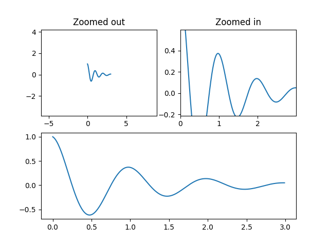
2.5.4 control view and zoom
#!/usr/bin/env python3
#coding=utf8
from pygnuplot import gnuplot
import pandas as pd

#https://matplotlib.org/gallery/subplots_axes_and_figures/axes_margins.html#sphx-glr-gallery-subplots-axes-and-figures-axes-margins-py
g = gnuplot.Gnuplot(log = True,
        output = '"sphx_glr_axes_margins_001.png"',
        term = 'pngcairo font "arial,10" fontscale 1.0 size 640,480',
        multiplot = True)

g.cmd('f(x) = exp(-x) * cos(2*pi*x)')
g.plot('sample [x=0:3] "+" using (x):(f(x)) with lines',
        title = '"Zoomed out"',
        key = None,
        xrange = '[-6: 9]',
        yrange = '[-4: 4]',
        xtics = '-5, 5, 5',
        ytics = '-2, 2, 4',
        origin = '0, 0.5',
        size = '0.5, 0.5')
g.plot('f(x)',
        title = '"Zoomed in"',
        key = None,
        xrange = '[0: 3]',
        yrange = '[-0.2: 0.5]',
        xtics = '0, 1, 2',
        ytics = '-0.2, 0.2, 0.4',
        origin = '0.5, 0.5',
        size = '0.5, 0.5')
g.plot('f(x)',
        title = None,
        key = None,
        xrange = '[0: 3]',
        yrange = '[-0.7: 1]',
        xtics = '0, 0.5, 3',
        ytics = '-0.5, 0.5, 1',
        origin = '0, 0',
        size = '1, 0.5')
This is the output:
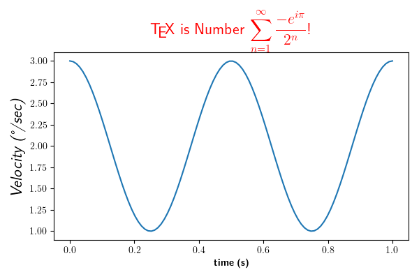
2.5.5 Rendering math equation using TeX
We can embed the TeX math equation into the gnuplot generated image by setting the epslatex terminal, it would be rendered as a .tex file, you can import it directly or you can convert it to .pdf file and then .png file if needed. this is the example:
#!/usr/bin/env python3
#coding=utf8
from pygnuplot import gnuplot
import pandas as pd

# https://matplotlib.org/gallery/text_labels_and_annotations/tex_demo.html#sphx-glr-gallery-text-labels-and-annotations-tex-demo-py
# http://wap.sciencenet.cn/blog-373392-500657.html
# https://www.thinbug.com/q/17593917
g = gnuplot.Gnuplot(log = True,
        output = '"sphx_glr_tex_demo_001.tex"',
        term = 'epslatex standalone lw 2 color colortext')

# NOTE: In the following example, we need to escape the "\", that means we
# should use '\\' or "\\\\" for \
g.plot('cos(4*pi*x) + 2',
        xlabel = "'\\textbf{time (s)}'",
        ylabel = "'\\textit{Velocity (\N{DEGREE SIGN}/sec)}'",
        title = "'\\TeX\\ is Number $\\displaystyle\\sum_{n=1}^\\infty\\frac{-e^{i\\pi}}{2^n}$!' tc 'red'",
        key = None,
        xrange = '[0: 1]')
This is the output:
I list the script output since it’s with the log=True:
[py-gnuplot 14:56:13] set output "sphx_glr_tex_demo_001.tex"
[py-gnuplot 14:56:13] set term epslatex standalone lw 2 color colortext
[py-gnuplot 14:56:13] set xlabel '\textbf{time (s)}'
[py-gnuplot 14:56:13] set ylabel '\textit{Velocity (°/sec)}'
[py-gnuplot 14:56:13] set title '\TeX\ is Number $\displaystyle\sum_{n=1}^\infty\frac{-e^{i\pi}}{2^n}$!' tc 'red'
[py-gnuplot 14:56:13] unset key
[py-gnuplot 14:56:13] set xrange [0: 1]
[py-gnuplot 14:56:13] plot cos(4*pi*x) + 2
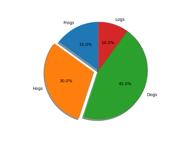
2.5.6 Basic pie chart
#!/usr/bin/env python3
#coding=utf8
from pygnuplot import gnuplot
import pandas as pd
import math

#http://www.phyast.pitt.edu/~zov1/gnuplot/html/pie.html
#https://matplotlib.org/gallery/pie_and_polar_charts/pie_features.html#sphx-glr-gallery-pie-and-polar-charts-pie-features-py
# Pie chart, where the slices will be ordered and plotted counter-clockwise:
labels = 'Frogs', 'Hogs', 'Dogs', 'Logs'
sizes = [15, 30, 45, 10]
explode = (0, 0.1, 0, 0)  # only "explode" the 2nd slice (i.e. 'Hogs')
startangle = math.pi/2

# Prepare the data: caculate the percentage
df = pd.DataFrame({'labels': labels, 'sizes': sizes, 'explode': explode})
df.index.name = 'index'
df['percentage'] = df['sizes'] / df['sizes'].sum()
df['end'] = df['percentage'].cumsum()*2*math.pi + startangle
#df['start'] = df['end'].shift(axis=0, fill_value = 0)
df['start'] = df['end'].shift(axis=0)
df = df.fillna(startangle)
#print(df)

pie_shade = []
pie_graph = []

shade_offset = 0.03
g = gnuplot.Gnuplot(log = True,
        output = '"sphx_glr_pie_features_0011.png"',
        term = 'pngcairo size 640, 480',
        key = None,
        parametric = "",
        border = "",
        tics = "",
        multiplot = True)

for k, v in df.iterrows():
    #print(k,v)
    cos = math.cos((v['start']+v['end'])/2)
    sin = math.sin((v['start']+v['end'])/2)

    # If we'd like explode the piece, ad the dx/dy to move the origi point.
    dx = v['explode'] * cos
    dy = v['explode'] * sin

    # make the shade for each piece
    g.plot('cos(t)+%f, sin(t)+%f with filledcurves xy=%f,%f lc "grey80"'
            %(dx-shade_offset, dy-shade_offset, dx-shade_offset, dy-shade_offset),
            trange = '[%f:%f]' %(v['start'], v['end']),
            xrange = '[-1.5:1.5]',
            yrange = '[-1.5:1.5]')

    # make the pie and label
    g.plot('cos(t)+%f, sin(t)+%f with filledcurve xy=%f,%f  lt %d'
            %(dx, dy, dx, dy, k+3),
            trange = '[%f:%f]' %(v['start'], v['end']),
            xrange = '[-1.5:1.5]',
            yrange = '[-1.5:1.5]',
            label = ['1 "%s" at %f, %f center front' %(v['labels'], 1.2*cos+dx, 1.2*sin+dy), '2 "%.1f%%" at %f, %f center front' %(v['percentage']*100, 0.6*cos, 0.6*sin)])
This is the output:
3. Q/A
4. CHANGLOG
1.0 Initial upload;
1.0.3 Now Gnuplot().plot()/splot() supplot set options as parameters.
1.0.7 The pyplot.plot() now can accept both string and pandas.Dataframe as the first parameter, Further more we need pandas installed at first.
1.0.11 Fix the bug: gnuplot.multiplot() doesn’t work.
1.0.15 1) Add an example of comparing the object-oriented interface call and global class-less function call in multiplot() in multiplot() in multiplot() in multiplot(). 2) remove some duplicate setting line.
1.0.19 Add a log options to enable the log when run the script.
1.1 Upgrade to 1.1: 1) Submodule pyplot is depreciated. 2) To plot python generated data we use gnuplot.plot_data() and gnuplot.splot_data().
1.1.2 Enhancement: If it’s multiplot mode, automatically call the following Gnuplot to unset the label:
g.unset(‘for [i=1:200] label i’)
1.1.3 Enhancement: When plotting the python generated data, we set the seperator to “,” for easy using it in csv file.
1.1.5 Bug fix: on some case it exit exceptionally.
1.1.8 Remove some Chinese comments to remove the “UnicodeDecodeError” for some users.
1.1.9 1) Run and update the examples in gnuplot6.0.0. 2) If you’d like enable multiplot, you shuld use multimplot = True to replace multimplot = “”.
1.1.13 Document update.
1.2.1 Bug fix: use data.to_csv(header=False) to replace data.to_csv() to avoid plot the header in pandas plot.
1.3 Bug fix: Add wait() before gnuplot quit. This make sure the code are executed line by line.
1.3.1 Set log = True by default.
1.3.2 Use the standardized build interface.
Release history Release notifications | RSS feed


Download files
Download the file for your platform. If you're not sure which to choose, learn more about installing packages.
Source Distribution
Built Distribution
Filter files by name, interpreter, ABI, and platform.
If you're not sure about the file name format, learn more about wheel file names.
Copy a direct link to the current filters
File details
Details for the file py_gnuplot-1.3.2.tar.gz.
File metadata
- Download URL: py_gnuplot-1.3.2.tar.gz
- Upload date:
- Size: 33.6 kB
- Tags: Source
- Uploaded using Trusted Publishing? No
- Uploaded via: twine/6.1.0 CPython/3.13.7
File hashes
| Algorithm | Hash digest | |
|---|---|---|
| SHA256 |
1c55aabf0ed780884f8184bfd838dc7d679686e1fe54556d5a75edf6a916533d
|
|
| MD5 |
d82fdcdcb8f6237fe04c67f536067504
|
|
| BLAKE2b-256 |
8c346346a89226b2782c6a72e649963c714ed9d55c024fa0a3b29d9cc3aa2881
|
File details
Details for the file py_gnuplot-1.3.2-py3-none-any.whl.
File metadata
- Download URL: py_gnuplot-1.3.2-py3-none-any.whl
- Upload date:
- Size: 16.5 kB
- Tags: Python 3
- Uploaded using Trusted Publishing? No
- Uploaded via: twine/6.1.0 CPython/3.13.7
File hashes
| Algorithm | Hash digest | |
|---|---|---|
| SHA256 |
e6b7d8ff368d904fd1064297c36dbab694edc64f3913ffc2711add19af5cb532
|
|
| MD5 |
cfae2a355033c3a5728840e2004aa662
|
|
| BLAKE2b-256 |
87b5c1de16efcc43319bb931f4f5b8461f9e2dc89b009a659e08af543160ff27
|


