A clean, class-based implementation of Chart.JS for Django, Flask and any other Python project

Project description

An easy to use, class-based approach to implementing Chart.js into Python projects.
Initially designed as a Django app, it is now self-contained and outputs chart data in JSON, meaning it can easily be used in:
- Django
- Flask
- AJAX/Rest API requests
- Other Python projects
Getting Started
Install with pip
> pip install pychart.js
You will need to have chart.js or chart.min.js ready for use in your HTML document. The following is a drop-in CDN script to use:
<script src="https://cdnjs.cloudflare.com/ajax/libs/Chart.js/2.8.0/Chart.min.js"></script>
Basic Usage
1. Chart Element in HTML and JS
As stated above, the output is a JSON object which can be used directly in any template. The following is an example HTML document with a simple chart element. Here, the chart object is going to be passed into the {{ chartJSON | safe }} tag. Note here that it has to be flagged as safe otherwise it will not work.
<canvas id="myChart"></canvas>

<script>
    var data = {{ chartJSON | safe }}
    var ctx = document.getElementById("myChart").getContext('2d');
    var myChart = new Chart(ctx, data);
</script>
2. Python Code
The following is a minimal example of a chart you can generate and pass into your HTML using a Django view.
Click to see more:
|
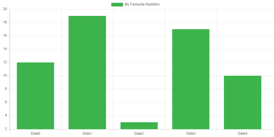
3. The Result
Extending With More Features
The above is what's achievable with minimal code but you can do almost anything the JS equivalent can do. Where a feature isn't implemented natively in ObjectiveChartJS, you can use a dictionary or list as per normal.
Here's a skeleton of what can be used:
class MyChart(BaseChart):

    type = ChartType.Line

    class labels:
        # ...

    class data:
        # ...

    class options:
        # ...

    class pluginOptions:
        # ...
Base Variables
Chart Type
Can use the variables in ChartType or can be entered directly
type = ChartType.Line   #...from pychartjs import ChartType
type = 'Bar'
In-line JS
Callbacks to Javascript functions or direct code can be implemented anywhere in the chart class as long as it is a string encapsulated within <<>>
- note: Using this will render the output non-compliant to the JSON standard, and as such it likely will not work with AJAX/REST
callback = "<<myJavascriptFunction>>"
inlineJS = "<<function(value, index, values) {
                      return '$' + value;
                  } >>"
Subclasses
Labels Class
Used to define the labels used for each data item. If it is left blank, labels will be generated automatically from the first data collection.
Can be any of:
- A single list of strings for all labels
- Independent variables for each label
- (Planned) Select from pre-determined lists for common datasets, e.g. Days, Months
class labels:
    grouped = ['Mon', 'Tue', 'Wed']
    # or
    day1 = 'Mon'
    day2 = 'Tue'
    day3 = 'Wed'
Data Class
Used to define data or datasets. If you only have one dataset, this can be defined directly in the class. Otherwise, use subclasses for each dataset. For each subclass, the name of the class is used as the label if one isn't specified.
Can be either of:
- A single dataset, defined directly as variables in the class
- Multiple datasets, each with their own subclass.
Rules:
- Must include a
datavariable of typelist - Must not have functions/methods. These will not work due to the reference methods used internally. However, you can use in-line operators or call to a function outside the Chart class. You just can't define a function within the dataset class.
- If you don't want a variable to be compiled, prefix it with an underscore, e.g.
_color
#One Dataset:
class data:
    data = [12, 19, 3, 17, 10]
    label = "Fruit Eaten"
    backgroundColor = Color.Palette(Color.Green)
    borderColor = Color.Hex(0xA2E6B1FF)

#Multiple Datasets:
class data:

    class Apples:
        data = [2, 8, 3, 3, 2]

    class Oranges:
        data = [2, 3, 0, 12, 1]
        label = "Bananas"  # Overrides the generated label 'Oranges'
Options Class
Define extended options here. Note however that plugin options get defined under their own heading, not in here (to avoid over-nesting).
Options can be defined either as dictionaries or by using the Options.Generic() object. builders for Title, Legend, Legend Labels and Layout are provided for convenience.
Can include:
- Top-level options as variables
- Deeper options as dictionaries or
Options.Genericobjects - callbacks or javascript functions can be included if the variable is surrounded by
<< >>tags
class options:

    # Object-based
    title = Options.Title("My Fruit Consumption")
    animation = Options.Generic(duration=1000)

    _labels = Options.Legend_Labels(fonColor=Color.Gray, fullwidth=True)
    legend = Options.Legend(position='bottom', labels=_labels)


    # Dictionary-based
    title = {"text": "My Fruit Consumption", "display": True}
    animation = {"duration": 1000}
    hover = {"animationDuration": 500 }
    responsiveAnimationDuration = 0

    legend = {
            'position': 'bottom',
            'labels': {
                'fontColor': Color.Gray,
                'fullWidth': True
                }
            }
Plugin Options Class
Used to define options for plugins. Could theorectically be included in the above options class, but has been split out here to reduce clutter.
Can include:
- One subclass per plugin (class name = plugin name)
- To disable a plugin, no subclass is required; simply put
pluginName = Falseat the top of the pluginOptions class
class pluginOptions:

    stacked100 = False   # Disables the plugin 'stacked100'

    class colorSchemes:
        scheme = "brewer.Paired12"
        custom = "<< customColorFunction >>"
Colors
Some rudimentary color functions are provided to make generating charts and graphs easier.
- All colors are returned in a formatted string
'rgba(R, G, B, A)'regardless of input type- Color.Hex() accepts a string or a Hex Integer.
- Color.RGBA() accepts either RGB or RGBA values.
- Color.HSLA()
- Color.HSVA()
from pychartjs import Color

color1 = Color.Magenta                  #22 basic colors available
color2 = Color.Hex("#242424")
color3 = Color.Hex(0x242424FF)
color4 = Color.RGBA(35, 22, 225)
color5 = Color.RGBA(35, 22, 255, 1.0)

>>> 'rgba(240, 50, 230, 1.0)'
Color Palettes
Color palettes can be generated using the Color.Palette() function. It returns a list of rgba() formatted colors which can be used directly in the chart.
BaseColor= Color to use as the generator for the palette. Must be a formatted string as above, which means it can accept any of the Color.X() functions as an input.n= Number of colors to generate. Defaults to 5.generator= Component to use to generate palette. Can be'hue','saturation','lightness'or'alpha'. Defaults tosaturation
p1 = Color.Palette(Color.Red)
p2 = Color.Palette(Color.Hex("#432475"), n=3, generator='lightness')

>>> ['rgba(55, 30, 97, 1.0)', 'rgba(111, 60, 195, 1.0)', 'rgba(183, 157, 224, 1.0)']
Color Gradients
Linear and Radial gradients can be generated using the Color.JSLinearGradient and Color.JSRadialGradient objects. Note that this returns an escaped javascript generator function.
Construction can be done in a similar fashion to the javascript way as seen here, or alternatively the whole gradient can be build in the constructor.
chartContextName= javascript chart context that you use in your HTML. Defaults to'ctx'.x1, y1, x2, y2(Linear) = start and stop gradient coordinatesx1, y1, r1, x2, y2, r2(Radial) = start, stop and radii of the circles to generate the gradient between.*colorStops= optional colorstops can be passed through as tuples to condense creation of gradients into one line
Stops can be added by calling the addColorStop() function
Click to see more examples:
|
Putting it all together
The following is an example of a complex chart that can be created with many of the above features:
class MyChart(BaseChart):

    type = ChartType.Bar

    class labels:
        group = ['Mon', 'Tue', 'Wed', 'Thu', 'Fri', 'Sat', 'Sun']

    class data:

        class apples:
            data = [2, 8, 11, 7, 2, 4, 3]
            backgroundColor = Color.Palette(Color.Hex('#30EE8090'), 7, 'lightness')
            borderColor = Color.Green
            yAxisID = 'apples'

        class totalEnergy:
            label = "Total Daily Energy Consumption (kJ)"
            type = ChartType.Line
            data = [5665, 5612, 7566, 8763, 5176, 5751, 6546]
            backgroundColor = Color.RGBA(0,0,0,0)
            borderColor = Color.Purple
            yAxisID = 'totalenergy'

    class options:

        title = Options.Title("Apples I've eaten compared to total daily energy")

        scales = {
            "yAxes": [
                {"id": "apples",
                 "ticks": {
                     "beginAtZero": True,
                     "callback": "<<function(value, index, values) {return value + ' Big Ones';}>>",
                     }
                },
                {"id": "totalenergy",
                 "position": "right",
                 "ticks": {"beginAtZero": True}
                }
            ]
        }
Output
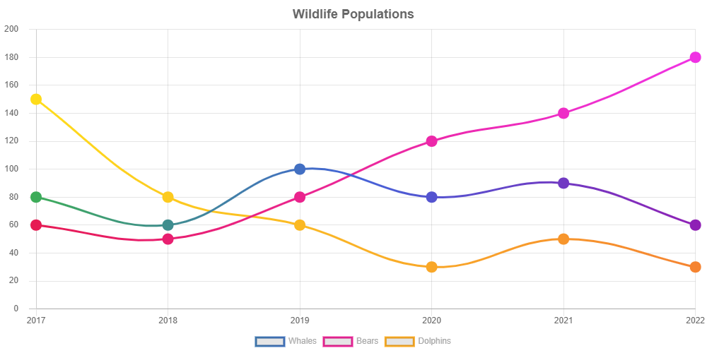
Another example
class NewChart(BaseChart):

    type = ChartType.Line

    class labels:
        Years = list(range(2017, 2023))

    class data:
        class Whales:
            data = [80, 60, 100, 80, 90, 60]

            _color = Color.JSLinearGradient('ctx', 0, 0, 1000, 0)
            _color.addColorStop(0, Color.Green)
            _color.addColorStop(1, Color.Purple)

            borderColor = _color.returnGradient()
            fill = False
            pointBorderWidth = 10
            pointRadius = 3

        class Bears:
            data = [60, 50, 80, 120, 140, 180]
            borderColor = Color.JSLinearGradient('ctx', 0, 0, 1000, 0,
                                                 (0, Color.Red),
                                                 (1, Color.Magenta)
                                                 ).returnGradient()
            fill = False
            pointBorderWidth = 10
            pointRadius = 3

        class Dolphins:
            data = [150, 80, 60, 30, 50, 30]
            borderColor = Color.JSLinearGradient('ctx', 0, 0, 1000, 0,
                                                 (0, Color.Yellow),
                                                 (1, Color.Orange)
                                                 ).returnGradient()
            fill = False
            pointBorderWidth = 10
            pointRadius = 3

    class options:

        title   = Options.Title(text="Wildlife Populations", fontSize=18)

        _lables = Options.Legend_Labels(fontColor=Color.Gray, fullWidth=True)
        legend  = Options.Legend(position='Bottom', labels=_lables)

        _yAxes = [Options.General(ticks=Options.General(beginAtZero=True, padding=15, max=200))]

        scales = Options.General(yAxes=_yAxes)
Output
More Examples
Can be found here
Release history Release notifications | RSS feed


Download files
Download the file for your platform. If you're not sure which to choose, learn more about installing packages.
Source Distribution
Built Distribution
Filter files by name, interpreter, ABI, and platform.
If you're not sure about the file name format, learn more about wheel file names.
Copy a direct link to the current filters
File details
Details for the file pyChart.JS-0.3.0.tar.gz.
File metadata
- Download URL: pyChart.JS-0.3.0.tar.gz
- Upload date:
- Size: 13.5 kB
- Tags: Source
- Uploaded using Trusted Publishing? No
- Uploaded via: twine/2.0.0 pkginfo/1.5.0.1 requests/2.22.0 setuptools/41.4.0 requests-toolbelt/0.9.1 tqdm/4.36.1 CPython/3.7.2
File hashes
| Algorithm | Hash digest | |
|---|---|---|
| SHA256 |
dc425aea72c4ab276799acf0837f7b45290147984ece1ede8bede6f1d46308ee
|
|
| MD5 |
23644bf5f72d6cfda8c5ce7eca0530b8
|
|
| BLAKE2b-256 |
4def4a90f63495a2cc758bc46b6a47cfee7f28902088bd4ccf1418d101ac5baf
|
File details
Details for the file pyChart.JS-0.3.0-py3-none-any.whl.
File metadata
- Download URL: pyChart.JS-0.3.0-py3-none-any.whl
- Upload date:
- Size: 12.6 kB
- Tags: Python 3
- Uploaded using Trusted Publishing? No
- Uploaded via: twine/2.0.0 pkginfo/1.5.0.1 requests/2.22.0 setuptools/41.4.0 requests-toolbelt/0.9.1 tqdm/4.36.1 CPython/3.7.2
File hashes
| Algorithm | Hash digest | |
|---|---|---|
| SHA256 |
5d9c135ccabceb86a556520401dd0660a1137da64e23a38d6703c3de0f96dd05
|
|
| MD5 |
9ec64c3f276f4a138560395f55e1da5b
|
|
| BLAKE2b-256 |
b1c534e2c818ee1bebb7e12106f7064b0a0d09f2fea5604919f88a81086ff332
|


