Pareto chart for python (similar to Matlab's, but much more flexible) - Fork from @tintrinh

Project description
@RogerioPradoJ paretochart - rogeriopradoj-paretochart - Fork from @tintrinh
Pareto chart for python 3 (similar to Matlab, but much more flexible) - Fork from @tintrinh.
Features
- Data labels for the chart x-axis.
- Fully customizable with unique
argandkwarginputs:- Bar chart: follows the inputs of the matplotlib.pyplot.bar function (use
bar_args=(...)andbar_kw={...}). - Cumulative line: follows the inputs of the matplotlib.pyplot.plot function (use
line_args=(...)andline_kw={...}). - Limit line: follows the inputs of the matplotlib.axes.Axes.axhline function (use
limit_kw={...}).
- Bar chart: follows the inputs of the matplotlib.pyplot.bar function (use
- Put the chart on arbitrary axes.
Examples
First, a simple import::
from paretochart.paretochart import pareto
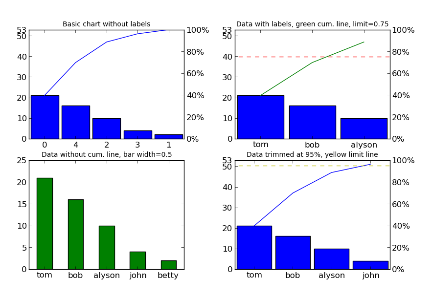
Now, let's create the numeric data (no pre-sorting necessary)::
data = [21, 2, 10, 4, 16]
We can even assign x-axis labels (in the same order as the data)::
labels = ['tom', 'betty', 'alyson', 'john', 'bob']
For this example, we'll create 4 plots that show the customization capabilities::
import matplotlib.pyplot as plt

# create a grid of subplots
fig, axes = plt.subplots(2, 2)
The first plot will be the simplest usage, with just the data::
pareto(data, axes=axes[0, 0])
plt.title('Basic chart without labels', fontsize=10)
In the second plot, we'll add labels, put a cumulative limit at 0.75 (or 75%) and turn the cumulative line green::
pareto(data, labels, axes=axes[0, 1], limit=0.75, line_args=('g',))
plt.title('Data with labels, green cum. line, limit=0.75', fontsize=10)
In the third plot, we'll remove the cumulative line and limit line, make the bars green and resize them to a width of 0.5::
pareto(data, labels, cumplot=False, axes=axes[1, 0], data_kw={'width': 0.5,
    'color': 'g'})
plt.title('Data without cum. line, green bar width=0.5', fontsize=10)
In the fourth plot, let's put the cumulative limit at 95% and make that line yellow::
pareto(data, labels, limit=0.95, axes=axes[1, 1], limit_kw={'color': 'y'})
plt.title('Data trimmed at 95%, yellow limit line', fontsize=10)
And last, but not least, let's show the image::
fig.canvas.set_window_title('Pareto Plot Test Figure')
plt.show()
This should result in the following image (click here if the image doesn't show up):
Installation
Since this is really a single python file, you can simply go to the
GitHub_ page, simply download paretochart.py and put it in
a directory that python can find it.
Alternatively, the file can be installed using::
pip install --upgrade rogeriopradoj-paretochart
If you are using Python2, you can use original @tintrinh's project::
pip install --upgrade paretochart
Development and Publishing New Versions
Using knowledge from https://medium.com/@joel.barmettler/how-to-upload-your-python-package-to-pypi-65edc5fe9c56.
- define next version number (try to follow semver 2
- make the changes in codebase
- update
setup.py:- version
- download_url
- update
README.md:- pareto_plot_test_figure url
- commit, tag, and push to git central repo
- create a source distribution, and validate it:
python setup.py sdisttwine check dist/*
- upload the source to PyPi:
twine upload dist/*
Release history Release notifications | RSS feed

Download files
Download the file for your platform. If you're not sure which to choose, learn more about installing packages.
Source Distribution
File details
Details for the file rogeriopradoj-paretochart-2.0.0.tar.gz.
File metadata
- Download URL: rogeriopradoj-paretochart-2.0.0.tar.gz
- Upload date:
- Size: 6.0 kB
- Tags: Source
- Uploaded using Trusted Publishing? No
- Uploaded via: twine/1.13.0 pkginfo/1.4.2 requests/2.18.4 setuptools/39.1.0 requests-toolbelt/0.9.1 tqdm/4.32.1 CPython/3.6.5
File hashes
| Algorithm | Hash digest | |
|---|---|---|
| SHA256 |
e88f4c24a0e4cfa3c69001e22f510c731b5887a58b0b6f668ae4eb11c4a01c0e
|
|
| MD5 |
92abfb837f0dd754cdba89123192231c
|
|
| BLAKE2b-256 |
d058060b8fd07cdabf3d090df6f6f18f420a27601d183377d2f7012bfaf3465b
|


