Module to create custom, interactive stock portfolio tree maps. Pulls data from Yahoo! Finance.

Project description
stock_treemap
Want to make a cool stock diagram, like those on finviz: https://finviz.com/map.ashx , but for your own portfolio?
This library generates tree maps for stock portfolios using Python, Yahoo Finance, and Plotly. This code is designed to be run within a Jupyter environment or can be used to create an html file of the resulting plot. More details of requirements are further below.
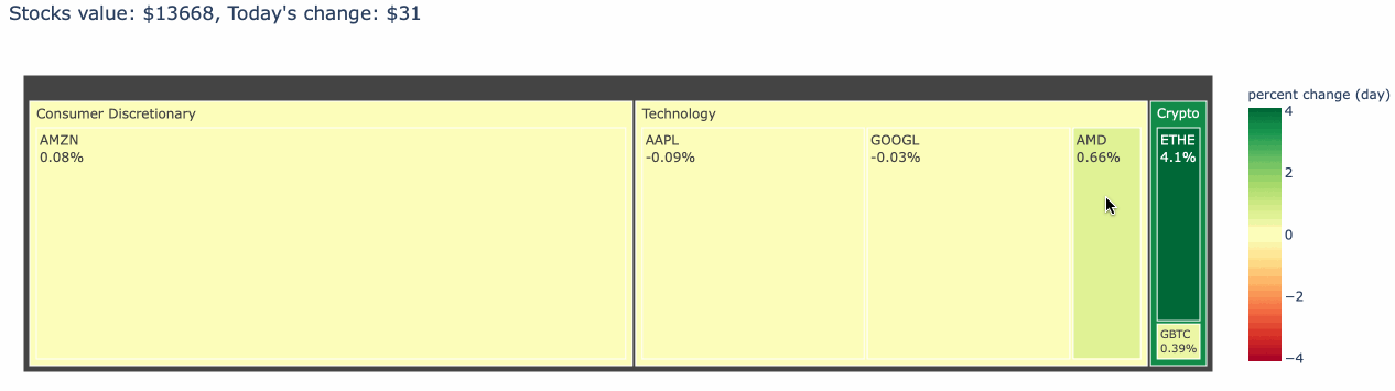
You will need to create a CSV file that has 2 columns: ticker and stocks. The ticker column should contain the stock ticker symbols for each stock you own. The shares column should contain the number of shares that you own. An example is shown below:
ticker,shares
aapl,20
amd,10
amzn,2
googl,1
ethe,30
gbtc,4
If this file is called 'example.csv', then you can create a tree map as follows:
from stock_treemap import stock_treemap, update_sectors
stock_treemap('example.csv')
An animated GIF showing an example of the output is below:
For more advanced options, see the function help (although it is still in progress with recent updates to provide saving to HTML.)
Requirements
Requires
- yfinance
- tqdm
- numpy
- pandas
- plotly
- Note that Plotly requires plug-ins to work properly in Jupyter environments. See https://plotly.com/python/getting-started/
If you find this useful...


Download files
Download the file for your platform. If you're not sure which to choose, learn more about installing packages.
Source Distribution
Built Distribution
Filter files by name, interpreter, ABI, and platform.
If you're not sure about the file name format, learn more about wheel file names.
Copy a direct link to the current filters
File details
Details for the file stock_treemap-1.6.tar.gz.
File metadata
- Download URL: stock_treemap-1.6.tar.gz
- Upload date:
- Size: 1.5 MB
- Tags: Source
- Uploaded using Trusted Publishing? No
- Uploaded via: python-requests/2.25.1
File hashes
| Algorithm | Hash digest | |
|---|---|---|
| SHA256 |
234fc47a897c12a1ed0cd233ff7b5ac6f203b0d327da683473bffa43c6d390f4
|
|
| MD5 |
d0af89c88e3c32b7c894ae2c924769fd
|
|
| BLAKE2b-256 |
31990f8d667628fef7ba966c5ca829ba84a1b407b91b8fb3c73776824a91d5be
|
File details
Details for the file stock_treemap-1.6-py2.py3-none-any.whl.
File metadata
- Download URL: stock_treemap-1.6-py2.py3-none-any.whl
- Upload date:
- Size: 5.0 kB
- Tags: Python 2, Python 3
- Uploaded using Trusted Publishing? No
- Uploaded via: python-requests/2.25.1
File hashes
| Algorithm | Hash digest | |
|---|---|---|
| SHA256 |
dcc3aee905ebbc0bdb199724a0785be4e58196bafb4232e622c78a659219196c
|
|
| MD5 |
bae8d2b080fc8199d02f7d45d4f59ea0
|
|
| BLAKE2b-256 |
3204dc6ef5192854df1b722c43151776c4da207e94de3335b072553d34fdc9d8
|


