Utilities for data science in python

Project description
PDSUtilities
Python Data Science Utilities
Installation
You can install PDSUtilities using pip:
pip install PDSUtilities
or by adding PDSUtilities to your requirements.txt file.
Usage
Import the functions you need as follows:
from PBSUtilities.xgboost import plot_importance
from PBSUtilities.xgboost import plot_tree
from PBSUtilities.pandas import plot_histograms
See below for sample usage of both of these functions.
Functions
Function: plot_importance()
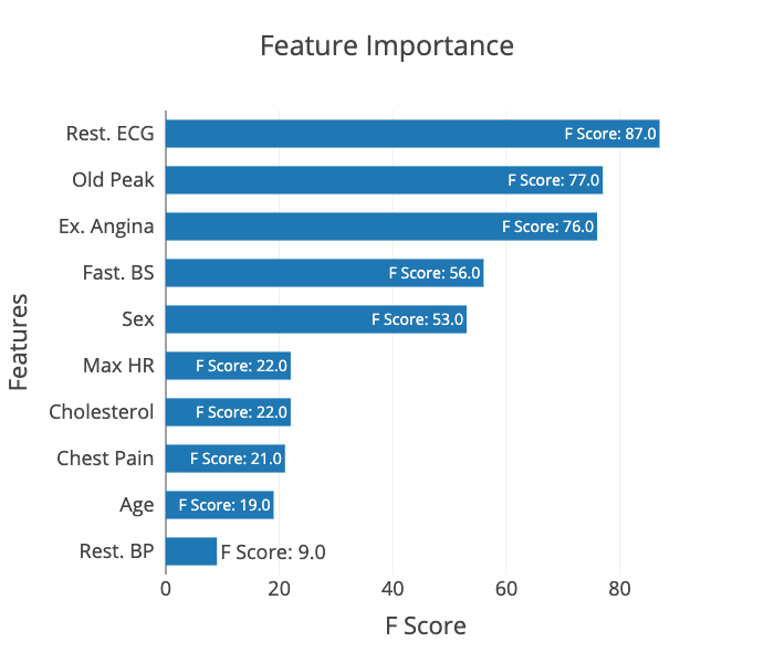
The plot_importance() function is a plotly-based replacement
for xgboost.plot_importance(). The APIs are similar (though
several parameters have been renamed) but with two key differences.
First, PDSUtilities.xgboost.plot_importance() does not rely on fmap
to supply feature names, instead exposing a labels parameter that
that can either be a list of labels or a dict that allows mapping of
feature names to labels.
And second, PDSUtilities.xgboost.plot_importance() does not rely on matplotlib
at all, instead using plotly for visualisation. This produces
an interactive, publication-quality visualisation that can also
be customised more easily, particularly using plotly.io templates.
The PDSUtilities.xgboost.plot_importance() function is a direct
copy/paste/edit modification of xgboost.plot_importance() with a few
minor tweaks to the API and relatively light changes to the code. The
xgboost team deserves the vast majority of credit for this code!
The xgboost license can be found here:
https://github.com/dmlc/xgboost/blob/master/LICENSE
The API is:
plot_importance(
	booster, labels = {}, width = 0.6, xrange = None, yrange = None,
	title = 'Feature Importance', xlabel = 'F Score', ylabel = 'Features',
	fmap = '', max_features = None, importance_type = 'weight',
	show_grid = True, show_values = True)
Example Usage
import pandas as pd

from xgboost import XGBClassifier
from xgboost import XGBModel
from xgboost import Booster

from sklearn.compose import ColumnTransformer
from sklearn.feature_selection import chi2
from sklearn.feature_selection import SelectKBest
from sklearn.model_selection import train_test_split
from sklearn.pipeline import Pipeline
from sklearn.preprocessing import OrdinalEncoder
from sklearn.preprocessing import MinMaxScaler

from PDSUtilities.xgboost import plot_importance

[...]

df = pd.read_csv("/some/datafile.csv")

xt, xv, yt, yv = train_test_split(
	df.drop("OutputFeature", axis = 1),
	df["OutputFeature"],
)

pipeline = Pipeline(steps = [
    ("transform", ColumnTransformer(
            transformers = [
                ("cat", OrdinalEncoder(), categorical_columns),
                ("num", MinMaxScaler(), numerical_columns)
            ]
        )
    ),
    ("features", SelectKBest()),
    ("classifier", XGBClassifier(
            objective = "binary:logistic",
			eval_metric = "auc",
			use_label_encoder = False
        )
    )
])

parameters = {
    "classifier__colsample_bytree": 0.2,
    "classifier__gamma": 0.4,
    "classifier__learning_rate": 0.1,
    "classifier__max_depth": 4,
    "classifier__n_estimators": 60,
    "features__k": 10,
    "features__score_func": chi2
}
pipeline.set_params(**parameters)
model = pipeline.fit(xt, yt)

[...]

classifier = pipeline["classifier"]
labels = [feature for column in xt.columns]

fig = plot_importance(classifier, labels = labels)
fig.update_layout(template = "presentation", width = 700, height = 600)
fig.show()
Function: plot_tree()
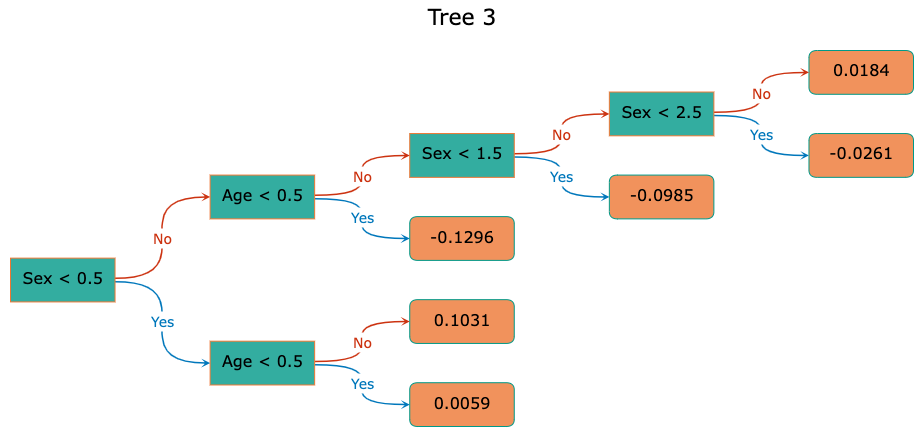
The plot_tree() function is a plotly-based replacement for xgboost.plot_tree()
that takes visualising booster trees to a whole new visual level. As a result,
the API looks nothing like that of xgboost.plot_tree(), though in its
simplest usage, it is almost identical, though again not requiring fmap
for adding feature names to the visualisation:
from PDSUtilities.xgboost import plot_tree

[...]

booster = pipeline["classifier"].get_booster()

fig = plot_tree(booster, tree = 0, labels = labels)
fig.show()
In this example, tree is the tree number and, as with plot_importance(),
the labels parameter can be either a list or a dict.
Note that the default colours were chosen from a vibrant, colourblind-friendly
palette, but can be completely configured via a number of additional configuration
settings. An additional, handy parameter is grayscale = True, which produces
a also colorblind-friendly, grayscale visualisation.
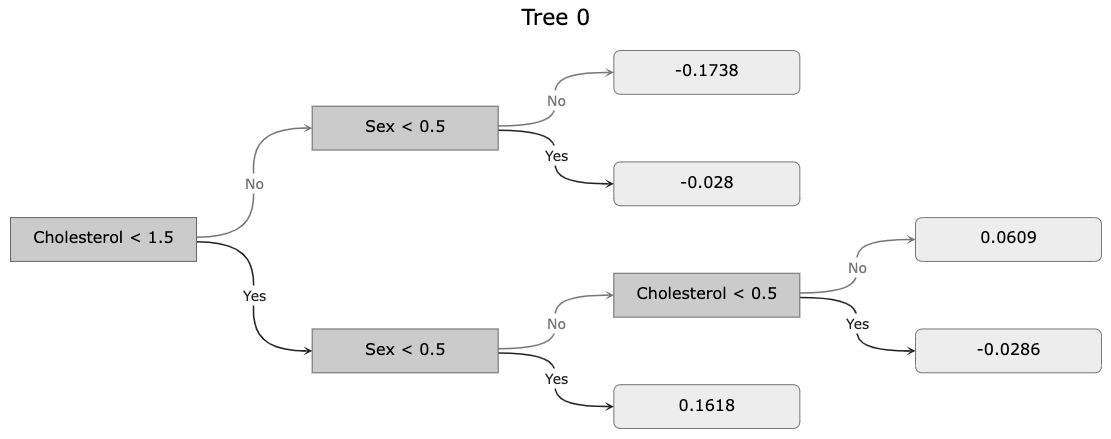
Finally, the Figure object returned by plot_impotance() can be further customised
via plotly's extensive API.
The plot_tree() API is:
plot_tree(booster, tree, labels = {}, width = None, height = None,
    precision = 4, scale = 0.7, font = None, grayscale = False,
    node_shape = {}, node_line = {}, node_font = {},
    leaf_shape = {}, leaf_line = {}, leaf_font = {},
    edge_labels = {}, edge_colors = {}, edge_arrow = {},
    edge_line = {}, edge_label = {}, edge_font = {})
Example The overall font can be configured by any of the following settings:
font = {
	'family': "Garamond, Cambria, Arial, etc",
	'size': 16,
	'color': "#000000"
}
These settings can be overridden for nodes, leaves and edges by the
node_font, leaf_font and edge_font settings, respectively. For
example, specifying
edge_font = {
	'size': 11,
}
would override the font setting so that the edge labels would be
11pt Garamond.
Edge colours can be configured via a decision-specific dict. For
example, the edge colours corresponding to grayscale = True
could be set by:
edge_clours = {
	'Yes': "#222222",
	'No': "#777777",
	'Missing': "#AAAAAA",
	'Yes/Missing':  "#222222",
	'No/Missing': "#777777",
}
Note that the keys Yes/Missing and No/Missing correspond to
the case where a branch point has a Missing branch that connects
to the same child as Yes or No, respectively.
Similarly, the edge labels can also be configured via a decision-specific
dict. The default is:
edge_labels = {
	'Yes': "Yes",
	'No': "No",
	'Missing': "Missing",
	'Yes/Missing': "Yes/Missing",
	'No/Missing': "No/Missing"
}
This is handy, for example, when it is known a priori that there are no missing values, in which case setting
edge_labels = {
	'Yes/Missing': "Yes/Missing",
	'No/Missing': "No/Missing"
}
will lead to a much cleaner looking visualisation.
Node and leaf shapes and lines can also be configured:
 node_shape = {
	'type': "rect",
	'fillcolor': "#CBCBCB",
	'opacity': 1.0,
}
node_line = {
	'color': "#666666",
	'width': 1,
	'dash': "solid",
}
leaf_shape = {
	'type': "rounded",
	'fillcolor': "#EDEDED",
	'opacity': 1.0,
}
leaf_line = {
	'color': "#777777",
	'width': 1,
	'dash': "solid",
}
Note that type can be any of "rect", "circle" or
"rounded" and that dash can be any of "solid", "dot", "dash", "longdash",
"dashdot" or "longdashdot".
The edge line, arrow and label properties can also be configured:
edge_line = {
	'width': 1.5,
	'dash': "solid",
}
edge_arrow = {
	'arrowhead': 3, # Integer between or equal to 0 and 8
	'arrowsize': 1.5,
}
edge_label = {
	'align': "center",
	'bgcolor': "#FFFFFF",
	'bordercolor': "rgba(0,0,0,0)",
	'borderpad': 1,
	'borderwidth': 1,
	'opacity': 1.0,
	'textangle': 0,
	'valign': "middle",
	'visible': True,
}
where dash is as above and arrowhead is an int in range(0, 9)
that specifies the arrowhead style.
Additionally, plot_tree() accepts width and height parameters
specifying the overall width and height of the visualisation--though the defaults
are reasonably good and tree-size dependent--as well as a precision parameter
specifying the number of decimal places displayed when rendering the numbers
in nodes and leaves.
Finally, plot_tree() also accepts a scale parameter that can be adjusted up or
down if the node and/or leaf labels do not quite fit in their corresponding
shapes. This can occur because plot_tree() does not use font metrics for
computing the size of the labels, instead using a reasonable guess. This is
because plotly does not offer this via their API and no python font metric
libraries seemed to offer what was needed. This may be improved in the future
but for now, adjusting scale is the preferred method for dealing with this.
As with plot_impotance() the returned Figure object can be further customised
via plotly's extensive API.
Function: plot_histograms()
The plot_histograms() function uses plotly to produce publication-quality histograms
for all categorical and numerical columns in a pandas dataframe with a single line of code.
In its simplest usage, plot_histograms() takes a single argument--the dataframe--but with
only a few more arguments, it quickly becomes a tool for not only visualising your data, but
also for exploriing it. For example, this code,
import pandas as pd
from PDSUtilities.pandas import plot_histograms

df = pd.read_csv("./data/heart.csv")

fig = plot_histograms(df, target = "ChestPainType", template = "presentation",
	title = "Heart Disease Dataset Histograms Grouped by Chest Pain Type")
fig.show()
produces histograms grouped by the values in the target column:
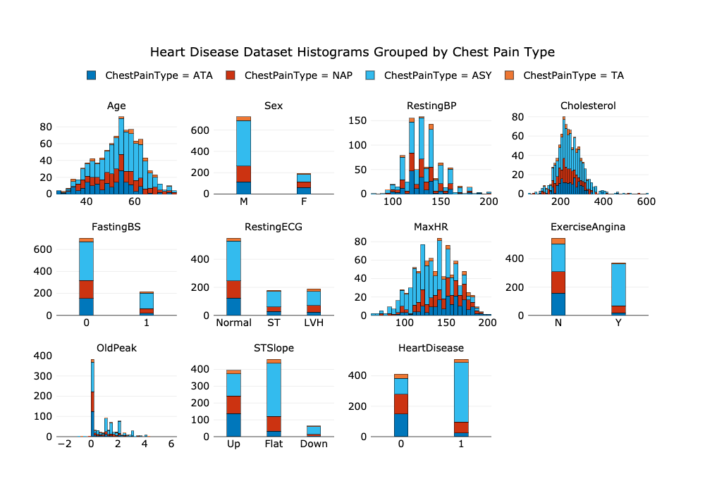
The plot_histograms() function has the following API:
plot_histograms(df, target = None, columns = None, rows = None, cols = None, width = None, height = None,
    title = None, cumulative = None, barmode = "stack", opacity = 0.65, bins = 0,
	hovermode = None, template = None, colors = 0, font = {}, title_font = {}, legend_font = {})
If target = None then totals are plotted for every column in the dataframe. If instead, target
is the name of a column, then totals for each value of the target are plotted for every column.
If columns = None then all columns are plotted. Otherwise, only the columns in columns are plotted.
If either or both of the number of rows and cols are specified, those are used in arranging the
histograms in the grid. Otherwise values are chosen automatically in a reasonable manner. The same
applies tohe width and column: either or both can be specified and missing values are calculated
automatically based upon the specified or calculated rows and cols.
The title can be supplied either as a string or a dict according to the plotly specification.
As an example, the default dict that is created when title is a string is:
title = { 'text': title, 'x': 0.5, 'xanchor': "center" }
Specifying cumulative = True produces cumulative histograms for each target variable, or the entire
dataset if target = None.
The barmode argument can be any of "stack", "group" or "overlay", and opacity is used only
when barmode is "overlay" to specify the opacity of the bars.
The bins argument can be either an int or a dict and suggests a maximum number of bins to use
for numerical columns. When bins is an int, this argument applies to all columns in the dataframe.
Note that the default value, bins = 0, specifies that plotly should choose the value automatically.
When bins is a dict it specifies the maximum number of bins for those columns in the dictionary,
where keys are column names and values are bins.
The hovermode argument controls the hover text and markers displayed as the cursor hovers over values
in plotly plots and can be any of "x", "y", "x unified" or "y unified", with the same meaning
as in plotly. The default is "x unified"which causes all values corresponding to the current x position
to be displayed in a single hover textbox.
The template argument can be used to specify a plotly template. See https://plotly.com/python/templates/
and the plotly documentation.
The colors argument can be an int in range(-1, 5) or a string from the list
["Vibrant", "Bright", "Muted", "Medium-Contrast", "Grayscale"]specifying one of
five colourblindness-friendly schemes to be used in setting the bar colours; or it
can be a list of colour strings of the form "#RRGGBB", "rgb(255,255,255)" or
"rgba(255,255,255,1.0)" to be used instead of the colour schemes.
Note that all of the colour schemes are colour blindness friendly and have significant
contrast. This is also true of the grayscale colour scheme, which can be selected with
either colors = 4 or colors = -1.
The font, title_font and legend_font set the fonts used for the text elements in the plots and
take values similar to other PDSUtilities functions. For example, the default font is:
font = {
	'family': "Verdana, Helvetica, Verdana, Calibri, Garamond, Cambria, Arial",
	'size': 14,
	'color': "#000000"
}
Attributions
This repository uses the Heart Failure Prediction Dataset[1] from UCI Machine Learning Repository
(data/heart.csv)
on the following link: https://archive.ics.uci.edu/ml/machine-learning-databases/heart-disease/
References
- fedesoriano. (September 2021). Heart Failure Prediction Dataset. Retrieved [January 16, 2022] from https://www.kaggle.com/fedesoriano/heart-failure-prediction.
Release history Release notifications | RSS feed


Download files
Download the file for your platform. If you're not sure which to choose, learn more about installing packages.
Source Distribution
Built Distribution
Filter files by name, interpreter, ABI, and platform.
If you're not sure about the file name format, learn more about wheel file names.
Copy a direct link to the current filters
File details
Details for the file PDSUtilities-0.1.26.tar.gz.
File metadata
- Download URL: PDSUtilities-0.1.26.tar.gz
- Upload date:
- Size: 27.3 kB
- Tags: Source
- Uploaded using Trusted Publishing? No
- Uploaded via: twine/3.8.0 pkginfo/1.8.2 readme-renderer/32.0 requests/2.27.1 requests-toolbelt/0.9.1 urllib3/1.26.8 tqdm/4.62.3 importlib-metadata/4.10.1 keyring/23.5.0 rfc3986/2.0.0 colorama/0.4.4 CPython/3.7.10
File hashes
| Algorithm | Hash digest | |
|---|---|---|
| SHA256 |
8e6e8df22c3c5f3225efb68c04c28af7c5ce50ffebff8aff8bb56f89b237b3fe
|
|
| MD5 |
5c564e6af1c1c907c82a083926f0d62d
|
|
| BLAKE2b-256 |
772c8ccb5a2c8f566d0ce9009499f083897795e3fd0501e08a42776dbb31cc36
|
File details
Details for the file PDSUtilities-0.1.26-py3-none-any.whl.
File metadata
- Download URL: PDSUtilities-0.1.26-py3-none-any.whl
- Upload date:
- Size: 38.2 kB
- Tags: Python 3
- Uploaded using Trusted Publishing? No
- Uploaded via: twine/3.8.0 pkginfo/1.8.2 readme-renderer/32.0 requests/2.27.1 requests-toolbelt/0.9.1 urllib3/1.26.8 tqdm/4.62.3 importlib-metadata/4.10.1 keyring/23.5.0 rfc3986/2.0.0 colorama/0.4.4 CPython/3.7.10
File hashes
| Algorithm | Hash digest | |
|---|---|---|
| SHA256 |
169e7584683644aba1bb85e6026ac80d2d2afe634727c94a21d513d4e61efc19
|
|
| MD5 |
face22c110e9abe282610b936e7a5d5a
|
|
| BLAKE2b-256 |
e75d37aa8b2c22f1087f760a450a7e2c2a557e8058b226d76dfd9dcdae96c0f7
|