Create ECharts plots in a single simple function call, with internal data wrangling via polars

Project description


QuickEcharts
QuickEcharts is a Python package that enables one to plot Echarts quickly. It piggybacks off of the pyecharts package that pipes into Apache Echarts. Pyecharts is a great package for fully customizing plots but is quite a challenge to make use of quickly. QuickEcharts solves this with a simple API for defining plotting elements and data, along with automatic data wrangling operations, using polars, to correctly structure data fast.
For the Code Examples below, there is a dataset in the QuickEcharts/datasets folder named FakeBevData.csv that you can download for replication purposes.
Installation
pip install QuickEcharts

or

pip install git+https://github.com/AdrianAntico/QuickEcharts.git#egg=quickecharts
Run Shiny App
from QuickEcharts.shiny_app import run_app
run_app(port=8001)
Code Examples
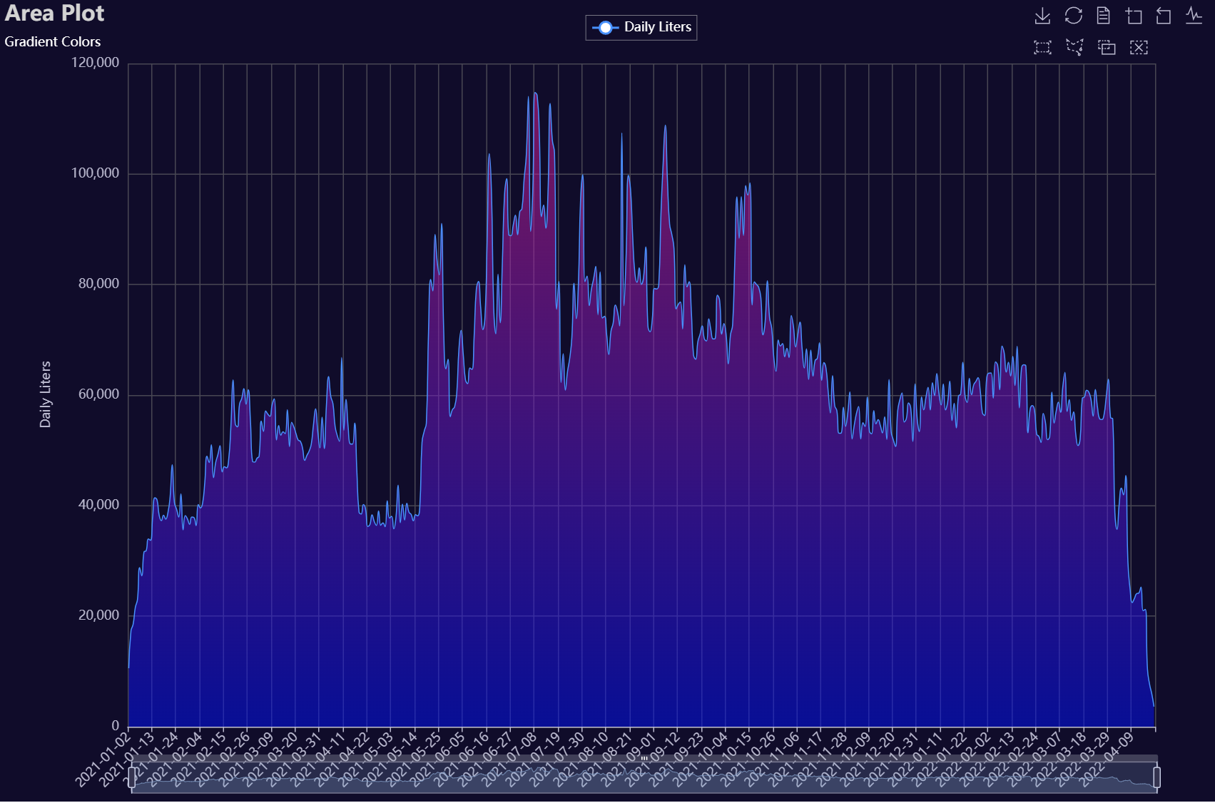
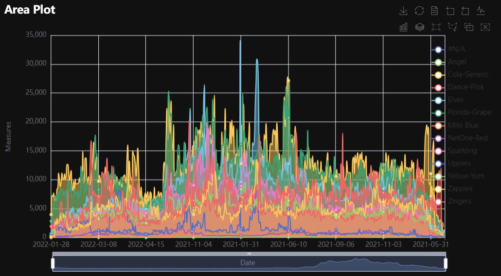
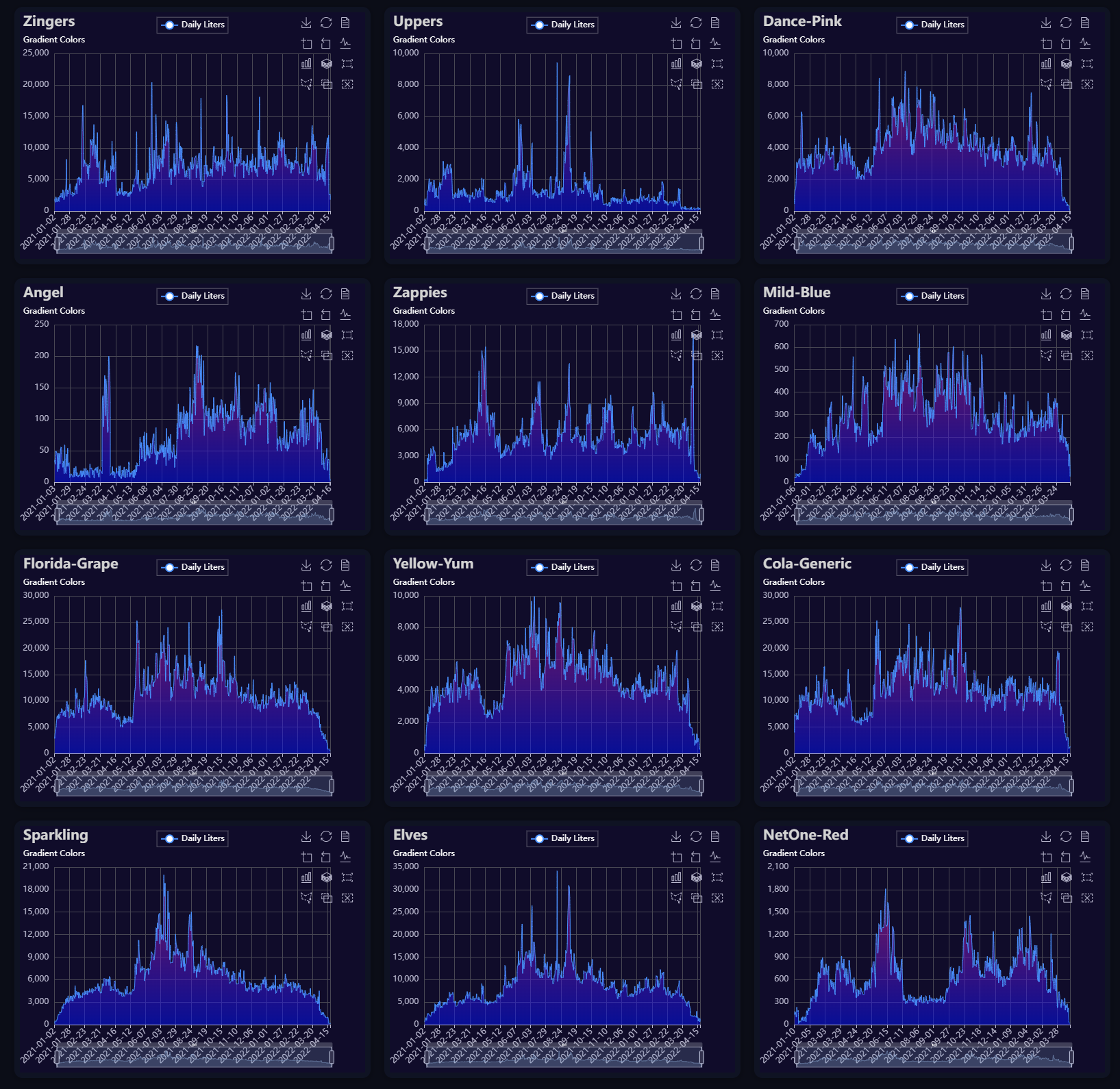
Area
Click for code example
# Environment
import pkg_resources
import polars as pl
from QuickEcharts import Charts
from pyecharts.globals import CurrentConfig, NotebookType
CurrentConfig.NOTEBOOK_TYPE = 'jupyter_lab'

# Pull Data from Package
FilePath = "..FakeBevData.csv"
data = pl.read_csv(FilePath)

# Create Plot in Jupyter Lab
p1 = Charts.Area(
  dt = data,
  PreAgg = False,
  YVar = 'Daily Liters',
  XVar = 'Date',
  GroupVar = None,
  FacetRows = 2,
  FacetCols = 2,
  FacetLevels = None,
  TimeLine = False,
  AggMethod = 'sum',
  YVarTrans = "Identity",
  RenderHTML = "Area Plot",
  Opacity = 0.50,
  GradientColors = ['#e12191', '#0011FF'],
  LineWidth = 1,
  Symbol = "emptyCircle",
  SymbolSize = 6,
  ShowLabels = False,
  LabelPosition = "top",
  Theme = 'dark',
  BackgroundColor = None,
  Width = "1200px",
  Height = "750px",
  ToolBox = True,
  Brush = True,
  DataZoom = True,
  Title = 'Area Plot',
  TitleColor = "lightgray",
  TitleFontSize = 20,
  SubTitle = "Gradient Colors",
  SubTitleColor = "#fff",
  SubTitleFontSize = 12,
  AxisPointerType = 'cross',
  YAxisTitle = "Daily Liters",
  YAxisNameLocation = 'middle',
  YAxisNameGap = 70,
  XAxisTitle = None,
  XAxisNameLocation = 'middle',
  XAxisNameGap = 42,
  Legend = 'top',
  LegendPosRight = '0%',
  LegendPosTop = '2%',
  LegendBorderSize = 0.25,
  LegendTextColor = "#fff",
  VerticalLine = None,
  VerticalLineName = 'Line Name',
  HorizontalLine = None,
  HorizontalLineName = 'Line Name',
  AnimationThreshold = 2000,
  AnimationDuration = 1000,
  AnimationEasing = "cubicOut",
  AnimationDelay = 0,
  AnimationDurationUpdate = 300,
  AnimationEasingUpdate = "cubicOut",
  AnimationDelayUpdate = 0)

# Needed to display
p1.load_javascript()

# In new cell
p1.render_notebook()
# Environment
import pkg_resources
import polars as pl
from QuickEcharts import Charts
from pyecharts.globals import CurrentConfig, NotebookType
CurrentConfig.NOTEBOOK_TYPE = 'jupyter_lab'

# Pull Data from Package
FilePath = "..FakeBevData.csv"
data = pl.read_csv(FilePath)

# Create Plot in Jupyter Lab
p1 = Charts.Area(
  dt = data,
  PreAgg = False,
  YVar = 'Daily Liters',
  XVar = 'Date',
  GroupVar = 'Brand',
  FacetRows = 1,
  FacetCols = 1,
  FacetLevels = None,
  TimeLine = False,
  AggMethod = 'sum',
  YVarTrans = "Identity",
  RenderHTML = None,
  Opacity = 0.5,
  GradientColors = ['#c86589', '#06a7ff0d'],
  LineWidth = 2,
  Symbol = "emptyCircle",
  SymbolSize = 6,
  ShowLabels = False,
  LabelPosition = "top",
  Theme = 'wonderland',
  BackgroundColor = None,
  Width = None,
  Height = None,
  ToolBox = True,
  Brush = True,
  DataZoom = True,
  Title = 'Line Plot',
  TitleColor = "#fff",
  TitleFontSize = 20,
  SubTitle = None,
  SubTitleColor = "#fff",
  SubTitleFontSize = 12,
  AxisPointerType = 'cross',
  YAxisTitle = None,
  YAxisNameLocation = 'middle',
  YAxisNameGap = 70,
  XAxisTitle = None,
  XAxisNameLocation = 'middle',
  XAxisNameGap = 42,
  Legend = None,
  LegendPosRight = '0%',
  LegendPosTop = '5%',
  LegendBorderSize = 1,
  LegendTextColor = "#fff",
  VerticalLine = None,
  VerticalLineName = 'Line Name',
  HorizontalLine = None,
  HorizontalLineName = 'Line Name',
  AnimationThreshold = 2000,
  AnimationDuration = 1000,
  AnimationEasing = "cubicOut",
  AnimationDelay = 0,
  AnimationDurationUpdate = 300,
  AnimationEasingUpdate = "cubicOut",
  AnimationDelayUpdate = 0)

# Needed to display
p1.load_javascript()

# In new cell
p1.render_notebook()
# Environment
import pkg_resources
import polars as pl
from QuickEcharts import Charts
from pyecharts.globals import CurrentConfig, NotebookType
CurrentConfig.NOTEBOOK_TYPE = 'jupyter_lab'

# Pull Data from Package
FilePath = "..FakeBevData.csv"
data = pl.read_csv(FilePath)

brand = data['Brand'].unique()
brand = [b for b in brand if b != "#N/A"]

plot_list = [None] * len(brand)
for i in range(len(brand)):
  plot_list[i] = Charts.Area(
    dt = data.filter(pl.col('Brand') == brand[i]),
    PreAgg = False,
    YVar = 'Daily Liters',
    XVar = 'Date',
    GroupVar = None,
    FacetRows = 1,
    FacetCols = 1,
    FacetLevels = None,
    TimeLine = False,
    AggMethod = 'sum',
    YVarTrans = "Identity",
    RenderHTML = "Area Plot",
    Opacity = 0.50,
    GradientColors = ['#e12191', '#0011FF'],
    LineWidth = 1,
    Symbol = "emptyCircle",
    SymbolSize = 6,
    ShowLabels = False,
    LabelPosition = "top",
    Theme = 'dark',
    BackgroundColor = None,
    Width = None,
    Height = None,
    ToolBox = True,
    Brush = True,
    DataZoom = True,
    Title = f'{brand[i]}',
    TitleColor = "lightgray",
    TitleFontSize = 20,
    SubTitle = "Gradient Colors",
    SubTitleColor = "#fff",
    SubTitleFontSize = 12,
    AxisPointerType = 'cross',
    YAxisTitle = "Daily Liters",
    YAxisNameLocation = 'middle',
    YAxisNameGap = 70,
    XAxisTitle = None,
    XAxisNameLocation = 'middle',
    XAxisNameGap = 42,
    Legend = 'top',
    LegendPosRight = '0%',
    LegendPosTop = '2%',
    LegendBorderSize = 0.25,
    LegendTextColor = "#fff",
    VerticalLine = None,
    VerticalLineName = 'Line Name',
    HorizontalLine = None,
    HorizontalLineName = 'Line Name',
    AnimationThreshold = 2000,
    AnimationDuration = 1000,
    AnimationEasing = "cubicOut",
    AnimationDelay = 0,
    AnimationDurationUpdate = 300,
    AnimationEasingUpdate = "cubicOut",
    AnimationDelayUpdate = 0)

Charts.display_plots_grid(
  plot_list,
  cols = 3,
  render = "html")
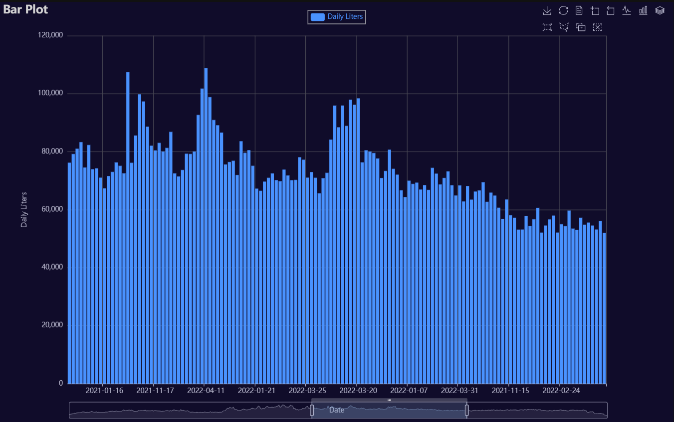
Bar
Click for code example
# Environment
import pkg_resources
import polars as pl
from QuickEcharts import Charts
from pyecharts.globals import CurrentConfig, NotebookType
CurrentConfig.NOTEBOOK_TYPE = 'jupyter_lab'

# Pull Data from Package
FilePath = "..FakeBevData.csv"
data = pl.read_csv(FilePath)

# Create Plot in Jupyter Lab
p1 = Charts.Bar(
  dt = data,
  PreAgg = False,
  YVar = 'Daily Liters',
  XVar = 'Date',
  GroupVar = None,
  FacetCols = 1,
  FacetRows = 1,
  FacetLevels = None,
  TimeLine = False,
  AggMethod = 'sum',
  YVarTrans = "Identity",
  RenderHTML = None,
  ShowLabels = False,
  LabelPosition = "top",
  Theme = 'dark',
  BackgroundColor = None,
  Width = "1200px",
  Height = "750px",
  ToolBox = True,
  Brush = True,
  DataZoom = True,
  Title = 'Bar Plot',
  TitleColor = "lightgray",
  TitleFontSize = 20,
  SubTitle = None,
  SubTitleColor = "#fff",
  SubTitleFontSize = 12,
  AxisPointerType = 'cross',
  YAxisTitle = 'Daily Liters',
  YAxisNameLocation = 'middle',
  YAxisNameGap = 70,
  XAxisTitle = 'Date',
  XAxisNameLocation = 'middle',
  XAxisNameGap = 42,
  Legend = 'top',
  LegendPosRight = '0%',
  LegendPosTop = '2%',
  LegendBorderSize = 1,
  LegendTextColor = "#lightgray",
  VerticalLine = None,
  VerticalLineName = 'Line Name',
  HorizontalLine = None,
  HorizontalLineName = 'Line Name',
  AnimationThreshold = 2000,
  AnimationDuration = 1000,
  AnimationEasing = "cubicOut",
  AnimationDelay = 0,
  AnimationDurationUpdate = 300,
  AnimationEasingUpdate = "cubicOut",
  AnimationDelayUpdate = 0)

# Needed to display
p1.load_javascript()

# In new cell
p1.render_notebook()
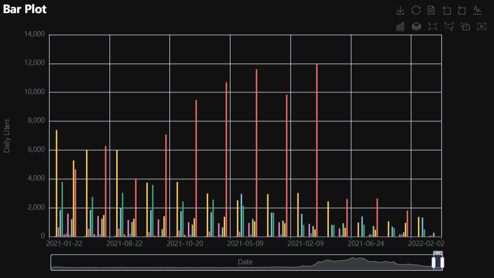
# Environment
import pkg_resources
import polars as pl
from QuickEcharts import Charts
from pyecharts.globals import CurrentConfig, NotebookType
CurrentConfig.NOTEBOOK_TYPE = 'jupyter_lab'

# Pull Data from Package
FilePath = "..FakeBevData.csv"
data = pl.read_csv(FilePath)

# Create Plot in Jupyter Lab
p1 = Charts.Bar(
  dt = data,
  PreAgg = False,
  YVar = 'Daily Liters',
  XVar = 'Date',
  GroupVar = 'Brand',
  FacetCols = 1,
  FacetRows = 1,
  FacetLevels = None,
  TimeLine = False,
  AggMethod = 'sum',
  YVarTrans = "Identity",
  RenderHTML = None,
  ShowLabels = False,
  LabelPosition = "top",
  Theme = 'wonderland',
  BackgroundColor = None,
  Width = None,
  Height = None,
  ToolBox = True,
  Brush = True,
  DataZoom = True,
  Title = 'Bar Plot',
  TitleColor = "#fff",
  TitleFontSize = 20,
  SubTitle = None,
  SubTitleColor = "#fff",
  SubTitleFontSize = 12,
  AxisPointerType = 'cross',
  YAxisTitle = None,
  YAxisNameLocation = 'middle',
  YAxisNameGap = 70,
  XAxisTitle = None,
  XAxisNameLocation = 'middle',
  XAxisNameGap = 42,
  Legend = None,
  LegendPosRight = '0%',
  LegendPosTop = '5%',
  LegendBorderSize = 1,
  LegendTextColor = "#fff",
  VerticalLine = None,
  VerticalLineName = 'Line Name',
  HorizontalLine = None,
  HorizontalLineName = 'Line Name',
  AnimationThreshold = 2000,
  AnimationDuration = 1000,
  AnimationEasing = "cubicOut",
  AnimationDelay = 0,
  AnimationDurationUpdate = 300,
  AnimationEasingUpdate = "cubicOut",
  AnimationDelayUpdate = 0)

# Needed to display
p1.load_javascript()

# In new cell
p1.render_notebook()
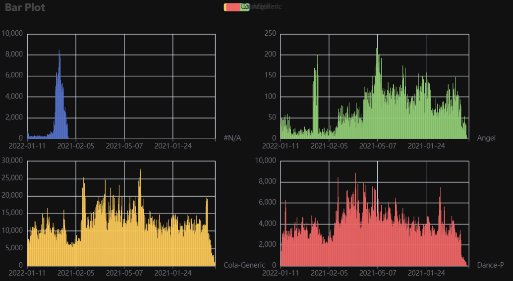
# Environment
import pkg_resources
import polars as pl
from QuickEcharts import Charts
from pyecharts.globals import CurrentConfig, NotebookType
CurrentConfig.NOTEBOOK_TYPE = 'jupyter_lab'

# Pull Data from Package
FilePath = "..FakeBevData.csv"
data = pl.read_csv(FilePath)

# Create Plot in Jupyter Lab
p1 = Charts.Bar(
  dt = data,
  PreAgg = False,
  YVar = 'Daily Liters',
  XVar = 'Date',
  GroupVar = 'Brand',
  FacetCols = 2,
  FacetRows = 2,
  FacetLevels = None,
  TimeLine = False,
  AggMethod = 'sum',
  YVarTrans = "Identity",
  RenderHTML = None,
  ShowLabels = False,
  LabelPosition = "top",
  Theme = 'wonderland',
  BackgroundColor = None,
  Width = None,
  Height = None,
  ToolBox = True,
  Brush = True,
  DataZoom = True,
  Title = 'Bar Plot',
  TitleColor = "#fff",
  TitleFontSize = 20,
  SubTitle = None,
  SubTitleColor = "#fff",
  SubTitleFontSize = 12,
  AxisPointerType = 'cross',
  YAxisTitle = None,
  YAxisNameLocation = 'middle',
  YAxisNameGap = 70,
  XAxisTitle = None,
  XAxisNameLocation = 'middle',
  XAxisNameGap = 42,
  Legend = None,
  LegendPosRight = '0%',
  LegendPosTop = '5%',
  LegendBorderSize = 1,
  LegendTextColor = "#fff",
  VerticalLine = None,
  VerticalLineName = 'Line Name',
  HorizontalLine = None,
  HorizontalLineName = 'Line Name',
  AnimationThreshold = 2000,
  AnimationDuration = 1000,
  AnimationEasing = "cubicOut",
  AnimationDelay = 0,
  AnimationDurationUpdate = 300,
  AnimationEasingUpdate = "cubicOut",
  AnimationDelayUpdate = 0)

# Needed to display
p1.load_javascript()

# In new cell
p1.render_notebook()
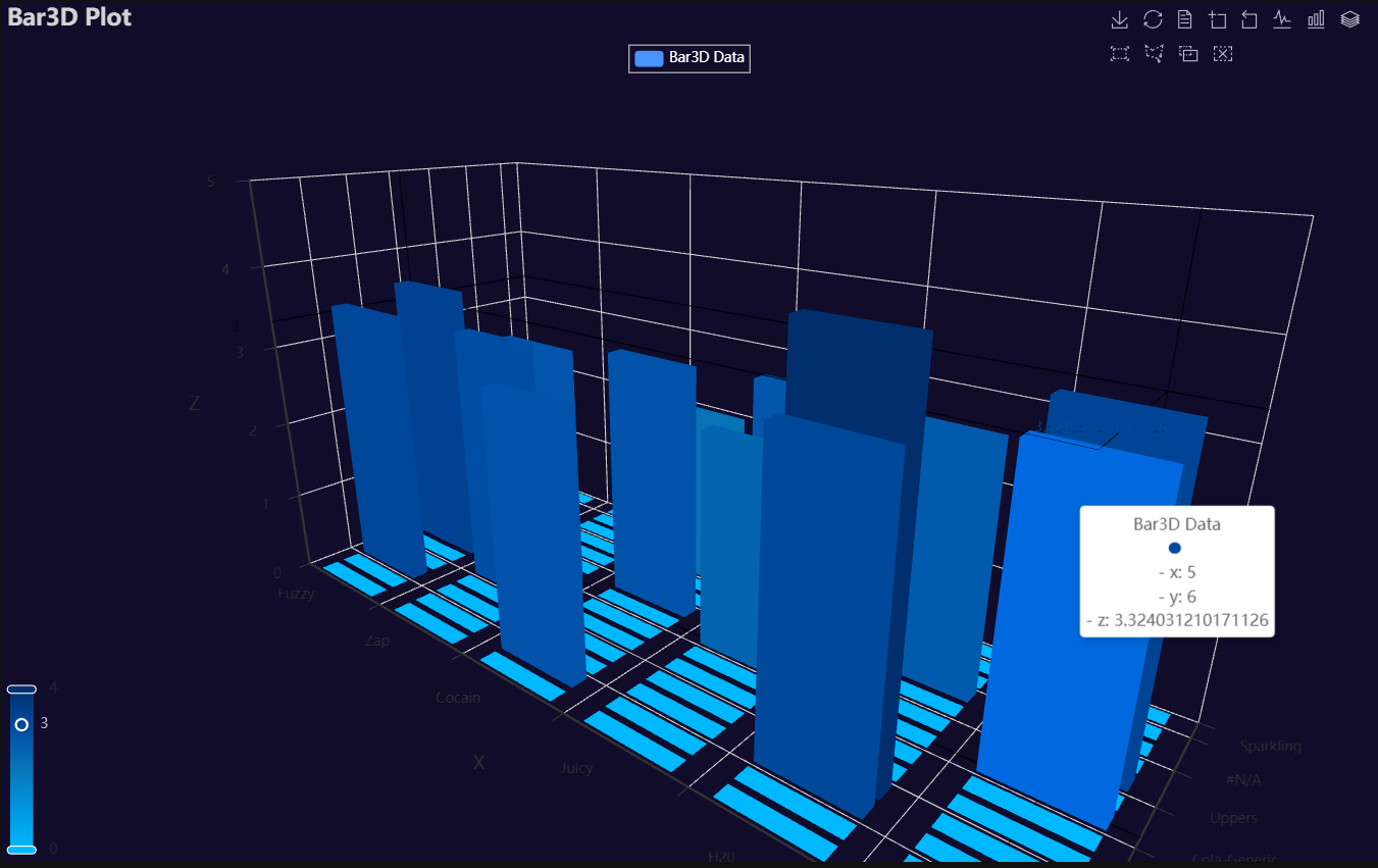
Bar3D
Click for code example
# Environment
import pkg_resources
import polars as pl
from QuickEcharts import Charts
from pyecharts.globals import CurrentConfig, NotebookType
CurrentConfig.NOTEBOOK_TYPE = 'jupyter_lab'

# Pull Data from Package
FilePath = "..FakeBevData.csv"
data = pl.read_csv(FilePath)

# Create Plot in Jupyter Lab
p1 = Charts.Bar3D(
  dt = data,
  PreAgg = False,
  YVar = 'Brand',
  XVar = 'Category',
  ZVar = 'Daily Liters',
  AggMethod = 'mean',
  ZVarTrans = "logmin",
  RenderHTML = None,
  Theme = 'wonderland',
  BarColors = ["#00b8ff", "#0097e1", "#0876b8", "#004fa7", "#012e6d"],
  BackgroundColor = "#000",
  Width = None,
  Height = None,
  ToolBox = True,
  Brush = True,
  DataZoom = True,
  Title = 'Bar3D Plot',
  TitleColor = "#fff",
  TitleFontSize = 20,
  SubTitle = None,
  SubTitleColor = "#fff",
  SubTitleFontSize = 12,
  Legend = 'top',
  LegendPosRight = '0%',
  LegendPosTop = '5%',
  LegendBorderSize = 1,
  LegendTextColor = "#fff",
  AnimationThreshold = 2000,
  AnimationDuration = 1000,
  AnimationEasing = "cubicOut",
  AnimationDelay = 0,
  AnimationDurationUpdate = 300,
  AnimationEasingUpdate = "cubicOut",
  AnimationDelayUpdate = 0)

# Needed to display
p1.load_javascript()

# In new cell
p1.render_notebook()
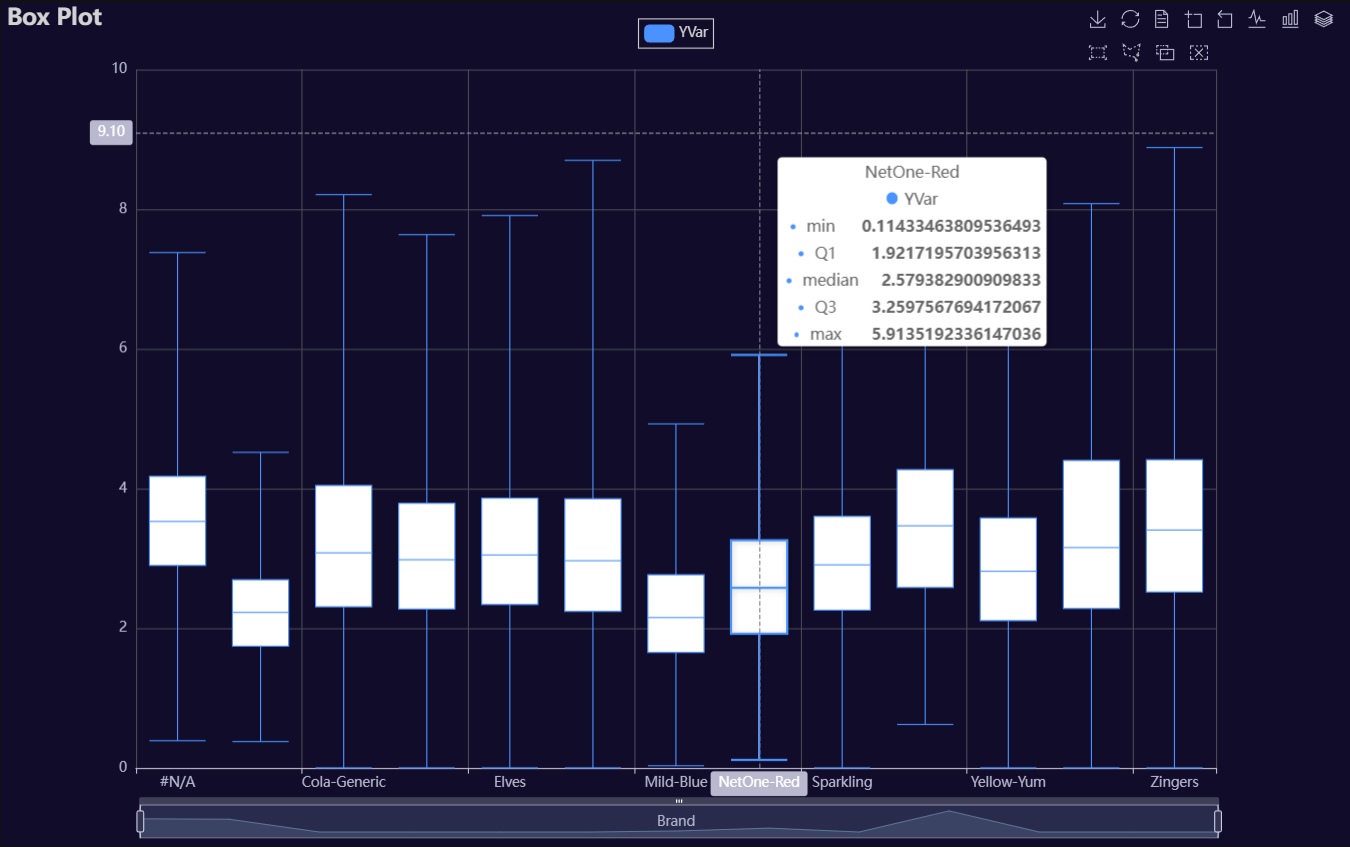
Box
Click for code example
# Environment
import pkg_resources
import polars as pl
from QuickEcharts import Charts
from pyecharts.globals import CurrentConfig, NotebookType
CurrentConfig.NOTEBOOK_TYPE = 'jupyter_lab'

# Pull Data from Package
FilePath = "..FakeBevData.csv"
data = pl.read_csv(FilePath)

# Create Plot in Jupyter Lab
p1 = Charts.BoxPlot(
  dt = data,
  SampleSize = 100000,
  YVar = 'Daily Liters',
  GroupVar = 'Brand',
  YVarTrans = "logmin",
  RenderHTML = None,
  Theme = 'dark',
  BackgroundColor = None,
  Width = "1200px",
  Height = "750px",
  ToolBox = True,
  Brush = True,
  DataZoom = True,
  Title = 'Box Plot',
  TitleColor = "lightgray",
  TitleFontSize = 20,
  SubTitle = None,
  SubTitleColor = "#fff",
  SubTitleFontSize = 12,
  AxisPointerType = 'cross',
  YAxisTitle = None,
  YAxisNameLocation = 'middle',
  YAxisNameGap = 42,
  XAxisTitle = None,
  XAxisNameLocation = 'middle',
  XAxisNameGap = 42,
  Legend = 'top',
  LegendPosRight = '0%',
  LegendPosTop = '2%',
  LegendBorderSize = 1,
  LegendTextColor = "lightgray",
  HorizontalLine = None,
  HorizontalLineName = 'Line Name',
  AnimationThreshold = 2000,
  AnimationDuration = 1000,
  AnimationEasing = "cubicOut",
  AnimationDelay = 0,
  AnimationDurationUpdate = 300,
  AnimationEasingUpdate = "cubicOut",
  AnimationDelayUpdate = 0)

# Needed to display
p1.load_javascript()

# In new cell
p1.render_notebook()
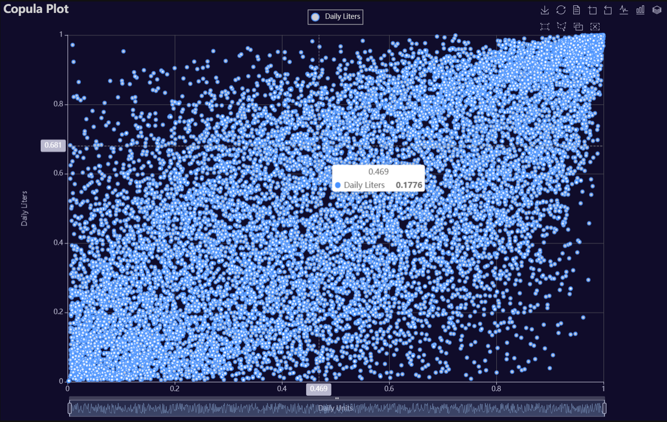
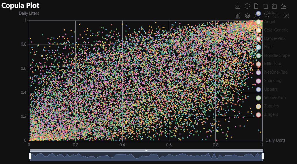
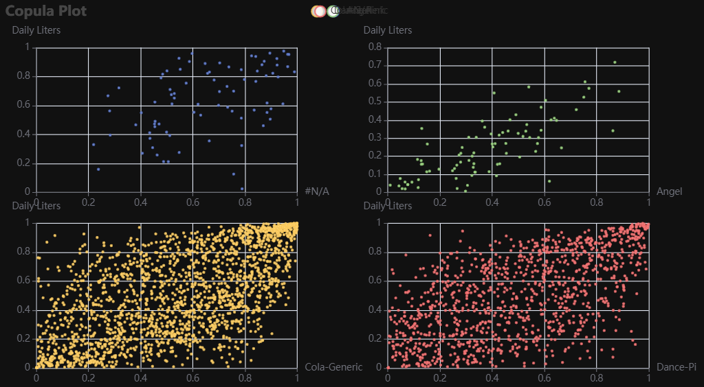
Copula
Click for code example
# Environment
import pkg_resources
import polars as pl
from QuickEcharts import Charts
from pyecharts.globals import CurrentConfig, NotebookType
CurrentConfig.NOTEBOOK_TYPE = 'jupyter_lab'

# Pull Data from Package
FilePath = "..FakeBevData.csv"
data = pl.read_csv(FilePath)

# Create Plot in Jupyter Lab
p1 = Charts.Copula(
  dt = data,
  SampleSize = 15000,
  YVar = 'Daily Liters',
  XVar = 'Daily Units',
  GroupVar = None,
  FacetRows = 2,
  FacetCols = 2,
  FacetLevels = None,
  TimeLine = False,
  AggMethod = 'mean',
  RenderHTML = None,
  LineWidth = 2,
  Symbol = "emptyCircle",
  SymbolSize = 6,
  ShowLabels = False,
  LabelPosition = "top",
  Theme = 'dark',
  BackgroundColor = None,
  Width = "1200px",
  Height = "750px",
  ToolBox = True,
  Brush = True,
  DataZoom = True,
  Title = 'Copula Plot',
  TitleColor = "lightgray",
  TitleFontSize = 20,
  SubTitle = None,
  SubTitleColor = "#fff",
  SubTitleFontSize = 12,
  AxisPointerType = 'cross',
  YAxisTitle = 'Daily Liters',
  YAxisNameLocation = 'middle',
  YAxisNameGap = 70,
  XAxisTitle = 'Daily Units',
  XAxisNameLocation = 'middle',
  XAxisNameGap = 42,
  Legend = 'top',
  LegendPosRight = '0%',
  LegendPosTop = '2%',
  LegendBorderSize = 1,
  LegendTextColor = "lightgray",
  VerticalLine = None,
  VerticalLineName = 'Line Name',
  HorizontalLine = None,
  HorizontalLineName = 'Line Name',
  AnimationThreshold = 2000,
  AnimationDuration = 1000,
  AnimationEasing = "cubicOut",
  AnimationDelay = 0,
  AnimationDurationUpdate = 300,
  AnimationEasingUpdate = "cubicOut",
  AnimationDelayUpdate = 0)

# Needed to display
p1.load_javascript()

# In new cell
p1.render_notebook()
# Environment
import pkg_resources
import polars as pl
from QuickEcharts import Charts
from pyecharts.globals import CurrentConfig, NotebookType
CurrentConfig.NOTEBOOK_TYPE = 'jupyter_lab'

# Pull Data from Package
FilePath = "..FakeBevData.csv"
data = pl.read_csv(FilePath)

# Create Plot in Jupyter Lab
p1 = Charts.Copula(
  dt = data,
  SampleSize = 15000,
  YVar = 'Daily Liters',
  XVar = 'Daily Units',
  GroupVar = 'Brand',
  FacetRows = 1,
  FacetCols = 1,
  FacetLevels = None,
  TimeLine = False,
  AggMethod = 'mean',
  RenderHTML = None,
  LineWidth = 2,
  Symbol = "emptyCircle",
  SymbolSize = 6,
  ShowLabels = False,
  LabelPosition = "top",
  Theme = 'wonderland',
  BackgroundColor = None,
  Width = None,
  Height = None,
  ToolBox = True,
  Brush = True,
  DataZoom = True,
  Title = 'Copula Plot',
  TitleColor = "#fff",
  TitleFontSize = 20,
  SubTitle = None,
  SubTitleColor = "#fff",
  SubTitleFontSize = 12,
  AxisPointerType = 'cross',
  YAxisTitle = None,
  YAxisNameLocation = 'middle',
  YAxisNameGap = 70,
  XAxisTitle = None,
  XAxisNameLocation = 'middle',
  XAxisNameGap = 42,
  Legend = None,
  LegendPosRight = '0%',
  LegendPosTop = '5%',
  LegendBorderSize = 1,
  LegendTextColor = "#fff",
  VerticalLine = None,
  VerticalLineName = 'Line Name',
  HorizontalLine = None,
  HorizontalLineName = 'Line Name',
  AnimationThreshold = 2000,
  AnimationDuration = 1000,
  AnimationEasing = "cubicOut",
  AnimationDelay = 0,
  AnimationDurationUpdate = 300,
  AnimationEasingUpdate = "cubicOut",
  AnimationDelayUpdate = 0)

# Needed to display
p1.load_javascript()

# In new cell
p1.render_notebook()
# Environment
import pkg_resources
import polars as pl
from QuickEcharts import Charts
from pyecharts.globals import CurrentConfig, NotebookType
CurrentConfig.NOTEBOOK_TYPE = 'jupyter_lab'

# Pull Data from Package
FilePath = "..FakeBevData.csv"
data = pl.read_csv(FilePath)

# Create Plot in Jupyter Lab
p1 = Charts.Copula(
  dt = data,
  SampleSize = 15000,
  YVar = 'Daily Liters',
  XVar = 'Daily Units',
  GroupVar = 'Brand',
  FacetRows = 2,
  FacetCols = 2,
  FacetLevels = None,
  TimeLine = False,
  AggMethod = 'mean',
  RenderHTML = None,
  LineWidth = 2,
  Symbol = "emptyCircle",
  SymbolSize = 6,
  ShowLabels = False,
  LabelPosition = "top",
  Theme = 'wonderland',
  BackgroundColor = None,
  Width = None,
  Height = None,
  ToolBox = True,
  Brush = True,
  DataZoom = True,
  Title = 'Copula Plot',
  TitleColor = "#fff",
  TitleFontSize = 20,
  SubTitle = None,
  SubTitleColor = "#fff",
  SubTitleFontSize = 12,
  AxisPointerType = 'cross',
  YAxisTitle = None,
  YAxisNameLocation = 'middle',
  YAxisNameGap = 70,
  XAxisTitle = None,
  XAxisNameLocation = 'middle',
  XAxisNameGap = 42,
  Legend = None,
  LegendPosRight = '0%',
  LegendPosTop = '5%',
  LegendBorderSize = 1,
  LegendTextColor = "#fff",
  VerticalLine = None,
  VerticalLineName = 'Line Name',
  HorizontalLine = None,
  HorizontalLineName = 'Line Name',
  AnimationThreshold = 2000,
  AnimationDuration = 1000,
  AnimationEasing = "cubicOut",
  AnimationDelay = 0,
  AnimationDurationUpdate = 300,
  AnimationEasingUpdate = "cubicOut",
  AnimationDelayUpdate = 0)

# Needed to display
p1.load_javascript()

# In new cell
p1.render_notebook()
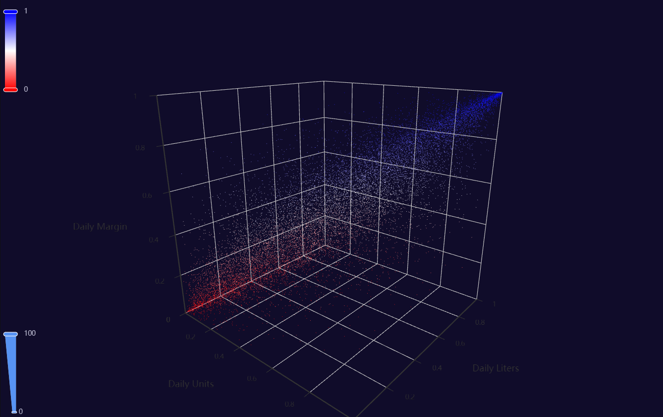
Copula3D
Click for code example
# Environment
import pkg_resources
import polars as pl
from QuickEcharts import Charts
from pyecharts.globals import CurrentConfig, NotebookType
CurrentConfig.NOTEBOOK_TYPE = 'jupyter_lab'
# Pull Data from Package
FilePath = "..FakeBevData.csv"
data = pl.read_csv(FilePath)
# Create Plot in Jupyter Lab
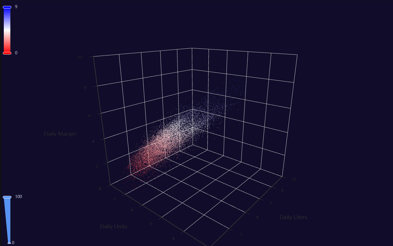
p1 = Charts.Copula3D(
dt = data,
SampleSize = 15000,
YVar = 'Daily Liters',
XVar = 'Daily Units',
ZVar = 'Daily Margin',
ColorMapVar = "ZVar",
AggMethod = 'mean',
RenderHTML = None,
RangeColor = ["red", "white", "blue"],
Theme = 'dark',
BackgroundColor = None,
Width = "1200px",
Height = "750px",
AnimationThreshold = 2000,
AnimationDuration = 1000,
AnimationEasing = "cubicOut",
AnimationDelay = 0,
AnimationDurationUpdate = 300,
AnimationEasingUpdate = "cubicOut",
AnimationDelayUpdate = 0)
# Needed to display
p1.load_javascript()
# In new cell
p1.render_notebook()
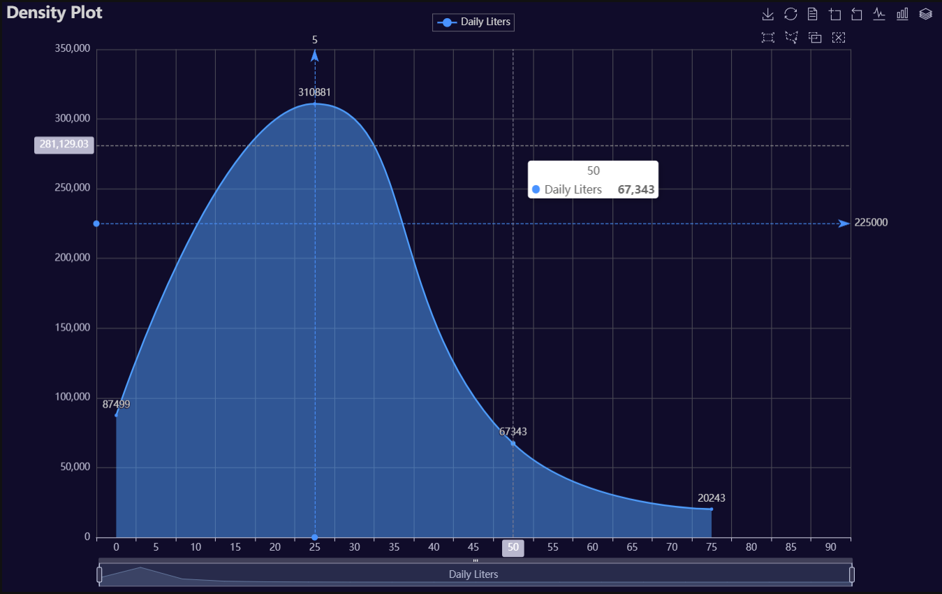
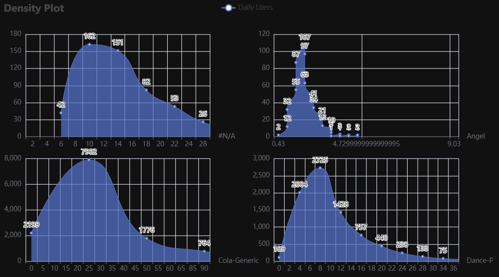
Density
Click for code example
# Environment
import pkg_resources
import polars as pl
from QuickEcharts import Charts
from pyecharts.globals import CurrentConfig, NotebookType
CurrentConfig.NOTEBOOK_TYPE = 'jupyter_lab'

# Pull Data from Package
FilePath = "..FakeBevData.csv"
data = pl.read_csv(FilePath)

# Create Plot in Jupyter Lab
p1 = Charts.Density(
  dt = data,
  SampleSize = 500000,
  YVar = "Daily Liters",
  GroupVar = None,
  FacetRows = 2,
  FacetCols = 2,
  FacetLevels = None,
  TimeLine = False,
  YVarTrans = "sqrt",
  RenderHTML = None,
  LineWidth = 2,
  FillOpacity = 0.5,
  Theme = 'dark',
  BackgroundColor = None,
  Width = "1200px",
  Height = "750px",
  ToolBox = True,
  Brush = True,
  DataZoom = True,
  Title = 'Density Plot',
  TitleColor = "lightgray",
  TitleFontSize = 20,
  SubTitle = None,
  SubTitleColor = "#fff",
  SubTitleFontSize = 12,
  AxisPointerType = 'cross',
  XAxisTitle = 'Daily Liters',
  XAxisNameLocation = 'middle',
  XAxisNameGap = 42,
  Legend = 'top',
  LegendPosRight = '0%',
  LegendPosTop = '2%',
  LegendBorderSize = 0.25,
  LegendTextColor = "lightgray",
  VerticalLine = 5,
  VerticalLineName = 'Line Name',
  HorizontalLine = 225000,
  HorizontalLineName = 'Line Name',
  AnimationThreshold = 2000,
  AnimationDuration = 1000,
  AnimationEasing = "cubicOut",
  AnimationDelay = 0,
  AnimationDurationUpdate = 300,
  AnimationEasingUpdate = "cubicOut",
  AnimationDelayUpdate = 0)

# Needed to display
p1.load_javascript()

# In new cell
p1.render_notebook()
# Environment
import pkg_resources
import polars as pl
from QuickEcharts import Charts
from pyecharts.globals import CurrentConfig, NotebookType
CurrentConfig.NOTEBOOK_TYPE = 'jupyter_lab'

# Pull Data from Package
FilePath = "..FakeBevData.csv"
data = pl.read_csv(FilePath)

# Create Plot in Jupyter Lab
p1 = Charts.Density(
  dt = data,
  SampleSize = 100000,
  YVar = "Daily Liters",
  GroupVar = 'Brand',
  FacetRows = 2,
  FacetCols = 2,
  FacetLevels = None,
  TimeLine = False,
  YVarTrans = "sqrt",
  RenderHTML = None,
  LineWidth = 2,
  FillOpacity = 0.5,
  Theme = 'wonderland',
  BackgroundColor = None,
  Width = None,
  Height = None,
  ToolBox = True,
  Brush = True,
  DataZoom = True,
  Title = 'Density Plot',
  TitleColor = "#fff",
  TitleFontSize = 20,
  SubTitle = None,
  SubTitleColor = "#fff",
  SubTitleFontSize = 12,
  AxisPointerType = 'cross',
  XAxisTitle = None,
  XAxisNameLocation = 'middle',
  XAxisNameGap = 42,
  Legend = None,
  LegendPosRight = '0%',
  LegendPosTop = '5%',
  LegendBorderSize = 1,
  LegendTextColor = "#fff",
  VerticalLine = None,
  VerticalLineName = 'Line Name',
  HorizontalLine = None,
  HorizontalLineName = 'Line Name',
  AnimationThreshold = 2000,
  AnimationDuration = 1000,
  AnimationEasing = "cubicOut",
  AnimationDelay = 0,
  AnimationDurationUpdate = 300,
  AnimationEasingUpdate = "cubicOut",
  AnimationDelayUpdate = 0)

# Needed to display
p1.load_javascript()

# In new cell
p1.render_notebook()
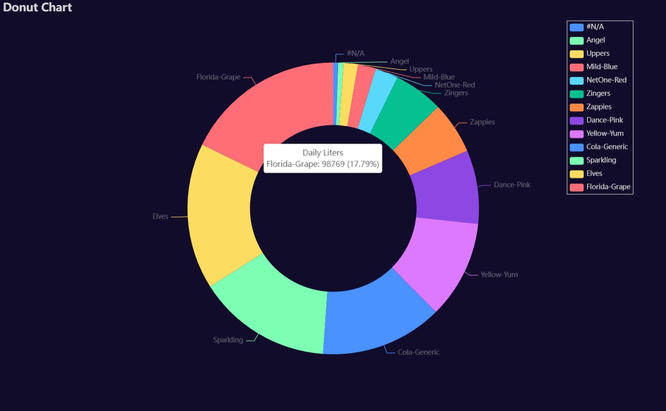
Donut
Click for code example
# Environment
import pkg_resources
import polars as pl
from QuickEcharts import Charts
from pyecharts.globals import CurrentConfig, NotebookType
CurrentConfig.NOTEBOOK_TYPE = 'jupyter_lab'

# Pull Data from Package
FilePath = "..FakeBevData.csv"
data = pl.read_csv(FilePath)

# Create Plot in Jupyter Lab
p1 = Charts.Donut(
  dt = data,
  PreAgg = False,
  YVar = 'Daily Liters',
  GroupVar = 'Brand',
  AggMethod = 'count',
  YVarTrans = "Identity",
  RenderHTML = None,
  Theme = 'dark',
  BackgroundColor = None,
  Width = "1200px",
  Height = "750px",
  Title = 'Donut Chart',
  TitleColor = "lightgray",
  TitleFontSize = 20,
  SubTitle = None,
  SubTitleColor = "#fff",
  SubTitleFontSize = 12,
  Legend = 'right',
  LegendPosRight = '5%',
  LegendPosTop = '5%',
  LegendBorderSize = 1,
  LegendTextColor = "lightgray",
  AnimationThreshold = 2000,
  AnimationDuration = 1000,
  AnimationEasing = "cubicOut",
  AnimationDelay = 0,
  AnimationDurationUpdate = 300,
  AnimationEasingUpdate = "cubicOut",
  AnimationDelayUpdate = 0)

# Needed to display
p1.load_javascript()

# In new cell
p1.render_notebook()
Funnel
Click for code example
# Environment
import pkg_resources
import polars as pl
from QuickEcharts import Charts
from pyecharts.globals import CurrentConfig, NotebookType
CurrentConfig.NOTEBOOK_TYPE = 'jupyter_lab'
# Pull Data from Package
FilePath = "..FakeBevData.csv"
data = pl.read_csv(FilePath)
# Create Plot in Jupyter Lab
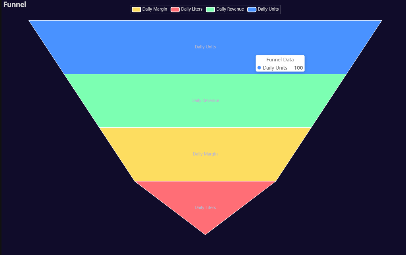
p1 = Charts.Funnel(
dt = data,
CategoryVar = ['Daily Units', 'Daily Revenue', 'Daily Margin', 'Daily Liters'],
ValuesVar = [100, 80, 60, 40],
RenderHTML = None,
SeriesLabel = "Funnel Data",
SortStyle = 'descending',
Theme = 'dark',
BackgroundColor = None,
Width = "1200px",
Height = "750px",
Title = "Funnel",
TitleColor = "lightgray",
TitleFontSize = 20,
Legend = 'top',
LegendPosRight = '0%',
LegendPosTop = '2%',
LegendBorderSize = 0.25,
LegendTextColor = "lightgray",
AnimationThreshold = 2000,
AnimationDuration = 1000,
AnimationEasing = "cubicOut",
AnimationDelay = 0,
AnimationDurationUpdate = 300,
AnimationEasingUpdate = "cubicOut",
AnimationDelayUpdate = 0)
# Needed to display
p1.load_javascript()
# In new cell
p1.render_notebook()
# Environment
import pkg_resources
import polars as pl
from QuickEcharts import Charts
from pyecharts.globals import CurrentConfig, NotebookType
CurrentConfig.NOTEBOOK_TYPE = 'jupyter_lab'
# Pull Data from Package
FilePath = "..FakeBevData.csv"
data = pl.read_csv(FilePath)
# Create Plot in Jupyter Lab
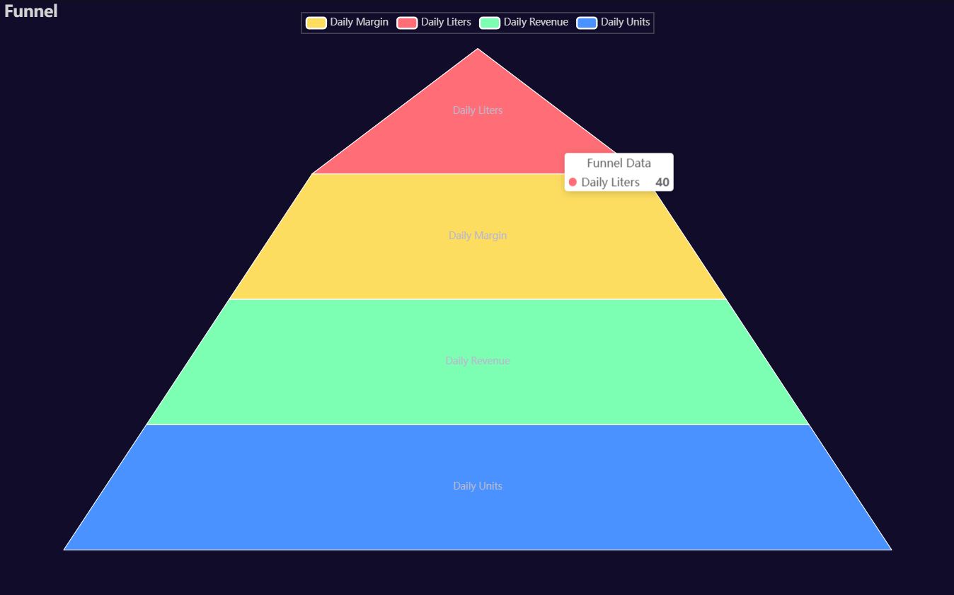
p1 = Charts.Funnel(
dt = data,
CategoryVar = ['Daily Units', 'Daily Revenue', 'Daily Margin', 'Daily Liters'],
ValuesVar = [100, 80, 60, 40],
RenderHTML = None,
SeriesLabel = "Funnel Data",
SortStyle = 'ascending',
Theme = 'dark',
BackgroundColor = None,
Width = "1200px",
Height = "750px",
Title = "Funnel",
TitleColor = "lightgray",
TitleFontSize = 20,
Legend = 'top',
LegendPosRight = '0%',
LegendPosTop = '2%',
LegendBorderSize = 0.25,
LegendTextColor = "lightgray",
AnimationThreshold = 2000,
AnimationDuration = 1000,
AnimationEasing = "cubicOut",
AnimationDelay = 0,
AnimationDurationUpdate = 300,
AnimationEasingUpdate = "cubicOut",
AnimationDelayUpdate = 0)
# Needed to display
p1.load_javascript()
# In new cell
p1.render_notebook()
Heatmap
Click for code example
# Environment
import pkg_resources
import polars as pl
from QuickEcharts import Charts
from pyecharts.globals import CurrentConfig, NotebookType
CurrentConfig.NOTEBOOK_TYPE = 'jupyter_lab'

# Pull Data from Package
FilePath = "..FakeBevData.csv"
data = pl.read_csv(FilePath)

# Create Plot in Jupyter Lab
p1 = Charts.Heatmap(
  dt = data,
  PreAgg = False,
  YVar = 'Brand',
  XVar = 'Category',
  MeasureVar = 'Daily Liters',
  AggMethod = 'mean',
  MeasureVarTrans = "Identity",
  RenderHTML = None,
  ShowLabels = False,
  LabelPosition = "top",
  LabelColor = "#fff",
  Theme = 'dark',
  RangeColor = ["#5b5b5b5d", "#00c4ff", "#9cff00"],
  BackgroundColor = None,
  Width = "1200px",
  Height = "750px",
  ToolBox = True,
  Brush = True,
  DataZoom = True,
  Title = 'Heatmap',
  TitleColor = "lightgray",
  TitleFontSize = 20,
  SubTitle = None,
  SubTitleColor = "#fff",
  SubTitleFontSize = 12,
  AxisPointerType = 'cross',
  YAxisTitle = None,
  YAxisNameLocation = 'middle',
  YAxisNameGap = 70,
  XAxisTitle = None,
  XAxisNameLocation = 'middle',
  XAxisNameGap = 42,
  Legend = 'top',
  LegendPosRight = '0%',
  LegendPosTop = '2%',
  LegendBorderSize = 0.25,
  LegendTextColor = "lightgray",
  AnimationThreshold = 2000,
  AnimationDuration = 1000,
  AnimationEasing = "cubicOut",
  AnimationDelay = 0,
  AnimationDurationUpdate = 300,
  AnimationEasingUpdate = "cubicOut",
  AnimationDelayUpdate = 0)

# Needed to display
p1.load_javascript()

# In new cell
p1.render_notebook()

Histogram
Click for code example
# Environment
import pkg_resources
import polars as pl
from QuickEcharts import Charts
from pyecharts.globals import CurrentConfig, NotebookType
CurrentConfig.NOTEBOOK_TYPE = 'jupyter_lab'
# Pull Data from Package
FilePath = "..FakeBevData.csv"
data = pl.read_csv(FilePath)
# Create Plot in Jupyter Lab
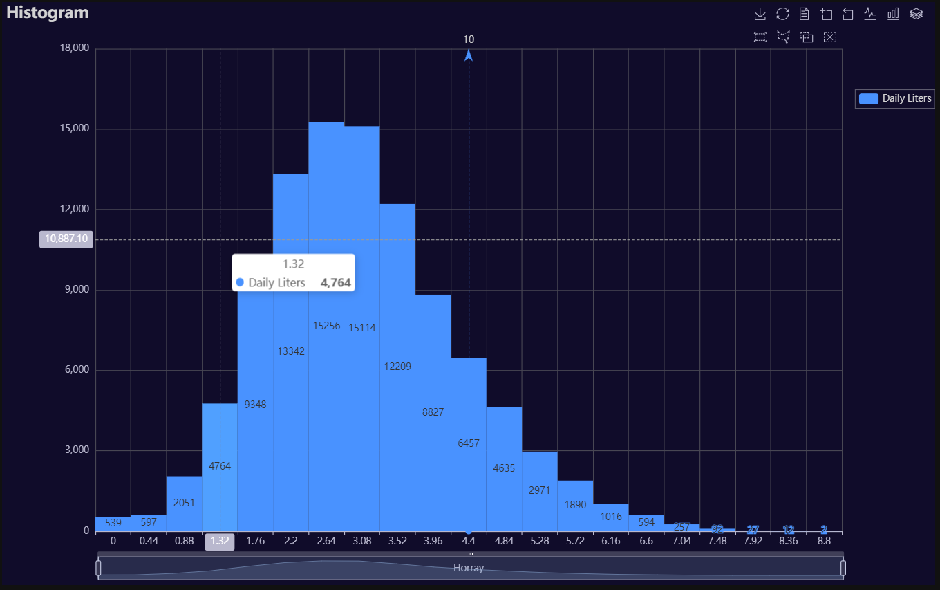
p1 = Charts.Histogram(
dt = data,
SampleSize = 100000,
YVar = "Daily Liters",
GroupVar = None,
FacetRows = 2,
FacetCols = 2,
FacetLevels = None,
TimeLine = False,
YVarTrans = "logmin",
RenderHTML = True,
Theme = 'dark',
CategoryGap = "0%",
BackgroundColor = None,
Width = "1200px",
Height = "750px",
ToolBox = True,
Brush = True,
DataZoom = True,
Title = 'Histogram',
TitleColor = "lightgray",
TitleFontSize = 20,
SubTitle = None,
SubTitleColor = "#fff",
SubTitleFontSize = 12,
AxisPointerType = 'cross',
XAxisTitle = "Horray",
XAxisNameLocation = 'middle',
XAxisNameGap = 42,
Legend = 'right',
LegendPosRight = '0%',
LegendPosTop = '15%',
LegendBorderSize = 0.25,
LegendTextColor = "lightgray",
VerticalLine = 10,
VerticalLineName = 'Line Name',
HorizontalLine = 40000,
HorizontalLineName = 'Line Name',
AnimationThreshold = 2000,
AnimationDuration = 1000,
AnimationEasing = "elasticOut",
AnimationDelay = 0,
AnimationDurationUpdate = 300,
AnimationEasingUpdate = "cubicOut",
AnimationDelayUpdate = 0)
# Needed to display
p1.load_javascript()
# In new cell
p1.render_notebook()
# Environment
import pkg_resources
import polars as pl
from QuickEcharts import Charts
from pyecharts.globals import CurrentConfig, NotebookType
CurrentConfig.NOTEBOOK_TYPE = 'jupyter_lab'
# Pull Data from Package
FilePath = "..FakeBevData.csv"
data = pl.read_csv(FilePath)
# Create Plot in Jupyter Lab
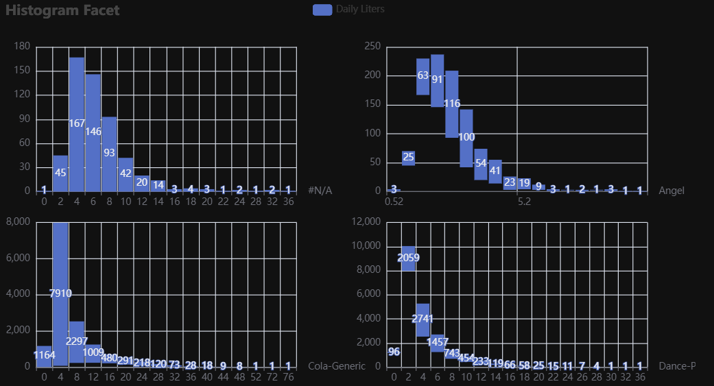
p1 = Charts.Histogram(
dt = data,
SampleSize = 500000,
YVar = 'Daily Liters',
GroupVar = 'Brand',
FacetRows = 2,
FacetCols = 2,
FacetLevels = None,
TimeLine = False,
YVarTrans = None,
RenderHTML = False
NumberBins = 20,
CategoryGap = "10%",
Theme = 'wonderland',
BackgroundColor = "#000",
Width = None,
Height = None,
ToolBox = True,
Brush = True,
DataZoom = True,
Title = 'Histogram',
TitleColor = "#fff",
TitleFontSize = 20,
SubTitle = None,
SubTitleColor = "#fff",
SubTitleFontSize = 12,
AxisPointerType = 'cross',
XAxisTitle = None,
XAxisNameLocation = 'middle',
XAxisNameGap = 42,
Legend = 'top',
LegendPosRight = '0%',
LegendPosTop = '5%',
LegendBorderSize = 1,
LegendTextColor = "#fff",
VerticalLine = None,
VerticalLineName = 'Line Name',
HorizontalLine = None,
HorizontalLineName = 'Line Name',
AnimationThreshold = 2000,
AnimationDuration = 1000,
AnimationEasing = "cubicOut",
AnimationDelay = 0,
AnimationDurationUpdate = 300,
AnimationEasingUpdate = "cubicOut",
AnimationDelayUpdate = 0)
# Needed to display
p1.load_javascript()
# In new cell
p1.render_notebook()
Line
Click for code example
# Environment
import pkg_resources
import polars as pl
from QuickEcharts import Charts
from pyecharts.globals import CurrentConfig, NotebookType
CurrentConfig.NOTEBOOK_TYPE = 'jupyter_lab'
# Pull Data from Package
FilePath = "..FakeBevData.csv"
data = pl.read_csv(FilePath)
# Create Plot in Jupyter Lab
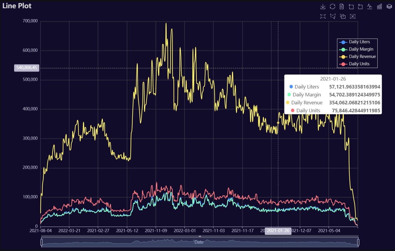
p1 = Charts.Line(
dt = data,
PreAgg = False,
YVar = ['Daily Liters', 'Daily Margin', 'Daily Revenue', 'Daily Units'],
XVar = 'Date',
GroupVar = None,
FacetRows = 1,
FacetCols = 1,
FacetLevels = None,
TimeLine = False,
AggMethod = 'sum',
YVarTrans = "Identity",
RenderHTML = None,
SmoothLine = True,
LineWidth = 2,
Symbol = None,
SymbolSize = 6,
ShowLabels = False,
LabelPosition = "top",
Theme = 'dark',
BackgroundColor = None,
Width = "1200px",
Height = "750px",
ToolBox = True,
Brush = True,
DataZoom = True,
Title = 'Line Plot',
TitleColor = "lightgray",
TitleFontSize = 20,
SubTitle = None,
SubTitleColor = "#fff",
SubTitleFontSize = 12,
AxisPointerType = 'cross',
YAxisTitle = None,
YAxisNameLocation = 'middle',
YAxisNameGap = 70,
XAxisTitle = 'Date',
XAxisNameLocation = 'middle',
XAxisNameGap = 42,
Legend = 'right',
LegendPosRight = '5%',
LegendPosTop = '15%',
LegendBorderSize = 1,
LegendTextColor = "lightgray",
VerticalLine = None,
VerticalLineName = 'Line Name',
HorizontalLine = None,
HorizontalLineName = 'Line Name',
AnimationThreshold = 2000,
AnimationDuration = 1000,
AnimationEasing = "cubicOut",
AnimationDelay = 0,
AnimationDurationUpdate = 300,
AnimationEasingUpdate = "cubicOut",
AnimationDelayUpdate = 0)
# Needed to display
p1.load_javascript()
# In new cell
p1.render_notebook()
# Environment
import pkg_resources
import polars as pl
from QuickEcharts import Charts
from pyecharts.globals import CurrentConfig, NotebookType
CurrentConfig.NOTEBOOK_TYPE = 'jupyter_lab'
# Pull Data from Package
FilePath = "..FakeBevData.csv"
data = pl.read_csv(FilePath)
# Create Plot in Jupyter Lab
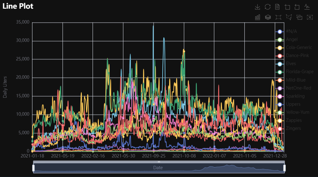
p1 = Charts.Line(
dt = data,
PreAgg = False,
YVar = 'Daily Liters',
XVar = 'Date',
GroupVar = 'Brand',
FacetRows = 1,
FacetCols = 1,
FacetLevels = None,
TimeLine = False,
AggMethod = 'sum',
YVarTrans = "Identity",
RenderHTML = None,
SmoothLine = True,
LineWidth = 2,
Symbol = "emptyCircle",
SymbolSize = 6,
ShowLabels = False,
LabelPosition = "top",
Theme = 'wonderland',
BackgroundColor = None,
Width = None,
Height = None,
ToolBox = True,
Brush = True,
DataZoom = True,
Title = 'Line Plot',
TitleColor = "#fff",
TitleFontSize = 20,
SubTitle = None,
SubTitleColor = "#fff",
SubTitleFontSize = 12,
AxisPointerType = 'cross',
YAxisTitle = None,
YAxisNameLocation = 'middle',
YAxisNameGap = 70,
XAxisTitle = None,
XAxisNameLocation = 'middle',
XAxisNameGap = 42,
Legend = None,
LegendPosRight = '0%',
LegendPosTop = '5%',
LegendBorderSize = 1,
LegendTextColor = "#fff",
VerticalLine = None,
VerticalLineName = 'Line Name',
HorizontalLine = None,
HorizontalLineName = 'Line Name',
AnimationThreshold = 2000,
AnimationDuration = 1000,
AnimationEasing = "cubicOut",
AnimationDelay = 0,
AnimationDurationUpdate = 300,
AnimationEasingUpdate = "cubicOut",
AnimationDelayUpdate = 0)
# Needed to display
p1.load_javascript()
# In new cell
p1.render_notebook()
# Environment
import pkg_resources
import polars as pl
from QuickEcharts import Charts
from pyecharts.globals import CurrentConfig, NotebookType
CurrentConfig.NOTEBOOK_TYPE = 'jupyter_lab'
# Pull Data from Package
FilePath = "..FakeBevData.csv"
data = pl.read_csv(FilePath)
# Create Plot in Jupyter Lab
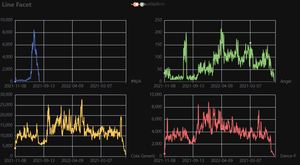
p1 = Charts.Line(
dt = data,
PreAgg = False,
YVar = 'Daily Liters',
XVar = 'Date',
GroupVar = 'Brand',
FacetRows = 2,
FacetCols = 2,
FacetLevels = None,
TimeLine = False,
AggMethod = 'sum',
YVarTrans = "Identity",
RenderHTML = None,
SmoothLine = True,
LineWidth = 2,
Symbol = "emptyCircle",
SymbolSize = 6,
ShowLabels = False,
LabelPosition = "top",
Theme = 'wonderland',
BackgroundColor = None,
Width = None,
Height = None,
ToolBox = True,
Brush = True,
DataZoom = True,
Title = 'Line Plot',
TitleColor = "#fff",
TitleFontSize = 20,
SubTitle = None,
SubTitleColor = "#fff",
SubTitleFontSize = 12,
AxisPointerType = 'cross',
YAxisTitle = None,
YAxisNameLocation = 'middle',
YAxisNameGap = 70,
XAxisTitle = None,
XAxisNameLocation = 'middle',
XAxisNameGap = 42,
Legend = None,
LegendPosRight = '0%',
LegendPosTop = '5%',
LegendBorderSize = 1,
LegendTextColor = "#fff",
VerticalLine = None,
VerticalLineName = 'Line Name',
HorizontalLine = None,
HorizontalLineName = 'Line Name',
AnimationThreshold = 2000,
AnimationDuration = 1000,
AnimationEasing = "cubicOut",
AnimationDelay = 0,
AnimationDurationUpdate = 300,
AnimationEasingUpdate = "cubicOut",
AnimationDelayUpdate = 0)
# Needed to display
p1.load_javascript()
# In new cell
p1.render_notebook()
Parallel
Click for code example
# Environment
import pkg_resources
import polars as pl
from QuickEcharts import Charts
from pyecharts.globals import CurrentConfig, NotebookType
CurrentConfig.NOTEBOOK_TYPE = 'jupyter_lab'
# Pull Data from Package
FilePath = "..FakeBevData.csv"
data = pl.read_csv(FilePath)
# Create Plot in Jupyter Lab
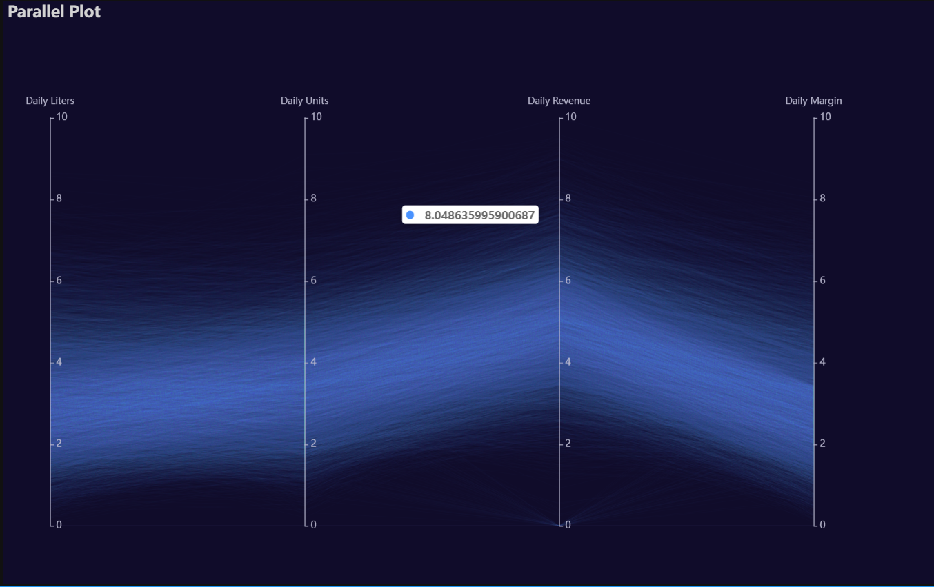
p1 = Charts.Parallel(
dt = data,
SampleSize = 15000,
Vars = ['Daily Liters', 'Daily Units', 'Daily Revenue', 'Daily Margin'],
VarsTrans = ['logmin'] * 4,
RenderHTML = None,
SymbolSize = 6,
Opacity = 0.05,
LineWidth = 0.20,
Theme = 'dark',
BackgroundColor = None,
Width = "1200px",
Height = "750px",
Title = 'Parallel Plot',
TitleColor = "lightgray",
TitleFontSize = 20,
SubTitle = None,
SubTitleColor = "#fff",
SubTitleFontSize = 12,
AnimationThreshold = 2000,
AnimationDuration = 1000,
AnimationEasing = "cubicOut",
AnimationDelay = 0,
AnimationDurationUpdate = 300,
AnimationEasingUpdate = "cubicOut",
AnimationDelayUpdate = 0)
# Needed to display
p1.load_javascript()
# In new cell
p1.render_notebook()
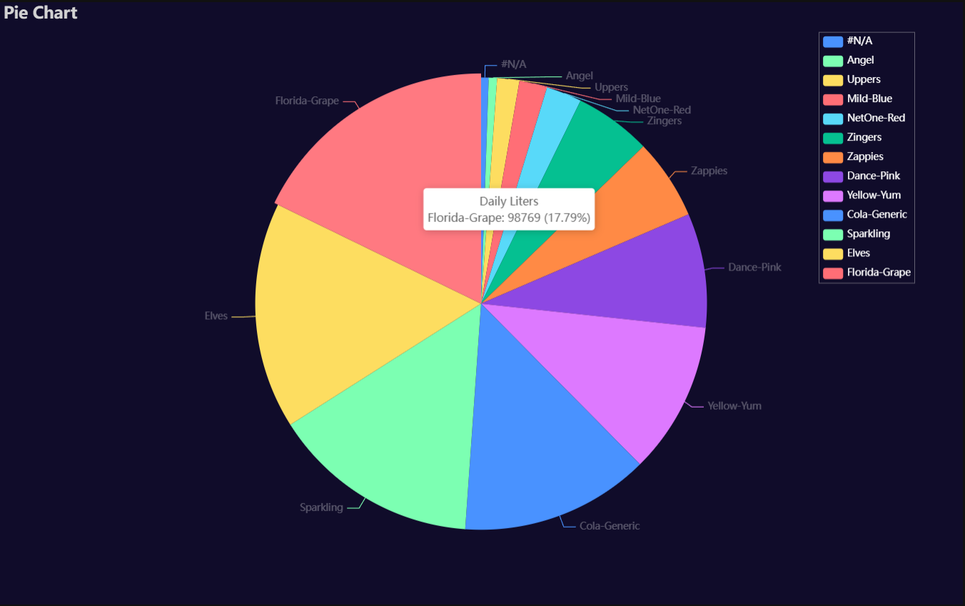
Pie
Click for code example
# Environment
import pkg_resources
import polars as pl
from QuickEcharts import Charts
from pyecharts.globals import CurrentConfig, NotebookType
CurrentConfig.NOTEBOOK_TYPE = 'jupyter_lab'

# Pull Data from Package
FilePath = "..FakeBevData.csv"
data = pl.read_csv(FilePath)

# Create Plot in Jupyter Lab
p1 = Charts.Pie(
  dt = data,
  PreAgg = False,
  YVar = 'Daily Liters',
  GroupVar = 'Brand',
  AggMethod = 'count',
  YVarTrans = None,
  RenderHTML = None,
  Theme = 'dark',
  BackgroundColor = None,
  Width = "1200px",
  Height = "750px",
  Title = 'Pie Chart',
  TitleColor = "lightgray",
  TitleFontSize = 20,
  SubTitle = None,
  SubTitleColor = "#fff",
  SubTitleFontSize = 12,
  Legend = "right",
  LegendPosRight = '5%',
  LegendPosTop = '5%',
  LegendBorderSize = 0.25,
  LegendTextColor = "#fff",
  AnimationThreshold = 2000,
  AnimationDuration = 1000,
  AnimationEasing = "cubicOut",
  AnimationDelay = 0,
  AnimationDurationUpdate = 300,
  AnimationEasingUpdate = "cubicOut",
  AnimationDelayUpdate = 0)

# Needed to display
p1.load_javascript()

# In new cell
p1.render_notebook()
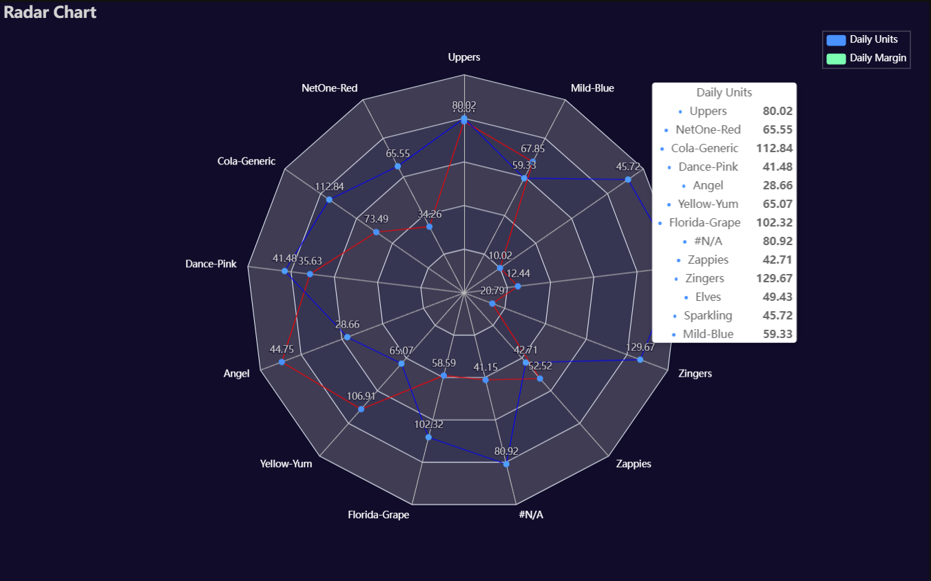
Radar
Click for code example
# Environment
import pkg_resources
import polars as pl
from QuickEcharts import Charts
from pyecharts.globals import CurrentConfig, NotebookType
CurrentConfig.NOTEBOOK_TYPE = 'jupyter_lab'

# Pull Data from Package
FilePath = "..FakeBevData.csv"
data = pl.read_csv(FilePath)

# Create Plot in Jupyter Lab
p1 = Charts.Radar(
  dt = data,
  YVar = ['Daily Liters', 'Daily Margin'],
  GroupVar = 'Brand',
  AggMethod = 'mean',
  YVarTrans = None,
  RenderHTML = None,
  LabelColor = '#fff',
  LineColors = ["#ed1690", "#8e5fa8", "#00a6fb", "#213f7f", "#22c0df"],
  Theme = 'dark',
  BackgroundColor = None,
  Width = "1200px",
  Height = "750px",
  Title = 'Radar Chart',
  TitleColor = "lightgray",
  TitleFontSize = 20,
  SubTitle = None,
  SubTitleColor = "#fff",
  SubTitleFontSize = 12,
  Legend = 'right',
  LegendPosRight = '2%',
  LegendPosTop = '5%',
  LegendBorderSize = 0.25,
  LegendTextColor = "#fff",
  AnimationThreshold = 2000,
  AnimationDuration = 1000,
  AnimationEasing = "cubicOut",
  AnimationDelay = 0,
  AnimationDurationUpdate = 300,
  AnimationEasingUpdate = "cubicOut",
  AnimationDelayUpdate = 0)

# Needed to display
p1.load_javascript()

# In new cell
p1.render_notebook()
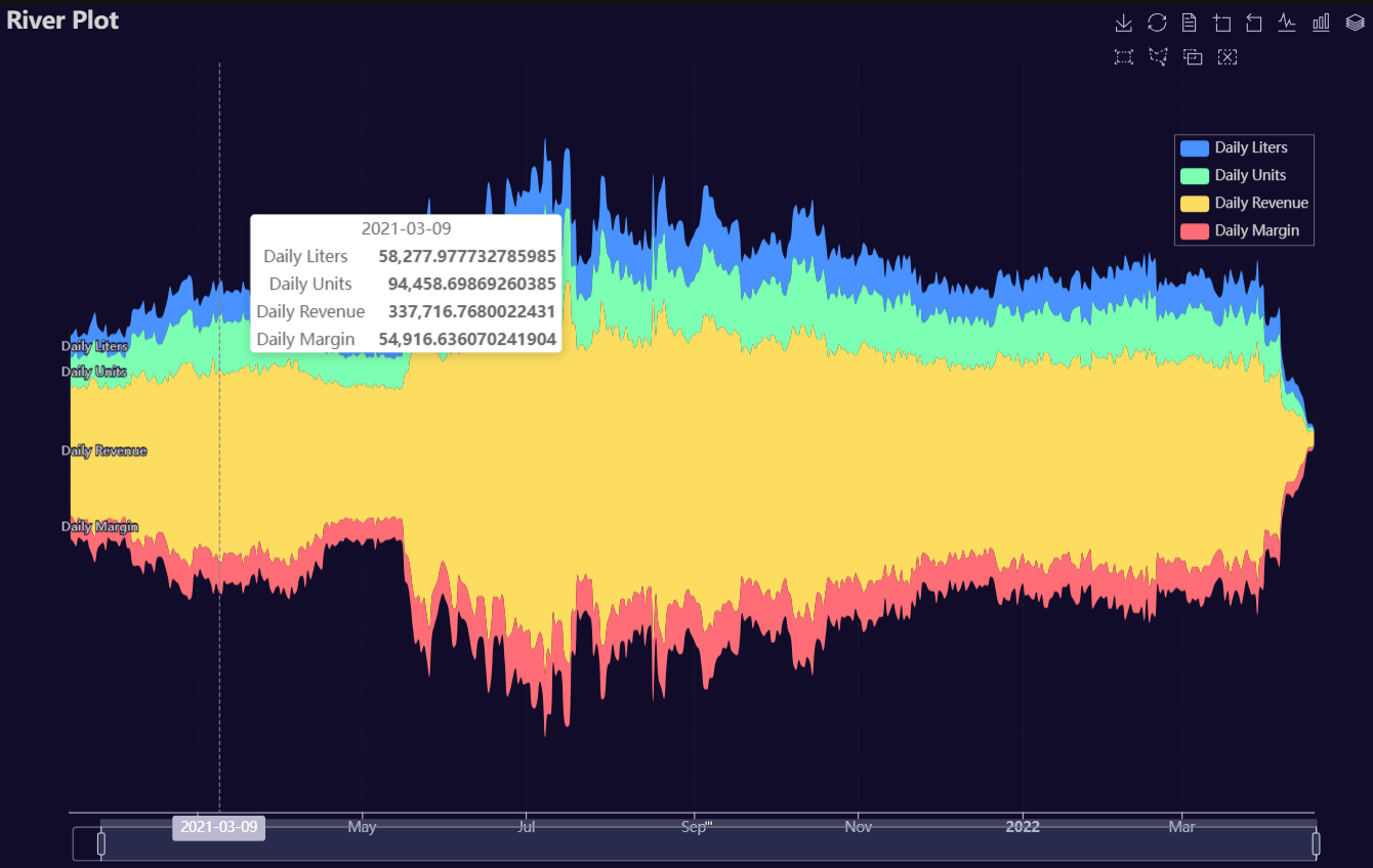
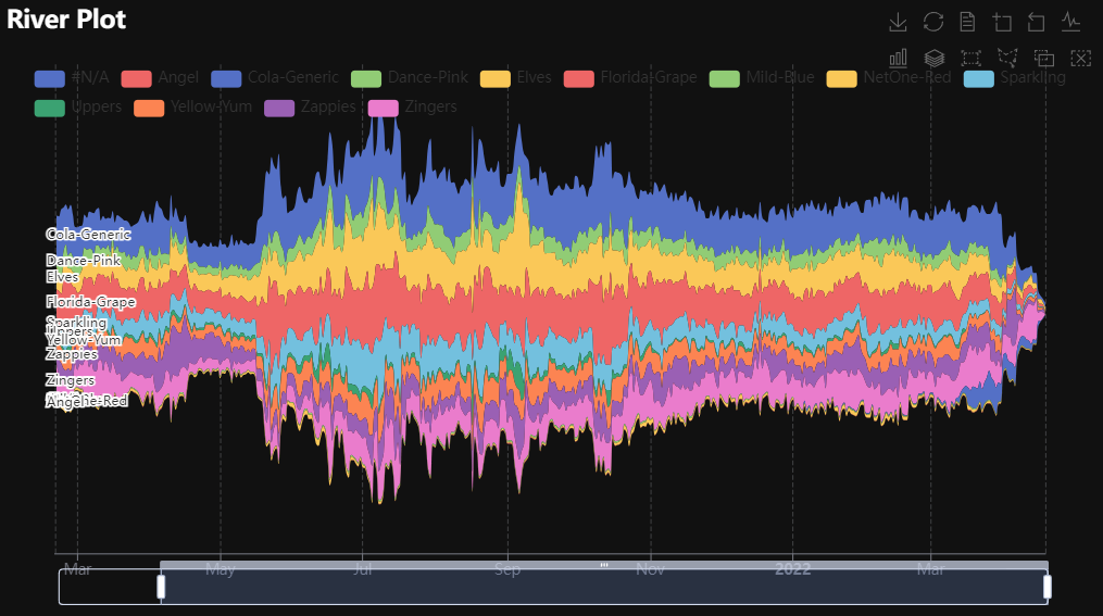
River
Click for code example
# Environment
import pkg_resources
import polars as pl
from QuickEcharts import Charts
from pyecharts.globals import CurrentConfig, NotebookType
CurrentConfig.NOTEBOOK_TYPE = 'jupyter_lab'

# Pull Data from Package
FilePath = "..FakeBevData.csv"
data = pl.read_csv(FilePath)

# Create Plot in Jupyter Lab
p1 = Charts.River(
  dt = data,
  PreAgg = False,
  YVars = ['Daily Liters', 'Daily Units', 'Daily Revenue', 'Daily Margin'],
  DateVar = 'Date',
  GroupVar = None,
  AggMethod = "sum",
  YVarTrans = None,
  RenderHTML = None,
  Theme = 'dark',
  BackgroundColor = None,
  Width = "1200px",
  Height = "750px",
  ToolBox = True,
  Brush = True,
  DataZoom = True,
  AxisPointerType = "cross",
  Title = "River Plot",
  TitleColor = "lightgray",
  TitleFontSize = 20,
  SubTitle = None,
  SubTitleColor = "#fff",
  SubTitleFontSize = 12,
  Legend = 'right',
  LegendPosRight = '5%',
  LegendPosTop = '15%',
  LegendBorderSize = 0.25,
  LegendTextColor = "lightgray",
  AnimationThreshold = 2000,
  AnimationDuration = 1000,
  AnimationEasing = "cubicOut",
  AnimationDelay = 0,
  AnimationDurationUpdate = 300,
  AnimationEasingUpdate = "cubicOut",
  AnimationDelayUpdate = 0)

# Needed to display
p1.load_javascript()

# In new cell
p1.render_notebook()
# Environment
import pkg_resources
import polars as pl
from QuickEcharts import Charts
from pyecharts.globals import CurrentConfig, NotebookType
CurrentConfig.NOTEBOOK_TYPE = 'jupyter_lab'

# Pull Data from Package
FilePath = "..FakeBevData.csv"
data = pl.read_csv(FilePath)

# Create Plot in Jupyter Lab
p1 = Charts.River(
  dt = data,
  PreAgg = False,
  YVars = 'Daily Liters',
  DateVar = 'Date',
  GroupVar = 'Brand',
  AggMethod = "sum",
  YVarTrans = None,
  RenderHTML = None,
  Theme = 'wonderland',
  BackgroundColor = None,
  ToolBox = True,
  Brush = True,
  DataZoom = True,
  Width = None,
  Height = None,
  AxisPointerType = "cross",
  Title = "River Plot",
  TitleColor = "#fff",
  TitleFontSize = 20,
  SubTitle = None,
  SubTitleColor = "#fff",
  SubTitleFontSize = 12,
  Legend = None,
  LegendPosRight = '0%',
  LegendPosTop = '5%',
  LegendBorderSize = 1,
  LegendTextColor = "#fff",
  AnimationThreshold = 2000,
  AnimationDuration = 1000,
  AnimationEasing = "cubicOut",
  AnimationDelay = 0,
  AnimationDurationUpdate = 300,
  AnimationEasingUpdate = "cubicOut",
  AnimationDelayUpdate = 0)

# Needed to display
p1.load_javascript()

# In new cell
p1.render_notebook()
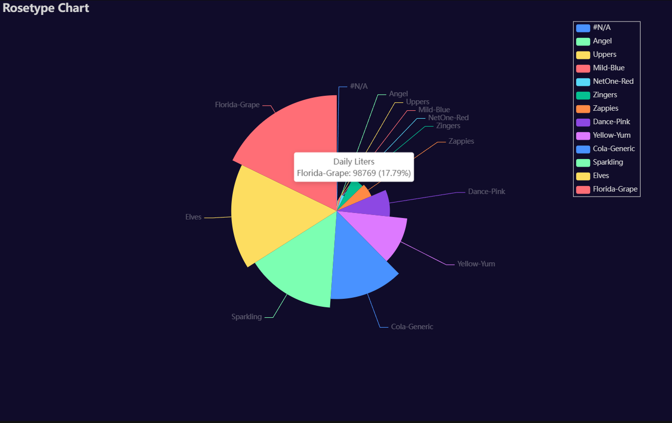
Rosetype
Click for code example
# Environment
import pkg_resources
import polars as pl
from QuickEcharts import Charts
from pyecharts.globals import CurrentConfig, NotebookType
CurrentConfig.NOTEBOOK_TYPE = 'jupyter_lab'

# Pull Data from Package
FilePath = "..FakeBevData.csv"
data = pl.read_csv(FilePath)

# Create Plot in Jupyter Lab
p1 = Charts.Rosetype(
  dt = data,
  PreAgg = False,
  YVar = 'Daily Liters',
  GroupVar = 'Brand',
  AggMethod = 'count',
  YVarTrans = "Identity",
  RenderHTML = None,
  Type = "radius",
  Radius = "55%",
  Theme = 'dark',
  BackgroundColor = None,
  Width = "1200px",
  Height = "750px",
  Title = 'Rosetype Chart',
  TitleColor = "lightgray",
  TitleFontSize = 20,
  SubTitle = None,
  SubTitleColor = "#fff",
  SubTitleFontSize = 12,
  Legend = 'right',
  LegendPosRight = '5%',
  LegendPosTop = '5%',
  LegendBorderSize = 1,
  LegendTextColor = "lightgray",
  AnimationThreshold = 2000,
  AnimationDuration = 1000,
  AnimationEasing = "cubicOut",
  AnimationDelay = 0,
  AnimationDurationUpdate = 300,
  AnimationEasingUpdate = "cubicOut",
  AnimationDelayUpdate = 0)

# Needed to display
p1.load_javascript()

# In new cell
p1.render_notebook()
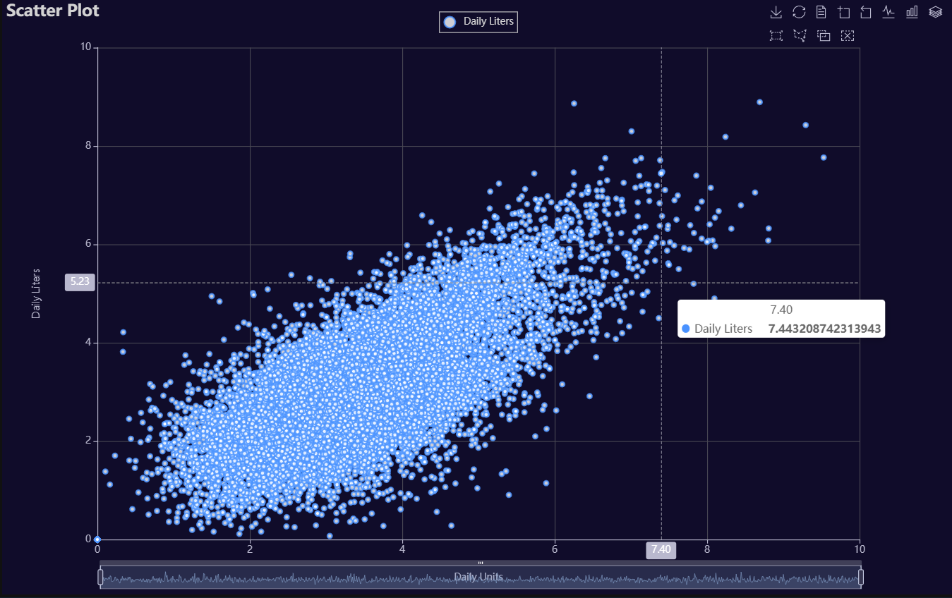
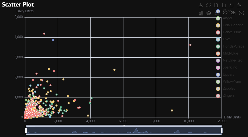
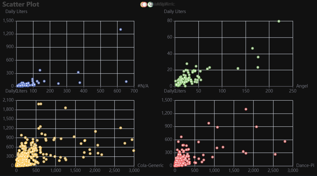
Scatter
Click for code example
# Environment
import pkg_resources
import polars as pl
from QuickEcharts import Charts
from pyecharts.globals import CurrentConfig, NotebookType
CurrentConfig.NOTEBOOK_TYPE = 'jupyter_lab'

# Pull Data from Package
FilePath = "..FakeBevData.csv"
data = pl.read_csv(FilePath)

# Create Plot in Jupyter Lab
p1 = Charts.Scatter(
  dt = data,
  SampleSize = 15000,
  YVar = 'Daily Liters',
  XVar = 'Daily Units',
  GroupVar = None,
  FacetRows = 1,
  FacetCols = 1,
  FacetLevels = None,
  TimeLine = False,
  AggMethod = 'mean',
  YVarTrans = "logmin",
  XVarTrans = "logmin",
  RenderHTML = None,
  LineWidth = 2,
  Symbol = "emptyCircle",
  SymbolSize = 6,
  ShowLabels = False,
  LabelPosition = "top",
  Theme = 'dark',
  BackgroundColor = None,
  Width = "1200px",
  Height = "750px",
  ToolBox = True,
  Brush = True,
  DataZoom = True,
  Title = 'Scatter Plot',
  TitleColor = "lightgray",
  TitleFontSize = 20,
  SubTitle = None,
  SubTitleColor = "#fff",
  SubTitleFontSize = 12,
  AxisPointerType = 'cross',
  YAxisTitle = 'Daily Liters',
  YAxisNameLocation = 'middle',
  YAxisNameGap = 70,
  XAxisTitle = 'Daily Units',
  XAxisNameLocation = 'middle',
  XAxisNameGap = 42,
  Legend = 'top',
  LegendPosRight = '0%',
  LegendPosTop = '2%',
  LegendBorderSize = 1,
  LegendTextColor = "lightgray",
  VerticalLine = None,
  VerticalLineName = 'Line Name',
  HorizontalLine = None,
  HorizontalLineName = 'Line Name',
  AnimationThreshold = 2000,
  AnimationDuration = 1000,
  AnimationEasing = "cubicOut",
  AnimationDelay = 0,
  AnimationDurationUpdate = 300,
  AnimationEasingUpdate = "cubicOut",
  AnimationDelayUpdate = 0)

# Needed to display
p1.load_javascript()

# In new cell
p1.render_notebook()
# Environment
import pkg_resources
import polars as pl
from QuickEcharts import Charts
from pyecharts.globals import CurrentConfig, NotebookType
CurrentConfig.NOTEBOOK_TYPE = 'jupyter_lab'

# Pull Data from Package
FilePath = "..FakeBevData.csv"
data = pl.read_csv(FilePath)

# Create Plot in Jupyter Lab
p1 = Charts.Scatter(
  dt = data,
  SampleSize = 15000,
  YVar = 'Daily Liters',
  XVar = 'Daily Units',
  GroupVar = 'Brand',
  FacetRows = 1,
  FacetCols = 1,
  FacetLevels = None,
  TimeLine = False,
  AggMethod = 'mean',
  YVarTrans = "Identity",
  XVarTrans = "Identity",
  RenderHTML = None,
  Symbol = "emptyCircle",
  SymbolSize = 6,
  ShowLabels = False,
  LabelPosition = "top",
  Theme = 'wonderland',
  BackgroundColor = None,
  Width = None,
  Height = None,
  ToolBox = True,
  Brush = True,
  DataZoom = True,
  Title = 'Scatter Plot',
  TitleColor = "#fff",
  TitleFontSize = 20,
  SubTitle = None,
  SubTitleColor = "#fff",
  SubTitleFontSize = 12,
  AxisPointerType = 'cross',
  YAxisTitle = None,
  YAxisNameLocation = 'middle',
  YAxisNameGap = 70,
  XAxisTitle = None,
  XAxisNameLocation = 'middle',
  XAxisNameGap = 42,
  Legend = None,
  LegendPosRight = '0%',
  LegendPosTop = '5%',
  LegendBorderSize = 1,
  LegendTextColor = "#fff",
  VerticalLine = None,
  VerticalLineName = 'Line Name',
  HorizontalLine = None,
  HorizontalLineName = 'Line Name',
  AnimationThreshold = 2000,
  AnimationDuration = 1000,
  AnimationEasing = "cubicOut",
  AnimationDelay = 0,
  AnimationDurationUpdate = 300,
  AnimationEasingUpdate = "cubicOut",
  AnimationDelayUpdate = 0)

# Needed to display
p1.load_javascript()

# In new cell
p1.render_notebook()
# Environment
import pkg_resources
import polars as pl
from QuickEcharts import Charts
from pyecharts.globals import CurrentConfig, NotebookType
CurrentConfig.NOTEBOOK_TYPE = 'jupyter_lab'

# Pull Data from Package
FilePath = "..FakeBevData.csv"
data = pl.read_csv(FilePath)

# Create Plot in Jupyter Lab
p1 = Charts.Scatter(
  dt = data,
  SampleSize = 15000,
  YVar = 'Daily Liters',
  XVar = 'Daily Units',
  GroupVar = 'Brand',
  FacetRows = 2,
  FacetCols = 2,
  FacetLevels = None,
  TimeLine = False,
  AggMethod = 'mean',
  YVarTrans = "Identity",
  XVarTrans = "Identity",
  RenderHTML = None,
  Symbol = "emptyCircle",
  SymbolSize = 6,
  ShowLabels = False,
  LabelPosition = "top",
  Theme = 'wonderland',
  BackgroundColor = None,
  Width = None,
  Height = None,
  ToolBox = True,
  Brush = True,
  DataZoom = True,
  Title = 'Scatter Plot',
  TitleColor = "#fff",
  TitleFontSize = 20,
  SubTitle = None,
  SubTitleColor = "#fff",
  SubTitleFontSize = 12,
  AxisPointerType = 'cross',
  YAxisTitle = None,
  YAxisNameLocation = 'middle',
  YAxisNameGap = 70,
  XAxisTitle = None,
  XAxisNameLocation = 'middle',
  XAxisNameGap = 42,
  Legend = None,
  LegendPosRight = '0%',
  LegendPosTop = '5%',
  LegendBorderSize = 1,
  LegendTextColor = "#fff",
  VerticalLine = None,
  VerticalLineName = 'Line Name',
  HorizontalLine = None,
  HorizontalLineName = 'Line Name',
  AnimationThreshold = 2000,
  AnimationDuration = 1000,
  AnimationEasing = "cubicOut",
  AnimationDelay = 0,
  AnimationDurationUpdate = 300,
  AnimationEasingUpdate = "cubicOut",
  AnimationDelayUpdate = 0)

# Needed to display
p1.load_javascript()

# In new cell
p1.render_notebook()
Scatter3D
Click for code example
# Environment
import pkg_resources
import polars as pl
from QuickEcharts import Charts
from pyecharts.globals import CurrentConfig, NotebookType
CurrentConfig.NOTEBOOK_TYPE = 'jupyter_lab'

# Pull Data from Package
FilePath = "..FakeBevData.csv"
data = pl.read_csv(FilePath)

# Create Plot in Jupyter Lab
p1 = Charts.Scatter3D(
  dt = data,
  SampleSize = 15000,
  YVar = 'Daily Liters',
  XVar = 'Daily Units',
  ZVar = 'Daily Margin',
  ColorMapVar = "ZVar",
  AggMethod = 'mean',
  YVarTrans = "logmin",
  XVarTrans = "logmin",
  ZVarTrans = "logmin",
  RenderHTML = None,
  SymbolSize = 6,
  Theme = 'dark',
  RangeColor = ["red", "white", "blue"],
  BackgroundColor = None,
  Width = "1200px",
  Height = "750px",
  AnimationThreshold = 2000,
  AnimationDuration = 1000,
  AnimationEasing = "cubicOut",
  AnimationDelay = 0,
  AnimationDurationUpdate = 300,
  AnimationEasingUpdate = "cubicOut",
  AnimationDelayUpdate = 0)

# Needed to display
p1.load_javascript()

# In new cell
p1.render_notebook()
Stacked Area
Click for code example
# Environment
import polars as pl
from QuickEcharts import Charts
from pyecharts.globals import CurrentConfig, NotebookType
CurrentConfig.NOTEBOOK_TYPE = 'jupyter_lab'
# Pull Data from Package
FilePath = "..FakeBevData.csv"
data = pl.read_csv(FilePath)
# Create Plot in Jupyter Lab
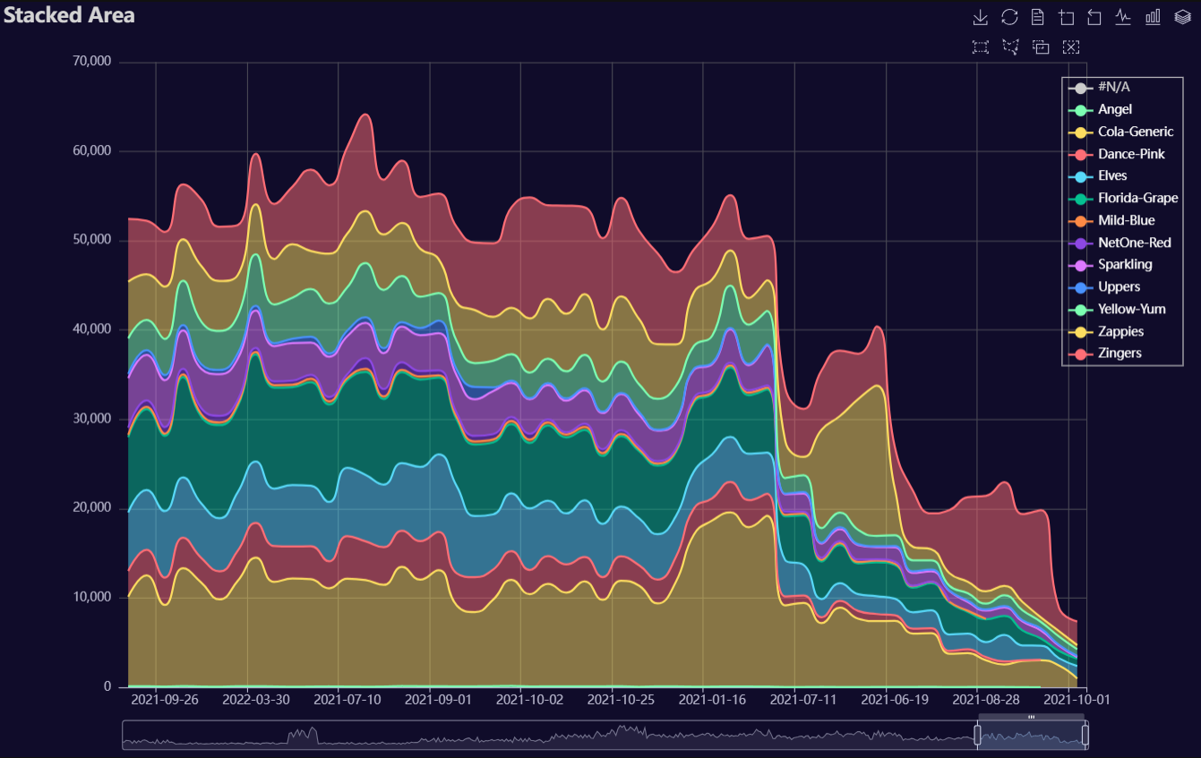
p1 = Charts.StackedArea(
dt = data,
PreAgg = False,
YVar = 'Daily Liters',
XVar = 'Date',
GroupVar = 'Brand',
AggMethod = 'sum',
YVarTrans = "Identity",
RenderHTML = None,
Opacity = 0.5,
LineWidth = 2,
Symbol = None,
SymbolSize = 6,
ShowLabels = False,
LabelPosition = "top",
Theme = 'dark',
BackgroundColor = None,
Width = "1200px",
Height = "750px",
ToolBox = True,
Brush = True,
DataZoom = True,
Title = 'Stacked Area',
TitleColor = "lightgray",
TitleFontSize = 20,
SubTitle = None,
SubTitleColor = "#fff",
SubTitleFontSize = 12,
AxisPointerType = 'cross',
YAxisTitle = None,
YAxisNameLocation = 'middle',
YAxisNameGap = 70,
XAxisTitle = None,
XAxisNameLocation = 'middle',
XAxisNameGap = 42,
Legend = "right",
LegendPosRight = '2%',
LegendPosTop = '10%',
LegendBorderSize = 1,
LegendTextColor = "#fff",
AnimationThreshold = 2000,
AnimationDuration = 1000,
AnimationEasing = "cubicOut",
AnimationDelay = 0,
AnimationDurationUpdate = 300,
AnimationEasingUpdate = "cubicOut",
AnimationDelayUpdate = 0)
# Needed to display
p1.load_javascript()
# In new cell
p1.render_notebook()
Stacked Bar
Click for code example
# Environment
import polars as pl
from QuickEcharts import Charts
from pyecharts.globals import CurrentConfig, NotebookType
CurrentConfig.NOTEBOOK_TYPE = 'jupyter_lab'
# Pull Data from Package
FilePath = "..FakeBevData.csv"
data = pl.read_csv(FilePath)
# Create Plot in Jupyter Lab
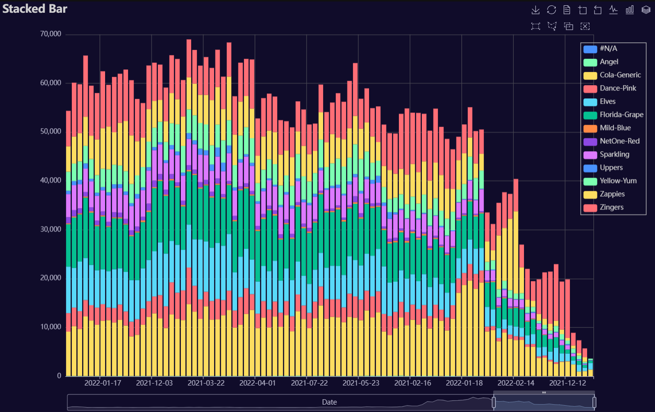
p1 = Charts.StackedBar(
dt = data,
PreAgg = False,
YVar = 'Daily Liters',
XVar = 'Date',
GroupVar = 'Brand',
AggMethod = 'sum',
YVarTrans = "Identity",
RenderHTML = None,
ShowLabels = False,
LabelPosition = "top",
Theme = 'wonderland',
BackgroundColor = None,
Width = None,
Height = None,
ToolBox = True,
Brush = True,
DataZoom = True,
Title = 'Stacked Bar',
TitleColor = "#fff",
TitleFontSize = 20,
SubTitle = None,
SubTitleColor = "#fff",
SubTitleFontSize = 12,
AxisPointerType = 'cross',
YAxisTitle = None,
YAxisNameLocation = 'middle',
YAxisNameGap = 70,
XAxisTitle = None,
XAxisNameLocation = 'middle',
XAxisNameGap = 42,
Legend = None,
LegendPosRight = '0%',
LegendPosTop = '5%',
LegendBorderSize = 1,
LegendTextColor = "#fff",
AnimationThreshold = 2000,
AnimationDuration = 1000,
AnimationEasing = "cubicOut",
AnimationDelay = 0,
AnimationDurationUpdate = 300,
AnimationEasingUpdate = "cubicOut",
AnimationDelayUpdate = 0)
# Needed to display
p1.load_javascript()
# In new cell
p1.render_notebook()
Stacked Line
Click for code example
# Environment
import polars as pl
from QuickEcharts import Charts
from pyecharts.globals import CurrentConfig, NotebookType
CurrentConfig.NOTEBOOK_TYPE = 'jupyter_lab'
# Pull Data from Package
FilePath = "..FakeBevData.csv"
data = pl.read_csv(FilePath)
# Create Plot in Jupyter Lab
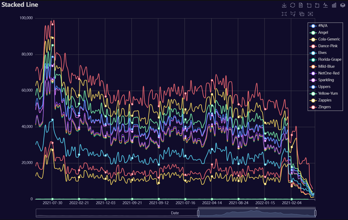
p1 = Charts.StackedLine(
dt = data,
PreAgg = False,
YVar = 'Daily Liters',
XVar = 'Date',
GroupVar = 'Brand',
AggMethod = 'sum',
YVarTrans = "Identity",
RenderHTML = None,
SmoothLine = True,
LineWidth = 2,
Symbol = "emptyCircle",
SymbolSize = 6,
ShowLabels = False,
LabelPosition = "top",
Theme = 'wonderland',
BackgroundColor = None,
Width = None,
Height = None,
ToolBox = True,
Brush = True,
DataZoom = True,
Title = 'Stacked Line',
TitleColor = "#fff",
TitleFontSize = 20,
SubTitle = None,
SubTitleColor = "#fff",
SubTitleFontSize = 12,
AxisPointerType = 'cross',
YAxisTitle = None,
YAxisNameLocation = 'middle',
YAxisNameGap = 70,
XAxisTitle = None,
XAxisNameLocation = 'middle',
XAxisNameGap = 42,
Legend = None,
LegendPosRight = '0%',
LegendPosTop = '5%',
LegendBorderSize = 1,
LegendTextColor = "#fff",
AnimationThreshold = 2000,
AnimationDuration = 1000,
AnimationEasing = "cubicOut",
AnimationDelay = 0,
AnimationDurationUpdate = 300,
AnimationEasingUpdate = "cubicOut",
AnimationDelayUpdate = 0)
# Needed to display
p1.load_javascript()
# In new cell
p1.render_notebook()
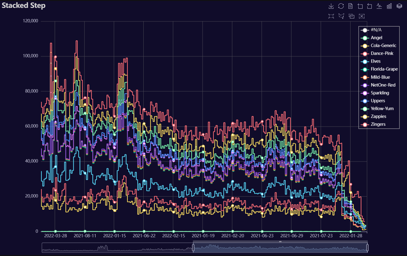
Stacked Step
Click for code example
# Environment
import polars as pl
from QuickEcharts import Charts
from pyecharts.globals import CurrentConfig, NotebookType
CurrentConfig.NOTEBOOK_TYPE = 'jupyter_lab'

# Pull Data from Package
FilePath = "..FakeBevData.csv"
data = pl.read_csv(FilePath)

# Create Plot in Jupyter Lab
p1 = Charts.StackedStep(
  dt = data,
  PreAgg = False,
  YVar = 'Daily Liters',
  XVar = 'Date',
  GroupVar = 'Brand',
  AggMethod = 'sum',
  YVarTrans = "Identity",
  RenderHTML = None,
  LineWidth = 2,
  Symbol = "emptyCircle",
  SymbolSize = 6,
  ShowLabels = False,
  LabelPosition = "top",
  Theme = 'wonderland',
  BackgroundColor = None,
  Width = None,
  Height = None,
  ToolBox = True,
  Brush = True,
  DataZoom = True,
  Title = 'Area Plot',
  TitleColor = "#fff",
  TitleFontSize = 20,
  SubTitle = None,
  SubTitleColor = "#fff",
  SubTitleFontSize = 12,
  AxisPointerType = 'cross',
  YAxisTitle = None,
  YAxisNameLocation = 'middle',
  YAxisNameGap = 70,
  XAxisTitle = None,
  XAxisNameLocation = 'middle',
  XAxisNameGap = 42,
  Legend = None,
  LegendPosRight = '0%',
  LegendPosTop = '5%',
  LegendBorderSize = 1,
  LegendTextColor = "#fff",
  AnimationThreshold = 2000,
  AnimationDuration = 1000,
  AnimationEasing = "cubicOut",
  AnimationDelay = 0,
  AnimationDurationUpdate = 300,
  AnimationEasingUpdate = "cubicOut",
  AnimationDelayUpdate = 0)

# Needed to display
p1.load_javascript()

# In new cell
p1.render_notebook()
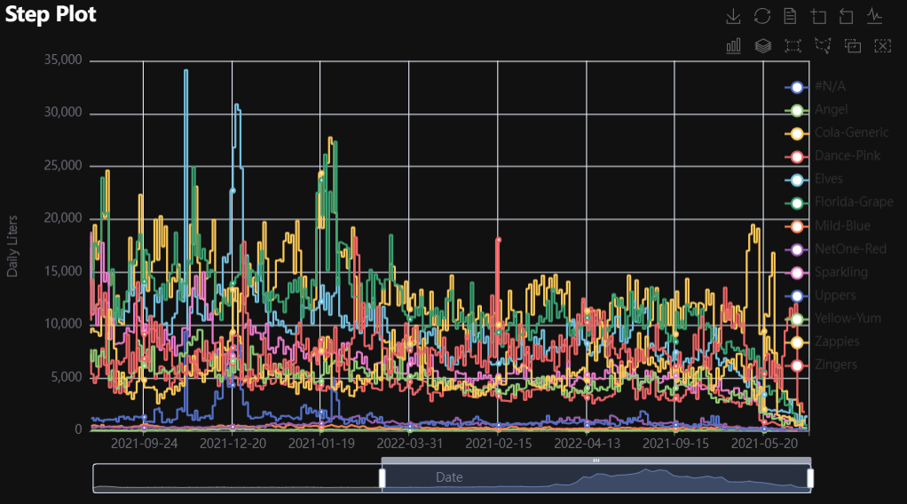
Step
Click for code example
# Environment
import pkg_resources
import polars as pl
from QuickEcharts import Charts
from pyecharts.globals import CurrentConfig, NotebookType
CurrentConfig.NOTEBOOK_TYPE = 'jupyter_lab'

# Pull Data from Package
FilePath = "..FakeBevData.csv"
data = pl.read_csv(FilePath)

# Create Plot in Jupyter Lab
p1 = Charts.Step(
  dt = data,
  PreAgg = False,
  YVar = ['Daily Liters', 'Daily Margin', 'Daily Revenue', 'Daily Units'],
  XVar = 'Date',
  GroupVar = None,
  FacetRows = 1,
  FacetCols = 1,
  FacetLevels = None,
  TimeLine = False,
  AggMethod = 'sum',
  YVarTrans = "Identity",
  RenderHTML = None,
  LineWidth = 2,
  Symbol = "emptyCircle",
  SymbolSize = 6,
  ShowLabels = False,
  LabelPosition = "top",
  Theme = 'wonderland',
  BackgroundColor = None,
  Height = None,
  Width = None,
  ToolBox = True,
  Brush = True,
  DataZoom = True,
  Title = 'Line Plot',
  TitleColor = "#fff",
  TitleFontSize = 20,
  SubTitle = None,
  SubTitleColor = "#fff",
  SubTitleFontSize = 12,
  AxisPointerType = 'cross',
  YAxisTitle = None,
  YAxisNameLocation = 'middle',
  YAxisNameGap = 70,
  XAxisTitle = None,
  XAxisNameLocation = 'middle',
  XAxisNameGap = 42,
  Legend = None,
  LegendPosRight = '0%',
  LegendPosTop = '5%',
  LegendBorderSize = 1,
  LegendTextColor = "#fff",
  VerticalLine = None,
  VerticalLineName = 'Line Name',
  HorizontalLine = None,
  HorizontalLineName = 'Line Name',
  AnimationThreshold = 2000,
  AnimationDuration = 1000,
  AnimationEasing = "cubicOut",
  AnimationDelay = 0,
  AnimationDurationUpdate = 300,
  AnimationEasingUpdate = "cubicOut",
  AnimationDelayUpdate = 0)

# Needed to display
p1.load_javascript()

# In new cell
p1.render_notebook()
# Environment
import pkg_resources
import polars as pl
from QuickEcharts import Charts
from pyecharts.globals import CurrentConfig, NotebookType
CurrentConfig.NOTEBOOK_TYPE = 'jupyter_lab'

# Pull Data from Package
FilePath = "..FakeBevData.csv"
data = pl.read_csv(FilePath)

# Create Plot in Jupyter Lab
p1 = Charts.Step(
  dt = data,
  PreAgg = False,
  YVar = 'Daily Liters',
  XVar = 'Date',
  GroupVar = 'Brand',
  FacetRows = 2,
  FacetCols = 2,
  FacetLevels = None,
  TimeLine = False,
  AggMethod = 'sum',
  YVarTrans = "Identity",
  RenderHTML = None,
  LineWidth = 2,
  Symbol = "emptyCircle",
  SymbolSize = 6,
  ShowLabels = False,
  LabelPosition = "top",
  Theme = 'wonderland',
  BackgroundColor = None,
  Height = None,
  Width = None,
  ToolBox = True,
  Brush = True,
  DataZoom = True,
  Title = 'Line Plot',
  TitleColor = "#fff",
  TitleFontSize = 20,
  SubTitle = None,
  SubTitleColor = "#fff",
  SubTitleFontSize = 12,
  AxisPointerType = 'cross',
  YAxisTitle = None,
  YAxisNameLocation = 'middle',
  YAxisNameGap = 70,
  XAxisTitle = None,
  XAxisNameLocation = 'middle',
  XAxisNameGap = 42,
  Legend = None,
  LegendPosRight = '0%',
  LegendPosTop = '5%',
  LegendBorderSize = 1,
  LegendTextColor = "#fff",
  VerticalLine = None,
  VerticalLineName = 'Line Name',
  HorizontalLine = None,
  HorizontalLineName = 'Line Name',
  AnimationThreshold = 2000,
  AnimationDuration = 1000,
  AnimationEasing = "cubicOut",
  AnimationDelay = 0,
  AnimationDurationUpdate = 300,
  AnimationEasingUpdate = "cubicOut",
  AnimationDelayUpdate = 0)

# Needed to display
p1.load_javascript()

# In new cell
p1.render_notebook()
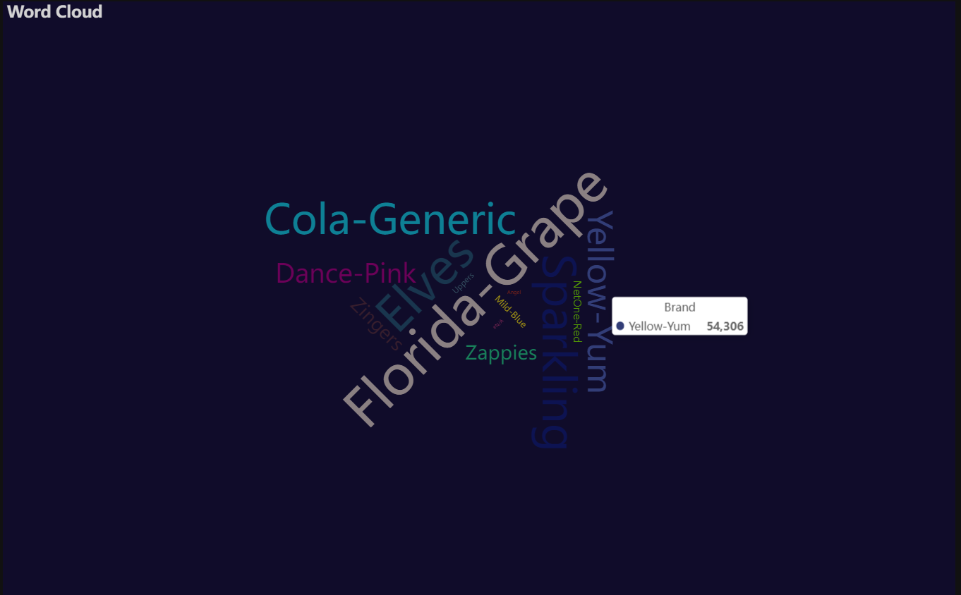
Word Cloud
Click for code example
# Environment
import pkg_resources
import polars as pl
from QuickEcharts import Charts
from pyecharts.globals import CurrentConfig, NotebookType
CurrentConfig.NOTEBOOK_TYPE = 'jupyter_lab'

# Pull Data from Package
FilePath = "..FakeBevData.csv"
data = pl.read_csv(FilePath)

# Create Plot in Jupyter Lab
p1 = Charts.WordCloud(
  dt = data,
  SampleSize = 100000,
  YVar = 'Brand',
  RenderHTML = None,
  SymbolType = 'diamond',
  Title = 'Word Cloud',
  TitleColor = "#fff",
  TitleFontSize = 20,
  SubTitle = None,
  SubTitleColor = "#fff",
  SubTitleFontSize = 12,
  Theme = 'wonderland')

# Needed to display
p1.load_javascript()

# In new cell
p1.render_notebook()
Release history Release notifications | RSS feed


Download files
Download the file for your platform. If you're not sure which to choose, learn more about installing packages.
Source Distribution
Built Distribution
Filter files by name, interpreter, ABI, and platform.
If you're not sure about the file name format, learn more about wheel file names.
Copy a direct link to the current filters
File details
Details for the file quickecharts-2.1.8.tar.gz.
File metadata
- Download URL: quickecharts-2.1.8.tar.gz
- Upload date:
- Size: 47.1 kB
- Tags: Source
- Uploaded using Trusted Publishing? No
- Uploaded via: twine/6.2.0 CPython/3.11.11
File hashes
| Algorithm | Hash digest | |
|---|---|---|
| SHA256 |
64c80f479a8567ba4708658f738ed9a1f2159b3e862e7267656eba277996882f
|
|
| MD5 |
0db541f27aed1f1d0657ed74450f7e38
|
|
| BLAKE2b-256 |
6e7b16d2cd4c8680d3606142d51bcbdbbdfb1f51d9b0da9617ca7c554e5e1079
|
File details
Details for the file quickecharts-2.1.8-py3-none-any.whl.
File metadata
- Download URL: quickecharts-2.1.8-py3-none-any.whl
- Upload date:
- Size: 40.8 kB
- Tags: Python 3
- Uploaded using Trusted Publishing? No
- Uploaded via: twine/6.2.0 CPython/3.11.11
File hashes
| Algorithm | Hash digest | |
|---|---|---|
| SHA256 |
d2891a80dec43fcdc8700f2233786043f05335e72628c0e6efc373f783a5187b
|
|
| MD5 |
c2c3c9fc766e86f2f0c7ec306ac88ffe
|
|
| BLAKE2b-256 |
5d550a8ada74bbaf68095370afcd57b8a0c250be3b17d5e733cd1015074e0dd5
|


