
Dragoman

A dragoman was an interpreter, translator, and official guide between Turkish, Arabic, and Persian-speaking countries and polities of the Middle East and European embassies, consulates, vice-consulates and trading posts. A dragoman had to have a knowledge of Arabic, Persian, Turkish, and European languages. (Source: wikipedia)
Similarly, the dragoman python library guides you through your data and translates between different representations. Its aim is to offer a consistant and pythonic way to handle different datasaets and translations between them. A dataset can for instance be simple colum/row data, or it can be data on a grid.
One of the key features of dragoman is the seamless translation from one data represenation into any other.
Convenience pyplot plotting functions are also available, in order to produce standard plots without any hassle.
Installation
git clone git@github.com:philippeller/dragoman.gitpip install dragoman
Getting Started
import numpy as np
import dragoman as dm
Grid Data
GridData is a collection of individual GridArrays. Both have a defined grid, here we initialize the grid in the constructor through simple keyword arguments resulting in a 2d grid with axes x and y
g = dm.GridData(x = np.linspace(0,3*np.pi, 30),
                y = np.linspace(0,2*np.pi, 20),
               )
Filling one array with some sinusoidal functions, called a here
g['a'] = np.sin(g['x']) * np.cos(g['y'])
As a shorthand, we can also use attributes instead of items:
g.a = np.sin(g.x) * np.cos(g.y)
in 1-d and 2-d they render as html in jupyter notebooks
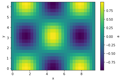
It can be plotted easily in case of 1-d and 2-d grids
g.plot(cbar=True);
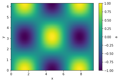
Let's interpolate the values to 200 points along each axis and plot
g.interp(x=200, y=200).plot(cbar=True);
Executions of (most) translation methods is lazy. That means that the computation only happens if a specific variable is used. This can have some side effects, that when you maipulate the original data before the translation is evaluated. just something to be aware of.
Masking, and item assignement also is supported
g.a[g.a > 0.3]
| y \ x | 0 | 0.325 | 0.65 | ... | 8.77 | 9.1 | 9.42 |
| 0 | -- | 0.319 | 0.605 | ... | 0.605 | 0.319 | -- |
| 0.331 | -- | 0.302 | 0.572 | ... | 0.572 | 0.302 | -- |
| 0.661 | -- | -- | 0.478 | ... | 0.478 | -- | -- |
| ... | ... | ... | ... | ... | ... | ... | ... |
| 5.62 | -- | -- | 0.478 | ... | 0.478 | -- | -- |
| 5.95 | -- | 0.302 | 0.572 | ... | 0.572 | 0.302 | -- |
| 6.28 | -- | 0.319 | 0.605 | ... | 0.605 | 0.319 | -- |
The objects are also numpy compatible and indexable by index (integers) or value (floats). Numpy functions with axis keywords accept either the name(s) of the axis, e.g. here x and therefore is independent of axis ordering, or the usual integer indices.
g[10::-1, :np.pi:2]
| y \ x | 3.25 | 2.92 | 2.6 | ... | 0.65 | 0.325 | 0 |
| 0 | a = -0.108 | a = 0.215 | a = 0.516 | ... | a = 0.605 | a = 0.319 | a = 0 |
| 0.661 | a = -0.0853 | a = 0.17 | a = 0.407 | ... | a = 0.478 | a = 0.252 | a = 0 |
| 1.32 | a = -0.0265 | a = 0.0528 | a = 0.127 | ... | a = 0.149 | a = 0.0784 | a = 0 |
| 1.98 | a = 0.0434 | a = -0.0864 | a = -0.207 | ... | a = -0.243 | a = -0.128 | a = -0 |
| 2.65 | a = 0.0951 | a = -0.189 | a = -0.453 | ... | a = -0.532 | a = -0.281 | a = -0 |
np.sum(g[10::-1, :np.pi:2].T, axis='x')
| y | 0 | 0.661 | 1.32 | 1.98 | 2.65 |
| a | 6.03 | 4.76 | 1.48 | -2.42 | -5.3 |
Comparison
As comparison to point out the convenience, an alternative way without using Dragoman to achieve the above would look something like the follwoing for creating and plotting the array:
x = np.linspace(0,3*np.pi, 30)
y = np.linspace(0,2*np.pi, 20)

xx, yy = np.meshgrid(x, y)
a = np.sin(xx) * np.cos(yy)

import matplotlib.pyplot as plt

x_widths = np.diff(x)
x_pixel_boundaries = np.concatenate([[x[0] - 0.5*x_widths[0]], x[:-1] + 0.5*x_widths, [x[-1] + 0.5*x_widths[-1]]])
y_widths = np.diff(y)
y_pixel_boundaries = np.concatenate([[y[0] - 0.5*y_widths[0]], y[:-1] + 0.5*y_widths, [y[-1] + 0.5*y_widths[-1]]])

pc = plt.pcolormesh(x_pixel_boundaries, y_pixel_boundaries, a)
plt.gca().set_xlabel('x')
plt.gca().set_ylabel('y')
cb = plt.colorbar(pc)
cb.set_label('a')
and for doing the interpolation:

> ```
> from scipy.interpolate import griddata
>
> interp_x = np.linspace(0,3*np.pi, 200)
> interp_y = np.linspace(0,2*np.pi, 200)
>
> grid_x, grid_y = np.meshgrid(interp_x, interp_y)
>
> points = np.vstack([xx.flatten(), yy.flatten()]).T
> values = a.flatten()
>
>interp_a = griddata(points, values, (grid_x, grid_y), method='cubic')
PointData
Another representation of data is PointData, which is not any different of a dictionary holding same-length nd-arrays or a pandas DataFrame (And can actually be instantiated with those).
p = dm.PointData()
p.x = np.random.randn(100_000)
p.a = np.random.rand(p.size) * p['x']**2
p
| x | -0.0697 | -0.311 | -0.439 | ... | -0.0637 | -0.455 | 0.399 |
| a | 0.000593 | 0.0533 | 0.0693 | ... | 0.00173 | 0.046 | 0.0425 |
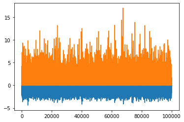
p.plot()
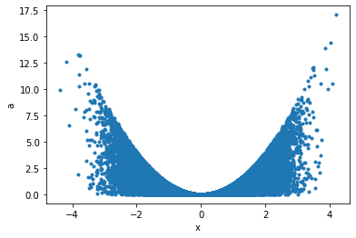
Maybe a correlation plot would be more insightful:
p.plot('x', 'a', '.');
This can now seamlessly be translated into Griddata, for example taking the data binwise in x in 20 bins, and in each bin summing up points:
p.binwise(x=20).sum()
| x | [-4.646 -4.207] | [-4.207 -3.768] | [-3.768 -3.328] | ... | [2.821 3.26 ] | [3.26 3.699] | [3.699 4.139] |
| a | 38.7 | 49.5 | 197 | ... | 953 | 310 | 82.3 |
p.binwise(x=20).sum().plot();
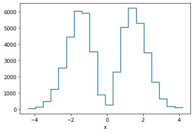
This is equivalent of making a weighted histogram, while the latter is faster.
p.histogram(x=20).a
| x | [-4.646 -4.207] | [-4.207 -3.768] | [-3.768 -3.328] | ... | [2.821 3.26 ] | [3.26 3.699] | [3.699 4.139] |
| 38.7 | 49.5 | 197 | ... | 953 | 310 | 82.3 |
np.allclose(p.histogram(x=10).a, p.binwise(x=10).sum().a)
True
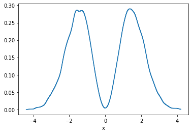
There is also KDE in n-dimensions available, for example:
p.kde(x=1000).a.plot();
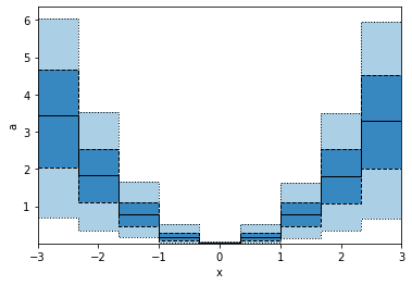
GridArrays can also hold multi-dimensional values, like RGB images or here 5 values from the percentile function. Let's plot those as bands:
p.binwise(x=20).quantile(q=[0.1, 0.3, 0.5, 0.7, 0.9]).plot_bands()
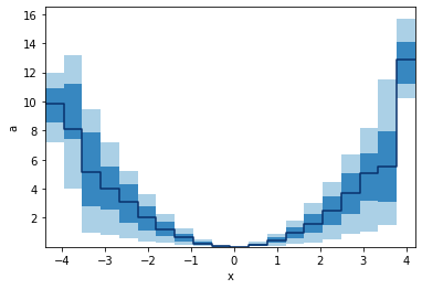
When we specify x with an array, we e gives a list of points to binwise. So the resulting plot will consist of points, not bins.
p.binwise(x=np.linspace(-3,3,10)).quantile(q=[0.1, 0.3, 0.5, 0.7, 0.9]).plot_bands(lines=True, filled=True, linestyles=[':', '--', '-'], lw=1)
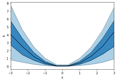
This is not the same as using edges as in the example below, hence also the plots look different.
p.binwise(x=dm.Edges(np.linspace(-3,3,10))).quantile(q=[0.1, 0.3, 0.5, 0.7, 0.9]).plot_bands(lines=True, filled=True, linestyles=[':', '--', '-'], lw=1)
1 maintainer

Metadata
1 maintainer
Release files for tandem 0.4.3
For a detailed explanation of source distributions (sdists) and built distributions (wheels), please see the package formats documentation.
Source distribution (sdist)
| File | Size | Uploaded | |
|---|---|---|---|
| tandem-0.4.3.tar.gz | 31.4 kB | Details |
Release files / tandem-0.4.3.tar.gz
| Download URL | tandem-0.4.3.tar.gz |
|---|---|
| Size | 31.4 kB |
| Tags | Source |
|
SHA-256 checksum How to use checksums |
3050f1a6f679ffa7b847bb772712cb16358d97614cfb9c413e57fec946fba1a5
|
|
BLAKE2b-256 checksum How to use checksums |
d50ec9409fef51e75887ad04bb84bc2af3638b8a555f92d200a793062dc1f12b
|
| Upload date | |
|
Uploaded using Trusted Publishing? What is trusted publishing? |
No |
| Uploaded via |
twine/3.3.0 pkginfo/1.6.1 requests/2.25.1 setuptools/54.1.1 requests-toolbelt/0.9.1 tqdm/4.54.1 CPython/3.7.6
|













