A simple Tkinter-based GUI framework for making a grid of buttons, text boxes, and labels.

Project description
ButtonPad
ButtonPad lets you create a GUI of a grid of buttons, labels, text boxes, and images using a compact, CSV-like layout string and control it with simple Python callbacks. It’s built on the Tkinter standard library and works on Windows, macOS, and Linux. (On macOS, it optionally uses tkmacosx for better button color support.)
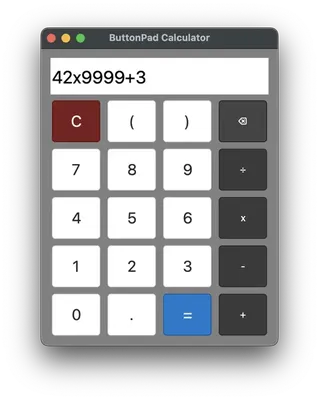
For example, this layout string is for a calculator app:
LAYOUT = """
'','','',''
C,(,),⌫
7,8,9,÷
4,5,6,x
1,2,3,-
0,.,=,+
"""
Key features:
- Pure-Python code that only depends on the standard library, built on top of tkinter. (Pillow is optional.)
- A CSV-like layout configuration string generates the grid of widgets.
- Callback functions handle click, enter, and exit events.
- Each widget can be assigned tool tip text, hotkey mappings, and custom font and colors.
- Optional status bar with custom colors.
- Optional menubar configuration.
- Adjustable per-column/row sizing, margins, borders, and resizable windows
- PyMsgBox dialog boxes:
alert(),confirm(),prompt(),password()
Check Out Demo Programs with the Launcher
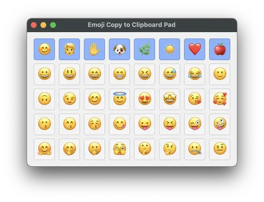
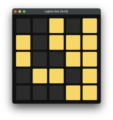
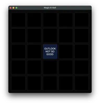
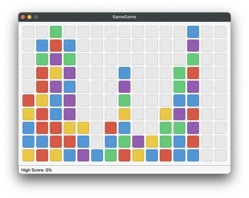
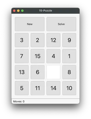
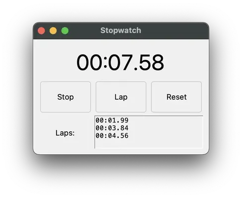
Run python -m buttonpad to run the launcher program to view several demo programs and games made with Buttonpad.
Quick Start Example Code
Here's a complete program for a simulated keypad. By default, buttons print their text with print():
# Phone keypad example
import buttonpad

# Multi-line string defines 4 rows of 3 cells each (a 3x4 grid).
bp = buttonpad.ButtonPad(
    """[],[],[]
    1,2,3
    4,5,6
    7,8,9
    *,0,#
    Call,Call,Cancel""",
)

bp.run()  # run the app
The buttonpad grid is split by commas and newlines.
The top row has empty square brackets to create an empty text box. Since all three have the same text (nothing), they are merged into one 3x1 text box.
Text without square brackets create buttons with the text as the button text.
The bottom row has two "Call" text which merges into a single 2x1 button labelled "Call". The default click callback function prints the label of the button. Here's an expanded version:
# Phone keypad example
import buttonpad

# Multi-line string defines 4 rows of 3 cells each (a 3x4 grid).
bp = buttonpad.ButtonPad(
	"""[],[],[]
    1,2,3
	4,5,6
	7,8,9
	*,0,#
	Call,Call,Cancel""",
	cell_width=100,  # width of each cell, in pixels
	cell_height=60,  # height of each cell, in pixels
	padx=10,  # horizontal padding in between cells, in pixels
	pady=5,  # vertical padding in between cells, in pixels
	border=20,  # padding at the edges of the window, in pixels
	default_bg_color='lightblue',  # background color of widgets (buttons, etc)
	default_text_color='darkblue', # color of widget text
	window_bg_color='whitesmoke',  # background color of the window
	title="Telephone Keypad Demo",  # title text of the app window
)

# Callback functions receive three arguments: the widget object that
# was clicked/entered/exited, and the xy position of the widget in the
# buttonpad grid.

# Create callback functions for the buttons:
def cancel_call(widget, x, y):
    bp[0,0].text = ''  # Clear the display

def call_number(widget, x, y):
    buttonpad.alert("Simulate calling " + bp[0,0].text)  # Show alert dialog

def add_button_label_to_display(widget, x, y):
    bp[0, 0].text += widget.text  # Append the pressed key to the display

# Assign callbacks to buttons:
for x in range(3):
    for y in range(1, 5):  # rows 1-4 contain keys 1..9,*,0,#
        bp[x,y].on_click = add_button_label_to_display

bp[2, 5].on_click = cancel_call  # Cancel button

bp[0, 5].on_click = call_number  # Call button

bp[0, 0].font_size = 24  # Make the display text larger

bp.run()  # run the app
ButtonPad color values are strings of tkinter color names, in '#ff00ff' style of RGB value, or as a tuple of three RGB integers like (255, 0, 0).
Configuring the GUI with a Layout String
The multiline string of comma-separated widgets in ButtonPad is called the layout string: commas separate columns, newlines separate rows. You can specify different user interface (UI) widgets in this string:
- Buttons: any unquoted text, e.g.
A,Click,7(or prefixed withBUTTON:) - Label: uneditable text enclosed in single or double quotes, e.g.
'Hello'or"Ready"(or prefix withLABEL:) - Text box (multiline and editable): text enclosed in square brackets, e.g.
[Name](or prefix withTEXTBOX:) - Image: Prefix with
IMAGE:followed by the image filename.
Widgets with the same text in a rectangular area in the layout string will be merged into a single widget. If you want to have separate, unmerged widgets with the same name, put a backtick prefix.
For example, this creates a top row with three buttons (labelled "A", "B", and "C"). The second row is a single wide, 3x1 cell button labelled "Play". The third row has two text labels that say "Status" and "Enabled", next to a text box with the placeholder text, "Name". The bottom row has three separate buttons, each labelled "Start":
A,B,C
Play,Play,Play
"Status","Enabled",[Name]
`Start,`Start,`Start
TODO: Add feature to allow escape characters so commas can be the text. Also check that a backtick prefix before a "BUTTON:" prefix still works.
Setting Event Callback Functions for Click, Enter, and Exit Handlers
Callback functions receive three arguments: the widget object that was clicked/entered/exited, and the xy position of the widget in the buttonpad grid.
Extra Widget Features: Tooltips, Custom Colors, Custom Fonts
Widgets (buttons, text boxes, etc.) have the following attributes that you can change:
text- The text label or text contents of the widget.tooltip- The tooltip text that appears when the mouse cursor hovers over the widget.text_color- The color of the text label or text contents.bg_color- The background color of the widget.font_name- Set the font of the widget text.font_size- Set the font size of the widget text.anchor- Set the alignment of the widget text; same as tkinter values:'n'or's'or'center', etc.
Extra Window Features: Resizeable Windows, Status Bar, and Menu Bar
TODO
API
ButtonPad
Constructor:
    def __init__(
        self,
        layout: str,  # """Button, 'Label 1', "Label 2", [Text Box], IMAGE:~/monalisa.png"""
        cell_width: Union[int, Sequence[int]] = 60,  # width of each grid cell in pixels; int for all cells or list of ints for per-column widths
        cell_height: Union[int, Sequence[int]] = 60,  # height of each grid cell in pixels; int for all cells or list of ints for per-row heights
        padx: int = 0,  # horizontal gap/padding between cells in pixels
        pady: int = 0,  # vertical gap/padding between cells in pixels
        window_bg_color: str = '#f0f0f0',  # background color of the window
        default_bg_color: str = '#f0f0f0',  # default background color for widgets
        default_text_color: str = 'black',  # default text color for widgets
        title: str = 'ButtonPad App',  # window title
        resizable: bool = True,  # whether the window is resizable
        border: int = 0,  # padding between the grid and the window edge
        status_bar: Optional[str] = None,  # initial status bar text; None means no status bar
        menu: Optional[Dict[str, Any]] = None,  # menu definition dict; see menu property for details
    ):
Notes:
cell_width/cell_heightcan be a single int (uniform) or a list matching the number of columns/rows.padx/padyset the internal spacing between cells;borderis outer margin.- The window is resizable by default.
Instance methods and properties:
run()— start the Tkinter event loop.quit()— quit the program.update(new_layout: str)— rebuild the grid from a new layout string.[x, y]— index into the grid to get an element wrapper at column x, row y.- Status bar:
status_bar(string or None) plusstatus_bar_bg_color,status_bar_text_color. - Menu: assign a nested dict to
menuto build a menubar with optional accelerators. - Global hooks:
on_pre_click(element),on_post_click(element)called around every click.
Re-exported dialogs from pymsgbox:
alert(text: str = "", title: str = "PyMsgBox", button: str = "OK")- Displays a message.confirm(text: str = "", title: str = "PyMsgBox", buttons: Union[str, Sequence[str]] = ("OK", "Cancel"))- Displays OK/Cancel box and returns selection.prompt(text: str = "", title: str = "PyMsgBox", default: str = "")- Lets user type a resonse and returns it.password(text: str = "", title: str = "PyMsgBox", default: str = "", mask: str = "*")- Likeprompt()but hides the typed characters.
Widgets
All wrappers expose:
text: str— get/set the visible text.bg_color: str— get/set background color.text_color: str— get/set text/foreground color.font_name: strandfont_size: int— change font.tooltip: Optional[str]— small hover tooltip; set to a string to enable,None/""to disable.on_click: Callable[[element, x, y], None] | None— click handler.on_enter/on_exit— hover handlers with the same signature.widget— the underlying Tk widget, for advanced customization. Specific additions:BPButton.hotkey/BPLabel.hotkeyproperties: assign a string (keysym) or tuple of strings to create independent hotkeys (case-insensitive). Reassigning replaces prior hotkeys.
Specifics:
BPButton— click-focused element; created for unquoted tokens.BPLabel— static text; hasanchorproperty (e.g.,"w","center","e") and optionalhotkeylike buttons.BPTextBox— editable single-line entry;textreflects its content.
Keyboard mapping
Map keys to cells with map_key. Keys are Tk keysyms (case-insensitive): "1", "a", "space", "Return", "Escape", etc.
pad.map_key("1", 0, 0)
pad.map_key("space", 1, 0)
Merging and no-merge cells
Adjacent identical tokens automatically merge into a single widget, spanning a rectangular area. To opt out for a specific cell, prefix it with a backtick to mark it as “no-merge”:
Play,Play,Play  # this row is merged into a single button
`Play,`Play,`Play   # this row is three separate buttons
Platform notes
- macOS: For fully colorable buttons, install
tkmacosx. When unavailable, ButtonPad falls back to the systemtk.Button(colors may not update on some macOS builds). You’ll see a console message suggesting:pip install tkmacosx. - Dialog helpers use
pymsgboxand are re-exported for convenience.


Download files
Download the file for your platform. If you're not sure which to choose, learn more about installing packages.
Source Distribution
Built Distribution
Filter files by name, interpreter, ABI, and platform.
If you're not sure about the file name format, learn more about wheel file names.
Copy a direct link to the current filters


