A package for plotting multiple datasets

Project description
MultiDataPlotting
MultiDataPlotting is a Python package designed for easy and efficient plotting of multiple data sets, providing tools for generating bar plots, scatter plots, and other types of visual data representations. It leverages popular libraries such as Matplotlib, Seaborn, and Pandas to offer a versatile set of plotting functionalities.
Features
- Plot multiple data sets in a single figure.
- Support for various types of plots: bar plots, scatter plots, line plots, rose maps.
- Customizable plot settings: colors, labels, legends, and more.
- Integration with Pandas for direct data frame plotting.
Installation
You can install MultiDataPlotting using pip:
pip install MultiDataPlotting
Usage
To use the package, you can import it into your Python scripts as follows:
import multidataprocessing as mdp
Plotting Clustered Data with Boundaries
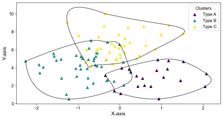
The plot_clustered_data function in the advanced data visualization toolkit allows for the visual representation of data clusters from a pandas DataFrame. This function is highly versatile, supporting multiple clustering methods and customizable plot aesthetics, including the option to draw smoothed boundaries around clusters. It is particularly useful in fields such as market segmentation, bioinformatics, environmental analysis, and any other area where data clustering provides insight.
Functionality
This function provides a detailed clustering and visualization of multidimensional data. Users can select specific columns for clustering and choose different axes for visualization. It supports various clustering algorithms, and it can visually delineate cluster boundaries, enhancing the interpretability of cluster separation and density. This makes it an invaluable tool for comprehensive data analysis and presentation.
Parameters
- df (pandas.DataFrame): The DataFrame containing the data.
- columns (list): Column indices or names to include in the clustering.
- x_index (int or str): Column index or name for the x-axis of the plot.
- y_index (int or str): Column index or name for the y-axis of the plot.
- n_clusters (int, optional): Number of clusters for certain algorithms. Default is 3.
- method (str, optional): Clustering method; options include 'KMeans', 'Agglomerative', 'DBSCAN', 'Spectral', or 'GaussianMixture'. Default is 'KMeans'.
- marker_size (int, optional): Size of the markers in the plot. Default is 50.
- marker_colors (list or dict, optional): Colors for the markers, specified as a list or dictionary mapping clusters to colors. Defaults to the 'viridis' colormap.
- marker_type (str, optional): Shape of the markers, such as 'o' (circle), 'x' (cross). Default is 'o'.
- figsize (tuple, optional): Dimensions of the figure in inches. Default is (10, 5).
- tick_font_size (int, optional): Font size for tick labels. Default is 12.
- tick_font_name (str, optional): Font family for tick labels. Default is 'Arial'.
- xlabel (str, optional): Label for the x-axis. Default is 'X-axis'.
- ylabel (str, optional): Label for the y-axis. Default is 'Y-axis'.
- label_font_size (int, optional): Font size for axis labels. Default is 14.
- is_legend (bool, optional): Whether to display a legend for the clusters. Default is True.
- cluster_names (list, optional): Custom names for each cluster in the legend. Defaults to generic names like "Cluster 0".
- is_show (bool, optional): Whether to display the plot on screen. Default is True.
- save_path (str, optional): File path to save the plot image, if desired.
- is_boundary (bool, optional): Whether to draw smooth boundaries around each cluster using a convex hull. Default is False.
- boundary_color (str, optional): Color of the boundary lines. Default is 'black'.
- boundary_linewidth (int, optional): Width of the boundary lines. Default is 2.
- boundary_alpha (float, optional): Transparency of the boundary lines. Default is 0.5.
Code Example
import pandas as pd
import numpy as np
import multidataplotting as mdp
np.random.seed(4444)  # For reproducible results
data = {
    'Feature1': np.random.normal(loc=0, scale=1, size=100),  # Normal distribution centered at 0
    'Feature2': np.random.normal(loc=5, scale=2, size=100),  # Normal distribution centered at 5
    'Feature3': np.random.normal(loc=10, scale=3, size=100)  # Normal distribution centered at 10
}

# Create DataFrame
df = pd.DataFrame(data)
# Example usage:
# Assuming 'df' is your DataFrame and it contains columns that you want to cluster
mdp.plot_clustered_data(df, ['Feature1', 'Feature2', 'Feature3'], 'Feature1', 'Feature2',
                    method='KMeans', marker_type='^', cluster_names=['Type A', 'Type B', 'Type C'], is_legend=True, is_boundary=True)
Heatmap Plotting on Geographic Maps
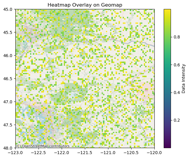
The plot_heatmap_on_geomap function facilitates the visualization of spatial data distributions by rendering heatmaps on geographic maps. It supports two mapping backends, Basemap and OpenStreetMap (OSM), offering flexibility in the appearance and detail of the underlying geographic context. This function is ideal for environmental studies, meteorology, urban planning, and other disciplines requiring geographic data visualization.
Functionality
This function overlays heatmap data onto a geographic map, allowing for precise visualization adjustments. It supports various customization options, including transparency thresholds, colormap choices, and tick formatting. The integration of Basemap and OpenStreetMap ensures broad applicability for different visualization needs.
Parameters
- data (numpy.ndarray): The 2D array of data points to be visualized as a heatmap.
- top_left_lat, top_left_lon (float): The latitude and longitude of the top-left corner of the map.
- bottom_right_lat, bottom_right_lon (float): The latitude and longitude of the bottom-right corner of the map.
- threshold (float): The data value threshold below which points will be transparent.
- cmap (str, optional): Colormap for the heatmap. Default is 'jet'.
- map_choice (str, optional): Backend map provider ('base' for Basemap, 'osm' for OpenStreetMap). Default is 'base'.
- zoom (int, optional): Zoom level for the map when using OSM. Default is 10.
- is_show (bool, optional): Whether to display the plot. Default is True.
- save_path (str, optional): Path to save the figure. If not specified, the figure is not saved.
- title (str, optional): Title of the plot. Default is 'Heatmap Overlay on Geomap'.
- colorbar_label (str, optional): Label for the colorbar. Default is 'Data Intensity'.
- fig_size (tuple, optional): Figure dimensions in inches. Default is (8, 6).
- x_tick_interval, y_tick_interval (float, optional): Interval between ticks on the x and y axes.
- tick_format (str, optional): Format string for tick labels. Default is "{:.2f}".
Code Example
import numpy as np
import multidataplotting as mdp

data = np.random.rand(100, 100)
mdp.plot_heatmap_on_geomap(data, 48.0, -123.0, 45.0, -120.0, threshold=0.75, map_choice='osm', x_tick_interval=1, y_tick_interval=1, tick_format="{:.2f}")
Plotting Time Histograms
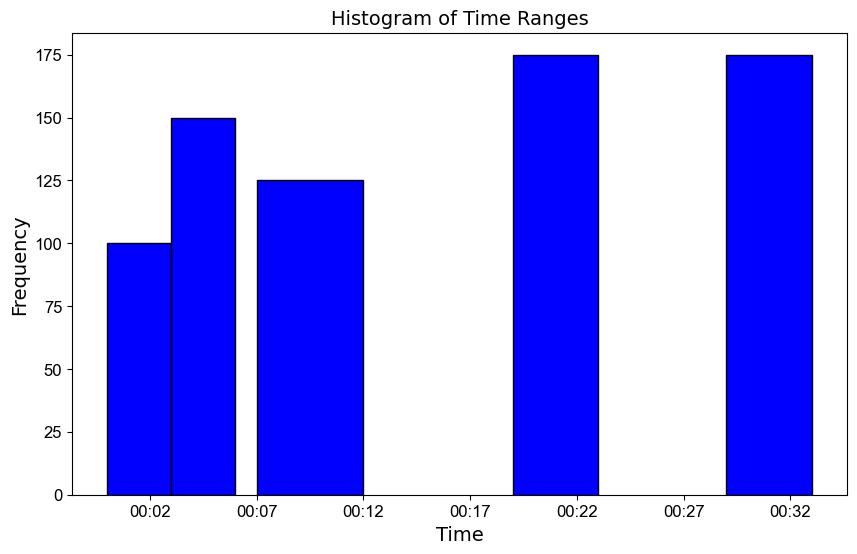
The plot_time_histogram function creates histograms based on time data, ideal for visualizing event frequencies over specific intervals. This method helps in identifying trends and patterns by illustrating how event occurrences are distributed across different time points.
Functionality
This function is particularly useful in scenarios such as analyzing user activity logs, sales data over time, or any periodic data that is timestamped. It helps in understanding the distribution and concentration of events, aiding in decision-making processes like resource allocation during peak times
Parameters
- histogram (dict): Dictionary with datetime keys (either strings or objects) and frequency counts as values.
- color (str, optional): Color of the histogram bars. Default is 'blue'.
- edgecolor (str, optional): Color of the bar edges. Default is 'black'.
- fig_size (tuple, optional): Size of the figure in inches. Default is (10, 6).
- tick_fontname (str, optional): Font name for the tick labels. Default is 'Arial'.
- tick_fontsize (int, optional): Font size for the tick labels. Default is 12.
- title_fontsize (int, optional): Font size for the title of the plot. Default is 14.
- label_fontsize (int, optional): Font size for the axis labels. Default is 14.
- y_range (list, optional): List specifying the y-axis limits as [min, max]. If not set, the axis scales automatically.
- x_tick_interval_minutes: (int,optional): the interval of the x ticks in minutes
- x_ticklabel_format (str, optional): Format of the x-tick labels, can be 'HH' for hours and minutes, or 'YYYY-MM-DD' for dates. Default is 'HH'.
- is_legend (bool, optional): Indicates whether to display a legend. Default is False.
- save_path (str, optional): File path where the plot will be saved, if desired. If not provided, the plot is not saved.
- is_show (bool, optional): Whether to display the plot on the screen. Default is False.
- is_save (bool, optional): Whether to save the plot to a file. Default is True.
- transparent_bg (bool, optional): Whether the background of the saved figure should be transparent. Default is True.
Code Example
import multidataplotting as mdp

# Example histogram data
# Example usage with datetime conversion
login_data = {
    '00:00:00 - 00:03:00': 100,
    '00:03:00 - 00:06:00': 150,
    '00:07:00 - 00:12:00': 125,
    '00:19:00 - 00:23:00': 175,
    '00:29:00 - 00:33:00': 175,
}

mdp.plot_time_histogram(login_data, color='blue', edgecolor='black', is_show=True)
Plotting Polylines
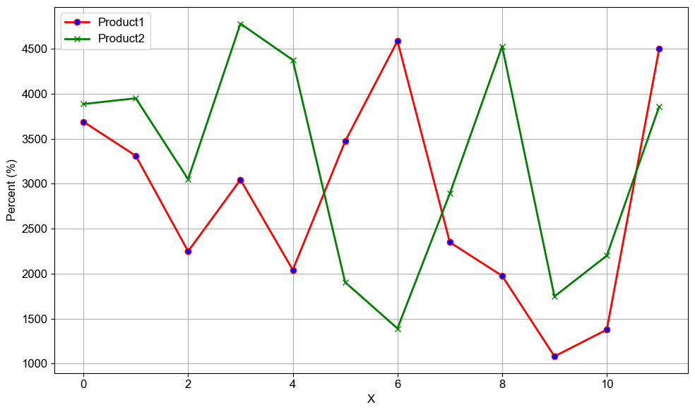
The plot_polylines function in the multidataprocessing package is designed to plot multiple lines from a DataFrame using specified columns for the x and y axes. This functionality is essential for visualizing trends and relationships in data over time or across categories.
Functionality
This function is invaluable for comparing trends across multiple datasets, enabling clear insights into how different variables evolve concurrently. It is particularly useful in financial analysis, environmental monitoring, or any scientific data visualization involving multiple variables.
Parameters
- df (pandas.DataFrame): The DataFrame containing the data to plot.
- x (int): Index of the column in the DataFrame to use as the x-axis.
- ys (list of int): Indices of columns to plot on the y-axis.
- line_styles (dict, optional): Dictionary specifying line styles for each y-column plotted, with keys as column indices and values as style strings. Default is solid lines for all.
- line_widths (dict, optional): Dictionary specifying line widths for each plotted y-column, with keys as column indices and values as numeric widths. Default is 2 for all lines.
- line_colors (dict, optional): Dictionary specifying colors for each plotted y-column, with keys as column indices and values as color names or hex codes. Default is 'blue' for all lines.
- legends (list, optional): List of legend labels corresponding to each y-column. If not provided, column names are used as labels.
- marker_colors (dict, optional): Dictionary specifying marker colors for each y-column, enhancing distinctiveness of each line.
- figsize (tuple, optional): Size of the figure in inches. Default is (10, 6).
- x_tick_interval (int, optional): Interval at which x-axis ticks should be placed. Default is 1.
- markers (dict, optional): Dictionary specifying marker styles for each y-column plotted, adding visual distinction to the lines.
- y_label (str, optional): Label for the y-axis. If not provided, defaults to a generic label.
- show_grid (bool, optional): Whether to display a grid in the background of the plot. Default is True.
- font_name (str, optional): Font family for all text elements in the plot. Default is 'Arial'.
- font_size (int, optional): Font size for all text elements in the plot. Default is 12.
- save_path (str, optional): Path to save the figure to a file. If not specified, the figure is not saved.
- dpi (int, optional): Resolution of the saved figure in dots per inch. Default is 600.
- y_range (list, optional): Specific limits for the y-axis as [min, max].
- is_show (bool, optional): Whether to display the plot on the screen. Default is True.
Code Example
import pandas as pd
import numpy as np
import multidataplotting as mdp

data = {
    'X': list(range(12)),
    'Product1': np.random.randint(1000, 5000, size=12),
    'Product2': np.random.randint(1000, 5000, size=12)
}

data = pd.DataFrame(data)
mdp.plot_polylines(data, x=0, ys=[1, 2], line_colors={1: 'red', 2: 'green'}, x_tick_interval = 2, markers={1: 'o', 2: 'x'})
Plotting Histograms
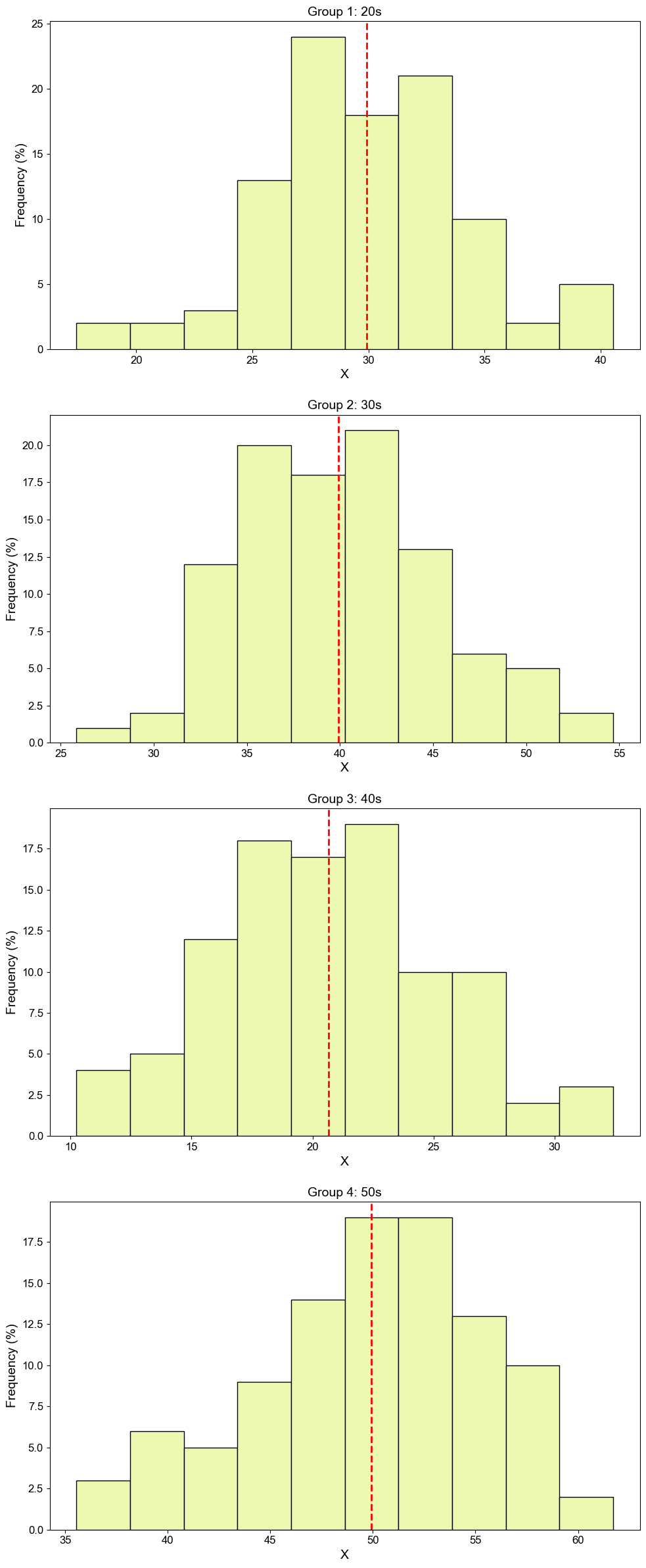
The plot_histograms function from the multidataprocessing package allows users to plot multiple histograms in a single figure. This feature is particularly useful for comparing the distributions of several datasets simultaneously, providing insights into variability, skewness, or similarity among the datasets.
Functionality
plot_histograms is ideal for statistical analysis and data exploration, helping to visualize and compare the frequency distributions of multiple groups or variables within the same graphical context. It's especially useful in fields like biostatistics, market research, and any area where distribution comparison is crucial.
Parameters
- list_of_lists (list of lists): A list where each sublist contains numeric data for one histogram.
- titles (list of str): Titles for each histogram. Must match the number of sublists in list_of_lists.
- xlabels (str or list of str, optional): X-axis labels for each histogram. Can be a single string or a list of strings matching the number of histograms.
- ylabels (str or list of str, optional): Y-axis labels for each histogram. Can be a single string or a list of strings matching the number of histograms.
- bins (int, optional): Number of bins for the histograms. Default is 10.
- color (str, optional): Color of the histogram bars. Default is 'blue'.
- edgecolor (str, optional): Color of the bar edges. Default is 'black'.
- fig_size (tuple, optional): Size of the figure, in inches. Default is (10, 6).
- tick_fontname (str, optional): Font name for the tick labels. Default is 'Arial'.
- tick_fontsize (int, optional): Font size for the tick labels. Default is 12.
- title_fontsize (int, optional): Font size for the titles of each plot. Default is 14.
- label_fontsize (int, optional): Font size for the labels. Default is 14.
- value_range (list, optional): Specific range of values to include in each histogram as [min, max].
- line_color (str, optional): Color of the mean line within each histogram. Default is 'red'.
- show_all_xticklabels (bool, optional): Whether to show all x-axis tick labels. Default is True.
- line_style (str, optional): Style of the mean line, such as '--' for dashed lines. Default is '--'.
- line_width (float, optional): Width of the mean line. Default is 2.
- is_legend (bool, optional): Whether to include a legend in the plots. Default is False.
- unit (str, optional): Unit of measurement for the data, useful for annotations. Default is 'm'.
- is_log (bool, optional): Whether to use a logarithmic scale for the y-axis. Default is False.
- is_log_x (bool, optional): Whether to use a logarithmic scale for the x-axis. Default is False.
- is_fixed_y_range (bool, optional): Whether to fix the y-axis range across all plots. Default is False.
- y_range (list, optional): Specific y-axis limits as [min, max] if is_fixed_y_range is True.
- is_mean_value (bool, optional): Whether to display the mean value on the histograms. Default is True.
- is_scaled (bool, optional): Whether to scale the data by a factor. Default is False.
- scale_factor (float, optional): Factor by which to scale the data if is_scaled is True. Default is 10.
- save_path (str, optional): File path where the plot will be saved, if desired.
- is_show (bool, optional): Whether to display the plot on the screen. Default is True.
- is_save (bool, optional): Whether to save the plot to a file. Default is True.
- transparent_bg (bool, optional): Whether the background of the saved figure should be transparent. Default is True.
- hspace (float, optional): Space between subplots, in normalized subplot coordinates. Default is 0.1.
- label_sep (str, optional): Separator for splitting the labels. Default is '_'.
Code Example
import numpy as np
import multidataplotting as mdp

# Generate random age data for four groups
group1 = np.random.normal(loc=30, scale=5, size=100)  # Mean age 30, SD 5
group2 = np.random.normal(loc=40, scale=5, size=100)  # Mean age 40, SD 5
group3 = np.random.normal(loc=20, scale=5, size=100)  # Mean age 20, SD 5
group4 = np.random.normal(loc=50, scale=5, size=100)  # Mean age 50, SD 5
list_of_lists = [group1, group2, group3, group4]

# Titles for each histogram
titles = ["Group 1: 20s", "Group 2: 30s", "Group 3: 40s", "Group 4: 50s"]
xlabels = ['A', 'B', 'C', 'D']
ylabels = 'Frequency (%)'
# Plotting histograms
mdp.plot_histograms(list_of_lists, titles=titles, xlabels = None, ylabels = ylabels, is_show=True, hspace = 0.2, color = '#edf8b1')
Drawing Categorical Bar and Curve Plots
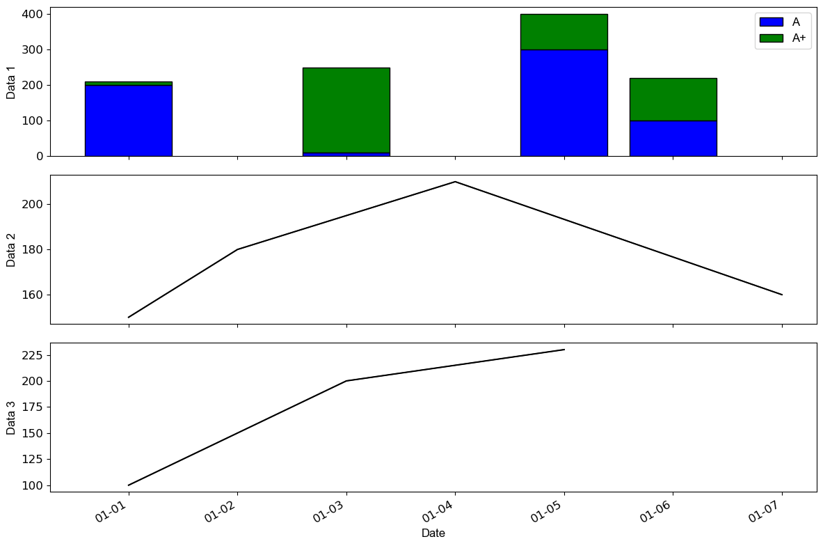
The draw_cat_bar_curveplots function from the multidataprocessing package combines categorical bar plots with overlaid curve plots. This feature allows for a detailed comparative analysis of primary data alongside secondary trends within the same visual context, making it ideal for simultaneous examination of discrete and continuous data aspects.
Functionality
This function is perfect for applications where understanding the relationship between categorical and continuous data is essential. It can be used in market research for product comparison across different time points, financial analysis showing categorical expenditure against revenue trends, or any scenario where integrated visualization provides deeper insights.
Parameters
- main_result (dict): Main categorical data to be plotted as bars. Keys should be categories and values the measurements.
- other_data_list (list of dicts): List of dictionaries for the curve plots, where each dictionary represents a dataset to be plotted as a curve over the bar plots.
- bar_colors (list, optional): List of colors for the bars in the bar plot. If not provided, a default set of colors is used.
- bar_thickness (float, optional): Thickness of the bars. Default is 0.8.
- bar_edge_color (str, optional): Color of the bar edges. Default is 'black'.
- line_color (str, optional): Color for all line plots. Default is 'black'.
- cat_labels (list, optional): the labels for each category
- xlabels (list, optional): the labels for the x-axis
- ylabels (list, optional): the labels for the y-axis
- y_range (list, optional): The range for the y-axis as [min, max]. If not set, the axis scales automatically.
- figsize (tuple, optional): Size of the figure, in inches. Default is (10, 6).
- line_thickness (float or list, optional): Thickness of the lines for curve plots. Can be a single value or a list of values corresponding to each dataset.
- tick_fontsize (int, optional): Font size for the tick labels. Default is 10.
- tick_fontname (str, optional): Font name for the tick labels. Default is 'sans-serif'.
- x_tick_interval (int, optional): Interval between x-ticks, useful for densely packed x-axes. Default is 1.
- is_show (bool, optional): Whether to display the plot on the screen. Default is False.
- is_save (bool, optional): Whether to save the plot to a file. Default is True.
- save_path (str, optional): File path where the plot will be saved, if desired. If not specified, the plot is not saved.
Code Example
import multidataplotting as mdp

# Main results for the bar plot
main_result = {'1993-01-01': [200, 10], '1993-01-03': [10, 240], '1993-01-05': [300, 100], '1993-01-06': [100, 120]}

# Additional data for curve plots
other_data_list = [
    {'1993-01-01': 150, '1993-01-02': 180, '1993-01-04': 210, '1993-01-07': 160},  # Product A
    {'1993-01-01': 100, '1993-01-03': 200, '1993-01-05': 230}   # Product B
]

# Plotting the combined bar and curve plots
mdp.draw_cat_bar_curveplots(
    main_result,
    other_data_list,
    bar_colors=['blue', 'green', 'red'],
    line_color='black',
    figsize=(12, 8),
    tick_fontsize=12,
    is_show=True,
    cat_labels=['A', 'A+'],
    xlabels = ['', '', 'Date'],
    ylabels = ['Data 1', 'Data 2', 'Data 3']
)
Plotting Bar Plots
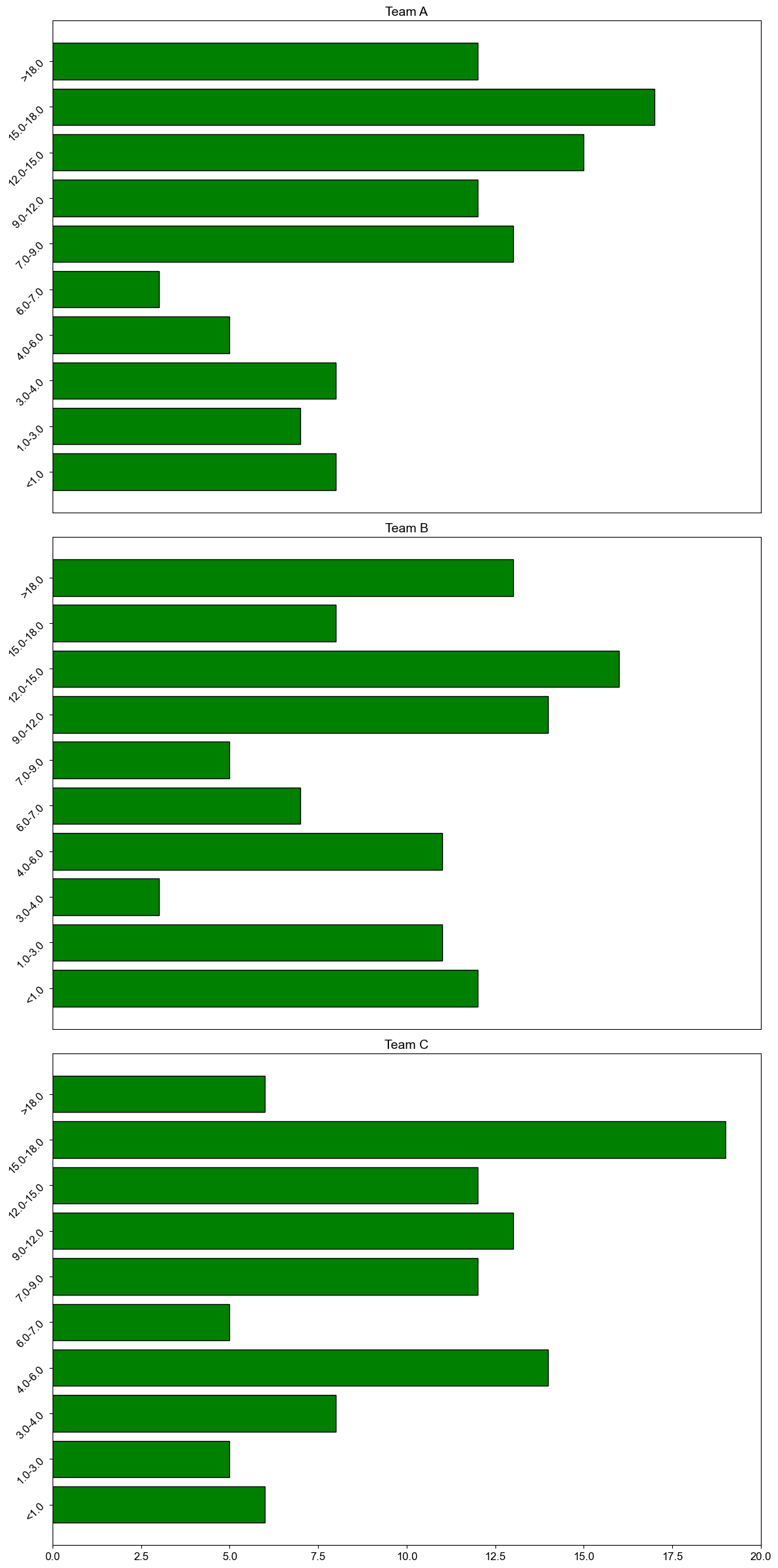
The plot_bar_plots function from the multidataprocessing package is designed to plot multiple bar plots within a single figure, allowing for comparative analysis across different data sets or categories. This function is particularly useful for visualizing and comparing discrete data points across multiple groups or time intervals.
Functionality
This function is ideal for business reporting, scientific data comparison, or any scenario where multiple datasets need to be compared side-by-side. It enhances data presentation by providing clear, distinct visualizations that facilitate easy comparison of categorical data.
Parameters
- list_of_lists (list of lists): A list where each sublist contains data for one bar plot.
- tuple_range_list (list of tuples): A list of tuples specifying the range for each bar in the plots.
- titles (str or list of str, optional): Titles for each subplot. Can be a single string or a list of strings if there are multiple plots.
- ylabels (str or list of str, optional): Y-axis labels for each subplot. Can be a single string or a list of strings if there are multiple plots.
- bar_color (str, optional): Color of the bars in the plots. Default is 'blue'.
- bar_edgecolor (str, optional): Color of the bar edges. Default is 'black'.
- fig_size (tuple, optional): Dimensions of the entire figure, in inches. Default is (10, 6).
- tick_fontname (str, optional): Font name for the tick labels. Default is 'Arial'.
- tick_fontsize (int, optional): Font size for the tick labels. Default is 12.
- title_fontsize (int, optional): Font size for the titles of each subplot. Default is 14.
- label_fontsize (int, optional): Font size for the labels. Default is 14.
- line_color (str, optional): Color of the line indicating mean or median, if applicable. Default is 'red'.
- show_all_xticklabels (bool, optional): Whether to show all x-tick labels. Default is True.
- bar_width (float, optional): Width of the bars in the plots. Default is 1.
- line_style (str, optional): Style of the mean or median line, e.g., '--' for dashed. Default is '--'.
- line_width (float, optional): Width of the mean or median line. Default is 2.
- is_legend (bool, optional): Whether to show a legend in the plots. Default is False.
- unit (str, optional): Unit of measurement for the data, useful for annotations. Default is 'm'.
- is_fixed_y_range (bool, optional): Whether to fix the y-axis range across all plots. Default is True.
- y_range (list, optional): Specific y-axis limits as [min, max].
- is_mean_value (bool, optional): Whether to display the mean value on the histograms. Default is False.
- is_scaled (bool, optional): Whether to scale the data by a factor. Default is False.
- scale_factor (float, optional): Factor by which to scale the data, if is_scaled is True.
- save_path (str, optional): File path where the plot will be saved, if desired.
- is_show (bool, optional): Whether to display the plot on the screen. Default is False.
- is_save (bool, optional): Whether to save the plot to a file. Default is True.
- transparent_bg (bool, optional): Whether the background of the saved figure should be transparent. Default is True.
- horizontal (bool, optional): Whether the bars should be plotted horizontally. Default is False.
- convert_minute (bool, optional): Whether to convert the x-tick labels to minutes. Default is True.
- hspace (float, optional): The amount of height reserved for white space between subplots, expressed as a fraction of the average axis height. Default is 0.05.
Code Example
import multidataplotting as mdp
import numpy as np

# Sample data
team_performance = [[20*np.random.random() for i in range(100)] for _ in range(3)]
range_tuples = [(1), (1, 3), (3,4), (4, 6), (6,7), (7, 9), (9, 12), (12, 15), (15, 18), (18)]  # Quarterly ranges

# Plotting the bar plots
mdp.plot_bar_plots(
    list_of_lists=team_performance,
    tuple_range_list=range_tuples,
    titles=["Team A", "Team B", "Team C"],
    ylabels="Score",
    bar_color='green',
    fig_size=(12, 8),
    is_scaled=False,
    is_show=True,
    convert_minute=False,
)
Plotting 2D Heatmaps
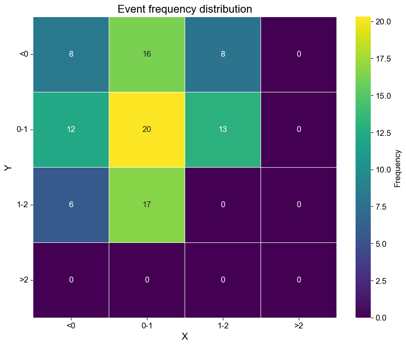
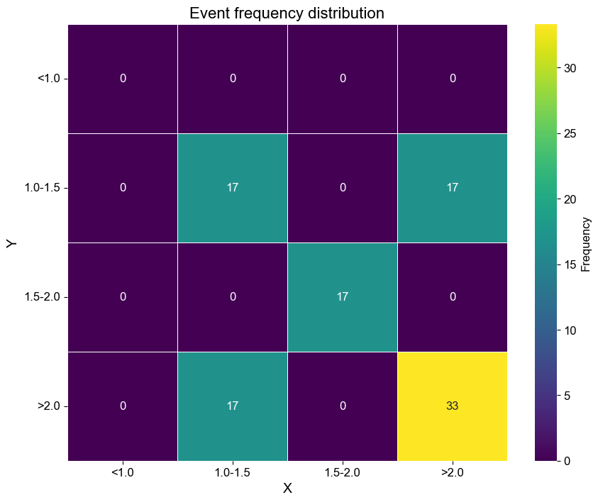
The plot_2D_heatmap function in the multidataprocessing package generates a two-dimensional heatmap from a dictionary of tuple pairs representing coordinate points and their respective frequency or intensity values. This visualization tool is especially useful for representing the density or intensity distribution across a two-dimensional space, making it applicable in areas like geographical data analysis, heat distribution, market density studies, and more.
Functionality
This function transforms raw data into a visually intuitive heatmap, allowing for the easy identification of patterns or concentrations within the data. It is invaluable for any analysis where understanding the spatial distribution of a variable is crucial.
Parameters
- pair_freq (dict): Dictionary with keys as tuple pairs of x and y coordinates (e.g., (x, y)) and values as their frequencies or intensities. Or a dataframe of two columns.
- x_bin_ticks(list, optional): a list of numbers, must locate within data range, if input is a dictionary, this is required, optional only if your input is a dataframe
- y_bin_ticks(list, optional): a list of numbers, must locate within data range, if input is a dictionary, this is required, optional only if your input is a dataframe
- fig_size (tuple, optional): The dimensions of the figure, in inches. Default is (10, 8).
- title (str, optional): The title of the heatmap. Default is 'Cross Relationship Heatmap'.
- title_fontsize (int, optional): Font size for the title. Default is 16.
- xlabel (str, optional): Label for the x-axis. Default is 'Variable 1'.
- ylabel (str, optional): Label for the y-axis. Default is 'Variable 2'.
- label_fontsize (int, optional): Font size for the axis labels. Default is 14.
- tick_fontsize (int, optional): Font size for the tick labels. Default is 12.
- vmin (float, optional): Minimum data value that corresponds to the colormap’s lower limit. If None, defaults to the data’s min value.
- vmax (float, optional): Maximum data value that corresponds to the colormap’s upper limit. If None, defaults to the data’s max value.
- cmap (str, optional): Colormap used for the heatmap. Default is 'viridis'.
- cbar_label (str, optional): Label for the colorbar. Default is 'Frequency'.
- save_path (str, optional): Path to save the figure. If provided, the plot is saved to this location.
- is_show (bool, optional): Whether to display the plot. Default is True.
- xtick_rotation (int, optional): Rotation angle for the x-axis tick labels. Default is 0.
- ytick_rotation (int, optional): Rotation angle for the y-axis tick labels. Default is 0.
- xticklabels (list, optional): Custom labels for the x-axis ticks. If None, default labels based on the data are used.
- yticklabels (list, optional): Custom labels for the y-axis ticks. If None, default labels based on the data are used.
Code Example
import multidataplotting as mdp

# Example data: coordinates with frequencies
data = {
    (0, 0): 100, (0, 2): 70,
    (0, 1): 150, (1, 2): 205,
    (1, 0): 200, (2, 1): 160,
    (1, 1): 250, (2, 0): 95,
}
x_bin_ticks = [0, 1, 2]
y_bin_ticks = [0, 1, 2]
# Plotting the heatmap
plot_2D_heatmap(pair_freq=data, x_bin_ticks=x_bin_ticks, y_bin_ticks=y_bin_ticks,title="Event Frequency Distribution",
                xlabel="X", ylabel="Y", is_show=True, is_annotate=True)
import multidataplotting as mdp

# Example data: dataframe
data = [
    {'X': 1, 'Y': 1},
    {'X': 1, 'Y': 2},
    {'X': 2, 'Y': 1},
    {'X': 2, 'Y': 2},
    {'X': 2, 'Y': 4},
    {'X': 1.5, 'Y':1.8}
]
data = pd.DataFrame(data)
# Plotting the heatmap
plot_2D_heatmap(pair_freq=data, title="Event Frequency Distribution",
                xlabel="X", ylabel="Y", is_show=True, is_annotate=True)
Plotting High-Dimensional Heatmaps with Velocity Arrows and Classifications
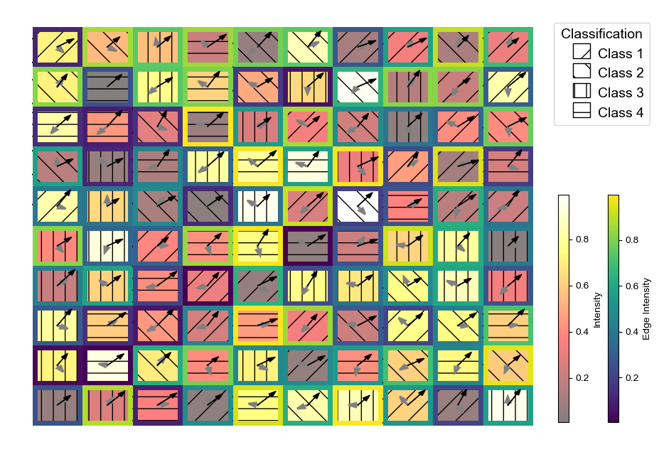
The plot_intensity_velocity_and_classes function creates detailed heatmaps that visualize intensity data with additional features such as velocity vectors, classification patterns, and optional edges. This is particularly useful in fields like geospatial analysis, fluid dynamics, and any area where it's critical to observe how different variables like speed and direction are distributed across a space.
Functionality
This function allows for the visualization of scalar fields (intensity data) while superimposing vector fields (velocity data) and categorical overlays (classification patterns). It supports customization of almost every visual aspect, including color maps for intensity and edges, transparency settings, and arrow dynamics. This makes it an invaluable tool for detailed spatial analysis and presentation-ready visualization.
Parameters
- intensity_data (list of np.array): Contains one or two 2D numpy arrays; the first array represents the intensity values for the heatmap, and the optional second array represents edge intensities.
- velocity_list (list of np.array): Contains pairs of numpy arrays representing the components of velocity vectors, either in Cartesian (x and y components) or polar (magnitude and direction) forms.
- classification_data (list of np.array): Contains a single numpy array with classification data for each cell, which will be represented as patterns on the heatmap.
- v_choice (str): Specifies the format of velocity data ('component' for Cartesian or 'theta' for polar coordinates).
- primary_colormap, edge_colormap (str): Colormap identifiers for the intensity and edge data, respectively.
- edge_thickness (float): Thickness of the edges around heatmap cells.
- face_alpha (float): Transparency for the face colors of heatmap cells.
- arrow_scale (float): Scaling factor for the velocity arrows.
- arrow_colors, arrow_styles, arrow_thicknesses: Properties for customizing the appearance of velocity arrows.
- figsize (tuple): Dimensions of the figure in inches.
- face_label, edge_label (str, optional): Labels for the colorbars of face and edge intensities.
- class_labels (list, optional): Custom labels corresponding to each class represented by patterns.
- is_legend (bool): Whether to display a legend for classification patterns.
- is_show (bool): Whether to display the plot on the screen.
- save_path (str, optional): Path to save the plot image file.
Code Example
import numpy as np
import multidataplotting as mdp
intensity_data1 = np.random.rand(10, 10)  # Random 10x10 array for cell faces
intensity_data2 = np.random.rand(10, 10)  # Random 10x10 array for cell edges
classification_data = [np.random.randint(0, 4, (10, 10))]  # Random class integers

velocity_x1 = np.random.rand(10, 10) - 0.5
velocity_y1 = np.random.rand(10, 10) - 0.5
velocity_x2 = np.random.rand(10, 10) + 0.5
velocity_y2 = np.random.rand(10, 10) + 0.5

mdp.plot_intensity_velocity_and_classes([intensity_data1, intensity_data2], [velocity_x1, velocity_y1, velocity_x2, velocity_y2],
                                             classification_data,
                                             v_choice='component', primary_colormap='hot', edge_colormap='viridis',
                                             edge_thickness=5, face_alpha=0.5, arrow_scale=0.2,
                                             arrow_colors=['gray', 'black'], arrow_styles=['-', '-'], arrow_thicknesses=[2, 1])
Plotting Contour Maps
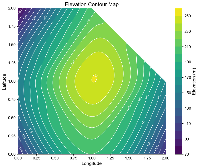
The plot_contour_map function in the multidataprocessing package generates contour maps based on spatial data, suitable for visualizing gradients, potential fields, or any continuous variable across a two-dimensional area. This function is extremely useful in geophysical studies, meteorology, and landscape ecology to understand topographical, temperature, or pressure variations in a given region.
Functionality
Contour maps created by this function help in interpreting complex spatial data by showing lines of equal value, making it easier to see hills, valleys, and plains in geographical data or gradients in any scientific measurements across a surface.
Parameters
- data (dict or pandas.DataFrame): Data to plot, which should be a dictionary with tuple pairs (x, y) as keys and values representing the measurement at those coordinates, or a DataFrame with columns for x, y, and value.
- fig_size (tuple, optional): Dimensions of the figure, typically in inches. Default is (10, 8).
- title (str, optional): Title of the contour map. Default is 'Contour Map'.
- title_fontsize (int, optional): Font size for the title. Default is 16.
- xlabel (str, optional): Label for the x-axis. Default is 'X Coordinate'.
- ylabel (str, optional): Label for the y-axis. Default is 'Y Coordinate'.
- colorbar_label (str, optional): Label for the colorbar that describes the variable. Default is 'Frequency (%)'.
- label_fontsize (int, optional): Font size for the axis labels. Default is 14.
- tick_fontsize (int, optional): Font size for the tick labels. Default is 12.
- contour_levels (int, optional): Number of contour levels to draw. Default is 20.
- cmap (str, optional): Colormap used for the contour plot. Default is 'viridis'.
- is_contour_line (bool, optional): Whether to draw contour lines. Default is True.
- contour_line_colors (str, optional): Color of the contour lines. Default is 'white'.
- contour_line_width (float, optional): Width of the contour lines. Default is 1.0.
- is_contour_label (bool, optional): Whether to label the contour lines. Default is True.
- contour_label_color (str, optional): Color of the contour labels. Default is 'white'.
- contour_label_size (int, optional): Font size of the contour labels. Default is 10.
- label_interval (int, optional): Interval at which labels appear on contour lines. Default is 2.
- save_path (str, optional): Path to save the figure. If provided, the plot is saved to this location.
- is_show (bool, optional): Whether to display the plot. Default is True.
- xticks (list, optional): Custom tick intervals for the x-axis.
- yticks (list, optional): Custom tick intervals for the y-axis.
- xtick_labels (list, optional): Custom labels for the x-axis ticks.
- ytick_labels (list, optional): Custom labels for the y-axis ticks.
Code Example
import multidataplotting as mdp
import pandas as pd

# Example Data
data = {
    (0, 0): 100, (0, 2): 70,
    (0, 1): 150, (1, 2): 205,
    (1, 0): 200, (2, 1): 160,
    (1, 1): 250, (2, 0): 95,
}

# if using pandas
# data = pd.DataFrame({'Points': [(0,0),(0,1), (0,2),(1,0),(1,1),(1,2),(2,1),(2,0)], 'Elevation': [100, 150, 70, 200, 250, 205, 160, 95]})
# Plotting the contour map
mdp.plot_contour_map(data, title="Elevation Contour Map", xlabel="Longitude", ylabel="Latitude", colorbar_label="Elevation (m)", is_show=True)
Plotting 3-D Bar Plots
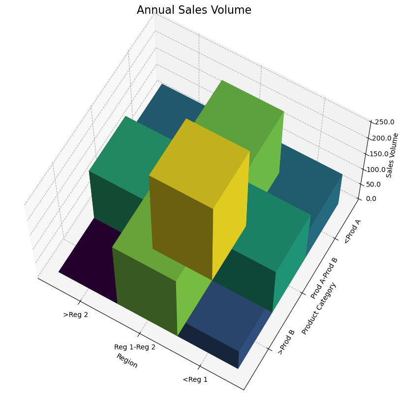
The plot_3d_stacked_bar function in the multidataprocessing package creates a three-dimensional stacked bar plot, which is particularly effective for visualizing the distribution of multiple variables across two dimensions with an additional dimension represented by the height of the bars. This type of visualization is useful in finance, sales data analysis, resource allocation, and more, where comparisons across two categorical dimensions are necessary.
Functionality
This function enhances data presentation by allowing for the visualization of complex interrelationships among data in a three-dimensional space, making it easier to discern patterns and trends that may not be as obvious in two-dimensional plots.
Parameters
- pair_freq (dict or pandas.DataFrame): Data to plot, either as a dictionary with tuple pairs (x, y) as keys and values as their frequency, or a DataFrame with suitable columns.
- x_bin_ticks (list): Bins or categories for the x-axis.
- y_bin_ticks (list): Bins or categories for the y-axis.
- fig_size (tuple, optional): Dimensions of the figure, typically in inches. Default is (12, 10).
- title (str, optional): Title of the 3D plot. Default is '3D Stacked Bar Plot'.
- title_fontsize (int, optional): Font size for the title. Default is 16.
- xlabel (str, optional): Label for the x-axis. Default is 'Variable 1'.
- ylabel (str, optional): Label for the y-axis. Default is 'Variable 2'.
- zlabel (str, optional): Label for the z-axis, representing the frequency or another measured variable. Default is 'Frequency'.
- is_percent (bool, optional): Whether to display the z-axis values as percentages. Default is False.
- label_fontsize (int, optional): Font size for the axis labels. Default is 10.
- tick_fontsize (int, optional): Font size for the tick labels. Default is 10.
- color_map (matplotlib.colors.Colormap, optional): Color map for the bars, affecting their color based on value. Default uses Matplotlib's viridis.
- save_path (str, optional): Path to save the figure. If provided, the plot is saved to this location.
- is_show (bool, optional): Whether to display the plot. Default is True.
- x_ticklabel_left_close (bool, optional): Whether to close the left side of x-tick labels. Default is False.
- x_ticklabel_right_close (bool, optional): Whether to close the right side of x-tick labels. Default is False.
- y_ticklabel_top_close (bool, optional): Whether to close the top side of y-tick labels. Default is False.
- y_ticklabel_bottom_close (bool, optional): Whether to close the bottom side of y-tick labels. Default is False.
- elevation (int, optional): Elevation angle of the 3D view. Default is 30.
- azimuth (int, optional): Azimuth angle of the 3D view. Default is 30.
- background_color (str, optional): Background color of the plot. Default is 'white'.
Code Example
import multidataplotting as mdp

# Example data: Sales volume for different regions and product categories
data = {
    (0, 0): 100, (0, 2): 70,
    (0, 1): 150, (1, 2): 205,
    (1, 0): 200, (2, 1): 160,
    (1, 1): 250, (2, 0): 95,
}

# Defining the categories for the axes
x_categories = ["Reg 1", "Reg 2"]
y_categories = ["Prod A", "Prod B"]

# Plotting the 3D stacked bar chart
mdp.plot_3d_stacked_bar(data, x_bin_ticks=x_categories, y_bin_ticks=y_categories, \
    elevation = 65, azimuth = 120, ytick_rotation=60,
        title="Annual Sales Volume", xlabel="Region", ylabel="Product Category", zlabel="Sales Volume", is_show=True)
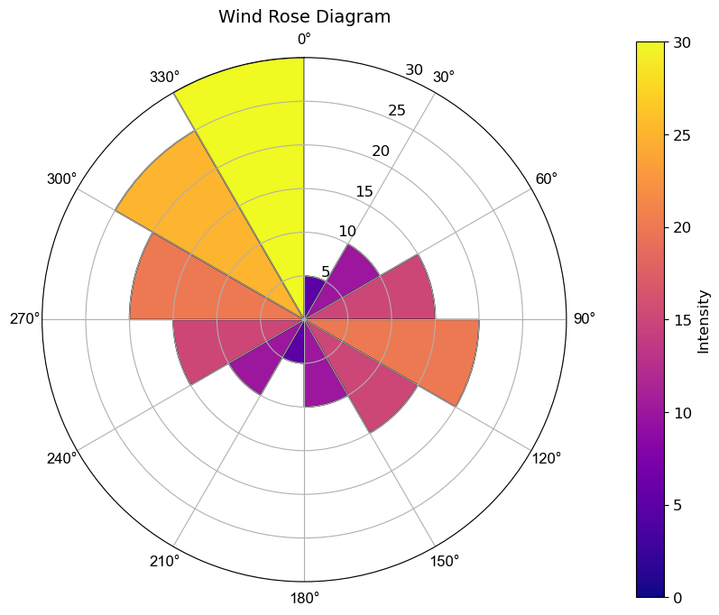
Plotting Rose Map
The plot_rose_map function in the multidataprocessing package creates a rose diagram (or wind rose), which is commonly used in meteorology to display the frequency of occurrence of events relative to multiple directions. This visualization is also highly effective in geography, environmental science, and any field requiring the analysis of directional data.
Functionality
This function facilitates the analysis of how often events occur from different directions and can include an additional dimension representing magnitude (such as wind speed) or frequency. It's perfect for visualizing how wind direction and speed vary at a particular location or how any directional data is distributed.
Parameters
- input_data (pd.DataFrame): The DataFrame containing the data. It should include columns for direction (degrees or category) and the value or frequency of occurrences.
- key_1 (str): Column name in input_data for directional data.
- key_2 (str): Column name in input_data for the values associated with each direction.
- interval (int, optional): The bin size for directional data, in degrees. Default is 10.
- value_interval (int, optional): The bin size for value data, providing granularity in how values are segmented within the plot. Default is None, which means no binning.
- title (str, optional): Title of the rose map. Default is "Rose Map".
- label_size (int, optional): Font size for the labels on the plot. Default is 12.
- label_interval (int, optional): Interval for displaying labels around the rose, which can help in reducing label clutter. Default is 1.
- color_ramp (str, optional): Color map used for the plot. Default is "viridis".
- tick_label_size (int, optional): Font size for the tick labels. Default is 12.
- tick_label_color (str, optional): Color for the tick labels. Default is 'black'.
- tick_font_name (str, optional): Font name for the tick labels. Default is 'Arial'.
- figsize (tuple, optional): Dimensions of the plot, in inches. Default is (10, 8).
- colorbar_label (str, optional): Label for the color bar. Default is "Intensity".
- colorbar_label_size (int, optional): Font size for the color bar label. Default is 12.
- max_radius (float, optional): Maximum radius for the plot, controlling how far out the data extends. Default is None, which auto-scales.
- save_path (str, optional): File path where the plot will be saved, if desired.
- is_show (bool, optional): Whether to display the plot. Default is True.
Code Example
import pandas as pd
import multidataplotting as mdp

# Example wind data
data = {
    'Direction': [0, 30, 60, 90, 120, 150, 180, 210, 240, 270, 300, 330],
    'Speed': [5, 10, 15, 20, 15, 10, 5, 10, 15, 20, 25, 30]
}
df = pd.DataFrame(data)

# Plotting the wind rose
mdp.plot_rose_map(df, key_1='Direction', key_2='Speed', interval=30, title="Wind Rose Diagram", color_ramp='plasma', is_show=True)
Plotting Rose Contour Map for Directional Data
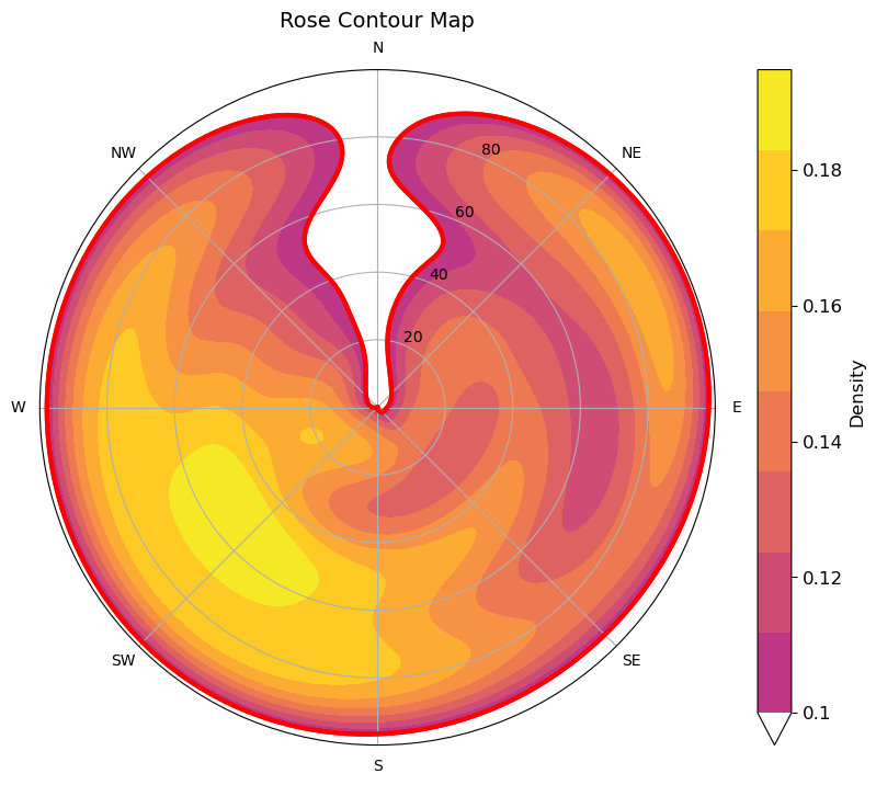
The plot_rose_contour_map function creates a rose contour map to visualize directional data using contours with optional threshold-based boundary lines. This is particularly useful in meteorology, oceanography, and environmental sciences where wind, waves, or any directional data need to be visualized for analysis and decision-making.
Functionality
This function plots a rose (or wind) contour map with options for customization such as color ramps, boundary lines at specified density thresholds, and percentage labels. It supports various contour levels, providing flexibility for detailed and high-level data representation.
Parameters
- input_data (pd.DataFrame): The DataFrame containing the directional data.
- key_1 (str): The column name for directional data.
- key_2 (str): The column name for the value data.
- title (str): Title of the plot.
- label_size (int): Font size for labels.
- color_ramp (str): Color ramp for the plot.
- figsize (tuple): Size of the figure.
- num_levels (int): Number of contour levels.
- max_radius (float): Maximum radius of the plot.
- density_threshold (float): Density threshold for boundary line.
- z_label (str): Label for the colorbar.
- boundary_line_color (str): Color for the boundary line.
- boundary_line_thickness (float): Thickness of the boundary line.
- is_percent (bool): Whether to show the colorbar as a percentage.
- tick_spacing (int): Spacing between ticks on the colorbar.
- save_path (str): Path to save the plot.
- is_show (bool): Whether to display the plot.
Code Example
Suppose you are analyzing wind data and need to visualize the distribution and intensity of wind directions:
import pandas as pd
import multidataplotting as mdp
data = pd.DataFrame({
    'direction': np.random.randint(0, 360, 1000),
    'speed': np.random.rand(1000) * 100
})
mdp.plot_rose_contour_map(data, 'direction', 'speed', color_ramp='plasma', num_levels=10, density_threshold=0.001,
                      boundary_line_color='red', boundary_line_thickness=3, is_percent = True)
Plotting Cumulative Distribution Functions
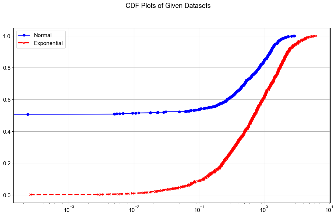
The plot_cdfs function generates cumulative distribution function (CDF) plots for multiple datasets. It is designed for versatile statistical analysis, useful in fields such as finance, engineering, and scientific research, where understanding the distribution of data is crucial.
Functionality
This function can plot the CDFs of multiple datasets either on a single figure or across multiple subplots. It offers extensive customization options, including line styles, colors, markers, and more. Optional logarithmic scaling for the x-axis accommodates data that spans several orders of magnitude.
Parameters
- data_lists (List of lists): Each sublist contains numerical data for plotting.
- figsize (tuple): Size of the figure.
- line_styles (dict): Dictionary mapping dataset indices to line styles.
- line_widths (dict): Dictionary mapping dataset indices to line widths.
- line_colors (dict): Dictionary mapping dataset indices to line colors.
- legends (list): Legend labels for each dataset.
- marker_colors (dict): Dictionary mapping dataset indices to marker colors.
- x_tick_interval (int): Interval between x-ticks on the axis.
- markers (dict): Dictionary mapping dataset indices to marker types.
- show_grid (bool): Whether to show grid lines.
- font_name (str): Font name for all text elements.
- font_size (int): Font size for all text elements.
- save_path (str): Optional path to save the figure.
- dpi (int): Resolution of the saved figure in dots per inch.
- is_same_figure (bool): Whether to plot all CDFs in the same figure.
- is_log_x (bool): Whether the x-axis should use a logarithmic scale.
Code Example
import numpy as np
import multidataplotting as mdp
data1 = np.random.normal(0, 1, 1000)
data2 = np.random.exponential(1, 1000)
mdp.plot_cdfs([data1, data2],line_styles={0: '-', 1: '--'},line_widths={0: 2, 1: 3},
          line_colors={0: 'blue', 1: 'red'},legends=['Normal', 'Exponential'],
          marker_colors={0: 'blue', 1: 'red'},markers={0: 'o', 1: 'x'},figsize=(12, 8),font_size=14,
          show_grid=True,save_path='cdf_plots.png', dpi=300,is_same_figure=True,is_log_x=True)
Plotting Positive and Negative Dot Plots
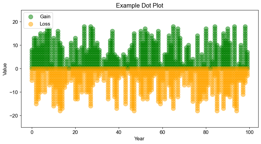
The plot_pos_neg_dot_plot function in the visualization toolkit is specifically designed to create scatter plots that visually distinguish between positive and negative data points over a set of years. This feature is particularly useful in fields like finance, environmental science, and public health, where it is crucial to track and compare upward and downward trends over time.
Functionality
This function is ideal for illustrating trends where data points are categorized into positive and negative groups across time. It can be used to visualize earnings vs. losses, growth vs. decline, or any other dataset where such distinctions are meaningful. The clear visualization aids in quick assessment and comparative analysis of data trends.
Parameters
- positive (array-like): Array of positive values.
- negative (array-like): Array of negative values.
- years (array-like): Array of years corresponding to the values.
- marker_size (int, optional): Size of the markers. Default is 100.
- marker_type (str, optional): Type of the markers (e.g., 'o' for circles, '*' for stars). Default is 'o'.
- alpha (float, optional): Transparency of the markers. Default is 1.0.
- tick_font_name (str, optional): Font name for the tick labels. Default is 'Arial'.
- tick_font_size (int, optional): Font size for the tick labels. Default is 12.
- positive_color (str, optional): Color for positive value markers. Default is 'blue'.
- negative_color (str, optional): Color for negative value markers. Default is 'red'.
- title (str, optional): Title of the plot. Default is 'Example Dot Plot'.
- xlabel (str, optional): Label for the x-axis. Default is 'Year'.
- ylabel (str, optional): Label for the y-axis. Default is 'Value'.
- y_limits (tuple, optional): Minimum and maximum limits for the y-axis. If None, defaults to [-25, 25].
- figsize (tuple, optional): Size of the figure in inches. Default is (10, 5).
- is_show (bool, optional): Whether to display the plot. Default is True.
- is_legend (bool, optional): Whether to display a legend. Default is False.
- positive_label (str, optional): Legend label for positive values. Default is 'Positive'.
- negative_label (str, optional): Legend label for negative values. Default is 'Negative'.
- save_path (str, optional): Path to save the plot image file. If None, the plot is not saved.
Code Example
import numpy as np
import multidataplotting as mdp
positive = np.random.randint(0, 20, 100)
negative = np.random.randint(0, 20, 100)
years = np.arange(100)  # Example years
mdp.plot_pos_neg_dots(positive, negative, years, marker_type='o', positive_color='green', negative_color='orange', alpha=0.5,
            positive_label='Gain', negative_label='Loss', is_legend=True, save_path='custom_plot.png')
Release history Release notifications | RSS feed


Download files
Download the file for your platform. If you're not sure which to choose, learn more about installing packages.
Source Distribution
Built Distribution
Filter files by name, interpreter, ABI, and platform.
If you're not sure about the file name format, learn more about wheel file names.
Copy a direct link to the current filters
File details
Details for the file MultiDataPlotting-0.6.0.tar.gz.
File metadata
- Download URL: MultiDataPlotting-0.6.0.tar.gz
- Upload date:
- Size: 54.8 kB
- Tags: Source
- Uploaded using Trusted Publishing? No
- Uploaded via: twine/5.1.0 CPython/3.9.12
File hashes
| Algorithm | Hash digest | |
|---|---|---|
| SHA256 |
e508c3e54a909adaea46bd5252eb29ece95f84e4a0bdd590638bb784f484914e
|
|
| MD5 |
bd62842905de95321735f0eda5364efc
|
|
| BLAKE2b-256 |
dde05698adce4c8d0b703dbac4116b2a41347b0498727bd43765ee3407a77232
|
File details
Details for the file MultiDataPlotting-0.6.0-py2.py3-none-any.whl.
File metadata
- Download URL: MultiDataPlotting-0.6.0-py2.py3-none-any.whl
- Upload date:
- Size: 32.9 kB
- Tags: Python 2, Python 3
- Uploaded using Trusted Publishing? No
- Uploaded via: twine/5.1.0 CPython/3.9.12
File hashes
| Algorithm | Hash digest | |
|---|---|---|
| SHA256 |
6d36783e9aace40ee23e8ec1450142c16ced5a3092c73ac0a182fd42781cb355
|
|
| MD5 |
bd93bc9ac269f6760a5606d706577dae
|
|
| BLAKE2b-256 |
0e7843dfc5305d11d118071ac8c744a6999b30c2ead4d019b853bea91e5990e8
|