SPC chart visuals using the NHS Making Data Count methodology — Python, Looker & Looker Studio
Verified details
These details have been verified by PyPIProject links
GitHub Statistics
Maintainers

Project description
abspc — Python SPC Charts
The abspc Python package provides publication-ready Statistical Process
Control (SPC) charts following the NHS
Making Data Count
methodology.
Built on matplotlib, it produces high-quality static images suitable for board reports, dashboards, and quality-improvement publications.
Installation
pip install abspc
Or install the development version from source:
git clone https://github.com/Aneurin-Bevan-University-Health-Board/biu_Making_Data_Count_CustomVisuals
cd biu_Making_Data_Count_CustomVisuals
pip install -e ".[dev]"
Quick Start
import pandas as pd
from abspc import plot_spc_chart, plot_run_chart

# Minimal XmR chart
data = pd.DataFrame({"value": [48, 52, 49, 55, 47, 51, 53, 50, 48, 54]})
fig, ax = plot_spc_chart(data, chart_type="XmR")
fig.savefig("my_xmr_chart.png")
Chart Types
XmR Chart
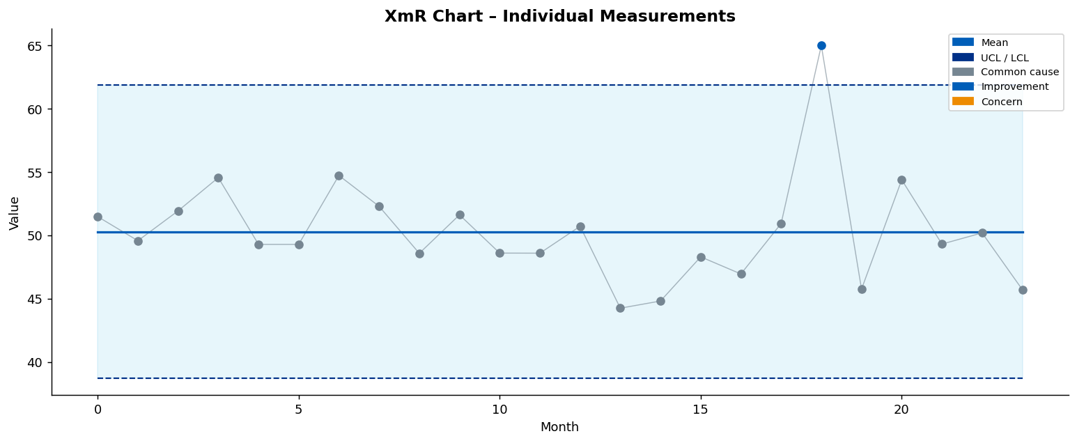
The XmR (individuals / moving-range) chart is the most common SPC chart type. It is suitable for individual measurements collected over time.
import numpy as np
import pandas as pd
from abspc import plot_spc_chart

data = pd.DataFrame({"value": np.random.normal(50, 3, 24)})

fig, ax = plot_spc_chart(
    data,
    chart_type="XmR",
    title="XmR Chart – Individual Measurements",
    xlabel="Month",
    ylabel="Value",
    shade_band=True,
    improvement_direction="high",
)
I (Individuals) chart —
chart_type="i"or"I"is an alias of XmR and produces identical control limits (mean ± 2.66·MRbarfor the 3-sigma limits,± 1.77·MRbarfor the 2-sigma warning limits). Only the default title changes to "I Chart (Individuals)".
p Chart
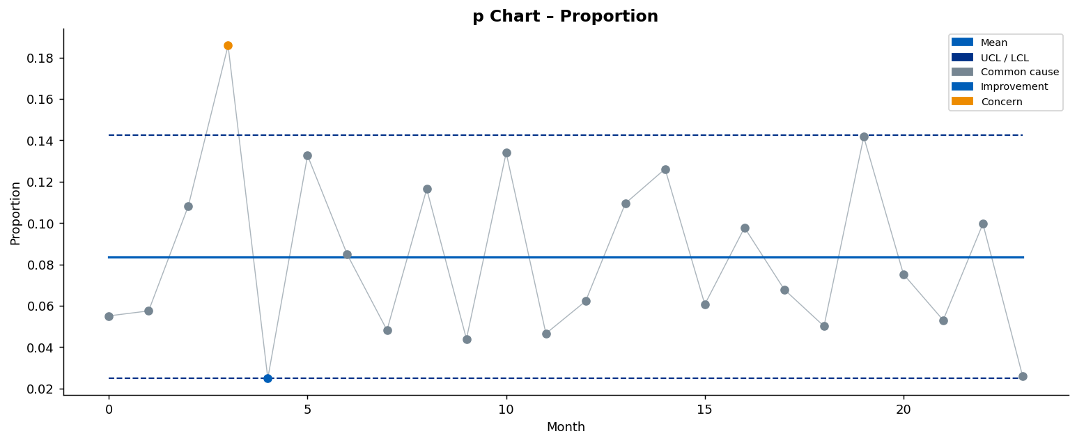
The p chart is for proportion data (e.g., percentage of patients waiting
4 hours). It requires a
subgroup_sizecolumn containing the denominator.
data = pd.DataFrame({
    "value": [0.10, 0.12, 0.08, 0.15, 0.09, 0.11, 0.10, 0.13, 0.07, 0.12,
              0.09, 0.11, 0.10, 0.08, 0.14, 0.12, 0.09, 0.11, 0.08, 0.10,
              0.12, 0.09, 0.11, 0.10],
    "subgroup_size": [200] * 24,
})

fig, ax = plot_spc_chart(
    data,
    chart_type="p",
    title="p Chart – Proportion",
    xlabel="Month",
    ylabel="Proportion",
    improvement_direction="low",
)
You can also pass a numerator column and a denominator column:
data = pd.DataFrame({
    "events":     [20, 24, 16, 30, 18],
    "population": [200, 200, 200, 200, 200],
})
fig, ax = plot_spc_chart(
    data,
    chart_type="p",
    value_col="population",
    numerator_col="events",
    improvement_direction="low",
)
c Chart
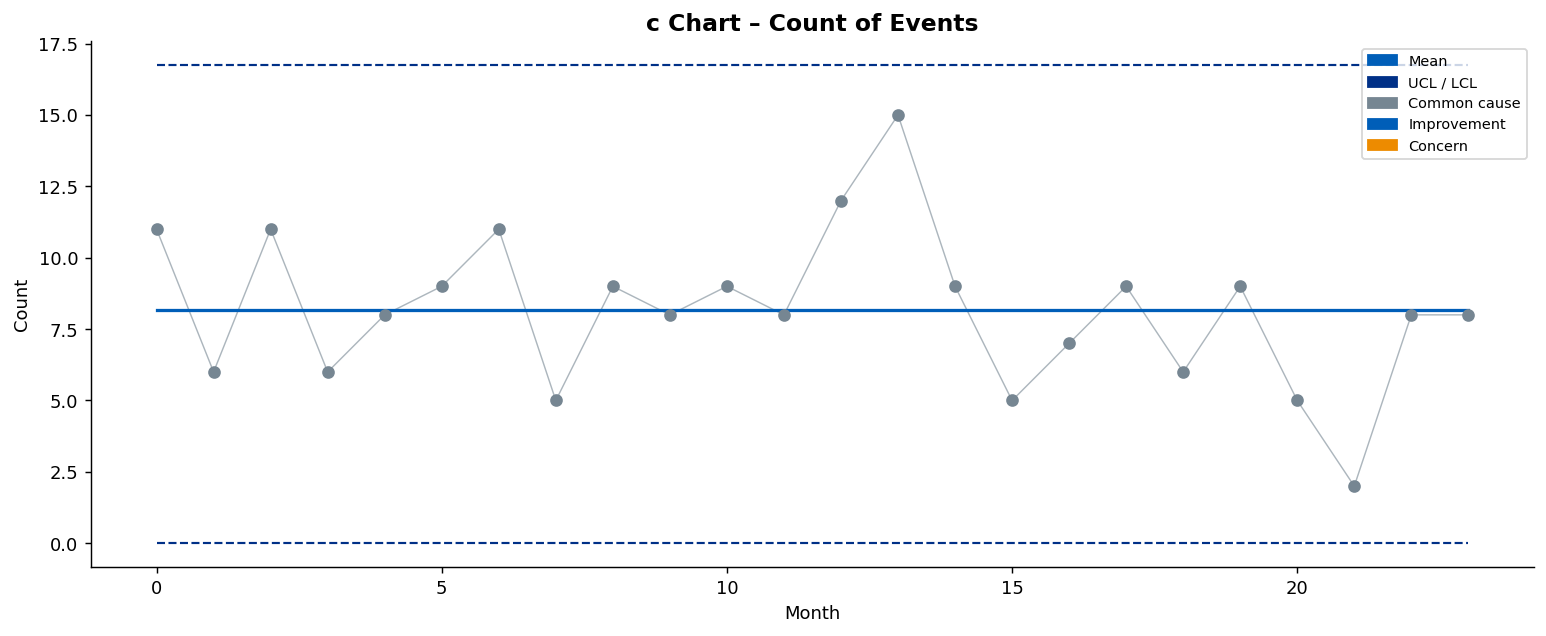
The c chart is for counts of events in a fixed sample size (e.g., adverse events per ward per month).
data = pd.DataFrame({"value": [3, 5, 2, 6, 4, 3, 7, 5, 4, 6,
                                 5, 3, 4, 6, 5, 4, 3, 5, 6, 4,
                                 3, 5, 4, 6]})

fig, ax = plot_spc_chart(
    data,
    chart_type="c",
    title="c Chart – Count of Events",
    xlabel="Month",
    ylabel="Count",
    improvement_direction="low",
)
Run Chart
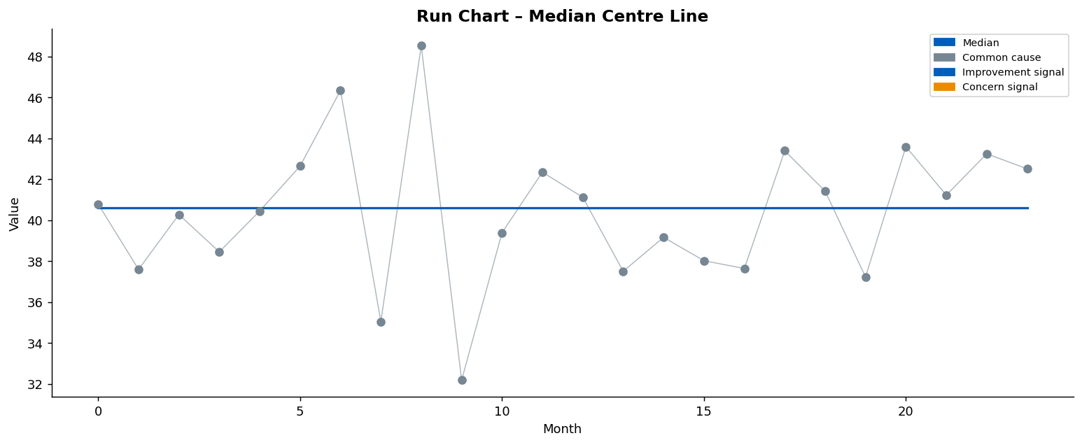
The run chart plots data against time with a median centre line and no control limits. It uses run-chart rules to detect signals (8-point shift and 6-point trend).
from abspc import plot_run_chart

data = pd.DataFrame({"value": np.random.normal(40, 4, 24)})

fig, ax = plot_run_chart(
    data,
    title="Run Chart – Median Centre Line",
    xlabel="Month",
    ylabel="Value",
    improvement_direction="high",
)
plot_spc_chart also accepts chart_type="run" and will automatically
delegate to plot_run_chart:
fig, ax = plot_spc_chart(data, chart_type="run")
Features
Logo Placement
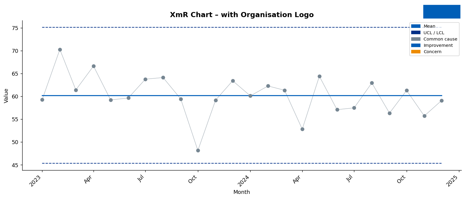
Pass any image (PNG, JPEG, etc.) via logo_path to display your
organisation's logo at the top-right of the chart, level with the title.
fig, ax = plot_spc_chart(
    data,
    chart_type="XmR",
    title="A&E 4-Hour Waits – Aneurin Bevan UHB",
    logo_path="path/to/logo.png",
    logo_zoom=0.08,
)
Note:
logo_pathplaces the logo in the title margin (top-right). The legacynhs_logo_pathparameter places an image inside the plot area.
Date Axis
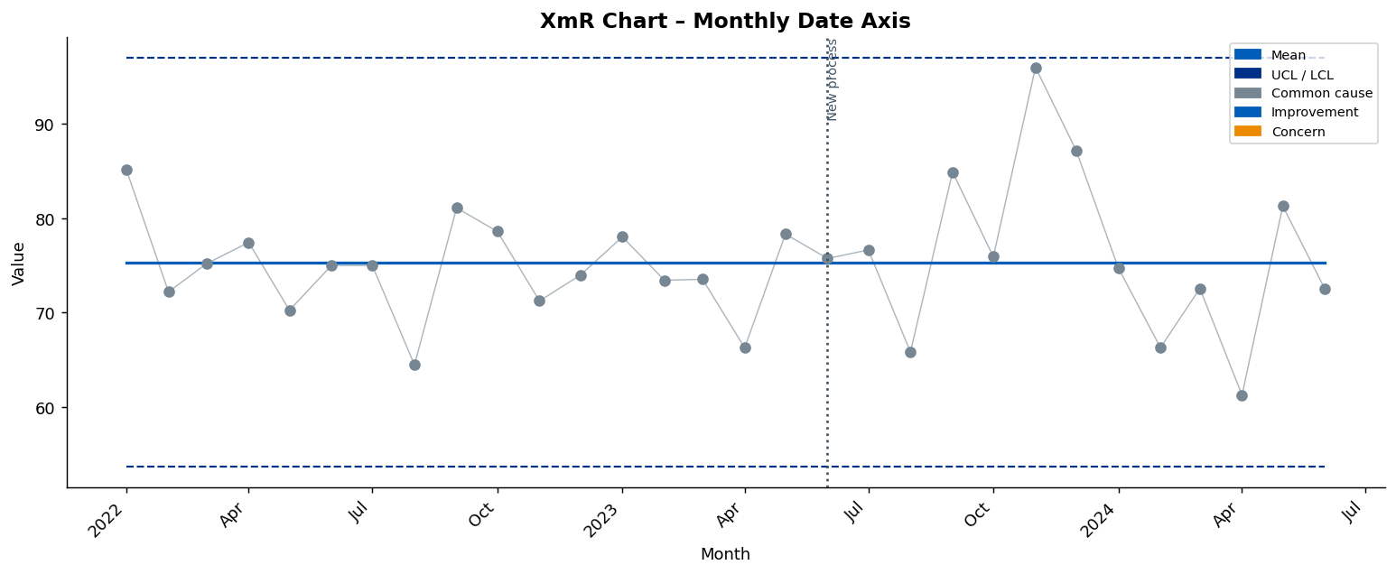
All chart functions automatically detect datetime data on the x-axis and apply smart date tick formatting.
Option 1 — DatetimeIndex (auto-detected):
dates = pd.date_range("2022-01-01", periods=30, freq="MS")
data  = pd.DataFrame({"value": np.random.normal(75, 6, 30)}, index=dates)

fig, ax = plot_spc_chart(data, chart_type="XmR", title="Monthly Date Axis")
Option 2 — Explicit date column:
fig, ax = plot_run_chart(data, x_col="period", date_format="%b %Y")
date_format |
Example output |
|---|---|
"%b %Y" |
Jan 2024 |
"%Y-%m" |
2024-01 |
"%d/%m/%Y" |
01/01/2024 |
None (default) |
Auto (ConciseDateFormatter) |
Change-Point Annotations
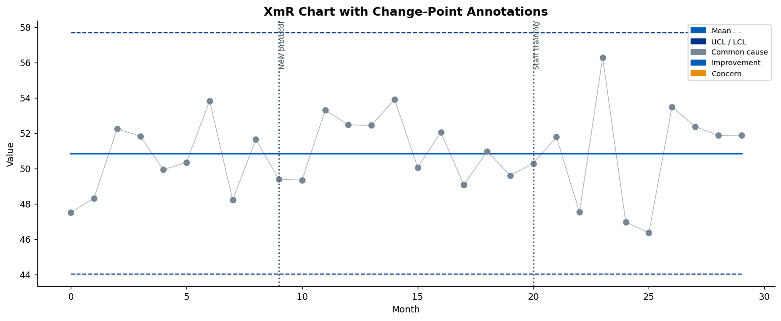
Mark known process changes with vertical lines and labels:
fig, ax = plot_spc_chart(
    data,
    chart_type="XmR",
    change_points=[
        {"x": 9,  "label": "New protocol"},
        {"x": 20, "label": "Staff training"},
    ],
)
Auto-Rebase on a Sustained Shift
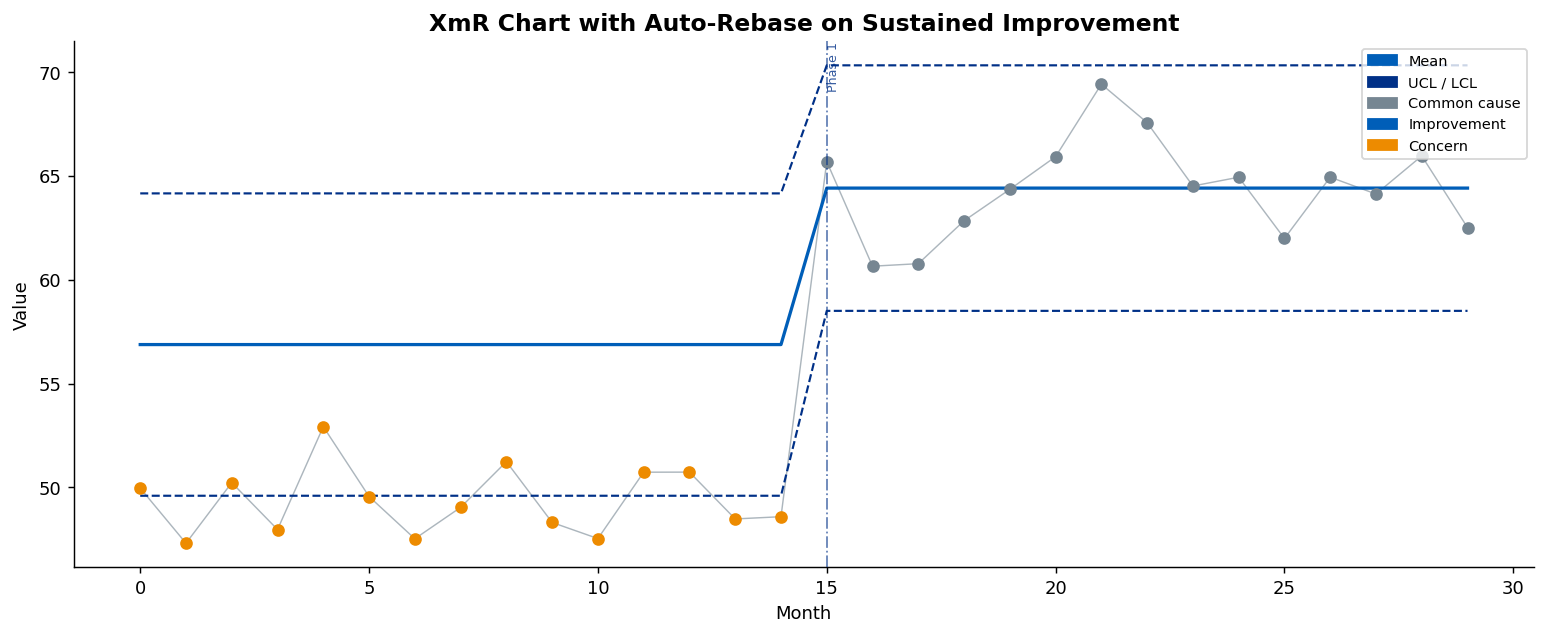
When a run of min_phase_length (default 8) consecutive points falls on
one side of the mean — the NHS MDC shift rule — control limits can be
automatically recalculated for the new phase:
fig, ax = plot_spc_chart(
    data,
    chart_type="XmR",          # or "I" — the Individuals chart, an alias of XmR
    improvement_direction="high",
    auto_rebase=True,
    rebase_on="any",            # "improvement" (default) | "worsening" | "any"
    baseline=15,                # min points per phase before a rebase is allowed
)
Use rebase_control_limits for programmatic access without plotting:
from abspc import rebase_control_limits

result = rebase_control_limits(
    data, chart_type="XmR", improvement_direction="high",
    rebase_on="any", baseline=15,
)
rebase_on— which direction of sustained shift triggers a rebase:"improvement"(inimprovement_direction),"worsening"(away from it), or"any"(either side; the earliest qualifying shift is used).baseline— the minimum number of points that must accumulate within a phase before a rebase is permitted (default15). A larger baseline absorbs early shifts.
Auto-rebase is supported for XmR / I, p, u, and c charts (not run charts).
MDC Variation & Assurance Icons
Set show_icons=True to display the official Making Data Count variation and
assurance icons at the top-left of the chart:
fig, ax = plot_spc_chart(
    data,
    chart_type="XmR",
    improvement_direction="high",
    target=60,
    show_target=True,
    show_icons=True,
)
Programmatic access:
from abspc import (
    calculate_control_limits,
    detect_special_causes,
    determine_variation_type,
    determine_assurance_type,
)

result = detect_special_causes(calculate_control_limits(data, chart_type="XmR"))
variation = determine_variation_type(result, value_col="value", improvement_direction="high")
assurance = determine_assurance_type(result, target=60, improvement_direction="high")
For run charts only the variation icon is shown (no control limits means assurance cannot be calculated).
MDC Summary Table
plot_mdc_summary_table renders an NHS MDC-style summary table showing
multiple measures at a glance:
from abspc import plot_mdc_summary_table

fig, ax = plot_mdc_summary_table(
    [
        {
            "data": df,
            "chart_type": "XmR",
            "measure": "A&E 4-Hour Waits",
            "description": "% patients seen within 4 hours",
            "value_col": "value",
            "improvement_direction": "high",
            "target": 95,
        },
        {
            "data": df_infections,
            "chart_type": "p",
            "measure": "Infection Rate",
            "description": "Proportion of infections per month",
            "value_col": "value",
            "improvement_direction": "low",
            "target": 0.05,
            "subgroup_col": "subgroup_size",
        },
    ],
    title="MDC Summary — Board Report",
)
Special-Cause Rules
Four NHS MDC rules (aligned with NHSRplotthedots):
| Rule | Name | Description |
|---|---|---|
| 1 | Astronomical point | Single value outside 3σ limits |
| 2 | Shift | ≥ 8 consecutive points above or below the mean |
| 3 | Trend | ≥ 6 consecutive points all rising or all falling |
| 4 | Two-in-three | 2 of 3 consecutive points in the warning zone |
Use the detection functions directly:
from abspc import calculate_control_limits, detect_special_causes

result = calculate_control_limits(data, chart_type="XmR")
flags  = detect_special_causes(result)
print(flags[["value", "mean", "ucl", "lcl", "rule1", "rule2", "rule3", "rule4", "special_cause"]])
API Reference
plot_spc_chart
fig, ax = plot_spc_chart(
    data,
    chart_type,                     # "XmR" | "I" | "p" | "u" | "c" | "run"
    value_col="value",
    subgroup_col="subgroup_size",
    numerator_col=None,
    x_col=None,
    title=None,
    xlabel="Observation",
    ylabel="Value",
    improvement_direction="high",
    target=None,
    show_target=False,
    shade_band=False,
    shade_color="#41B6E6",
    nhs_logo_path=None,
    ax=None,
    figsize=(12, 5),
    show_legend=True,
    change_points=None,
    auto_rebase=False,
    rebase_on="improvement",        # "improvement" | "worsening" | "any"
    baseline=15,                    # min points per phase before rebasing
    date_format=None,
    logo_path=None,
    logo_zoom=0.07,
    show_icons=False,
    icon_zoom=0.06,
)
| Parameter | Type | Default | Description |
|---|---|---|---|
data |
pd.DataFrame |
(required) | Input DataFrame with at least the value_col column. |
chart_type |
str |
(required) | "XmR", "i" / "I" (alias of XmR), "p", "u", "c", or "run" (case-insensitive). |
value_col |
str |
"value" |
Column containing the measured values. |
subgroup_col |
str | None |
"subgroup_size" |
Column with subgroup sizes. Required for "p" and "u". |
numerator_col |
str | None |
None |
For "p" charts: column with event counts when value_col holds the denominator. |
x_col |
str | None |
None |
Column for the x-axis. Auto-detects DatetimeIndex if None. |
title |
str | None |
None |
Chart title. Auto-generated if omitted. |
xlabel |
str |
"Observation" |
X-axis label. |
ylabel |
str |
"Value" |
Y-axis label. |
improvement_direction |
str |
"high" |
"high" or "low". Controls point colouring. |
target |
float | None |
None |
Optional target value for the target line and assurance calculation. |
show_target |
bool |
False |
Draw a dashed target line at target. |
shade_band |
bool |
False |
Fill between UCL and LCL with a translucent band. |
shade_color |
str |
"#41B6E6" |
Colour for tolerance-band shading. |
nhs_logo_path |
str | None |
None |
Logo inside the axes (legacy). Use logo_path instead. |
ax |
Axes | None |
None |
Existing axes to draw on. Creates a new figure when None. |
figsize |
tuple |
(12, 5) |
Figure size in inches. Ignored when ax is provided. |
show_legend |
bool |
True |
Add a colour legend. |
change_points |
list[dict] | None |
None |
Vertical annotation lines. Each dict needs "x" and "label". |
auto_rebase |
bool |
False |
Auto-detect a sustained shift and recalculate limits. |
rebase_on |
str |
"improvement" |
Shift direction that triggers a rebase: "improvement", "worsening", or "any". |
baseline |
int |
15 |
Minimum points per phase before a rebase is permitted. |
date_format |
str | None |
None |
strftime-style format for datetime x-axis. |
logo_path |
str | None |
None |
Logo image at top-right of figure. |
logo_zoom |
float |
0.07 |
Logo height as fraction of figure height. |
show_icons |
bool |
False |
Display MDC variation & assurance icons. |
icon_zoom |
float |
0.06 |
Icon height as fraction of figure height. |
Returns: (fig, ax) — matplotlib.figure.Figure and matplotlib.axes.Axes.
plot_run_chart
fig, ax = plot_run_chart(
    data,
    value_col="value",
    x_col=None,
    title=None,
    xlabel="Observation",
    ylabel="Value",
    improvement_direction="high",
    target=None,
    show_target=False,
    nhs_logo_path=None,
    ax=None,
    figsize=(12, 5),
    show_legend=True,
    change_points=None,
    date_format=None,
    logo_path=None,
    logo_zoom=0.07,
    show_icons=False,
    icon_zoom=0.06,
)
Same parameter semantics as plot_spc_chart (without chart_type,
subgroup_col, numerator_col, shade_band, shade_color, auto_rebase).
Returns: (fig, ax).
calculate_control_limits
Returns the input DataFrame extended with mean, ucl, lcl, uwl, lwl
columns (or just mean for run charts).
detect_special_causes
Returns the DataFrame extended with boolean columns rule1, rule2, rule3,
rule4, and special_cause.
detect_run_chart_signals
Returns the DataFrame extended with run_shift, run_trend, and run_signal.
rebase_control_limits
Returns the DataFrame with limits recalculated per improvement phase and a
rebase_phase integer column.
show_summary
Generates a programmatic summary dictionary for a chart, including variation
type, assurance status, descriptive statistics, triggered SPC rules, and a
list of signal points. Pass show_summary=True to plot_spc_chart or
plot_run_chart to render the summary as an additional figure.
from abspc import show_summary

summary = show_summary(data, chart_type="XmR", improvement_direction="high", target=60)
print(summary["variation"], summary["assurance"])
plot_mdc_summary_table
Renders an NHS MDC-style summary table for one or more measures (see the MDC Summary Table section above).
Running Tests
pip install -e ".[dev]"
pytest
160 unit tests covering all chart types, SPC rules, run-chart signals, auto-rebase, change-point annotations, summary generation, and plotting.
Project details
Verified details
These details have been verified by PyPIProject links
GitHub Statistics
Maintainers
Release history Release notifications | RSS feed


Download files
Download the file for your platform. If you're not sure which to choose, learn more about installing packages.
Source Distribution
Built Distribution
Filter files by name, interpreter, ABI, and platform.
If you're not sure about the file name format, learn more about wheel file names.
Copy a direct link to the current filters
File details
Details for the file abspc-1.1.0.tar.gz.
File metadata
- Download URL: abspc-1.1.0.tar.gz
- Upload date:
- Size: 285.9 kB
- Tags: Source
- Uploaded using Trusted Publishing? Yes
- Uploaded via: twine/6.1.0 CPython/3.13.12
File hashes
| Algorithm | Hash digest | |
|---|---|---|
| SHA256 |
d12b185d059f474b11dfac0579ca1e3a6549485b98e52afb387bdcfcf8bc23bd
|
|
| MD5 |
8ddf39d5f4bc9fe169e57781f51246aa
|
|
| BLAKE2b-256 |
c4d61ef14acc4813462cf208bcfbd589ff6f7a10ac7c2770b0f0dbbfbbbccce0
|
Provenance
The following attestation bundles were made for abspc-1.1.0.tar.gz:
Publisher:
publish.yml on Aneurin-Bevan-University-Health-Board/biu_Making_Data_Count_CustomVisuals
-
Statement:
-
Statement type:
https://in-toto.io/Statement/v1 -
Predicate type:
https://docs.pypi.org/attestations/publish/v1 -
Subject name:
abspc-1.1.0.tar.gz -
Subject digest:
d12b185d059f474b11dfac0579ca1e3a6549485b98e52afb387bdcfcf8bc23bd - Sigstore transparency entry: 1828535576
- Sigstore integration time:
-
Permalink:
Aneurin-Bevan-University-Health-Board/biu_Making_Data_Count_CustomVisuals@14a91accd355193c145dbe0005aa8a310ae6b8ba -
Branch / Tag:
refs/tags/v1.1.0 - Owner: https://github.com/Aneurin-Bevan-University-Health-Board
-
Access:
public
-
Token Issuer:
https://token.actions.githubusercontent.com -
Runner Environment:
github-hosted -
Publication workflow:
publish.yml@14a91accd355193c145dbe0005aa8a310ae6b8ba -
Trigger Event:
release
-
Statement type:
File details
Details for the file abspc-1.1.0-py3-none-any.whl.
File metadata
- Download URL: abspc-1.1.0-py3-none-any.whl
- Upload date:
- Size: 278.1 kB
- Tags: Python 3
- Uploaded using Trusted Publishing? Yes
- Uploaded via: twine/6.1.0 CPython/3.13.12
File hashes
| Algorithm | Hash digest | |
|---|---|---|
| SHA256 |
7cc1b600635d0e2f523078e6e62d750eedad1aa4ceb8bb5b8d081ec3500790ab
|
|
| MD5 |
7cc33bf39813682930048bbd740d8ac5
|
|
| BLAKE2b-256 |
112a206e369e5f4c716640aca7536fdf87b39038da26f7b2b33690caf5c976d5
|
Provenance
The following attestation bundles were made for abspc-1.1.0-py3-none-any.whl:
Publisher:
publish.yml on Aneurin-Bevan-University-Health-Board/biu_Making_Data_Count_CustomVisuals
-
Statement:
-
Statement type:
https://in-toto.io/Statement/v1 -
Predicate type:
https://docs.pypi.org/attestations/publish/v1 -
Subject name:
abspc-1.1.0-py3-none-any.whl -
Subject digest:
7cc1b600635d0e2f523078e6e62d750eedad1aa4ceb8bb5b8d081ec3500790ab - Sigstore transparency entry: 1828535654
- Sigstore integration time:
-
Permalink:
Aneurin-Bevan-University-Health-Board/biu_Making_Data_Count_CustomVisuals@14a91accd355193c145dbe0005aa8a310ae6b8ba -
Branch / Tag:
refs/tags/v1.1.0 - Owner: https://github.com/Aneurin-Bevan-University-Health-Board
-
Access:
public
-
Token Issuer:
https://token.actions.githubusercontent.com -
Runner Environment:
github-hosted -
Publication workflow:
publish.yml@14a91accd355193c145dbe0005aa8a310ae6b8ba -
Trigger Event:
release
-
Statement type: