Publication-quality reaction energy diagrams for computational chemistry
Verified details
These details have been verified by PyPIProject links
GitHub Statistics
Maintainers

Project description
chemdiagrams


A Python package for creating publication-quality reaction energy diagrams with Matplotlib.
Installation
You can use the latest release by installing it from PyPi:
pip install chemdiagrams
Requirements: Python ≥ 3.10, Matplotlib ≥ 3.7, NumPy ≥ 1.23, SciPy ≥ 1.10
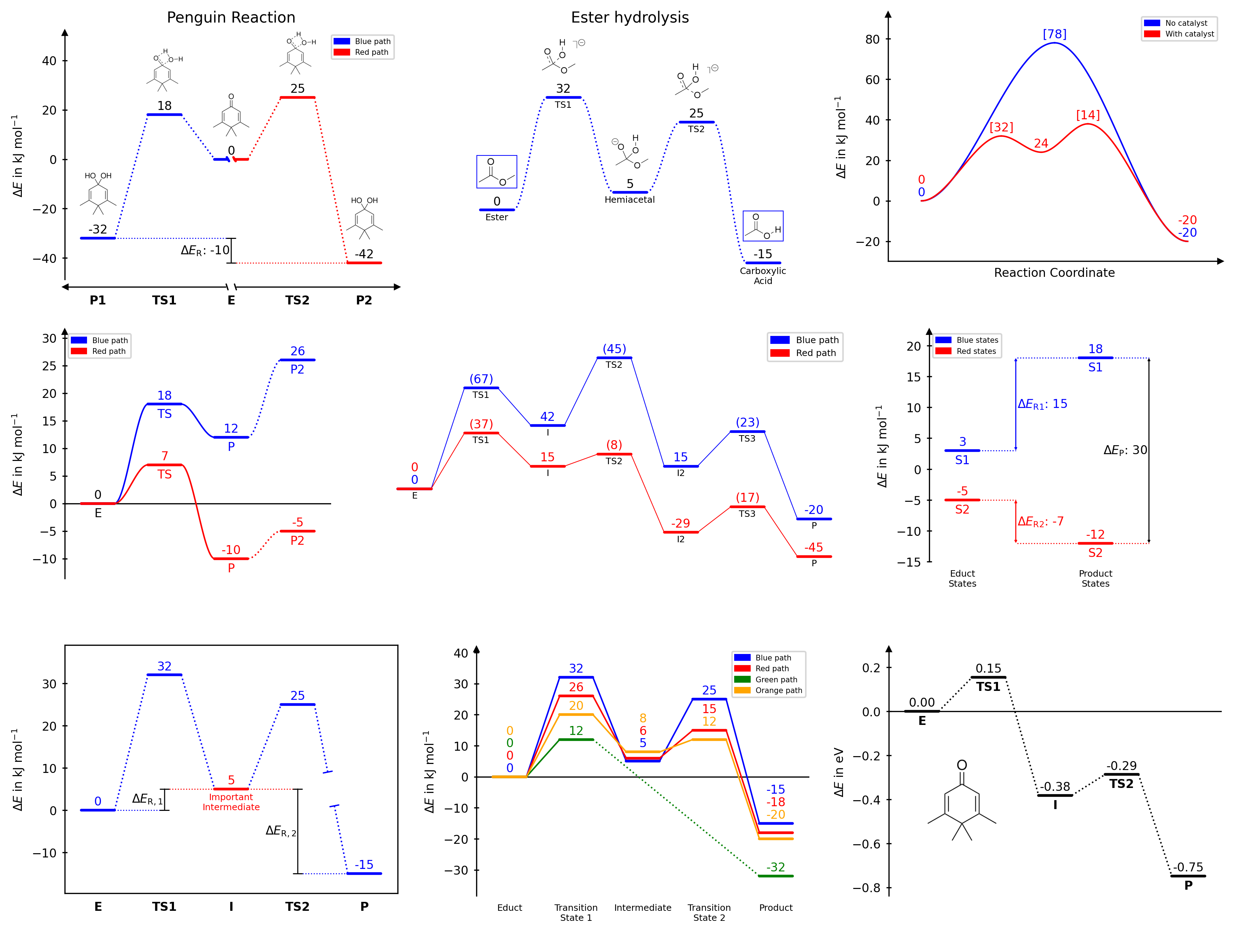
Features
- Multiple reaction paths on a single diagram
- Nine connector styles: dotted, solid, broken dotted, broken solid, spline dotted, spline solid, broken spline dotted, broken spline solid or none
- Five diagram styles:
open,halfboxed,boxed,twosided,borderless - Automatic, stacked, naïve, and averaged energy label placement (numbering)
- Custom text labels for each path at each position
- Energy difference bars with optional whiskers
- Axis break markers for both x and y axes
- Image placement along the diagram, with automatic collision avoidance and pixel-accurate scaling options
- Full access to the underlying Matplotlib objects for fine-grained customisation
- Customizable templates for consistent styling across multiple diagrams
- Possibility to insert multiple diagrams into a single figure using external Matplotlib axes (e.g. plt.subplots)
Documentation
Full documentation with usage instructions, examples, and API reference is available at https://tonner-zech-group.github.io/chem-diagrams/.
Quickstart
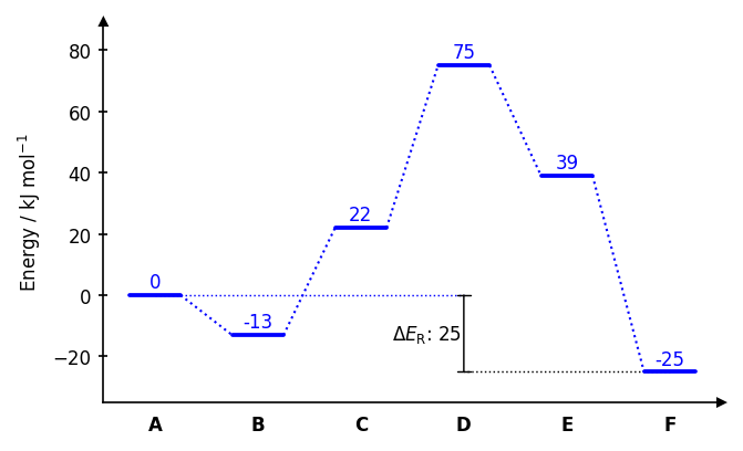
Drawing paths
from chemdiagrams import EnergyDiagram

dia = EnergyDiagram()

dia.draw_path(
    x_data=[0, 1, 2, 3, 4, 5],
    y_data=[0, -13, 22, 75, 39, 20],
    color="blue",
    path_name="Pathway A",
    linetypes=[2, 3, 4, -1, 0],
)
dia.draw_path(
    x_data=[0, 1, 2, 3, 5],
    y_data=[0, -25, 20, 50, 6],
    color="red",
    path_name="Pathway B",
)

dia.legend(fontsize=7)
dia.add_numbers_auto()
dia.set_xlabels(["A", "B", "C", "D", "E", "F"])
dia.ax.set_ylabel("Energy / kJ mol$^{-1}$", fontsize=8)
dia.show()
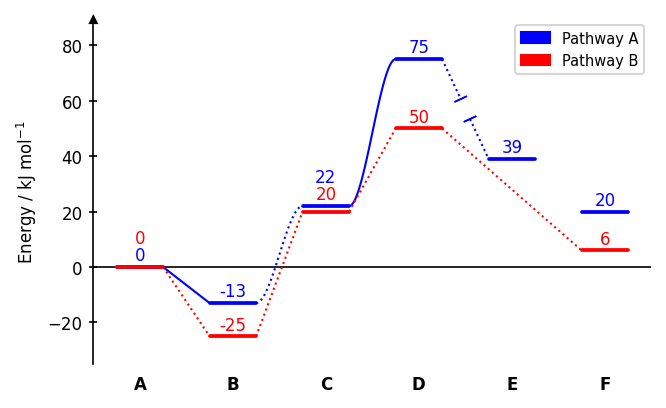
Connector styles (linetypes): 0 none, 1 dotted (default), -1 dotted with gap, 2 solid, -2 solid with gap, 3 dotted spline, -3 dotted spline with gap, 4 solid spline, -4 solid spline with gap. A single integer applies the same style to all segments.
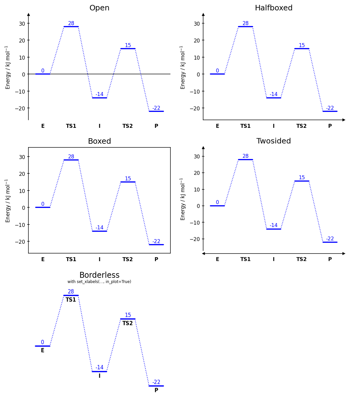
Diagram styles
dia = EnergyDiagram(style="halfboxed") # open | halfboxed | boxed | twosided | borderless
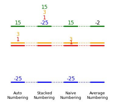
Energy labels
dia.add_numbers_auto()       # recommended
dia.add_numbers_stacked()
dia.add_numbers_naive()
dia.add_numbers_average()
Energy difference bars
dia.draw_difference_bar(
    x=3,
    y_start_end=(-25, 0),
    description=r"$\Delta E_\mathrm{R}$: ",
    x_whiskers=(5, 0),
    left_side=True,
)
Images
dia.add_image_series_in_plot(
    ["img0.png", "img1.png", "img2.png", "img3.png", "img4.png"],
    y_placement="auto",
    width=0.6,
    proportional_scaling=True,
)
Saving figures
dia.fig.savefig("diagram.png", dpi=300, bbox_inches="tight")
dia.fig.savefig("diagram.pdf", bbox_inches="tight")
For full documentation on all parameters and features, see https://tonner-zech-group.github.io/chem-diagrams/.
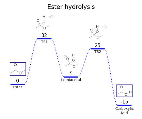
Examples
Examples can be found in the (documentation). A set of even more examples is available in examples/example_use.ipynb. The latter, however, is not actively maintained anymore and may be outdated with respect to the latest version of the package.
Citation
If you use chemdiagrams in published work, please consider citing the repository:
Tim Bastian Enders, chemdiagrams, https://github.com/Tonner-Zech-Group/chem-diagrams, https://doi.org/10.5281/zenodo.18957965
License
MIT — see LICENSE for details.
Project details
Verified details
These details have been verified by PyPIProject links
GitHub Statistics
Maintainers
Release history Release notifications | RSS feed


Download files
Download the file for your platform. If you're not sure which to choose, learn more about installing packages.
Source Distribution
Built Distribution
Filter files by name, interpreter, ABI, and platform.
If you're not sure about the file name format, learn more about wheel file names.
Copy a direct link to the current filters
File details
Details for the file chemdiagrams-0.5.6.tar.gz.
File metadata
- Download URL: chemdiagrams-0.5.6.tar.gz
- Upload date:
- Size: 61.3 kB
- Tags: Source
- Uploaded using Trusted Publishing? Yes
- Uploaded via: twine/6.1.0 CPython/3.13.12
File hashes
| Algorithm | Hash digest | |
|---|---|---|
| SHA256 |
83909537c9eac0effc3611e5243869e412649479246fed68b9b296caf37338d9
|
|
| MD5 |
96ed94e3159f01a47e1d458527f9bab8
|
|
| BLAKE2b-256 |
a136f79f34d84e922cfd2a9e55b2bd6f91628eef52c65f8999412b0f92c86c98
|
Provenance
The following attestation bundles were made for chemdiagrams-0.5.6.tar.gz:
Publisher:
publish.yml on Tonner-Zech-Group/chem-diagrams
-
Statement:
-
Statement type:
https://in-toto.io/Statement/v1 -
Predicate type:
https://docs.pypi.org/attestations/publish/v1 -
Subject name:
chemdiagrams-0.5.6.tar.gz -
Subject digest:
83909537c9eac0effc3611e5243869e412649479246fed68b9b296caf37338d9 - Sigstore transparency entry: 2142708855
- Sigstore integration time:
-
Permalink:
Tonner-Zech-Group/chem-diagrams@37c5bb00e78442481f2032b3926c8a95498150f1 -
Branch / Tag:
refs/tags/v0.5.6 - Owner: https://github.com/Tonner-Zech-Group
-
Access:
public
-
Token Issuer:
https://token.actions.githubusercontent.com -
Runner Environment:
github-hosted -
Publication workflow:
publish.yml@37c5bb00e78442481f2032b3926c8a95498150f1 -
Trigger Event:
push
-
Statement type:
File details
Details for the file chemdiagrams-0.5.6-py3-none-any.whl.
File metadata
- Download URL: chemdiagrams-0.5.6-py3-none-any.whl
- Upload date:
- Size: 51.2 kB
- Tags: Python 3
- Uploaded using Trusted Publishing? Yes
- Uploaded via: twine/6.1.0 CPython/3.13.12
File hashes
| Algorithm | Hash digest | |
|---|---|---|
| SHA256 |
8f68e1409bfffa1f03ded64e5eb015cac3c089b87d17f3d3ec3c0c19f343fa29
|
|
| MD5 |
264b2a683a48448cb50c80c0579b0a5e
|
|
| BLAKE2b-256 |
7f8c0798b9768929f203f09d2b91e7958b07f3fe218af22748ac984a89605d15
|
Provenance
The following attestation bundles were made for chemdiagrams-0.5.6-py3-none-any.whl:
Publisher:
publish.yml on Tonner-Zech-Group/chem-diagrams
-
Statement:
-
Statement type:
https://in-toto.io/Statement/v1 -
Predicate type:
https://docs.pypi.org/attestations/publish/v1 -
Subject name:
chemdiagrams-0.5.6-py3-none-any.whl -
Subject digest:
8f68e1409bfffa1f03ded64e5eb015cac3c089b87d17f3d3ec3c0c19f343fa29 - Sigstore transparency entry: 2142708888
- Sigstore integration time:
-
Permalink:
Tonner-Zech-Group/chem-diagrams@37c5bb00e78442481f2032b3926c8a95498150f1 -
Branch / Tag:
refs/tags/v0.5.6 - Owner: https://github.com/Tonner-Zech-Group
-
Access:
public
-
Token Issuer:
https://token.actions.githubusercontent.com -
Runner Environment:
github-hosted -
Publication workflow:
publish.yml@37c5bb00e78442481f2032b3926c8a95498150f1 -
Trigger Event:
push
-
Statement type:


