Publication-ready visualization for 1D data distributions using intuitive circular color gradients

Project description
ColorGradient
Publication-ready visualization for 1D data distributions using intuitive circular color gradients


Why ColorGradient?
In the context of plotting hyperparameter search grids, traditional visualizations show only average values, ignoring critical information about underlying distributions. ColorGradient reveals the full story by displaying data distributions as intuitive circular gradients, where the center represents the maximum value of the distribution and edges show the the minimal value of the distribution.
Perfect for machine learning researchers who need to:
- Compare model performance across hyperparameter grids (epochs × learning rates)
- Visualize multiple 1D data distributions organized into a single figure with multiple rows and columns
Features
- Circular gradient visualization with center=max, edges=min
- Nested grid layouts (each subplot can contain multiple rows and columns): useful for hyperparameter grid search plots
- Smart highlighting (using borders) for global/local best mean, median, min, max, p25, p75
- Publication-ready, reproducible SVG output with optional legends
Quick Start
Installation
pip install colorgradient
Examples
Example 1: Basic Distribution Comparison
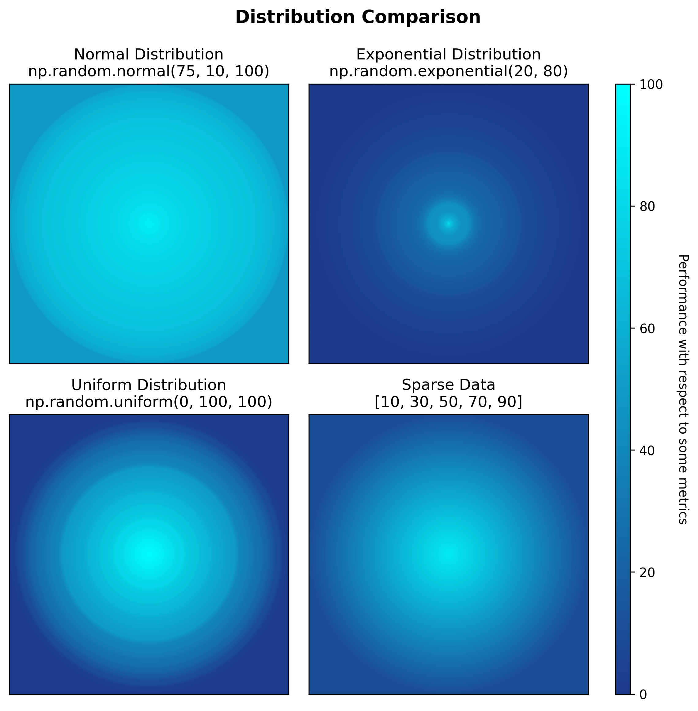
Show imports and color schema
import numpy as np
from colorgradient import plot_gradient_grid
import matplotlib.pyplot as plt
import matplotlib.colors as mcolors
import matplotlib as mpl
mpl.rcParams["svg.hashsalt"] = "42"

BLUE_CYAN_SCHEMA = {
    0: '#1E3A8A',       # Dark blue (poor performance)
    100: '#00FFFF'      # Cyan (excellent performance)
}

np.random.seed(42)
subplot_data = [
    {'data': np.random.normal(75, 10, 100), 'title': 'Normal Distribution\nnp.random.normal(75, 10, 100)'},
    {'data': np.random.exponential(20, 80), 'title': 'Exponential Distribution\nnp.random.exponential(20, 80)'},
    {'data': np.random.uniform(0, 100, 100), 'title': 'Uniform Distribution\nnp.random.uniform(0, 100, 100)'},
    {'data': [10, 30, 50, 70, 90], 'title': 'Sparse Data\n[10, 30, 50, 70, 90]'}
]

fig, axes = plot_gradient_grid(
    subplot_data=subplot_data,
    color_schema=BLUE_CYAN_SCHEMA,
    rows=2,
    cols=2,
    figsize_per_subplot=4,
    suptitle={
        'title': 'Distribution Comparison',
        'fontsize': 14,
        'bold': True
    }
)
Show colorbar setup
# Move all subplots left to make room for colorbar
plt.subplots_adjust(right=0.82)

# Calculate proper colorbar position to match subplot heights
subplot_positions = axes[0, 0].get_position()
subplot_bottom = subplot_positions.y0
subplot_top = axes[0, 0].get_position().y1
subplot_height = subplot_top - subplot_bottom
row_spacing = axes[0, 0].get_position().y0 - axes[1, 0].get_position().y1
total_height = 2 * subplot_height + row_spacing
colorbar_bottom = axes[1, 0].get_position().y0		# Bottom-left subplot
colorbar_axis = fig.add_axes([0.85, colorbar_bottom, 0.02, total_height])

colormap = mcolors.LinearSegmentedColormap.from_list('darkblue_to_cyan', ['#1E3A8A', '#00FFFF'])
norm = mcolors.Normalize(vmin=0, vmax=100)
colorbar = plt.colorbar(plt.cm.ScalarMappable(norm=norm, cmap=colormap), cax=colorbar_axis)
colorbar.set_label('Performance Score', rotation=270, labelpad=20)

plt.savefig('example1_basic_distributions.svg', dpi=300, bbox_inches='tight', metadata={'Date': None})
Example 2: Single Model Hyperparameter Grid
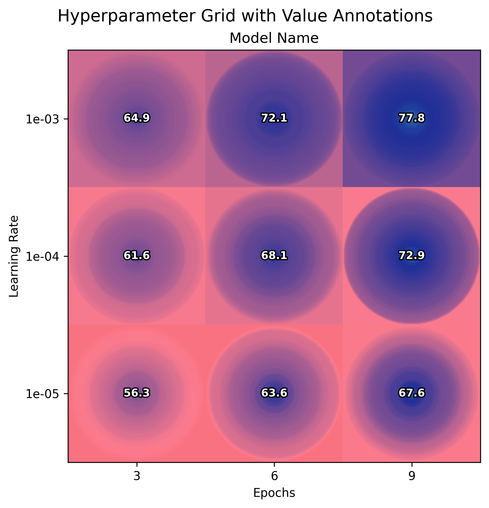
Show imports and benchmark data generation
import numpy as np
from colorgradient import plot_gradient_grid, DEFAULT_COLOR_SCHEMA
import matplotlib.pyplot as plt
import matplotlib as mpl
mpl.rcParams["svg.hashsalt"] = "42"

np.random.seed(42)
epochs = [3, 6, 9]
learning_rates = [1e-3, 1e-4, 1e-5]

grid_data = {}
for lr_idx, lr in enumerate(learning_rates):
    for epoch_idx, epoch in enumerate(epochs):
        base_perf = 60 + epoch * 2 - lr_idx * 5
        performance = np.random.normal(base_perf, 5 + lr_idx * 2, 50)
        grid_data[(lr_idx, epoch_idx)] = np.clip(performance, 0, 100)
subplot_data = [{
    'grid_data': grid_data,
    'title': 'Model Name',
    'row_labels': [f'{lr:.0e}' for lr in learning_rates],
    'col_labels': [str(e) for e in epochs],
    'xlabel': 'Epochs',
    'ylabel': 'Learning Rate'
}]

fig, axes = plot_gradient_grid(
    subplot_data,
    DEFAULT_COLOR_SCHEMA,
    rows=1,
    cols=1,
    figsize_per_subplot=6,
    show_values=True
)
fig.suptitle('Hyperparameter Grid with Value Annotations', fontsize=14)
plt.savefig('example2_hyperparameter_grid.svg', dpi=300, bbox_inches='tight', metadata={'Date': None})
Example 3: Multi-Model Comparison
Show helper function
def generate_model_data(model_idx, epochs, learning_rates, seed=42):
    """Generate synthetic hyperparameter search data for a model"""
    np.random.seed(seed + model_idx)
    grid_data = {}
    for lr_idx, lr in enumerate(learning_rates):
        for epoch_idx, epoch in enumerate(epochs):
            base_performance = 60 + model_idx * 5
            epoch_effect = epoch * 2
            lr_effect = (2 - lr_idx) * 3
            noise_scale = 8 + lr_idx * 2
            n_samples = 50
            performance_data = np.random.normal(base_performance + epoch_effect + lr_effect, noise_scale, n_samples)
            performance_data = np.clip(performance_data, 0, 100)
            grid_data[(lr_idx, epoch_idx)] = performance_data
    return grid_data

# Example output structure for Model-1 (model_idx=0):
# grid_data[(0, 0)] = np.array([75.97, 70.89, ...])  # lr=1e-03, epoch=3, 50 samples, mean=70.20
# grid_data[(0, 1)] = np.array([81.45, 75.32, ...])  # lr=1e-03, epoch=6, 50 samples, mean=78.14
# grid_data[(0, 2)] = np.array([87.92, 80.56, ...])  # lr=1e-03, epoch=9, 50 samples, mean=83.58
# ... (9 total cells in the nested grid)
# ... (other subplots)

import os
import numpy as np
from colorgradient import plot_gradient_grid, DEFAULT_COLOR_SCHEMA
import matplotlib.pyplot as plt
import matplotlib as mpl
mpl.rcParams["svg.hashsalt"] = "42"
models = ['Model-1', 'Model-2', 'Model-3', 'Model-4', 'Model-5']
epochs = [3, 6, 9]
learning_rates = [1e-3, 1e-4, 1e-5]

subplot_data = []
for model_idx, model_name in enumerate(models):
    grid_data = generate_model_data(model_idx, epochs, learning_rates)
    subplot_data.append({
        'grid_data': grid_data,
        'title': model_name,
        'row_labels': [f'{lr:.0e}' for lr in learning_rates],
        'col_labels': [str(epoch) for epoch in epochs],
        'xlabel': 'Epochs',
        'ylabel': 'Learning Rate'
    })

# Add color schema legend (excluded from best highlighting)
color_schema_grid = {}
schema_values = [[75.0, 90.0, 100.0], [70.0, 85.0, 97.5], [65.0, 80.0, 95.0]]
for i in range(3):
    for j in range(3):
        color_schema_grid[(i, j)] = [schema_values[i][j]]

subplot_data.append({
    'grid_data': color_schema_grid,
    'title': 'Color Schema',
    'row_labels': [],
    'col_labels': [],
    'exclude_from_best': True
})

fig, axes = plot_gradient_grid(
    subplot_data,
    DEFAULT_COLOR_SCHEMA,
    rows=2,
    cols=3,
    figsize_per_subplot=4,
    show_values=False
)
fig.suptitle('Model Comparison: Hyperparameter Search Results', fontsize=14)
plt.savefig('example_hyperparameter_grid_1.svg', dpi=300, bbox_inches='tight', metadata={'Date': None})
Example 4: With Value Annotations

# Same code as Example 3, but add show_values=True:
fig, axes = plot_gradient_grid(
    subplot_data,
    DEFAULT_COLOR_SCHEMA,
    rows=2,
    cols=3,
    figsize_per_subplot=4,
    show_values=True        # <-- Show mean values
)
fig.suptitle('Model Comparison with Mean Annotations', fontsize=14)
plt.savefig('example_hyperparameter_grid_2.svg', dpi=300, bbox_inches='tight', metadata={'Date': None})
Example 5: With Border Highlighting
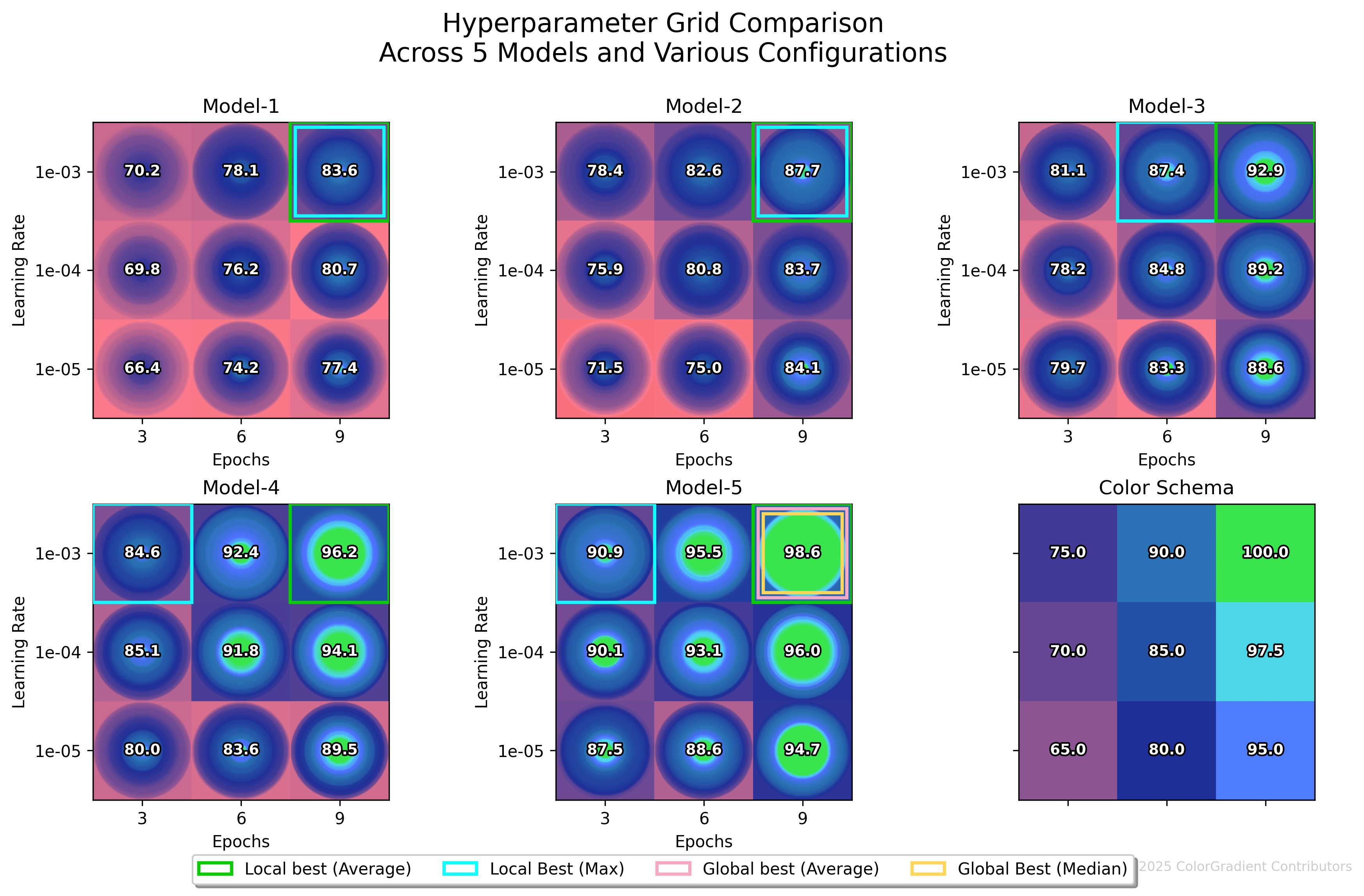
highlight_borders = {
    'local_best_mean': {'enabled': True, 'color': '#08CB00', 'override': 'Local best (Average)'},
    'local_best_max': {'enabled': True, 'color': '#0FFFFF'},
    'global_best_mean': {'enabled': True, 'color': '#F7A8C4', 'override': 'Global best (Average)'},
    'global_best_median': {'enabled': True, 'color': '#FFD65A'}
}

suptitle_config = {
    'title': 'Hyperparameter Grid Comparison\nAcross 5 Models and Various Configurations',
    'fontsize': 16,
    'bold': False,
    #'y_override': 0.97. # Optional manual override: recommended range 0.90 (very tight) to 0.97 (a lot of white space)
}

fig, axes = plot_gradient_grid(
    subplot_data,
    DEFAULT_COLOR_SCHEMA,
    rows=2,
    cols=3,
    figsize_per_subplot=4,
    highlight_borders=highlight_borders,
    show_values=True,
    suptitle=suptitle_config,
    copyright_text='© 2025 ColorGradient Contributors'
)
plt.savefig('example_hyperparameter_grid_3.svg', dpi=300, bbox_inches='tight', metadata={'Date': None})
API Documentation
plot_gradient_grid(subplot_data, **kwargs)
Core Parameters:
subplot_data(list): List of subplot configurations- Simple mode:
{'data': [values], 'title': 'Name'} - Grid mode:
{'grid_data': {(row,col): [values]}, 'title': 'Name', 'row_labels': [...], 'col_labels': [...]} - Exclusion:
{'exclude_from_best': True}to exclude from best mean/median/... highlighting
- Simple mode:
Visualization Options:
color_schema(dict): Color mapping{value: '#HEX'}. Default:DEFAULT_COLOR_SCHEMArows,cols(int): Grid dimensionsfigsize_per_subplot(float): Size per subplot in inches (default: 4.0)resolution(int): Gradient resolution (default: 500)show_values(bool): Display mean values as overlay text
Border Highlighting:
highlight_borders(dict): Configure borders for best performance- Available types:
local_best_mean/median/min/max/p25/p75,global_best_mean/median/min/max/p25/p75 - Config:
{'enabled': True, 'color': '#HEX', 'override': 'Custom Label'}
- Available types:
Suptitle Configuration:
suptitle(dict):{'title': str, 'fontsize': int, 'bold': bool, 'y_override': float}- Automatically adjusts spacing for multi-line titles
Returns: (fig, axes) — matplotlib figure and axes for further customization
Default Color Schema
DEFAULT_COLOR_SCHEMA = {
    0: '#F44336',       # Red (poor)
    50: '#FB7B8E',      # Pink
    80: '#1F2F98',      # Dark blue
    90: '#2973B2',      # Blue
    95: '#4E71FF',      # Light blue
    97.5: '#4ED7F1',    # Cyan
    100: '#38E54D'      # Green (excellent)
}
Use Cases
Machine Learning Research
- Hyperparameter optimization visualization
- Model comparison across different configurations
- Performance distribution analysis
Scientific Publishing
- Experimental result distributions
- Treatment effect comparisons with variance
- Statistical result summaries
Running Examples
cd examples
python example.py
python example_hyperparameter_grid.py
License
Creative Commons Attribution-NonCommercial 4.0 (CC BY-NC 4.0)
Citation
@software{colorgradient2025,
    title = {ColorGradient: Publication-ready hyperparameter search visualization},
    author = {ColorGradient Contributors},
    year = {2025},
    version = {1.1.0},
    url = {https://github.com/PhyloBridge/ColorGradient}
}
Release history Release notifications | RSS feed


Download files
Download the file for your platform. If you're not sure which to choose, learn more about installing packages.
Source Distribution
File details
Details for the file colorgradient-1.1.0.tar.gz.
File metadata
- Download URL: colorgradient-1.1.0.tar.gz
- Upload date:
- Size: 23.9 kB
- Tags: Source
- Uploaded using Trusted Publishing? No
- Uploaded via: twine/6.2.0 CPython/3.11.13
File hashes
| Algorithm | Hash digest | |
|---|---|---|
| SHA256 |
c837dc0d88dec33b1f1d31192fa2dcf9828735b0b572a27f486b336b9facef89
|
|
| MD5 |
8b90b166f20216c859d25b02bf643cba
|
|
| BLAKE2b-256 |
3ccad079ad5841f9dd79cd955475d541155e1454655e106d581fde993bb9cb47
|


