
dash-startup-loading-plugin
An installable Dash Hooks plugin that replaces Dash's initial loading presentation with a configurable full-screen overlay.
The plugin injects its CSS and JavaScript into Dash's normal index document
before React mounts. Applications do not need to copy assets or replace
index_string, and Dash's built-in <div class="_dash-loading"> remains in the
document.
Requirements
- Python 3.9 or later
- Dash 3.0.3 or later
Installation
pip install "dash-startup-loading-plugin>=2.0.0"
Dash discovers the plugin through its dash_hooks entry point. Installing the
package enables the default loading overlay without an explicit import.
The default background colors work with native Dash and Dash Ant Design.
Quick start
The plugin is discovered automatically, so a native Dash app needs no plugin-specific code:
from dash import Dash, html

app = Dash(__name__)
app.layout = html.Main(
    [
        html.H1("My Dash app"),
        html.P("The overlay closes after this layout is ready."),
    ]
)

if __name__ == "__main__":
    app.run(debug=True)
The example above uses Dash's native components from dash.html. You can also
use the plugin with dash-antd-components:
pip install dash-ant-design
uv add dash-ant-design
import dash_antd_components as dac
from dash import Dash

app = Dash(__name__)
app.layout = dac.Space(
  [
    dac.Title("My Dash Ant Design app", level=2),
    dac.Button("Continue", type="primary"),
    dac.Input(placeholder="Search"),
  ],
  orientation="vertical",
  size="middle",
)

if __name__ == "__main__":
  app.run(debug=True)
When the dash-antd-components bundle is present, the plugin automatically
uses Ant Design's four-dot loader unless loader is explicitly configured.
Native Dash apps use the Loading UI ring loader by default.
Theme behavior
Theme initialization belongs to the application. Set dark/light on the
root HTML element before Dash mounts, for example in index_string; the
plugin's CSS follows html.dark. This avoids a theme flash without making the
plugin own application preferences or asynchronous theme callbacks.
Use prefers-color-scheme in that head script when the application follows the
operating system preference.
Dash Ant Design
Dash Ant Design is optional. The same setup() function configures native Dash
and Dash Ant Design applications. When its component bundle is present and
loader was not explicitly configured, the plugin uses Ant Design's four-dot
loader and colorPrimary defaults. Other component libraries use Loading UI's
ring loader by default. Explicit loader and color options always take
precedence:
pip install dash-ant-design
uv add dash-ant-design
from dash_startup_loading_plugin import setup

setup(loader="antd")
Dismissal behavior
By default, the plugin preserves its original behavior: it observes Dash's
standard #react-entry-point and closes the overlay after Dash's
._dash-loading element disappears. Theme initialization and application
specific callback/layout settling belong in the application's index_string
and callbacks.
Configuration
setup(**changes) updates the process-wide immutable
StartupLoadingConfig.
| Option | Default | Description |
|---|---|---|
enabled |
True |
Enable index injection. |
aria_label |
"Loading" |
Accessible status label. |
z_index |
9999 |
Overlay stacking order. |
loader_color |
#1677ff |
Loader color in light mode. |
loader_dark_color |
#1668dc |
Loader color in dark mode. |
loader_text_color |
rgba(0,0,0,0.88) |
Text color for text-* Loading UI loaders in light mode. |
loader_dark_text_color |
rgba(255,255,255,0.85) |
Text color for text-* Loading UI loaders in dark mode. |
loader |
"default" |
Loading UI's ring animation. |
loader_text |
"Loading" |
Text rendered by text-* Loading UI loaders. |
loader_size |
64 |
Target loader width and height. Loading UI uses its ring default of 4rem (64px); the antd loader uses Ant Design Spin's medium visual size of 20px. Other Loading UI loaders scale proportionally from their bundled default geometry. None uses the 64px baseline. |
loader_stroke_width |
2 |
Loading UI border and SVG stroke width, generated from its 2px default at the 64px ring baseline. |
custom_loader_html |
None |
Trusted HTML replacing the default spinner. |
custom_loader_html is inserted verbatim and must never contain untrusted
user input.
The default loader uses Loading UI's ring animation. To use Ant Design's
four-dot loader, configure it explicitly:
setup(loader="antd")
The overlay background follows the application's html.dark class and --layout-bg CSS variable, with #f5f5f5 and #111825 fallbacks. The plugin does not inspect ConfigProvider tokens. Explicit color options always take precedence. Use loader_size, loader_color, loader_dark_color, loader_text_color, and loader_dark_text_color to match a customized theme. Use loader_text to replace the default text in text-* loaders:
setup(loader="text-shimmer", loader_text="Preparing dashboard")
Loader gallery
The effective default depends on the component bundle:
| Application | Default loader | Notes |
|---|---|---|
| Native Dash components | ring |
Loading UI renderer. |
dash-antd-components |
antd |
Ant Design's four-dot spinner. |
Any app with an explicit setup(loader=...) |
The selected loader | Explicit configuration always wins. |
All Loading UI loaders are bundled separately and loaded only when selected.
The preview images below link to the official interactive demos. Open a preview
to see its live animation and source details. The text-* loaders accept
custom text through loader_text; loader_color, loader_dark_color,
loader_size, and loader_stroke_width apply where supported.
| Preview | Preview | Preview |
|---|---|---|
 accordion-loader |
 analyzing-image |
 arc |
 bars |
 bobbing-dots |
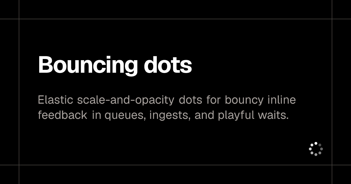 bouncing-dots |
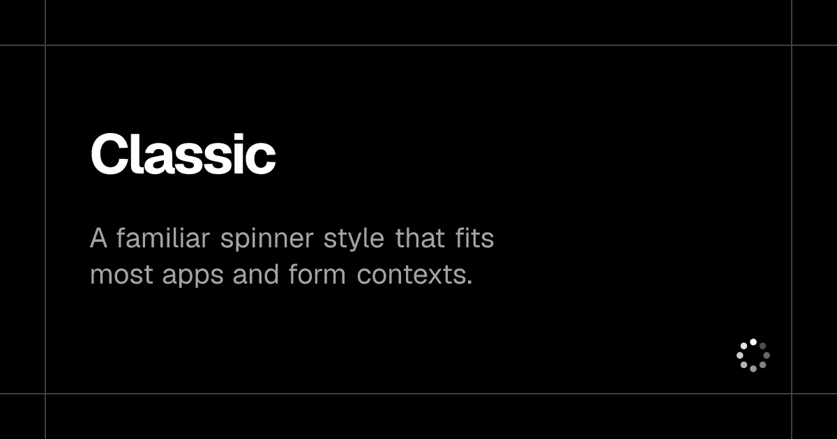 classic |
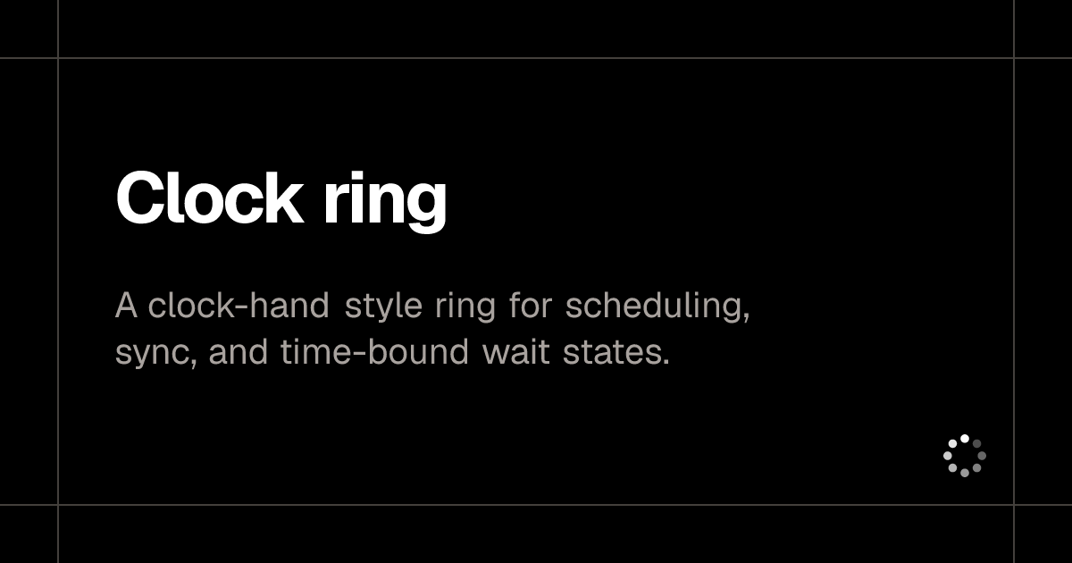 clock-ring |
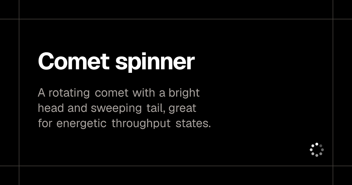 comet-spinner |
 concentric-ring |
 conveyor-loop |
 dash-ring |
 diamond |
 dots |
 dots-ring |
 dual-arc |
 fade-arc |
 infinity |
 infinity-square-snake |
 infinity-track |
 morphing-infinity |
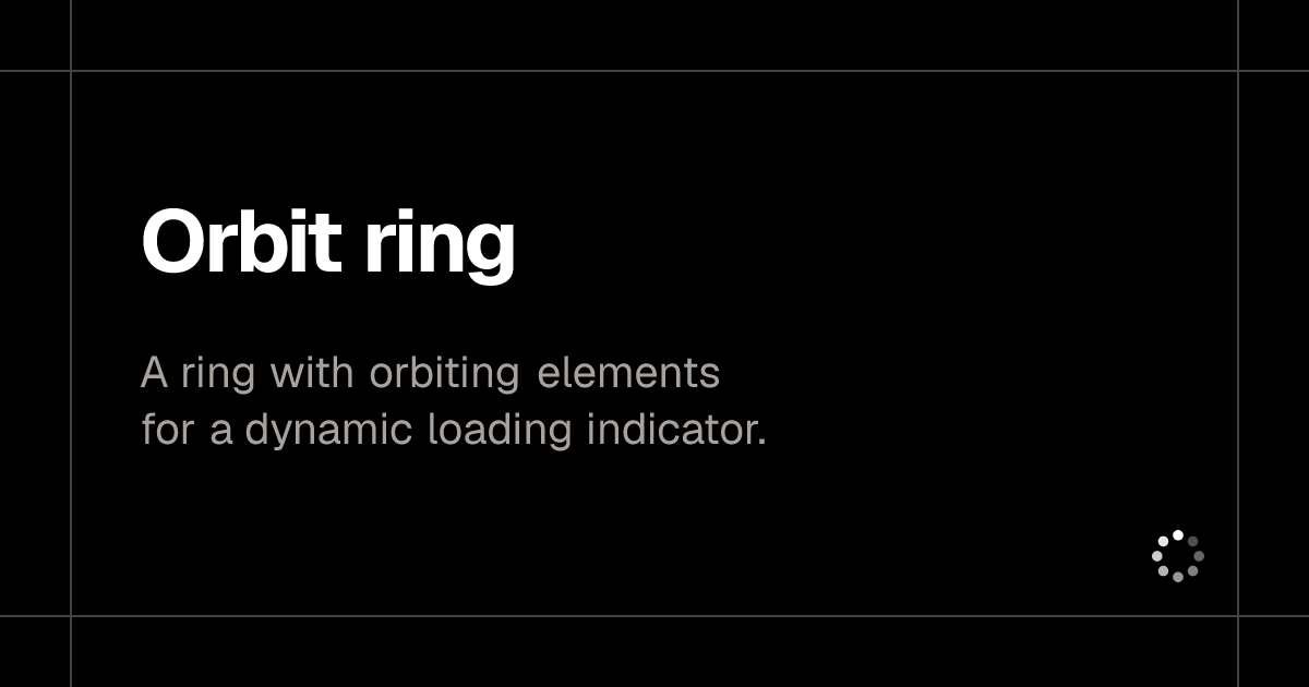 orbit-ring |
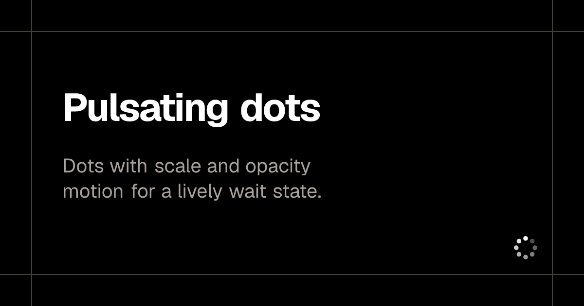 pulsating-dots |
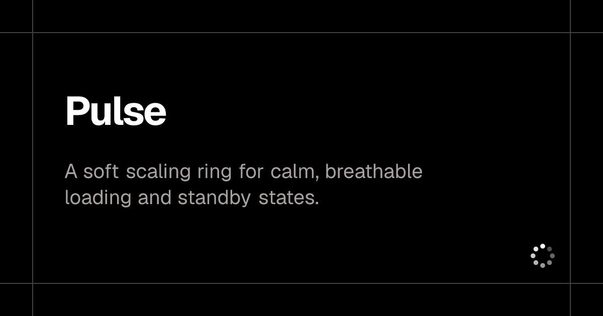 pulse |
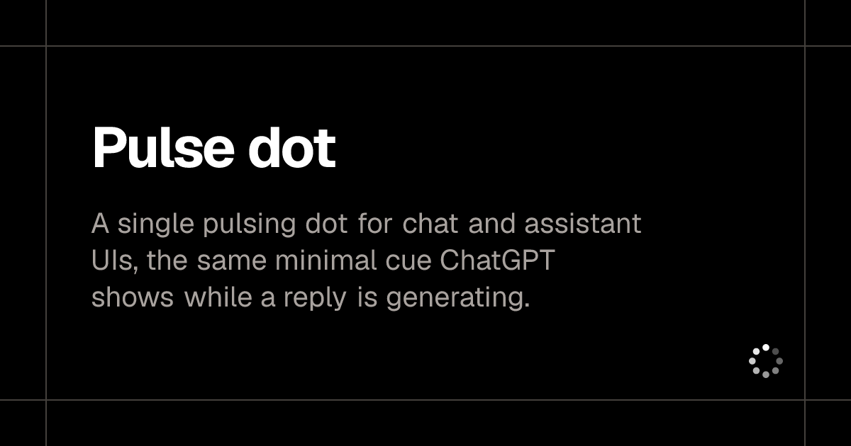 pulse-dot |
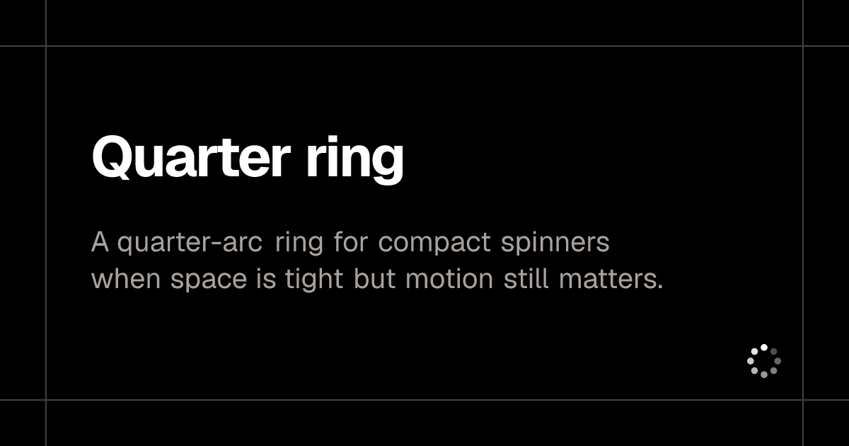 quarter-ring |
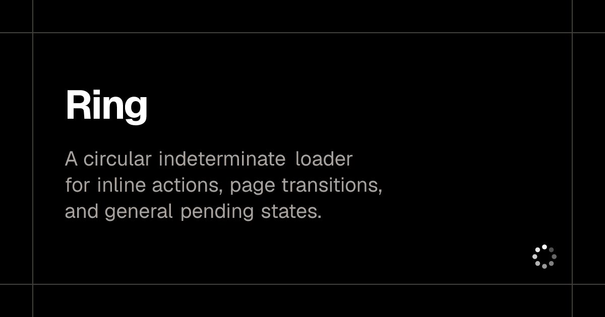 ring |
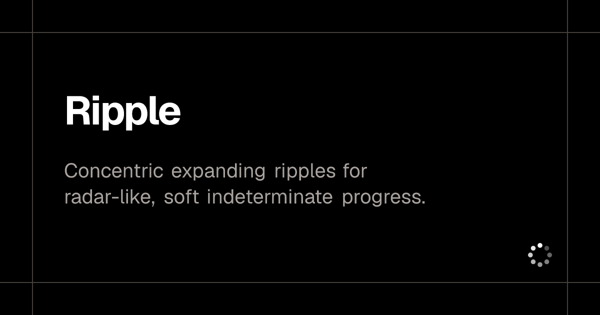 ripple |
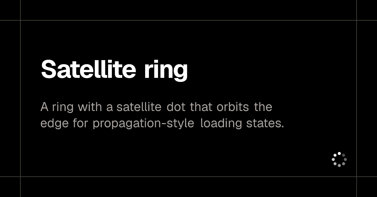 satellite-ring |
 skeleton |
 spiral |
 spokes |
 square-accordion |
 square-grid |
 square-snake |
 swirling |
 symmetric-wave |
 terminal |
 text-blink |
 text-dots |
 text-shimmer |
 text-shimmer-wave |
 triple-dot-spinner |
 twin-orbit |
 typing |
 wandering-eyes |
 wave |
Default: ringdefault |
Ant Design Spinantd |
The bundled Loading UI collection supports all 47 loader names in the current upstream catalog:
accordion-loader, analyzing-image, arc, bars, bobbing-dots, bouncing-dots, classic, clock-ring, comet-spinner, concentric-ring, conveyor-loop, dash-ring, diamond, dots, dots-ring, dual-arc, fade-arc, infinity, infinity-square-snake, infinity-track, morphing-infinity, orbit-ring, pulsating-dots, pulse, pulse-dot, quarter-ring, ring, ripple, satellite-ring, skeleton, spiral, spokes, square-accordion, square-grid, square-snake, swirling, symmetric-wave, terminal, text-blink, text-dots, text-shimmer, text-shimmer-wave, triple-dot-spinner, twin-orbit, typing, wandering-eyes, wave
For example:
setup(loader="spiral", loader_color="#e91e63", loader_dark_color="#ff80ab")
The default loader, ring, and other Loading UI loaders use a bundled, isolated renderer loaded before Dash starts. Each loader ships as its own bundle, and the index only references the selected one at <requests_pathname_prefix>_dash-startup-loading/<loader>.js. That keeps the HTML document small and lets the browser cache the renderer, so the choice of loader does not grow the first-screen payload. No other indicator is shown while that renderer starts. Loading UI loaders sit in a centered 4:3 region that uses full width below 640px, half width from 640px, one-third from 768px, and one-quarter from 1024px. Each loader keeps the geometry from its official demo: square icons use their documented size-*, rectangular loaders keep their documented aspect ratio, and character-grid loaders derive intrinsic ch/em dimensions from their default props. Text loaders fit their text.
Python API
from dash_startup_loading_plugin import (
    StartupLoadingConfig,
    setup,
    get_config,
    reset_config,
)
Notes
- Dash's hook and plugin configuration is process-wide. Use one configuration per process.
- Readiness gates apply only to startup. Later callbacks do not recreate the overlay.
- The overlay markup and its small startup runtime are inlined, so strict Content Security Policy deployments must allow the injected style and script. The Loading UI renderer is served from a plugin route instead of being inlined.
- The overlay is only for initial application startup. Use
dcc.Loadingor another callback-specific pattern for later callback execution.
License
This project is distributed under the MIT License.
MIT
1 maintainer

Release files for dash-startup-loading-plugin 2.0.0
For a detailed explanation of source distributions (sdists) and built distributions (wheels), please see the package formats documentation.
Source distribution (sdist)
| File | Size | Uploaded | |
|---|---|---|---|
| dash_startup_loading_plugin-2.0.0.tar.gz | 4.3 MB | Details |
Built distribution (wheel)
| File | Interpreter | ABI | Platform | Reset |
|---|---|---|---|---|
| dash_startup_loading_plugin-2.0.0-py3-none-any.whl | Python 3 | none | any | Details |
Total release size: 8.5 MB
Release files / dash_startup_loading_plugin-2.0.0.tar.gz
| Download URL | dash_startup_loading_plugin-2.0.0.tar.gz |
|---|---|
| Size | 4.3 MB |
| Tags | Source |
|
SHA-256 checksum How to use checksums |
dced971a5ffcabeee8b31386aeeccaacb24a08084e8bf178673adec4dc9b1ec8
|
|
BLAKE2b-256 checksum How to use checksums |
dcbafebc9293424863367cd7c21af13f958014c82eb2b018d0f5ea5f96e0cbe9
|
| Upload date | |
|
Uploaded using Trusted Publishing? What is trusted publishing? |
No |
| Uploaded via |
uv/0.9.22 {"installer":{"name":"uv","version":"0.9.22","subcommand":["publish"]},"python":null,"implementation":{"name":null,"version":null},"distro":{"name":"Ubuntu","version":"24.04","id":"noble","libc":null},"system":{"name":null,"release":null},"cpu":null,"openssl_version":null,"setuptools_version":null,"rustc_version":null,"ci":null}
|
Release files / dash_startup_loading_plugin-2.0.0-py3-none-any.whl
| Download URL | dash_startup_loading_plugin-2.0.0-py3-none-any.whl |
|---|---|
| Size | 4.3 MB |
| Tags | Python 3 |
|
SHA-256 checksum How to use checksums |
f93308138a58ac64b39c4cba6d30f1e976657e93deb1a1e84ff1abdcb7e07d45
|
|
BLAKE2b-256 checksum How to use checksums |
6f713b6f77b037145b0dbdc687870710c6b91458b63146466671c640124e4a8a
|
| Upload date | |
|
Uploaded using Trusted Publishing? What is trusted publishing? |
No |
| Uploaded via |
uv/0.9.22 {"installer":{"name":"uv","version":"0.9.22","subcommand":["publish"]},"python":null,"implementation":{"name":null,"version":null},"distro":{"name":"Ubuntu","version":"24.04","id":"noble","libc":null},"system":{"name":null,"release":null},"cpu":null,"openssl_version":null,"setuptools_version":null,"rustc_version":null,"ci":null}
|














