

Data visualization package, simple to use, highly customizable





Documentation · How-to Guides · API Reference · Source
The datachart package is a python package for creating data visualizations, built on top of matplotlib. It is designed to be simple to use and highly customizable, i.e. it is easy to change the look and feel of the charts.
Features:
- Charts. Chart types for trends, comparisons, distributions, relationships, and flows — each created with a single function call from plain lists of dicts. See Charts.
- Composition. Combine rendered charts with
Panel(overlay charts on a single plot, with optional dual y-axes) andGrid(arrange charts in a grid; grids nest). See Composition. - Themes & configuration. Predefined themes, each named for its visual trait, plus a global
configfor tweaking any style attribute — per-chartstyleoverrides included. See Themes.
Quick start
pip install datachart # or: uv add datachart
Every chart takes a list of series, each a list of dicts. Set a theme once and every chart follows it:
from datachart.charts import LineChart
from datachart.config import config
from datachart.constants import THEME
from datachart.utils import save_figure

config.set_theme(THEME.INK)

months = ["Jan", "Feb", "Mar", "Apr", "May", "Jun", "Jul"]
signups = [420, 465, 430, 510, 560, 545, 610]
churned = [380, 400, 440, 435, 480, 520, 550]

figure = LineChart(
    [
        [{"x": x, "y": y} for x, y in enumerate(signups)],
        [{"x": x, "y": y} for x, y in enumerate(churned)],
    ],
    title="Monthly signups vs. churn",
    subtitle=["Signups", "Churned"],
    xlabel="Month",
    ylabel="Users",
    xticks=list(range(len(months))),
    xticklabels=months,
    show_legend=True,
)
save_figure(figure, "line.png")
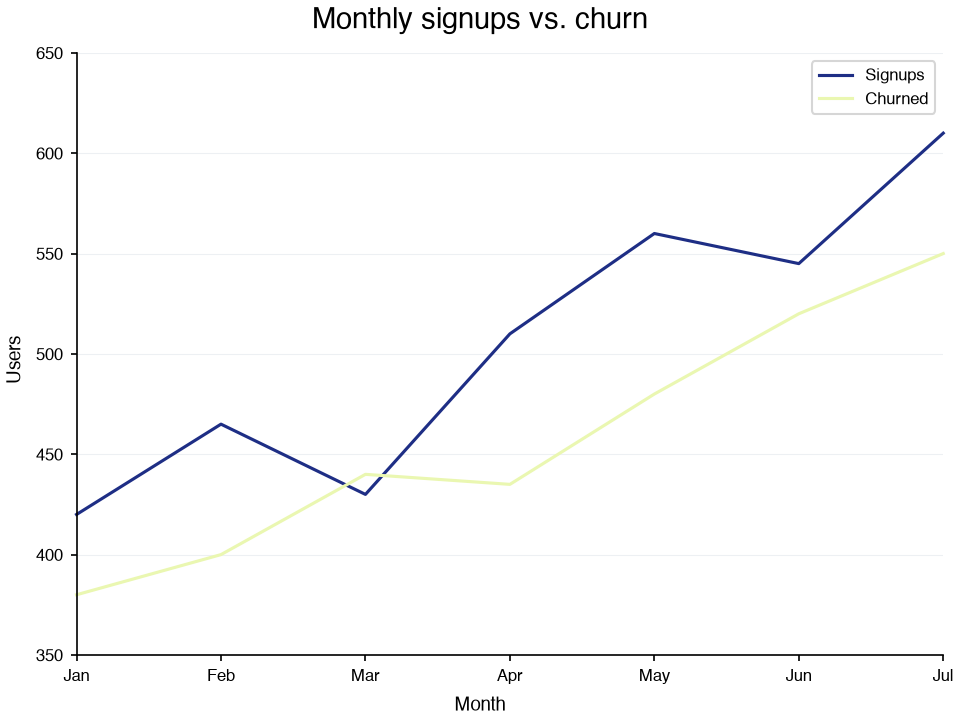
figure is a plain matplotlib Figure, so anything matplotlib can do with it still works.
Charts
Every chart is a single function call taking plain lists of dicts, and every
function accepts a list of series to overlay or a subplots=True flag to
split them apart. The dict keys per chart are listed in each guide.
| Family | Charts | Use for |
|---|---|---|
| Trends | LineChart, StackedAreaChart | values over an ordered axis; area for part-of-whole over time |
| Comparisons | BarChart, PyramidChart, RadialChart | category totals, paired populations, cyclic/periodic values |
| Distributions | Histogram, BoxPlot, ViolinPlot, SwarmPlot, RaincloudPlot | shape and spread of one variable, per group |
| Relationships | ScatterChart, Heatmap, ContourChart, HexbinChart, ParallelCoords, NetworkChart | two-variable correlation, matrices, dense 2-D density, many dimensions, who is linked to whom |
| Flows | SankeyChart | quantities moving between stages |
| Proportions | Treemap | how a whole splits into parts, with one level of grouping |
Composition
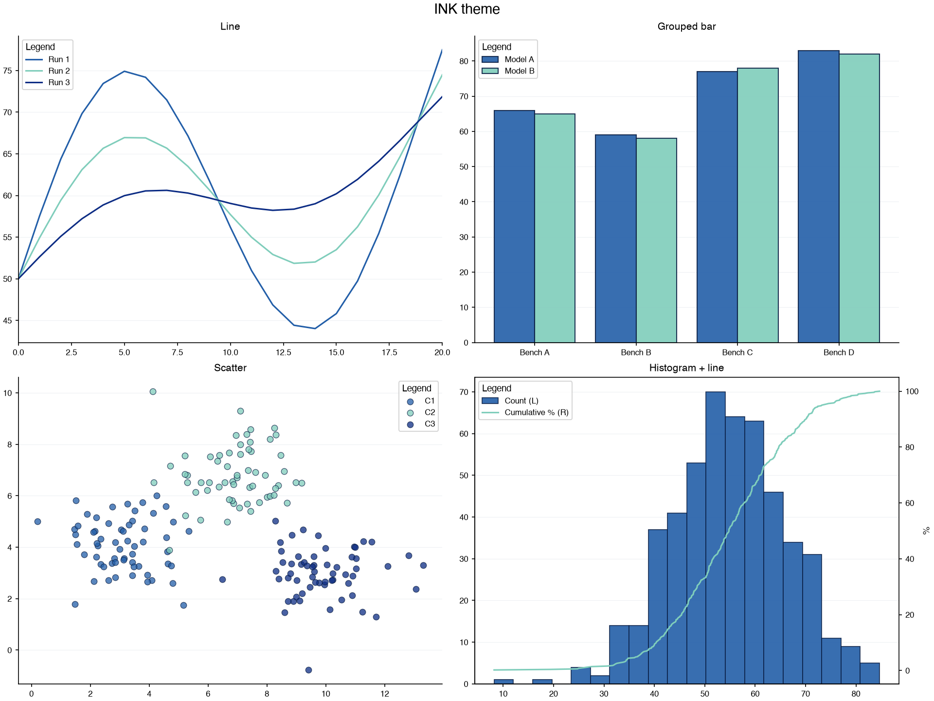
Rendered figures compose. Grid arranges them in a grid (nested lists define rows; grids nest), and Panel overlays charts on one plot, with an optional secondary y-axis. Four chart types, one theme, one grid — with a Panel in the last cell:
import numpy as np

from datachart.charts import BarChart, Histogram, LineChart, ScatterChart
from datachart.config import config
from datachart.constants import LEGEND_LOCATION, THEME
from datachart.utils import Grid, Panel, save_figure

config.set_theme(THEME.INK)
rng = np.random.default_rng(0)

line = LineChart(
    [[{"x": x, "y": 50 + a * np.sin(x / 3) + x} for x in range(21)] for a in (20, 12, 5)],
    title="Line", subtitle=["Run 1", "Run 2", "Run 3"], show_legend=True,
)
bars = BarChart(
    [[{"label": f"Bench {b}", "y": y} for b, y in zip("ABCD", ys)]
     for ys in ([66, 59, 77, 83], [65, 58, 78, 82])],
    title="Grouped bar", subtitle=["Model A", "Model B"], show_legend=True,
)
scatter = ScatterChart(
    [[{"x": x, "y": y} for x, y in zip(rng.normal(cx, 1.2, 60), rng.normal(cy, 1, 60))]
     for cx, cy in ((3, 4), (7, 7), (10, 3))],
    title="Scatter", subtitle=["C1", "C2", "C3"], show_legend=True,
)

# Panel overlays figures on one axes; the line gets its own y-axis on the right
samples = np.sort(rng.normal(55, 12, 500))
hist = Histogram([{"x": x} for x in samples], subtitle="Count")
cdf = LineChart(
    [{"x": x, "y": 100 * i / len(samples)} for i, x in enumerate(samples, 1)],
    subtitle="Cumulative %",
)
config.update_config({"plot_legend_location": LEGEND_LOCATION.UPPER_LEFT})
overlay = Panel(
    [hist, cdf], title="Histogram + line", ylabel_right="%",
    auto_secondary_axis=1, show_legend=True,
)

# Grid arranges figures in cells; nested lists define the rows
figure = Grid([[line, bars], [scatter, overlay]], title="INK theme")
save_figure(figure, "grid.png")
Themes
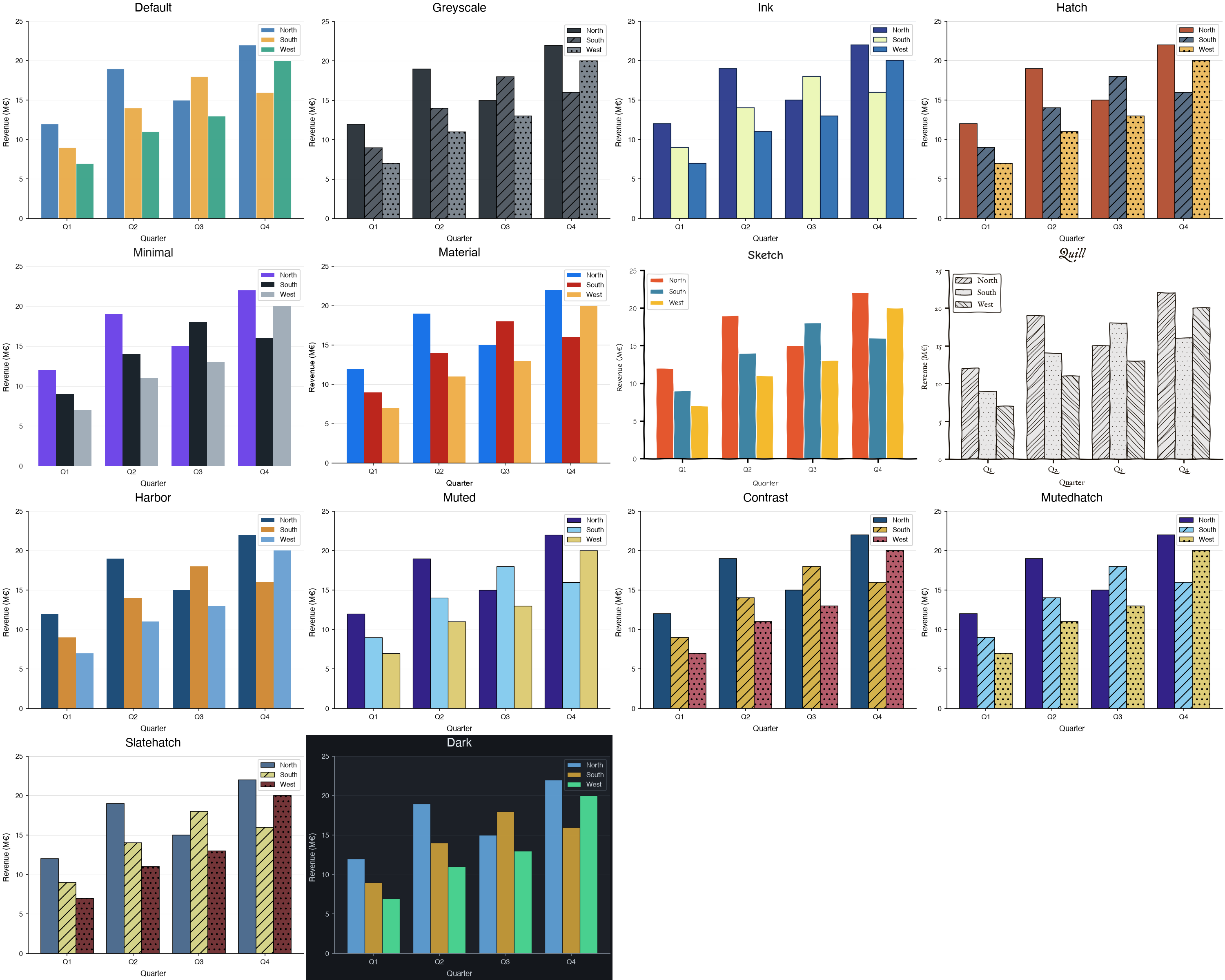
Predefined themes, applied with config.set_theme(THEME.<NAME>). Any attribute can then be tweaked globally via config.update_config(...) or per chart via the style argument — see the themes, config, and theme gallery guides.
More examples on how to use the datachart package are available
on the official How-to Guides.
Install
Requires python 3.10 or higher.
pip install -U datachart
With uv:
uv add datachart
Using with LLMs
The documentation is available in LLM-friendly formats:
- llms.txt — index of the documentation with descriptions
- llms-full.txt — full documentation in a single file
- Every documentation page is also available as plain markdown by appending
index.mdto its URL, e.g. how-to-guides/charts/linechart/index.md
You can also connect your AI assistant directly:
- Context7 — up-to-date, version-aware docs for AI coding assistants
- GitMCP — an MCP server serving this repository's documentation
Contributing
Bug reports, feature requests, and pull requests are welcome — open an issue to report a problem or propose a chart, theme, or option you are missing.
To work on the package locally:
git clone https://github.com/eriknovak/datachart.git
cd datachart
uv sync --group dev                  # package + dev dependencies
python -m unittest discover test     # unit tests
pytest                               # documentation notebooks
mkdocs serve                         # docs at http://127.0.0.1:8000
Code is formatted with black; the pre-commit hook runs it for you.
1 maintainer

Metadata
1 maintainer
Release files for datachart 0.9.1
For a detailed explanation of source distributions (sdists) and built distributions (wheels), please see the package formats documentation.
Source distribution (sdist)
| File | Size | Uploaded | |
|---|---|---|---|
| datachart-0.9.1.tar.gz | 265.1 kB | Details |
Built distribution (wheel)
| File | Interpreter | ABI | Platform | Reset |
|---|---|---|---|---|
| datachart-0.9.1-py3-none-any.whl | Python 3 | none | any | Details |
Total release size: 505.7 kB
Release files / datachart-0.9.1.tar.gz
| Download URL | datachart-0.9.1.tar.gz |
|---|---|
| Size | 265.1 kB |
| Tags | Source |
|
SHA-256 checksum How to use checksums |
9cb65f6433ccaba2e003a0233adc7cf958b0959c492f013b8d566b3334284f9a
|
|
BLAKE2b-256 checksum How to use checksums |
6ae5db8f246c8facc782542fcc563bcc70f6a20da036bcc7f0df850b382d398a
|
| Upload date | |
|
Uploaded using Trusted Publishing? What is trusted publishing? |
Yes |
| Uploaded via |
twine/7.0.0 CPython/3.13.14
|
Provenance
Provenance describes where a file came from. On PyPI, provenance is shared via attestations, which provide a verifiable record of the build or publishing details. View details, limitations and caveats.


PyPI Publish Attestation
PyPI verified that this artifact, at this checksum, originated from the publisher listed below.
Signed by GitHub Actions, verified by PyPI on Sep 7, 2026.
Transparency logRelease files / datachart-0.9.1-py3-none-any.whl
| Download URL | datachart-0.9.1-py3-none-any.whl |
|---|---|
| Size | 240.6 kB |
| Tags | Python 3 |
|
SHA-256 checksum How to use checksums |
a688506ee6a4105966f40d0891bc27c04e0e158db7b84d9be8295a85235a0d38
|
|
BLAKE2b-256 checksum How to use checksums |
fc5d9ade8ab2be61ca49380fd9576d20d8b8b75851e4435942018c1c996b0434
|
| Upload date | |
|
Uploaded using Trusted Publishing? What is trusted publishing? |
Yes |
| Uploaded via |
twine/7.0.0 CPython/3.13.14
|
Provenance
Provenance describes where a file came from. On PyPI, provenance is shared via attestations, which provide a verifiable record of the build or publishing details. View details, limitations and caveats.
PyPI Publish Attestation
PyPI verified that this artifact, at this checksum, originated from the publisher listed below.
Signed by GitHub Actions, verified by PyPI on Sep 7, 2026.
Transparency log













