Visualization tool designed to analyze and illustrate the Lorenz Energy Cycle for atmospheric science.

Project description


Lorenz Phase Space Visualization
Overview
The Lorenz Phase Space (LPS) visualization tool is designed to analyze and illustrate the dynamics of the Lorenz Energy Cycle in atmospheric science.
This tool offers a unique perspective for studying the intricate processes governing atmospheric energetics and instability mechanisms. It visualizes the transformation and exchange of energy within the atmosphere, specifically focusing on the interactions between kinetic and potential energy forms as conceptualized by Edward Lorenz.
The LPS complements the Cyclone Phase Space (CPS) developed by Hart (2003). While the CPS provides information about cyclone structure (thermal symmetry and core temperature), the LPS focuses on energetics (baroclinic/barotropic instabilities and boundary energy fluxes).
Key Features
-
Mixed Mode: Offers insights into both baroclinic and barotropic instabilities, which are fundamental in understanding large-scale atmospheric dynamics. This mode is particularly useful for comprehensively analyzing scenarios where both instabilities are at play.
-
Baroclinic Mode: Focuses on the baroclinic processes, highlighting the role of temperature gradients and their impact on atmospheric energy transformations. This mode is vital for studying weather systems and jet stream dynamics.
-
Imports Mode: Concentrates on processes related to imports and exports of eddy energy. This mode is useful for understanding scenarios where a nearby eddy is triggering local development.
-
Flexible Visualization: Supports both standard (fixed limits) and zoom (dynamic limits) modes for different analysis needs.
-
Multiple Trajectory Support: Plot multiple cyclone lifecycles on the same diagram for comparison.
By utilizing the LPS tool, researchers and meteorologists can delve into the complexities of atmospheric energy cycles, gaining insights into how different energy forms interact and influence weather systems and climate patterns.
Documentation
📚 Complete API Documentation - Detailed reference for all classes, methods, and parameters
📓 Example Notebook - Interactive Jupyter notebook with examples
🔖 Quick Reference - One-page reference guide
🧪 Testing Guide - How to run tests and verify visual output
Features
- Visualization of data in Lorenz Phase Space
- Support for different types of Lorenz Phase Spaces: mixed, baroclinic, and imports
- Dynamic adjustment of visualization parameters based on data scale
- Customizable plotting options for detailed analysis
- Support for multiple trajectories on a single plot
Installation
From PyPI
pip install lorenz-phase-space
From Source
git clone https://github.com/daniloceano/lorenz_phase_space.git
cd lorenz_phase_space
pip install -e .
Dependencies
pip install pandas matplotlib numpy cmocean
Quick Start
Quick Start
Simple Example
This example demonstrates basic usage of the Lorenz Phase Space visualization tool.
from lorenz_phase_space.phase_diagrams import Visualizer
import pandas as pd
import matplotlib.pyplot as plt

# Load your data
data = pd.read_csv('your_data.csv')

# Create LPS visualizer
lps = Visualizer(LPS_type='mixed', zoom=False)

# Plot your data
lps.plot_data(
    x_axis=data['Ck'],      # Conversion: mean to eddy KE
    y_axis=data['Ca'],      # Conversion: mean to eddy APE
    marker_color=data['Ge'], # Generation of eddy APE
    marker_size=data['Ke']   # Eddy kinetic energy
)

# Save the visualization
plt.savefig('lps_diagram.png', dpi=300, bbox_inches='tight')
Example with Zoom for Detailed Analysis
# Enable zoom for dynamic axis limits
lps = Visualizer(LPS_type='mixed', zoom=True)

# Plot data
lps.plot_data(
    x_axis=data['Ck'],
    y_axis=data['Ca'],
    marker_color=data['Ge'],
    marker_size=data['Ke']
)

plt.savefig('lps_zoomed.png', dpi=300, bbox_inches='tight')
Advanced Usage
Comparing Multiple Cyclones
Plot two cyclone lifecycles on the same diagram for comparison.
Comparing Multiple Cyclones
Plot two cyclone lifecycles on the same diagram for comparison.
from lorenz_phase_space.phase_diagrams import Visualizer
import pandas as pd
import matplotlib.pyplot as plt

# Load datasets
data1 = pd.read_csv('cyclone1.csv')
data2 = pd.read_csv('cyclone2.csv')

# Create visualizer
lps = Visualizer(LPS_type='mixed', zoom=True)

# Plot first cyclone
lps.plot_data(
    x_axis=data1['Ck'],
    y_axis=data1['Ca'],
    marker_color=data1['Ge'],
    marker_size=data1['Ke'],
    alpha=0.7  # Add transparency
)

# Plot second cyclone
lps.plot_data(
    x_axis=data2['Ck'],
    y_axis=data2['Ca'],
    marker_color=data2['Ge'],
    marker_size=data2['Ke'],
    alpha=0.7
)

plt.savefig('lps_comparison.png', dpi=300, bbox_inches='tight')
Using Custom Limits for Consistent Comparison
When comparing multiple systems, use custom limits to ensure consistent scales.
import numpy as np

# Calculate dynamic limits across all datasets
x_min = min(data1['Ck'].min(), data2['Ck'].min())
x_max = max(data1['Ck'].max(), data2['Ck'].max())
y_min = min(data1['Ca'].min(), data2['Ca'].min())
y_max = max(data1['Ca'].max(), data2['Ca'].max())
color_min = min(data1['Ge'].min(), data2['Ge'].min())
color_max = max(data1['Ge'].max(), data2['Ge'].max())
size_min = min(data1['Ke'].min(), data2['Ke'].min())
size_max = max(data1['Ke'].max(), data2['Ke'].max())

# Create LPS with custom limits
lps = Visualizer(
    LPS_type='mixed',
    zoom=True,
    x_limits=[x_min, x_max],
    y_limits=[y_min, y_max],
    color_limits=[color_min, color_max],
    marker_limits=[size_min, size_max]
)

# Plot both datasets
lps.plot_data(data1['Ck'], data1['Ca'], data1['Ge'], data1['Ke'], alpha=0.8)
lps.plot_data(data2['Ck'], data2['Ca'], data2['Ge'], data2['Ke'], alpha=0.8)

plt.savefig('lps_custom_limits.png', dpi=300, bbox_inches='tight')
Different LPS Types
Baroclinic Mode
Focus on baroclinic instability processes.
lps = Visualizer(LPS_type='baroclinic', zoom=False)

lps.plot_data(
    x_axis=data['Ce'],  # Conversion: zonal to eddy KE
    y_axis=data['Ca'],  # Conversion: zonal to eddy APE
    marker_color=data['Ge'],
    marker_size=data['Ke']
)

plt.savefig('lps_baroclinic.png', dpi=300, bbox_inches='tight')
Imports Mode
Analyze energy imports and exports across boundaries.
lps = Visualizer(LPS_type='imports', zoom=False)

lps.plot_data(
    x_axis=data['BAe'],  # Eddy APE transport
    y_axis=data['BKe'],  # Eddy KE transport
    marker_color=data['Ge'],
    marker_size=data['Ke']
)

plt.savefig('lps_imports.png', dpi=300, bbox_inches='tight')
Data Requirements
Your input data should contain the following variables (units in W m⁻² for conversions/transports, J m⁻² for reservoirs):
For Mixed LPS
- Ck: Conversion from mean to eddy kinetic energy
- Ca: Conversion from mean to eddy available potential energy
- Ge: Generation of eddy available potential energy
- Ke: Eddy kinetic energy
For Baroclinic LPS
- Ce: Conversion from zonal to eddy kinetic energy
- Ca: Conversion from zonal to eddy available potential energy
- Ge: Generation of eddy available potential energy
- Ke: Eddy kinetic energy
For Imports LPS
- BAe: Eddy APE transport across boundaries
- BKe: Eddy KE transport across boundaries
- Ge: Generation of eddy available potential energy
- Ke: Eddy kinetic energy
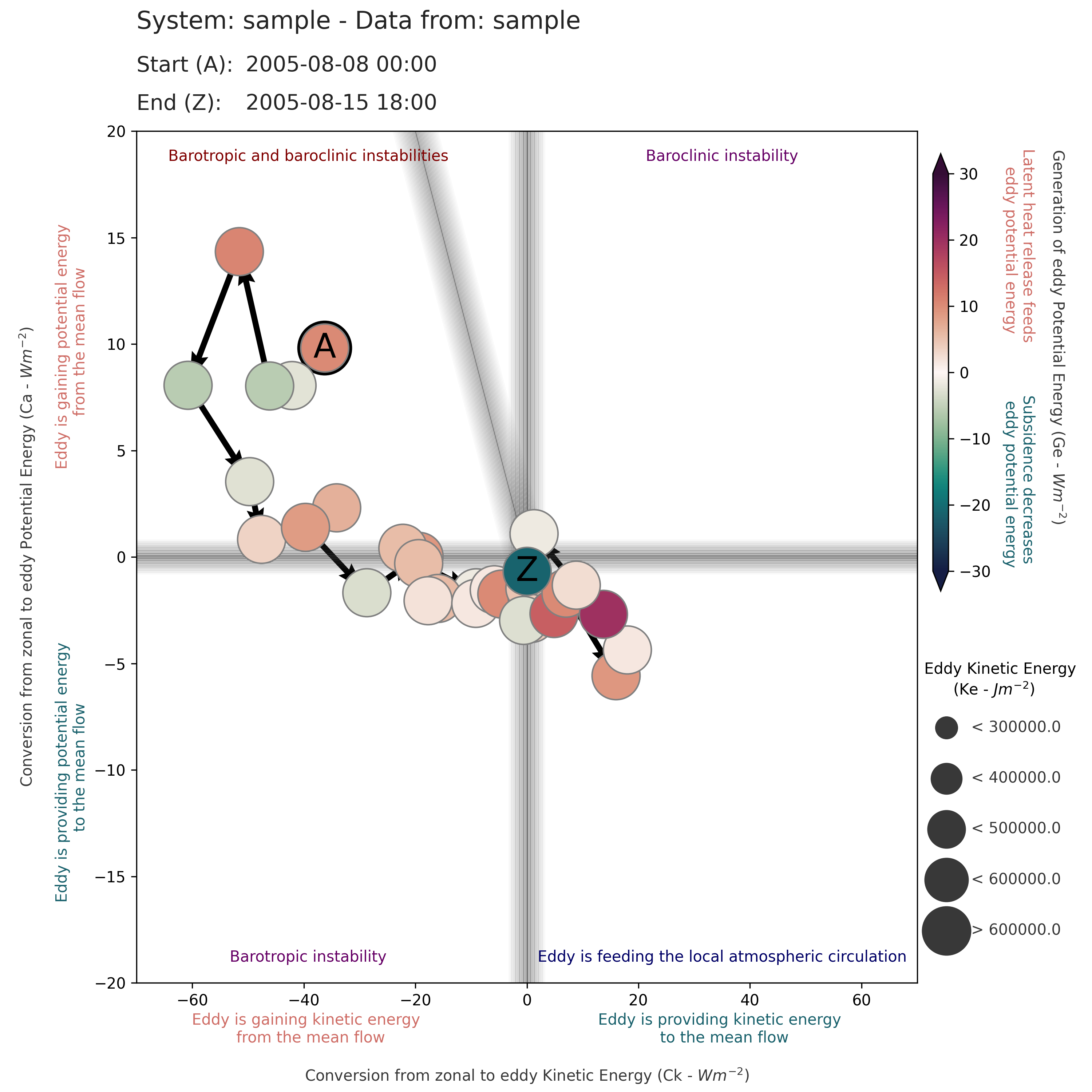
Interpretation Guide
Mixed LPS Quadrants
| Region | Description |
|---|---|
| Upper-Right | Baroclinic instability dominant |
| Upper-Left | Both baroclinic and barotropic instabilities |
| Lower-Left | Barotropic instability dominant |
| Lower-Right | Eddy feeding local atmospheric circulation |
Visual Elements
- Marker Color: Red indicates latent heat release (positive Ge), Blue indicates subsidence (negative Ge)
- Marker Size: Larger markers indicate higher eddy kinetic energy
- 'A' Marker: Start of the cyclone lifecycle
- 'Z' Marker: End of the cyclone lifecycle
- Thick Outline: Point of maximum intensity (highest Ke)
- Arrows: Show temporal evolution of the system
Testing
Run the comprehensive test suite:
# Run all tests
python -m pytest tests/test_lps.py -v

# Run with visual inspection
cd tests
python test_lps.py
Visual outputs will be generated in tests/test_outputs/ for manual verification.
See tests/TESTING.md for detailed testing documentation.
API Reference
For complete API documentation, see API_DOCUMENTATION.md.
Main Classes
Visualizer: Main class for creating LPS diagramsplot_data(): Add trajectory data to the plotget_labels(): Get axis labels for current LPS typeset_limits(): Set custom axis limitscalculate_marker_size(): Calculate marker sizes and intervals
Helper Functions
get_max_min_values(): Adjust min/max values for balanced normalization
Customization Options
The Visualizer class accepts various customization parameters:
lps = Visualizer(
    LPS_type='mixed',        # 'mixed', 'baroclinic', or 'imports'
    zoom=False,              # Enable dynamic limits
    x_limits=None,           # Custom x-axis limits
    y_limits=None,           # Custom y-axis limits
    color_limits=None,       # Custom colorbar limits
    marker_limits=None,      # Custom marker size limits
    line_alpha=0.2,          # Reference line transparency
    lw=20,                   # Reference line width
    c='#383838',             # Reference line color
    labelpad=5,              # Label padding
    fontsize=10,             # Annotation font size
    label_fontsize=14        # Axis label font size
)
Best Practices
- Standardized Comparisons: Use
zoom=Falsewith default limits when comparing multiple cyclones - Detailed Analysis: Use
zoom=Truefor single-system detailed analysis - Multiple Trajectories: Calculate common limits when overlaying datasets
- Data Quality: Ensure temporal continuity for meaningful trajectory arrows
- Visual Verification: Always inspect generated plots visually
- Resolution: Save at 300 dpi for publication-quality figures
Examples with Sample Data
The package includes sample data for testing and demonstration:
from lorenz_phase_space.phase_diagrams import Visualizer
import pandas as pd
import matplotlib.pyplot as plt

# Load sample data
df = pd.read_csv('samples/sample_results_1.csv',
                 parse_dates={'Datetime': ['Date', 'Hour']},
                 date_format='%Y-%m-%d %H')

# Create and plot
lps = Visualizer(LPS_type='mixed', zoom=False)
lps.plot_data(df['Ck'].values, df['Ca'].values,
             df['Ge'].values, df['Ke'].values)

plt.savefig('sample_lps.png', dpi=300, bbox_inches='tight')
Troubleshooting
Common Issues
Q: Why aren't the arrows appearing? A: Ensure your data has at least 2 time steps. Arrows connect consecutive points.
Q: The axis limits look strange A: Verify your data units. Energy conversions should be in W m⁻², energy reservoirs in J m⁻².
Q: Colors don't match the expected pattern A: Check that your Ge (generation) values have the correct sign. Positive should be energy generation.
Q: The plot looks different than expected A: The plotting functions are highly optimized. Avoid modifying the core plotting methods directly.
Getting Help
- Email: danilo.oceano@gmail.com
- GitHub Issues: github.com/daniloceano/lorenz_phase_space/issues
- Documentation: See API_DOCUMENTATION.md and TESTING.md
Contributing
Contributions are welcome! Please feel free to submit a Pull Request. For major changes:
- Fork the repository
- Create a feature branch (
git checkout -b feature/AmazingFeature) - Commit your changes (
git commit -m 'Add some AmazingFeature') - Push to the branch (
git push origin feature/AmazingFeature) - Open a Pull Request
Please ensure:
- All tests pass
- New features include tests
- Documentation is updated
- Visual outputs are verified
Citation
If you use this package in your research, please cite:
@software{lorenz_phase_space,
  author = {Couto de Souza, Danilo},
  title = {Lorenz Phase Space Visualization Tool},
  year = {2025},
  url = {https://github.com/daniloceano/lorenz_phase_space},
  version = {1.3.0}
}
References
- Hart, R. E. (2003). A Cyclone Phase Space derived from thermal wind and thermal asymmetry. Monthly Weather Review, 131(4), 585-616.
- Lorenz, E. N. (1955). Available potential energy and the maintenance of the general circulation. Tellus, 7(2), 157-167.
License
This project is licensed under the MIT License - see the LICENSE file for details.
Changelog
See CHANGELOG.md for a detailed history of changes.
Contact
Danilo Couto de Souza
- Email: danilo.oceano@gmail.com
- GitHub: @daniloceano
Note: This tool is specifically designed for atmospheric science applications. The plotting functions are optimized for specific visual output characteristics. While the package is flexible for various use cases, modifications to core plotting methods may significantly alter the diagram appearance.
Release history Release notifications | RSS feed


Download files
Download the file for your platform. If you're not sure which to choose, learn more about installing packages.
Source Distribution
Built Distribution
Filter files by name, interpreter, ABI, and platform.
If you're not sure about the file name format, learn more about wheel file names.
Copy a direct link to the current filters
File details
Details for the file lorenz_phase_space-1.3.0.tar.gz.
File metadata
- Download URL: lorenz_phase_space-1.3.0.tar.gz
- Upload date:
- Size: 86.8 kB
- Tags: Source
- Uploaded using Trusted Publishing? No
- Uploaded via: twine/6.2.0 CPython/3.10.12
File hashes
| Algorithm | Hash digest | |
|---|---|---|
| SHA256 |
c539b96cf1e153ecbe13d150002e0fb31f0470c2791e54911db235e4398c63c7
|
|
| MD5 |
3f5c95c9b56eebf2737c1f348554c907
|
|
| BLAKE2b-256 |
48ea4d7316d21a976e249417a6189b996d71f080e671dda9d2aef6bd19672212
|
File details
Details for the file lorenz_phase_space-1.3.0-py3-none-any.whl.
File metadata
- Download URL: lorenz_phase_space-1.3.0-py3-none-any.whl
- Upload date:
- Size: 20.4 kB
- Tags: Python 3
- Uploaded using Trusted Publishing? No
- Uploaded via: twine/6.2.0 CPython/3.10.12
File hashes
| Algorithm | Hash digest | |
|---|---|---|
| SHA256 |
906e5b2c7c91e35c0d5cc06783d8b0443fdcdd93322b552eb18d4722fe6a022e
|
|
| MD5 |
2e24cab917c1afcf4d13198e94b10d21
|
|
| BLAKE2b-256 |
b1c7bf8b3703554edd73a98096a2446a8c9e7e22fb229f0cc8f5cdcff46212ba
|


