
mkdocs-audience-toggle
A MkDocs plugin (built for and tested with
Material for MkDocs) that adds a toggle to the header that allows the user to switch the content mode. A mode allows you to hide content sections that you do not want that audience to see. By default all content is otherwise available in all modes (see "Marking content"). State persists across pages via localStorage.
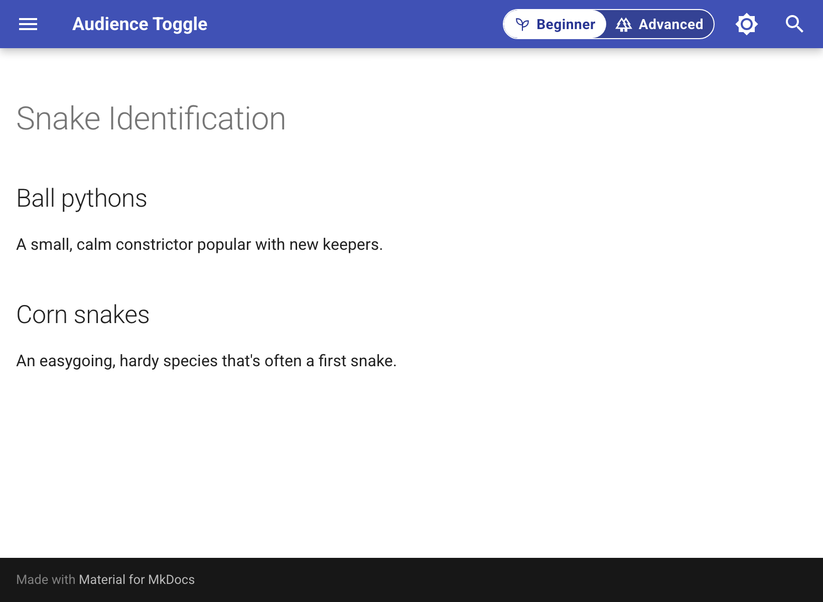
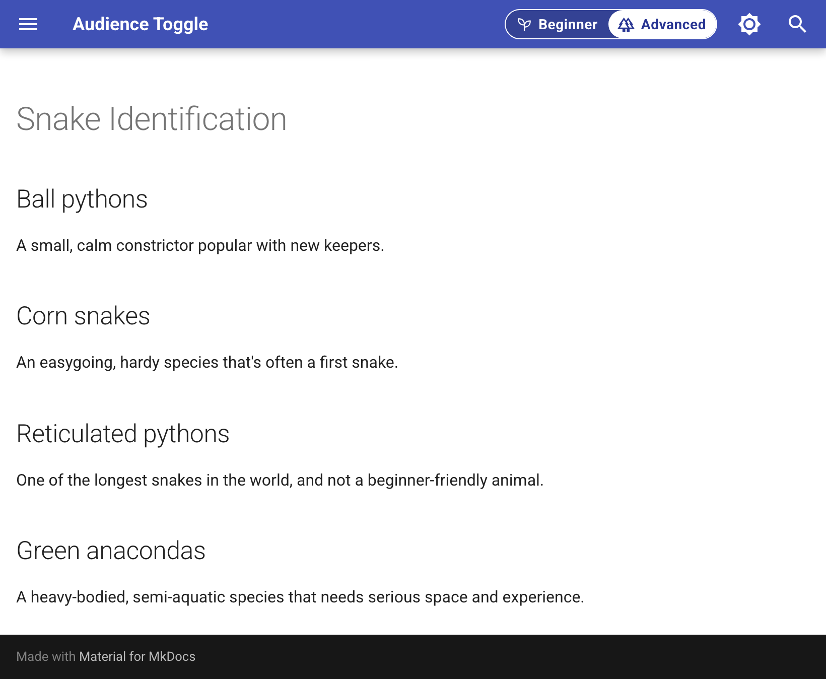
With two modes, Beginner hides the advanced sections and Advanced shows everything. Switching modes updates the page without reloading it.
plugins:
  - audience_toggle:
      modes:
        - name: beginner
          label: Beginner
          icon: url(...)
        - name: advanced
          label: Advanced
          default: true
          icon: url(...)

In this example, the last two sections are marked {: data-fcm-hide="beginner" } (see
"Marking content"), so Beginner mode hides them:
You can add more modes. Each mode's icon is optional.
      modes:
        - name: beginner
          icon: url(...)
        - name: intermediate
          default: true
          icon: url(...)
        - name: advanced
          icon: url(...)

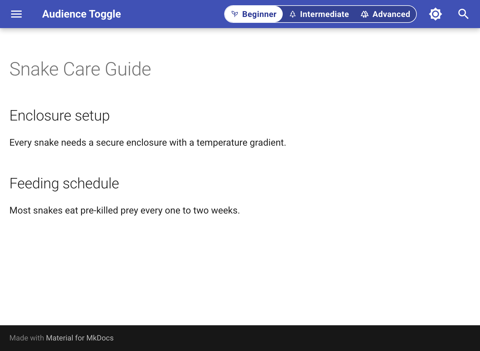
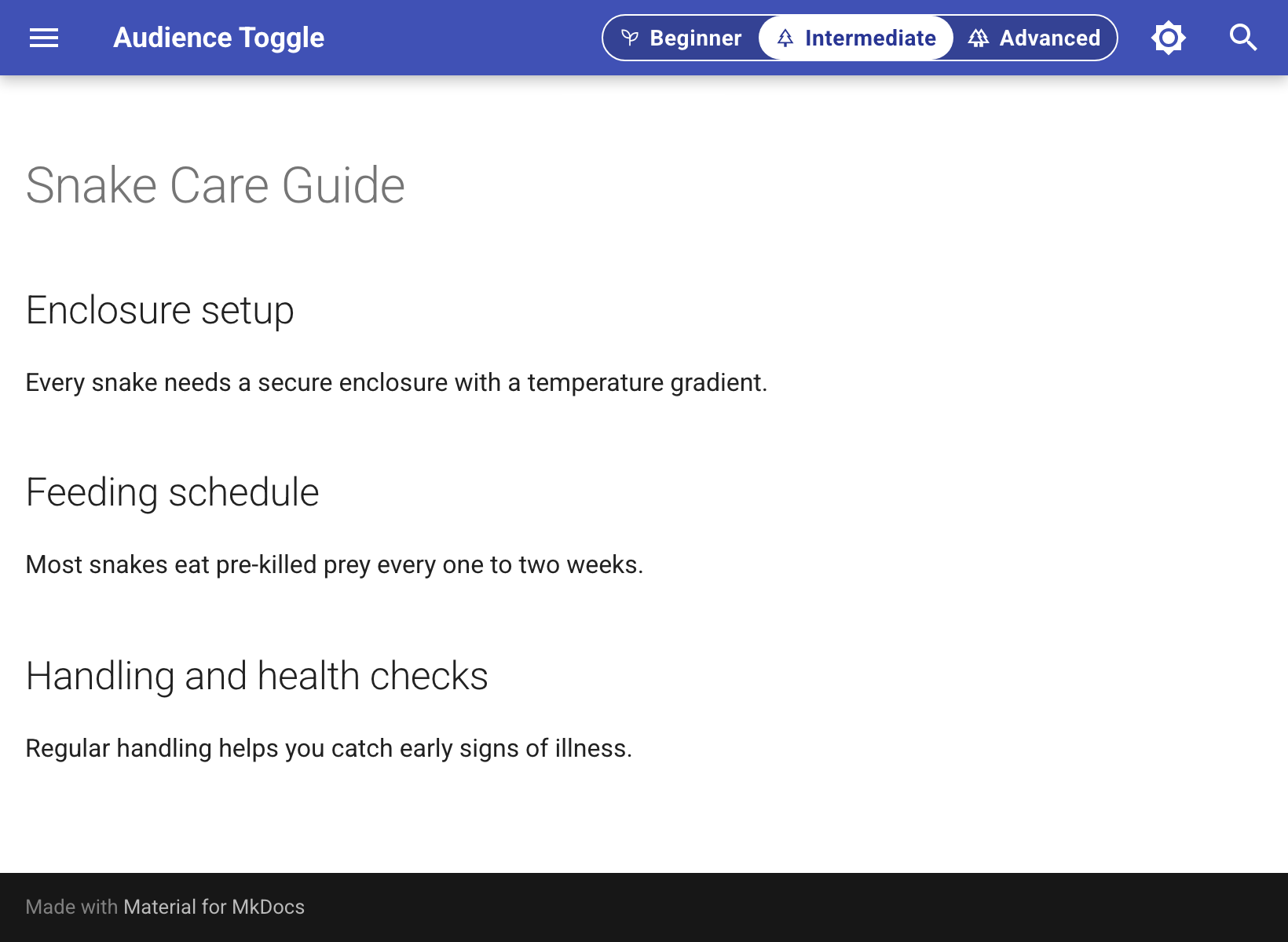
Each heading lists the modes it's hidden in, so sections can appear in stages:
## Handling and health checks {: data-fcm-hide="beginner" }

## Breeding cycles {: data-fcm-hide="beginner intermediate" }
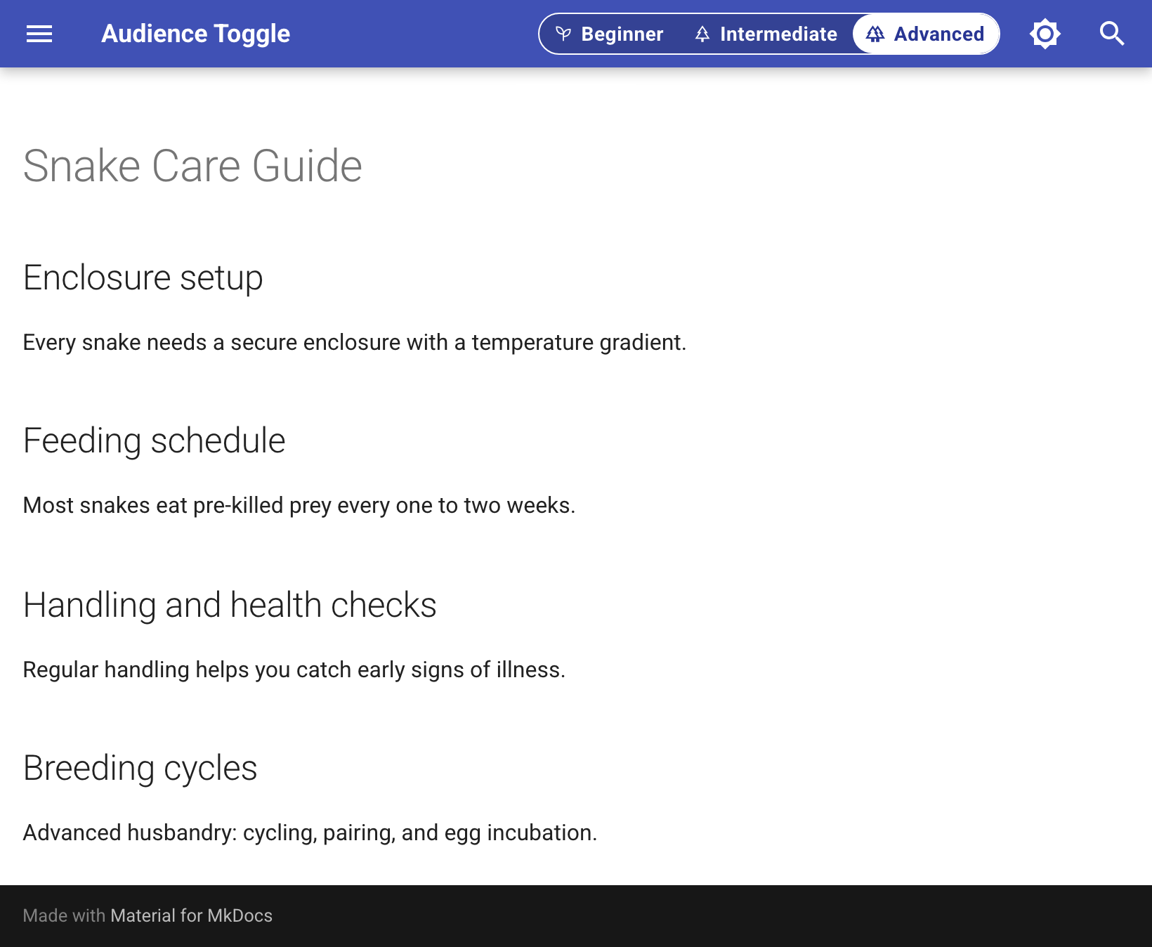
Below a 45em viewport width, collapse_labels shows only the icons:
collapse_labels: true

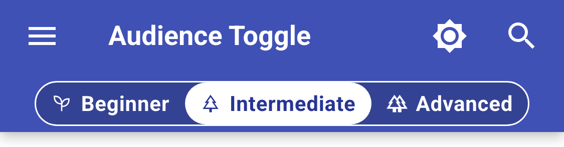
Without collapse_labels, a toggle that doesn't fit in the header moves to its own row:
Requirements
Python 3.9+ and MkDocs 1.5+. The plugin doesn't depend on Material for MkDocs, but it was built and tested with it, and two options rely on Material's markup:
insert_selectordefaults to Material's palette toggle. If nothing matches, the toggle is added to the end of<body>. Setinsert_selectorto place it somewhere else.hide_toc_entrieshides entries in Material's table of contents. With other themes it does nothing, but the content itself is still hidden.
Hidden content is not private
Content is hidden in the browser with JavaScript and CSS. Every visitor downloads the full page in every mode, and hidden content can be read in the page source, with JavaScript turned off, or by switching modes. Don't use the plugin to restrict access to anything.
MkDocs' search plugin indexes all content regardless of mode. A search result can point to a
heading that's hidden in the current mode. Following it switches modes, as described in
"Linking to hidden content".
Install
pip install mkdocs-audience-toggle
Configure
plugins:
  - audience_toggle:
      modes:
        - name: essentials
          label: Essentials
          default: true
          description: Show only what you need to write your first programs
          announcement: Just the basics, start here!
          icon: url(...)
        - name: advanced
          label: Advanced
          description: Show all site content
          announcement: Viewing all content.
          icon: url(...)
modes is required. List at least two. Each entry has these keys:
| Key | Required | Description |
|---|---|---|
name |
yes | Identifier used in data-fcm-hide, the URL parameter, and localStorage. |
label |
no | Button text. Defaults to name.title(). |
default |
no | Makes this the mode on a reader's first visit. Defaults to the first mode. |
icon |
no | A CSS mask-image value, such as "url('data:image/svg+xml,...')". |
description |
no | Tooltip text for the mode's button. |
announcement |
no | Text shown in the toast after switching to this mode. Defaults to label. |
Other options:
| Key | Default | Description |
|---|---|---|
storage_key |
fcm-mode |
localStorage key for the active mode. |
query_param |
none | URL parameter that sets the mode, such as ?mode=advanced. |
insert_selector |
[data-md-component="palette"] |
The toggle is inserted before the first element matching this selector. If nothing matches, it's added to the end of <body>. |
attribute |
data-fcm-hide |
Attribute used to mark content. |
hide_toc_entries |
true |
Also hide a hidden heading's entry in Material's table of contents. |
wrapper_class |
[] |
Class names of wrapper elements to hide along with a marked heading, when the heading is the wrapper's first child. |
aria_label |
Content mode |
Accessible label for the toggle. |
collapse_labels |
false |
Below a 45em viewport width, show only the icons. Every mode needs an icon. |
show_toast |
true |
Show a short message after the mode changes. |
Below 45em, if the toggle doesn't fit in Material's header row, it moves to its own row below it.
When it fits, it stays next to the title.
This needs browser support for CSS :has(). Without it, the toggle stays in the header row and
can overflow on narrow screens.
Marking content
The plugin hides elements whose data-fcm-hide attribute (or the attribute set in attribute)
includes the active mode. The value is a space-separated list of mode names. There are three ways
to add the attribute.
1. attr_list attributes
With the attr_list extension enabled
in markdown_extensions, add the attribute to a heading, paragraph, list item, or admonition:
## Decorators {: data-fcm-hide="essentials" }

This section is hidden in Essentials mode.

## Functions

This paragraph is hidden in Essentials mode. The rest of the section is shown.
{: data-fcm-hide="essentials" }
A marked heading hides its whole section, up to the next heading of the same or higher level. Any other marked element hides only itself.
2. HTML wrappers
To hide content that isn't a single block, wrap it in a <div> or <span> with the attribute. On
a <div>, add markdown="block" (from the
md_in_html extension) so the Markdown
inside it is still rendered:
<div data-fcm-hide="essentials" markdown="block">
This block is hidden in Essentials mode.
</div>

This sentence has <span data-fcm-hide="essentials">an inline aside</span> in it.
3. CSS for multi-paragraph list items
The plugin hides only the marked element and, for a heading, its section. It doesn't hide parent
elements. For a list item with more than one paragraph, such as a card in a Material
card grid,
attr_list can only mark the first paragraph, not the <li>. To hide the whole item, add a CSS
rule that uses the data-fcm-mode attribute the plugin sets on <html>:
html[data-fcm-mode="essentials"] .grid.cards > ul > li:has(> p[data-fcm-hide~="essentials"]) {
  display: none;
}
The default mode is the one active on a reader's first visit. Content can be hidden in it like in any other mode.
The attribute has no effect without the plugin. If you remove the plugin, all marked content is shown.
Linking to hidden content
When a link points to content that's hidden in the reader's current mode, the plugin switches to
the nearest mode that shows it. This works whether the target is marked itself or is hidden
because of something around it, such as a subheading inside a hidden section or a heading inside
a hidden <div>.
Distance is measured from the current mode's position in the modes list: the plugin checks the
modes one position away, then two, and so on. If two modes are the same distance away, it picks
the one later in the list.
For example, with the modes beginner, intermediate, and advanced, a heading marked
data-fcm-hide="beginner advanced" is shown only in Intermediate. Following a link to it from
Beginner or Advanced switches to Intermediate. A heading marked data-fcm-hide="beginner" is
shown in both Intermediate and Advanced, so a Beginner reader following a link to it switches to
Intermediate, the closer of the two.
If the target is hidden in every mode, the mode doesn't change.
Setting the mode from a URL
Set query_param to let a link choose the mode:
query_param: mode
https://example.com/some-page/?mode=advanced
Opening this link switches to Advanced mode and saves it to localStorage, so the mode stays the
same on other pages. Unrecognized values are ignored. To also jump to a section, add a heading
anchor: ?mode=advanced#some-heading.
The parameter stays in the URL after the mode is applied. With Material's navigation.instant
feature, Material rewrites the page's navigation links as absolute URLs, including the query
string, before the plugin runs. If the plugin removed the parameter afterward, those links would no
longer match the current URL, and clicking one would reload the page instead of scrolling to the
heading.
As a result, analytics tools that count page views by URL record the landing page as
/some-page/?mode=advanced, separately from /some-page/. Only the page opened from the link is
affected. To track modes without relying on the URL, use the event described in
"Analytics".
Styling
The toggle's CSS is controlled with custom properties. Override them in your extra_css file on
#fcm-toggle, or on a parent element such as :root:
#fcm-toggle {
  --fcm-accent: #2e7d32;      /* border and highlight color (default: currentColor) */
  --fcm-track-bg: #fdf6e3;    /* toggle background (default: transparent) */
  --fcm-active-fg: #fdf6e3;   /* text color of the active option (default: Canvas) */
  --fcm-radius: 1rem;         /* corner radius of the toggle and highlight (default: 1rem) */
  --fcm-height: 1.2rem;       /* toggle height (default: 1.2rem) */
  --fcm-font-size: 0.6rem;    /* label font size (default: 0.6rem) */
  --fcm-icon-size: 0.7rem;    /* icon size (default: 0.7rem) */
}
For other changes, target the classes .fcm-toggle, .fcm-highlight, .fcm-option,
.fcm-option--icon, and .fcm-label. The script sets the highlight's left and width inline to
match the active option.
Accessibility
- The color properties aren't checked for contrast. Check your color choices against WCAG contrast requirements.
- With
collapse_labels: true, give every mode anicon. Below 45em the labels are hidden visually but still read by screen readers, so a mode without an icon appears as an empty button. - Each option is a toggle button with
aria-pressedand its own tab stop. The toggle doesn't use the ARIA radio group pattern, which has a single tab stop and arrow-key navigation. - The card grid CSS rule and the toggle's mobile row both
need CSS
:has()(Chrome 105+, Safari 15.4+, Firefox 121+). In older browsers, the card's first paragraph is still hidden but the rest of the card isn't, and the toggle doesn't move to its own row. - Transitions are turned off when
prefers-reduced-motion: reduceis set. - Hidden content uses
display: none, which removes it from the accessibility tree. - If the plugin's JavaScript doesn't run, no content is hidden.
Active mode attribute
The plugin sets data-fcm-mode on <html> to the name of the active mode. Use it to style other
elements or to read the mode from other scripts.
Analytics
The plugin doesn't add the mode to URLs, so page views counted by URL don't include it. To record
the mode, listen for the fcm:modechange event on document. event.detail contains mode and
previousMode:
document.addEventListener("fcm:modechange", (event) => {
  const { mode, previousMode } = event.detail;
  // Google Analytics (gtag.js)
  gtag("event", "content_mode_change", { mode, previous_mode: previousMode });
  // Plausible
  plausible("Content Mode Change", { props: { mode } });
});
The event fires when the plugin sets the mode on page load (previousMode is null) and each time
the mode changes. Clicking the option that's already active doesn't fire it.
A script that loads after the plugin, such as a tag manager snippet, misses the page-load event.
Read document.documentElement.dataset.fcmMode when the script starts to get the current mode,
then listen for the event.
Using a MutationObserver
You can also watch the data-fcm-mode attribute instead of listening for the event. With
navigation.instant, the plugin sets the attribute again on each page change even when the mode
hasn't changed, so this example skips repeated values:
const html = document.documentElement;
let lastMode = null;

function reportMode() {
  const mode = html.dataset.fcmMode;
  if (!mode || mode === lastMode) return;
  gtag("event", "content_mode_change", { mode, previous_mode: lastMode });
  lastMode = mode;
}

reportMode();
new MutationObserver(reportMode).observe(html, { attributeFilter: ["data-fcm-mode"] });
Testing
python3 -m venv .venv
source .venv/bin/activate
pip install -e ".[test]"
playwright install chromium
pytest
tests/fixture_site/ is a small Material for MkDocs site that uses the plugin. The tests build it
once, serve it locally, and run Playwright against it:
test_behavior.py: hiding, persistence, links to hidden content, and toggle layout.test_accessibility.py: axe-core checks.test_keyboard.py: keyboard use and focus.
axe-core is included in tests/vendor/, so the tests don't need network access.
License
1 maintainer

Release files for mkdocs-audience-toggle 0.1.0
For a detailed explanation of source distributions (sdists) and built distributions (wheels), please see the package formats documentation.
Source distribution (sdist)
| File | Size | Uploaded | |
|---|---|---|---|
| mkdocs_audience_toggle-0.1.0.tar.gz | 167.7 kB | Details |
Built distribution (wheel)
| File | Interpreter | ABI | Platform | Reset |
|---|---|---|---|---|
| mkdocs_audience_toggle-0.1.0-py3-none-any.whl | Python 3 | none | any | Details |
Total release size: 182.5 kB
Release files / mkdocs_audience_toggle-0.1.0.tar.gz
| Download URL | mkdocs_audience_toggle-0.1.0.tar.gz |
|---|---|
| Size | 167.7 kB |
| Tags | Source |
|
SHA-256 checksum How to use checksums |
340cfda6d23420e8fbac64245bbffc88d0401e5d76cbc5fbabeacc5af34db355
|
|
BLAKE2b-256 checksum How to use checksums |
5b958baf80a9458547c0411ffe7633945a2bb84c2432b7ad69bee41486c5ccc5
|
| Upload date | |
|
Uploaded using Trusted Publishing? What is trusted publishing? |
Yes |
| Uploaded via |
twine/7.0.0 CPython/3.13.14
|
Provenance
Provenance describes where a file came from. On PyPI, provenance is shared via attestations, which provide a verifiable record of the build or publishing details. View details, limitations and caveats.


PyPI Publish Attestation
PyPI verified that this artifact, at this checksum, originated from the publisher listed below.
Signed by GitHub Actions, verified by PyPI on Sep 27, 2026.
Transparency logRelease files / mkdocs_audience_toggle-0.1.0-py3-none-any.whl
| Download URL | mkdocs_audience_toggle-0.1.0-py3-none-any.whl |
|---|---|
| Size | 14.8 kB |
| Tags | Python 3 |
|
SHA-256 checksum How to use checksums |
e8fe946e621a7b0d7c2b3ee62aa765abc78e14b51041c8bf24048c632c356a97
|
|
BLAKE2b-256 checksum How to use checksums |
3472ac0033215d3bce3207fbdf26ffb58217bac7edb7f933286c51d589f3ccbb
|
| Upload date | |
|
Uploaded using Trusted Publishing? What is trusted publishing? |
Yes |
| Uploaded via |
twine/7.0.0 CPython/3.13.14
|
Provenance
Provenance describes where a file came from. On PyPI, provenance is shared via attestations, which provide a verifiable record of the build or publishing details. View details, limitations and caveats.
PyPI Publish Attestation
PyPI verified that this artifact, at this checksum, originated from the publisher listed below.
Signed by GitHub Actions, verified by PyPI on Sep 27, 2026.
Transparency log












