Interactive Altair charts and a matplotlib/Altair styling toolkit for the 2022 FIFA World Cup (MSDS 610 example).

Project description
msds-comms-plotter
A small teaching library for the MSDS 610 (Communications for Analytics)
coursework. It bundles a tiny pandas data layer, a World Cup 2022 example
dataset with matplotlib figures, and chartkit — a styling toolkit that
gives matplotlib and Altair one shared visual identity.
General
The package ships three things:
| Module | What it does |
|---|---|
msds_comms_plotter.plots |
Ready-made matplotlib figures for the World Cup 2022 dataset. |
msds_comms_plotter.altair_charts |
Interactive Altair explorations of the same data (bar, line, scatter, histogram, heatmap, two linked-brush charts, a point-paths chart, and a horizon graph), with a page-wide color-scheme picker in the gallery. |
msds_comms_plotter.chartkit |
Shared theming for matplotlib and Altair. |
About chartkit
matplotlib and Altair are independent renderers: matplotlib draws static
figures in Python, while Altair emits Vega-Lite
JSON that renders in a browser. You can't stack one on the other. What
chartkit does instead is give both the same visual identity so a static
matplotlib figure and an interactive Altair chart look like siblings:
- One typeface — JetBrains Mono, with a monospace fallback stack.
- One palette — a calm, colorblind-aware 8-color categorical set, plus a
sequential (
viridis) and diverging (redblue) scheme for magnitude and polarity data. - Matching minimal chrome — left-aligned bold titles, quiet horizontal-only gridlines, no top/right spines, tickless axes.
Font note: JetBrains Mono must be installed for matplotlib to use it, and available to the browser (e.g. via a webfont) for Altair. Both fall back to a generic monospace stack otherwise — nothing breaks, the type just changes. Get the font at https://www.jetbrains.com/lp/mono/.
Installation
Requires Python ≥ 3.9.
Just want to use it? Inside an activated virtual environment (see below), the package installs straight from PyPI — the World Cup sample data is bundled, so the charts work with no extra downloads:
python -m pip install msds-comms-plotter          # add "[png]" for static PNG export
python -c "from msds_comms_plotter import altair_charts as ac; ac.linked_scatter_passing().save('passing.html')"
The rest of this section covers a full editable/dev install from a clone.
Either way, install into a virtual environment (venv). This is the recommended (and on
many systems, required) approach: a modern Python — including the Homebrew
Python on macOS — is "externally managed" and will refuse a plain
pip install with an error: externally-managed-environment (PEP 668). A venv
sidesteps that entirely by giving the project its own isolated Python and
pip, so you never touch the system install.
1. Get the code
git clone https://github.com/tjsasser/msds-comms-plotter.git
cd msds-comms-plotter
2. Create the venv
Run this once, from the repo root. It makes a .venv/ folder holding a
private copy of Python (.venv/ is already covered by .gitignore).
python3 -m venv .venv
3. Activate it
You must activate the venv in each new terminal session before installing or running anything. Pick the line for your shell:
# macOS / Linux (bash, zsh)
source .venv/bin/activate

# Windows (PowerShell)
.venv\Scripts\Activate.ps1

# Windows (Command Prompt)
.venv\Scripts\activate.bat
Once active, your prompt is prefixed with (.venv). Confirm pip now points
inside the venv (not the system Python):
which pip     # macOS / Linux  -> .../msds-comms-plotter/.venv/bin/pip
where pip     # Windows        -> ...\msds-comms-plotter\.venv\Scripts\pip.exe
4. Install the package
With the venv active, upgrade pip and install this project in editable mode
(-e, so your source edits take effect without reinstalling). Because you're
inside the venv, no --break-system-packages or --user flag is needed:
python -m pip install --upgrade pip
python -m pip install -e .
This pulls in every dependency automatically (see the table below).
5. Verify
python -c "from msds_comms_plotter import chartkit; print('chartkit OK', len(chartkit.PALETTE), 'colors')"
Expected output: chartkit OK 8 colors.
6. When you're done
Leave the venv with:
deactivate
Next time you work on the project, just re-activate (step 3) — you don't need to recreate the venv or reinstall.
Note — do not use
--break-system-packages. That flag (or a globalpip installoutside a venv) writes into the system/Homebrew Python and can corrupt it. The venv above is the safe, standard fix for theexternally-managed-environmenterror.
Requirements
Installing the package pulls these in automatically (declared in
pyproject.toml):
| Dependency | Used by |
|---|---|
pandas |
core data helpers |
pyarrow |
Parquet I/O |
requests |
data fetching |
matplotlib |
chartkit matplotlib theming + plots |
altair |
chartkit Altair theming (Altair 5.x; both the ≥5.5 and legacy theme APIs are supported) |
chartkit imports matplotlib and Altair lazily, inside the functions that
need them — so importing chartkit never fails just because one renderer is
missing. Use the matplotlib half without Altair installed, or vice versa.
Optional — static PNG export. Altair charts save as interactive .html out
of the box. To also write .png files, install the extra:
python -m pip install -e ".[png]" # adds vl-convert-python
To register the JetBrains Mono font without a system-wide install, see
register_font in the API below.
API
Import it from the package:
from msds_comms_plotter import chartkit
Design tokens (module constants)
These are the shared values every function draws from. Read them, or reuse them directly in your own plotting code.
| Name | Value | Meaning |
|---|---|---|
FONT |
"JetBrains Mono" |
Primary typeface. |
FONT_STACK |
["JetBrains Mono", "DejaVu Sans Mono", "Menlo", "Consolas", "monospace"] |
Fallback chain. |
PALETTE |
8 hex colors | Categorical palette (blue, orange, teal, amber, pink, violet, green, red). |
INK |
"#2c2c2a" |
Primary text / axis domain. |
MUTED |
"#6b6a66" |
Secondary text / tick labels. |
GRID |
"#e1e0d9" |
Gridlines. |
SURFACE |
"#ffffff" |
Chart background. |
SEQUENTIAL |
"viridis" |
Scheme for magnitude scales (heatmaps, choropleths). |
DIVERGING |
"redblue" |
Scheme for polarity scales (deltas vs. a baseline). |
SIZE_TITLE, SIZE_LABEL, SIZE_TICK, SIZE_LEGEND |
15, 12, 10, 11 |
Font sizes (pt). |
matplotlib functions
apply_matplotlib_theme() -> dict
Applies the chartkit look to matplotlib globally via rcParams (font, palette
cycle, figure size/DPI, spines, grid, ticks, legend). Call once, near the top of
your script or notebook. Returns the dict of rcParams it set.
style_axes(ax, title=None, xlabel=None, ylabel=None, ygrid_only=True) -> Axes
Per-axes finishing touches the global rcParams can't express: left-aligned
title, axis labels, hidden tick marks (labels kept), and horizontal-only grid
when ygrid_only=True. Returns the same ax for chaining.
ensure_font(name="JetBrains Mono") -> bool
Returns True if the font is available to matplotlib; otherwise emits a
UserWarning explaining the fallback and returns False. Handy as a
pre-flight check.
register_font(path) -> str
Registers a .ttf/.otf with matplotlib at runtime (no system install needed)
and returns the resolved font family name.
Altair functions
altair_theme() -> dict
Returns the chartkit Vega-Lite config as a plain dict — useful if you want to merge or inspect it rather than register it.
enable_altair_theme(name="chartkit") -> str
Registers and enables the theme, transparently handling both the Altair
≥ 5.5 decorator API and the legacy alt.themes registry. Returns the theme
name. Call once per session.
alt_line(data, x, y, color=None, title="") -> alt.Chart
alt_bar(data, x, y, color=None, title="") -> alt.Chart
alt_scatter(data, x, y, color=None, title="") -> alt.Chart
Thin styled chart builders. Channel arguments use Altair shorthand
("date:T", "price:Q", "symbol:N"). They return a normal alt.Chart, so
you can keep chaining Altair methods (.properties(...), .interactive(), …).
Examples
matplotlib
import matplotlib.pyplot as plt
from msds_comms_plotter import chartkit

chartkit.ensure_font()            # warns if JetBrains Mono isn't installed
chartkit.apply_matplotlib_theme() # set the global look once

x = range(1, 13)
y = [3, 5, 4, 7, 8, 6, 9, 11, 10, 13, 12, 15]

fig, ax = plt.subplots()
ax.plot(x, y, marker="o")
chartkit.style_axes(ax, title="Monthly revenue", xlabel="Month", ylabel="USD (000s)")
fig.savefig("revenue.png")        # 200 DPI, tight bbox, white background
If JetBrains Mono lives in a local file rather than a system install:
family = chartkit.register_font("fonts/JetBrainsMono-Regular.ttf")
chartkit.apply_matplotlib_theme()
Altair
import pandas as pd
from msds_comms_plotter import chartkit

chartkit.enable_altair_theme()    # register + enable once

df = pd.DataFrame({
    "date":   pd.date_range("2024-01-01", periods=6, freq="MS").tolist() * 2,
    "price":  [10, 12, 11, 14, 13, 16, 8, 9, 9, 11, 10, 12],
    "symbol": ["AAA"] * 6 + ["BBB"] * 6,
})

chart = chartkit.alt_line(df, x="date:T", y="price:Q", color="symbol:N",
                          title="Price by symbol")
chart.save("price.html")          # or chart.interactive() in a notebook
Both figures now share the same font, palette, and chrome.
Running the World Cup example charts
The package ships a worked example on real data: altair_charts explores the
2022 World Cup with the five most common Altair chart types (bar, line,
scatter, histogram, heatmap) plus two linked-brush charts, a point-paths chart,
and a horizon graph of shots-per-minute, and plots renders matplotlib figures
of the same data.
Interactive — open the whole gallery in your browser (recommended). The
example script examples/show_wc2022_charts.py builds every chart, stacks them
into one page, and opens it in your default web browser. Every chart has hover
tooltips; the line and scatter charts also support zoom and pan
(scroll/drag) — the bar, histogram, and heatmap have categorical or binned axes
where zoom isn't meaningful, so they're tooltip-only. The linked brush charts
let you drag a box on a scatter so the bars below recount only the players you
selected; the passing chart adds a player-name search box; and the
point-paths chart adds a match-number slider, hover-to-trace team paths, and
a team search box.
Two color pickers are pinned to the top of the gallery: a Category scheme (15 categorical schemes) that recolors every chart at once — including the single-hue bar/line/scatter/histogram, each taking a distinct slot of the scheme — and a Heatmap ramp (15 sequential schemes) for the heatmap.
python examples/show_wc2022_charts.py
The example uses the World Cup data bundled inside the installed package, so
it works from any folder with no raw data and no network. It writes a
self-contained HTML gallery to ./wc2022_altair_gallery.html in whatever
directory you run it from (the Vega libraries are embedded, so it stays
interactive offline — no server, no internet). Re-open that file any time
without re-running. On a headless machine the script skips the browser and just
prints the file path.
Two more drop-in example scripts ship alongside it:
python examples/save_png.py           # -> ./passing_chart.png  (needs the [png] extra)
python examples/use_your_own_data.py  # feed the chart your own DataFrame
Quickest — just look at the pre-rendered charts. Individual charts are
committed in reports/figures/. Open any alt_*.html in a browser for the
interactive version, or the matching .png for a static image:
open reports/figures/alt_scatter_xg_vs_goals.html    # macOS
xdg-open reports/figures/alt_scatter_xg_vs_goals.html # Linux
Regenerate them yourself. With the package installed (steps above), run the module — it uses the bundled World Cup data, so no raw-data unpack is needed:
python -m msds_comms_plotter.altair_charts   # writes alt_*.html + alt_*.png
python -m msds_comms_plotter.plots            # the matplotlib figures
Both write to reports/figures/. (.html always; .png needs the [png]
extra above.)
In a notebook, call any builder to display one chart inline — no need to run the whole module:
from msds_comms_plotter import altair_charts as ac
ac.scatter_xg_vs_goals()            # returns an alt.Chart; renders in Jupyter / VS Code
ac.bar_goals_by_team()              # bar / line / scatter / histogram / heatmap
ac.linked_scatter_position_counts() # brush a box on the scatter → bars below recount
ac.scatter_point_paths_hover()      # hover to trace a team's path; slider + search box
ac.linked_scatter_passing()         # brush + player search + color-scheme dropdown (15 schemes)
See the chart cookbook below for a picture and the core
Altair code for each chart type, and docs/wc2022_data.md
for the full chart list and the dataset columns.
Chart cookbook
One recipe per chart type used in this project: what it looks like, and the
core Altair code to build it. The snippets are trimmed to the essential
mark + encode so the technique is clear — the full themed, interactive
versions live in
msds_comms_plotter.altair_charts
(call ac.bar_goals_by_team(), ac.line_cumulative_goals(), …). Every chart
first picks up the shared look with:
import altair as alt
from msds_comms_plotter import chartkit
chartkit.enable_altair_theme()   # JetBrains Mono, shared palette, minimal chrome
Data comes from the bundled sample tables (worldcup.sample_goals(),
worldcup.sample_player_match_stats(), worldcup.sample_shots()); see
docs/wc2022_data.md for columns.
1. Bar chart — mark_bar
Magnitude across a category. One measure, one categorical axis, single hue; rank is carried by length and the sort order.
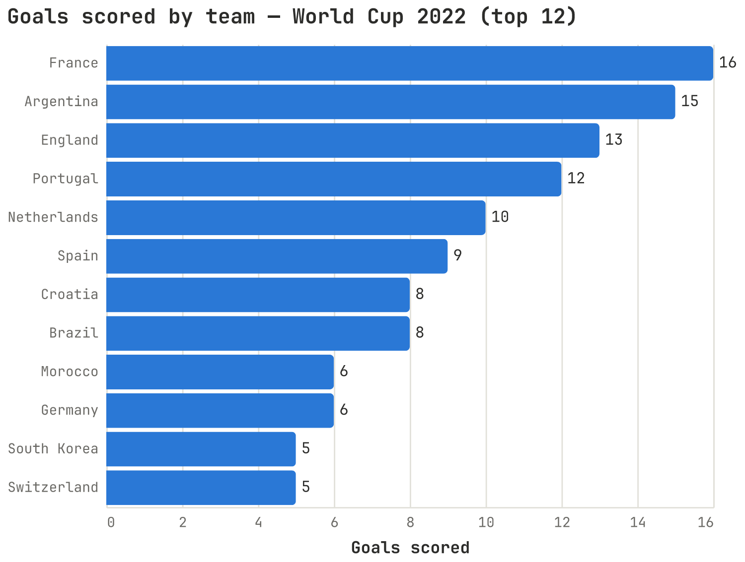
# by_team: columns "team", "goals"
alt.Chart(by_team).mark_bar().encode(
    x=alt.X("goals:Q", title="Goals scored"),
    y=alt.Y("team:N", sort="-x", title=None),   # sort teams by the x value
)
2. Line chart — mark_line
Change over time. Here goals are summed per match-day and accumulated into a
monotone curve. point=True marks each observation.
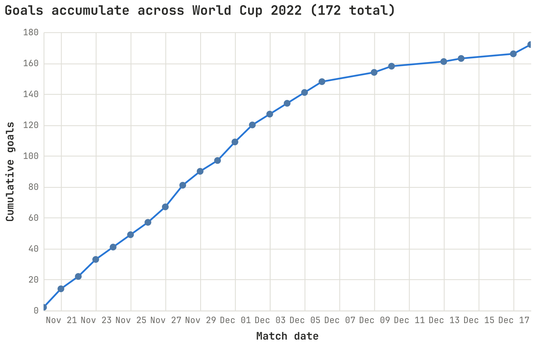
# daily: columns "match_date" (datetime), "cumulative_goals"
alt.Chart(daily).mark_line(point=True).encode(
    x=alt.X("match_date:T", title="Match date"),
    y=alt.Y("cumulative_goals:Q", title="Cumulative goals"),
)
3. Scatter plot — mark_point
Relationship between two continuous measures — one dot per record.
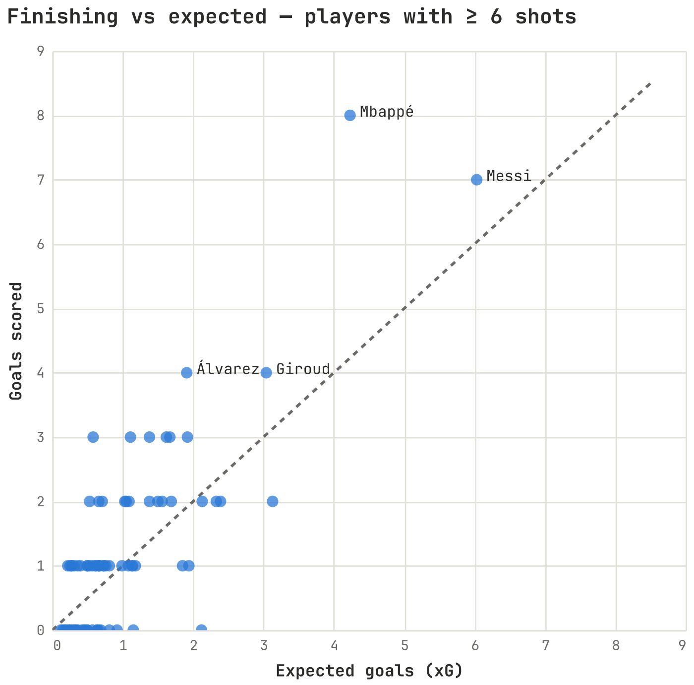
# players: columns "xg", "goals"
alt.Chart(players).mark_point(filled=True, size=70).encode(
    x=alt.X("xg:Q", title="Expected goals (xG)"),
    y=alt.Y("goals:Q", title="Goals scored"),
)
Add a y = x reference line by layering a second chart:
diag = alt.Chart(alt.Data(values=[{"v": 0}, {"v": 9}])).mark_line(
    strokeDash=[4, 4]).encode(x="v:Q", y="v:Q")
chart = diag + points
4. Histogram — mark_bar with bin
Distribution of a continuous variable: bin it, then count. A histogram is a bar chart whose x is binned.
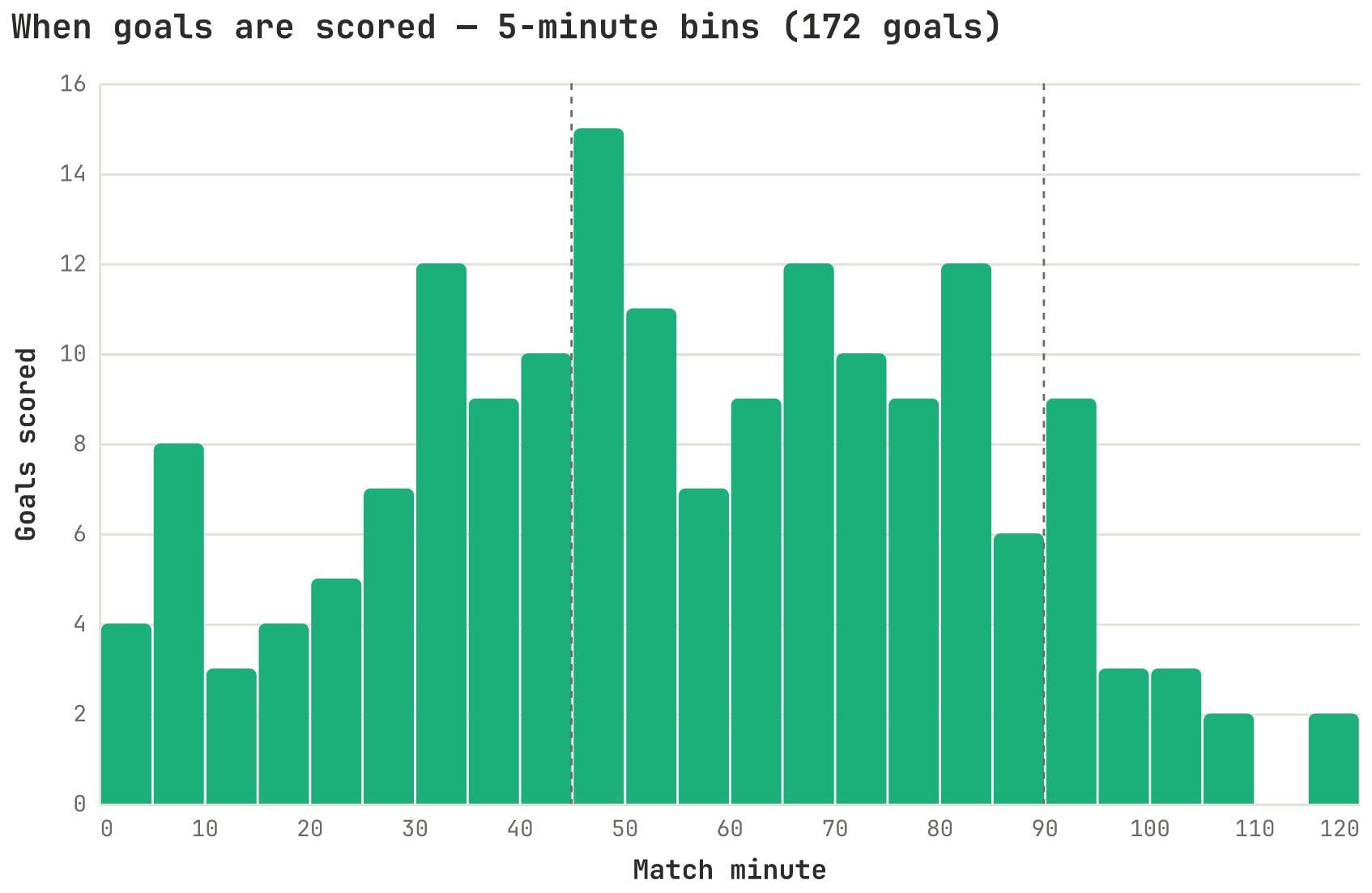
# goals: one row per goal, column "minute"
alt.Chart(goals).mark_bar().encode(
    x=alt.X("minute:Q", bin=alt.Bin(step=5), title="Match minute"),
    y=alt.Y("count():Q", title="Goals scored"),   # count() aggregates per bin
)
5. Heatmap — mark_rect
Two categorical axes with a magnitude in each cell, shaded by a sequential color ramp.
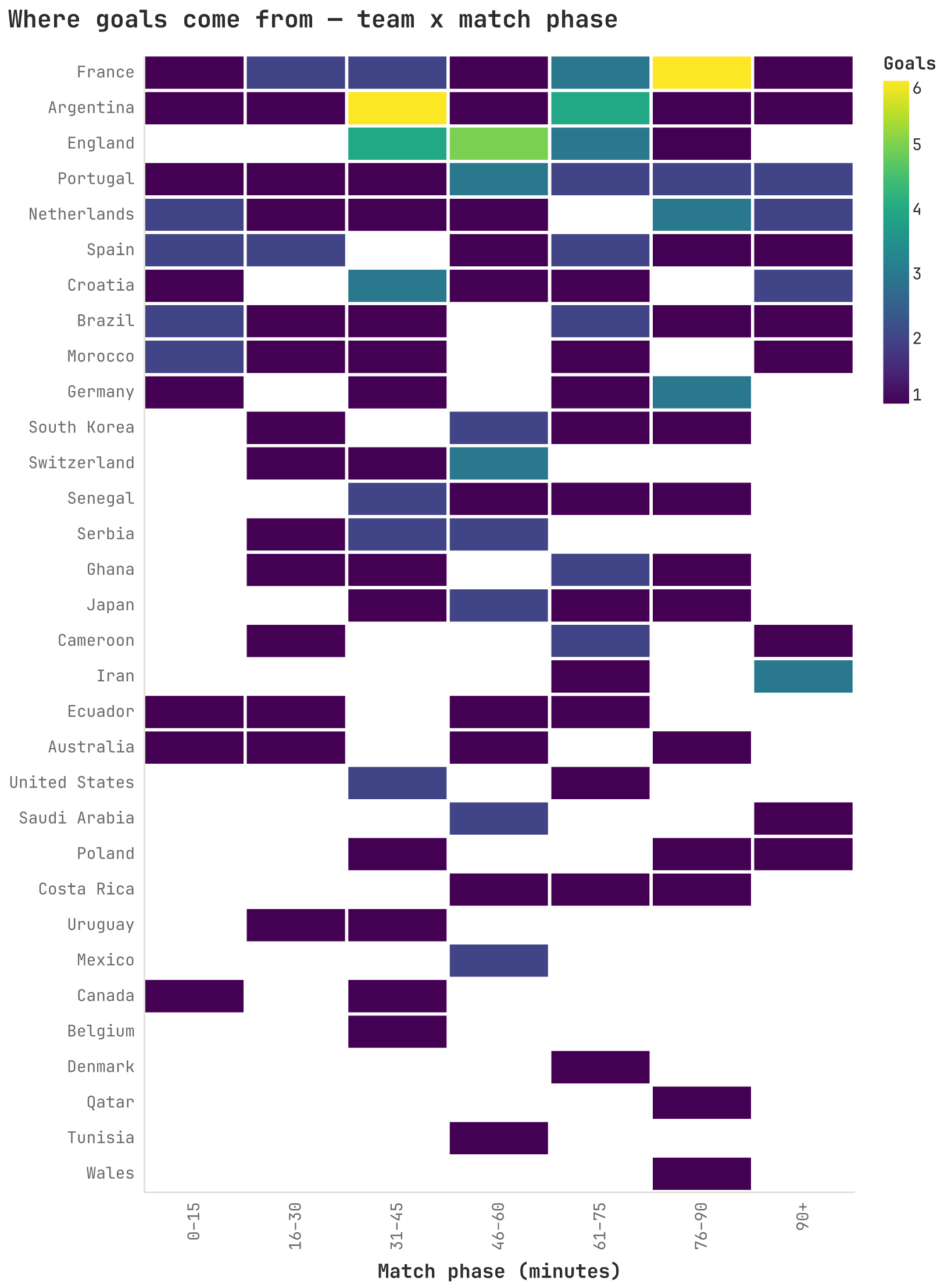
# counts: columns "team", "phase", "goals"
alt.Chart(counts).mark_rect(stroke="white", strokeWidth=2).encode(
    x=alt.X("phase:N", title="Match phase"),
    y=alt.Y("team:N", title=None),
    color=alt.Color("goals:Q", scale=alt.Scale(scheme="viridis")),
)
6. Linked brush — selection_interval (crossfilter)
Altair's signature interaction: drag a box on the scatter and a second view re-aggregates to only the selected points; the rest fade to grey. One selection drives both marks.
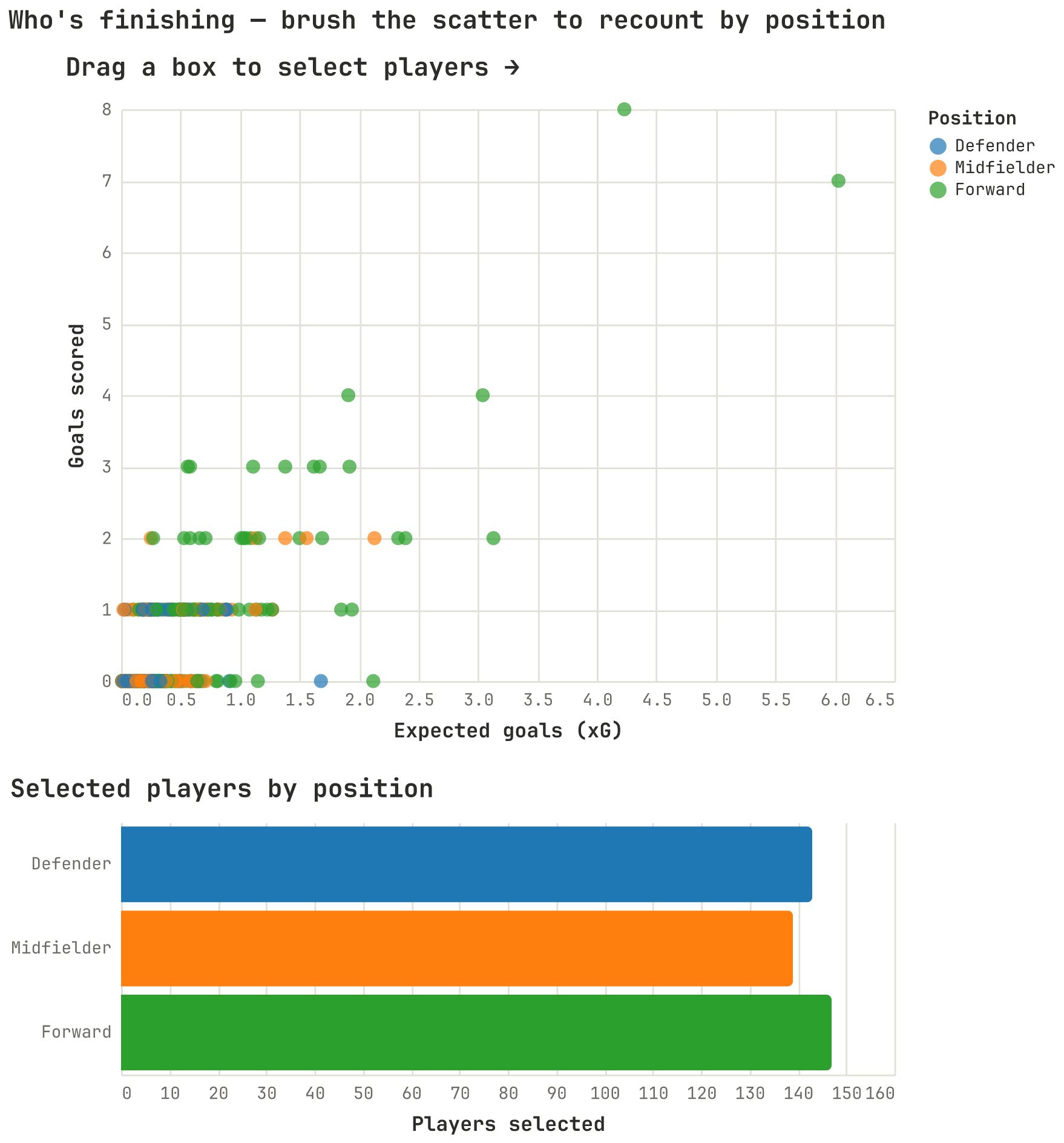
brush = alt.selection_interval()
color = alt.Color("position:N")

points = alt.Chart(players).mark_point(filled=True).encode(
    x="xg:Q", y="goals:Q",
    # selected points keep their category color; the rest go grey
    color=alt.when(brush).then(color).otherwise(alt.value("lightgray")),
).add_params(brush)

bars = alt.Chart(players).mark_bar().encode(
    y="position:N", x="count():Q", color=color,
).transform_filter(brush)          # only the brushed points are counted

points & bars                      # vertical concatenation
The passing chart (ac.linked_scatter_passing) is the same pattern with a
player-name search box and a live color-scheme dropdown added on top — see the
one-call shortcut at the end of this cookbook.
7. Point paths on hover — mark_trail + hover selection
Each entity is a trajectory over an ordered dimension. Hovering one traces its whole path as a tapering trail; the rest stay dim. (Abbreviated — the full builder adds a match-number slider and a team search box.)
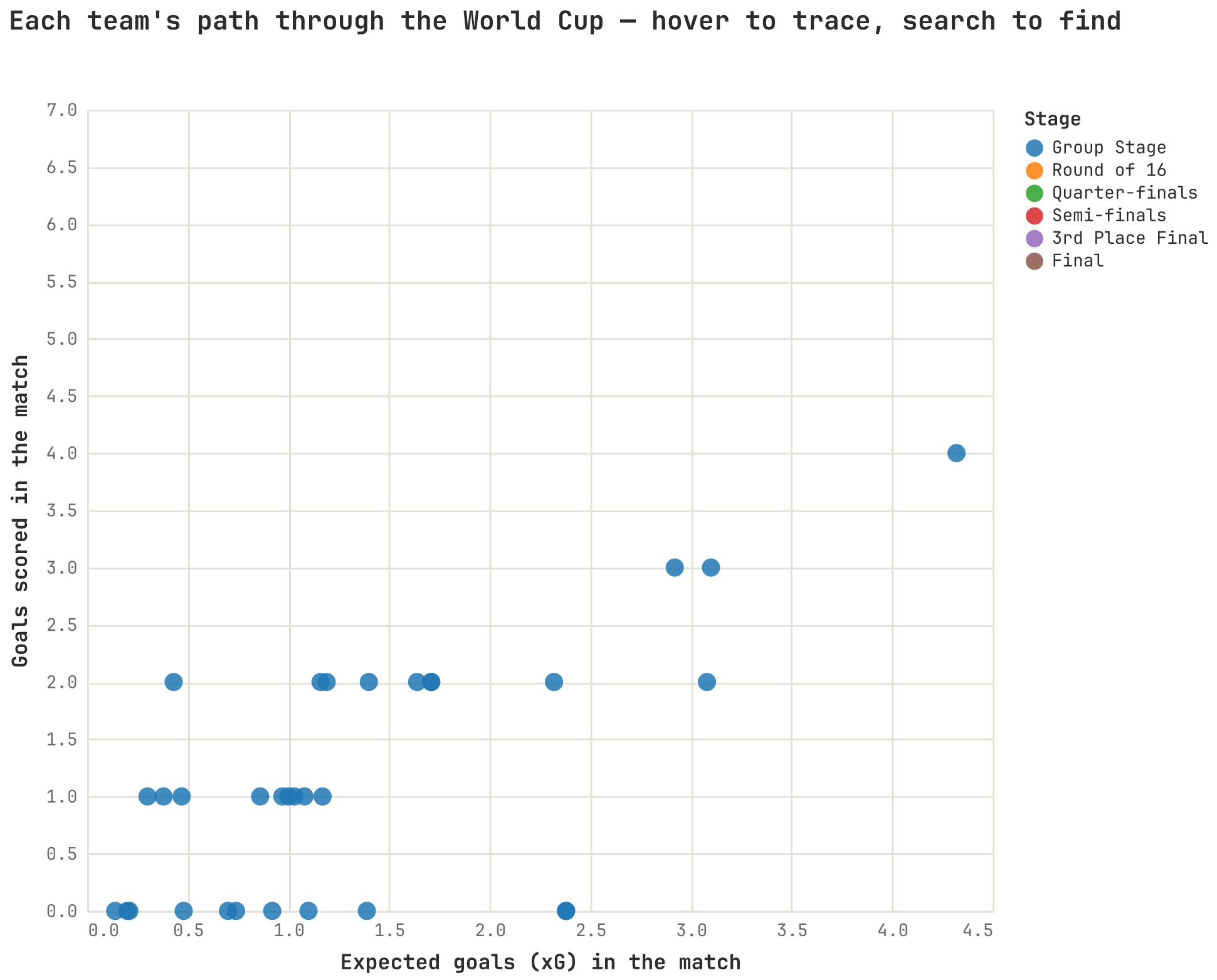
hover = alt.selection_point(on="mouseover", fields=["team"], empty=False)

# team_matches: columns "xg", "goals", "team", "match_num"
base = alt.Chart(team_matches).encode(x="xg:Q", y="goals:Q", detail="team:N")

points = base.mark_circle(size=110).add_params(hover)
trail = base.mark_trail().encode(
    order=alt.Order("match_num:Q"),                 # connect in match order
    size=alt.Size("match_num:Q", legend=None),      # taper over time
    opacity=alt.when(hover).then(alt.value(0.4)).otherwise(alt.value(0)),
)
trail + points
8. Horizon graph — layered clipped mark_area
Compresses a tall time series into a short band: fold it into N layers, each a clipped area of the amount spilling past its threshold, so busier values stack into darker color.
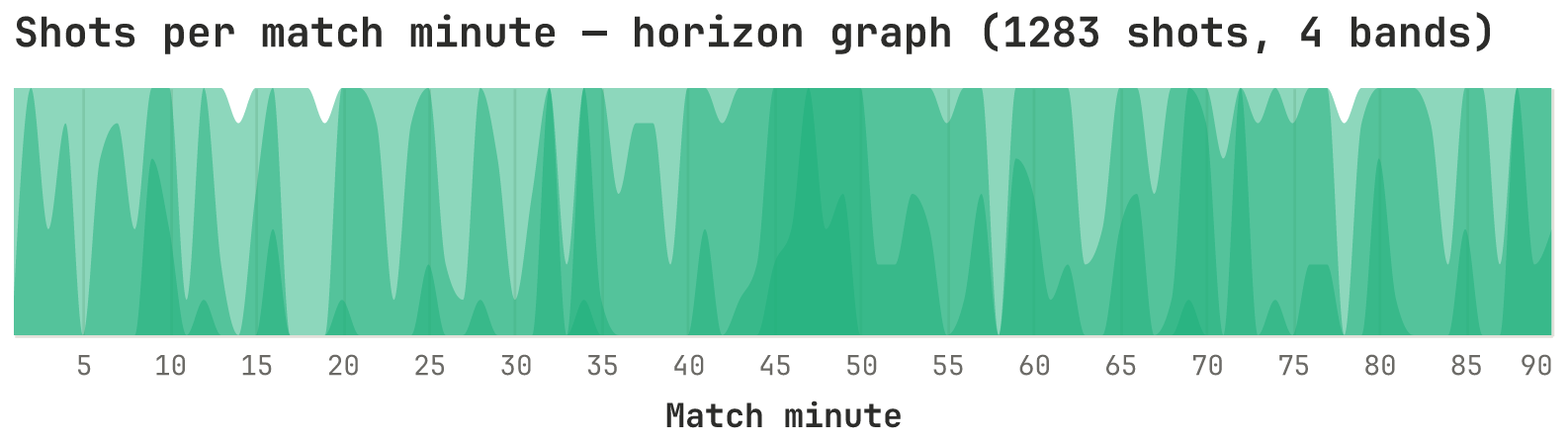
import math
# per_min: columns "minute", "shots"
bands = 4
band = math.ceil(per_min["shots"].max() / bands)

layers = [
    alt.Chart(per_min)
       .transform_calculate(v=f"clamp(datum.shots - {k * band}, 0, {band})")
       .mark_area(clip=True, interpolate="monotone", opacity=0.5)
       .encode(x=alt.X("minute:Q", title="Match minute"),
               y=alt.Y("v:Q", scale=alt.Scale(domain=[0, band]), axis=None))
    for k in range(bands)
]
alt.layer(*layers)
Saving a chart
Any chart is an alt.Chart; save it as interactive HTML or a static PNG:
chart.save("chart.html")            # interactive; add inline=True for offline
chart.save("chart.png", ppi=200)    # needs vl-convert-python (the [png] extra)
To see them all together with the shared color pickers, run the gallery:
python examples/show_wc2022_charts.py
Shortcut: just call the library
You don't have to reproduce any of the code above. Each chart already has a
one-call builder in altair_charts, and every builder defaults to the bundled
World Cup data — so a plain call works right after pip install. For example,
the full passing chart — brush, player-name search box, color-scheme
dropdown, and the linked count-by-position bars — is one function call:
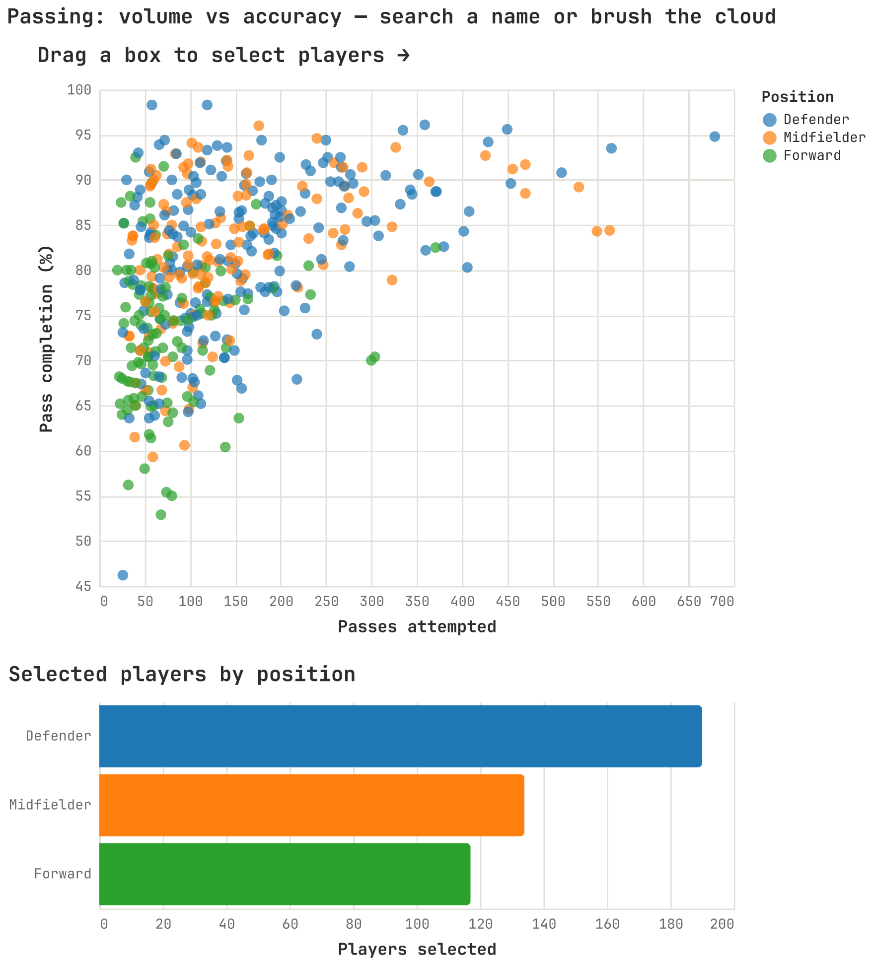
from msds_comms_plotter import altair_charts as ac

chart = ac.linked_scatter_passing()   # bundled data; returns an alt.Chart
chart.save("passing.html")             # or just `chart` in a notebook
The same one-call pattern works for every chart — ac.bar_goals_by_team(),
ac.horizon_shots_per_minute(), and so on. To use your own numbers, pass a
DataFrame (ac.linked_scatter_passing(stats=my_df)) and you get the full
themed, interactive chart back as an alt.Chart.
Project layout
msds-comms-plotter/
├── src/msds_comms_plotter/
│   ├── __init__.py       # exposes chartkit
│   ├── chartkit.py       # matplotlib + Altair theming  ← documented above
│   ├── altair_charts.py  # World Cup 2022 Altair charts (run as a module)
│   ├── plots.py          # World Cup 2022 matplotlib figures
│   └── worldcup.py       # dataset loading/paths
├── examples/             # runnable examples (show_wc2022_charts.py opens a browser)
├── data/                 # example datasets
├── docs/                 # dataset notes (see docs/wc2022_data.md)
├── notebooks/            # exploratory notebooks
├── reports/figures/      # generated figures (alt_*.html/.png, plus matplotlib .png)
└── pyproject.toml
Contributing
This is a course project, but if you're extending it:
- Keep the shared design tokens (
PALETTE,INK,GRID, …) as the single source of truth — style through them rather than hard-coding colors. - Keep renderer imports lazy (import matplotlib/altair inside functions) so the two halves stay independent.
- Run a quick import check before committing:
python -c "from msds_comms_plotter import chartkit".
License
See LICENSE.
Release history Release notifications | RSS feed


Download files
Download the file for your platform. If you're not sure which to choose, learn more about installing packages.
Source Distribution
Built Distribution
Filter files by name, interpreter, ABI, and platform.
If you're not sure about the file name format, learn more about wheel file names.
Copy a direct link to the current filters
File details
Details for the file msds_comms_plotter-0.1.1.tar.gz.
File metadata
- Download URL: msds_comms_plotter-0.1.1.tar.gz
- Upload date:
- Size: 157.3 kB
- Tags: Source
- Uploaded using Trusted Publishing? No
- Uploaded via: twine/7.0.0 CPython/3.14.6
File hashes
| Algorithm | Hash digest | |
|---|---|---|
| SHA256 |
078eb36d75705b415f62960cbae20248c7e7dc0218a582e5564a2576dedaecfe
|
|
| MD5 |
3cbde26a363b4cb827239ef13827ac9f
|
|
| BLAKE2b-256 |
9a4ad2b62e0988acfc614fce4a693221564204e11bf31a45bce3dc25f7600b39
|
File details
Details for the file msds_comms_plotter-0.1.1-py3-none-any.whl.
File metadata
- Download URL: msds_comms_plotter-0.1.1-py3-none-any.whl
- Upload date:
- Size: 146.5 kB
- Tags: Python 3
- Uploaded using Trusted Publishing? No
- Uploaded via: twine/7.0.0 CPython/3.14.6
File hashes
| Algorithm | Hash digest | |
|---|---|---|
| SHA256 |
7bcc75f84a0e4b47902e15a2bf80b8ecf34c9bb8cb84d2d9ff0341bd8dfa868c
|
|
| MD5 |
4020f076eed9be2d326f46c9d9d19a2c
|
|
| BLAKE2b-256 |
58e635d2bb462a34802e213abe7482c4873e8589aa96c0a9fe4b0833a53346d3
|