





odl-renderer
Python renderer for the OpenDisplay Language (ODL).
odl-renderer is a standalone Python library for generating images from ODL drawing instructions. Originally extracted from the OpenEPaperLink Home Assistant integration, it provides a clean, async API for rendering text, shapes, icons, QR codes, and more to PIL images.
Features
- Pure Rendering: No dependencies on Home Assistant or other frameworks
- 17 Element Types: Text, shapes, icons, QR codes, images, progress bars, and more
- Async/Await: Modern async API for efficient image generation
- Flexible Input: Accepts fonts as PIL objects, absolute paths, built-in names, or names resolved from caller-supplied directories
- Full Color Output: Returns PIL Image objects in full RGB/RGBA (caller handles dithering)
- Percentage-Based Coordinates: Position elements using percentages or absolute pixels
- Template-Ready: All values are plain data (templates expanded by caller)
Installation
uv add odl-renderer
# or
pip install odl-renderer
Quickstart
import asyncio
from odl_renderer import generate_image

async def main():
    image = await generate_image(
        width=296,
        height=128,
        elements=[
            {
                "type": "text",
                "value": "Hello World",
                "x": "50%",
                "y": 50,
                "font": "ppb",
                "size": 24,
                "color": "black",
                "anchor": "mm",
            },
            {
                "type": "rectangle",
                "x_start": 10,
                "y_start": 10,
                "x_end": 100,
                "y_end": 50,
                "fill": "red",
                "outline": "black",
                "width": 2,
            },
        ],
        background="white",
        accent_color="red",
    )
    image.save("output.png")

asyncio.run(main())
Element Types
| Category | Types |
|---|---|
| Text | text, multiline |
| Shapes | rectangle, rectangle_pattern, circle, ellipse, polygon, arc, line |
| Icons | icon, icon_sequence |
| Media | dlimg, qrcode |
| Visualizations | progress_bar, plot, diagram |
| Debug | debug_grid |
Reference
Fonts
Elements that render text accept a font field. The following sources are tried in order:
- PIL object — an
ImageFont.FreeTypeFontpassed directly (returned as-is) - Absolute path — e.g.
"/config/www/fonts/MyFont.ttf"(loaded from disk) font_dirssearch — a relative name like"MyFont"or"MyFont.ttf"resolved against the directories passed viafont_dirsingenerate_image(), in order- Bundled assets — built-in names
"ppb"(PPB) and"rbm"(RBM) shipped with the library
Using custom font directories:
image = await generate_image(
    width=400,
    height=100,
    elements=[{"type": "text", "value": "Hi", "font": "MyFont", "size": 32}],
    font_dirs=["/config/www/fonts", "/media/fonts"],
)
generate_image silently skips directories that don't exist, so it's safe to pass a fixed list of candidate paths regardless of installation type.
Colors
| Value | Description |
|---|---|
"black" / "b" |
Black |
"white" / "w" |
White |
"red" / "r" |
Red |
"yellow" / "y" |
Yellow |
"blue" / "bl" |
Blue |
"green" / "gr" / "g" |
Green |
"gray" / "grey" |
Mid-gray |
"half_black" / "hb" |
Half-tone black |
"half_red" / "hr" |
Half-tone red |
"half_yellow" / "hy" |
Half-tone yellow |
"accent" / "a" |
Accent color (configured via accent_color param) |
"half_accent" / "ha" |
Half-tone accent |
"#RGB" / "#RRGGBB" |
Hex color |
Coordinates
Coordinates accept either absolute integers (10, 256) or percentage strings ("50%", "100%").
When y is omitted, elements stack automatically: each element is placed below the previous one using pos_y + y_padding (default padding: 10px).
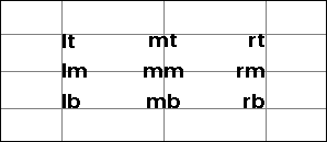
anchor
Used by text, icon, and icon_sequence to set which point of the element aligns to the given x/y coordinates, and by pivot (see rotation/mirror) to set the transform origin.
All of them use the PIL anchor format — horizontal axis first, then vertical:
| Code | Meaning |
|---|---|
lt |
Left-top |
mt |
Middle-top |
rt |
Right-top |
lm |
Left-middle |
mm |
Middle (center) |
rm |
Right-middle |
lb |
Left-bottom |
mb |
Middle-bottom |
rb |
Right-bottom |
icon and icon_sequence default to la (left-ascender) rather than lt; otherwise the codes are identical.
Each label below is drawn with its own anchor code at a crosshair; the intersection of the two gray lines is the x/y coordinate the text is anchored to:
[
    # Illustration only — crosshairs marking the nine x/y coordinates:
    {"type": "line", "x_start": 0, "x_end": 296, "y_start": 30, "fill": "gray"},
    {"type": "line", "x_start": 0, "x_end": 296, "y_start": 64, "fill": "gray"},
    {"type": "line", "x_start": 0, "x_end": 296, "y_start": 98, "fill": "gray"},
    {"type": "line", "x_start": 55, "x_end": 55, "y_start": 0, "y_end": 128, "fill": "gray"},
    {"type": "line", "x_start": 148, "x_end": 148, "y_start": 0, "y_end": 128, "fill": "gray"},
    {"type": "line", "x_start": 241, "x_end": 241, "y_start": 0, "y_end": 128, "fill": "gray"},

    {"type": "text", "value": "lt", "x": 55, "y": 30, "size": 18, "anchor": "lt"},
    {"type": "text", "value": "mt", "x": 148, "y": 30, "size": 18, "anchor": "mt"},
    {"type": "text", "value": "rt", "x": 241, "y": 30, "size": 18, "anchor": "rt"},
    {"type": "text", "value": "lm", "x": 55, "y": 64, "size": 18, "anchor": "lm"},
    {"type": "text", "value": "mm", "x": 148, "y": 64, "size": 18, "anchor": "mm"},
    {"type": "text", "value": "rm", "x": 241, "y": 64, "size": 18, "anchor": "rm"},
    {"type": "text", "value": "lb", "x": 55, "y": 98, "size": 18, "anchor": "lb"},
    {"type": "text", "value": "mb", "x": 148, "y": 98, "size": 18, "anchor": "mb"},
    {"type": "text", "value": "rb", "x": 241, "y": 98, "size": 18, "anchor": "rb"}
]
The visible field
Every element type accepts an optional visible field. When falsy, the element is skipped entirely (no rendering, no position update). Defaults to true.
{
    "type": "text",
    "value": "Hidden",
    "x": 10,
    "y": 10,
    "visible": False
}
String values are coerced, which matters when visible is produced by a Home Assistant template (templates render to strings). The string "false" (case-insensitive) and empty/whitespace-only strings hide the element; any other non-empty string shows it. So a template that renders "false" hides the element as expected — rendering down to an empty string is no longer required.
rotation
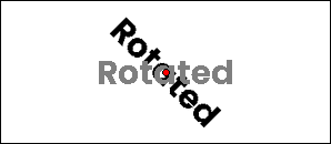
Every element type accepts an optional rotation (degrees, positive = clockwise, arbitrary values allowed) and an optional pivot controlling the point it rotates about. The element is rendered, then rotated in place and composited back, so any element type works.
| Field | Required | Default | Notes |
|---|---|---|---|
rotation |
no | 0 |
Degrees, positive = clockwise |
pivot |
no | "mm" (center) |
Anchor keyword relative to the element (e.g. lt, mm, rb), or [x, y] canvas coords (percentages allowed, e.g. ["50%", "50%"]) |
Not to be confused with the
image/dlimg-onlyrotatefield, which rotates the source image before fitting it to the box. Userotationto tilt any rendered element on the canvas.
[
    {
        "type": "text",
        "value": "Rotated",
        "x": 148,
        "y": 64,
        "size": 30,
        "anchor": "mm",
        "rotation": 45
    },
    # Illustration only — the gray "ghost" of the original orientation:
    {
        "type": "text",
        "value": "Rotated",
        "x": 148,
        "y": 64,
        "size": 30,
        "anchor": "mm",
        "color": "gray"
    },
    # Illustration only — a dot marking the pivot (the element's center):
    {
        "type": "circle",
        "x": 148,
        "y": 64,
        "radius": 3,
        "fill": "red"
    }
]
Only the first element matters for usage — the gray "ghost" shows the un-rotated original and the red dot marks the pivot (pivot defaults to the element's center; set e.g. "pivot": "lt" or "pivot": [148, 64] to move it).
mirror
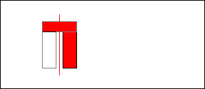
Every element type accepts an optional mirror to flip it about its pivot: "h" (horizontal), "v" (vertical), or "hv" (both). Unknown values are ignored.
| Field | Required | Default | Notes |
|---|---|---|---|
mirror |
no | — | "h", "v", or "hv" (case-insensitive) |
pivot |
no | "mm" (center) |
Same as rotation: anchor keyword or [x, y] |
[
    {
        "type": "polygon",
        "points": [[60, 30], [110, 30], [110, 45], [80, 45], [80, 98], [60, 98]],
        "fill": "red",
        "mirror": "h"
    },
    # Illustration only — the original outline and the flip axis:
    {
        "type": "polygon",
        "points": [[60, 30], [110, 30], [110, 45], [80, 45], [80, 98], [60, 98]],
        "outline": "gray",
        "width": 1
    },
    {
        "type": "line",
        "x_start": 85,
        "y_start": 20,
        "x_end": 85,
        "y_end": 108,
        "fill": "red",
        "width": 1
    }
]
The filled red shape is mirrored; the gray outline shows the original and the vertical red line marks the flip axis (the element's center by default).
Text
text
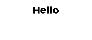
Single-line text with optional wrapping, truncation, stroke, and inline color markup.
| Field | Required | Default | Notes |
|---|---|---|---|
value |
yes | — | Text content |
x |
yes | — | X position |
y |
no | auto | Y position; auto-stacks if omitted |
font |
no | "ppb" |
Built-in name ("ppb", "rbm"), file path, or PIL Font object |
size |
no | 20 |
Font size in pixels |
color |
no | "black" |
Text color |
anchor |
no | "lt" / "la" |
Anchor point; defaults to "la" when text wraps to multiple lines |
max_width |
no | — | Wrap text at this pixel width |
truncate |
no | false |
Truncate with … instead of wrapping |
align |
no | "left" |
"left", "center", or "right" |
spacing |
no | 5 |
Line spacing when wrapped |
stroke_width |
no | 0 |
Outline width |
stroke_fill |
no | "white" |
Outline color |
parse_colors |
no | false |
Enable [red]text[/red] inline color markup |
y_padding |
no | 10 |
Extra space above when auto-stacking |
{
    "type": "text",
    "value": "Hello",
    "x": "50%",
    "y": 20,
    "size": 32,
    "anchor": "mt",
}
Inline color markup (requires parse_colors: true): wrap text in [color]...[/color] tags. Accepts all named colors, short names, and hex ([#ff0000]red text[/#ff0000]).
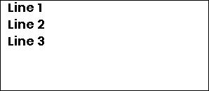
multiline
Fixed-line text split by a delimiter, each line placed at a fixed vertical offset.
| Field | Required | Default | Notes |
|---|---|---|---|
value |
yes | — | Full text content |
x |
yes | — | X position |
delimiter |
yes | — | Character used to split lines (e.g. "|") |
offset_y |
yes | — | Pixels between each line |
y |
no | auto | Y of first line |
font |
no | "ppb" |
Font |
size |
no | 20 |
Font size |
color |
no | "black" |
Text color |
anchor |
no | "lm" |
Anchor point |
align |
no | "left" |
Text alignment |
stroke_width |
no | 0 |
Outline width |
stroke_fill |
no | "white" |
Outline color |
parse_colors |
no | false |
Inline color markup |
{
    "type": "multiline",
    "value": "Line 1|Line 2|Line 3",
    "x": 10,
    "y": 10,
    "delimiter": "|",
    "offset_y": 24,
    "size": 18,
}
Shapes
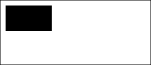
rectangle
Rectangle with optional fill, outline, and rounded corners.
| Field | Required | Default | Notes |
|---|---|---|---|
x_start |
yes | — | Left edge |
y_start |
yes | — | Top edge |
x_end |
yes | — | Right edge |
y_end |
yes | — | Bottom edge |
fill |
no | — | Fill color |
outline |
no | "black" |
Border color |
width |
no | 1 |
Border width |
corners |
no | — | Which corners to round: "all", "top_left", "top_right", "bottom_left", "bottom_right" (comma-separated) |
radius |
no | 10 |
Corner radius; only applies when corners is set |
{
    "type": "rectangle",
    "x_start": 10,
    "y_start": 10,
    "x_end": 100,
    "y_end": 60,
    "fill": "black",
}
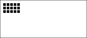
rectangle_pattern
Repeating grid of rectangles — useful for dot matrices, grids, and decorative patterns.
| Field | Required | Default | Notes |
|---|---|---|---|
x_start |
yes | — | Starting X |
y_start |
yes | — | Starting Y |
x_size |
yes | — | Width of each rectangle |
y_size |
yes | — | Height of each rectangle |
x_repeat |
yes | — | Number of columns |
y_repeat |
yes | — | Number of rows |
x_offset |
yes | — | Horizontal gap between rectangles |
y_offset |
yes | — | Vertical gap between rectangles |
fill |
no | — | Fill color |
outline |
no | "black" |
Border color |
width |
no | 1 |
Border width |
corners / radius |
no | — | Same as rectangle |
{
    "type": "rectangle_pattern",
    "x_start": 10,
    "y_start": 10,
    "x_size": 8,
    "y_size": 8,
    "x_repeat": 5,
    "y_repeat": 3,
    "x_offset": 4,
    "y_offset": 4,
    "fill": "black",
}
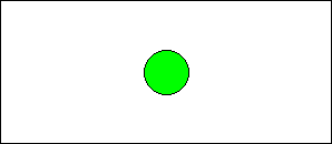
circle
Circle defined by center point and radius.
| Field | Required | Default | Notes |
|---|---|---|---|
x |
yes | — | Center X |
y |
yes | — | Center Y |
radius |
yes | — | Radius in pixels |
fill |
no | — | Fill color |
outline |
no | "black" |
Border color |
width |
no | 1 |
Border width |
{
    "type": "circle",
    "x": "50%",
    "y": "50%",
    "radius": 20,
    "fill": "green",
    "outline": "black",
}
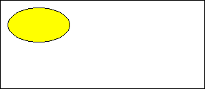
ellipse
Ellipse defined by a bounding box.
| Field | Required | Default | Notes |
|---|---|---|---|
x_start |
yes | — | Left edge |
y_start |
yes | — | Top edge |
x_end |
yes | — | Right edge |
y_end |
yes | — | Bottom edge |
fill |
no | — | Fill color |
outline |
no | "black" |
Border color |
width |
no | 1 |
Border width |
{
    "type": "ellipse",
    "x_start": 10,
    "y_start": 10,
    "x_end": 100,
    "y_end": 60,
    "fill": "yellow",
}
polygon
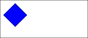
Arbitrary polygon defined by a list of vertices.
| Field | Required | Default | Notes |
|---|---|---|---|
points |
yes | — | List of [x, y] pairs |
fill |
no | — | Fill color |
outline |
no | "black" |
Border color |
{
    "type": "polygon",
    "points": [[10, 50], [50, 10], [90, 50], [50, 90]],
    "fill": "blue",
}
arc
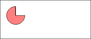
Arc or pie slice defined by center, radius, and angle range.
| Field | Required | Default | Notes |
|---|---|---|---|
x |
yes | — | Center X |
y |
yes | — | Center Y |
radius |
yes | — | Radius in pixels |
start_angle |
yes | — | Start angle in degrees (0 = right, counter-clockwise) |
end_angle |
yes | — | End angle in degrees |
fill |
no | — | Fill color (creates a pie slice) |
outline |
no | "black" |
Border color |
width |
no | 1 |
Border width |
{
    "type": "arc",
    "x": 50,
    "y": 50,
    "radius": 30,
    "start_angle": 0,
    "end_angle": 270,
    "outline": "black",
    "fill": "half_red",
}
line
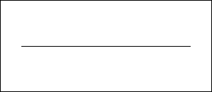
Straight line between two points with optional dashing.
| Field | Required | Default | Notes |
|---|---|---|---|
x_start |
yes | — | Start X |
x_end |
yes | — | End X |
y_start |
no | auto | Start Y |
y_end |
no | y_start |
End Y (horizontal line if omitted) |
fill |
no | "black" |
Line color |
width |
no | 1 |
Line width |
dashed |
no | false |
Enable dashed style |
dash_length |
no | 5 |
Length of each dash |
space_length |
no | 3 |
Gap between dashes |
{
    "type": "line",
    "x_start": "10%",
    "y_start": "50%",
    "x_end": "90%",
    "y_end": "50%",
    "fill": "black",
}
Icons
Icons use the bundled Material Design Icons font (7,000+ icons). Pass the icon name with or without the mdi: prefix.
icon
Single MDI icon.
| Field | Required | Default | Notes |
|---|---|---|---|
value |
yes | — | Icon name, e.g. "home" or "mdi:home" |
x |
yes | — | X position |
y |
yes | — | Y position |
size |
yes | — | Icon size in pixels |
color |
no | "black" |
Icon color |
anchor |
no | "mm" |
Anchor point |
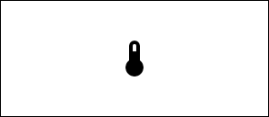
{
    "type": "icon",
    "value": "mdi:thermometer",
    "x": "50%",
    "y": "50%",
    "size": 48,
    "anchor": "mm",
}
icon_sequence
Row or column of MDI icons.
| Field | Required | Default | Notes |
|---|---|---|---|
icons |
yes | — | List of icon names |
x |
yes | — | Starting X |
y |
yes | — | Starting Y |
size |
yes | — | Icon size in pixels |
direction |
no | "right" |
"right", "left", "up", or "down" |
spacing |
no | size / 4 |
Gap between icons |
color |
no | "black" |
Icon color |
anchor |
no | "mm" |
Anchor point |
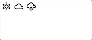
{
    "type": "icon_sequence",
    "icons": ["mdi:weather-sunny", "mdi:weather-cloudy", "mdi:weather-rainy"],
    "x": 20,
    "y": 20,
    "size": 32,
}
Media
dlimg
Image from a URL, file path, data URI, bytes, or PIL Image object. Resized to fit the specified dimensions.
Note: Entity IDs are not resolved — the caller must pass a URL, file path, or image object directly.
| Field | Required | Default | Notes |
|---|---|---|---|
url |
yes | — | Source: HTTP URL, file path, data URI, bytes, or PIL.Image |
x |
yes | — | X position |
y |
yes | — | Y position |
xsize |
yes | — | Target width |
ysize |
yes | — | Target height |
rotate |
no | 0 |
Rotation in degrees |
resize_method |
no | "stretch" |
"stretch", "crop", "cover", or "contain" |
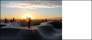
{
    "type": "dlimg",
    "url": "https://picsum.photos/seed/odl/200/150",
    "x": 0,
    "y": 0,
    "xsize": 200,
    "ysize": 150,
    "resize_method": "cover",
}
qrcode
QR code generated from any text or URL.
| Field | Required | Default | Notes |
|---|---|---|---|
data |
yes | — | QR code content |
x |
yes | — | X position |
y |
yes | — | Y position |
color |
no | "black" |
Foreground color |
bgcolor |
no | "white" |
Background color |
border |
no | 1 |
Quiet zone size in modules |
boxsize |
no | 2 |
Pixel size of each module |
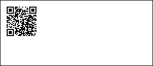
{
    "type": "qrcode",
    "data": "https://opendisplay.org",
    "x": 10,
    "y": 10,
}
Visualizations
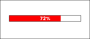
progress_bar
Horizontal or vertical progress bar with optional percentage label.
| Field | Required | Default | Notes |
|---|---|---|---|
x_start |
yes | — | Left edge |
y_start |
yes | — | Top edge |
x_end |
yes | — | Right edge |
y_end |
yes | — | Bottom edge |
progress |
yes | — | Fill level 0–100 (clamped automatically) |
direction |
no | "right" |
"right", "left", "up", or "down" |
fill |
no | "red" |
Progress fill color |
background |
no | "white" |
Empty track color |
outline |
no | "black" |
Border color |
width |
no | 1 |
Border width |
show_percentage |
no | false |
Overlay percentage text |
font_name |
no | "ppb" |
Font for percentage text |
{
    "type": "progress_bar",
    "x_start": "10%",
    "y_start": 50,
    "x_end": "90%",
    "y_end": 70,
    "progress": 72,
    "fill": "accent",
    "show_percentage": True,
}
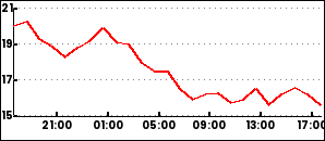
plot
Time-series line chart with configurable axes, grid, and legends. Requires a DataProvider in the drawing context to supply historical data.
| Field | Required | Default | Notes |
|---|---|---|---|
data |
yes | — | List of series configs (see below) |
x_start |
no | 0 |
Chart left edge |
y_start |
no | 0 |
Chart top edge |
x_end |
no | image width | Chart right edge |
y_end |
no | image height | Chart bottom edge |
duration |
no | 86400 |
Time window in seconds |
low / high |
no | auto | Y-axis range override |
font |
no | "ppb" |
Font for labels |
Series, axis, and legend options
Each series in data:
| Field | Default | Notes |
|---|---|---|
entity |
required | Data source identifier passed to DataProvider |
color |
required | Line color |
width |
2 |
Line width |
smooth |
false |
Smooth the line |
line_style |
"solid" |
"solid", "dashed", or "dotted" |
show_points |
false |
Draw data points |
span_gaps |
false |
Connect across missing values |
yaxis (optional dict):
| Field | Default |
|---|---|
tick_every |
required |
color |
"black" |
grid |
true |
grid_style |
"dotted" |
xaxis (optional dict):
| Field | Default |
|---|---|
color |
"black" |
grid |
true |
grid_style |
"dotted" |
ylegend (optional dict):
| Field | Default |
|---|---|
position |
"left" |
size |
10 |
color |
"black" |
xlegend (optional dict):
| Field | Default |
|---|---|
interval |
required |
format |
"%H:%M" |
position |
"bottom" |
size |
10 |
snap_to_hours |
true |
{
  "type": "plot",
  "x_start": 0,
  "y_start": 6,
  "x_end": 292,
  "y_end": 120,
  "round_values": True,
  "data":
    [
      {
        "entity": "sensor.temperature",
        "color": "red",
        "width": 2
      }
    ],
  "yaxis":
    {
      "tick_every": 2,
      "grid_color": "gray"
    },
  "ylegend":
    {
      "position": "left"
    },
  "xaxis":
    {
      "color": "black",
      "grid": False
    },
  "xlegend":
    {
      "interval": 14400
    }
}
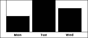
diagram
Simple bar chart with labeled axes.
| Field | Required | Default | Notes |
|---|---|---|---|
x |
yes | — | X position |
height |
yes | — | Diagram height |
width |
no | image width | Diagram width |
margin |
no | 20 |
Margin from edges |
bars |
no | — | Bar chart config (see below) |
bars config:
| Field | Notes |
|---|---|
values |
Semicolon-separated "label,value" pairs: "Mon,10;Tue,20;Wed,15" |
color |
Bar fill color |
font |
Font name |
legend_size |
Label font size |
legend_color |
Label color |
{
    "type": "diagram",
    "x": 0,
    "height": 128,
    "bars": {
        "values": "Mon,10;Tue,20;Wed,15",
        "color": "black",
    },
}
Debug
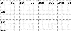
debug_grid
Renders a coordinate grid over the image. Useful during layout development.
| Field | Required | Default | Notes |
|---|---|---|---|
spacing |
no | 20 |
Grid cell size in pixels |
line_color |
no | "black" |
Grid line color |
dashed |
no | true |
Use dashed lines |
dash_length |
no | 2 |
Dash segment length |
space_length |
no | 4 |
Gap between dashes |
show_labels |
no | true |
Show coordinate labels |
label_step |
no | spacing * 2 |
Interval between labels |
label_color |
no | "black" |
Label color |
label_font_size |
no | 12 |
Label font size |
font |
no | "ppb" |
Font for labels |
{
    "type": "debug_grid",
    "spacing": 20,
    "line_color": "gray",
}
Metadata
Release files for odl-renderer 0.5.13
For a detailed explanation of source distributions (sdists) and built distributions (wheels), please see the package formats documentation.
Source distribution (sdist)
| File | Size | Uploaded | |
|---|---|---|---|
| odl_renderer-0.5.13.tar.gz | 1.1 MB | Details |
Built distribution (wheel)
| File | Interpreter | ABI | Platform | Reset |
|---|---|---|---|---|
| odl_renderer-0.5.13-py3-none-any.whl | Python 3 | none | any | Details |
Total release size: 2.0 MB
Release files / odl_renderer-0.5.13.tar.gz
| Download URL | odl_renderer-0.5.13.tar.gz |
|---|---|
| Size | 1.1 MB |
| Tags | Source |
|
SHA-256 checksum How to use checksums |
1e7555f32ae851c937d16a4a453aa7f64245cfa1831876bb0befb7846f270f04
|
|
BLAKE2b-256 checksum How to use checksums |
35436fd4a0a01c3b7a4e06214fdcfc1be876f226fb359a3375c2b8e7aa123a96
|
| Upload date | |
|
Uploaded using Trusted Publishing? What is trusted publishing? |
Yes |
| Uploaded via |
twine/7.0.0 CPython/3.13.14
|
Provenance
Provenance describes where a file came from. On PyPI, provenance is shared via attestations, which provide a verifiable record of the build or publishing details. View details, limitations and caveats.


PyPI Publish Attestation
PyPI verified that this artifact, at this checksum, originated from the publisher listed below.
Signed by GitHub Actions, verified by PyPI on Sep 27, 2026.
Transparency logRelease files / odl_renderer-0.5.13-py3-none-any.whl
| Download URL | odl_renderer-0.5.13-py3-none-any.whl |
|---|---|
| Size | 874.2 kB |
| Tags | Python 3 |
|
SHA-256 checksum How to use checksums |
73f1b1072178b7fef902d38d3137b29d5edd469b730e0c15a561e9c9c7e75d9f
|
|
BLAKE2b-256 checksum How to use checksums |
66bd21ffe3cc08671a8a9e7354bb1e6773b89ce257418d177f3fc7f39cf0360e
|
| Upload date | |
|
Uploaded using Trusted Publishing? What is trusted publishing? |
Yes |
| Uploaded via |
twine/7.0.0 CPython/3.13.14
|
Provenance
Provenance describes where a file came from. On PyPI, provenance is shared via attestations, which provide a verifiable record of the build or publishing details. View details, limitations and caveats.
PyPI Publish Attestation
PyPI verified that this artifact, at this checksum, originated from the publisher listed below.
Signed by GitHub Actions, verified by PyPI on Sep 27, 2026.
Transparency log













