Tracking your Income and Expenses Automatically

Project description


Tracking personal finances can be tedious. It either requires a massive time investment to keep everything well categorized as new transactions come in or it is far from accurate with tools that try to do prediction to define categories for you. Perhaps it works fine for names such as "Wall Mart" or "Starbucks" but your local bakery called "Morty's Place" is definitely not going to get picked up by the model. Many personal finance tools allow you to manually adjust these categories but that is just as tedious as doing it from scratch.
Through defining each category with appropriate keywords, you can be sure that the model will categorise transactions how you defined them. This is because it is not a generic model that is trained on a large dataset of transactions from all over the world. It is trained on your own data, which means that it will be able to categorise transactions that are specific to you. This results in Morty's Place being correctly categorised as a Bakery.
To assist in not needing to get exact matches, the package makes use of the Levenshtein distance to determine how similar two strings are. This means that if you have a category called "Groceries" with the keyword "Supermarket" and a transaction comes in with the name "Rick's Super Market", it will still be categorised as "Groceries". There is a limited amount of Mumbo Jumbo going on here on purpose so that it still becomes logical why it is categorised as such.
By doing most of these things through Python and Excel, you have the complete freedom to decide what to do with the output. For example, you can use it to create your own personalized dashboards via any programming language or application such as Excel, PowerBI, Tableau, etc. I don't want to bore you with custom dashboards that I tailored to myself just so that you can come to the conclusion that it isn't a perfect fit for you.

Installation
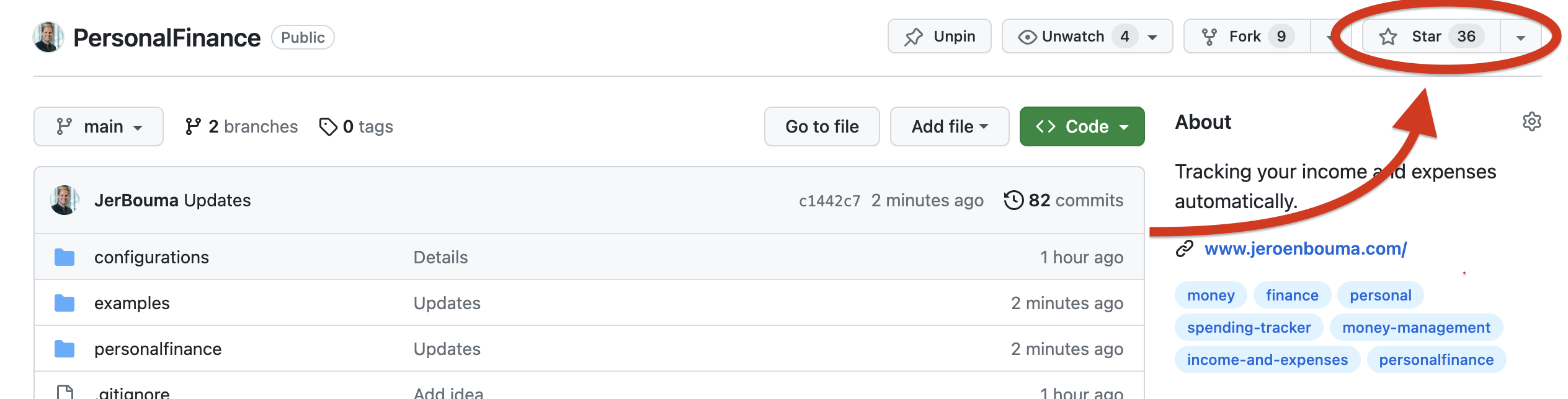
Before installation, consider starring the project on GitHub which helps others find the project as well.
To install the PersonalFinance it simply requires the following:
pip install personalfinance -U
Then to use the features within Python use:
from personalfinance import Cashflow

cashflow = Cashflow()
This will generate the configuration file for you to use which you can supply again by using configuration_file='cashflow.yaml'. See below for more information about each capability and what you can do with this file.
Getting Started
To get started, you need to acquire a configuration file that defines your transactions. This file consists of things such as the location of the datasets, the columns that define e.g. the name, the amount, the date and the categories and keywords that can be used to categorize transactions. The configuration file is automatically downloaded on initialization.
To see an example, you can run the following code:
from personalfinance import Cashflow

cashflows = Cashflow(example=True)

cashflows.perform_analysis()
Before it does anything, it will download the example datasets as found here. This is merely meant for you to understand how the functionality works. When you are ready to use it for your own cashflows, you can simply remove the example=True argument and supply your own configuration file. If you don't have one yet, it will automatically supply one if you use Cashflow(). See the Notebooks as found here for an in-depth explanation.
The perform_analysis functionality does the following things:
- It reads all the cashflow datasets based on the configuration file's
file_locationparameter. This can be a single file, a selection of files or an entire folder. It also applies the cost or income indicator if the numbers in your file are all positive (e.g. a column that says "Plus" or "Minus") if chosen. - It starts applying categorization based on the
categoriessection in the configuration file. It uses Levenshtein distance to find matches that are closely related (e.g. 'Tim's Bakery' and 'Bakery' would fit in the same category) - It generates multiple transactional and categorized overviews on a weekly, monthly, quarterly and yearly basis.
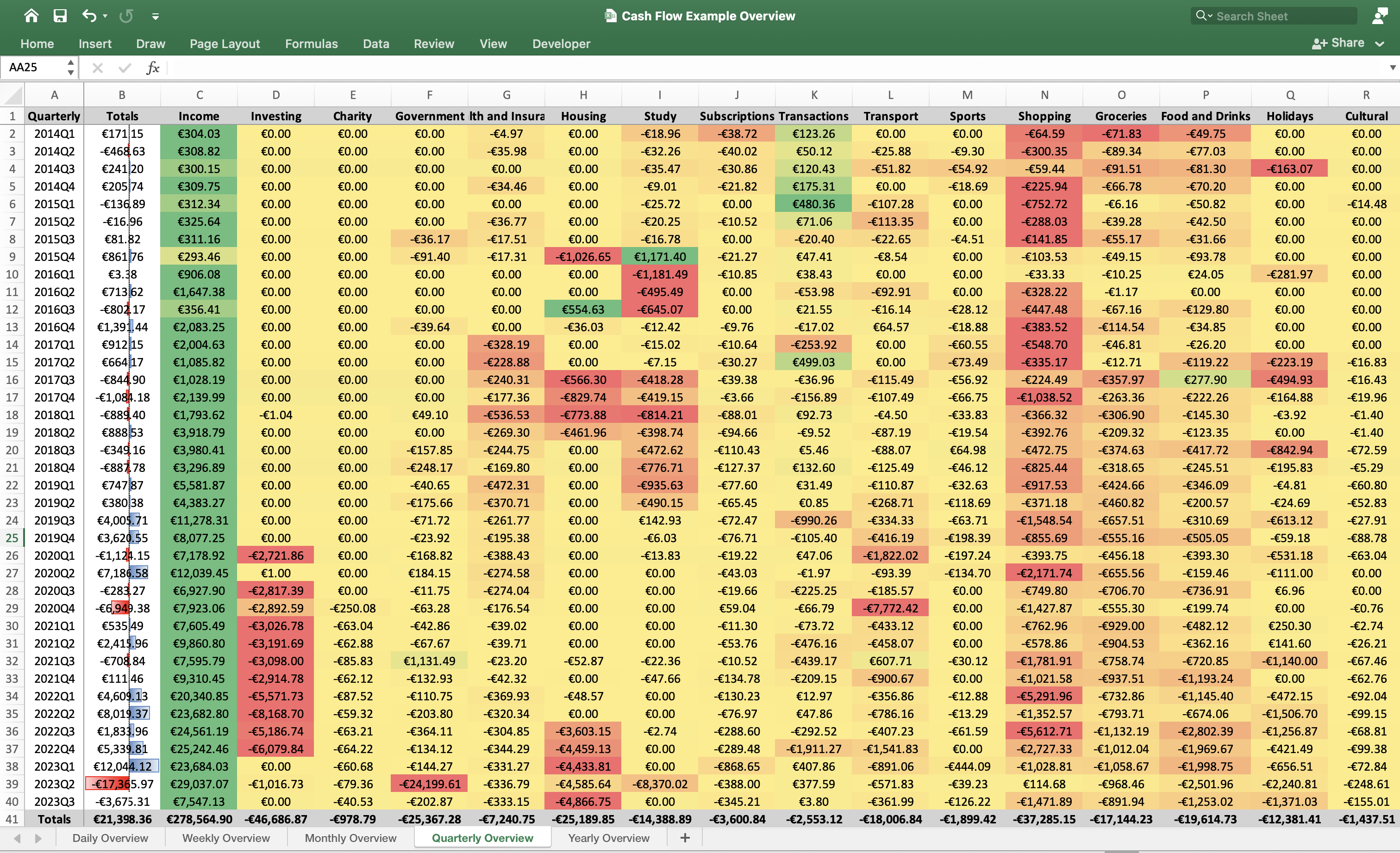
- It generates an Excel file in which all of the results are displayed in a neat format based on the
excelsection of the configuration file. This is optional and can be disabled by settingwrite_to_exceltoFalse.
See the resulting image for the file that is generated based on the example dataset:
Besides that, you don't have to continue in Excel if you are handy with Python as all created datasets can be directly accessed in Python as well. All of the datasets can be accessed through the related get functions for example:
cashflows.get_period_overview(period='yearly')
Which returns:
| Yearly | Totals | Income | Investing | Charity | Government | Health and Insurance | Housing | Study | Subscriptions | Transactions | Transport | Sports | Shopping | Groceries | Food and Drinks | Holidays | Cultural | Festivals, Clubs and Concerts | Other |
|---|---|---|---|---|---|---|---|---|---|---|---|---|---|---|---|---|---|---|---|
| 2014 | 149.46 | 1222.75 | 0 | 0 | 0 | -75.41 | 0 | -95.7 | -131.42 | 469.12 | -77.7 | -82.91 | -650.32 | -319.46 | -278.28 | -163.07 | 0 | 71.67 | 260.19 |
| 2015 | 789.73 | 1242.6 | 0 | 0 | -127.57 | -71.59 | -1026.65 | 1108.65 | -31.79 | 578.43 | -251.82 | -4.51 | -1286.13 | -149.76 | -218.76 | 0 | -14.48 | 0 | 1043.11 |
| 2016 | 1306.27 | 4993.12 | 0 | 0 | -39.64 | 0 | 518.6 | -2334.47 | -20.61 | -11.02 | -44.48 | -47 | -1192.55 | -193.12 | -140.6 | -281.97 | 0 | -28.3 | 128.31 |
| 2017 | -352.76 | 6258.63 | 0 | 0 | 0 | -974.74 | -1396.04 | -859.6 | -83.95 | 51.26 | -222.98 | -257.71 | -2146.88 | -680.85 | -89.78 | -883 | -53.22 | -109 | 1095.1 |
| 2018 | -1237.81 | 12989.7 | -1.04 | 0 | -356.92 | -1220.38 | -1235.84 | -2462.28 | -420.47 | 221.27 | -305.25 | -34.51 | -2057.27 | -1209.5 | -931.88 | -1042.69 | -80.68 | -93.65 | -2996.43 |
| 2019 | 8754.51 | 29320.7 | 0 | 0 | -311.95 | -1300.17 | 0 | -1288.88 | -292.23 | -1063.32 | -1130.1 | -413.42 | -3692.94 | -2098.15 | -1362.4 | -701.8 | -230.32 | -179.51 | -6501 |
| 2020 | -1170.22 | 34069.3 | -8430.84 | -250.08 | -59.7 | -1113.59 | 0 | -13.83 | -22.87 | -246.95 | -9873.4 | -331.94 | -4743.16 | -2373.74 | -1489.41 | -635.22 | -63.8 | 0 | -5591.02 |
| 2021 | 2354.07 | 34372.5 | -12231.2 | -273.87 | 888.03 | -144.25 | -52.87 | -70.02 | -210.36 | -1198.2 | -1184.15 | -30.12 | -4145.31 | -3529.78 | -2758.37 | -748.1 | -159.17 | 0 | -6170.67 |
| 2022 | 19802.3 | 93827.3 | -25007 | -274.27 | -812.78 | -1339.41 | -8110.85 | -2.74 | -785.28 | -2142.96 | -3092.08 | -87.76 | -14984.6 | -3670.8 | -6591.52 | -3657.21 | -359.38 | -75.52 | -3030.89 |
| 2023 | -8997.16 | 60268.2 | -1016.73 | -180.57 | -24546.8 | -1001.21 | -13886.2 | -8370.02 | -1601.86 | 789.25 | -1824.88 | -609.54 | -2386.02 | -2919.07 | -5753.73 | -4268.35 | -476.46 | -480.95 | -732.3 |
And the following:
cashflows.get_transactions_overview(period='weekly')
Which returns:
| Weekly | Date | Name | Value | Description | Category | Keyword | Certainty |
|---|---|---|---|---|---|---|---|
| 2023-09-04/2023-09-10 | 2023-09-10 | thuisbezorgd - Omitted due to Privacy Reasons | -12.55 | thuisbezorgd - Omitted due to Privacy Reasons | Food and Drinks | thuisbezorgd | 100% |
| 2023-09-04/2023-09-10 | 2023-09-10 | Tinq - Omitted due to Privacy Reasons | -53.81 | Tinq - Omitted due to Privacy Reasons | Transport | Tinq | 100% |
| 2023-09-11/2023-09-17 | 2023-09-12 | geldmaat - Omitted due to Privacy Reasons | -18.43 | geldmaat - Omitted due to Privacy Reasons | Transactions | geldmaat | 100% |
| 2023-09-11/2023-09-17 | 2023-09-13 | asr - Omitted due to Privacy Reasons | 12.2 | asr - Omitted due to Privacy Reasons | Income | asr | 100% |
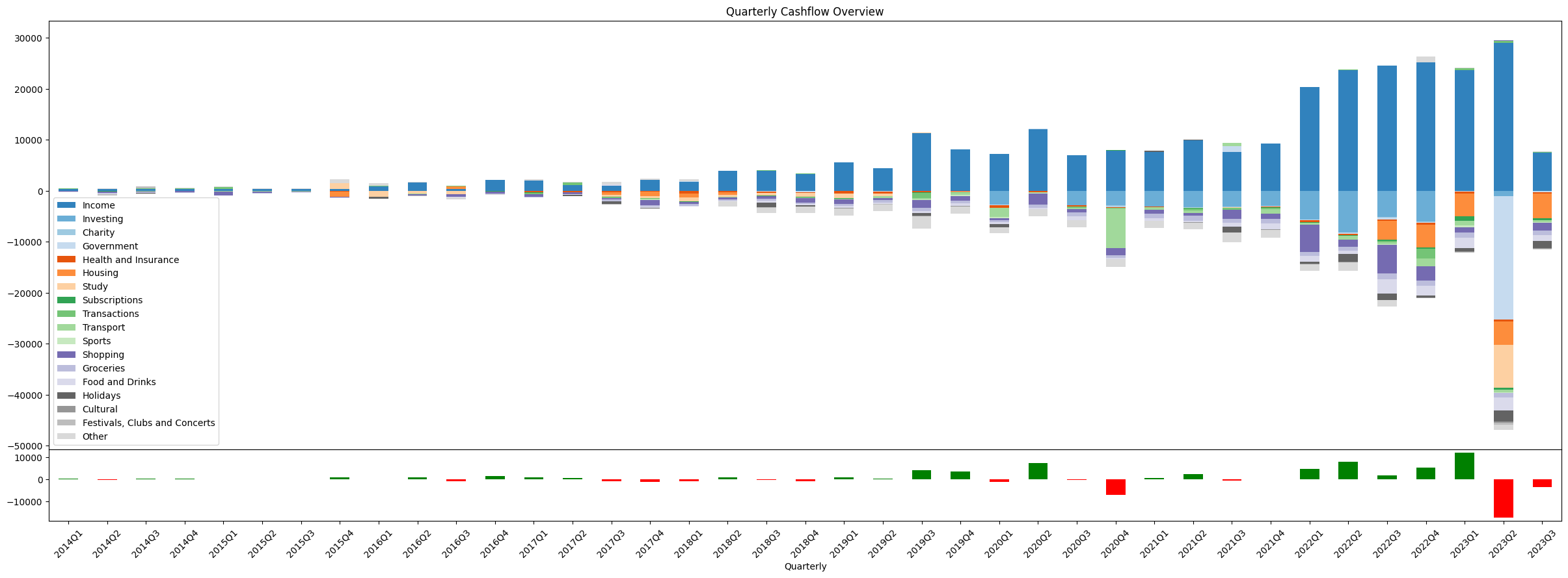
These datasets make it possible to plot the spending pattern over time for each category. This can be simply by selecting the column and using .plot() from Pandas but it also possible to create a larger overview as shown below:
import matplotlib.pyplot as plt

# Obtain the Quarterly Cashflow Overview
quarterly_cashflows = cashflows.get_period_overview(period='quarterly')

# Define the colormap
cmap = plt.get_cmap('tab20c')

# Create the figure and axes
fig, axes = plt.subplots(
    nrows=2,
    height_ratios=[6, 1],
    figsize=(30, 10))

# Plot the data per category
quarterly_cashflows.plot.bar(
    stacked=True,
    colormap=cmap,
    title="Quarterly Cashflow Overview",
    ax=axes[0])

# Calculate the totals
totals = quarterly_cashflows.sum(axis=1)

# Plot the totals
totals.plot.bar(
    color=['g' if x >= 0 else 'r' for x in totals],
    ax=axes[1])

# Format the plot by rotating labels and adjusting space
plt.xticks(rotation=45)
fig.subplots_adjust(wspace=0, hspace=0)
This returns the following plot:
Contact
If you have any questions about PersonalFinance or would like to share with me what you have been working on, feel free to reach out to me via:
- Website: https://jeroenbouma.com/
- Twitter: https://twitter.com/JerBouma
- LinkedIn: https://www.linkedin.com/in/boumajeroen/
- Email: jer.bouma@gmail.com
- Discord: add me on Discord
JerBouma
If you'd like to support my efforts, either help me out by contributing to the package or Sponsor Me.

Release history Release notifications | RSS feed

Download files
Download the file for your platform. If you're not sure which to choose, learn more about installing packages.
Source Distribution
Built Distribution
Filter files by name, interpreter, ABI, and platform.
If you're not sure about the file name format, learn more about wheel file names.
Copy a direct link to the current filters
File details
Details for the file personalfinance-1.0.0.tar.gz.
File metadata
- Download URL: personalfinance-1.0.0.tar.gz
- Upload date:
- Size: 25.1 kB
- Tags: Source
- Uploaded using Trusted Publishing? No
- Uploaded via: twine/4.0.2 CPython/3.10.9
File hashes
| Algorithm | Hash digest | |
|---|---|---|
| SHA256 |
8291f41df8d335390ec473cebf44b85cadd21dd6ad5afa0f9195062d29e4c440
|
|
| MD5 |
f723de07c53f87c36575b16a6c04deee
|
|
| BLAKE2b-256 |
a1c3a4666f238db8500c70324c7cd5a5fdff1898e0268f3d07649402a3e8e2e7
|
File details
Details for the file personalfinance-1.0.0-py3-none-any.whl.
File metadata
- Download URL: personalfinance-1.0.0-py3-none-any.whl
- Upload date:
- Size: 22.2 kB
- Tags: Python 3
- Uploaded using Trusted Publishing? No
- Uploaded via: twine/4.0.2 CPython/3.10.9
File hashes
| Algorithm | Hash digest | |
|---|---|---|
| SHA256 |
7696dcceecd0ca3e030dd19df53f8328026f25b17049299d0d2d87a561539653
|
|
| MD5 |
ce81a0db320448ec7ce5564eafb20b01
|
|
| BLAKE2b-256 |
b42ff5848a5c8e98e912ff31aeab02d0e23ae8ad5fe5ead76950952ea33c6ac0
|


