A wrapper for automating common matplotlib tasks

Project description
plit
plit is a Matplotlib wrapper that automates the
undifferentiated heavy-lifting of writing boilerplate code while maintaining
the power and feel of Matplotlib.


There are two components to plit:
- Wrappers around core chart types for standard line, scatter, histograms, and bar charts.
- Templates that are built from these primatives for specific analytic tasks.
Here is an example chart created with plit:
See the PRFAQ for more information.
Install
pip install plitlib
Quick Start
The best place to get started is the wrappers. There are three main wrappers
included in plit. The naming is consistent with matplotlib. They work with
multi-series by default.
plot: for line and scatter charts.hist: for histograms.bar: for bar charts.
Create a line chart
Create a line and scatter chart using the plot function.
import numpy as np
x = [np.arange(10)]
y = [np.random.random(size=(10,1)) for _ in range(4)]

from plit import plot

plot(x, y, list("ABCD"), 'X', 'Y');
Create a scatter chart
By simply changing the marker_type='o' you switch from line to scatter chart.
from plit import plot

x = [np.random.random(size=(10,1)) for _ in range(4)]
plot(x, y, list("ABCD"), 'X', 'Y', marker_type='o')
Create a histogram
Create a histogram using the hist function.
from plit import hist

x = [np.random.normal(size=(100,1)), np.random.gamma(shape=1, size=(100,1)) - 2]
hist(x, list("AB"), 'X', title='Histogram', bins=20)
Create a bar chart
Create a grouped bar chart with the bar function.
from plit import bar

x = [f"Group {i+1}"for i in range(6)]
y = [np.random.random(size=(6)) for _ in range(2)]
bar(x, y, list("AB"),'X', 'Y', colors=list("kb"), title='Bar Chart')
Example notebooks
The best way to go deeper is to look at the examples notebooks:
- quick-start notebook gives an overview of core functionality including creating core chart types.
- plit-vs-matplotlib shows the difference between matplotlib and plit with a simple example.
- creating-templates-file demonstrates how to use partial functions to simplify and streamline your visualization workflow.
- accuracy-vs-coverage shows an illustrative example using a template created for visualizing accuracy and coverage.
- precision-vs-recall shows an illustrative example using a template created for choosing a threshold using precision and recall.
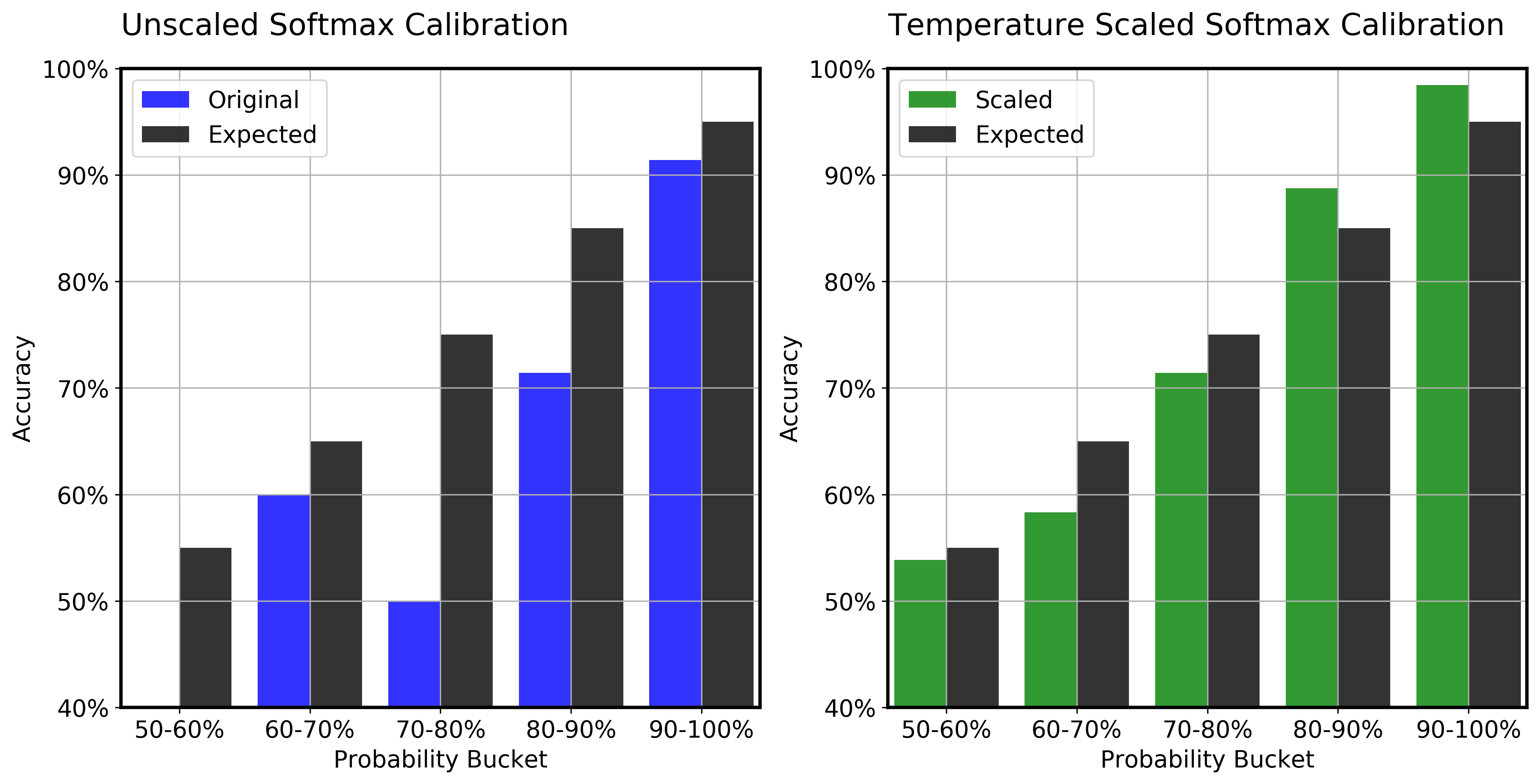
- softmax-calibration shows an illustrative example using a template created for evaluating the calibration for softmax output.
Release history Release notifications | RSS feed


Download files
Download the file for your platform. If you're not sure which to choose, learn more about installing packages.
Source Distribution
Built Distribution
Filter files by name, interpreter, ABI, and platform.
If you're not sure about the file name format, learn more about wheel file names.
Copy a direct link to the current filters
File details
Details for the file plitlib-0.1.9.tar.gz.
File metadata
- Download URL: plitlib-0.1.9.tar.gz
- Upload date:
- Size: 22.5 kB
- Tags: Source
- Uploaded using Trusted Publishing? No
- Uploaded via: twine/3.3.0 pkginfo/1.7.0 requests/2.25.1 setuptools/52.0.0.post20210125 requests-toolbelt/0.9.1 tqdm/4.58.0 CPython/3.7.10
File hashes
| Algorithm | Hash digest | |
|---|---|---|
| SHA256 |
6a414c69913403aa0db8cca72822497512dbee3d21af83daf6d2b1df374264e8
|
|
| MD5 |
7d56c6fe49b70459ebf26b6507589a5b
|
|
| BLAKE2b-256 |
e64d6b5158e1bdd95b07a7ab8c6e1649631de9aee406240995903d7af3391228
|
File details
Details for the file plitlib-0.1.9-py3-none-any.whl.
File metadata
- Download URL: plitlib-0.1.9-py3-none-any.whl
- Upload date:
- Size: 11.5 kB
- Tags: Python 3
- Uploaded using Trusted Publishing? No
- Uploaded via: twine/3.3.0 pkginfo/1.7.0 requests/2.25.1 setuptools/52.0.0.post20210125 requests-toolbelt/0.9.1 tqdm/4.58.0 CPython/3.7.10
File hashes
| Algorithm | Hash digest | |
|---|---|---|
| SHA256 |
a39eb1a98e146e1d5e147728add951700f625df014cc15c1a712f6d2c95f84c1
|
|
| MD5 |
bb4decd88be0d552d0b710c95f297ca3
|
|
| BLAKE2b-256 |
53f32bafaf869100676f51ff63f8253bb6c56639bd09af7b5dc7325183b38e5c
|


