A plotly plotting script generator and data parser

Project description
plotgen: easy data parsing and plot script generator


About
Uses plotly to visualize data (e.g. tab, space, comma separated files) or pickled pandas dataframes. A lot of features are supported like reading in files with different separators, selecting and sorting columns, processing of multiple files, plotting line, scatter, bar, violin, box and gantt charts and customizing the graphs to all the needs. Many operations can be applied before plotting, like joining files, computing over rows and columns (sum, mean, median...), normalising data and filtering.
This script acts as a master script generating a plotting script. In case this script doesn't cover something that is required for a graph, it can output the final plotting script to make manual adjustments like adding annotations.
Installation
Easy installation via pip:
pip install plotgen
Manual
This is a single script project to allow the highest level of portability. Therefor manual installation is easy as you only have to put plotgen within your path and satisfy the requirements:
pip install -r requirements.txt
Usage
The script is designed to process any formatted data file (e.g. tsv, csv, pandas df) into a table of rows and columns. Every row is a data point while every column is a data trace. Columns starting with '_' are treated as special columns (e.g. _error _labels, _colour or _offset). Rows starting with '#' are treated as comments and are ignored. (Those special characters can be adjusted with the rescpective parameters).
The input parsing arguments are processed in order and can be used as many times as whished. This enables very powerful preprocessing of the data before the actual plotting takes place. One can even do very complex inter-column and inter-row computation, normalisation, adding rows/columns with the average and a lot more. This script can also be used to just process the input data and output it as a new file or pickle container.
There are global parameters which can be set once per call like all colour options, legend options, width, height or output. The next set or parameters can only be specified on an input file and affect how the file is treated and plotted like row, col, sorting options, selection and ignoring of data points or plot type (line, bar, box, violin). However some options will be inherited by the following input files e.g. row, col and plot type and some won't be inherited like all input file parsing options (sorting, selection...) or options that affect the actual plot like axis titles or ranges. Options that are inherited can also be specified before an input file.
By default plotgen will create an html plot and opens it in the default browser:
plotgen -i lines.tsv
plotgen can also just print the data it has parsed from the file:
plotgen -i lines.tsv --print
Or create a standalone plotting script out of the input data which incorporates all the options that can be set and are shown later:
plotgen -i lines.tsv --output lines.py
All these options can also be combined to print the data, open a browser plot and save it as a PDF:
plotgen -i lines.tsv --print --browser --output lines.py lines.pdf --width 1920 --height 1080
The full power becomes visisble when working with multiple files (but also the same file more than once) and processing the data and making subplots:
plotgen -i lines.tsv --row 1 --select-columns Sin -i lines.tsv --row 2 --sort-order desc --sort-by-column Sin --select-column Cos
Selection of rows and columns is order sensitive and allows custom trace or data point ordering or duplication of traces and datapoints by repeating the names. All data row and column options also support numeric indexing by using e.g. --select-icolumns 0 1 2 etc.
The width and height of individual subplots can be simply adjusted by using colspan and rowspan:
plotgen -i lines.tsv --row 1 --rowspan 2 -i lines.tsv --row 3 --rowspan 1
It is also possible to plot many files into the same plot by just targetting the same row and col. Setting plot options like x-title, y-title or axis ranges should be done only once per subplot and ideally for the last file of the subplot.
Examples
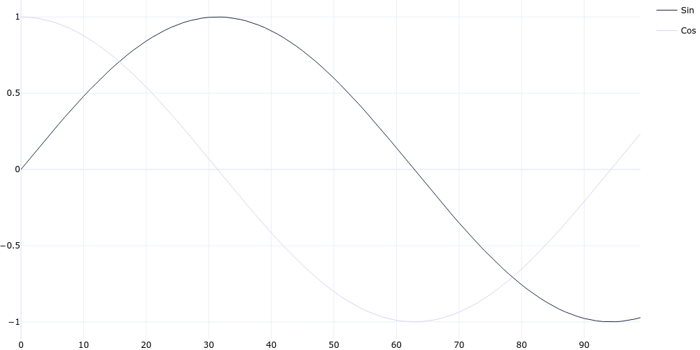
Line Chart
plotgen -i lines.tsv --plot line --output line.png
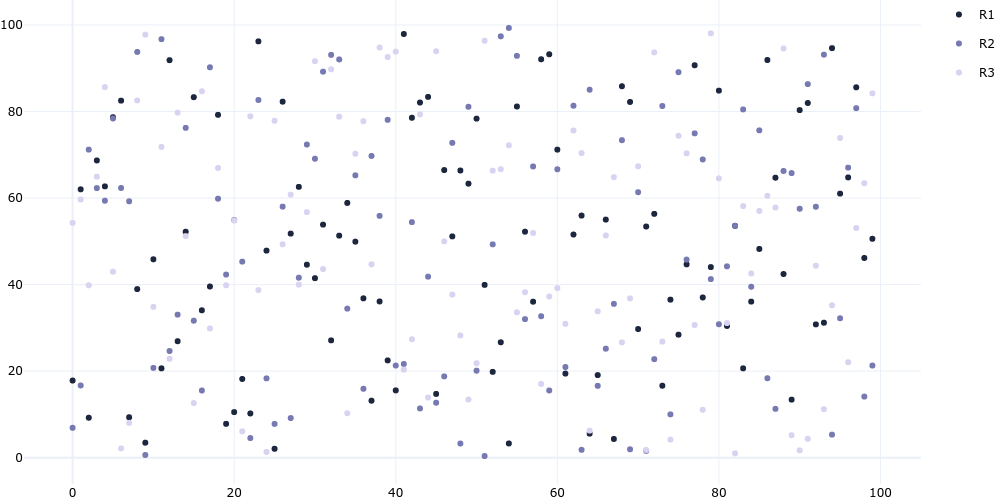
Scatter Chart
plotgen -i scatter.tsv --plot line --line-mode markers --output scatter.png
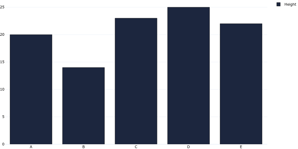
Bar Chart
plotgen -i bar.tsv --plot bar --output bar.png
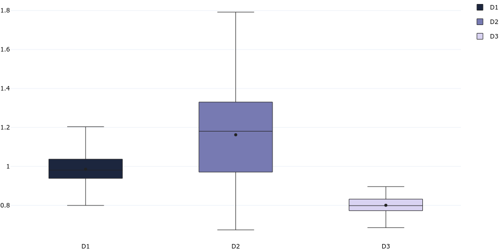
Box Chart
plotgen -i distribution.tsv --plot box --output box.png
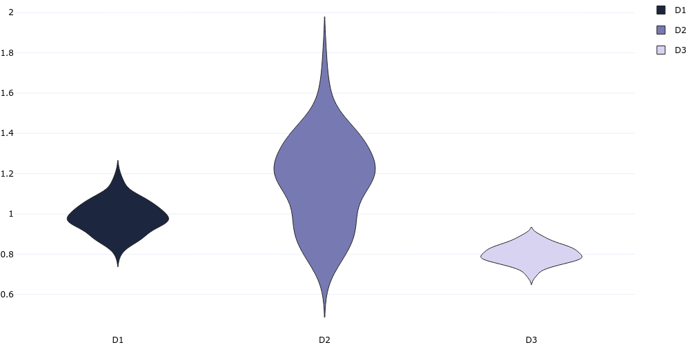
Violin Chart
plotgen -i distribution.tsv --plot violin --output violin.png
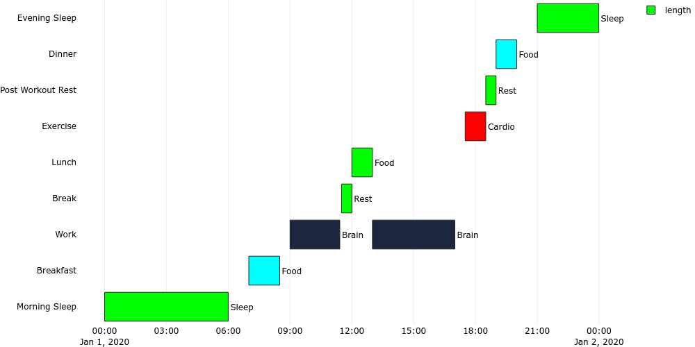
Gantt Chart
plotgen -i gantt.tsv --plot bar --bar-mode stack --bar-text-position inside --orientation h --x-type date --output gantt.png
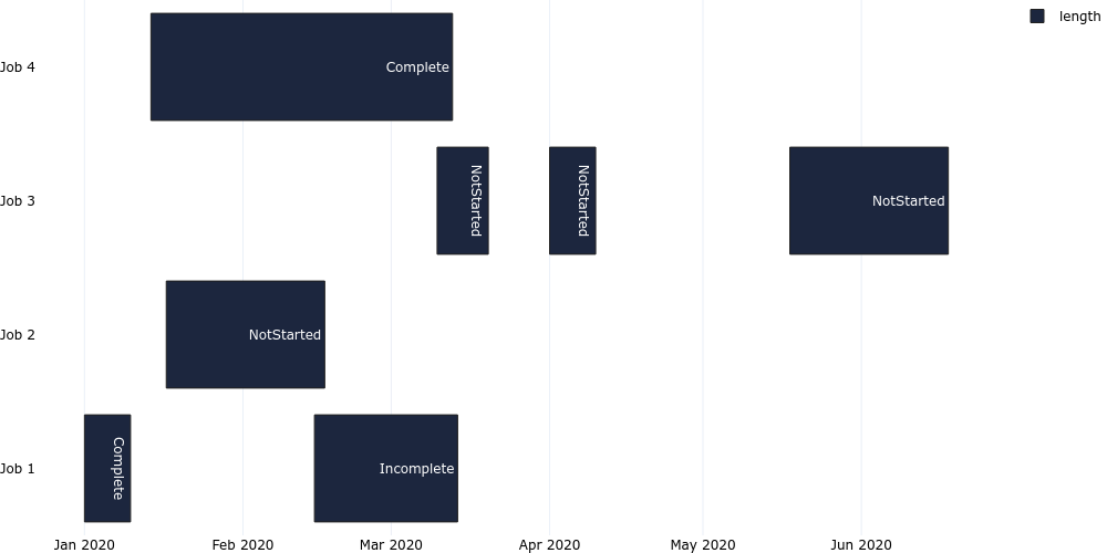
plotgen -i gantt_time.tsv --plot bar --bar-mode stack --bar-text-position outside --orientation h --x-type date --output gantt_time.png
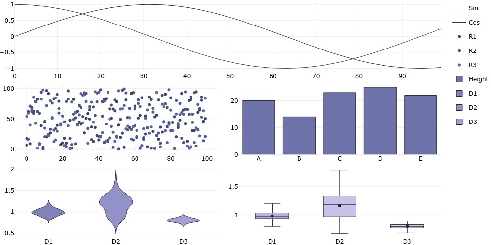
Combined Subplots
plotgen -i lines.tsv --colspan 2 -i scatter.tsv --row 2 --colspan 1 --line-mode markers -i bar.tsv --col 2 --plot bar -i distribution.csv --row 3 --col 1 --plot violin -i distribution.csv --col 2 --plot box --horizontal-spacing 0.05 --vertical-spacing 0.05 --per-trace-colours --output subplot.png
Release history Release notifications | RSS feed


Download files
Download the file for your platform. If you're not sure which to choose, learn more about installing packages.
Source Distributions
Built Distribution
Filter files by name, interpreter, ABI, and platform.
If you're not sure about the file name format, learn more about wheel file names.
Copy a direct link to the current filters
File details
Details for the file plotgen-0.8.22-py3-none-any.whl.
File metadata
- Download URL: plotgen-0.8.22-py3-none-any.whl
- Upload date:
- Size: 40.1 kB
- Tags: Python 3
- Uploaded using Trusted Publishing? No
- Uploaded via: twine/5.0.0 CPython/3.12.3
File hashes
| Algorithm | Hash digest | |
|---|---|---|
| SHA256 |
690619f2c972d888630cb057daa796bd5c85c0b97e3c9ef52446c859ca028eca
|
|
| MD5 |
3c3e5b44a74e32579d96ecc218aac8d9
|
|
| BLAKE2b-256 |
27a6d037c267360c9bcdde84f25a65114fce385fe8f8089d1d7ff1aa4c8e983a
|


