
plotpress
Plot once. Share anywhere. Explore everywhere.
A fast, dependency-light plotting library for scientific computing, with
a matplotlib-shaped API and no compiled extension — install it
anywhere Python does, from notebooks to CI pipelines to offline environments.
It renders one figure to SVG, PNG, PDF, Vega/Vega-Lite, and self-contained
interactive HTML — the HTML carrying a toolbar for pan/zoom, point-picking,
annotation, and slicing a heatmap. No global state, either — a Figure
owns its own axes and its own Style.
📖 Documentation · User guide · API reference · Example gallery · Real applications
import plotpress
import numpy as np

fig, ax = plotpress.subplots()
x = np.linspace(0, 4 * np.pi, 400)
ax.plot(x, np.sin(x), label="sin")
ax.plot(x, np.cos(x), label="cos", linestyle="--")
ax.set_xlabel("x")
ax.set_ylabel("y")
ax.legend()

fig.save("out.svg")                     # static vector SVG
fig.save("out.png")                     # raster export
fig.save("out.pdf")                     # vector export
fig.save("out.html", interactive=True)  # interactive: zoom / pick / annotate / slice
fig.show()                              # native pop-up window
out.html above is a real, self-contained page — no server, no external JS —
with a toolbar over every axes in the figure at once. Self-contained means
genuinely shareable: the plotted data and the toolbar's own JS are both
inlined into that one file, so anyone can open and interact with it with
nothing installed on their end — no Python, no plotpress, no internet
connection, just a browser. Email it, drop it in a chat, put it on a USB
stick — it still works. Send someone a file, not a service they have to
install.
A README on PyPI or GitHub can't run that page's script, so the GIFs below are recordings of it rather than the real thing. For the live version, open a saved file yourself or visit the real-applications gallery, where every figure is embedded exactly this way.
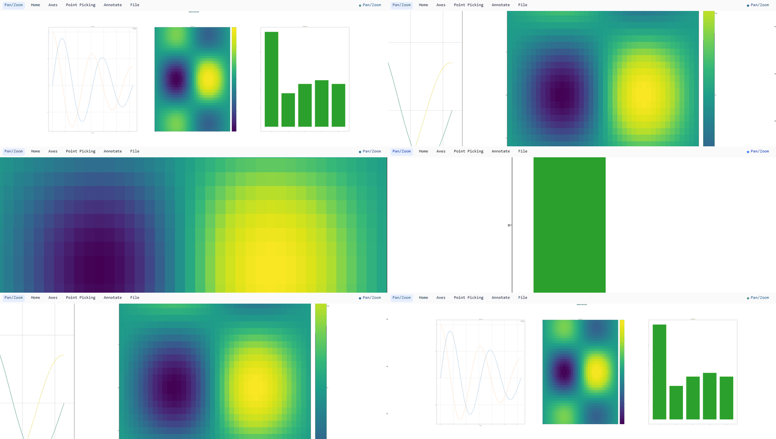
Pan / zoom, working the same over every axes, not just the one under the cursor:
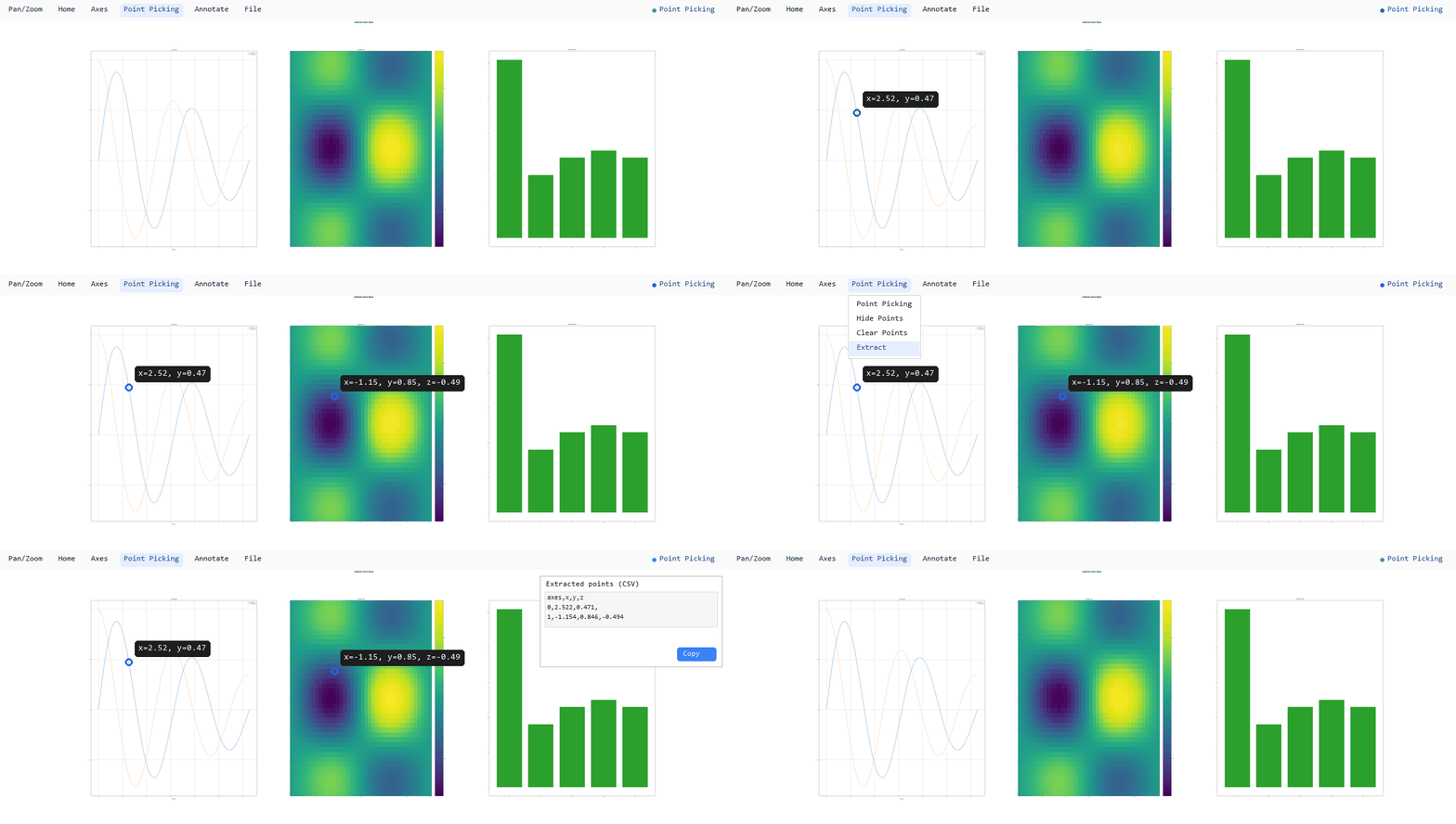
Point picking, reading a value off any axes — a mesh's z, not just a
line's x/y — then extracting every picked point as CSV/JSON:
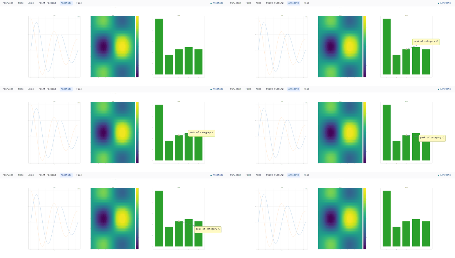
Annotation, a free-form note whose label box drags independently of the point it's pinned to:
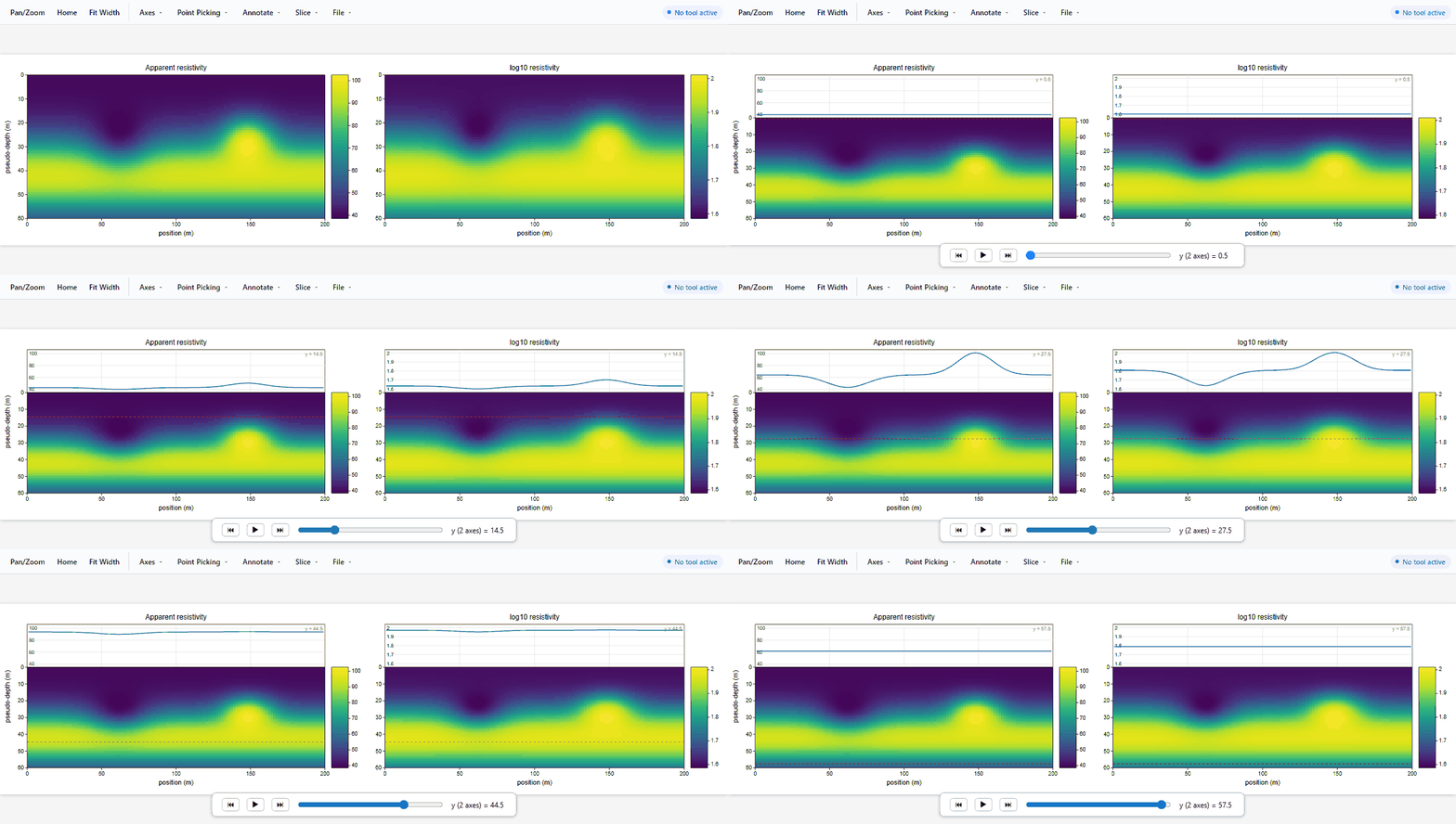
Slicing a heatmap, reading a row of a pcolormesh as a profile in a strip
carved out of the same axes — the companion view of the opt-in Slice tool. One
slider drives every mesh sharing the grid, so both sections stay on the same
row as it sweeps down; the profile's value axis is pinned to the colorbar's
range, so the line moves through the field instead of rescaling each step:
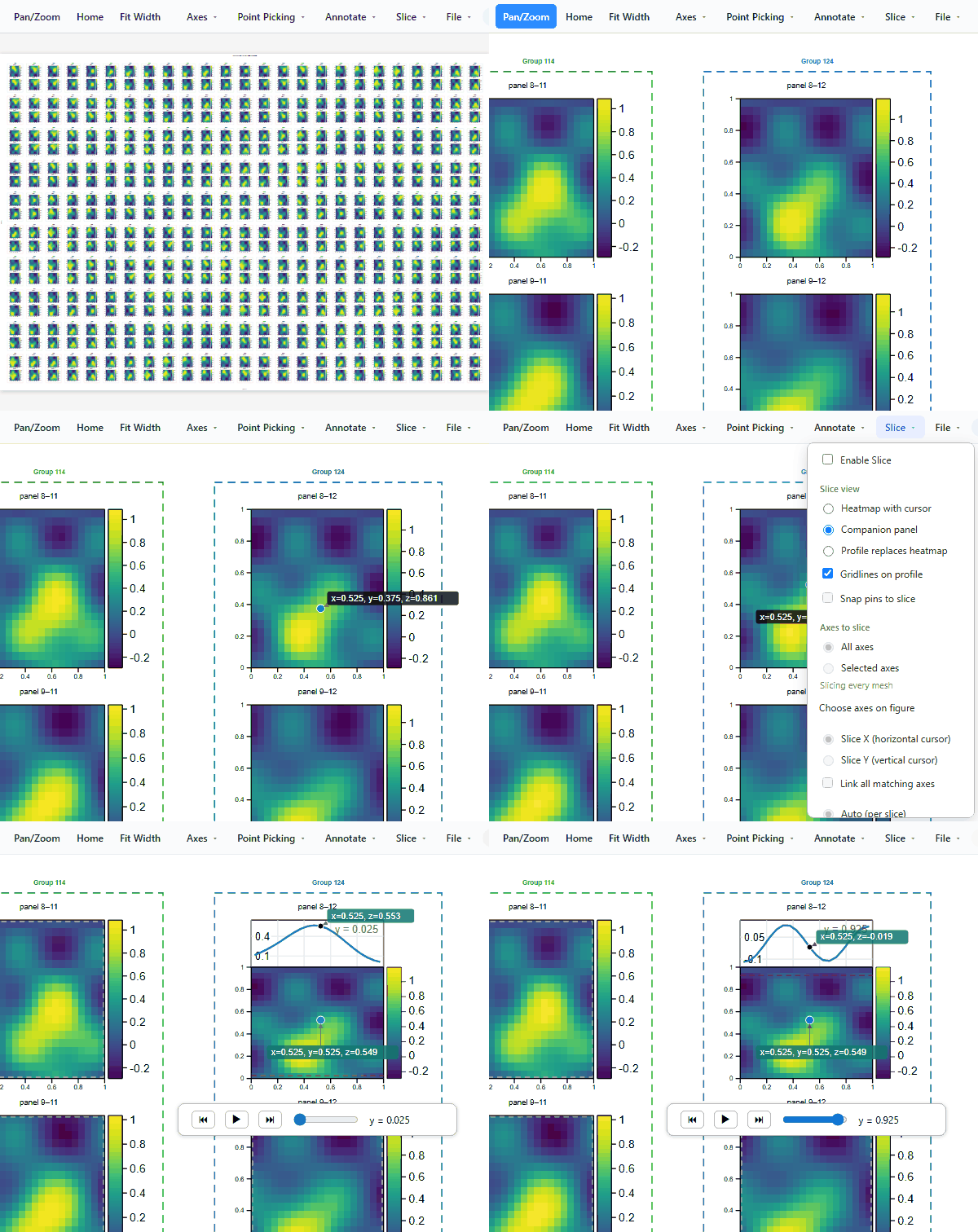
At scale, every gesture above still works the same way on a figure with
hundreds of axes — zoom from the full grid down into a handful of panels, pan,
pick a value off a mesh cell, walk it to another with the arrow keys, drag its
label clear of the dot it stays pinned to, then hand that one panel to Slice by
clicking it on the figure, read the profile through it, and project the pin
onto that profile so the same point is marked on both. The other 499 panels are
left alone throughout (the figure is
docs/figure_layout/grouping/plot_13_full_scale_demo.py —
500 pcolormesh panels, 250 groups, each with its own colorbar):
One figure. Many destinations.
The same Figure built once from the matplotlib-shaped API renders to every
format below — no separate figure per output, no plugin to install:
                                    one Figure object
                                            |
    +---------------+---------------+-------+-------+---------------+---------------+
    ▼               ▼               ▼               ▼               ▼               ▼
  .svg            .png            .pdf            .html           Vega          Vega-Lite
(vector,        (raster,        (vector,        (SVG + JS       (v5 JSON,      (v5 JSON, a
the core         Pillow)        svglib +       inlined --      real pixel-   stricter, more
 format)                       reportlab)       no server     space marks)     declarative
                                               round trip)                      grammar)
fig.save(path, ...) dispatches on the file extension for the first four;
fig.to_vega() / fig.to_vega_lite() return a JSON specification as a plain
dict for a separate Vega/Vega-Lite runtime to render — a bridge from
scientific Python to web-native visualization, for handing a figure to an
existing Vega-based dashboard or notebook without rebuilding the plot from
scratch. See the
architecture docs
for exactly how much of the rendering pipeline each of these six actually
shares, and where a format gets its own dedicated path instead.
Reading a figure back out of HTML
A plot doesn't have to be a dead image. The interactive HTML above isn't a one-way trip: it embeds the plotted data and the figure's own structure and styling as JSON alongside the SVG, so a later process — with none of the Python objects that built it still around — can read a figure back out and rebuild it. The figure becomes a portable representation of the data it displays, not just a picture of it:
a saved .html (Figure.save(path, interactive=True))
      embeds <script id="plotpress-pick"> and
         id="plotpress-layout"> per figure
                         |
                         ▼
             plotpress.load_data(path)
         parses that embedded JSON back out
                          |
           +--------------+--------------+
           ▼                             ▼
      "template"                      "axes"
  (grid shape, spines,           (recovered series/
 tick overrides, groups,       mesh/pie data per axes,
  overlays, Style, ...)            keyed by title)

           |
           ▼
    plotpress.figure_from_template(template)
     rebuilds the grid, every axes' own
 decorations/styling, and its overlays --
       not the plotted data itself
                         |
                         ▼
     a new, already-styled Figure -- ready for
     the caller to replot the recovered "axes"
                   data back into
A freeform Figure.add_axes() rect has no grid cell to rebuild from — its
index is listed in template["omitted_axes"] instead of silently
vanishing. See the
full API and worked examples
for the round trip end to end.
For the common case of a uniform grid — every axes its own single
pcolormesh or line series, all the same shape — plotpress.load_data_xarray()
skips the title-keyed dict above entirely and reads the same file straight
into one xarray.Dataset indexed by row/column instead, with the recovered
template still available under ds.attrs["template"] for
plotpress.figure_from_template(). See the
data round-trip example
for both paths worked through end to end.
"template" above is the exact same dict Figure.to_template()/
save_template() produce directly, with no HTML export or plotted data
involved at all — a figure's grid, group boxes, spine colors, tick
overrides, ids, twin/secondary/inset overlays, and its own Style, with
no plotted data in it at all — so a layout worth building once can be
reused across many future plots via plotpress.load_template()/
plotpress.figure_from_template(), the identical function this data
round-trip itself uses. See the
templates example.
What makes it different
A plotpress figure can leave behind a recoverable artifact rather than an image: it stores its plotted data, layout, and styling together in the same file.
- Return to the analysis, not just the image. A saved interactive figure carries its plotted series alongside its structure and styling. Long after the original Python session, notebook, or source dataset is gone, the file can be read back to recover the data, inspect what was plotted, rebuild the figure, continue the analysis, or create a new visualization. The output is a durable analytical record rather than a screenshot at the end of a workflow.
- Share the artifact without sharing the environment. Everything is contained in one HTML file. A recipient can open it directly in a browser, explore every axes, pick values, and add annotations without Python, plotpress, a server, an account, or any code of their own. The file works offline and can travel through email, chat, removable storage, a paper's supplementary material, or a long-term archive.
- Keep exploration, publication, and recovery connected. The recoverable interactive artifact comes from the same figure that exports to SVG, PNG, PDF, Vega, or Vega-Lite. Collaborators can explore it now, a paper can use its static rendering, and a future researcher can recover and analyze its underlying data later — without maintaining separate plotting workflows.
Scientific visualization, end to end
plotpress is designed around the way scientific figures actually get used:
Explore ──► Analyze ──► Visualize ──► Share ──► Publish ──► Archive ──► Reuse
   ▲                                                                       │
   └───────────────────────────────────────────────────────────────────────┘
- Explore — interact with a measurement, simulation, image, or spectrum while building an experiment or analysis (pan/zoom, point-picking).
- Analyze — the same figure workflow for signal processing, statistics, and multidimensional data.
- Visualize — build and style the figure: plot, arrange subplots, apply colormaps and normalization.
- Share — hand an interactive HTML figure to a collaborator — no server, nothing to install on their end.
- Publish — export a publication figure as SVG/PNG/PDF, or publish a self-contained HTML figure that carries its own data.
- Archive — keep the figure and its plotted data together in one portable file.
- Reuse — load the figure back with
plotpress.load_data(), recover the data, and analyze or replot it — the cycle starts again from Explore.
Made for real scientific workloads
plotpress isn't just a handful of basic plotting primitives — it covers the kinds of figures scientists actually build. See Supported plot types below for the full method list; the categories:
- Signal processing — power spectral density, cross-spectral density, coherence, spectrograms, autocorrelation, cross-correlation, and magnitude/angle/phase spectra (pure-NumPy Welch estimators).
- 2-D and gridded data — images, meshes (including curvilinear grids), contours, vector fields, and logarithmic/power/symlog normalization for large scientific fields.
- Statistical visualization — histograms, 2-D histograms, box plots, violin plots, ECDFs, KDEs, event rasters, error bars, and hexbins.
- Complex figures — subplot grids, shared axes, colorbars (including one shared across several axes), secondary axes, inset axes, grouped panels, figure-level titles/labels, and mixed layouts.
- Animation — animated lines and meshes with frame sliders, exportable as self-contained looping GIFs.
- Large figures — built to keep object and output-node counts under
control, so a very large multi-panel figure stays practical; see the "At
scale" GIF above (500
pcolormeshpanels, 250 groups, each with its own colorbar).
What it is for
plotpress is not a matplotlib replacement, and it does not try to match matplotlib's twenty years of breadth (no geographic projections or triangulated grids, a handful of bundled font-metric families, no 3-D, and its polar axes project onto the 2-D core rather than a dedicated pipeline — see Supported plot types below). It aims at a narrower, underserved spot: plotting where matplotlib's install footprint or global state gets in the way. Scientific software doesn't always run on a developer laptop.
Reach for plotpress when you want to:
- Ship plots from a constrained runtime — locked-down networks, offline systems, minimal containers, Pyodide/WASM, CI, or shared computing environments — where a pure-Python + NumPy install with no build toolchain and no per-platform wheels matters.
- Embed in web apps or notebooks as SVG or self-contained interactive HTML whose JS makes no external requests (works under strict CSPs like Jupyter).
- Write library or server code that should never touch a global "current
figure" or a process-wide
rcParams.
Reach for matplotlib (or seaborn, Plotly) when you need publication-grade typography across arbitrary fonts, the full plot-type gallery, 3-D, or the deep ecosystem that pandas, seaborn and scikit-learn plot into.
Two galleries in the docs, on separate pages: a plot-type reference with one figure per method, and real applications — over 160 worked figures built from the data real measurements produce, grouped by field, each explaining the axis, scale and colour choices the data forces. Every application figure is embedded live, with the interactive toolbar.
Install
pip install plotpress            # SVG + interactive HTML + PNG/PDF export
pip install plotpress[full]      # + the viewers (gui, qt, jupyter) and xarray
pip install plotpress[contrib]   # + everything a contributor needs (dev, browser, bench, docs)
The standard install covers all file output — SVG, interactive HTML, PNG
and vector PDF — with pure-wheel dependencies that install everywhere (servers,
CI, notebooks). Reach for [full] as soon as you want anything beyond that.
Its pieces also install individually, or in combination
(pip install plotpress[gui,xarray]): [gui], [qt], [jupyter],
[xarray], or all three viewers at once via [viewers]. That matters because
each pulls its own stack — [gui] brings a desktop webview for the native
fig.show() window, which a [qt]-only or [jupyter]-only install has no
reason to carry. See Installation
for the full extras reference.
Output surfaces (one scene, many targets)
| Call | Result |
|---|---|
fig.save("x.svg") |
static vector SVG |
fig.save("x.png") / fig.savefig(...) |
raster PNG (supersampled Pillow backend, dpi metadata included) |
fig.save("x.jpg") / fig.save("x.webp") |
raster, lossy — smaller for dense mesh figures than PNG |
fig.save("x.pdf") / fig.save("x.eps") |
vector PDF / EPS (svglib + reportlab) |
fig.save("x.html", interactive=True) |
interactive HTML (self-contained JS toolbar) |
fig.to_svg() / fig.to_html() |
string, for embedding |
fig._repr_svg_() |
inline SVG in Jupyter |
fig.show() |
native pop-up window (pywebview, [gui] extra; falls back to browser) |
fig.show_qt() |
embed in a PyQt/PySide app (plotpress.qt, [qt] extra) |
Interactive figures
Interactive HTML and pop-up output carry a self-contained vanilla-JS toolbar (no external requests, so it works under strict CSPs like Jupyter and sandboxed webviews). Nothing is active until you pick a tool:
Pan/Zoom, Home and Fit Width sit standalone on the toolbar's left; everything else is grouped into Axes, Point Picking, Annotate, and File menus:
- Pan/Zoom — plain-wheel whole-figure zoom/pan, for wherever holding Ctrl (Axis Zoom's whole-figure gesture, below) is awkward. Home restores its magnification back to natural size, and Fit Width snaps it to exactly the window's width.
- Axis Span — drag to pan a single plot's data window (log-aware).
- Axis Zoom — rubber-band box to zoom one axes in data space (ticks recompute, markers keep a constant size); Ctrl+wheel (or a trackpad pinch) zooms the whole figure instead, centered on the cursor. Reset All Axes restores every axes' own pan/zoom back to its original view; neither Reset button clears pins/annotations — double-click a single plot under Axis Span/Zoom to reset just that one.
- Point Picking — click to pin the nearest data point's value; arrow keys
step along the series (nearest-neighbour for scatter, cell-by-cell for
meshes/contours), reporting extra dims (
z,c, …). Click a pin, or use Clear Points, to remove it. Its label box (connected to the marker by a leader arrow) is draggable while Point Picking is active. Hide Points toggles every pin's visibility without deleting them, and Extract copies/downloads them all as CSV/JSON, or hands them back to the kernel (fig.show(wait_for_extract=True)). - Annotate — three ways to drop a user-written note: a plain caption pinned to a figure position, an Annotate Arrow note that points at where it was dropped, and an Annotate Point note locked to the nearest datum the way a pick is. Clear Annotations removes only these, leaving Point Picking pins untouched (Escape clears both kinds at once, and deselects the active tool). Each note's box drags the same way, while the tool that would have created it is active. Hide Annotations toggles every note's visibility (plus any boxed callout the figure itself drew) without deleting them.
- Save/Save As — persist pan/zoom, every pin/annotation, and every toggle above to a new (or the same) self-contained HTML file.
That toolbar is what every interactive figure gets. Anything beyond it is
opt-in through options=, so nothing new changes an existing figure unless
you ask for it:
fig.save("out.html", interactive=True, options=["slice"])
- Slice — for a
pcolormeshorimshow, scrub any row or column as a 1-D profile with a play/step slider. The profile can sit in a strip beside the heatmap, replace it, or stay hidden behind just a cursor line; its value axis can follow each slice, the colorbar's range, or bounds you set. Point Picking works on the profile itself, and every mesh sharing a grid can be driven from one slider — which is what makes it usable on a figure with hundreds of panels. Pass settings instead of a bare name to open in a chosen state:options={"slice": {"enabled": True, "view": "companion"}}.
fig.to_html()/fig.save(..., interactive=True) also accept extra_js — a
raw JS string inlined as its own <script>, for adding a custom tool to the
same toolbar menu — plus pick_precision (decimal places embedded per
value) and pick_max_mesh_cells/pick_max_points (a hard cap on how much of
each mesh/series is embedded for picking, per artist) to bound the
interactive payload for mesh- or point-heavy figures.
Per axes: ax.set_pickable(False) excludes that axes from Point Picking
(Axis Span/Zoom/Annotation still work everywhere), and
ax.set_pick_context(**kwargs) attaches extra key/value context — e.g. a
panel's spine color — that rides along on every record picked from it. Every
picked record also always carries axes_title (falling back to a generated
name when the axes has no title) plus xlabel/ylabel and zlabel (the
title of any colorbar attached to that axes, shared or not), so a value
pulled out of context still says what it means.
A stack of 2-D frames via ax.plot_frames(...)/ax.pcolormesh_frames(...)
adds a slider (play/pause/step) over the extra dimension. Multiple sliders
can be linked by a shared index.
Supported plot types
plotpress covers the core of matplotlib's "Plot types" reference grid, plus the axis, layout and color machinery a real figure needs. Each table below is one grouping.
Plots
plot (lines) |
scatter (+ c/cmap) |
bar / barh |
hist |
step |
fill_between |
stem |
errorbar (x/y err + caps) |
imshow |
pcolormesh |
pie |
plot_frames (slider) |
boxplot |
violinplot (KDE) |
eventplot |
quiver |
contour (marching squares) |
hist2d |
stackplot |
contourf (filled) |
hexbin |
matshow |
spy |
broken_barh |
stairs |
axline |
barbs |
ecdfplot |
kdeplot |
pcolormesh_frames (slider) |
Signal processing
Pure-NumPy Welch estimators — no SciPy required.
psd |
csd |
cohere |
magnitude_spectrum |
angle_spectrum |
phase_spectrum |
specgram |
xcorr |
acorr |
Polar
Created with projection="polar", projected onto the 2-D core rather than a
dedicated pipeline — see the
limitations docs
for the caveats.
plot |
scatter |
fill |
set_rmax / set_rlim |
set_rticks |
set_thetagrids |
Reference marks and fills
axhline / axvline |
axhspan / axvspan |
hlines / vlines |
fill |
fill_between |
fill_betweenx |
Axis control
| Call | What it does |
|---|---|
set_xscale / set_yscale / loglog / semilogx / semilogy |
log scales |
set_aspect("equal") |
equal data aspect |
set_xlim / set_ylim |
limits |
set_xticks / set_yticks |
fixed tick locations |
set_xticklabels / set_yticklabels |
fixed tick labels |
invert_xaxis / invert_yaxis |
reversed direction |
margins / grid / set_axis_off |
padding, gridlines, hiding the frame |
tick_params |
per-axes, per-axis tick styling |
More than one axes
| Call | What it does |
|---|---|
subplots(sharex=…, sharey=…) |
shared limits across a grid |
ax.sharex(other) / ax.sharey(other) |
the same, applied after the fact |
twinx / twiny |
an overlaid axes with a second y/x axis |
secondary_xaxis / secondary_yaxis |
a mirrored, unit-converted second axis |
inset_axes |
a nested axes inside another |
Figure layout
| Call | What it does |
|---|---|
fig.tight_layout() |
auto-margins, so labels never overflow |
fig.subplots_adjust(...) |
direct margin control |
GridSpec (plotpress.figure) |
row/column spans |
ax.spines |
per-side visible / color / linewidth |
align_xlabels / align_ylabels |
line labels up across panels |
Text, legends and colorbars
| Call | What it does |
|---|---|
ax.text / ax.annotate |
text, with optional arrows |
suptitle / supxlabel / supylabel |
figure-level titles and labels |
legend(loc=…, ncol=…, title=…) |
per-axes legend |
fig.colorbar(...) |
one colorbar, or one shared across a list of axes |
Colormaps
27 built-in, plus any _r reversed variant, named colors ("red", "k", …)
and the matplotlib "C0".."CN" cycle. plotpress.make_cmap() /
register_cmap() build a custom one from any list of colors.
| Family | Colormaps |
|---|---|
| Perceptually uniform | viridis, plasma, inferno, magma, cividis |
| Diverging | coolwarm, RdBu, Spectral, PiYG, BrBG, seismic |
| Sequential | Blues, Greens, Oranges, Reds, Purples, YlOrRd, gray, hot, cool |
| Cyclic | twilight |
| Rainbow | jet, turbo |
| Qualitative | tab10, tab20, Set1, Dark2 — for class labels with no natural ordering |
Normalization
| Class | Scaling |
|---|---|
Normalize |
linear |
LogNorm |
logarithmic |
PowerNorm |
gamma |
SymLogNorm |
log, through zero |
TwoSlopeNorm |
diverging, midpoint pinned to a real center value |
BoundaryNorm |
discrete bins |
Runnable examples
python examples/plot_types.py    # plot / scatter / bar / hist / pie / imshow / ...
python examples/plot_types_2.py  # boxplot / violin / quiver / contour / hist2d / ...
python examples/gallery.py       # line/scatter/pcolormesh/subplots
Not yet implemented
streamplot, triangulation (tri*), and geographic / map projections — each
would need new primitives. These are the main remaining plot-type gaps against
matplotlib's full gallery.
Testing
pip install plotpress[dev]                      # pytest
python -m pytest                                # fast unit + output tests (~1 min)
python -m pytest -m perf -s                     # timing tests + speedup report (needs matplotlib)
A plain pytest run deselects the browser tests below (they need a Chromium
download); -m perf selects the timing ones, which a plain run also skips.
The suite covers the no-global-state invariants, plotting/autoscale logic, transforms/tickers/colors, a lossless PNG round-trip, SVG/HTML well-formedness and structure, the interactive JS's tick labels against the Python ones that drew them, and performance (regression guards + a comparative claim vs matplotlib).
Point-picking tests (opt-in)
Point picking runs in JavaScript inside the interactive HTML, so it is tested
end-to-end in a real browser: each case clicks the pixel where the renderer drew
a known datum and asserts the marker reports that datum, across every pickable
plot type (line, scatter, bar, stem, errorbar, quiver, eventplot, boxplot,
violin, fill, pcolormesh, imshow, pie) and awkward axes (log, inverted,
set_aspect, multi-subplot).
These need a browser, so they are deselected by default and skip cleanly when it is missing:
pip install plotpress[browser] && playwright install chromium
python -m pytest -m browser
Benchmarks
pip install plotpress[bench]        # matplotlib, for comparison
python benchmarks/benchmark.py  # plotpress vs matplotlib, plot build + SVG output
Representative run (best of 3, one machine — build and serialize to SVG, both using the object-oriented API):
| scenario | plotpress | matplotlib | speedup |
|---|---|---|---|
| pcolormesh 300×300 | ~16 ms | ~6400 ms | ~400× |
| many axes (8×8 grid) | ~40 ms | ~1600 ms | ~40× |
| scatter, 5k points | ~15 ms | ~220 ms | ~14× |
| single line, 100k points | ~9 ms | ~48 ms | ~5.6× |
Where the win comes from: avoiding matplotlib's per-Artist Python
overhead (many axes), and rasterizing meshes to one <image> instead of tens
of thousands of vector cells (pcolormesh). The single huge polyline
case used to be a loss (pure-Python float→string serialization of 100k points);
it's now a win via min/max path decimation — a monotonic-x line is reduced
to first/last/min/max per pixel column before serializing, which is visually
lossless (spikes preserved), keeps the output vector, and needs no compiled
backend. Coordinate formatting itself is already vectorized with numpy.char.
Pure Python, and staying that way. Every number above comes from NumPy, not from native code — plotpress has no compiled extension and is not going to grow one. Curvilinear and Gouraud meshes scan-convert in NumPy for the same reason: where a faster path would need a C extension, the NumPy one is what gets written. Installing everywhere pip does, with no build toolchain and no per-platform wheels, is a first-class feature here rather than a trade-off made to get it.
Architecture notes
plotpress/ layout:
| Module | Responsibility |
|---|---|
figure.py |
Figure, subplots(), layout, save/show/_repr_* |
axes.py |
Axes: plotting methods, limits, autoscale |
polar.py |
PolarAxes: (θ, r) projection + polar frame, built from existing artists |
_spectral.py |
pure-NumPy Welch spectral estimators (psd/csd/cohere/specgram/…) |
artists.py |
data-only scene primitives (Line2D, ScatterCollection, QuadMesh) |
style.py |
per-figure Style (replaces global rcParams) |
transform.py |
vectorized data→pixel transforms (linear + log scales) |
colors.py |
Normalize, colormap LUTs, colormap application |
ticker.py |
"nice number" + log tick locations, label formatting |
dates.py |
datetime axis tick locations + label formatting |
svg.py |
the renderer: scene → SVG string (+ per-axes metadata) |
primitives.py |
backend-agnostic pixel-space primitives + one artist→primitive converter |
png.py |
stdlib-only PNG encoder for mesh/image layers |
raster.py |
Pillow raster backend for PNG export; svglib/reportlab for PDF |
fonts/ |
bundled width tables + the family registry (layout only; no glyph rasterization) |
_interactive.py |
inlined vanilla JS: toolbar, per-axes zoom, picking, annotate, slice, sliders, export |
vega.py / vega_lite.py |
Figure → Vega / Vega-Lite v5 JSON specifications |
qt.py |
optional PyQt/PySide WebEngine widget + window (fig.show_qt(), [qt] extra) |
Artists never render themselves — they just hold arrays. The geometry of each
artist is computed once in primitives.py; svg.py and raster.py are thin
emitters over that shared primitive vocabulary, so an artist is defined in one
place, not per backend.
Fonts. A figure is laid out before anything draws its glyphs — SVG emits
<text> and lets the viewer rasterize — so plotpress has to predict text width
from bundled metric tables. That keeps layout identical on every machine with no
font-file dependency. Bundled are the base-14 metric families — Helvetica,
Times and Courier, each in regular / bold / italic / bold-italic — plus
DejaVu Sans, which covers the metric-compatible clones too (Arial and
Liberation Sans are Helvetica, Liberation Serif is Times, Liberation Mono is
Courier). Families outside those groups — Verdana, Tahoma, Arial Black, Arial
Narrow — have proprietary metrics, so they render but are measured as Helvetica
and need hand-tuned figsize; Style(measure_installed_fonts=True) opts into
measuring the real file on this machine instead, trading cross-machine
reproducibility for fidelity. PNG export picks a matching face, falling back to
Pillow's built-in font where the system has none.
1 maintainer

Release files for plotpress 0.42.2
For a detailed explanation of source distributions (sdists) and built distributions (wheels), please see the package formats documentation.
Source distribution (sdist)
| File | Size | Uploaded | |
|---|---|---|---|
| plotpress-0.42.2.tar.gz | 710.5 kB | Details |
Built distribution (wheel)
| File | Interpreter | ABI | Platform | Reset |
|---|---|---|---|---|
| plotpress-0.42.2-py3-none-any.whl | Python 3 | none | any | Details |
Total release size: 1.1 MB
Release files / plotpress-0.42.2.tar.gz
| Download URL | plotpress-0.42.2.tar.gz |
|---|---|
| Size | 710.5 kB |
| Tags | Source |
|
SHA-256 checksum How to use checksums |
6369157762f76adae9c5b18aa724b123c059f03183e7f6c41644aa01ca6fe113
|
|
BLAKE2b-256 checksum How to use checksums |
211d0b49107d08ab8d0872157cf0a73dd00adddd47b2e49bdde7f03e4f4efc55
|
| Upload date | |
|
Uploaded using Trusted Publishing? What is trusted publishing? |
Yes |
| Uploaded via |
twine/7.0.0 CPython/3.13.14
|
Provenance
Provenance describes where a file came from. On PyPI, provenance is shared via attestations, which provide a verifiable record of the build or publishing details. View details, limitations and caveats.


PyPI Publish Attestation
PyPI verified that this artifact, at this checksum, originated from the publisher listed below.
Signed by GitHub Actions, verified by PyPI on Sep 21, 2026.
Transparency logRelease files / plotpress-0.42.2-py3-none-any.whl
| Download URL | plotpress-0.42.2-py3-none-any.whl |
|---|---|
| Size | 434.8 kB |
| Tags | Python 3 |
|
SHA-256 checksum How to use checksums |
d764bb83e6c7b9af65f385107311a9f644e9063c6193916f64a63b690153f168
|
|
BLAKE2b-256 checksum How to use checksums |
b198f6ee9c42f83b4650023089aafc6030725009e1ad145409e85256348dd137
|
| Upload date | |
|
Uploaded using Trusted Publishing? What is trusted publishing? |
Yes |
| Uploaded via |
twine/7.0.0 CPython/3.13.14
|
Provenance
Provenance describes where a file came from. On PyPI, provenance is shared via attestations, which provide a verifiable record of the build or publishing details. View details, limitations and caveats.
PyPI Publish Attestation
PyPI verified that this artifact, at this checksum, originated from the publisher listed below.
Signed by GitHub Actions, verified by PyPI on Sep 21, 2026.
Transparency log













