Generate sleek, no-fluff themes, tailored for Oh My Posh.

Project description
📑 Table of Contents
Introduction


Generate sleek, no-fluff themes, tailored for Oh My Posh.
📦 pompomp
After switching to a new PC, I thought it was the perfect opportunity to refresh my terminals. While reworking my Oh My Posh theme configuration, an extremely powerful and customizable tool, I quickly ran into a challenge: managing long JSON or YAML files to tweak every detail of the prompt can become tricky over time (yes, blame the Ebbinghaus forgetting curve… and my goldfish memory! 🐠) and let's not even talk about remembering which segment goes where...
That’s why I came up with pompomp: it lets you break down all the OMP logic (blocks, palettes, icons, conditions…) into small, independent YAML fragments that are easy to read, maintain, and share. pompomp then assembles these fragments to automatically generate a complete configuration file, ready to use for OMP, with all the Go Template logic neatly compiled.
Whether you want to nest conditions, inject specific palettes, or just keep a maintainable and shareable config, pompomp was designed to make it all accessible ; without taking away any of OMP’s power, just making it nicer to use every day.
pompomp is built on three pillars:
- Modularity : each element is independent and can be changed without impacting the rest.
- Smart fallback : even if some parts are missing, pompomp ensures a clean final result.
- Flexibility : test a preview, tweak a palette, change a segment: everything can be done quickly and painlessly.
So here’s pompomp, hoping it will help out another geekette or geek. 😄
💡 pompomp also includes a preview mode: you can see your changes live in the terminal and fine-tune your prompt design without having to reload OMP every time. ^^
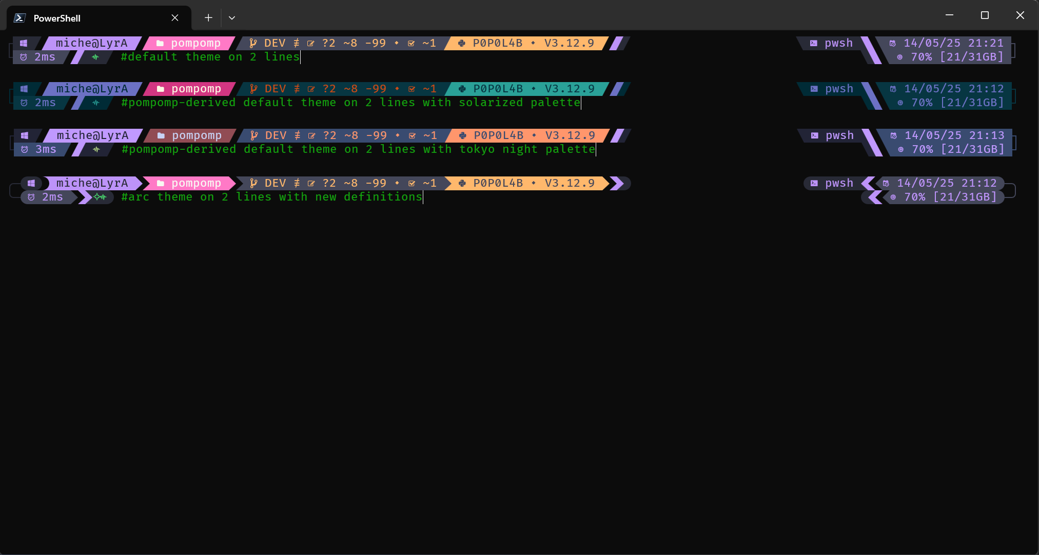
🎨 Quick preview of the available themes generated with pompomp
Two-line themes
One-line themes (default, solarized, tokyo night, and arc theme)
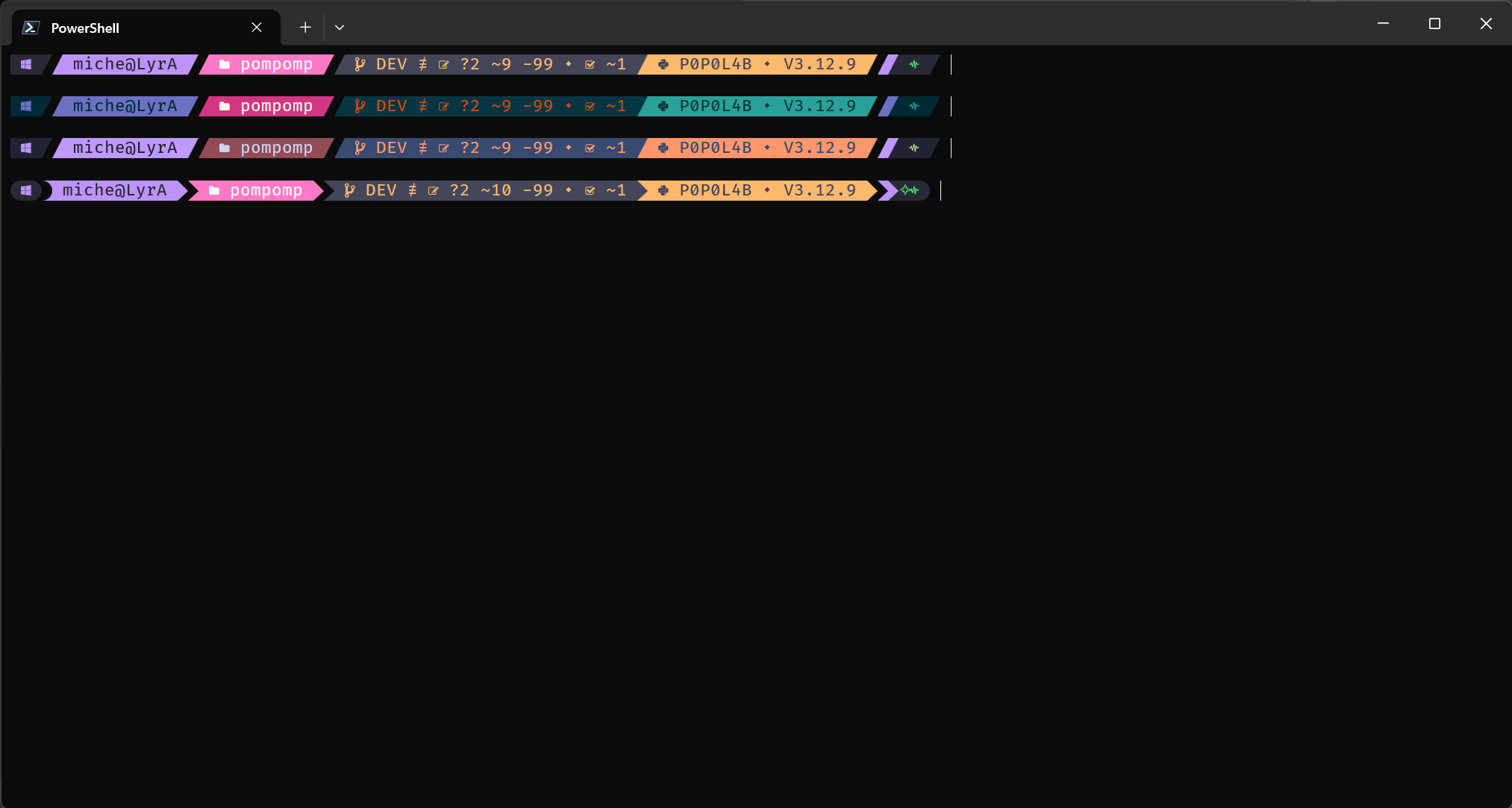
💡 By default, pompomp generates themes based on the Dracula color palette. You can easily switch to other palettes like Tokyo Night or Solarized.
Prerequisites
💡 Prerequisites:
pompomp depends on Oh My Posh (developed by Jan DE DOBBELEER) because it generates JSON/YML/TOML files that are interpreted by OMP.
Make sure you have OMP installed on your machine by following the official documentation: https://ohmyposh.dev.
Installation
Installation via pipx (recommended for Linux and WSL)
python -m pip install --upgrade pip
pip install pipx
pipx ensurepath
pipx install pompomp
Installation via PyPI
python -m pip install --upgrade pip
pip install pompomp
Installation from the Git repository
Option 1 : Direct install from GitHub
pip install git+https://github.com/KaminoU/pompomp
Option 2 : Clone and manual install
# Clone the repository from GitHub
git clone https://github.com/KaminoU/pompomp
cd pompomp

# 🔥 Recommended method
pip install .

# 🛠️ Alternative method (if pip is unavailable or causes issues)
python -m build
pip install ./dist/pompomp-1.0.0.tar.gz
Generate a Theme in One Command
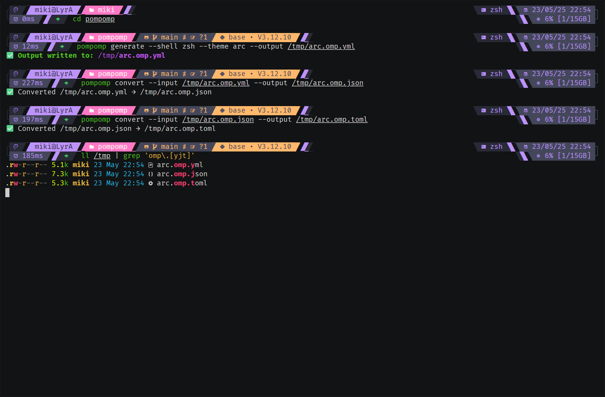
Theme generation is done with a single command:
pompomp generate --output ./<theme_name>.omp.json # personally, I prefer the YAML format: .omp.yml
This command generates a JSON file that can be used directly by Oh My Posh.
Preview Mode
To preview the result directly in your terminal:
pompomp generate --dry-run --preview --shell zsh
This lets you see the theme live, without reloading your configuration.
🎥 Demo Videos: Theme Generation & Exploration
💡 They say a picture is worth a thousand words... and a video is even better!
ℹ️ Asciinema playback may look slightly different from your local rendering due to font smoothing limitations in the web player.
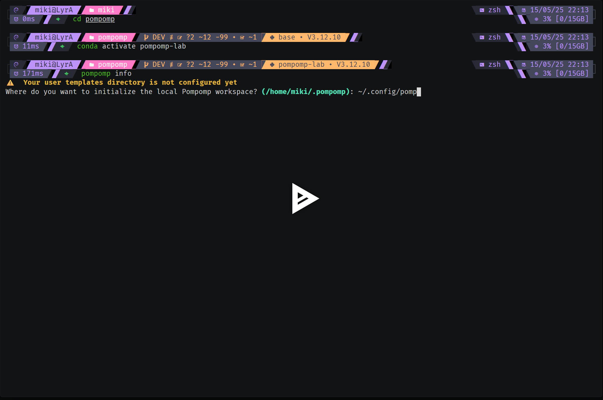
1️⃣ pompomp Initialization
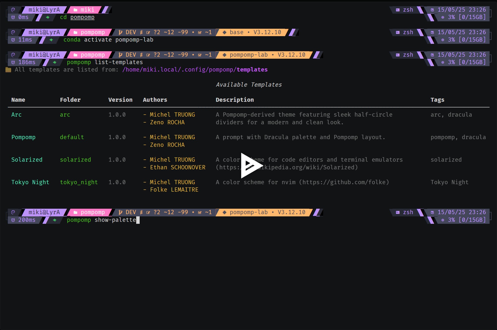
2️⃣ Listing Available Themes & Associated Palettes
3️⃣ Live Preview
4️⃣ Template Derivation
5️⃣ Generating a Final Theme with Format Conversion
Fallback & Template Management
The fallback mechanism lets you retrieve any missing elements from the default template when they aren’t defined in
your derived template.
Create a Derived Template
With the following command, you can create a derived template from an existing one:
pompomp scaffold --new-palette --theme-name "Pastel Rainbow" --author-name "Miki"
Automatically Generated Structure
templates/
└── pastel_rainbow/
    ├── layouts/
    │   └── meta.yml
    ├── meta.yml
    └── shared/
        └── palette.yml
Only the elements you define are created:
- The
meta.ymlfile with basic information (author, version, description). - The palette file with your custom colors.
- Everything else? Pulled from the
defaulttheme fallback.
This lets you redefine only what changes: colors, icons, or specific segments. The rest is automatically inherited
without having to duplicate the YAML from default.
Full Structure of the Default Template
View the detailed structure of the default template
templates/
└── default/
    ├── core
    │   ├── _closures_
    │   │   ├── main_closure.yml
    │   │   ├── secondary_left_closure.yml
    │   │   └── secondary_right_closure.yml
    │   ├── languages
    │   │   └── python.yml
    │   ├── source_control
    │   │   └── git.yml
    │   └── system
    │       ├── execution_time.yml
    │       ├── os_layouts
    │       │   ├── 1_line.yml
    │       │   └── 2_lines.yml
    │       ├── os.yml
    │       ├── path.yml
    │       ├── plain_text
    │       │   ├── line_1_right_connector.yml
    │       │   ├── line_2_left_connector.yml
    │       │   └── line_2_right_connector.yml
    │       ├── session.yml
    │       ├── shell.yml
    │       ├── status_code.yml
    │       ├── sysinfo.yml
    │       └── time.yml
    ├── layouts
    │   ├── 1_line.yml
    │   ├── 2_lines.yml
    │   ├── common_left_prompt.yml
    │   ├── __main__.yml
    │   └── meta.yml
    ├── meta.yml
    └── shared
        ├── icons.yml
        ├── omp
        │   ├── leading_diamond
        │   │   ├── execution_time_left_divider.yml
        │   │   ├── line_1_left_connector.yml
        │   │   ├── line_1_right_connector.yml
        │   │   ├── line_2_left_connector.yml
        │   │   ├── os_left_divider.yml
        │   │   ├── path_left_divider.yml
        │   │   ├── secondary_left_closure_divider.yml
        │   │   ├── status_code_left_divider.yml
        │   │   ├── sysinfo_left_divider.yml
        │   │   └── time_left_divider.yml
        │   ├── os_properties.yml
        │   ├── powerline_symbol
        │   │   └── divider.yml
        │   ├── template
        │   │   ├── line_1_right_connector.yml
        │   │   ├── line_2_left_connector.yml
        │   │   ├── line_2_right_connector.yml
        │   │   ├── secondary_left_closure_divider.yml
        │   │   ├── secondary_right_closure_divider.yml
        │   │   ├── session_left_divider.yml
        │   │   ├── session_right_divider.yml
        │   │   ├── shell_left_divider.yml
        │   │   ├── shell_right_divider.yml
        │   │   └── status_code_left_divider.yml
        │   └── trailing_diamond
        │       ├── execution_time_right_divider.yml
        │       ├── os_right_divider.yml
        │       ├── path_right_divider.yml
        │       ├── secondary_right_closure_divider.yml
        │       ├── session_right_divider.yml
        │       ├── status_code_right_divider.yml
        │       ├── sysinfo_right_divider.yml
        │       └── time_right_divider.yml
        └── palette.yml
The pompomp DSL
The pompomp DSL (Domain Specific Language) lets you structure, modularize, and customize your themes with maximum flexibility. Its main goal is to break themes into independent fragments while benefiting from a smart fallback mechanism.
DSL Directive Reference
The DSL supports the following directives:
| Directive | Description |
|---|---|
[inc:...] |
Includes a DSL block with dot-paths like syntax |
[inc_var:...] |
Includes with ${} variable interpolation |
[palette:...] |
Resolves a color role from the palette |
[ui:...] |
Inserts a composed glyph with optional styles |
[icons:...] |
Inserts a named icon (not UI-specific) |
[if ...] / [else] / [end] |
Conditional rendering blocks |
[.Var] |
Transformed into Go-style OMP template {{ .Var }} |
All [ui:...] blocks support style annotations (e.g., transparent, palette:..., parentBackground,
childBackground).
Conditional blocks support and, or, not, as well as comparison operators (eq, gt, contains, etc.).
ℹ️ About YAML:
When writing a single-line pompomp DSL directive in a YAML file, remember to wrap the value in quotes (
"..."). Example:template: "[ui:divider.right_half_circle_thick, palette: roles.a_role, transparent]"If you use a multi-line block (
>-), quoting isn’t necessary. Example:template: >- [ui: divider.upper_left_triangle, palette: roles.a_role, transparent]Otherwise, YAML parsing may behave in surprising ways (to say the least!), and that won’t be pompomp's fault or OMP's either. =þ
YAML Fragment Inclusion (inc)
The [inc:...] directive lets you include a YAML fragment inside another file. It’s a convenient way to break
your configuration into small, reusable, readable blocks that are easy to maintain. This way, every component
(layout, segment, etc.) can be logically organized, while being automatically assembled when generating the final theme.
Example organization with inclusions in the default theme:
layouts/
├── 1_line.yml
├── 2_lines.yml
├── common_left_prompt.yml
├── __main__.yml  # default entry point
└── meta.yml
# layouts/__main__.yml
blocks:
  "[inc_var: layouts.${line_mode}]"  # will call layouts.1_line.yml or layouts.2_lines.yml, based on the meta.yml line_mode definition
version: 3
final_space: true
# layouts/1_line.yml
blocks:
  - type: prompt
    alignment: left
    newline: true
    segments:
      - "[inc: layouts.common_left_prompt]"  # list of all segments common to all layouts (1_line and 2_lines)
      - "[inc: core._closures_.main_closure]"
# layouts/2_lines.yml
blocks:
  - type: prompt
    alignment: left
    newline: true
    segments:
      - "[inc: layouts.common_left_prompt]"  # list of all segments common to all layouts (1_line and 2_lines)
      - "[inc: core._closures_.secondary_left_closure]"
  - type: prompt
    alignment: right
    segments:
      - "[inc: core.system.shell]"
      - "[inc: core.system.time]"
      - "[inc: core.system.plain_text.line_1_right_connector]"
  - type: prompt
    alignment: left
    newline: true
    segments:
      - "[inc: core.system.plain_text.line_2_left_connector]"
      - "[inc: core.system.execution_time]"
      - "[inc: core._closures_.main_closure]"
  - type: rprompt
    segments:
      - "[inc: core._closures_.secondary_right_closure]"
      - "[inc: core.system.sysinfo]"
      - "[inc: core.system.plain_text.line_2_right_connector]"
# layouts/common_left_prompt.yml
# Want to remove a segment? Just comment it out in this file.
# Want to add a segment shared by all layouts? Add it here.
# Note: This file is shared between all layouts (1_line and 2_lines).
# For layout-specific segments, create your own YAML file (with or without includes).
segments:
  - "[inc: core.system.os]"
  - "[inc: core.system.session]"
  - "[inc: core.system.path]"
  - "[inc: core.source_control.git]"
  - "[inc: core.languages.python]"
🌱 Possible Uses
- Break up large segments for better readability
- Organize components by category (system, shell, etc.)
- Reduce YAML code duplication to make maintenance easier
- Allow easy evolution and updates without breaking everything
There’s no “right” or “wrong” way ; just structure things to fit your needs!
🔎 Note: Compatibility with Oh My Posh Go Templates
You can freely mix pompomp’s DSL with the classic Go Template directives from Oh My Posh in your YAML files. This lets you take advantage of pompomp’s modularity, while keeping the full power of native OMP templates (e.g., piping, advanced formatting, etc.).
Example: Hybrid DSL + Go Template
# default/core/system/time.yml
segments:
  type: time
  style: diamond
  invert_powerline: true
  properties:
    time_format: "02/01/06 15:04"
  leading_diamond: >-
    [inc: shared.omp.leading_diamond.time_left_divider]
  template: " [icons: prompt.calendar_clock] {{ .CurrentDate | date .Format }}"  # Hybrid syntax
  trailing_diamond: >-
    [inc: shared.omp.trailing_diamond.time_right_divider]
  foreground: >-
    [palette: roles.seg_sys_os_fg]
  background: >-
    [palette: roles.seg_sys_os_bg]
Here, you get the best of both worlds: modular inclusions and dynamic rendering.
(Okay, I’ll admit it. I discovered late that Go-style piping was supported in OMP, so I’m using this as an opportunity to highlight that you really can use Golang Templates as-is. pompomp will be just as happy with Go templates as with its own DSL! ^^)
⚠️ Tip: Key Consistency with [inc: ...]
When you use [inc: ...], the key of the included element must exactly match the key expected by the calling file
(e.g., segments, template, etc.). Otherwise, an error will be raised to prevent inconsistencies.
Example of a common mistake
# layout.yml
segments:
  - "[inc: to_include]"
# ./to_include.yml
trailing_diamond: # ❌ Key does not match "segments"
  - type: powerline
    style: diamond
Correct solution
# layout.yml
segments:
  - "[inc: to_include]"
# ./to_include.yml
segments: # ✅ Matching key
  - type: powerline
    style: diamond
This constraint ensures robust fallback and file merging.
Dynamic Inclusion with Variables (inc_var)
The [inc_var:...] directive lets you dynamically include a YAML fragment, while injecting variables into the path
or content via ${} interpolation. This is super useful for generating similar blocks that are customized
to the context (theme, environment, user… whatever you need!).
🧩 Syntax & Basic Usage
Path with interpolated variable:
segments:
  - "[inc_var: layouts.${theme}.main]"  # will resolve ${theme} using meta.yml
Here, ${theme} will be replaced by the value defined in the context at render time (for example, default,
tokyo_night, etc.).
Variables inside an included fragment: You can also reference variables within the content of a fragment, and they’ll be resolved before merging.
📋 Concrete Example
Suppose you have a user config file:
# meta.yml
author: "Michel"
theme: "pastel_rainbow"
And in your layout:
blocks:
  - type: prompt
    alignment: left
    segments:
      - "[inc_var: layouts.${theme}.main]"  # will call layouts.pastel_rainbow.main
The engine will automatically substitute ${theme} with pastel_rainbow, which is equivalent to:
[ inc: layouts.pastel_rainbow.main ]
It’s only at this point that the inclusion happens. And voilà, the magic happens! =þ 🎩✨
🌱 Possible Uses
- Dynamic themes: include different palettes/segments based on the variable
- Factorize similar blocks for multiple contexts
- Be more DRY and maintainable by avoiding duplication
📌 Typical pompomp Tip
In a main layout:
blocks:
  "[inc_var: layouts.${line_mode}]"  # structure picked based on the value of line_mode
And in the associated file:
# layouts/meta.yml
line_mode: 2_lines   # or 1_line
This lets you dynamically choose the prompt structure (one line, two lines, or more. OMP and pompomp keep things fully open!), without duplicating logic in each layout.
Make sure to define the variable in the
meta.ymlfile every time you add or modify a layout. Otherwise, a clear error will be displayed when generating the prompt.
Palette & Color Management (palette)
The [palette:...] directive lets you dynamically reference colors defined in the palette of the current theme.
This means you centralize everything, avoid repeating color codes, and keep visual consistency super easy to maintain or
customize.
🧩 Syntax & Basic Usage
Direct color from colors:
foreground: "[palette:colors.cyan]" # will resolve to the hex value of cyan
Here, the hex color for cyan is extracted directly from the colors key in the palette.
Color via role (roles):
background: "[palette:roles.accent_5]" # will resolve accent_5 role, then its color
Here, you first resolve the logical role (accent_5), which points to a real color in colors.
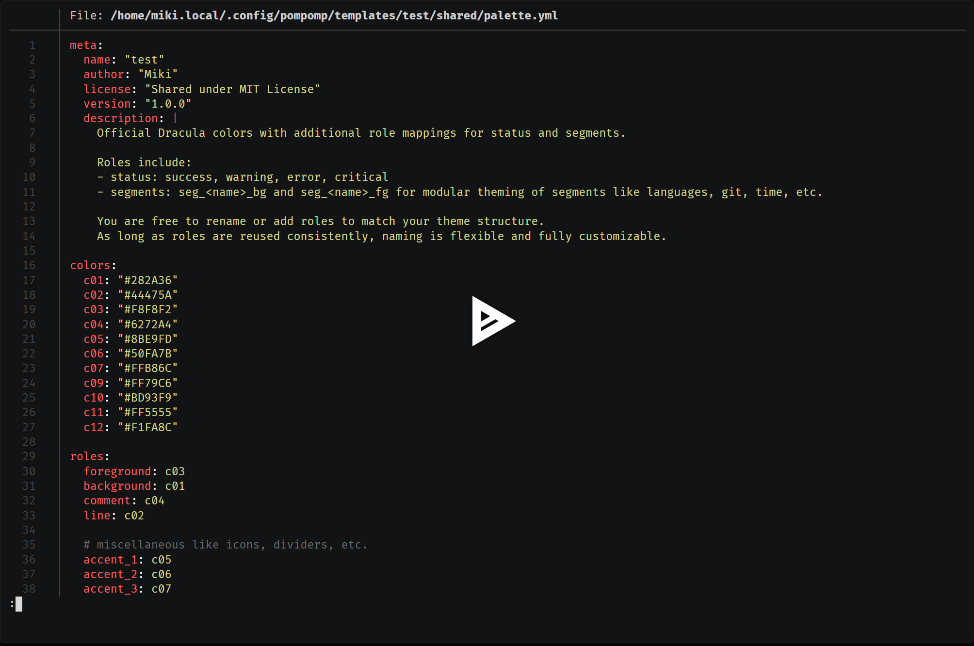
📋 Palette Example
# templates/default/shared/palette.yml
colors:
  cyan: "#7fdbff"
  pink: "#ff69b4"
  green: "#2ecc40"
  grey: "#bbbbbb"
roles:
  accent_5: cyan
  main_bg: grey
In a YAML segment:
foreground: "[palette:colors.pink]"    # will resolve to #ff69b4
background: "[palette:roles.main_bg]"  # will resolve to grey, then to #bbbbbb
🌱 Possible Uses
- Reuse the palette across all segments (even derived ones)
- Manage multiple variants (multi-palettes) from a single source
- Override certain roles to create custom variations (e.g., accent, fg, bg)
⚠️ Good to Know
- If a requested key doesn’t exist in the palette, you’ll get an explicit error : never a silent/implicit default.
- Strict fallback is managed by the Python module (
palette.py): each reference must point to a valid value. - If the directive format is malformed or the key doesn’t exist, you’ll get a detailed exception explaining how to fix it.
🛠️ Technical Note
[palette:colors.cyan]: looks upcyanincolors[palette:roles.accent_5]: looks upaccent_5inroles, then its color incolors
🚩 What to Avoid
- Watch out for typos: a typo in a role or color name will block theme generation.
- Try to always use the palette to maintain harmony in your theme (avoid hardcoding hex codes in layouts!)
ℹ️ Best Practices:
Once you’ve defined your colors in the palette, prefer using roles (
roles) to reference colors in your layouts/segments. Adapt the level of detail to your needs (super simple or ultra-precise, it’s up to you!).
💡 Tip: The
[palette:...]directive can also be used as a property to style[icons:...]and[ui:...]blocks. See DSL definitions & examples in Custom Icons (icons) and UI Glyphs & Visual Blocks (ui).
UI Glyphs & Visual Blocks (ui)
The [ui:...] directive is used to insert graphical glyphs from your icon palette (icons.yml) into your prompt. It’s
handy for visually injecting separators, closures, or other decorative elements, while applying one or more styles (
color, transparency, etc.).
🧩 Syntax & Typical Usage
-
No style (raw glyph):
template: "[ui:divider.right_half_circle_thick]" # injects the glyph as is (e.g. )
-
With style:
template: "[ui:divider.right_half_circle_thick, transparent]" # applies the 'transparent' style
-
With two styles:
template: "[ui:divider.right_half_circle_thick, palette:roles.line, transparent]" # color from palette + transparency
-
Use the Unicode code instead of the glyph:
template: "[ui:divider.right_half_circle_thick.code]" # returns the Unicode code (U+E0B4)
🌱 Possible Uses
- Quickly customize the appearance of segments without duplicating templates
- Dynamically change dividers, closures, etc. based on the theme
- Ensure graphical consistency across all prompts (by centralizing glyphs)
⚠️ Good to Know / Limitations
- The order of styles matters for the visual result
- Maximum two styles: if you add more, only the first two are used
- The access path must exist in
icons.yml, otherwise you'll get an immediate error
Custom Icons (icons)
The [icons:...] directive lets you inject any icon defined in the icons: section of your icons.yml,
either as a glyph (by default) or as a Unicode code (with .code). You can also apply a style (such as a palette color)
to the icon, making it visually fit your theme.
🧩 Syntax & Typical Usage
-
Simple icon (glyph):
template: "[icons:prompt.folder]" # injects the glyph (e.g. )
-
Unicode icon (code):
template: "[icons:git.branch_icon.code]" # injects the Unicode code (e.g., U+E725)
-
Styled icon with the palette:
template: "[icons:prompt.folder, palette:roles.line]" # applies color from the palette
🌱 Possible Uses
- Quickly add a pictogram to a segment, section, or status info
- Style an icon without changing the entire palette
- Display the Unicode code of a glyph (for debugging, documentation, or conditional rendering)
⚠️ Good to Know / Limitations
- Double-check the path spelling: any typo in the family, name, or attribute will raise an explicit error
- Maximum one style possible (unlike
[ui:...]which allows two) - Use
[ui:...]if you want to inject complex or decorative glyphs (dividers, closures, etc.)
🛠️ Technical Note
- The
.codeattribute returns the Unicode code; theglyphattribute (default) returns the visual character - Parsing and rendering are handled by the Python handler (
icons.py)
Conditional Blocks (if, else, end)
The [if ...], [else], and [end] blocks let you add advanced conditional logic to your pompomp templates.
These blocks are automatically transformed into Go-template syntax compatible with Oh My Posh, allowing you to
dynamically show, hide, or modify any segment or property based on the shell state, an OMP variable, an environment
variable, and more.
🧩 Syntax & Supported Operators
-
Comparisons (DSL → Go Template)
[if .UserName == 'root']        # → {{ if eq .UserName "root" }}
[if .Shell != 'pwsh']           # → {{ if ne .Shell "pwsh" }}
[if .Env.NUM > 5]               # → {{ if gt .Env.NUM 5 }}
[if .A <= .B]                   # → {{ if le .A .B }}
-
Combined Logic
[if .A > 0 and .B < 5]          # → {{ if and (gt .A 0) (lt .B 5) }}
[if .Root or .Admin]            # → {{ if or .Root .Admin }}
[if not .Debug]                 # → {{ if not .Debug }}
-
Contains (substring/element)
[if .Env.ENV contains 'PROD'] # → {{ if contains "PROD" .Env.ENV }}
-
Else / End
[else]                          # → {{ else }}
[end]                           # → {{ end }}
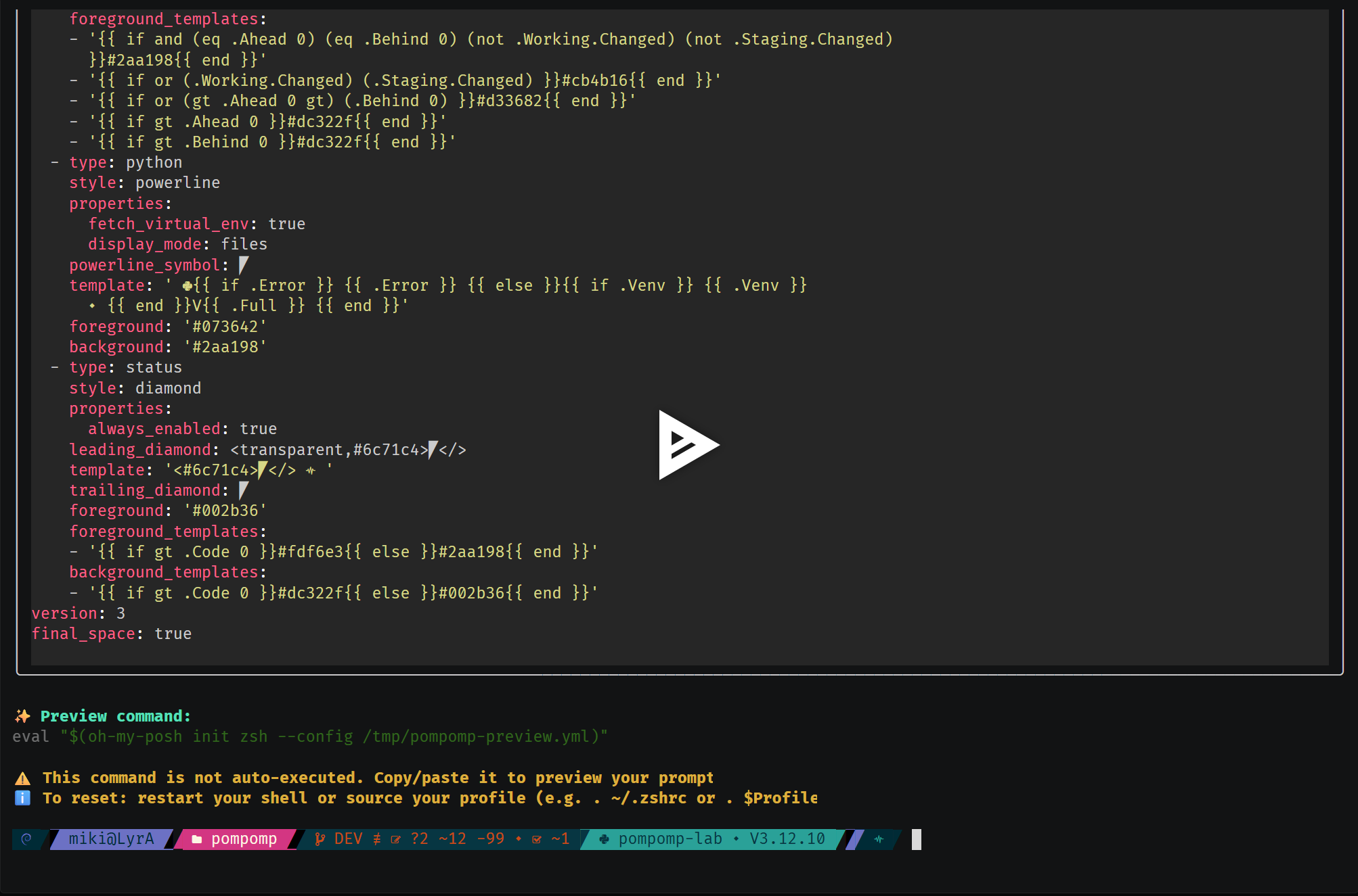
📋 Full Example
foreground_templates:
  - >-
    [if .Code > 0]
      [palette: roles.foreground]
    [else]
      [palette: roles.success]
    [end]
background_templates:
  - >-
    [if .Code > 0]
      [palette: roles.critical]
    [else]
      [palette: roles.background]
    [end]
Result after transformation:
foreground_templates:
  - '{{ if gt .Code 0 }}#F8F8F2{{ else }}#50FA7B{{ end }}'
background_templates:
  - '{{ if gt .Code 0 }}#FF5555{{ else }}#282A36{{ end }}'
🛠️ Technical Note / Mapping
- All
[if ...]expressions are translated on the fly into Go-template by the Python handler (ifm.py) - All standard DSL operators (
==,!=,>,<,<=,>=,contains) are automatically mapped to their Go-template equivalents (eq,ne,gt,lt,ge,le,contains) - Logical operators
and,or, andnotare supported (including combined or nested logic) - You can include any OMP variables in your conditions
- If the syntax is incorrect (typo, missing parenthesis, etc.), you’ll get a clear error message explaining the issue
🌱 Tips & Limitations
- Prefer simplicity: the more readable your conditions are, the easier they are to maintain
- String comparisons use double quotes in the final output
- You can chain or nest as many
[if ...],[else],[end]blocks as needed
OMP Variable Insertion ([.Var])
The [.Var] notation lets you directly insert any OMP variable into your pompomp templates.
During generation, it’s automatically translated into Go Template syntax ({{ .Var }}), usable anywhere OMP expects a
variable.
🛠️ Technical Note / Mapping
To see all available variables:
pompomp show-vars
You can filter by segment, keyword, family, etc. Example:
pompomp show-vars --family system --keyword time
💡 pompomp does not list segment properties, so take a look (or both eyes!) at the official OMP docs to see all available properties.
→ The full OMP documentation is available here: https://ohmyposh.dev/docs/configuration/segment
Contributions
All contributions are welcome 🤝, whether it's fixing a typo, suggesting a feature, or sharing a whole new theme!
If you find pompomp useful, or have an idea to make it better, feel free to fork, open a PR, or start a discussion. Every bit of help or feedback is much appreciated.
o( ^ ^ )o Thank you in advance for your interest in the project! o( ^ ^ )o
Sharing is caring!
- New segment or feature? If you add something cool, please consider sharing it back. It can help others, and I'll be happy to highlight your contribution.
- Made your own theme? Don’t hesitate to share your theme or palette! Community examples help everyone and are always welcome.
You can also open an Issue for questions, bugs, or just to say hi.
Thanks again for being part of the journey and helping make pompomp even better. 💚
Credits
Big thanks to Jan DE DOBBELEER for creating and maintaining Oh My Posh.
Without OMP, pompomp simply wouldn’t exist!
Special thanks to the following projects and authors for their work, which inspired and enriched pompomp :
- Powerline extra symbols: © ryanoasis/powerline-extra-symbols
- Dracula palette: © Zeno Rocha, draculatheme.com
- Tokyo Night palette: © folke/tokyonight.nvim
- Solarized palette: © Ethan SCHOONOVER, ethanschoonover.com/solarized
All user-contributed themes are credited to their respective authors.
pompomp is about modularity and sharing ; feel free to copy, fork, and remix!
License
MIT License
Copyright © • 2025 • Michel TRUONG
Permission is hereby granted, free of charge, to any person obtaining a copy of this software and associated documentation files (the "Software"), to deal in the Software without restriction, including without limitation the rights to use, copy, modify, merge, publish, distribute, sublicense, and/or sell copies of the Software, and to permit persons to whom the Software is furnished to do so, subject to the following conditions:
The above copyright notice and this permission notice shall be included in all copies or substantial portions of the Software.
THE SOFTWARE IS PROVIDED "AS IS", WITHOUT WARRANTY OF ANY KIND, EXPRESS OR IMPLIED, INCLUDING BUT NOT LIMITED TO THE WARRANTIES OF MERCHANTABILITY, FITNESS FOR A PARTICULAR PURPOSE AND NONINFRINGEMENT. IN NO EVENT SHALL THE AUTHORS OR COPYRIGHT HOLDERS BE LIABLE FOR ANY CLAIM, DAMAGES OR OTHER LIABILITY, WHETHER IN AN ACTION OF CONTRACT, TORT OR OTHERWISE, ARISING FROM, OUT OF OR IN CONNECTION WITH THE SOFTWARE OR THE USE OR OTHER DEALINGS IN THE SOFTWARE.
Release history Release notifications | RSS feed

Download files
Download the file for your platform. If you're not sure which to choose, learn more about installing packages.
Source Distribution
Built Distribution
Filter files by name, interpreter, ABI, and platform.
If you're not sure about the file name format, learn more about wheel file names.
Copy a direct link to the current filters
File details
Details for the file pompomp-1.0.1.tar.gz.
File metadata
- Download URL: pompomp-1.0.1.tar.gz
- Upload date:
- Size: 99.2 kB
- Tags: Source
- Uploaded using Trusted Publishing? No
- Uploaded via: twine/6.1.0 CPython/3.12.9
File hashes
| Algorithm | Hash digest | |
|---|---|---|
| SHA256 |
7220fd0c9ad5dccd170ce1304b2b6908271fdccbcf9deaff0dc18dd500ca9506
|
|
| MD5 |
86e8c57f213e4829688f750bc6354c5a
|
|
| BLAKE2b-256 |
8767c914046f8f92f7bfb257eb9321c3a056ca45bbe4e7936decc01e98c2c116
|
File details
Details for the file pompomp-1.0.1-py3-none-any.whl.
File metadata
- Download URL: pompomp-1.0.1-py3-none-any.whl
- Upload date:
- Size: 122.1 kB
- Tags: Python 3
- Uploaded using Trusted Publishing? No
- Uploaded via: twine/6.1.0 CPython/3.12.9
File hashes
| Algorithm | Hash digest | |
|---|---|---|
| SHA256 |
3bd9102f313806bbe8232e3be7f2c04707de075b857c04c0821c28064dece1df
|
|
| MD5 |
f0ced2967c2e1a4cef1c4755e4eb8623
|
|
| BLAKE2b-256 |
08153e71159b5c4f3c784872d33e99f9c3d4a6940f696cc99c3fe7d6f8965b7a
|


