Dice plots for high-dimensional categorical data, with matplotlib and plotly backends


Project description
pydiceplot






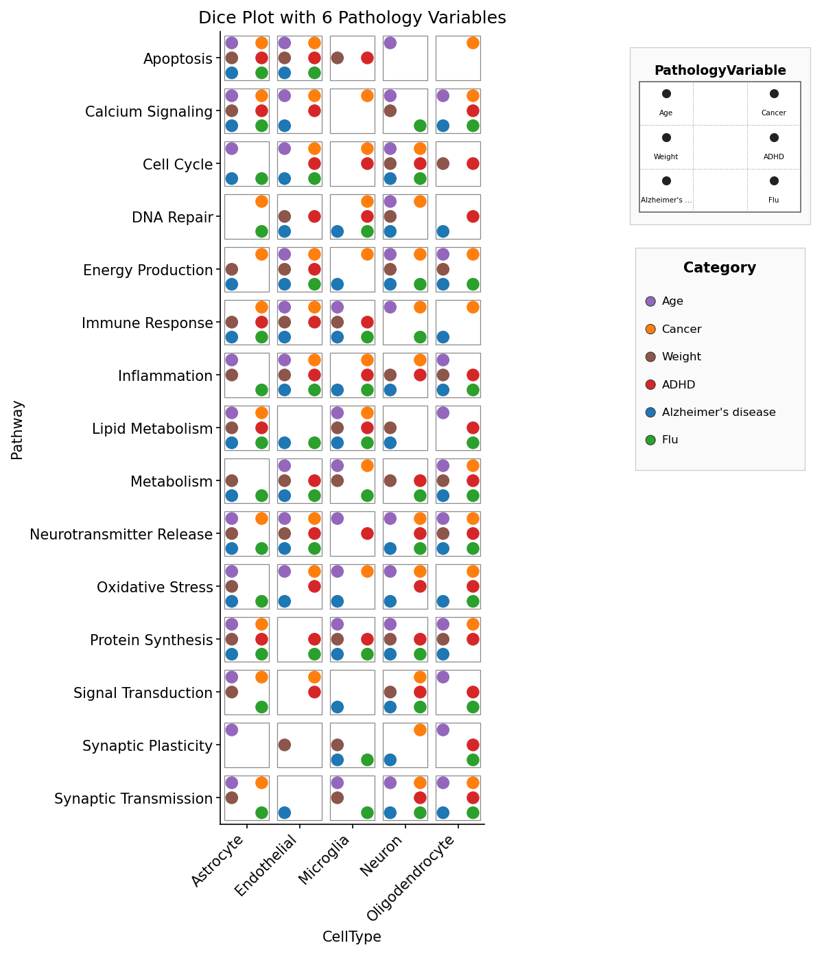
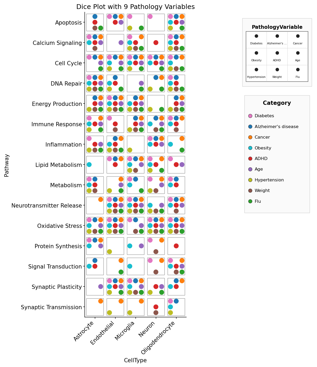
pydiceplot draws dice plots: grids of die-face icons that encode up to
nine categorical variables (one per pip slot) plus optional continuous fill
and size mappings. It also ships a refactored domino_plot(...) API for
two-contrast feature-by-celltype panels. Both plot types share matplotlib and
plotly backends with seaborn-style entry points.
It's the Python sibling of the R package
ggdiceplot. The grid geometry and
legend stack are ports of
kuva's DicePlot, which is itself a
port of ggdiceplot::geom_dice — so all three packages produce the same
visual layout (with one intentional fix: n=6 is the traditional two-column
die face rather than ggdiceplot's transposed two-row layout).
Install
pip install pydiceplot
For development against this repo:
git clone https://github.com/maflot/pydiceplot.git
cd pydiceplot
pixi install
pixi run test     # run the test suite
pixi run example  # regenerates the showcase images under images/
pixi run build    # sdist + wheel in dist/
pixi run precommit
Quick start
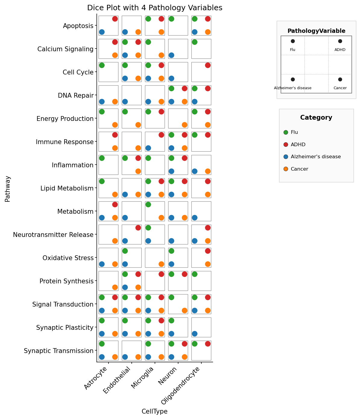
Categorical mode — each pip is coloured by its pips value:
import matplotlib.pyplot as plt
import pydiceplot
from pydiceplot import dice_plot
from pydiceplot.plots.backends._dice_utils import (
    get_diceplot_example_data, get_example_cat_c_colors,
)

pydiceplot.set_backend("matplotlib")
data = get_diceplot_example_data(4)
colors = dict(list(get_example_cat_c_colors().items())[:4])

fig, ax = dice_plot(
    data,
    x="CellType", y="Pathway", pips="PathologyVariable",
    pip_colors=colors,
    title="Dice Plot with 4 Pathology Variables",
    figsize=(9, 10),
)
fig.savefig("dice_4.png", dpi=150, bbox_inches="tight")
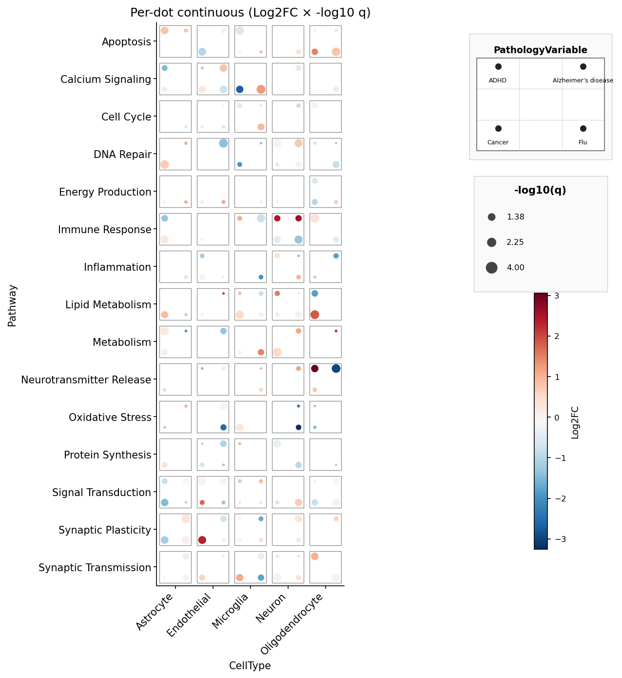
Per-pip continuous fill + size — mirrors ggdiceplot's
geom_dice(aes(dots=..., fill=lfc, size=-log10(q))) (we rename dots →
pips since the marks on a die are formally called pips):
import numpy as np
from pydiceplot import dice_plot

rng = np.random.default_rng(1)
data = get_diceplot_example_data(4)
data["lfc"] = rng.normal(0, 1.2, len(data))
data["nlq"] = rng.uniform(0.5, 4, len(data))

fig, ax = dice_plot(
    data,
    x="CellType", y="Pathway", pips="PathologyVariable",
    fill="lfc", size="nlq",
    fill_label="Log2FC", size_label="-log10(q)",
    cmap="RdBu_r",
    title="Per-dot continuous",
)
Plotly — same API, returns a plotly.graph_objects.Figure:
pydiceplot.set_backend("plotly")
fig = dice_plot(data, x="CellType", y="Pathway", pips="PathologyVariable",
                fill="lfc", size="nlq", cmap="RdBu_r",
                width=900, height=650)
fig.write_image("dice.png")
Drawing into an existing axes (skips the built-in right-side legend stack so you can compose your own multi-panel figure):
fig, axes = plt.subplots(1, 2, figsize=(14, 6))
dice_plot(data, x="CellType", y="Pathway", pips="PathologyVariable",
          pip_colors=colors, ax=axes[0])
axes[1].plot(range(10))
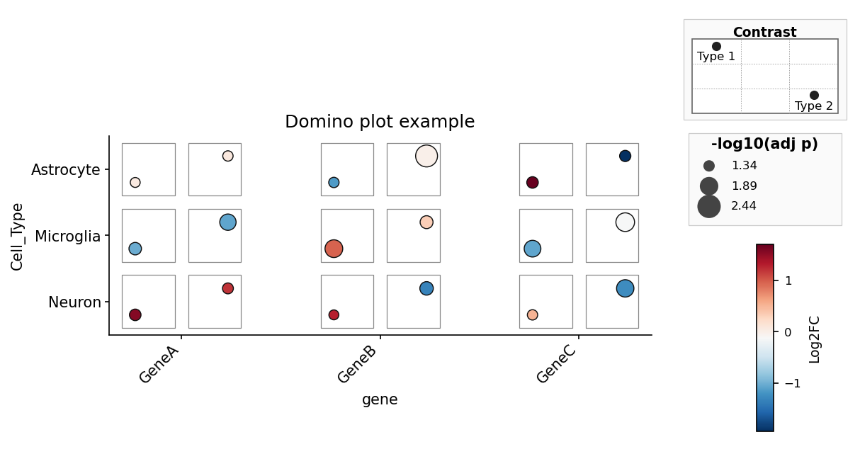
Domino plots use a matching column-first API. Each tile is a
(feature, celltype) pair with exactly two contrast slots:
from pydiceplot import domino_plot
from pydiceplot.plots.backends._domino_utils import get_domino_example_data

data = get_domino_example_data()

fig, ax = domino_plot(
    data,
    "gene", "Cell_Type", "Group",
    features=["GeneA", "GeneB", "GeneC"],
    label="var",
    fill="logFC",
    size="neg_log10_adj_p",
    contrast_order=["Type1", "Type2"],
    contrast_labels=["Type 1", "Type 2"],
    fill_label="Log2FC",
    size_label="-log10(adj p)",
    figsize=(9, 5.5),
)
Modes
dice_plot has three input modes, picked by which arguments you pass:
| Mode | Trigger | What each pip encodes |
|---|---|---|
| Categorical | pip_colors={label: hex, ...} |
filled circle in its category colour when present |
| Per-pip continuous | fill="col" and/or size="col" |
continuous colour and/or size from numeric columns |
| Per-pip discrete | fill="col" + fill_palette={value: hex, ...} |
colour per discrete fill value; pip slot still comes from pips |
The legend stack on the right always includes a position legend showing
which pip slot maps to which pips value, plus a colorbar and size legend
when continuous mappings are active. That stacking matches
ggdiceplot::draw_key semantics.
Sample output
Everything below is produced by example_code/example.py. Regenerate with
pixi run example.
Quick tour
Domino example
The standalone domino example lives in example_code/example_domino.py.
1-to-1 ports of ggdiceplot's demo plots
Each script in example_code/ reproduces one of the figures from
ggdiceplot/demo_output/, loading the original R sample data exported to
CSV under example_code/data/.
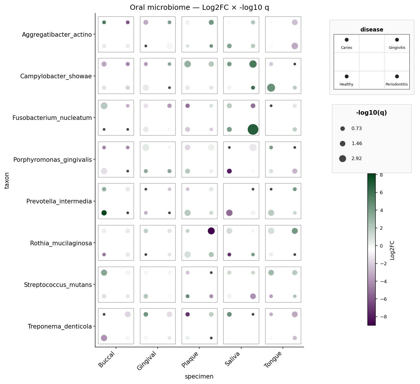
Oral microbiome — 8 taxa × 5 specimens × 4 diseases, per-pip Log2FC and
-log10 q. Mirrors sample_dice_data2 / example2.png.
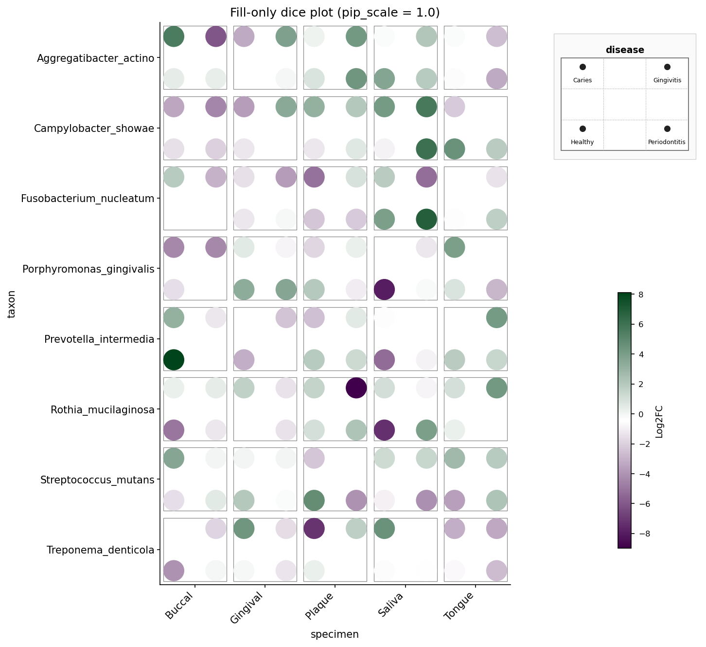
Oral microbiome, fill-only — same data but size is constant and
pip_scale=1.0 fills the die face fully. Mirrors example4_fill_only.png.
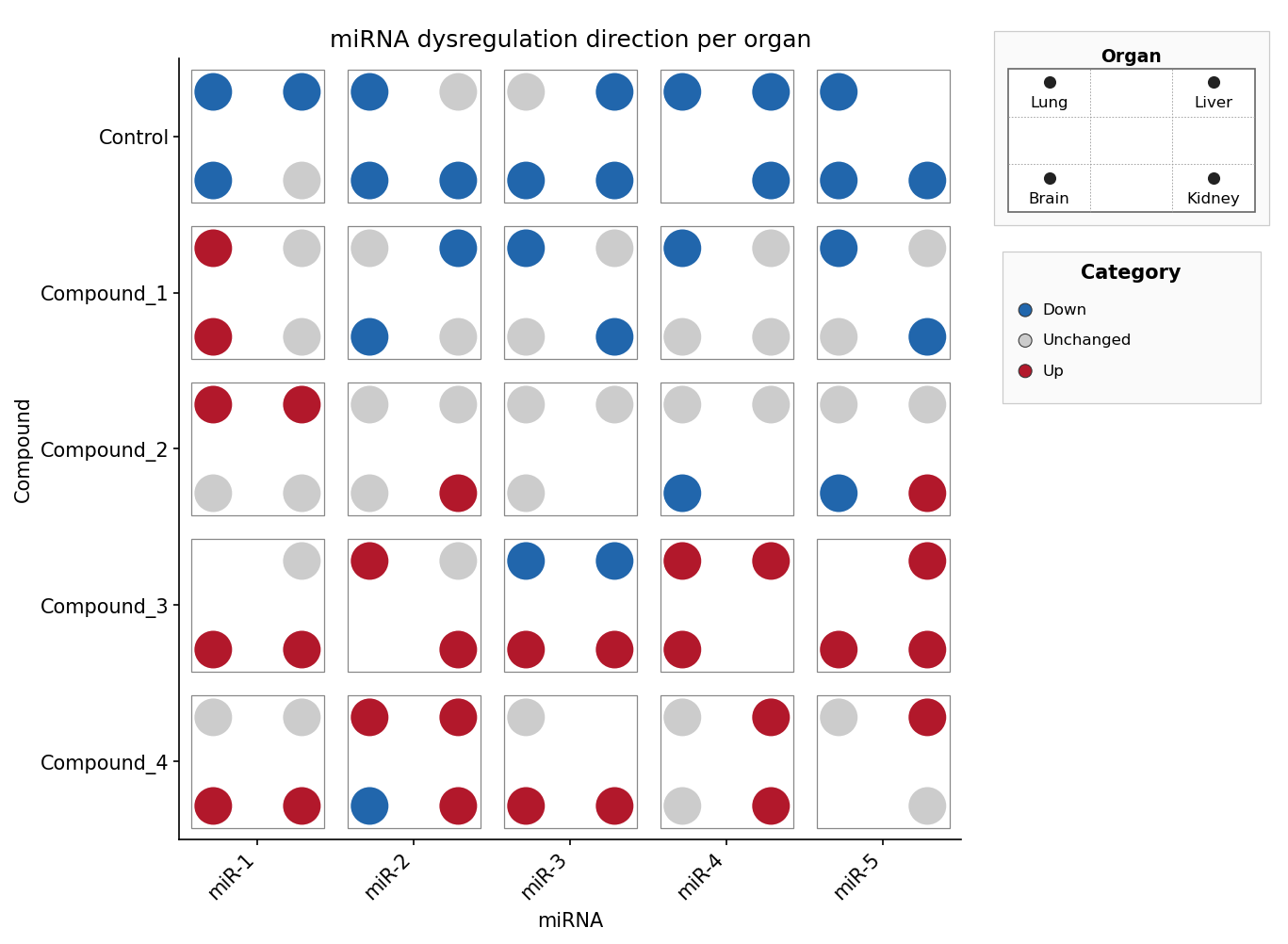
miRNA × compound × organ, discrete direction — the pip slot selects the
organ, the pip colour encodes the regulation direction (Down / Unchanged /
Up) via fill_palette. Mirrors sample_dice_miRNA.
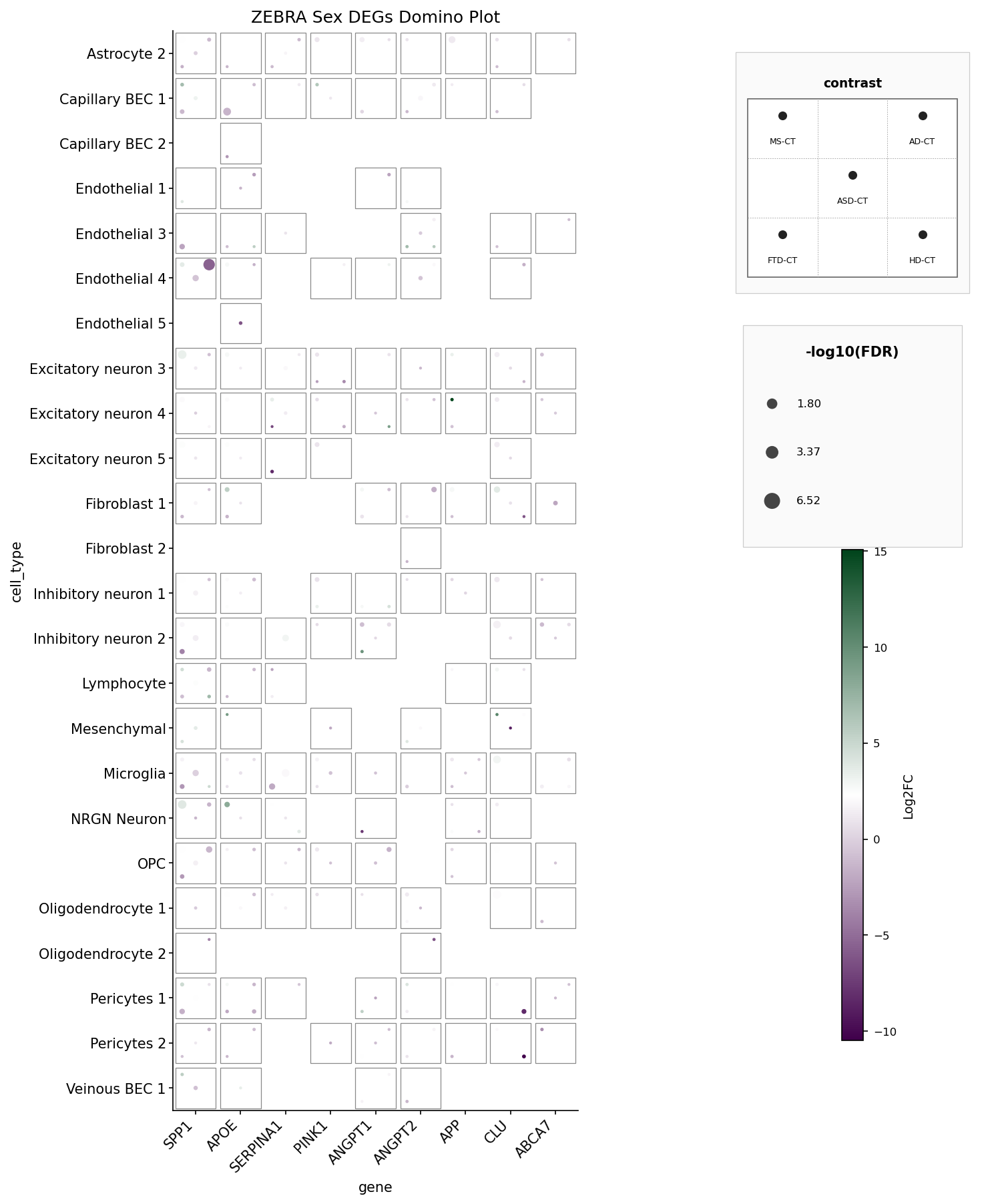
ZEBRA Sex DEGs domino plot — 9 genes × 27 cell types × 5 disease
contrasts, filtered to PValue < 0.05. Mirrors ZEBRA_domino_example.png.
Creative n=9 example
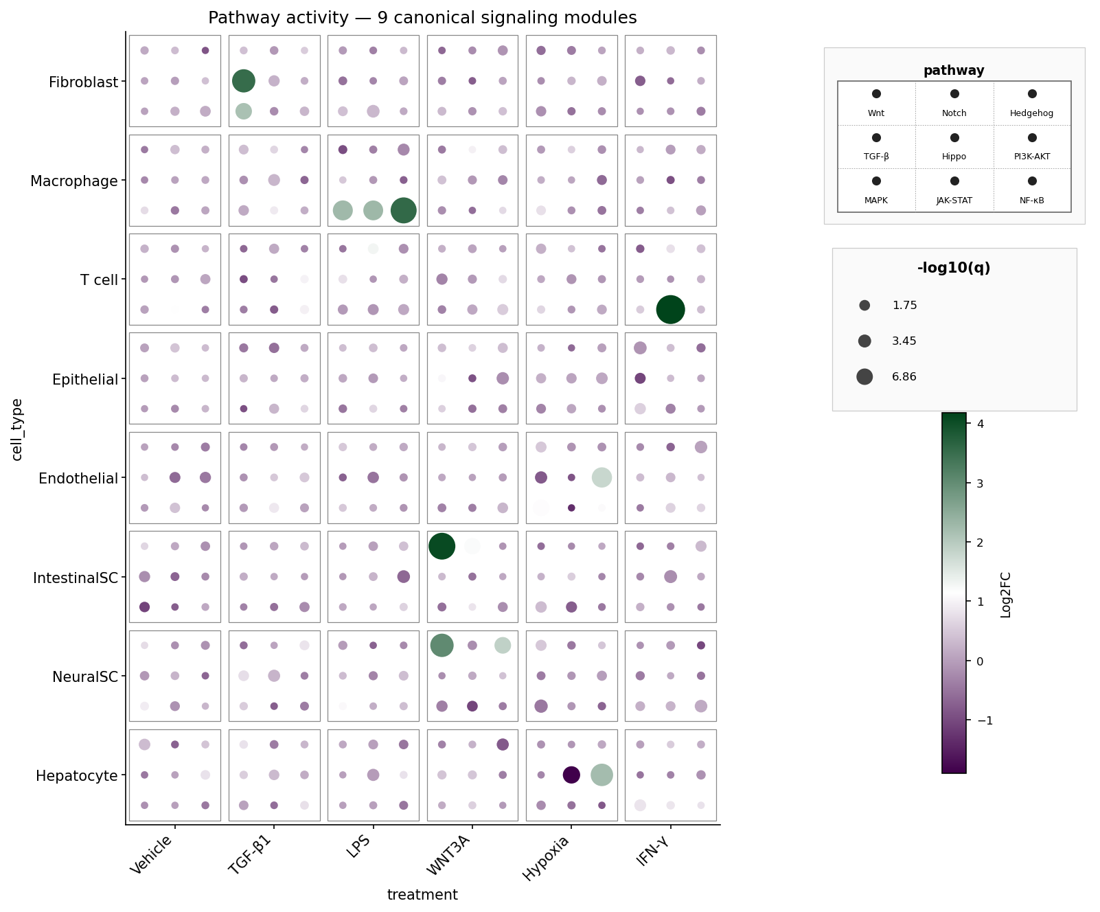
A fully populated 3×3 die face: nine canonical signaling pathways (Wnt, Notch, Hedgehog, TGF-β, Hippo, PI3K-AKT, MAPK, JAK-STAT, NF-κB) per cell-type × treatment tile. Pip colour = Log2FC, pip size = -log10 q. The synthetic data boosts biologically plausible pathway hits: fibroblasts respond to TGF-β1 via TGF-β, macrophages activate NF-κB / JAK-STAT / MAPK under LPS, intestinal stem cells light up Wnt under WNT3A, and so on.
API
dice_plot(data, x, y, pips, *, ...)
dice_plot(
    data, x, y, pips, *,
    # pip encoding
    pip_colors=None,       # dict {pips value: hex} — categorical colour per pip
    fill=None,             # str — per-pip fill column (continuous or discrete)
    fill_palette=None,     # dict {fill value: hex} — discrete fill lookup
    size=None,             # str — numeric per-pip size column
    # ordering
    x_order=None, y_order=None, pips_order=None,
    # dice geometry
    pip_scale=0.85, tile_size=0.85, grid_lines=False,
    # colour scales
    fill_range=None, size_range=None, cmap="viridis",
    # labels
    title=None, xlabel=None, ylabel=None,
    fill_label=None, size_label=None, pips_label=None,
    # plot target
    ax=None,                  # matplotlib: existing Axes (skips legend stack)
    fig=None,                 # plotly: existing Figure (skips legend stack)
    figsize=None,             # matplotlib: (width_in, height_in)
    width=None, height=None,  # plotly: pixels
    max_pips=9,
)
Returns
- matplotlib:
(Figure, Axes)when we create the figure, justAxeswhen the caller suppliesax=. - plotly:
plotly.graph_objects.Figure.
Use the native save/show methods on the return value: fig.savefig(...) /
plt.show() for matplotlib, fig.write_image(...) / fig.show() for plotly.
domino_plot(data, feature, celltype, contrast, *, ...)
domino_plot(
    data, feature, celltype, contrast, *,
    features=None,          # optional feature filter; also sets order by default
    label=None,             # optional hover/annotation column
    fill="logFC",           # numeric fill column
    size="neg_log10_adj_p", # numeric size column
    feature_order=None, celltype_order=None,
    contrast_order=None,    # must contain exactly two contrast values
    contrast_labels=None,   # human-readable labels for those two slots
    switch_axis=False,
    fill_range=None, size_range=None, cmap="RdBu_r",
    title=None, xlabel=None, ylabel=None,
    fill_label=None, size_label=None,
    ax=None,                  # matplotlib: existing Axes
    fig=None,                 # plotly: existing Figure
    figsize=None,             # matplotlib: (width_in, height_in)
    width=None, height=None,  # plotly: pixels
)
Returns
- matplotlib:
(Figure, Axes)when we create the figure, justAxeswhen the caller suppliesax=. - plotly:
plotly.graph_objects.Figure.
Pip slot layout
The 3×3 pip grid uses natural row-major reading order:
pos 1 (TL)  pos 2 (TM)  pos 3 (TR)
pos 4 (ML)  pos 5 (MM)  pos 6 (MR)
pos 7 (BL)  pos 8 (BM)  pos 9 (BR)
Dice sizes pick from this table (traditional die faces; n=6 is two vertical
columns, unlike ggdiceplot::make_offsets which returns the transposed
two-row layout — we deliberately diverge here):
| n | positions | visual |
|---|---|---|
| 1 | [5] |
center |
| 2 | [1, 9] |
diagonal (TL + BR) |
| 3 | [1, 5, 9] |
diagonal + center |
| 4 | [1, 3, 7, 9] |
four corners |
| 5 | [1, 3, 5, 7, 9] |
corners + center |
| 6 | [1, 3, 4, 6, 7, 9] |
two vertical columns |
| 7 | [1, 3, 4, 5, 6, 7, 9] |
6 + center |
| 8 | [1, 2, 3, 4, 6, 7, 8, 9] |
3×3 minus center |
| 9 | [1, 2, 3, 4, 5, 6, 7, 8, 9] |
fully populated 3×3 |
Citation
If you use this package, please cite:
M. Flotho, P. Flotho, A. Keller, "DicePlot: a package for high-dimensional categorical data visualization," Bioinformatics, vol. 42, no. 2, btaf337, 2026.
@article{flotho2026diceplot,
  title   = {DicePlot: a package for high-dimensional categorical data visualization},
  author  = {Flotho, Matthias and Flotho, Philipp and Keller, Andreas},
  journal = {Bioinformatics},
  volume  = {42},
  number  = {2},
  pages   = {btaf337},
  year    = {2026},
  publisher = {Oxford University Press}
}
Related packages
ggdiceplot— the R / ggplot2 siblingkuva— a Rust plotting library that ships a dice plot
License
MIT — see LICENSE.
Release history Release notifications | RSS feed


Download files
Download the file for your platform. If you're not sure which to choose, learn more about installing packages.
Source Distribution
Built Distribution
Filter files by name, interpreter, ABI, and platform.
If you're not sure about the file name format, learn more about wheel file names.
Copy a direct link to the current filters
File details
Details for the file pydiceplot-1.0.0.tar.gz.
File metadata
- Download URL: pydiceplot-1.0.0.tar.gz
- Upload date:
- Size: 1.4 MB
- Tags: Source
- Uploaded using Trusted Publishing? Yes
- Uploaded via: twine/6.1.0 CPython/3.13.12
File hashes
| Algorithm | Hash digest | |
|---|---|---|
| SHA256 |
38bea845e3ded27f282b07876333e47aeb481acb01c09bb2534084531c26aca9
|
|
| MD5 |
640dd4a58dcdc4a2a5ad57146062ce15
|
|
| BLAKE2b-256 |
8ee31750f96ce9eb9d1cf2d3aa4f0bad7539616daa1516f103dd52abcde329d1
|
Provenance
The following attestation bundles were made for pydiceplot-1.0.0.tar.gz:
Publisher:
pypi-release.yml on maflot/pydiceplot
-
Statement:
-
Statement type:
https://in-toto.io/Statement/v1 -
Predicate type:
https://docs.pypi.org/attestations/publish/v1 -
Subject name:
pydiceplot-1.0.0.tar.gz -
Subject digest:
38bea845e3ded27f282b07876333e47aeb481acb01c09bb2534084531c26aca9 - Sigstore transparency entry: 1342615887
- Sigstore integration time:
-
Permalink:
maflot/pydiceplot@23dd33e75a8eb18d9f3f475d6592f8104234a01f -
Branch / Tag:
refs/tags/v1.0.0 - Owner: https://github.com/maflot
-
Access:
public
-
Token Issuer:
https://token.actions.githubusercontent.com -
Runner Environment:
github-hosted -
Publication workflow:
pypi-release.yml@23dd33e75a8eb18d9f3f475d6592f8104234a01f -
Trigger Event:
push
-
Statement type:
File details
Details for the file pydiceplot-1.0.0-py3-none-any.whl.
File metadata
- Download URL: pydiceplot-1.0.0-py3-none-any.whl
- Upload date:
- Size: 30.1 kB
- Tags: Python 3
- Uploaded using Trusted Publishing? Yes
- Uploaded via: twine/6.1.0 CPython/3.13.12
File hashes
| Algorithm | Hash digest | |
|---|---|---|
| SHA256 |
036e49911066c29abe075a9a7b0ecbb38fc9142f2ea819dbe38698b65fd24f36
|
|
| MD5 |
990f51e79563f4d40d8e05adb4ba7bde
|
|
| BLAKE2b-256 |
d2cd59eaf4b1f44de8470e220e6a3fb22973d9aa049011f8d526acd8d53cce3b
|
Provenance
The following attestation bundles were made for pydiceplot-1.0.0-py3-none-any.whl:
Publisher:
pypi-release.yml on maflot/pydiceplot
-
Statement:
-
Statement type:
https://in-toto.io/Statement/v1 -
Predicate type:
https://docs.pypi.org/attestations/publish/v1 -
Subject name:
pydiceplot-1.0.0-py3-none-any.whl -
Subject digest:
036e49911066c29abe075a9a7b0ecbb38fc9142f2ea819dbe38698b65fd24f36 - Sigstore transparency entry: 1342615894
- Sigstore integration time:
-
Permalink:
maflot/pydiceplot@23dd33e75a8eb18d9f3f475d6592f8104234a01f -
Branch / Tag:
refs/tags/v1.0.0 - Owner: https://github.com/maflot
-
Access:
public
-
Token Issuer:
https://token.actions.githubusercontent.com -
Runner Environment:
github-hosted -
Publication workflow:
pypi-release.yml@23dd33e75a8eb18d9f3f475d6592f8104234a01f -
Trigger Event:
push
-
Statement type: