Quick and Easy way to do descriptive analysis.

Project description
qdesc : Quick and Easy Descriptive Analysis


Installation
pip install qdesc
What's New?
- Version 1.1.1: Fixed the following: qd.purvis_bar function to return fig, ax for easy image save.
Fixed the QDesc ReadMe file. - Version 1.1.0: Introduced two new functions, purvis_rose and purvis_bubble, to create purposive rose charts and bubble charts respectively.
Updated the docstring and provided specific details on the Return section for purposive data visualization functions.
Updated data visualization functions to return fig, ax for easy image save using: fig.savefig("datavis.png", dpi=300).
Provided a link to available QDesc Color Palettes in said section of this Read Me. - Version 1.0.9.9: Updated dependency versions to ensure compatibility and prevent import errors with recent scipy releases.
- Version 1.0.9.8: Fixed the README to show the image of the updated qd.normcheck_dashboard() function.
- Version 1.0.9.7: Updated the README to reflect the changes in the outputs of qd.desc(), qd.grp_desc(), and qd.normcheck_dashboard() functions.
- Version 1.0.9.6: Updated the qd.desc() function to use the SciPy "interpolate" method for Anderson-Darling p-value calculation, ensuring compatibility with SciPy >= 1.17.
Users no longer need to manually compare Anderson-Darling statistics with critical values; p-value is now returned directly. - Version 1.0.9.5: Updated the Readme file.
- Version 1.0.9.4: Introduced docstrings for purposive data visualizations.
- Version 1.0.9.1: Provided docstrings for descriptive statistics functions. See them via function? (i.e., qd.desc?)
- Version 1.0.8.8: QDesc introduces three new visualization functions designed to make column, bar, and line charts more intentional and expressive.
Purpose-Driven Rose, Bubble, Bar, Column, Line Visualizations
These new tools allow you to emphasize what matters most by selectively highlighting either the top or bottom values in your data. You control how many values are emphasized, making it easy to tailor each chart to your reporting needs whether you are spotlighting top performers or calling attention to areas that need improvement.
Custom Color Palettes
To complement this focused storytelling, the new functions support beautiful, customizable color palettes. Choose from curated palettes to match your brand, publication style, or personal preference without sacrificing clarity or visual impact. Currently supports: teal, dark_blue, rose, earth, mono, dawn, stern, directions, spritz, breeze, and yang color palette. Click Here (right-click and Open in new tab)
Clear Insights, Thoughtful Design
Together, these enhancements make it easier to create charts that are not just visually appealing but also purposeful in guiding the audience attention exactly where it belongs.
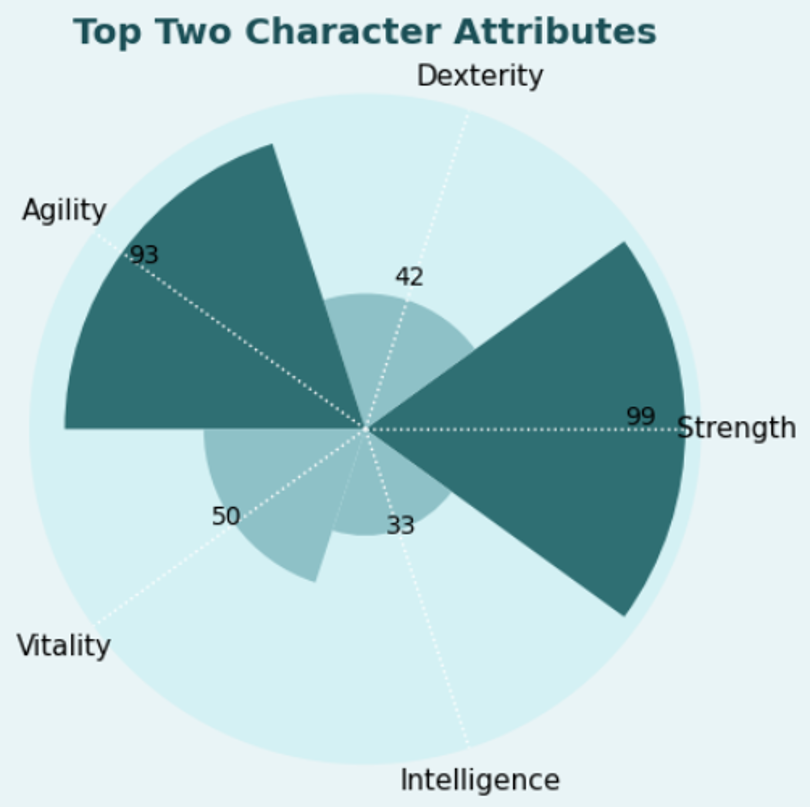
The New purvis_rose function
df = pd.DataFrame({
    "Attribute": ["Strength", "Dexterity", "Agility", "Vitality", "Intelligence"],
    "Value": [99, 42, 93, 50, 33]
})

qd.purvis_rose(df,
            value_col="Value",
            label_col="Attribute",
            palette = "teal",
            title="Top Two Character Attributes",
            highlight='top',
            n_highlight=2)
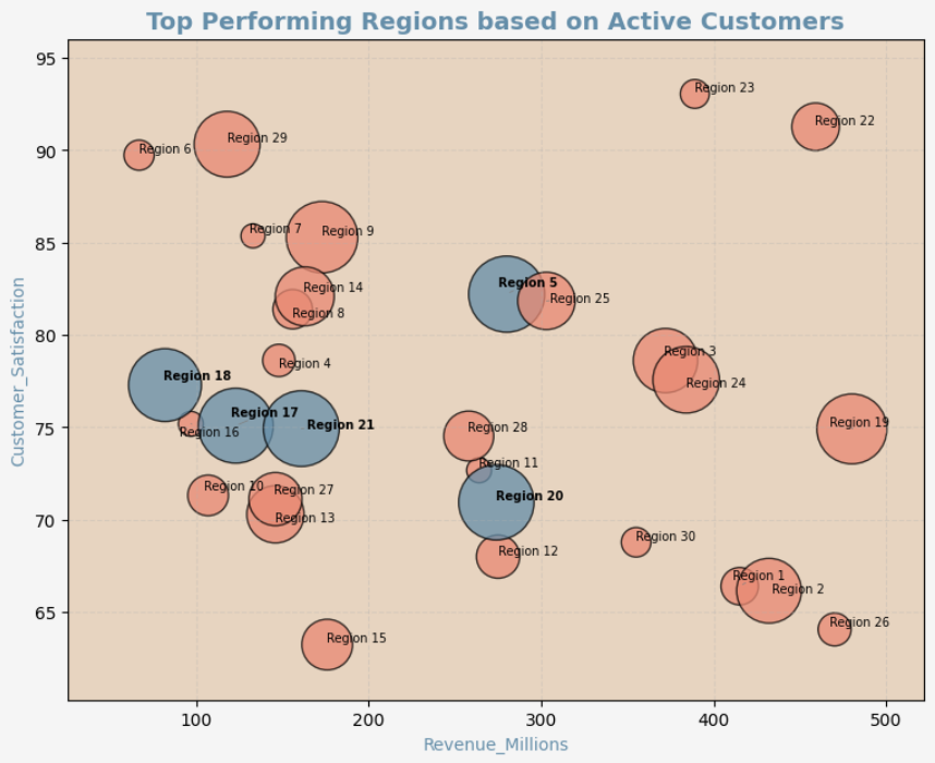
The New purvis_bubble function
import pandas as pd
import numpy as np

np.random.seed(123)

df_sales = pd.DataFrame({
    "Region": [f"Region {i}" for i in range(1, 31)],
    "Revenue_Millions": np.random.randint(50, 500, 30),
    "Customer_Satisfaction": np.random.uniform(60, 95, 30),
    "Active_Customers_Thousands": np.random.randint(10, 300, 30)
})

qd.purvis_bubble(
    df_sales,
    x_col="Revenue_Millions",
    y_col="Customer_Satisfaction",
    size_col="Active_Customers_Thousands",
    label_col="Region",
    palette = "yang",
    mode="top",
    top_n=5,
    show_all_labels=True,
    title="Top Performing Regions based on Active Customers"
)
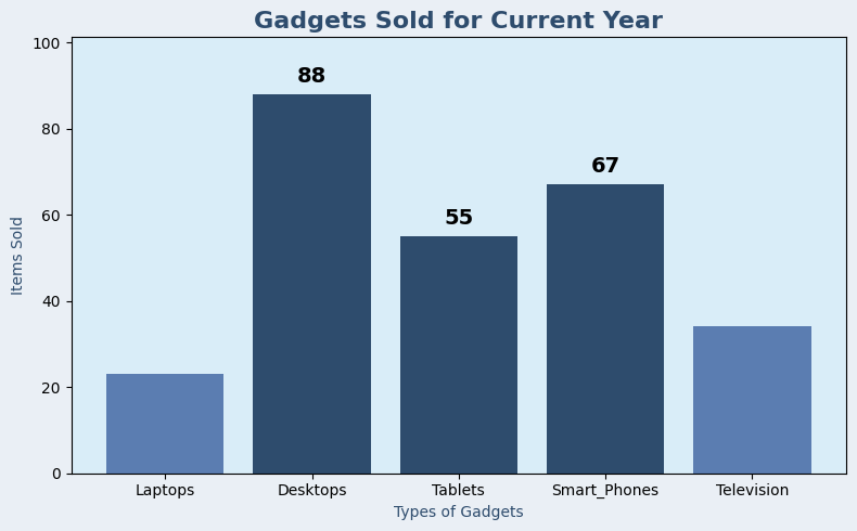
The New purvis_col function
import pandas as pd
import qdesc as qd

df = pd.DataFrame({
    'Category': ['Laptops', 'Desktops', 'Tablets', 'Smart_Phones', 'Television'],
    'Value': [23, 88, 55, 67, 34]
})

qd.purvis_col(df,
           title = "Gadgets Sold for Current Year",
           category_col='Category',
           value_col='Value',
           xlabel= "Types of Gadgets",
           ylabel = "Items Sold",
           mode = "top", # can be adjusted to top or bottom
           top_n = 3, # adjust the number of highlighted columns
           palette = "dark_blue") # change color palette based on your preference. listing available at qdesc pypi documentation
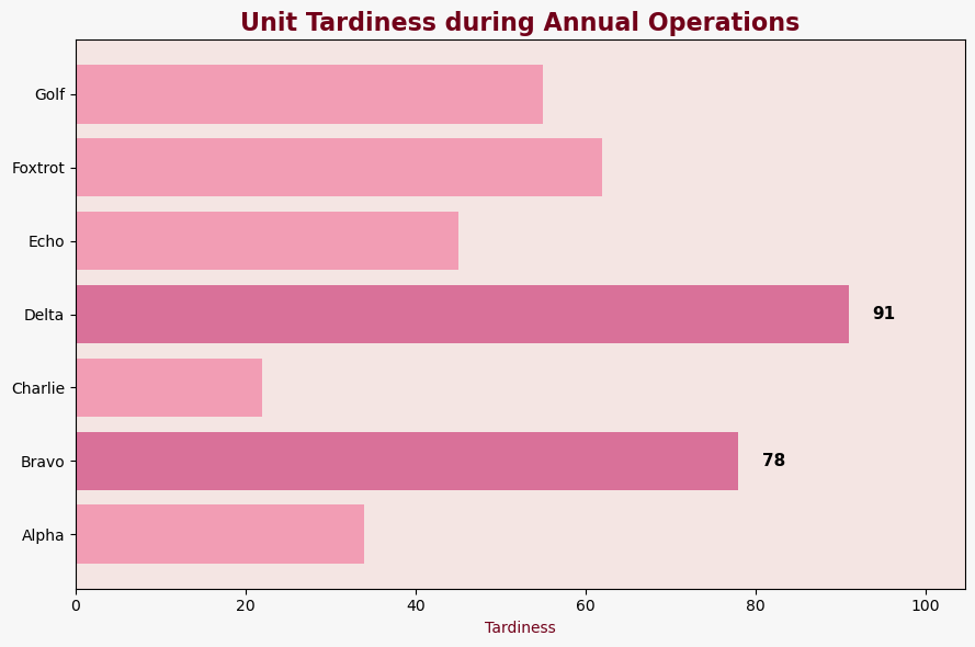
The New purvis_bar function
import pandas as pd
import qdesc as qd

df = pd.DataFrame({
    'Category': ['Alpha', 'Bravo', 'Charlie', 'Delta', 'Echo', 'Foxtrot', 'Golf'],
    'Value':    [34,78,22,91,45,62,55]
})

qd.purvis_bar(df,
           title = "Unit Tardiness during Annual Operations",
           category_col = "Category",
           value_col = "Value",
           xlabel= "Tardiness",
           top_n = 2, # adjust the number of highlighted columns
           mode = "top", # can be adjusted to top or bottom
           palette = "rose") # change color palette based on your preference. listing available at qdesc pypi documentation
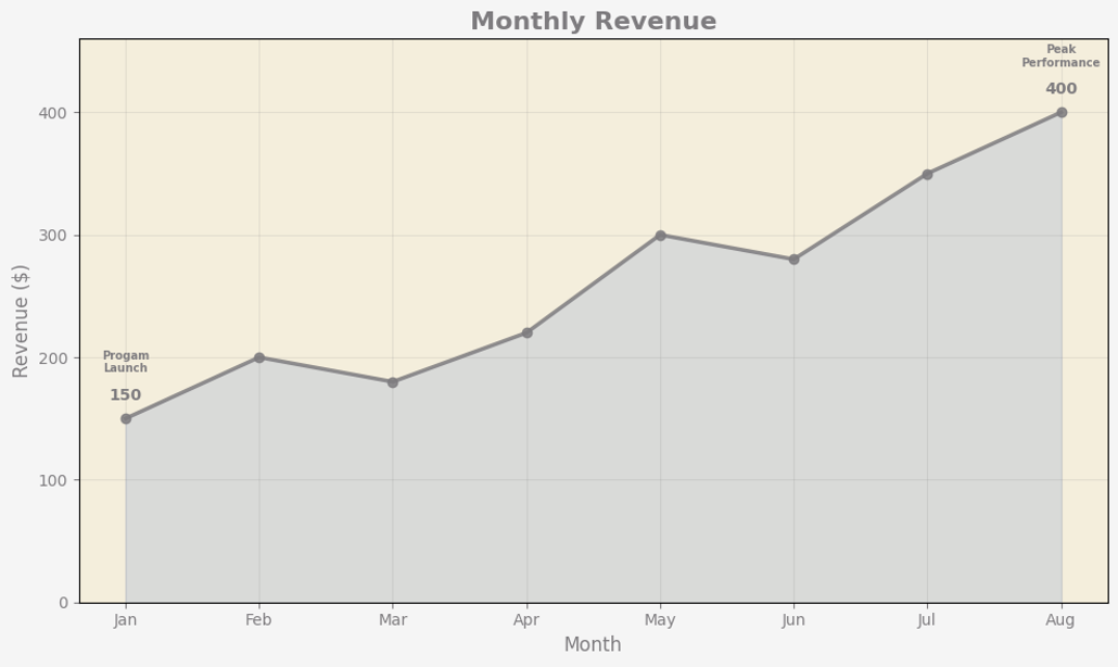
The New purvis_line function
import pandas as pd
import qdesc as qd

# Sample data
df = pd.DataFrame({
    'Period': ['Jan', 'Feb', 'Mar', 'Apr', 'May', 'Jun', 'Jul', 'Aug'],
    'Sales': [150, 200, 180, 220, 300, 280, 350, 400]
})

# Indicate the annotations on the line chart that you wish to have
annotations_list = [
    {"x": "Aug", "text": "Peak Performance"},
    {"x": "Jan", "text": "Progam Launch"}
]

qd.purvis_line(
    df,
    x_col="Period",
    y_col="Sales",
    title="Monthly Revenue",
    xlabel="Month",
    ylabel="Revenue ($)",
    palette="stern", # change color palette based on your preference. listing available at qdesc pypi documentation
    mode="both", # can be top, bottom, or both
    top_n= 1, # adjust the number of highlighted columns
    marker_shape='o',  # can be 'o' for circle, 's' for square, 'D' for diamond, '^' for triangle pointing upwards, and 'v' for triangle pointing downwards
    line_width=2.5,
    light_grid=True, # prefer to have a light grid or not
    annotations = annotations_list
)
Overview
Qdesc is a package for quick and easy descriptive analysis. It is a powerful Python package designed for quick and easy descriptive analysis of quantitative data. It provides essential statistics like mean and standard deviation for normal distribution and median and raw/norm median absolute deviation for skewed data. With built-in functions for frequency distributions, users can effortlessly analyze categorical variables and export results to a spreadsheet. The package also includes a normality check dashboard, featuring Anderson-Darling statistics and visualizations like histograms and Q-Q plots. Whether you're handling structured datasets or exploring statistical trends, qdesc streamlines the process with efficiency and clarity.
Creating a sample dataframe
import pandas as pd
import numpy as np

# Create sample data
np.random.seed(42)  # Set the seed for reproducibility

data = {
    "Age": np.random.randint(18, 60, size=570),  # Continuous variable
    "Salary": np.random.randint(30000, 120000, size=570),  # Continuous variable
    "Department": np.random.choice(["HR", "Finance", "IT", "Marketing"], size=570),  # Categorical variable
    "Gender": np.random.choice(["Male", "Female"], size=570),  # Categorical variable
}

# Create DataFrame
df = pd.DataFrame(data)
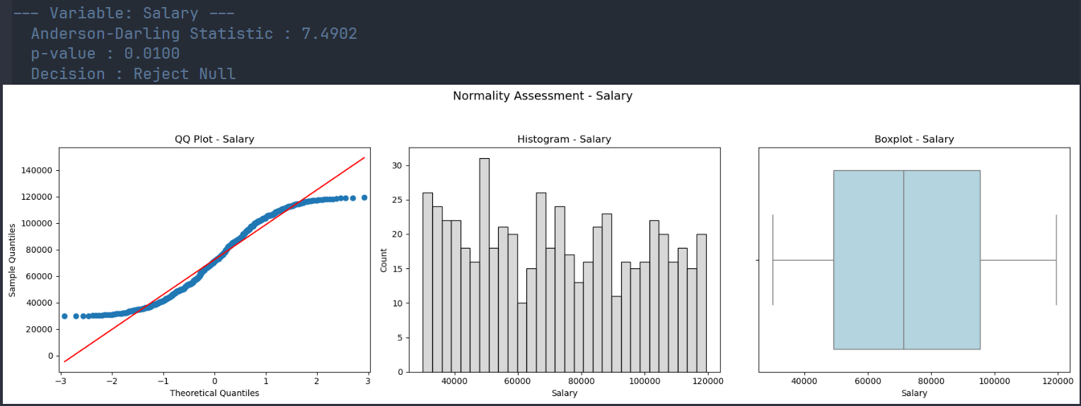
qd.desc Function
The function qd.desc(df) generates the following statistics:
- count - number of observations
- mean - measure of central tendency for normal distribution
- std - measure of spread for normal distribution
- median - measure of central tendency for skewed distributions or those with outliers
- MAD_raw - measure of spread for skewed distributions or those with outliers; this is manual Median Absolute Deviation (MAD) which is more robust when dealing with non-normal distributions.
- MAD_Norm -MAD_raw multiplied by 1.4826 to make it comparable to the standard deviation for normally distributed data.
- min - lowest observed value
- max - highest observed value
- AD_stat - Anderson - Darling Statistic
- 5% crit_value - critical value for a 5% Significance Level
- 1% crit_value - critical value for a 1% Significance Level
import qdesc as qd
qd.desc(df)

| Variable | Count | Mean     | Std Dev   | Median   | MAD Raw  | MAD Norm  | Min      | Max       | AD Stat | pvalue    |
|----------|-------|----------|-----------|----------|----------|-----------|----------|-----------|---------|-----------|
| Age      | 570.0 | 39.23    | 12.15     | 40.0     | 10.0     | 14.83     | 18.0     | 59.0      | 7.11    | 0.01      |
| Salary   | 570.0 | 72419.00 | 26364.59  | 71333.5  | 22751.5  | 33731.37  | 30055.0  | 119339.0  | 7.49    | 0.01      |
qd.grp_desc Function
This function, qd.grp_desc(df, "Continuous Var", "Group Var") creates a table for descriptive statistics similar to the qd.desc function but has the measures presented for each level of the grouping variable. It allows one to check whether these measures, for each group, are approximately normal or not. Combining it with qd.normcheck_dashboard allows one to decide on the appropriate measure of central tendency and spread.
import qdesc as qd
qd.grp_desc(df, "Salary", "Gender")

| Variable       | Count | Mean      | Std Dev   | Median   | MAD Raw  | MAD Norm  | Min    | Max      | AD Stat | pvalue  |
|----------------|-------|-----------|-----------|----------|----------|-----------|--------|----------|---------|---------|
| Gender: Female | 292   | 73144.74  | 26180.74  | 72496.5  | 22883.5  | 33927.08  | 30055  | 118869   | 3.69    | 0.01    |
| Gender: Male   | 278   | 71656.72  | 26582.16  | 69290.0  | 21591.0  | 32010.82  | 30077  | 119339   | 4.01    | 0.01    |
qd.freqdist Function
Run the function qd.freqdist(df, "Variable Name") to easily create a frequency distribution for your chosen categorical variable with the following:
- Variable Levels (i.e., for Sex Variable: Male and Female)
- Counts - the number of observations
- Percentage - percentage of observations from total.
import qdesc as qd
qd.freqdist(df, "Department")

| Variable              | Count | Percentage |
|-----------------------|-------|------------|
| Department: HR        | 154   | 27.02%     |
| Department: Finance   | 145   | 25.44%     |
| Department: IT        | 144   | 25.26%     |
| Department: Marketing | 127   | 22.28%     |
qd.freqdist_a Function
Run the function qd.freqdist_a(df, ascending = FALSE) to easily create frequency distribution tables, arranged in descending manner (default) or ascending (TRUE), for all the categorical variables in your data frame. The resulting table will include columns such as:
- Variable levels (i.e., for Satisfaction: Very Low, Low, Moderate, High, Very High)
- Counts - the number of observations
- Percentage - percentage of observations from total.
import qdesc as qd
qd.freqdist_a(df)

| Variable              | Count | Percentage |
|-----------------------|-------|------------|
| Department: HR        | 154   | 27.02%     |
| Department: Finance   | 145   | 25.44%     |
| Department: IT        | 144   | 25.26%     |
| Department: Marketing | 127   | 22.28%     |
| Gender: Female        | 292   | 51.23%     |
| Gender: Male          | 278   | 48.77%     |
qd.freqdist_to_excel Function
Run the function qd.freqdist_to_excel(df, "Filename.xlsx", ascending = FALSE ) to easily create frequency distribution tables, arranged in descending manner (default) or ascending (TRUE), for all the categorical variables in your data frame and SAVED as separate sheets in the .xlsx File. The resulting table will include columns such as:
- Variable levels (i.e., for Satisfaction: Very Low, Low, Moderate, High, Very High)
- Counts - the number of observations
- Percentage - percentage of observations from total.
import qdesc as qd
qd.freqdist_to_excel(df, "Results.xlsx")

Frequency distributions written to Results.xlsx
qd.normcheck_dashboard Function
Run the function qd.normcheck_dashboard(df) to efficiently check each numeric variable for normality of its distribution. It will compute the Anderson-Darling statistic and create visualizations (i.e., qq-plot, histogram, and boxplots) for checking whether the distribution is approximately normal.
import qdesc as qd
qd.normcheck_dashboard(df)
License
This project is licensed under the GPL-3 License. See the LICENSE file for more details.
Acknowledgements
This package relies on the following Python libraries:
We sincerely thank the developers and contributors of these libraries for their hard work and dedication to the open-source ecosystem. Your efforts make projects like this possible!
Release history Release notifications | RSS feed


Download files
Download the file for your platform. If you're not sure which to choose, learn more about installing packages.
Source Distribution
Built Distribution
Filter files by name, interpreter, ABI, and platform.
If you're not sure about the file name format, learn more about wheel file names.
Copy a direct link to the current filters
File details
Details for the file qdesc-1.1.1.tar.gz.
File metadata
- Download URL: qdesc-1.1.1.tar.gz
- Upload date:
- Size: 23.7 kB
- Tags: Source
- Uploaded using Trusted Publishing? No
- Uploaded via: twine/6.2.0 CPython/3.12.7
File hashes
| Algorithm | Hash digest | |
|---|---|---|
| SHA256 |
e3905cec42f44e324c9eb92d949c58aa4a6665d3d5bbbbec5f36ddee40c9c5ea
|
|
| MD5 |
f94b65df48fbd4b1b73dc3498ef51511
|
|
| BLAKE2b-256 |
3ff62887d685ef0e6a07d95b4eb717cb52ed566840e5966068d48802774d1b6c
|
File details
Details for the file qdesc-1.1.1-py3-none-any.whl.
File metadata
- Download URL: qdesc-1.1.1-py3-none-any.whl
- Upload date:
- Size: 20.0 kB
- Tags: Python 3
- Uploaded using Trusted Publishing? No
- Uploaded via: twine/6.2.0 CPython/3.12.7
File hashes
| Algorithm | Hash digest | |
|---|---|---|
| SHA256 |
62fb1760b2d450812726a384c4bdff3ce2efeb9cd34c17b878e306b60c5eebe0
|
|
| MD5 |
53eda90c500409beefea8f3a4b8a41a4
|
|
| BLAKE2b-256 |
e95d5b54685016c04b8255076c7a022efc500a387993b21e863aa36d098dcfd3
|


