
Qt-Material
This is another stylesheet for PySide6, and PyQt6, which looks like Material Design (close enough).








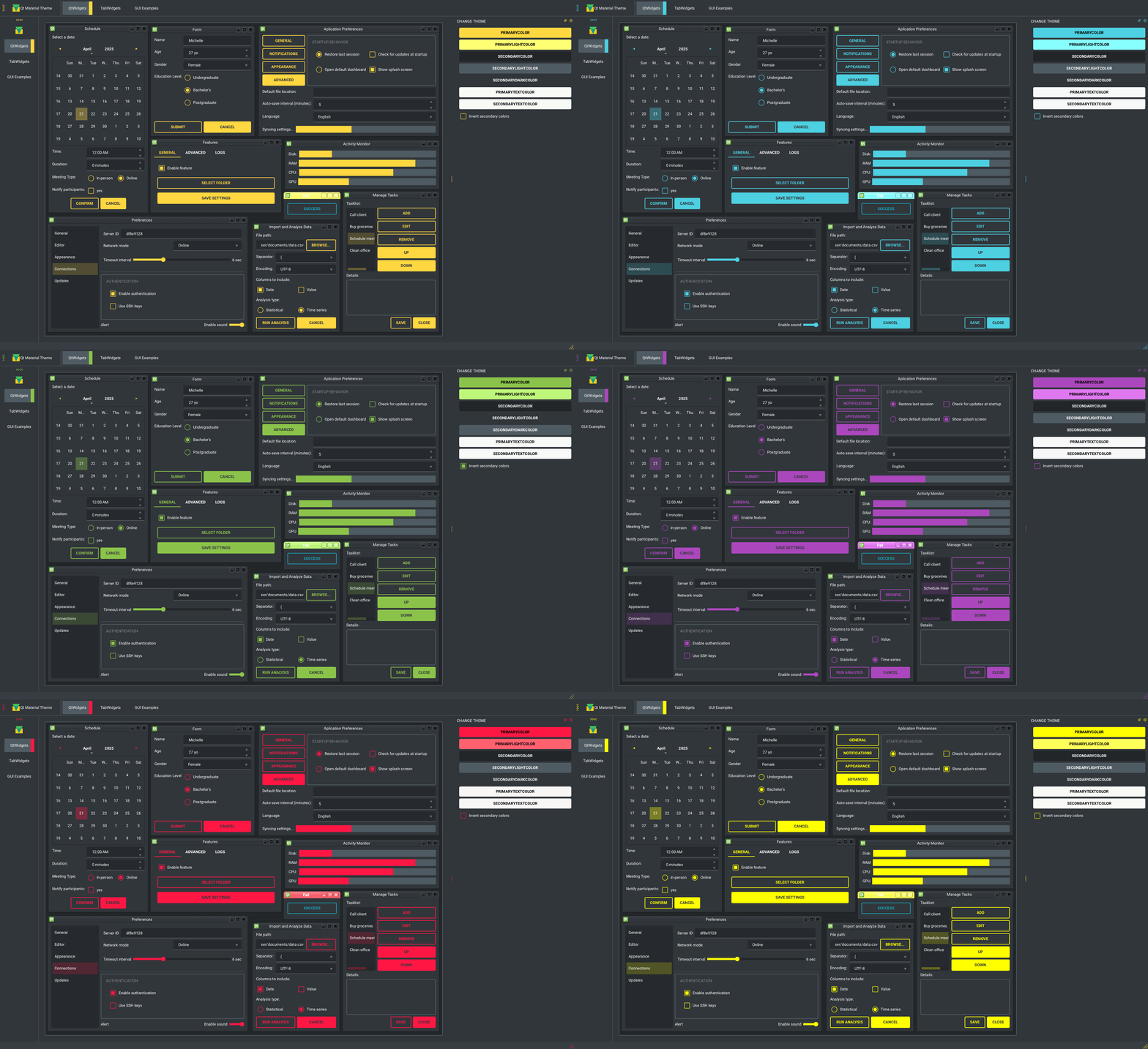
There is some custom dark themes:
Navigation
- Install
- Usage
- Themes
- Custom colors
- Usage
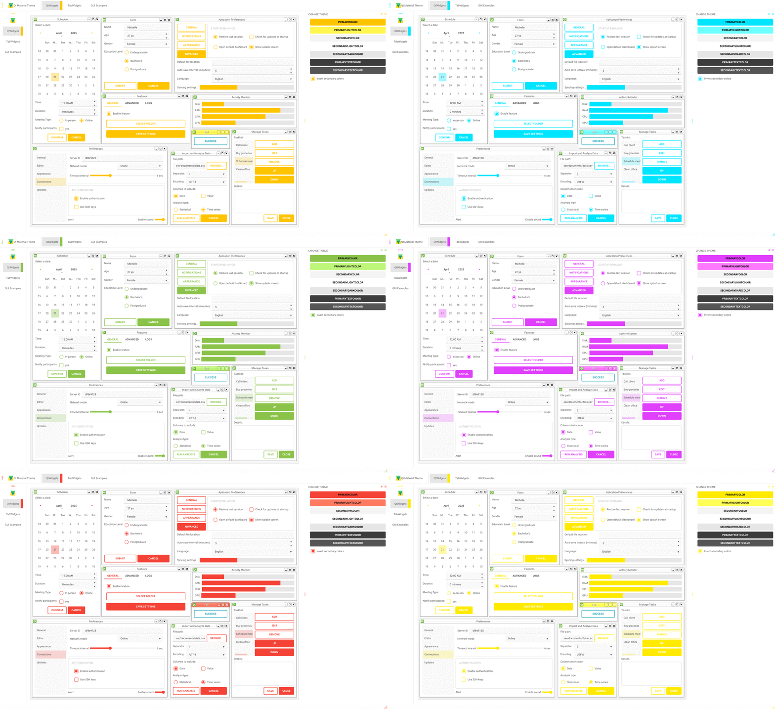
- Light themes
- Environ variables
- Alternative QPushButtons and custom fonts
- Custom stylesheets
- Run examples
- New themes
- Change theme in runtime
- Export theme
- Density scale
- Troubleshoots
Install
pip install qt-material
Usage
import sys
from PySide6 import QtWidgets
# from PySide2 import QtWidgets
# from PyQt5 import QtWidgets
from qt_material import apply_stylesheet

# create the application and the main window
app = QtWidgets.QApplication(sys.argv)
window = QtWidgets.QMainWindow()

# setup stylesheet
apply_stylesheet(app, theme='dark_teal.xml')

# run
window.show()
app.exec_()
Themes
from qt_material import list_themes

list_themes()
WARNING:root:qt_material must be imported after PySide or PyQt!


['dark_amber.xml',
 'dark_blue.xml',
 'dark_cyan.xml',
 'dark_lightgreen.xml',
 'dark_pink.xml',
 'dark_purple.xml',
 'dark_red.xml',
 'dark_teal.xml',
 'dark_yellow.xml',
 'light_amber.xml',
 'light_blue.xml',
 'light_cyan.xml',
 'light_cyan_500.xml',
 'light_lightgreen.xml',
 'light_pink.xml',
 'light_purple.xml',
 'light_red.xml',
 'light_teal.xml',
 'light_yellow.xml']
Custom colors
Color Tool is the best way to generate new themes, just choose colors and export as Android XML, the theme file must look like:
<!--?xml version="1.0" encoding="UTF-8"?-->
<resources>
<color name="primaryColor">#00e5ff</color>
<color name="primaryLightColor">#6effff</color>
<color name="secondaryColor">#f5f5f5</color>
<color name="secondaryLightColor">#ffffff</color>
<color name="secondaryDarkColor">#e6e6e6</color>
<color name="primaryTextColor">#000000</color>
<color name="secondaryTextColor">#000000</color>
</resources>
Save it as my_theme.xml or similar and apply the style sheet from Python.
apply_stylesheet(app, theme='dark_teal.xml')
Light themes
Light themes will need to add invert_secondary argument as True.
apply_stylesheet(app, theme='light_red.xml', invert_secondary=True)
Environ variables
There is a environ variables related to the current theme used, these variables are for consult purpose only.
| Environ variable | Description | Example |
|---|---|---|
| QTMATERIAL_PRIMARYCOLOR | Primary color | #2979ff |
| QTMATERIAL_PRIMARYLIGHTCOLOR | A bright version of the primary color | #75a7ff |
| QTMATERIAL_SECONDARYCOLOR | Secondary color | #f5f5f5 |
| QTMATERIAL_SECONDARYLIGHTCOLOR | A bright version of the secondary color | #ffffff |
| QTMATERIAL_SECONDARYDARKCOLOR | A dark version of the primary color | #e6e6e6 |
| QTMATERIAL_PRIMARYTEXTCOLOR | Color for text over primary background | #000000 |
| QTMATERIAL_SECONDARYTEXTCOLOR | Color for text over secondary background | #000000 |
| QTMATERIAL_THEME | Name of theme used | light_blue.xml |
Alternative QPushButtons and custom fonts
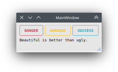
There is an extra argument for accent colors and custom fonts.
extra = {

    # Button colors
    'danger': '#dc3545',
    'warning': '#ffc107',
    'success': '#17a2b8',

    # Font
    'font_family': 'Roboto',
}

apply_stylesheet(app, 'light_cyan.xml', invert_secondary=True, extra=extra)
The accent colors are applied to QPushButton with the corresponding class property:
pushButton_danger.setProperty('class', 'danger')
pushButton_warning.setProperty('class', 'warning')
pushButton_success.setProperty('class', 'success')
Custom stylesheets
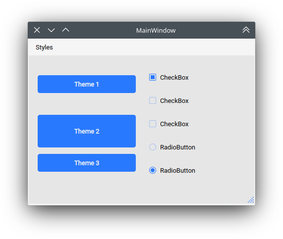
Custom changes can be performed by overwriting the stylesheets, for example:
QPushButton {{
  color: {QTMATERIAL_SECONDARYCOLOR};
  text-transform: none;
  background-color: {QTMATERIAL_PRIMARYCOLOR};
}}

.big_button {{
  height: 64px;
}}
Then, the current stylesheet can be extended just with:
apply_stylesheet(app, theme='light_blue.xml', css_file='custom.css')
The stylesheet can also be changed on runtime by:
stylesheet = app.styleSheet()
with open('custom.css') as file:
    app.setStyleSheet(stylesheet + file.read().format(**os.environ))
And the class style can be applied with the setProperty method:
self.main.pushButton.setProperty('class', 'big_button')
Run examples
A window with almost all widgets (see the previous screenshots) are available to test all themes and create new ones.
git clone https://github.com/UN-GCPDS/qt-material.git
cd qt-material
python setup.py install
cd examples/full_features
python main.py --pyside6

New themes
Do you have a custom theme? it looks good? create a pull request in themes folder and share it with all users.
Change theme in runtime
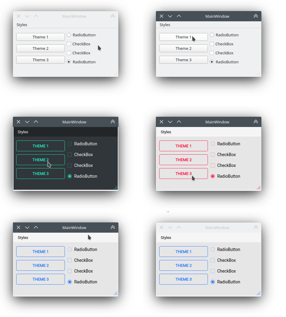
There is a qt_material.QtStyleTools class that must be inherited along to QMainWindow for change themes in runtime using the apply_stylesheet() method.
class RuntimeStylesheets(QMainWindow, QtStyleTools):

    def __init__(self):
        super().__init__()
        self.main = QUiLoader().load('main_window.ui', self)

        self.apply_stylesheet(self.main, 'dark_teal.xml')
        # self.apply_stylesheet(self.main, 'light_red.xml')
        # self.apply_stylesheet(self.main, 'light_blue.xml')
Integrate stylesheets in a menu
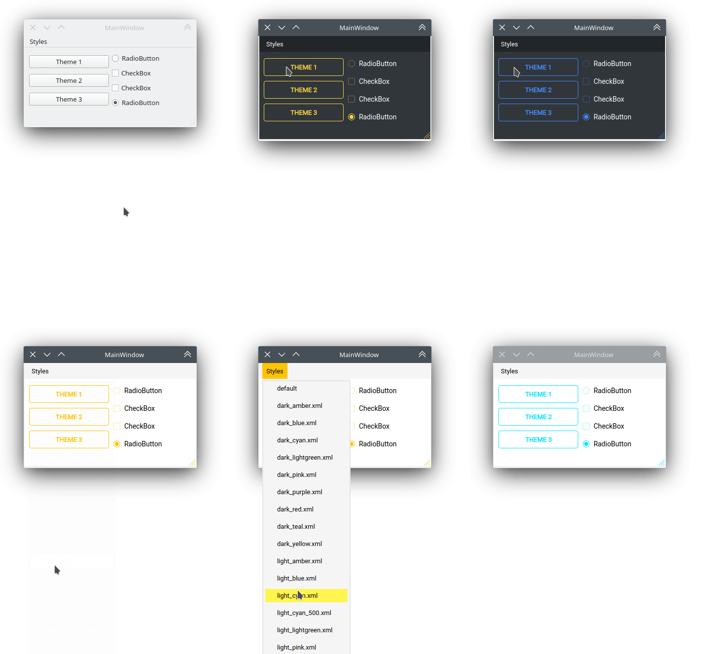
A custom stylesheets menu can be added to a project for switching across all default available themes.
class RuntimeStylesheets(QMainWindow, QtStyleTools):

    def __init__(self):
        super().__init__()
        self.main = QUiLoader().load('main_window.ui', self)

        self.add_menu_theme(self.main, self.main.menuStyles)
Create new themes
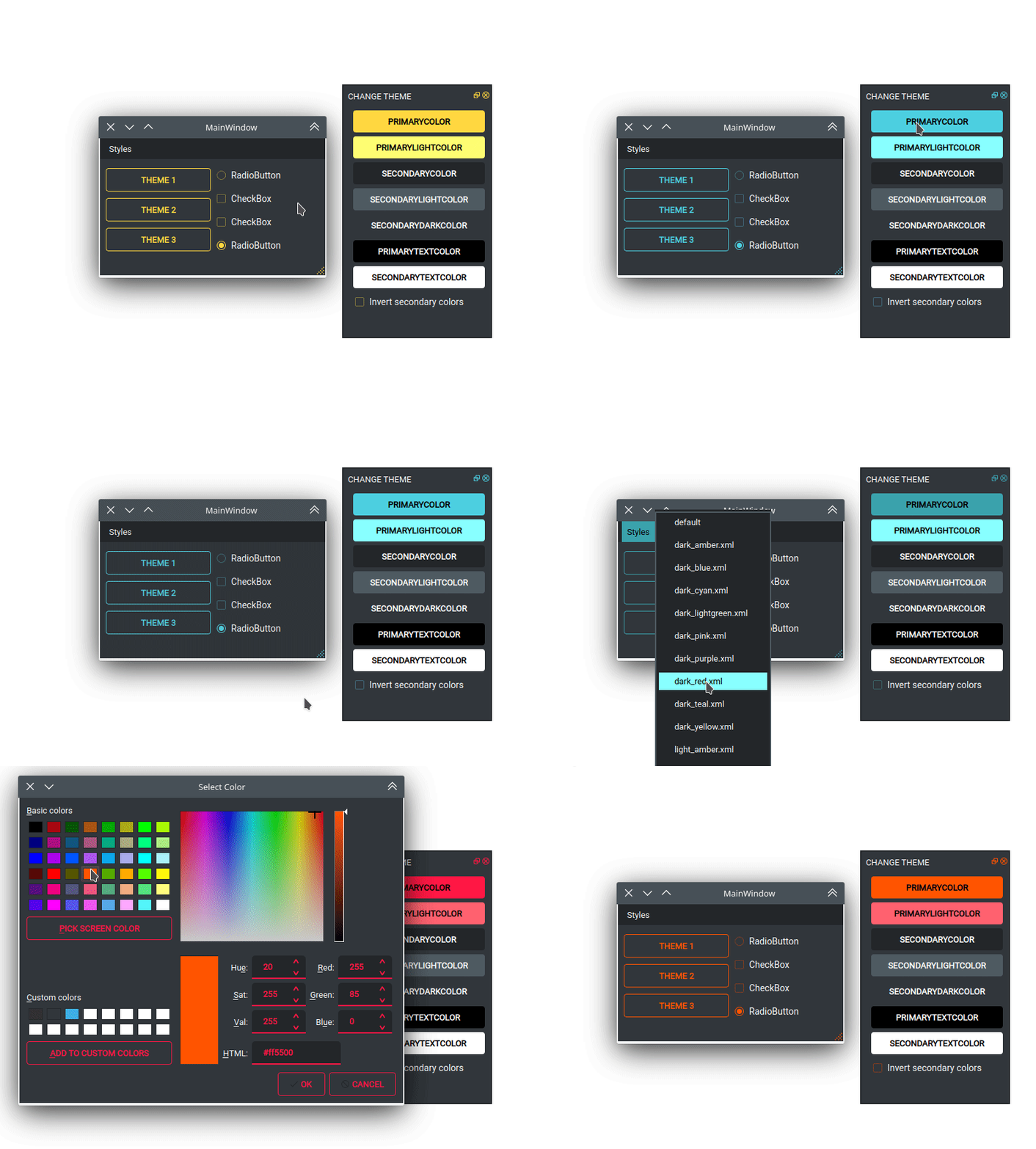
A simple interface is available to modify a theme in runtime, this feature can be used to create a new theme, the theme file is created in the main directory as my_theme.xml
class RuntimeStylesheets(QMainWindow, QtStyleTools):

    def __init__(self):
        super().__init__()
        self.main = QUiLoader().load('main_window.ui', self)

        self.show_dock_theme(self.main)
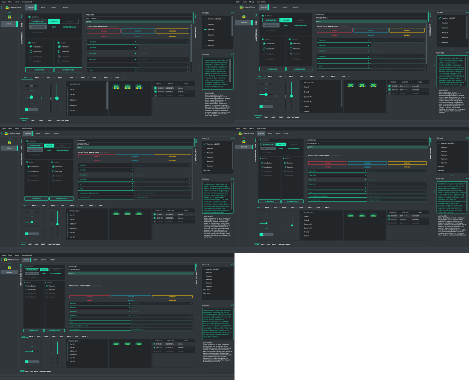
A full set of examples are available in the exmaples directory
Export theme
This feature able to use qt-material themes into Qt implementations using only local files.
from qt_material import export_theme

extra = {

    # Button colors
    'danger': '#dc3545',
    'warning': '#ffc107',
    'success': '#17a2b8',

    # Font
    'font_family': 'monoespace',
    'font_size': '13px',
    'line_height': '13px',

    # Density Scale
    'density_scale': '0',

    # environ
    'pyside6': True,
    'linux': True,

}

export_theme(theme='dark_teal.xml',
             qss='dark_teal.qss',
             rcc='resources.rcc',
             output='theme',
             prefix='icon:/',
             invert_secondary=False,
             extra=extra,
            )
This script will generate both dark_teal.qss and resources.rcc and a folder with all theme icons called theme.
The files generated can be integrated into a PySide6 application just with:
import sys

from PySide6 import QtWidgets
from PySide6.QtCore import QDir
from __feature__ import snake_case, true_property

# Create application
app = QtWidgets.QApplication(sys.argv)

# Load styles
with open('dark_teal.qss', 'r') as file:
    app.style_sheet = file.read()

# Load icons
QDir.add_search_path('icon', 'theme')

# App
window = QtWidgets.QMainWindow()
checkbox = QtWidgets.QCheckBox(window)
checkbox.text = 'CheckBox'
window.show()
app.exec()
This files can also be used into non Python environs like C++.
Density scale
The extra arguments also include an option to set the density scale, by default is 0.
extra = {

    # Density Scale
    'density_scale': '-2',
}

apply_stylesheet(app, 'default', invert_secondary=False, extra=extra)
Troubleshoots
QMenu
QMenu has multiple rendering for each Qt backend, and for each operating system. Even can be related with the style, like fusion. Then, the extra argument also supportsQMenu parameters to configure this widgest for specific combinations. This options are not affected by density scale.
extra['QMenu'] = {
    'height': 50,
    'padding': '50px 50px 50px 50px',  # top, right, bottom, left
}
1 maintainer

Release files for qt-material 2.17
For a detailed explanation of source distributions (sdists) and built distributions (wheels), please see the package formats documentation.
Source distribution (sdist)
| File | Size | Uploaded | |
|---|---|---|---|
| qt_material-2.17.tar.gz | 1.7 MB | Details |
Built distribution (wheel)
| File | Interpreter | ABI | Platform | Reset |
|---|---|---|---|---|
| qt_material-2.17-py3-none-any.whl | Python 3 | none | any | Details |
Total release size: 3.4 MB
Release files / qt_material-2.17.tar.gz
| Download URL | qt_material-2.17.tar.gz |
|---|---|
| Size | 1.7 MB |
| Tags | Source |
|
SHA-256 checksum How to use checksums |
b500a0c1f5ef8f46a8cf037d1aa5bdf9ea4eb618180b6332539dfbdd0647ad0d
|
|
BLAKE2b-256 checksum How to use checksums |
3a57d6473fc7f9b1a81f6bddea555119270818c54be7717f38d0977bb6161408
|
| Upload date | |
|
Uploaded using Trusted Publishing? What is trusted publishing? |
Yes |
| Uploaded via |
twine/6.1.0 CPython/3.12.9
|
Provenance
Provenance describes where a file came from. On PyPI, provenance is shared via attestations, which provide a verifiable record of the build or publishing details. View details, limitations and caveats.


PyPI Publish Attestation
PyPI verified that this artifact, at this checksum, originated from the publisher listed below.
Signed by GitHub Actions, verified by PyPI on Apr 21, 2025.
Transparency logRelease files / qt_material-2.17-py3-none-any.whl
| Download URL | qt_material-2.17-py3-none-any.whl |
|---|---|
| Size | 1.7 MB |
| Tags | Python 3 |
|
SHA-256 checksum How to use checksums |
660523341ae45b79d222bf15e202ec76ba3bf5e7e82170b66759738d7bb4873d
|
|
BLAKE2b-256 checksum How to use checksums |
3763e1085fd76bfea103b6c93d133d849f80a5a94b924f31897eb936cabe8459
|
| Upload date | |
|
Uploaded using Trusted Publishing? What is trusted publishing? |
Yes |
| Uploaded via |
twine/6.1.0 CPython/3.12.9
|
Provenance
Provenance describes where a file came from. On PyPI, provenance is shared via attestations, which provide a verifiable record of the build or publishing details. View details, limitations and caveats.
PyPI Publish Attestation
PyPI verified that this artifact, at this checksum, originated from the publisher listed below.
Signed by GitHub Actions, verified by PyPI on Apr 21, 2025.
Transparency log













