
Radar plot
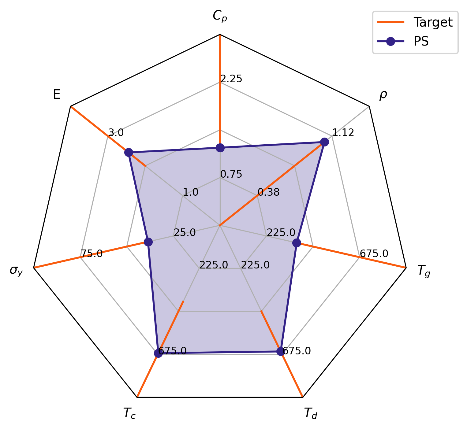
This package creates radar plots. It can generate typical radar plots and plot ranges of values.
Data formatting
Data you want to plot must have a tidy format. For instance, if I wanted to plot three properties (let's say prop1, prop2, and prop3 with values 12, 3.5, and 42 respectively) then you should load a csv file into a pandas dataframe that has the following format:
| property | value | item |
|---|---|---|
| prop1 | 12.0 | item1 |
| prop2 | 3.5 | item1 |
| prop3 | 42 | item1 |
If you wanted to plot several items (e.g., item1, item2, and item3) with different values for the properties, then format the data like this:
| property | value | item |
|---|---|---|
| prop1 | 12.0 | item1 |
| prop2 | 3.5 | item1 |
| prop3 | 42 | item1 |
| prop1 | 14.0 | item2 |
| prop2 | 4.0 | item2 |
| prop3 | 36 | item2 |
| prop1 | 15 | item3 |
| prop2 | 2 | item3 |
| prop3 | 40 | item3 |
Basic Usage
Following that formatting scheme, you can plot the data as follows
import pandas as pd
import matplotlib.pyplot as plt
import radarplt

# see tables above
df = pd.read_csv('example_data.csv')
fig, ax = radarplt.plot(
    df,
    label_column="property",
    value_column="value",
    hue_column="item",
)
legend = ax.legend(loc=(0.9, 0.95))
plt.tight_layout()
plt.show()
Resulting in the following image
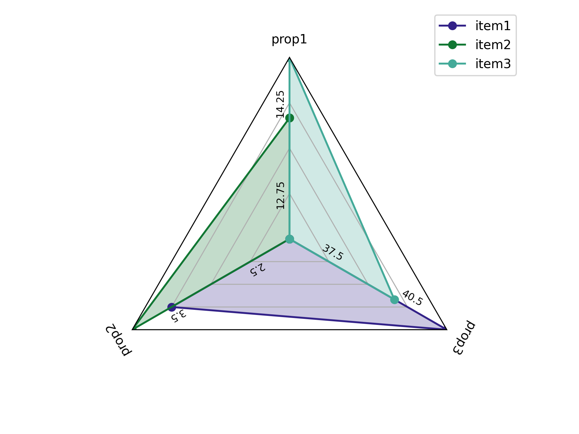
Additional lines are plotted at the .25, .50, and .75 marks on the image. The value at the .25 and .75 line for each property is labeled and values increase/decrease linearly between these points. For instance, the 0.5 mark for property 2 would be 4, the 1 mark would be 6 and the 0 mark would be 2.
Changing Ranges
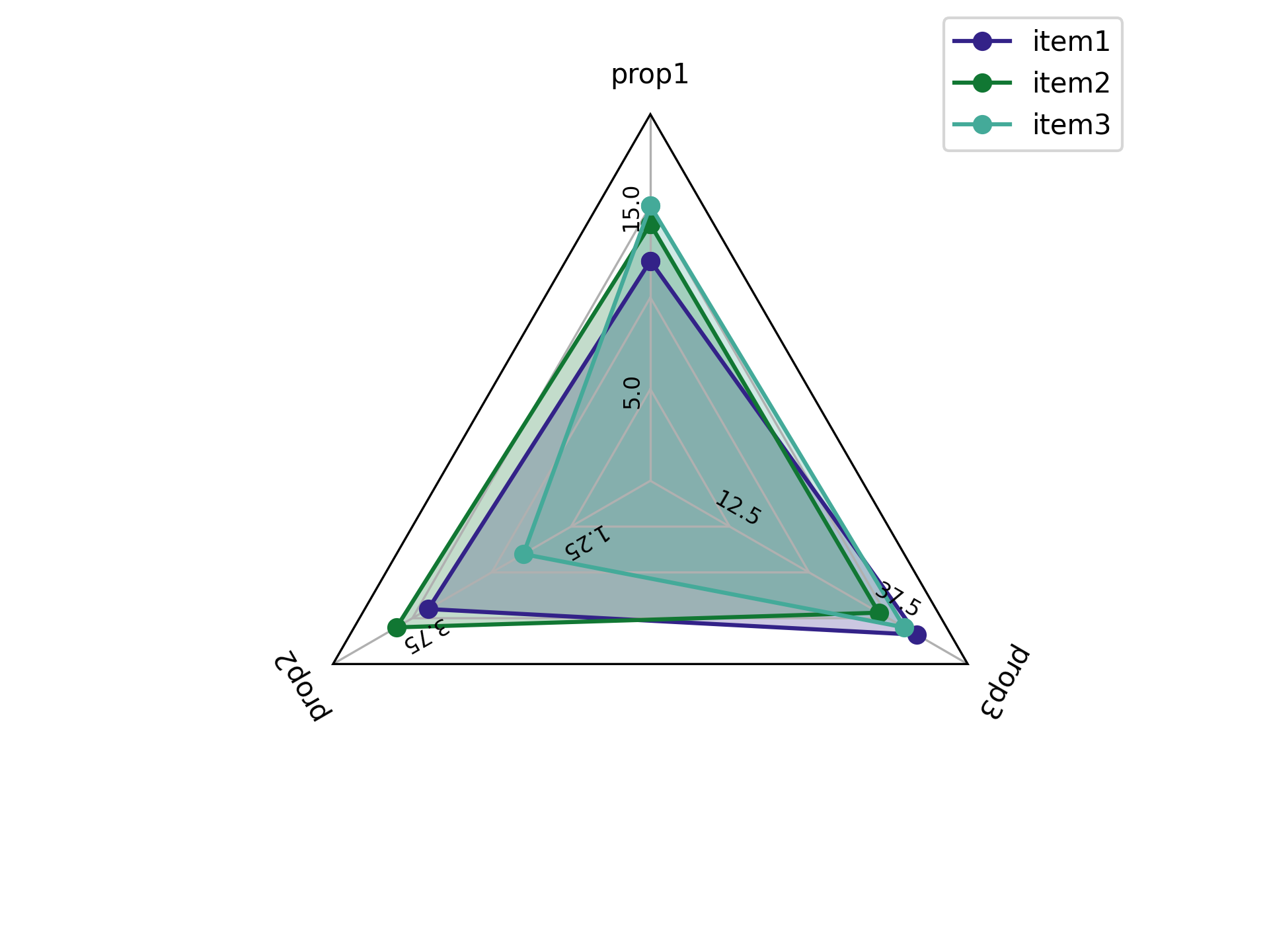
Let's say you don't like that the prop2 ranges from 1 to 6. To change
these value ranges create a dictionary of the ranges you want for each property and
pass it to the function via the value_ranges parameter.
For instance:
import pandas as pd
import matplotlib.pyplot as plt
import radarplt

value_ranges = {
  "prop1": [0, 20],
  "prop2": [0, 5],
  "prop3": [0, 50],
}

# see tables above
df = pd.read_csv('example_data.csv')
fig, ax = radarplt.plot(
    df,
    label_column="property",
    value_column="value",
    hue_column="item",
    value_ranges=value_ranges,
)
legend = ax.legend(loc=(0.9, 0.95))
plt.tight_layout()
plt.show()
Resulting in the following image
Changing labels
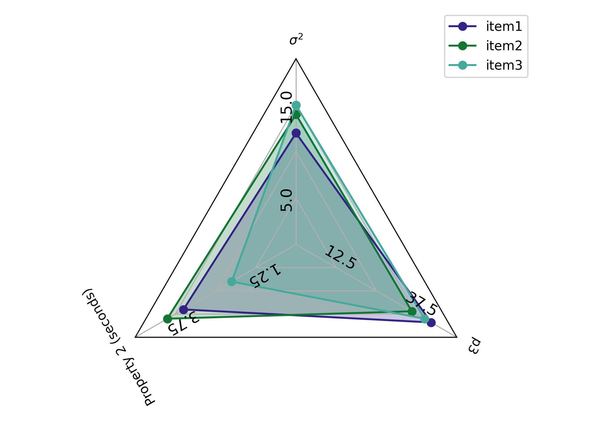
If you don't want the labels for the properties to be the property names,
you can change those as well with the plot_labels parameter.
import pandas as pd
import matplotlib.pyplot as plt
import radarplt

value_ranges = {
  "prop1": [0, 20],
  "prop2": [0, 5],
  "prop3": [0, 50],
}

plot_labels = {
  "prop1": "$\sigma^{2}$",
  "prop2": "Property 2 (seconds)",
  "prop3": "p3"
}

# see tables above
df = pd.read_csv('example_data.csv')
fig, ax = radarplt.plot(
    df,
    label_column="property",
    value_column="value",
    hue_column="item",
    value_ranges=value_ranges,
    plot_labels=plot_labels,
    # can change fontsize of the numbers in the plot
    tick_fontsize=12
)
legend = ax.legend(loc=(0.9, 0.95))
plt.tight_layout()
plt.show()
Resulting in the following image
Plotting target ranges
If you want to see if your items' values fall within a certain range, you can add those ranges as well
import pandas as pd
import matplotlib.pyplot as plt
import radarplt

target_ranges = {
  "prop1": [10, 20],
  "prop2": [0, 2],
  "prop3": [25, 35]
}

value_ranges = {
  "prop1": [0, 20],
  "prop2": [0, 5],
  "prop3": [0, 50],
}

plot_labels = {
  "prop1": "$\sigma^{2}$",
  "prop2": "Property 2 (seconds)",
  "prop3": "p3"
}

# see tables above
df = pd.read_csv('example_data.csv')
fig, ax = radarplt.plot(
    df,
    label_column="property",
    value_column="value",
    hue_column="item",
    value_ranges=value_ranges,
    plot_labels=plot_labels,
    target_ranges=target_ranges
    # note, you can also change the radar plot target linewidth
    target_linewidth=2
)
legend = ax.legend(loc=(0.9, 0.95))
plt.tight_layout()
plt.show()
Resulting in the following image

1 maintainer

Download files
Download the file for your platform. If you're not sure which to choose, learn more about installing packages.
Source Distribution
Built Distribution
Filter files by name, interpreter, ABI, and platform.
If you're not sure about the file name format, learn more about wheel file names.
Copy a direct link to the current filters
File details
Details for the file radarplt-2.2.2.tar.gz.
File metadata
- Download URL: radarplt-2.2.2.tar.gz
- Upload date:
- Size: 7.1 kB
- Tags: Source
- Uploaded using Trusted Publishing? No
- Uploaded via:
poetry/1.6.1 CPython/3.11.6 Darwin/22.6.0
File hashes
| Algorithm | Hash digest | |
|---|---|---|
| SHA256 |
07d6e43162020ad803ca6ea1f7a8a3d92e1e03531d9039dedd737749f97fc583
|
|
| MD5 |
6e9aaa3b57ee5f5b48a0e4783e8cb98a
|
|
| BLAKE2b-256 |
91600195a8d5674858126334a28fe7a4f6fb68c5e790d26b2037fd05543d10d3
|
File details
Details for the file radarplt-2.2.2-py3-none-any.whl.
File metadata
- Download URL: radarplt-2.2.2-py3-none-any.whl
- Upload date:
- Size: 8.0 kB
- Tags: Python 3
- Uploaded using Trusted Publishing? No
- Uploaded via:
poetry/1.6.1 CPython/3.11.6 Darwin/22.6.0
File hashes
| Algorithm | Hash digest | |
|---|---|---|
| SHA256 |
bdfa7b8d647a2d1d0181a83c05a684c7cbb07055af049a49114032520b037950
|
|
| MD5 |
bf5304e72127f67de3406f5360703398
|
|
| BLAKE2b-256 |
ab69496f4dbe1dde4f9b2036e8e4550788e724e81e9e7f7c708a761d0c77d28e
|














