Fast candlestick chart using Python. Includes navigator, slider, navigation, and text information display functions

Project description
Donation
Bitcoin: 1MKCHW8smDZv5DFMiVkA5G3DeXcMn871ZX
Ethereum: 0x1c5fb8a5e0b1153cd4116c91736bd16fabf83520
Document
This document was originally written in Korean and translated using a machine translation tool.
Base Version
3.0.0
Package Introduction
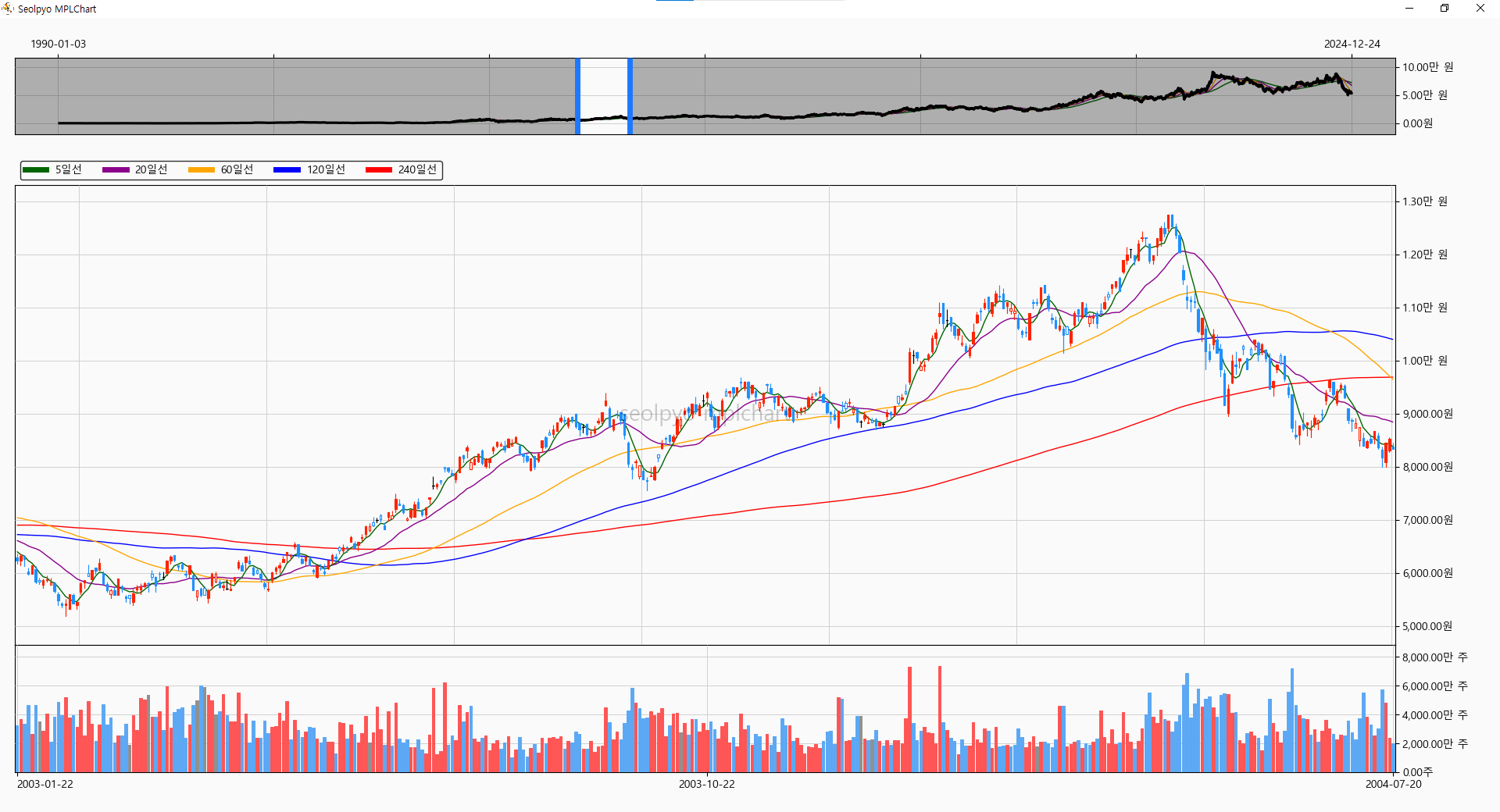
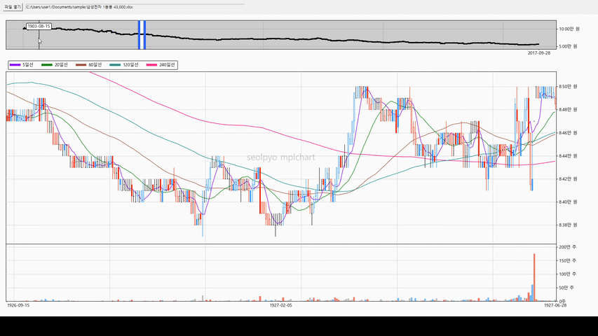
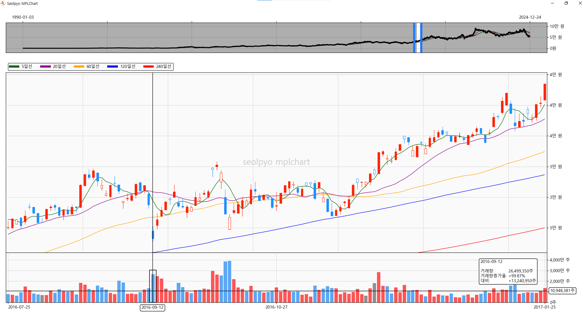
Drawing over 40,000 stock information charts sample, with Intel i5 4690
seolpyo-mplchart is a matplotlib-based Python package.
While finplot or plotly are commonly used to draw candlestick charts using Python, I felt the need to create something new, which led to the creation of this new code.
The main features of this package are as follows:
Key Features
- Uses CPU instead of GPU for calculations and drawing.
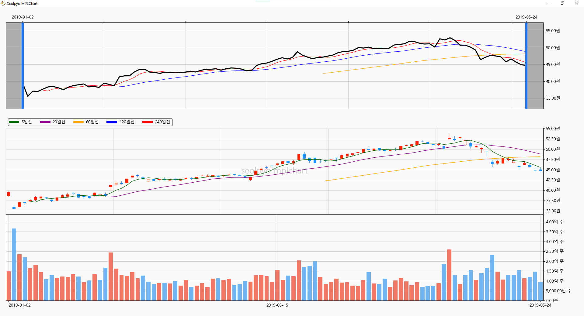
- An overview slider is provided to display the viewing area. This allows you to select or move the viewing area.
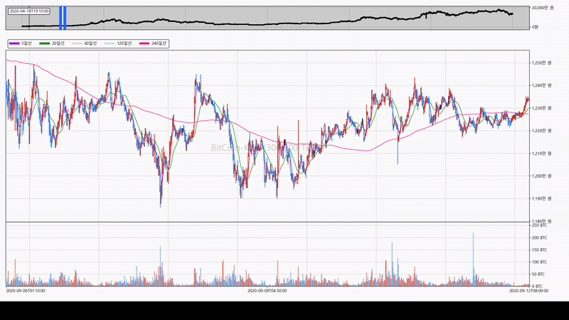
- Can be connected and used with various GUIs. It can also connect to tkinter and operates smoothly.
- Displays stock information text. It appears when the mouse cursor is positioned over a candle or volume bar.
- Provides the on/off function for the price moving average line by default.
Samples of drawing candlestick charts by connecting to tkinter can be found at the following link.
※ I have directly verified that it operates on 32-bit Python 3.11, pandas 2.0.0, and matplotlib 3.7.0.
Installation
> pip install seolpyo-mplchart
Quick Start
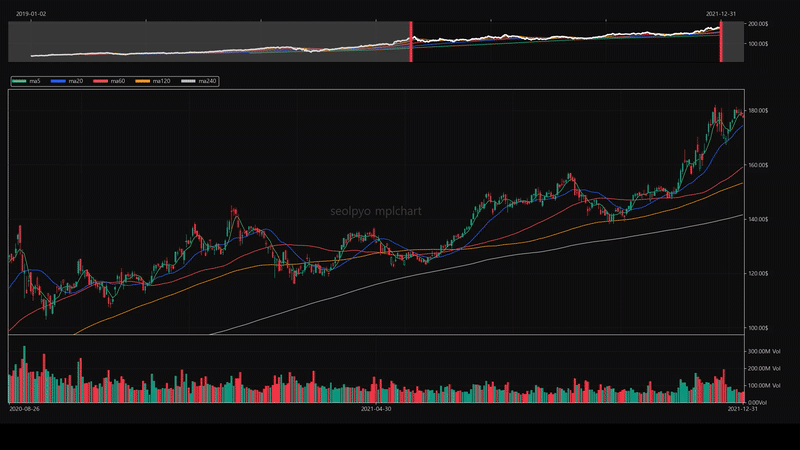
Chart
You can select or move the viewing area using the slider. Additionally, you can move the viewing area by clicking and dragging on the chart area.
import seolpyo_mplchart as mc

chart = mc.Chart()
df: pandas.DataFrame = {stock price data frame}
chart.set_data(df)
mc.show()
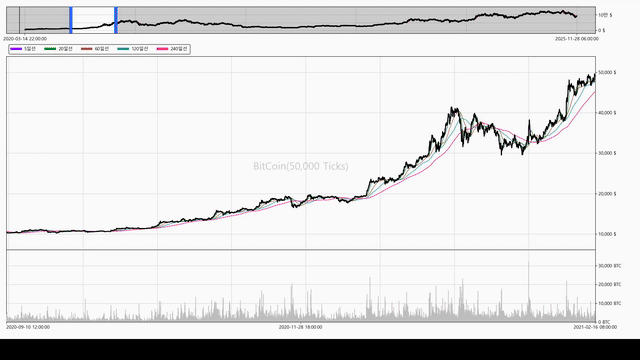
Chart.get_default_xlim()
Gets the xlim value set during Chart.refresh().
Chart.refresh(change_xlim=False)
Refreshes the chart.
Reflects changes to self.STYLE upon refresh.
Chart.set_data(df, change_xlim=True)
Passes stock price data to the chart object.
The chart object generates chart data based on the received data.
When retrieving data from a DataFrame, it uses the predefined Chart.key_date, Chart.key_open, Chart.key_high, Chart.key_low, Chart.key_close, and Chart.key_volume, so you must change the keys appropriately before using set_data.
Performs refresh automatically during set_data.
key_date, key_open, key_high, key_low, key_close, key_volume
Sets the column key values of the DataFrame received through Chart.set_data(df).
The chart uses the received df and each key to newly generate and store a df with the keys date, open, high, low, and close.
If if not self.key_volume is true, the volume chart is not drawn, and upon Chart.refresh(), if if not self.key_volume is true, the volume chart area is removed.
import seolpyo_mplchart as mc

df: pandas.DataFrame = {stock price data frame}

c = mc.Chart()
c.key_date= '시간'
c.key_open = 'open'
c.key_high = '고가'
c.key_low = '저가'
c.key_close = 'close'
# c.key_volume = '거래량'
c.key_volume = None
c.set_data(df)

mc.show() # same as matplotlib.pyplot.show()


### OR ###


import json

import seolpyo_mplchart as mc
import pandas as pd

file = {stock price data path}
with open(file, 'r', encoding='utf-8') as txt:
    data = json.load(txt)
df = pd.DataFrame(data)

class Chart(mc.Chart):
  key_date = '시간'
  key_open, key_high, key_low, key_close = ('open', '고가', '저가', 'close')
  # key_volume = '거래량'
  key_volume = None

c = Chart()'
c.set_data(df)

mc.show() # same as matplotlib.pyplot.show()
How to Change Chart Settings
In the chart settings, you can control the chart ratio, slider position, slider on/off, information text format, volume chart on/off, and more.
The following is an example code:
# seolpyo_mplchart/test.py
import seolpyo_mplchart as mc
# mc.STYLE.CHART.MA.linewidth = 5
class Chart(mc.Chart):
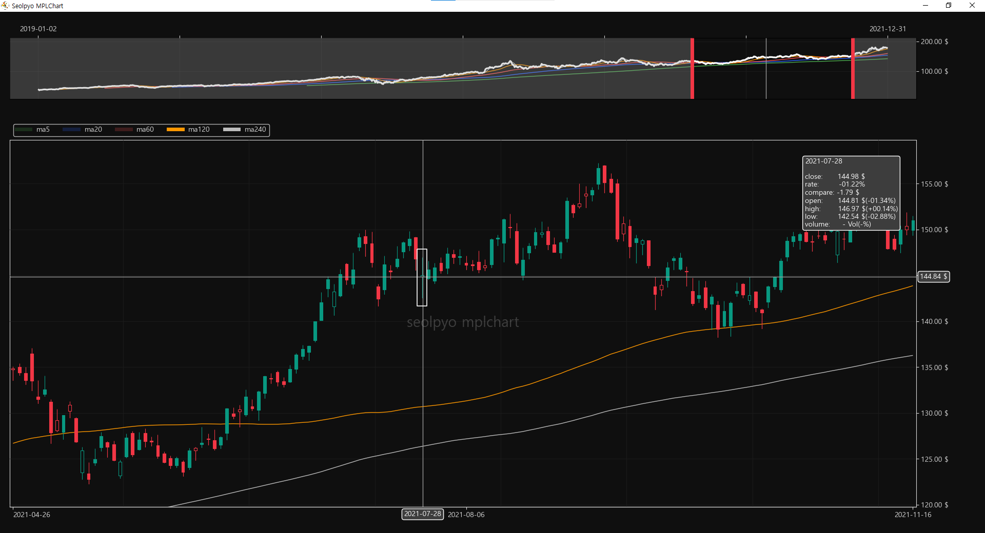
watermark = 'Apple'
# fraction = True
# watermark = 0
theme = 'light'
limit_candle = 10
limit_wick = 50
# limit_ma = None
# candle_on_ma = False
# slider_top = False
get_price_line_segment = mc.Chart.get_price_hl_line_segment
def on_click(self, e):
super().on_click(e)
# print(f'{e.button=}')
# print(f'{e.button.__str__()=}')
if e.button.__str__() == '2':
# wheel click
# slider show/hide
self.show_slider = (not self.show_slider)
# volume chart show/hide
if self.key_volume:
self.key_volume = None
else:
self.key_volume = '거래량'
self.refresh()
if e.button.__str__() == '3':
# right click
# print('refresh')
if self.theme == 'light':
# change theme
self.theme = 'dark'
self.STYLE = mc.set_theme(mc.STYLE, theme=self.theme)
# label, info text digit
self.digit_price = 2
# set slider bottom
self.slider_top = False
# use fraction in info text
self.fraction = True
# use english formatter
self.FORMATTER = mc.FORMATTER_EN
# change price info foramt
self.price_info_format = mc.format_info_price_en
# change volume info foramt
self.volume_info_format = mc.format_info_volume_en
# change ma format (legend)
self.ma_format = 'ma {}'
# change price element (bar)
self.get_candle_segment = lambda _=None: mc.Chart.get_bar_segment(self)
# change ax ratio
self.get_ax_config_list = lambda _=None: [
{
'name': 'slider',
'is_px': True,
'size': 100,
},
{
'name': 'none',
'is_px': True,
'size': 40,
},
{
'name': 'legend',
'is_px': True,
'size': 60,
},
{
'name': 'price',
'is_px': False,
'size': 1,
},
{
'name': 'volume',
'is_px': False,
'size': 2,
},
]
else:
# 테마 변경
self.theme = 'light'
self.STYLE = mc.set_theme(mc.STYLE, theme=self.theme)
# 정보, 라벨에 표시되는 가격 소수점 최대 자릿수
self.digit_price = 0
# 슬라이더를 위에 배치
self.slider_top = True
# 분수 표시 off
self.fraction = False
# 한글 포매터 사용
self.FORMATTER = mc.FORMATTER
# 가격 차트 정보 텍스트 포맷
self.price_info_format = mc.format_info_price
# 거래량 차트 정보 텍스트 포맷
self.volume_info_format = mc.format_info_volume
# 이평선 포맷 (legend)
self.ma_format = '{}일선'
# 가격 차트에서 캔들 차트를 사용
self.get_candle_segment = lambda _=None: mc.Chart.get_candle_segment(self)
# 차트 비율 변경
self.get_ax_config_list = lambda _=None: mc.Chart.get_ax_config_list(self)
self.refresh()
return
How to Change Styles
You can change the style by modifying the STYLE object as follows, and you can change more options by checking the STYLE object code.
The following is an example code:
# seolpyo_mplchart/utils/theme/dark.py

from ...style import Style


def set_theme(style: Style):
    # change canvas style
    style.CHART.facecolor = '#0f0f0f'
    style.CHART.edgecolor = '#dbdbdb'
    style.CHART.fontcolor = '#dbdbdb'
    style.CHART.GRID.color = '#1c1c1c'

    # change price chart element style
    style.CHART.PRICE.line_color = 'w'
    style.CHART.PRICE.FACECOLOR.up_rise = '#089981'
    style.CHART.PRICE.FACECOLOR.up_fall = '#0f0f0f'
    style.CHART.PRICE.FACECOLOR.down_fall = '#f23645'
    style.CHART.PRICE.FACECOLOR.down_rise = '#0f0f0f'

    style.CHART.PRICE.EDGECOLOR.up_rise = '#089981'
    style.CHART.PRICE.EDGECOLOR.up_fall = '#089981'
    style.CHART.PRICE.EDGECOLOR.down_fall = '#f23645'
    style.CHART.PRICE.EDGECOLOR.down_rise = '#f23645'
    style.CHART.PRICE.EDGECOLOR.flat = 'w'

    # change volume chart element style
    style.CHART.VOLUME.FACECOLOR.rise = '#2A8076'
    style.CHART.VOLUME.FACECOLOR.fall = '#BE4F58'
    style.CHART.VOLUME.FACECOLOR.unchange = '#82828A'

    style.CHART.VOLUME.EDGECOLOR.rise = '#2A8076'
    style.CHART.VOLUME.EDGECOLOR.fall = '#BE4F58'
    style.CHART.VOLUME.EDGECOLOR.unchange = '#82828A'

    # change ma line color style
    style.CHART.MA.color_default = 'w'
    style.CHART.MA.color_list = ['#FFB300', '#03A9F4', '#AB47BC', '#8BC34A', '#EF5350']

    # artist
    # chage info text, label style
    style.ARTIST.TEXT.BBOX.facecolor = '#3d3d3d'
    style.ARTIST.TEXT.BBOX.edgecolor = '#ffffff'
    style.ARTIST.TEXT.color = '#ffffff'

    # change chart box style
    style.ARTIST.BOX.edgecolor = 'w'

    # change crossline style
    style.ARTIST.CROSSLINE.edgecolor = '#9c9c9c'

    # change watermark color
    style.ARTIST.WATERMARK.color = 'w'

    # change slider nav color
    style.SLIDER.NAV.edgecolor = '#00A6FF'
    style.SLIDER.NAV.facecolor = '#FFFFFF4D'

    return style
FORMATTER
The price and volume unit texts displayed on the chart are determined by Chart.FORMATTER.
The default value is Korean, and an English formatter is available.
# seolpyo_mplchart/utils/formatter.py

from .num import num_to_str, unit_data, unit_data_en


class Formatter:
    price_word = '원'
    volume_word = '주'

    unit_data = unit_data

    def price_formatter(self, x, pos, /):
        return num_to_str(x, pos=pos, word=self.price_word, unit_data=self.unit_data)

    def volume_formatter(self, x, pos, /):
        return num_to_str(x, pos=pos, word=self.volume_word, unit_data=self.unit_data)

class FormatterEN(Formatter):
    price_word = '$'
    volume_word = ' Vol.'

    unit_data = unit_data_en

FORMATTER = Formatter()
FORMATTER_EN = FormatterEN()
Chart.fraction
If true, displays numbers below the decimal point as fractions.
Limited to numbers under 10,000, and if the denominator is 10 or greater, displays a real number instead of a fraction.
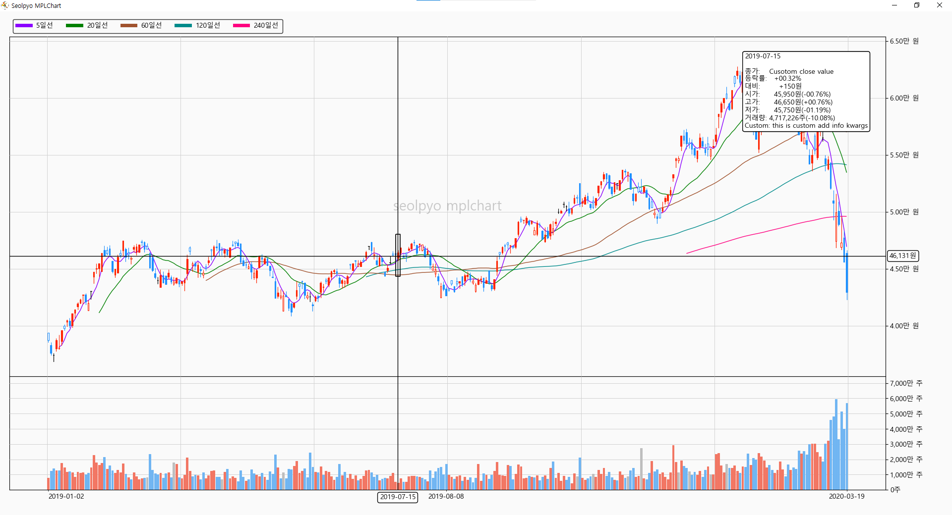
How to Change Information Text Format
The text format retrieves and uses Chart.price_info_format and Chart.volume_info_format.
The kwargs to be used for the format are retrieved through Chart.get_info_kwargs().
The default values are as follows:
price_info_format = """\
{dt}

close:  {close}
등락률: {rate}
대비:  {compare}
open:  {open}({rate_open})
고가:  {high}({rate_high})
저가:  {low}({rate_low})
거래량: {volume}({rate_volume})\
"""
volume_info_format = """\
{dt}

거래량:    {volume}
거래량증가율: {rate_volume}
대비:     {compare}\
"""
Chart.get_info_kwargs
You can change or add data displayed in the text box through the "get_info_kwargs" method.
The predefined kwargs values are passed to kwargs.
import pandas as pd
import seolpyo_mplchart as mc


class Chart(mc.Chart):
    format_info_price = mc.format_info_price + '\nCustom info: {ci}'

    def get_info_kwargs(self, idx, *, is_price):
        kwargs = super().get_info_kwargs(idx, is_price=is_price)
        if is_price:
            kwargs['ci'] = 'this is custom add info kwargs'
            kwargs['close'] = 'Cusotom close value'
        return kwargs

C = Chart()
data = {stock price data}
df = pd.DataFrame(data)

C.set_data(df)

mc.show()
Changing Chart Ratio
The chart ratio is based on the values provided by Chart.get_ax_config_list(). It creates as many ax instances as the number provided here, and configs named slider, none, legend, price, and volume must strictly exist.
When creating a chart, it generates as many Axes as the number in ax_config_list. There is no limit to the number, but slider, none, legend, price, and volume must be included.
The default values are as follows:
    def get_ax_config_list(self) -> list[AxData]:
        return [
        {
            'name': 'slider',
            'is_px': True,
            'size': 100,
        },
        {
            'name': 'none',
            'is_px': True,
            'size': 40,
        },
        {
            'name': 'legend',
            'is_px': True,
            'size': 60,
        },
        {
            'name': 'price',
            'is_px': False,
            'size': 8,
        },
        {
            'name': 'volume',
            'is_px': False,
            'size': 3,
        },
    ]
Chart.STYLE
A configuration where configuration class objects such as CANVAS, CHART, SLIDER, and ARTIST exist.
# seolpyo_mplchart/style/__init__.py

from .chart import (
    PRICEFACECOLOR, PRICEEDGECOLOR, PRICE,
    MA,
    VOLUMEFACECOLOR, VOLUMEEDGECOLOR, VOLUME,

    Style as ChartStyle, STYLE as CHARTSTYLE,
)
from .slider import (
    NAVSTYLE,

    STYLE as SLIDERSTYLE
)
from .artist import (
    WATRERMARKSTYLE,

    CROSSLINE,
    BOX, BBOX,
    TEXT,

    STYLE as ARTISTSTYLE
)

class Style:
    def __init__(self):
        # chart
        self.CHART = CHARTSTYLE

        # slider
        self.SLIDER = SLIDERSTYLE

        # etc artists
        self.ARTIST = ARTISTSTYLE

STYLE = Style()
Chart.watermark
Watermark text displayed in the center of the chart.
Chart.get_cnadle_segment
A method provided to change the appearance of the candles drawn on the chart.
import pandas as pd
import seolpyo_mplchart as mc

class Chart(mc.Chart):
    def __init__(self, *args, **kwargs):
        super().__init__(*args, **kwargs)
        self.collection_candle.set_linewidth(1.5)
        self.get_candle_segment = self.get_bar_segment
        return

C = Chart()

data = {stock price data}
df = pd.DataFrame(data)

C.set_data(df)

mc.show()
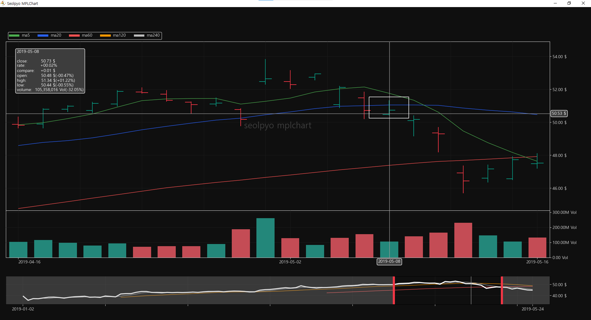
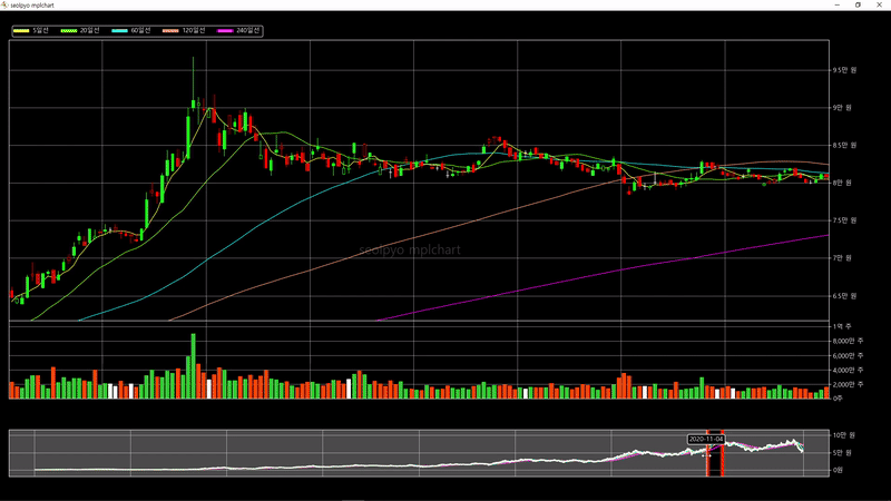
Chart.candle_on_ma
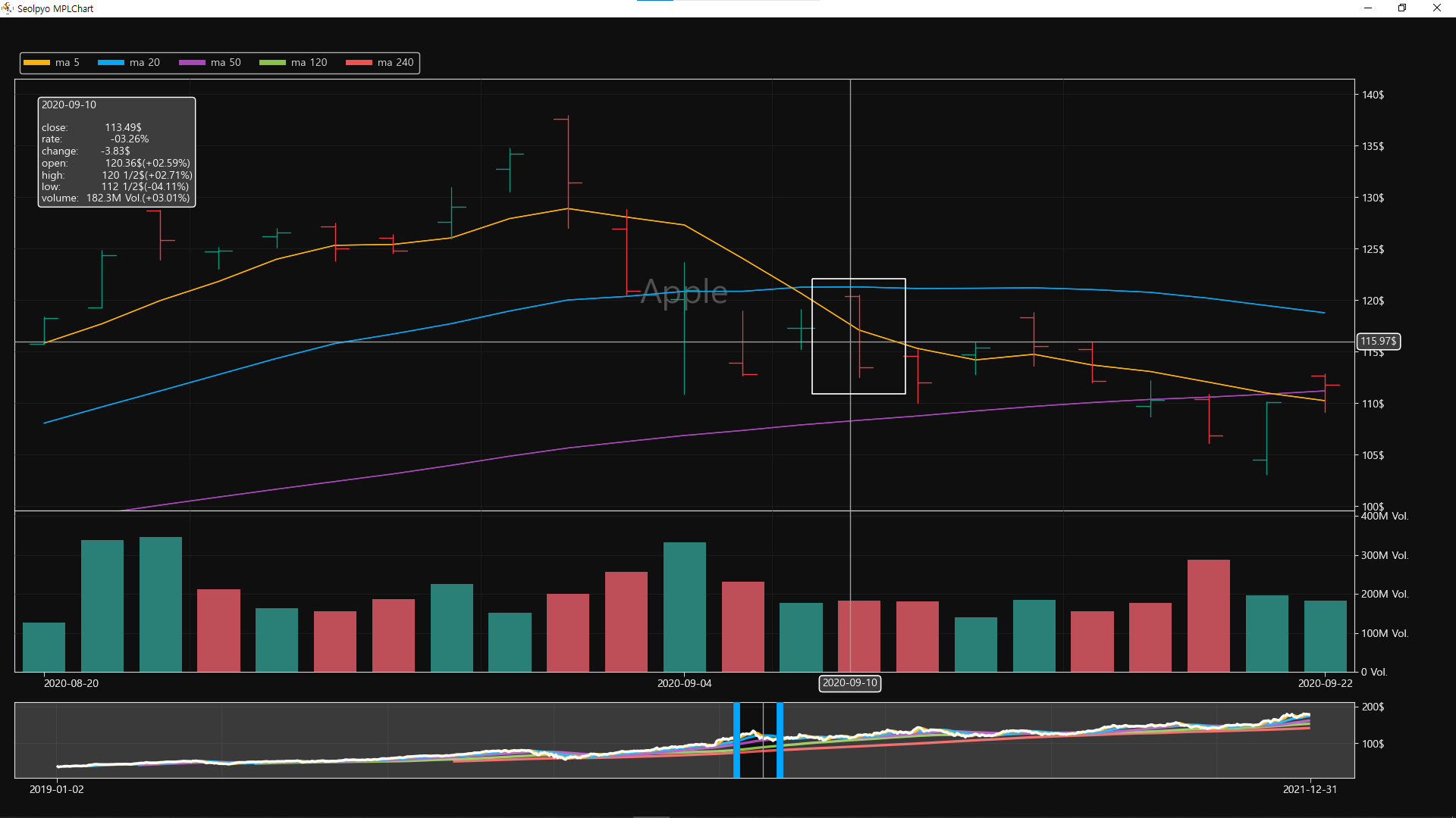
If true, draws the candles on top of the moving average lines. If false, draws the candles underneath the moving average lines, as shown in the following image.
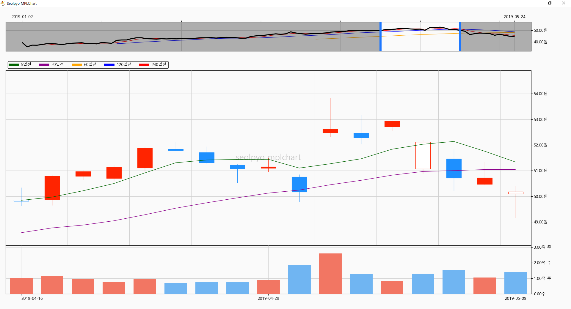
Chart.limit_candle
If the number of candles displayed on the screen is less than or equal to this value, the full candles are drawn; if it is greater, only the wicks are drawn.
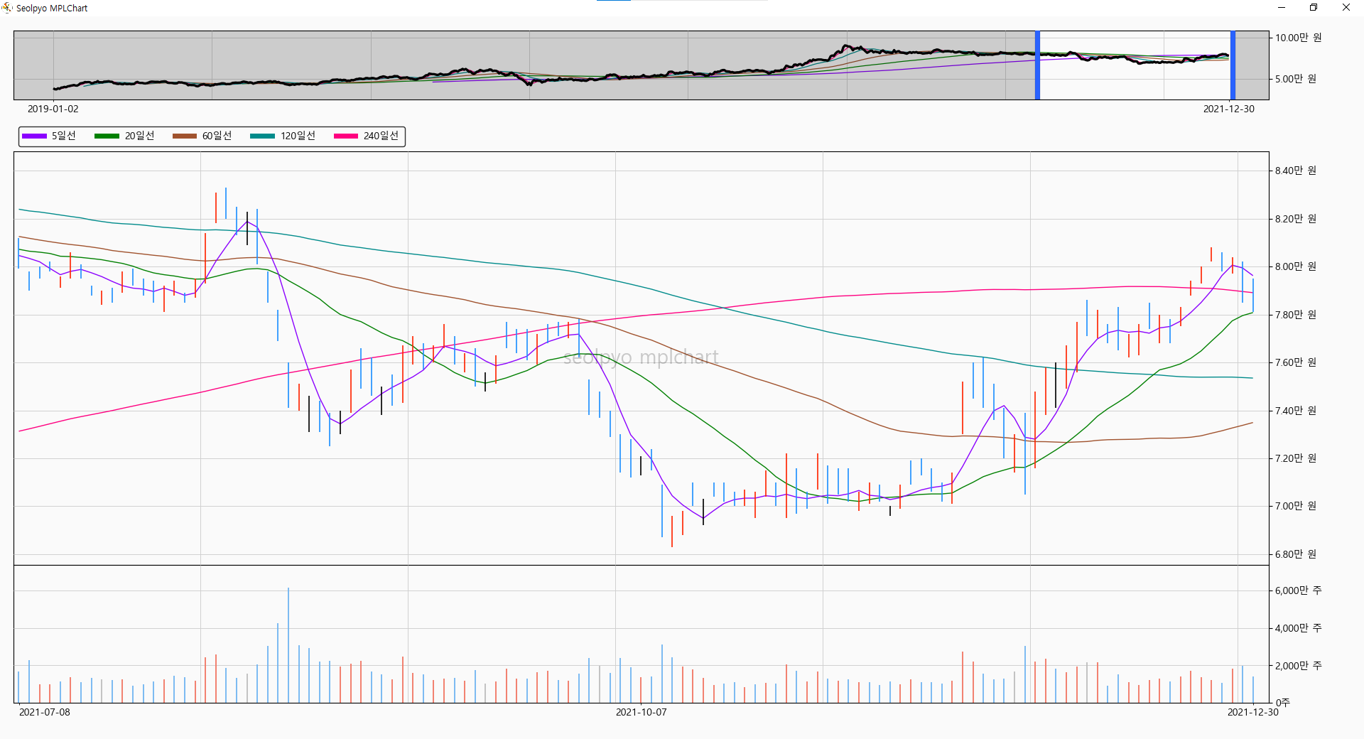
Chart.limit_wick
If the number of candles displayed on the screen is less than or equal to this value, the wicks are drawn; if it is greater, a line chart is drawn.
When drawing the line chart, instead of rendering the entire dataset, a line chart connecting a maximum of 2,000 points is drawn. If the number of points exceeds 2,000, a step interval is applied.
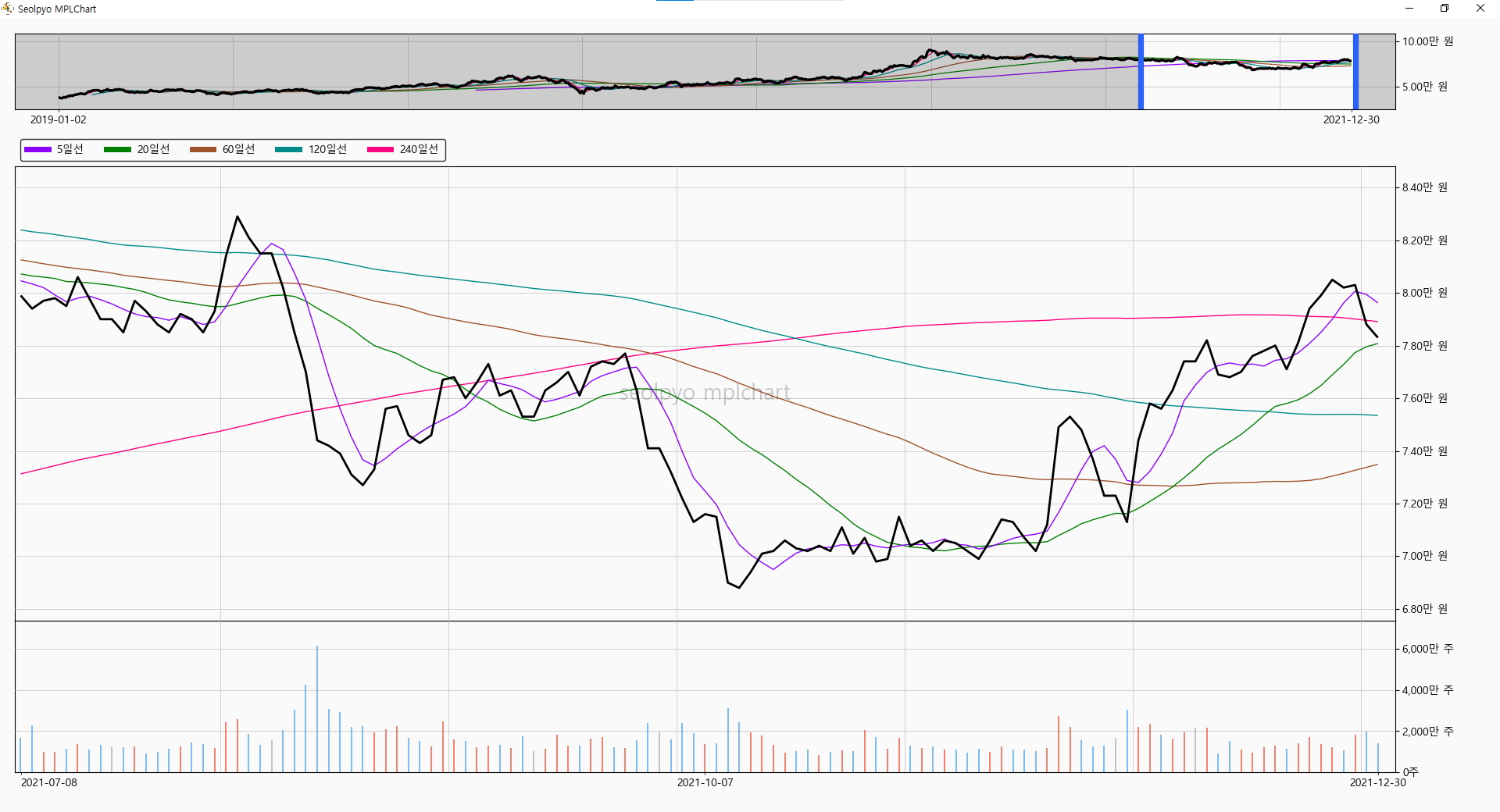
line chart
Even when drawing a line chart, performance can slow down if the rendering range becomes too large.
To prevent this issue, when a line chart is drawn, a step interval is applied to render only a subset of the data.
By default, it draws a simple close price line.
If you want to draw a high-low line instead of a simple close price line, you can override it before creating the chart instance by setting Chart.get_segment_price_line = Chart.get_segment_hl_line.
Chart.limit_volume
If the number of candles displayed on the screen is less than or equal to self.limit_wick, the total volume is drawn; if it is greater, only a portion of the volume is drawn.
When drawing only a portion, it renders the top limit_volume number of items based on volume descending order.
If you experience lagging while moving after selecting a wide range, you can improve the rendering speed by lowering this value.
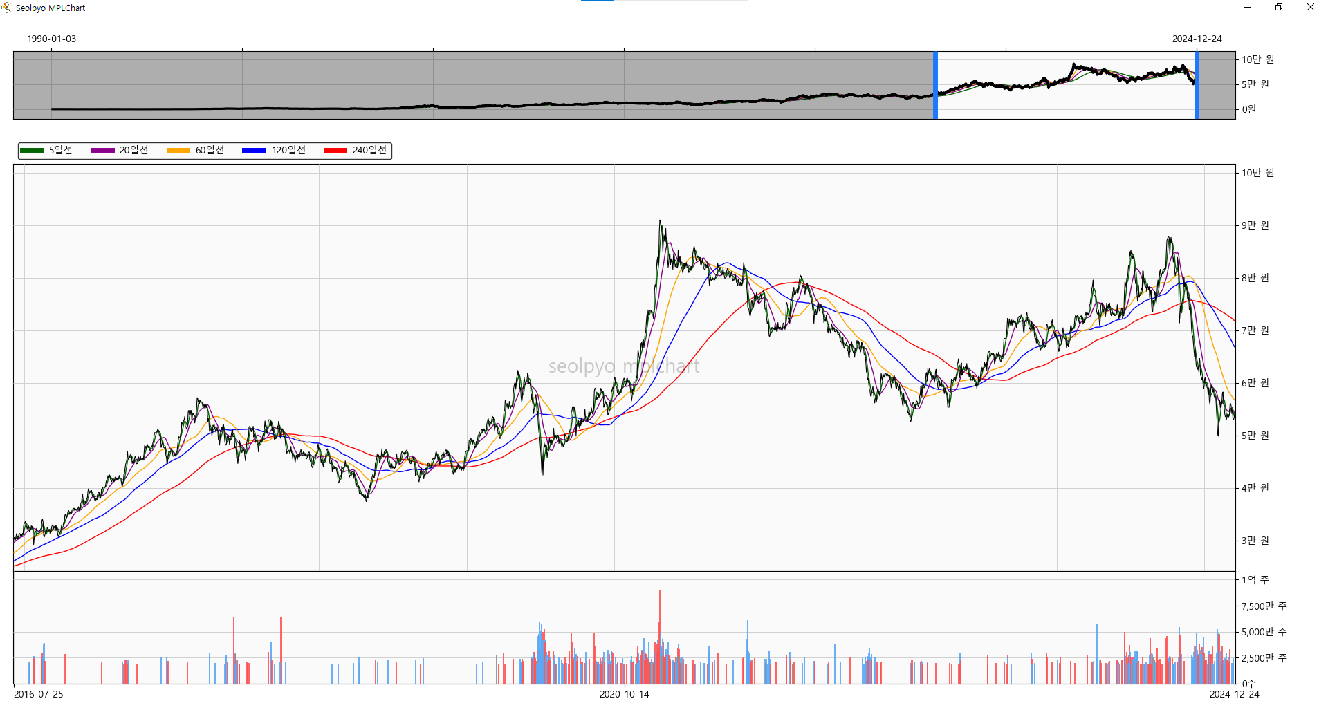
Chart.get_price_colors(), Chart.get_volume_colors()
This method determines the colors of the candles and volume bars drawn on the chart.
It returns (facecolors, edgecolors) for each.
You can set your desired colors by modifying the return values of this function.
Candle Color
open < close, pre close < close : self.STYLE.CHART.PRICE.FACECOLOR.up_rise, self.STYLE.CHART.PRICE.EDGECOLOR.up_rise
open < close, pre close > close : self.STYLE.CHART.PRICEE.FACECOLOR.up_fall, self.STYLE.CHART.PRICE.EDGECOLOR.up_fall
close < open, close < pre close: self.STYLE.CHART.PRICE.FACECOLOR.down_fall, self.STYLE.CHART.PRICE.EDGECOLOR.down_fall
close < open, close > pre close : self.STYLE.CHART.PRICE.FACECOLOR.down_rise, self.STYLE.CHART.PRICE.EDGECOLOR.down_rise
open == close : self.CONFIG.CANDLE.EDGECOLOR.flat
Volume Color
pre close < close : self.STYLE.CHART.VOLUME.FACECOLOR.rise, self.STYLE.CHART.VOLUME.EDGECOLOR.rise
pre close > close : self.STYLE.CHART.VOLUME.FACECOLOR.fall, self.STYLE.CHART.VOLUME.EDGECOLOR.fall
pre close == close : self.STYLE.CHART.VOLUME.FACECOLOR.unchage, self.STYLE.CHART.VOLUME.EDGECOLOR.unchange
Chart.limit_ma
If the number of candles displayed on the screen is less than or equal to this value, the moving average lines are drawn.
If you experience lagging while moving after selecting a wide range, you can improve the performance by setting this value lower.
The default value is None.
Chart.slider_top
If true, places the slider on top of the chart.
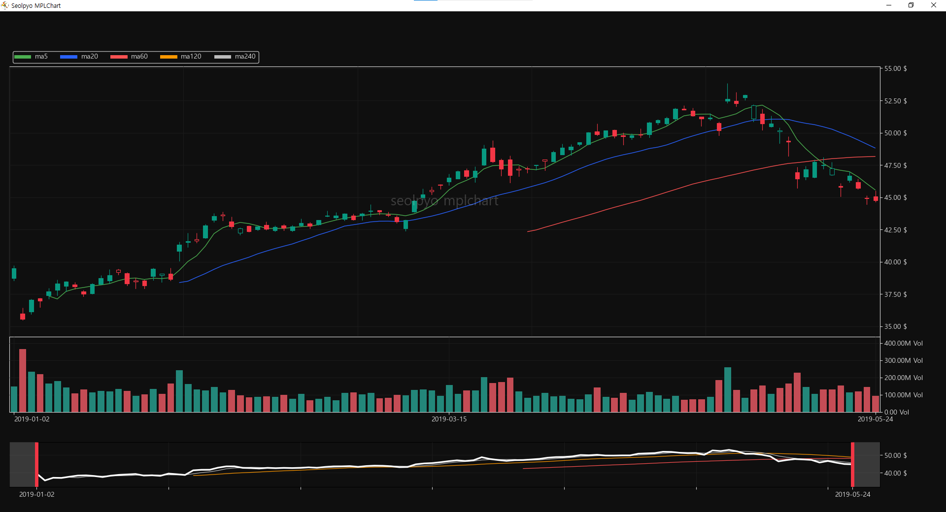
Chart.min_distance
The minimum number of candles that must be selected when selecting the slider area.
If an area smaller than this value is selected, the previous area will be maintained.
in_chart
Distinguishes whether the mouse cursor is within the price chart area or the volume chart area.
in_slider
Distinguishes whether the mouse cursor is within the slider area.
in_price_chart
Distinguishes whether the mouse cursor is within the price chart area.
in_volume_chart
Distinguishes whether the mouse cursor is within the volume chart area.
Chart.add_artist()
A function that adds the Artists used in the chart. Called during initialization (init).
Chart.draw_chart()
A function that draws the basic elements of the chart. Called when the on_draw event is triggered.
It is also called while moving across the chart.
Chart.draw_artist()
A function that draws Artists on the chart. Called when the on_draw event is triggered.
It is also called while moving across the chart.
Chart.set_artist()
A function that applies the settings of the chart Artists. Called during refresh.
Chart.set_collection_artist(ind_start, ind_end)
A function that changes the segments of chart elements (candles, volume, etc.). Called upon every axis change.
Chart.on_draw(e)
A method called when the draw event is triggered.
Chart.on_resize(e)
A method called when the resize event is triggered.
Chart.on_pick(e)
A method called when the pick event is triggered.
Chart.on_move(e)
A method called when the mouse move event is triggered.
Chart.on_click(e)
A method called when the mouse click event is triggered.
Chart.on_release(e)
A method called when the mouse release event is triggered.
Release history Release notifications | RSS feed


Download files
Download the file for your platform. If you're not sure which to choose, learn more about installing packages.
Source Distribution
Built Distribution
Filter files by name, interpreter, ABI, and platform.
If you're not sure about the file name format, learn more about wheel file names.
Copy a direct link to the current filters
File details
Details for the file seolpyo_mplchart-3.0.0.tar.gz.
File metadata
- Download URL: seolpyo_mplchart-3.0.0.tar.gz
- Upload date:
- Size: 82.1 kB
- Tags: Source
- Uploaded using Trusted Publishing? No
- Uploaded via: twine/6.2.0 CPython/3.12.10
File hashes
| Algorithm | Hash digest | |
|---|---|---|
| SHA256 |
7c0a1f9e4ebdb287e9e825cbc4e20b5e8646e6dfa1d7443ba7217d33cb0353da
|
|
| MD5 |
f35edfcf2551f892f257670069863f81
|
|
| BLAKE2b-256 |
0c5f2b2ad74343336b533b33bf600ff0418a67dac163b15388f8ad4d415eb3d6
|
File details
Details for the file seolpyo_mplchart-3.0.0-py3-none-any.whl.
File metadata
- Download URL: seolpyo_mplchart-3.0.0-py3-none-any.whl
- Upload date:
- Size: 787.6 kB
- Tags: Python 3
- Uploaded using Trusted Publishing? No
- Uploaded via: twine/6.2.0 CPython/3.12.10
File hashes
| Algorithm | Hash digest | |
|---|---|---|
| SHA256 |
1ece4d6061b9a46dacdd2a7f940312115391f38ab88917226bf6e0e0506630a5
|
|
| MD5 |
cc98c604b267a82b708518506bf69cf2
|
|
| BLAKE2b-256 |
fed7c2d7d5f7f9a11b8f787623288ddeecc293173152baf75b3ee86cbbd625ee
|


