
SlantUI
A window look, as a library: a frameless Qt window whose title bar is one oblique band drawn by the page, a step rail under it, a work area, a side panel, and a widget set that uses no dividing lines anywhere.
It took a long time to get right, and it is a library so that the next application does not start by copying files out of the last one.
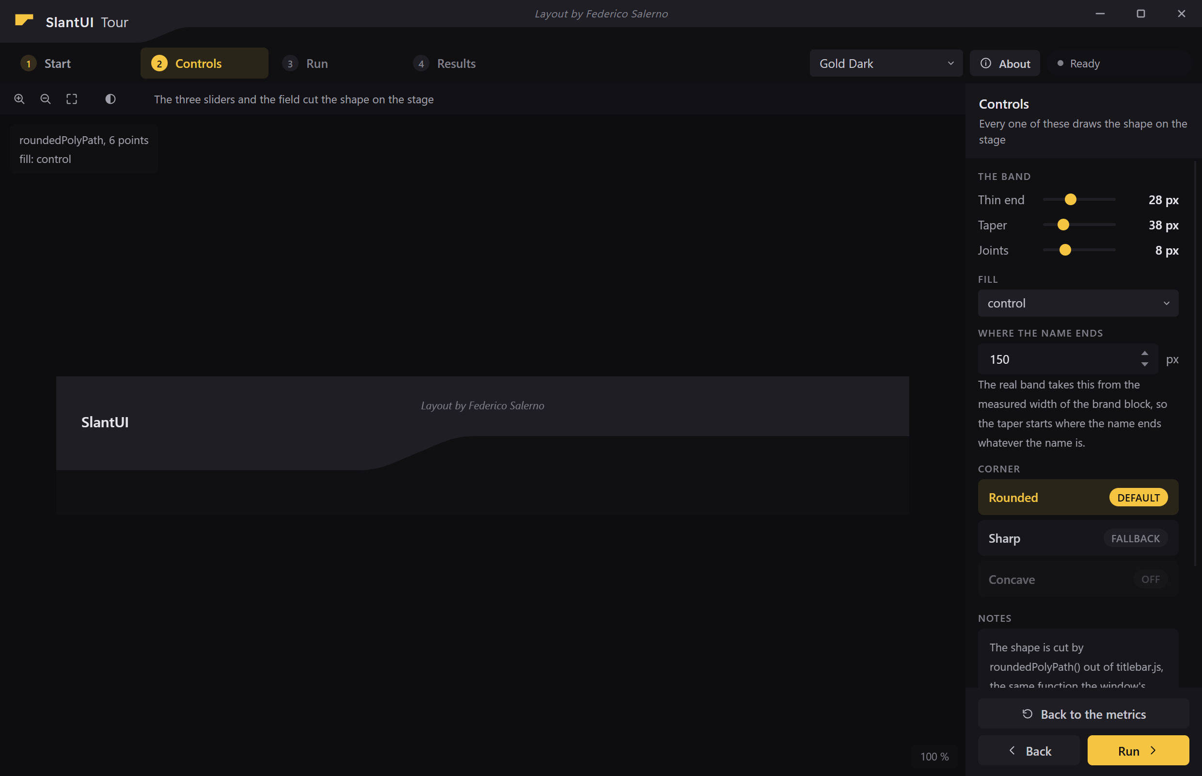
examples/tour, a window on SlantUI and nothing else. The shape on the stage
is the title bar's own profile drawn large, by the same function that cuts the
band above it.
Status: early, and in use. The token system, the stylesheets, the browser
side scripts and the Python shell all work and are tested, examples/tour is
a window built on them and nothing else, and docs/gallery.html is the
catalogue every picture on this page was taken from. Applications are built on
it today, both pages in a Qt window and WPF windows that take the palette and
the band's geometry as data.
Documentation
| Starting an application | The four files, the markup the window needs, and the two calls that make it a window. |
| The roles | The thirty one names a stylesheet may use, one by one, and the contrast contract behind them. |
| Palettes | The eight that ship, how to switch them, and how to build one from five colours. |
| The window | What it does on Windows, and why a frameless window still carries a frame. |
| Outside a browser | The same design in WPF, in Unity, or as plain data. |
| The examples | The tour taken apart. |
The window
Four parts, and each one below is the real thing, grabbed out of a running window and cropped where the page said to crop it.

The band is one shape across the whole width. It is 44 px deep under the
name, runs obliquely down over 38 px, and stays 28 px to the right edge: it
never stops, it only gets thinner. titlebar.js cuts it from those three
metrics and the measured width of the brand block, so the taper starts where
the name ends whatever the name is. The credit line the licence asks for sits
in the middle of it. Under the band the HWND carries a real Windows frame, so
the window animates, snaps and casts a shadow like any other, and no caption
is ever drawn.

The rail under it carries the steps of the job on the left and the
application's own buttons on the right. The step you are on is a pill in the
accent, a step you have done keeps its number in the accent, and a step not
reached yet recedes into text-4. Every tab is the same width and every one
is left aligned, so the numbers and the words line up in a column, and the
status pill at the far end is 150 px whatever it says, so nothing to its left
moves when the status changes.

The toolbar is a strip of small controls over the work area, a line of
hint text in the middle, and the name of what is open on the right.
fitOneLine() shortens a name that does not fit and keeps the extension, so
the strip is one line at any width.
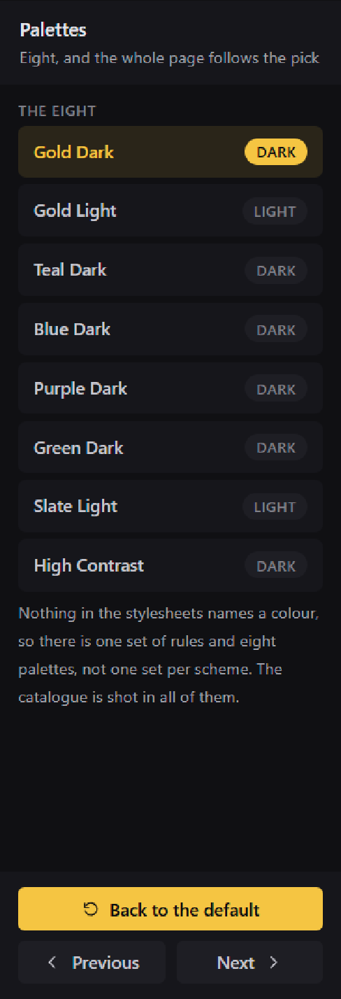
The panel on the right is a header that names the step, a body that
scrolls, and a footer that does not. The footer holds the step's own action
above Back and the primary button, at a fixed height, so the buttons are in
the same place on every step and a tall glyph cannot move a row. The body is
the application's, and the widget set below is what goes in it.
Those four and the stage between them are the whole layout. .titlebar,
.topbar, .toolbar and .rp are classes and not ids, so a page keeps its
own ids and can hold two of anything.
The widget set
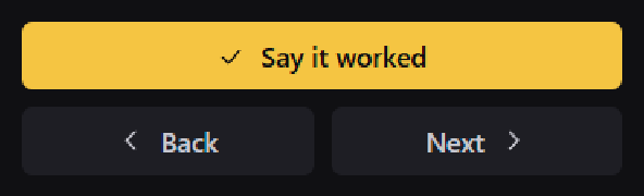
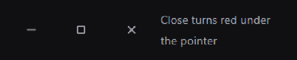
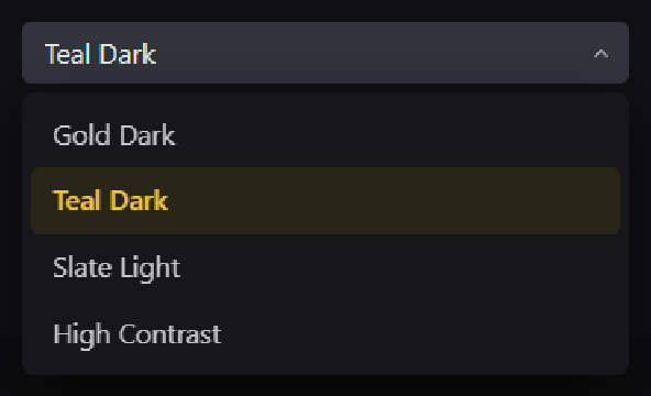
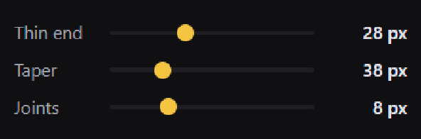
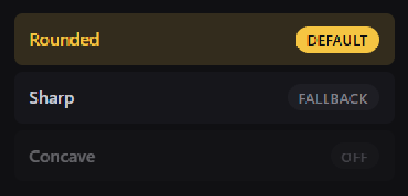
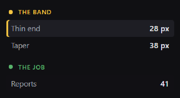
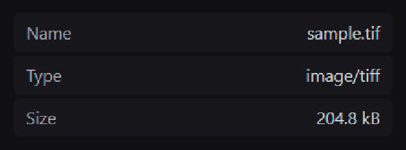
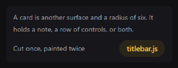
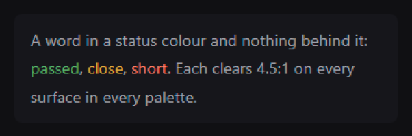
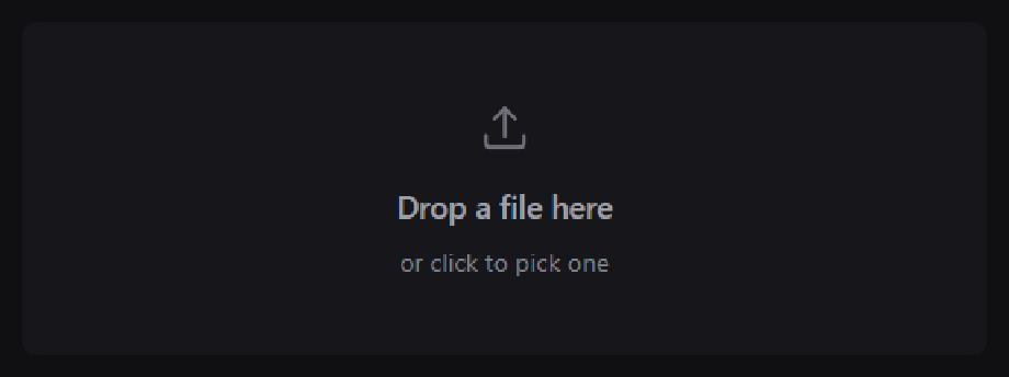
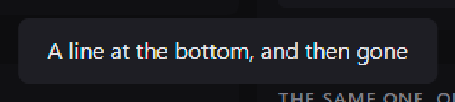
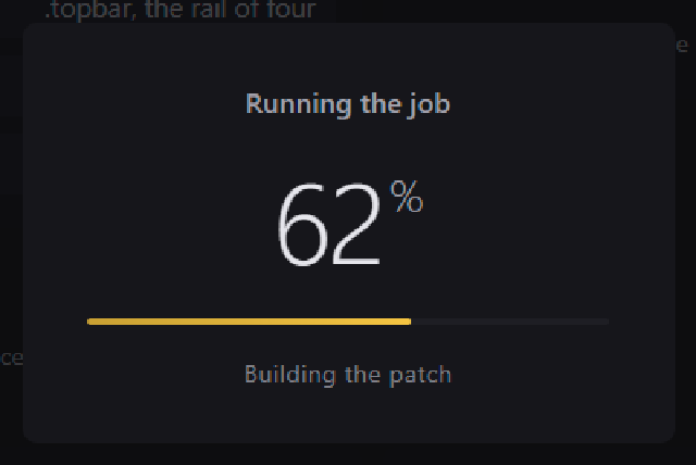
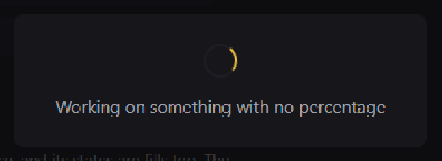
One of each, drawn by the library, in the default palette. The catalogue they
come from is docs/gallery.html, and a widget missing from it is a widget
nobody looks at again, so the test suite fails when one is.
| Buttons | Buttons filling the width | The window buttons |
|---|---|---|
 |
 |
 |
| Toolbar buttons | A text field | A number field, with its own stepper |
 |
 |
 |
| A dropdown, open | Sliders | A list to choose from |
 |
 |
 |
| Chips | Metric rows | Key and value rows |
 |
 |
 |
| A card | Words in a status colour | A note on the stage |
 |
 |
 |
| The steps, in their three states | The status pill, in five |
|---|---|
 |
 |
| The drop zone | A line at the bottom, and then gone |
 |
 |
| A job with a percentage | Work with no percentage |
 |
 |
Colour
Colours are on two levels. A palette holds thirty one concrete values. A role is the name a component is allowed to use. Nothing in a stylesheet ever names a colour, which is what makes one component file correct on a dark palette and on a light one.
surface-0..3   control control-hover control-active   text-1..4
accent accent-hover accent-active on-accent accent-text
accent-surface accent-surface-hover
ok warn err on-status ok-text warn-text err-text
err-surface err-surface-hover
scrim shadow overlay
Eight palettes fill them: Gold Dark (the default), Gold Light, four accent variants of the default, Slate Light and High Contrast. The same three buttons, with no rule written twice:
| Gold Dark | Gold Light | Teal Dark | Blue Dark |
|---|---|---|---|
|
 |
 |
 |
| Purple Dark | Green Dark | Slate Light | High Contrast |
 |
 |
 |
 |
A page switches palette by setting one attribute, and the window behind it is told so the colour under the page moves too:
<html data-palette="slate-light">
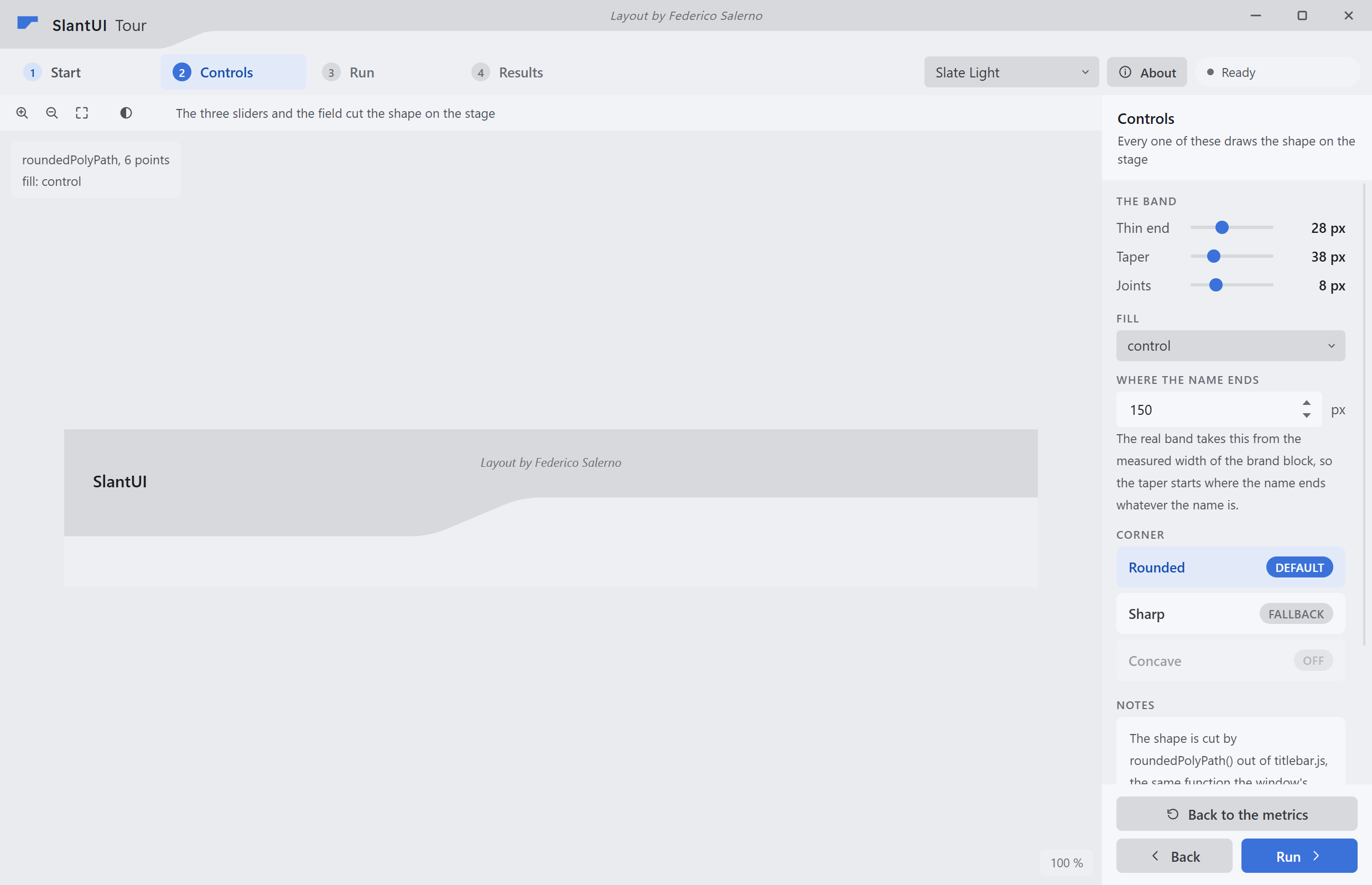
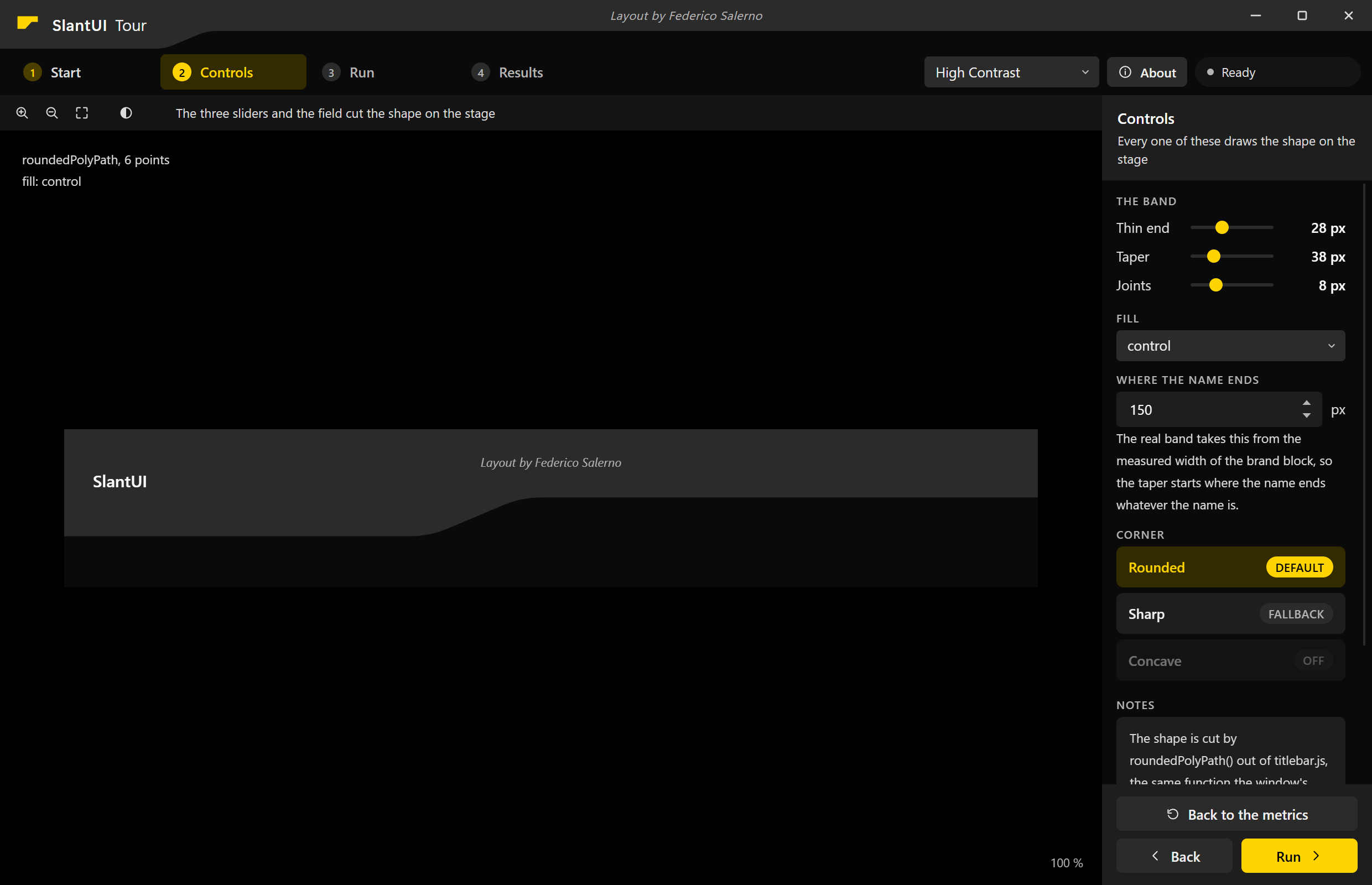
That is the whole of it. The two windows below are the one at the top of this page, in another palette, with the same markup and the same stylesheets:
| Slate Light | High Contrast |
|---|---|
 |
 |
python -m slantui.tokens list
python -m slantui.tokens css gold-dark        # a :root block
python -m slantui.tokens css                  # all eight, switchable
python -m slantui.tokens roles                # the vocabulary and the floors
python -m slantui.tokens audit                # exits 1 on a single shortfall
A palette from five values
from slantui.tokens import derive

p = derive(base="#0D0D0F", accent="#F5C542", text="#E6E6EC",
           ok="#57B26A", err="#B0524A", name="My App", slug="my-app")
Surfaces step away from the base in OKLab lightness, controls step away from
the page, warn is err turned to amber, and every foreground is solved
against the same contrast function the auditor measures with. A derived
palette clears the audit by construction.
Anyone who wants full control writes all thirty one roles by hand instead and gets the same object back.
Contrast
Every text role is measured against every surface role of every palette. That is 110 pairs per palette and 880 in total, and the test suite fails on one shortfall.
| Tier | Roles | Floor |
|---|---|---|
| body | text-1 text-2 text-3 and the four hue foregrounds |
4.5:1 |
| minor | text-4, which is barred from carrying a sentence |
3.0:1 |
| on-fill | on-accent on the accent fills, on-status on the status fills |
4.5:1 |
The floors were fixed before any palette was written, so that a palette is never the argument for lowering one. Three of the colours this design shipped with did not clear them, and the colours moved.
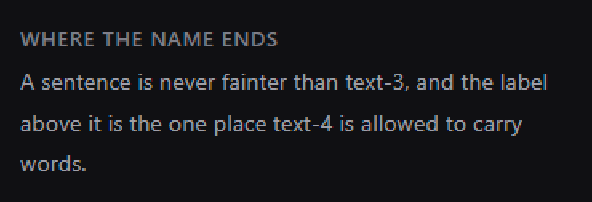
text-4 is the one role held to the lower floor, and this is the rule that
comes with it: it labels a block, it never carries the sentence.
Stylesheets
Five files, loaded in this order:
palettes.css     the eight palettes, one :root block each, written by the Python
metrics.css      radii, type, the geometry of the band, the rail and the side panel
base.css         reset, document defaults, focus ring, scrollbars, helpers
layout.css       the shell: title bar, step rail, work area, side panel
components.css   the widgets
from slantui.css import STYLESHEETS, path, bundle
Nothing hand written names a colour. Every value in the last three files is
var(--role) or var(--metric), and the test suite fails on a hex value, an
rgb(), an id selector, a property that is neither a role nor a metric, and a
solid border. Fills, never outlines: a control is told apart from what is
behind it by being another surface, and its states are fills too.
Scripts
Four classic scripts, no modules, because the embedded browser serves the
page from file://:
theme.js         the roles read back off :root for a canvas, plus colour maths
bridge.js        the QWebChannel transport, with a queue for calls made too early
widgets.js       the dropdown, the number stepper, text that has to fit on one line
titlebar.js      the oblique band, the window buttons, the resize strips, the credit
from slantui.js import SCRIPTS, path, bundle
titlebar.js cuts the band to the four metrics and the measured width of the
brand block, so the taper starts where the name ends whatever the name is. It
also writes the credit line the licence asks for. The tests run all four files
in a bare V8 against a small fake DOM.
Shell
The Python side: a frameless Qt window that still animates, snaps and casts a shadow like a native one, and the object the page talks to.
import sys
from slantui.shell import Application, Bridge, Window, pyqtSignal, pyqtSlot

class Backend(Bridge):
    hello = pyqtSignal(str)

    @pyqtSlot(str, result=str)
    def greet(self, name):
        return "hello " + name

app = Application("My App", app_id="Me.MyApp")
win = Window("ui/index.html", bridge=Backend(), title="My App")
win.show()
sys.exit(app.run())
Application is a QApplication that does the four things Qt wants done
before it exists, in the right order: the taskbar identity, the Chromium
flags, the high DPI policy and the WebEngine initialisation. Window is a
QQuickView holding one WebEngineView (a widget view costs three GPU
presents per resize; the Quick window costs one), with the page's window
chrome wired: the HWND carries the real frame styles so Windows animates
it, answers WM_NCCALCSIZE so no caption is ever laid out, and rounds its
own corners. Bridge carries the six slots and the one signal the title
bar uses; an application subclasses it and adds its own.
Maximised is a state of the window, not of the HWND. A window that carries the frame styles gets placed past the edge of the screen when Windows zooms it, and stays there, so the window never zooms: it animates onto the work area and tells the page. Win+Up, Win+Down and the taskbar menu are taken over as system commands, a drag to the top edge is undone the moment Qt reports it, and a drag on the band of a maximised window restores it under the cursor first, as Windows does.
The page loads qrc:///qtwebchannel/qwebchannel.js before bridge.js, puts
a .titlebar in its markup, and calls Bridge.init() and initTitlebar().
A page that lets the user change palette tells the window with
Window.set_palette(slug), so the colour behind it moves too.
Qt names come from slantui.shell.qt, PyQt6 first and PyQt5 as a fallback, so
an application that imports its Qt names from there gets the fallback too.
SLANTUI_SOFTWARE_RENDER=1 in the environment draws every SlantUI application
through software, for a machine with a broken driver.
Example
.venv\Scripts\python examples\tour\main.py
The window at the top of this page. Four steps, a drawing on the stage, a side panel with one of every widget, a switcher that moves all eight palettes, and a backend with four slots and two signals. It is the proof that the look left the application it came out of, and the answer to how a page finds the library's files when they live in site-packages.
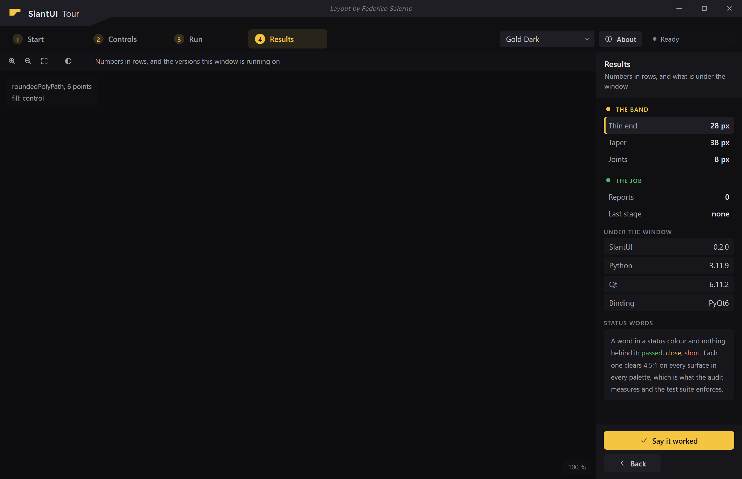
The sliders start at the real metrics, read off :root, so moving one redraws
the shape on the stage with the number the band itself uses. See
examples/README.md.
The harder proof
The tour was written to use the library, so it proves less than it looks. The real test was taking an application that was written before the library and moving it onto it. That is one commit: 257 lines in, 1731 lines out, and eight files deleted, which were its Qt shim, its QML shell, three of its five stylesheets and three of its scripts. It takes all of them from the package now.
Not one line of slantui/ was edited to make it fit. Of the 124 classes that
application's markup uses, the only ones the library did not already define
were its own screens and two states of its own navigation. Everything else
landed on a role or a component that was already here.
Gallery
.venv\Scripts\python docs\capture.py
.venv\Scripts\python docs\publish.py
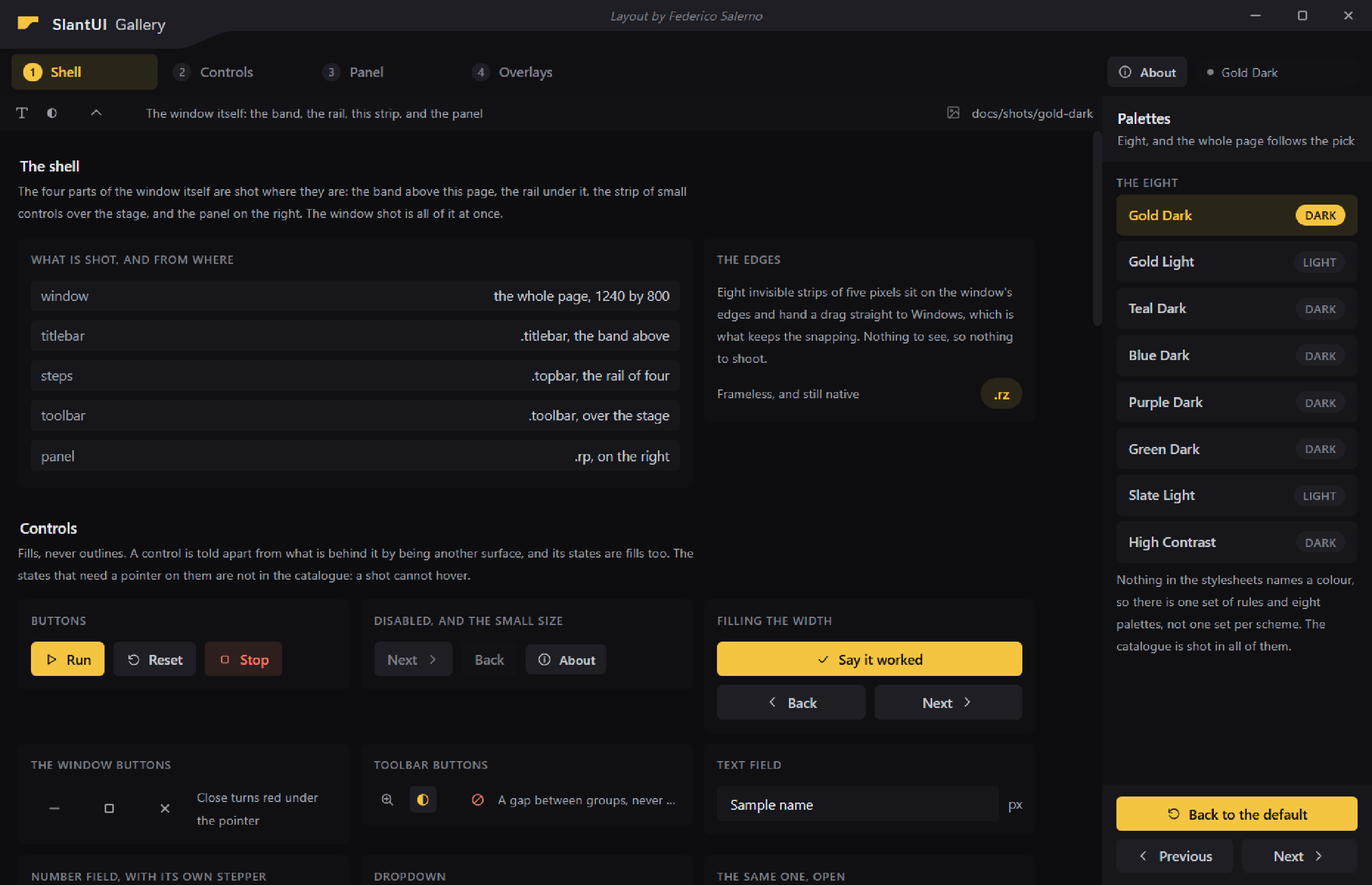
docs/gallery.html is a window holding a catalogue of the widget set, one
cell per component, and docs/capture.py opens it and saves a picture of
every cell in every palette: thirty one shots, eight palettes, and the four parts
of the shell shot where they are. There is no screenshot tool in it. The
window renders the page, grabWindow() hands the frame back as an image, and
the page itself says which rectangle to keep, so a picture is of the real
widget in the real window and cannot drift away from the library.
A full run is 259 files and six megabytes, and docs/shots/ is ignored by
git. docs/publish.py is what puts the handful this page shows into
docs/img/, which is tracked: it reads the markdown, copies every picture a
page points at, and deletes the ones nobody points at any more. So a picture
enters the repository by being put in a page. See docs/README.md.
Outside a browser
The look is not just for a page in a Qt window. Two of the applications that wear it are WPF windows written in PowerShell, so the palettes, the metrics and the band's profile are written out for a toolkit that cannot read a stylesheet.
python -m slantui.tokens json                 the whole design as data
python -m slantui.tokens xaml gold-dark       a WPF ResourceDictionary
python -m slantui.tokens ps1                  a PowerShell data file
python -m slantui.tokens uss                  Unity's UI Toolkit
The band is the interesting one, because it is the one part of the design
that is a drawing and not a rectangle. Its profile is six points and two
rounded corners, built in slantui/geometry.py and emitted as an SVG path,
which the page clips with and WPF parses with no character changing. There
are three implementations, in Python, in JavaScript and in PowerShell, and
the tests run all three on the same windows and compare the strings.
See docs/beyond-the-browser.md, which carries the recipe in enough detail to draw the band in a toolkit this library has never heard of.
Install
pip install -e ".[shell,dev]"
python -m pytest tests -q
slantui.tokens has no dependencies. The colour maths, sRGB through OKLab and
OKLCH, is written out in slantui/tokens/color.py so that a palette can be
checked on a machine with nothing installed. The shell extra is PyQt6 with
QtWebEngine, which only slantui.shell imports. The dev extra adds pytest
and mini-racer, which is V8 as a wheel; without it the script tests skip
and everything else still runs.
Three test files open a real window for a few seconds and check the frame, the work area, the example and the gallery from the outside. They run only when asked:
SLANTUI_SHOW_WINDOW=1 python -m pytest tests -q
Licence
MIT, with one extra condition: the credit line SlantUI draws in the title bar stays on screen. Everything else about your application is yours. See LICENSE, which is written to be read in half a minute.
1 maintainer

Release files for slantui 0.2.0
For a detailed explanation of source distributions (sdists) and built distributions (wheels), please see the package formats documentation.
Source distribution (sdist)
| File | Size | Uploaded | |
|---|---|---|---|
| slantui-0.2.0.tar.gz | 147.9 kB | Details |
Built distribution (wheel)
| File | Interpreter | ABI | Platform | Reset |
|---|---|---|---|---|
| slantui-0.2.0-py3-none-any.whl | Python 3 | none | any | Details |
Total release size: 253.9 kB
Release files / slantui-0.2.0.tar.gz
| Download URL | slantui-0.2.0.tar.gz |
|---|---|
| Size | 147.9 kB |
| Tags | Source |
|
SHA-256 checksum How to use checksums |
1cdfced40a0c1a9b697bb678a393ccf4bdae9b7ab16c6c462f3abf900e483c3e
|
|
BLAKE2b-256 checksum How to use checksums |
78fc2e095fc153e8d91a2e49a84333720d0e223ebcbd4a1ae64efeddf245a135
|
| Upload date | |
|
Uploaded using Trusted Publishing? What is trusted publishing? |
No |
| Uploaded via |
twine/7.0.0 CPython/3.11.9
|
Release files / slantui-0.2.0-py3-none-any.whl
| Download URL | slantui-0.2.0-py3-none-any.whl |
|---|---|
| Size | 106.0 kB |
| Tags | Python 3 |
|
SHA-256 checksum How to use checksums |
eb6fd4433d463f30aac1448fbc14f45f94d4e5f09b7f30ff1fc4040a6eaeb0e2
|
|
BLAKE2b-256 checksum How to use checksums |
179c19d03ee9b5e491ede35c989913f65b014757675369555d1de6d35506c162
|
| Upload date | |
|
Uploaded using Trusted Publishing? What is trusted publishing? |
No |
| Uploaded via |
twine/7.0.0 CPython/3.11.9
|














