Advanced styling and custom components for Streamlit applications

Project description
st_yled - Streamlit Styling and Components




New in st_yled 0.5: Beautiful Theme templates for effortless app design
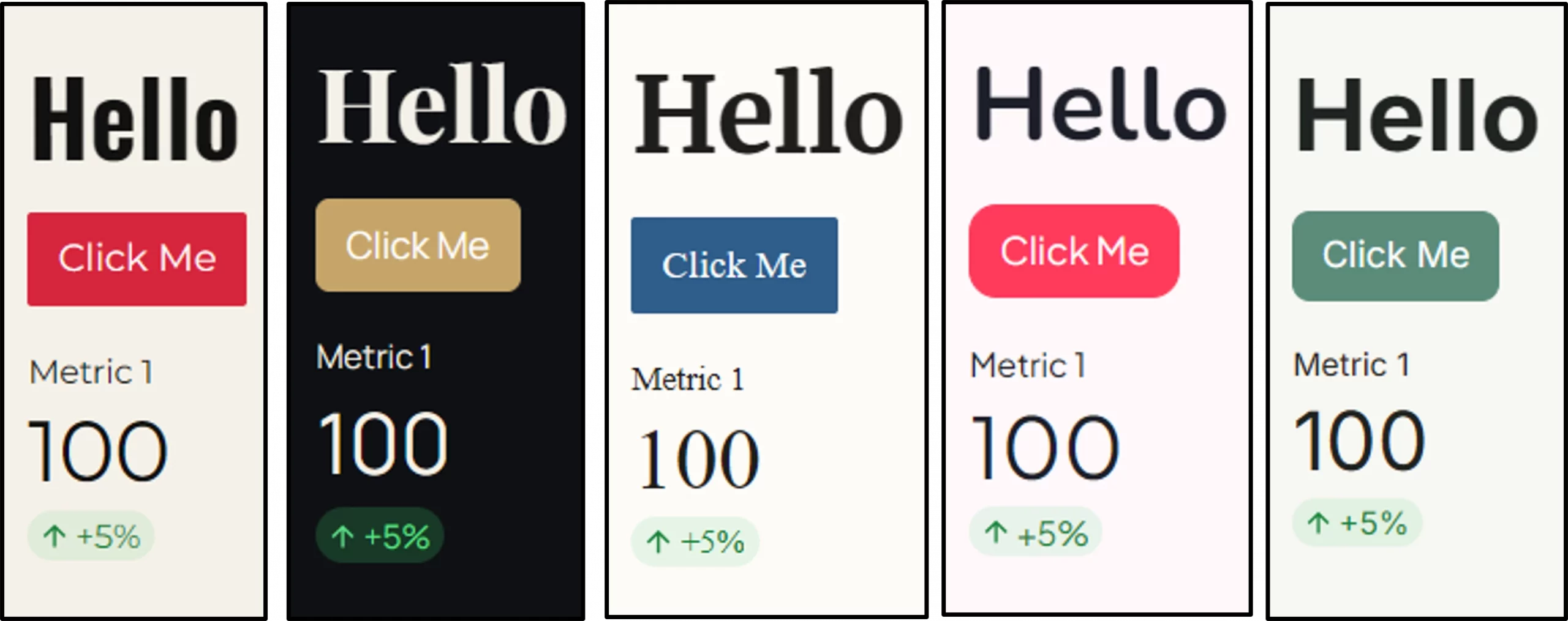
st_yled provides styling capabilities and improved components for Streamlit applications. Style your Streamlit apps with custom themes and unique elements to match your personal tone or corporate brand.
-
Custom styling for most elements: background colors, font size and more
-
New components like cards for stunning apps, built faster
-
Built-in theme templates supporting light and dark mode
-
st_yled studio app to configure your layouts and custom elements.
Check the offical st_yled docs https://st-styled.evo-byte.com/
✨ Features
🎨 CSS Integration - Load custom CSS files and apply styles seamlessly
🎯 Global Styling - Apply consistent styles across all elements
🔧 Elements - 44+ styled component wrappers with validation
🔧 New Components - 6+ new components like cards, headers or buttons
⚡ st_yled studio - Use the accompanying app to test your layout styling
🚀 Quick Start
Installation
pip install st-styled
Basic Usage
import streamlit as st
import st_yled

# Initialize st_yled (loads CSS from .streamlit/st-styled.css if available)
st_yled.init()

# Apply global styling to all buttons
st_yled.set("button", "background_color", "#ff6b6b")
st_yled.set("button", "border_style", "solid")

# Use enhanced components with styling
st_yled.button("Styled Button", background_color="#4ecdc4", color="white")
st_yled.text("Styled Text", color="#2c3e50", font_size="18px")

# Add st_yled components - like a badge card
st_yled.badge_card_one(
    badge_text="New",
    badge_icon=":material/star:",
    title="Featured Item",
    text="Check out this amazing feature",
)

# Apply a built-in theme template (v0.5)
st_yled.init(theme="bauhaus")

# st_yled updates the Streamlit theme sections in .streamlit/config.toml
# so theme colors are applied consistently in the app.
📚 Documentation
Content
- Installation & Setup - Get started quickly
- API Reference - Core functions and usage
- st_yled Components - New component examples
- Element Examples - Basic element styling
- Styling Properties - Supported CSS properties
- Configuration - Advanced configuration options
📖 API Reference
Core Functions
st_yled.init(css_path=None, bypass_css_validation=False, strict_css_validation=False, reset_tracebacklimit=True)
Initialize st_yled with CSS styling.
Parameters:
css_path(str, optional): Path to custom CSS file. If not provided, looks for.streamlit/st-styled.cssbypass_css_validation(bool, optional): Skip CSS validation inst_yledwhen set toTruestrict_css_validation(bool, optional): Raise errors for invalid CSS values when set toTruereset_tracebacklimit(bool, optional): Improve traceback depth for CSS-path related debugging
Example:
# Load default CSS file
st_yled.init()

# Load custom CSS file
st_yled.init("path/to/custom.css")

# Configure validation behavior
st_yled.init(
    bypass_css_validation=False,
    strict_css_validation=True,
)
Validation precedence is: environment variables (ST_STYLED_BYPASS_VALIDATION, ST_STYLED_STRICT_VALIDATION) > init(...) arguments > class defaults.
st_yled.set(component, property, value)
Apply global styling to all components of a specific type.
Parameters:
component(str): Component type (e.g., "button", "text", "header")property(str): CSS property name (e.g., "background_color", "font_size")value(str): CSS property value (e.g., "#ff6b6b", "18px")
Example:
# Style all buttons
st_yled.set("button", "background_color", "#3498db")
st_yled.set("button", "border_style", "solid")
st_yled.set("button", "color", "white")

# Style all headers
st_yled.set("header", "color", "#2c3e50")
st_yled.set("header", "font_size", "24px")
🎨 st_yled Components
st_yled provides new custom components that extend Streamlit's functionality with pre-built UI patterns. A full list of new st_yled components can be found here: st_yled component docs
Card Components
# Badge card with icon and styled badge
st_yled.badge_card_one(
    badge_text="New",
    badge_icon=":material/star:",
    title="Featured Item",
    text="Check out this amazing feature",
)
Layout Components
# Sticky header that stays visible while scrolling
st_yled.sticky_header(
    "My App Title",
    background_color="#ffffff",
    border_bottom="2px solid #e0e0e0"
)
Input Components
# Split button with dropdown actions
st_yled.split_button(
    primary_label="Save",
    actions=["Save as Draft", "Save and Publish", "Save as Template"]
)
See st_yled component docs for full list and detailed documentation
🔧 Elements
St_yled provides enhanced versions of Streamlit elements with additional styling parameters:
Text Elements
st_yled.title("My Title", color="#2c3e50", font_size="2.5rem")
st_yled.header("Section Header", color="#3498db")
st_yled.subheader("Subsection", color="#7f8c8d", font_size="1.5rem")
st_yled.text("Regular text", font_size="16px", color="#2c3e50")
st_yled.markdown("**Bold text**", color="#e74c3c")
st_yled.caption("Small caption", color="#95a5a6", font_size="14px")
Interactive Elements
st_yled.button("Click Me", background_color="#e74c3c", color="white")
st_yled.text_input("Name", background_color="#f8f9fa", color="#2c3e50")
st_yled.selectbox("Choose", options=["A", "B"], background_color="#f8f9fa")
st_yled.slider("Value", 0, 100, color="#2ecc71")
Layout Elements
# Styled containers (only background_color and border properties supported)
with st_yled.container(
    background_color="#f8f9fa",
    border_style="solid",
    border_color="#dee2e6",
    border_width="1px"
):
    st.write("Content inside styled container")

# Standard columns (st_yled.columns doesn't exist, use st.columns)
col1, col2 = st.columns(2)
Status Elements
# Status elements with styling (only color property supported)
st_yled.success(
    "Success message",
    color="#155724"
)

st_yled.info(
    "Info message",
    color="#0c5460"
)

st_yled.warning(
    "Warning message",
    color="#856404"
)

st_yled.error(
    "Error message",
    color="#721c24"
)
🎨 Element Coverage
St_yled supports 43 styled elements with comprehensive CSS property support:
- Text Elements (9): title, header, subheader, text, markdown, caption, code, latex, json
- Interactive Elements (16): button, download_button, text_input, text_area, number_input, selectbox, multiselect, slider, select_slider, checkbox, radio, toggle, color_picker, file_uploader, pills, form_submit_button
- Layout Elements (3): container, expander, tabs
- Status Elements (4): success, info, warning, error
- Data Elements (4): table, metric, progress, status
- Chat Elements (1): chat_message
Check the st_yled element docs for more information
🛡️ Validation System
St_yled includes a comprehensive parameter validation system:
Validation Modes
- Permissive Mode (default): Invalid properties removed with warnings
- Strict Mode: Invalid properties raise
ValidationError - Bypass Mode: No validation (for advanced users)
Configuration
In init call
st_yled.init(
    bypass_css_validation: bool = False,
    strict_css_validation: bool = True,
)
Through environment variables
import os

# Enable strict validation (recommended for development)
os.environ["ST_STYLED_STRICT_VALIDATION"] = "true"

# Bypass validation (for performance-critical applications)
os.environ["ST_STYLED_BYPASS_VALIDATION"] = "true"
🎨 Styling Properties
Color Properties
- Valid formats: Hex (
#ff0000), RGB (rgb(255,0,0)), HSL (hsl(0,100%,50%)), Named (red) - Examples:
color,background_color,border_color
Size Properties
- Valid units:
px,em,rem - Examples:
font_size,width,height,padding,margin
Border Properties
- Styles:
solid,dashed,dotted,double, ... - Examples:
border,border_radius,border_width,border_style
See Component Reference for complete property details.
🚀 Advanced Usage
Custom Themes
def apply_dark_theme():
    st_yled.set("title", "color", "#ffffff")
    st_yled.set("container", "background_color", "#1f2937")
    st_yled.set("button", "background_color", "#3b82f6")
    st_yled.set("button", "color", "#ffffff")

apply_dark_theme()
Dashboard Layouts
# Professional metric cards
col1, col2, col3 = st.columns(3)

with col1:
    with st_yled.container(
        background_color="#f8fafc",
        border="1px solid #e2e8f0",
        border_radius="12px",
    ):
        st_yled.metric("Revenue", "$2.4M", "+12%", color="#059669")
🔧 Configuration
CSS File Locations
St_yled looks for CSS files in the following order:
- Custom path provided to
st_yled.init(css_path) .streamlit/st-styled.cssin current working directory~/.streamlit/st-styled.cssin home directory
Styling Priority
Styles are applied in priority order (highest to lowest):
- Inline component styling parameters
- Global styles set with
st_yled.set() - CSS file styles
- Default Streamlit styles
Environment Variables
# Validation configuration
export ST_STYLED_STRICT_VALIDATION=true   # Enable strict validation
export ST_STYLED_BYPASS_VALIDATION=true   # Bypass all validation
📝 License
This project is licensed under the MIT License - see the LICENSE file for details.
🔗 Links
- 🐙 Source Code: GitHub Repository
- 🐛 Issue Tracker: GitHub Issues
- 📦 PyPI Package: st-styled
❓ Support
If you encounter any issues or have questions:
- 📖 Check the comprehensive documentation
- 🔍 Search existing issues
- 💬 Create a new issue
- 📧 Contact the maintainers
Made with ❤️ by EVOBYTE for the Streamlit community
Transform your Streamlit apps with professional styling and comprehensive validation.


Download files
Download the file for your platform. If you're not sure which to choose, learn more about installing packages.
Source Distribution
Built Distribution
Filter files by name, interpreter, ABI, and platform.
If you're not sure about the file name format, learn more about wheel file names.
Copy a direct link to the current filters
File details
Details for the file st_styled-0.5.0.tar.gz.
File metadata
- Download URL: st_styled-0.5.0.tar.gz
- Upload date:
- Size: 95.4 kB
- Tags: Source
- Uploaded using Trusted Publishing? No
- Uploaded via: poetry/2.4.1 CPython/3.11.15 Linux/6.17.0-1015-azure
File hashes
| Algorithm | Hash digest | |
|---|---|---|
| SHA256 |
d12118e4439eafd7300a96b52bbbd68dcb46dabc8b15e3e54e461a140811f262
|
|
| MD5 |
ae166882333ed3a916b4b2fa47a0899d
|
|
| BLAKE2b-256 |
8ef5291edcdc71f0b12dde79d7fe5659a901ffc5c4e4f7ae98075db6926cb900
|
File details
Details for the file st_styled-0.5.0-py3-none-any.whl.
File metadata
- Download URL: st_styled-0.5.0-py3-none-any.whl
- Upload date:
- Size: 111.5 kB
- Tags: Python 3
- Uploaded using Trusted Publishing? No
- Uploaded via: poetry/2.4.1 CPython/3.11.15 Linux/6.17.0-1015-azure
File hashes
| Algorithm | Hash digest | |
|---|---|---|
| SHA256 |
b83641aab56540a33a69fc4f89d1589f8b2040fee1702ee609c3f3ffcc6e5af2
|
|
| MD5 |
d042cb8d5077e1d36df7ddaa272a1515
|
|
| BLAKE2b-256 |
5e48aacf7923ec069e103aeded642560aeee57c6386d8438aaf9823d7625327b
|