







Streamlit Listview
A selectable, scrollable list widget for Streamlit — with grouping, search, sorting, multi-select, and native theming. It renders inline in the page (no iframe) and inherits your Streamlit theme automatically.
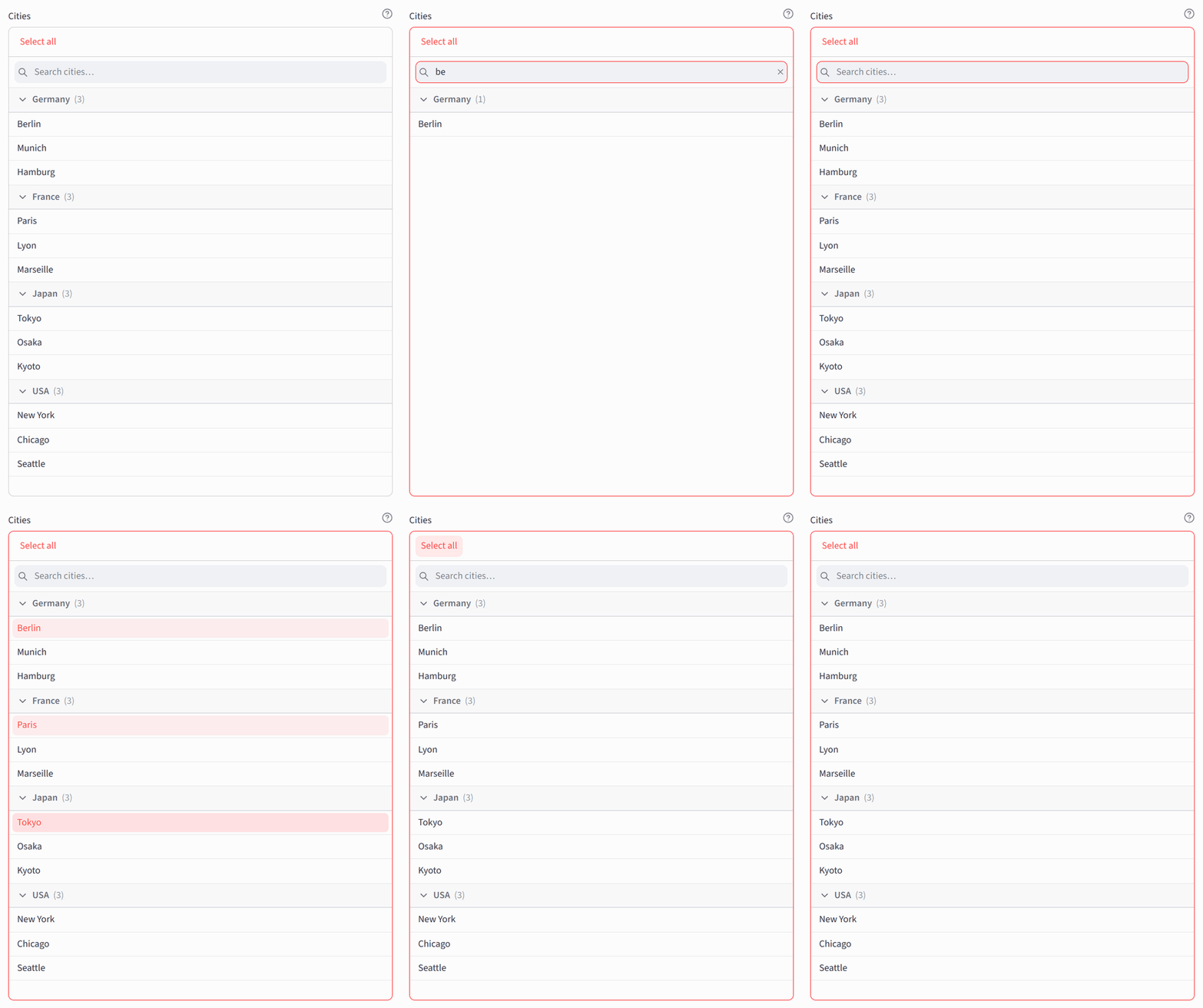
Live search · collapsible groups · multi-select · select-all — all themed by Streamlit, no iframe.
Why listview?
st.multiselect and st.radio are great for a handful of options, but they don't scroll, group, or search well once the list grows. listview is a dedicated, always-visible list surface:
- Single / multi selection with an optional
max_selectionscap. - Grouping with sticky headers and optional collapsible groups.
- Live search — filters by label as you type, optionally pinned (stays put while the list scrolls).
- Sorting — order items, group headers, or both alphabetically (ascending or descending).
- Select all / Deselect all toggle for multi-select, scoped to the rows matching the current search — including rows inside collapsed groups (collapse is visual, not a filter) — excluding disabled rows.
- Add new options — let users enter values that aren't in the list (returned as the typed string). Typing the visible text of an option that is already there selects that option instead of adding a duplicate row.
- Jump to default — auto-scrolls the default selection into view on first render, and again whenever
defaultchanges (the list scrolls, never the surrounding page). - Native theming — pure
--st-*CSS variables, so light, dark, and custom themes apply automatically. No Bootstrap, no hardcoded palette. - Markdown labels & help — Streamlit-parity Markdown (GFM + Streamlit directives like
:red[…], badges,:material/icon:,:streamlit:, emoji). - Keyboard & screen-reader friendly —
role="listbox"/option, namedrole="group"per group header, the listbox named after yourlabel(also when it is hidden or collapsed), arrow-key navigation,/to jump to the search field, andaria-*state. - Returns what you passed in — select a dict, get that dict back (metadata and all).
Built on Streamlit Components V2: the widget renders inline in the host page (inside a Shadow DOM), not in an iframe.
Installation
uv pip install streamlit-listview
Requires Python ≥ 3.10 and Streamlit ≥ 1.51.
Quickstart
import streamlit as st
from streamlit_listview import listview

choice = listview(
    "Pick a fruit",
    ["Apple", "Banana", "Cherry"],
    selection_mode="single",
    key="fruit",
)
st.write("You picked:", choice)
Grouped, multi-select, searchable, with a help tooltip:
choice = listview(
    "Pick ingredients",
    [
        {"id": "apple", "label": "Apple", "group": "Fruit"},
        {"id": "carrot", "label": "Carrot", "group": "Vegetable"},
        {"id": "salmon", "label": "Salmon", "group": "Fish", "disabled": True},
    ],
    selection_mode="multi",
    max_selections=2,
    enable_search=True,
    pin_search=True,
    collapsible_groups=True,
    select_all=True,
    help="Pick up to **two** ingredients.",
    key="ingredients",
)
st.write(choice)
API
Full signature
def listview(
    label,
    options=None,
    *,
    selection_mode="single",          # "single" | "multi"
    default=None,                     # option id, or list of ids (multi)
    format_func=None,                 # maps an option -> display label
    enable_search=False,
    pin_search=False,                 # sticky search field; requires enable_search=True
    search_placeholder="Search",
    collapsible_groups=False,
    collapsed_groups=None,            # ["GroupA", ...] | "all" | None — initial state, per group
    sort=None,                        # "items" | "groups" | "both" | None
    sort_ascending=True,              # True = A→Z; False = Z→A; only when sort is set
    accept_new_options=False,
    max_selections=None,              # multi mode; single accepts None or 1
    select_all=False,                 # multi mode only; adds a Select all / Deselect all toggle
    placeholder=None,                 # text shown when options is empty
    height=300,                       # px, >= 100
    item_height=None,                 # px, >= 1; minimum row height (floor), None = auto
    content_font_size=None,           # px, >= 1; font size of rows + group headers, None = theme default
    width="stretch",                  # "stretch" | int (px, >= 1)
    show_grid_lines=True,             # divider lines between rows; False for a compact list
    help=None,                        # Markdown tooltip; shown when label is visible
    disabled=False,
    label_visibility="visible",       # "visible" | "hidden" | "collapsed"
    on_change=None,
    args=None,
    kwargs=None,
    key=None,                         # strongly recommended (see Keying)
) -> dict | str | int | list | None: ...
Parameters
| Parameter | Description |
|---|---|
label |
Text above the list; renders inline Markdown (see Markdown). |
options |
The options — simple str/int values or dicts (see Options). |
selection_mode |
"single" (the default) or "multi". |
default |
Initially selected option id (or list of ids in multi mode); applied at mount only (see Keying). |
format_func |
Maps an option — the dict, or the scalar itself — to its display label; an explicit dict label wins (see Options). |
enable_search |
Adds a search field that live-filters the list by label. |
pin_search |
Keeps the search field in view while the list scrolls; requires enable_search=True. |
search_placeholder |
Placeholder text of the search field. |
collapsible_groups |
Makes every group header a collapse/expand toggle. |
collapsed_groups |
Groups that start collapsed: ["GroupA", ...] or "all" (see Collapsible groups). |
sort |
Alphabetical ordering: "items", "groups", "both", or None for input order (see Sorting). |
sort_ascending |
True = A→Z (the default), False = Z→A; only meaningful when sort is set. |
accept_new_options |
Lets users add values not in the list; returned as the typed string. |
max_selections |
Cap on the multi-mode selection (single mode accepts None or 1). |
select_all |
Multi mode only: adds the Select all / Deselect all toggle. |
placeholder |
Text shown instead of the list when options is empty. |
height |
List height in px (≥ 100). |
item_height |
Minimum row height in px — a floor, rows still grow to fit their content; None = auto. |
content_font_size |
Font size in px of rows and group headers; None = theme default. |
width |
"stretch" (fill the container, the default) or a pixel width (≥ 1). |
show_grid_lines |
Divider lines between rows; False for a compact, line-free list. |
help |
Markdown tooltip beside the label; shown only while the label is visible. |
disabled |
Disables the whole widget. |
label_visibility |
"visible", "hidden" (keeps the label's space), or "collapsed". |
on_change |
Callback invoked when the selection changes, called as on_change(*args, **kwargs). |
args |
Positional arguments for on_change. |
kwargs |
Keyword arguments for on_change. |
key |
Widget identity across reruns — strongly recommended (see Keying). |
Options
- Simple values (
str | int): the value is both the id and the label, e.g.["Apple", "Banana"]. - Dicts:
{"id": ..., "label": ..., "group": ..., "disabled": ...}id(required;strorint— nothing else, not evenboolorfloat)label(optional display text; when missing,None, or NaN — the last two are whatdf.to_dict("records")yields for a NULL cell — the label comes fromformat_func(option), i.e.str(id)whenformat_funcisNone, the default)group(optionalstr; items sharing agrouprender under one header)disabled(optionalbool; visible but not selectable)- any extra fields (e.g. a
payload) are never rendered directly, and come back untouched in the selection result — handy for attaching your own metadata to an option.format_funccan read them to build the displayed label (see below).
Ids are validated at the boundary, because the frontend identifies each row by JavaScript String(id): they must be unique as rendered (1 and "1" collide, and so would a bool), and an int id must fit JavaScript's safe-integer range (abs(id) <= 2**53 - 1) since the payload travels as JSON and larger ints lose precision as doubles — use the string form for BIGINT or snowflake keys.
default ids are validated exactly like option ids: str or int only (bool is rejected), an int must satisfy abs(id) <= 2**53 - 1, and — unless accept_new_options=True — each must name an option by its rendered String(id) identity.
format_func runs server-side, receives the option as passed — the dict for dict options, the scalar itself for simple values — and returns its display label. An explicit label always wins, so you can format some rows and hand-write the rest. Because the whole option arrives, the label can be built from fields the widget never renders:
listview(
    "Objects",
    options=[
        {"id": 1, "text": "Orders",     "type": "Table"},
        {"id": 2, "text": "OrdersView", "type": "View"},
    ],
    format_func=lambda o: f"{o['text']}{'' if o['type'] == 'Table' else ' 👓'}",
)
# rows read "Orders" and "OrdersView 👓"
Two things to know about which options reach it:
{"label": None}and{"label": nan}carry alabelkey and still go throughformat_func, because neither is usable display text — and that is exactly whatdf.to_dict("records")produces for a NULL cell. So "all my dicts have alabel" is not a safe assumption; write the formatter to cope, or it will raise aValueErrornaming the option.- Scalar options arrive as themselves, so one formatter has to handle both shapes if your data mixes them:
option["id"] if isinstance(option, dict) else option.
format_func=None (the default) means no formatter: the label is str(id). Don't pass str to get that — str would receive the option and render a dict repr. The option you get is your own object, not a copy; treat it as read-only.
Sorting
By default options render in the order you pass them (sort=None). Set sort to reorder alphabetically by the displayed label / group name (case-insensitive, stable):
sort="items"— sort options within each group; group order unchanged.sort="groups"— sort the group headers; option order within a group unchanged.sort="both"— sort both.
sort_ascending=False reverses the order. When groups are sorted, ungrouped options always render last. Entries added via accept_new_options are appended at the bottom — below every group — and are not sorted.
Collapsible groups
With collapsible_groups=True every group header becomes a toggle. collapsed_groups (["GroupA", ...] or "all") is initial state, applied per group the first time that group appears while collapsible_groups=True — at mount for the groups your options already contain, and on the later rerun that first brings a group in for the rest (options fetched asynchronously, or loaded behind a button, reach the widget after mount). Once a group has been seen the user owns it: a manual toggle is never overridden, and neither is a collapsed_groups change on a keyed instance — change the key to re-apply it (see Keying). Groups only ever shown with collapsible_groups=False do not count as seen, so enabling collapsible_groups later on a keyed instance applies collapsed_groups to them at that point.
The sharp edge of "per group": with collapsed_groups="all", a brand-new group that appears after mount starts collapsed. If you append a group to a live list and want it open, name the groups explicitly instead of using "all". A group that disappears and later comes back still counts as seen, so it returns open rather than collapsed a second time.
Return value
You get back what you passed in:
- single → the selected option exactly as passed (dict or scalar), or
None. - multi → a list of the selected options, in selection order;
[]if none. - Entries added via
accept_new_optionscome back as the plain string the user typed.
Changing options, max_selections or selection_mode later
On a keyed widget the selection survives a rerun (an unkeyed one remounts and resets), so it can outlive the data it was made against. When that happens the widget re-derives the selection from the current data and commits the correction, so the rows you see and the value listview() returns cannot disagree. In selection order, it drops:
- ids that are no longer in
options(kept as typed strings whenaccept_new_options=True); - everything past a freshly lowered
max_selections— the earliest-selected survive; - everything past the first entry when
selection_modeflips from"multi"to"single".
A selected option that merely became disabled is not dropped — a disabled selection is locked, not removed.
Two consequences to plan for:
on_changefires once on that rerun. A correction is written back through the same channel a click uses, and Components V2 offers no second one for it, so the callback cannot tell them apart. If yours must run for real user input only, compare against the previous selection yourself.- The returned value never shows the uncorrected selection. The write-back is what triggers the rerun that carries the correction, so it arrives one rerun late — but
listview()applies the same rules on the way out (ids are matched to options by their renderedString(id)identity, ids matching no option are dropped, duplicate spellings of one row collapse, and the multi list is truncated tomax_selections, keeping the same earliest-selected survivors), so it cannot hand back more options than you allow, an option you removed, or one row twice. Nothing lags: a typed"7"after you promote the int7intooptionscomes back as that option immediately.
Markdown (label & help)
label and help render as Markdown using the same engine Streamlit's own widgets use:
label— restricted inline tier: bold, italics, strikethrough, inlinecode, links, inline images, plus Streamlit extras (:red[…]and other colors,:color-background[…],:color-badge[…],:small[…],:material/icon:,:streamlit:, emoji shortcodes). Block elements are suppressed.help— full GitHub-Flavored Markdown (headings, lists, tables, blockquotes, fenced code, …) plus the same extras. Shown only whenlabel_visibility="visible".
Note: LaTeX/KaTeX is intentionally not supported (
$…$renders as literal text), and there is nounsafe_allow_html— raw HTML stays escaped.
Theming
All styling uses Streamlit's --st-* CSS custom properties (e.g. --st-primary-color, --st-background-color, --st-text-color, --st-font, radius variables), so light, dark, and custom themes apply automatically. The label, help icon, and tooltip replicate Streamlit's built-in widget look.
The list itself looks like an open st.selectbox menu, and each state borrows the native widget that plays the same part:
- Hover — the menu's grey highlight pill, computed with the same formula Streamlit's theme uses, so it follows custom themes too.
- Selected rows — an active
st.pills: the primary color at 10 % with primary-colored text. - Group headers — the
st.dataframeheader band. - Search field — filled like
st.text_input. - Frame — turns the primary color only while the widget has focus, like every native input; hovering or scrolling leaves it alone. A click anywhere inside the frame, including the empty space below a short list, focuses the list.
In st.sidebar the widget detects its container and adapts. Streamlit's sidebar theme swaps --st-background-color with --st-secondary-background-color; the list undoes that swap and stays on the menu's surface, which is what st.selectbox opens onto in either container (white in the light theme, #0e1117 in the dark one). The search field swaps with it, so it still stands out from the list. Nothing to configure, and a custom [theme.sidebar] is respected — the colors are derived from the tokens, never hardcoded.
The hover highlight uses CSS relative color syntax (Chrome/Edge 119+, Firefox 128+, Safari 18+). Older browsers show a close approximation instead.
Keying
key is strongly recommended for any dynamic app. With a key, Streamlit updates the existing element in place when other parameters change, so frontend-local UI state (collapse, search text, focus, scroll) and the selection survive. Without a key, any parameter change remounts the widget and resets that state — so changing the key is the deliberate way to reset the widget.
A keyed widget's selection also survives moving it between containers (say st.sidebar ↔ the main body): the move rebuilds the frontend, but the widget re-seeds its rows from the selection persisted in st.session_state, so the rows and the returned value both carry over — only frontend-local UI state (search text, scroll, collapse) resets.
Because the selection survives, two parameters only take effect at mount: changing default on a keyed widget moves neither the displayed selection nor the returned value — it only scrolls the newly named row into view — and changing collapsed_groups never re-collapses a group that has already been shown (Collapsible groups). Change the key to re-apply either. A keyed selection that no longer fits the current parameters is corrected instead — see Changing options, max_selections or selection_mode later.
Demo
An interactive playground — every parameter as a live control, plus a generated code snippet and an API reference — lives in demo/:
uv run streamlit run demo/app.py
The demo needs the package installed — uv run does that for you, including the compiled frontend in streamlit_listview/frontend/build/ (a generated, git-ignored artifact). A separate npm run build is only needed after editing streamlit_listview/frontend/src/ (see Building from source). See demo/README.md for details.
Building from source
Development install (editable)
From the directory containing the root pyproject.toml:
uv venv                                # once, if there is no .venv yet
uv pip install -e . --force-reinstall
On a clean clone this also triggers the frontend build via the build backend
(Node.js ≥ 24 required). Set LISTVIEW_SKIP_NPM_BUILD=1 to skip it when the
bundle is already built — e.g. after a manual npm run build in
streamlit_listview/frontend/.
Build a wheel
uv build
The build backend compiles the frontend automatically (npm ci if needed, then
npm run build) before packaging, so the wheel always bundles a fresh
streamlit_listview/frontend/build and the nested
streamlit_listview/pyproject.toml component manifest (Streamlit reads it at
runtime to resolve the asset globs). This produces dist/:
dist/streamlit_listview-1.0.1-py3-none-any.whldist/streamlit_listview-1.0.1.tar.gz(sdist)
Requirements
- Python ≥ 3.10
- Streamlit ≥ 1.51
- Node.js ≥ 24 (LTS) — only to build the frontend
- uv — used by the commands shown above
License
Apache-2.0 (see LICENSE). Bundled/ported third-party code is attributed in NOTICE.
AI
Claude Code (Models Opus 4.8 / 5 / 5.5 and Fable 5) with superpowers plugin.
1 maintainer

Metadata
1 maintainer
Release files for streamlit-listview 1.0.1
For a detailed explanation of source distributions (sdists) and built distributions (wheels), please see the package formats documentation.
Source distribution (sdist)
| File | Size | Uploaded | |
|---|---|---|---|
| streamlit_listview-1.0.1.tar.gz | 270.6 kB | Details |
Built distribution (wheel)
| File | Interpreter | ABI | Platform | Reset |
|---|---|---|---|---|
| streamlit_listview-1.0.1-py3-none-any.whl | Python 3 | none | any | Details |
Total release size: 495.8 kB
Release files / streamlit_listview-1.0.1.tar.gz
| Download URL | streamlit_listview-1.0.1.tar.gz |
|---|---|
| Size | 270.6 kB |
| Tags | Source |
|
SHA-256 checksum How to use checksums |
4ba55e5465190ecac515687f3159be30b71e5cbe68630905c0b710d17a6e588e
|
|
BLAKE2b-256 checksum How to use checksums |
39fddf73c7abcf222016cd3ea92c2d7e32d6c872c3cdb245bda8b8433e5695dc
|
| Upload date | |
|
Uploaded using Trusted Publishing? What is trusted publishing? |
Yes |
| Uploaded via |
twine/7.0.0 CPython/3.13.14
|
Provenance
Provenance describes where a file came from. On PyPI, provenance is shared via attestations, which provide a verifiable record of the build or publishing details. View details, limitations and caveats.


PyPI Publish Attestation
PyPI verified that this artifact, at this checksum, originated from the publisher listed below.
Signed by GitHub Actions, verified by PyPI on Oct 4, 2026.
Transparency logRelease files / streamlit_listview-1.0.1-py3-none-any.whl
| Download URL | streamlit_listview-1.0.1-py3-none-any.whl |
|---|---|
| Size | 225.2 kB |
| Tags | Python 3 |
|
SHA-256 checksum How to use checksums |
46e841a5dcd225edd0fba3430fef535a126173ecbda8fafeda7228c57a7cfb68
|
|
BLAKE2b-256 checksum How to use checksums |
706a236071468280f348db649eb992e42c2b1a1a2a15f47a4562089f1cb16202
|
| Upload date | |
|
Uploaded using Trusted Publishing? What is trusted publishing? |
Yes |
| Uploaded via |
twine/7.0.0 CPython/3.13.14
|
Provenance
Provenance describes where a file came from. On PyPI, provenance is shared via attestations, which provide a verifiable record of the build or publishing details. View details, limitations and caveats.
PyPI Publish Attestation
PyPI verified that this artifact, at this checksum, originated from the publisher listed below.
Signed by GitHub Actions, verified by PyPI on Oct 4, 2026.
Transparency log













