A Streamlit component that allows you to place a navigation bar in your Streamlit app.

Project description
Streamlit Navigation Bar
A Streamlit component that allows you to place a navigation bar in your Streamlit app.
Installation
pip install streamlit-navigation-bar
Usage
If there is no st.set_page_config
command on the app page, st_navbar must be the first Streamlit command used,
and must only be set once per page. If there is a st.set_page_config
command, then st_navbar must be the second one, right after it.
Parameters
pages : list of str
A list with the name of each page that will be displayed in the navigation bar.
selected : str, optional
The page that will be selected by default when the navigation bar is displayed.
It could be one of the pages list values, but it is not limited to them.
logo_path : str, optional
The path to an SVG file for a logo. It will be shown on the left side of the
navigation bar. Defaults to None, where no logo is displayed.
logo_page : str, default="Home"
Set the page value that will be returned by clicking on the logo (if there is
one). For a non-clickable logo, set this to None.
urls : dict of str: str, optional
A dictionary with the page name as the key and an external URL as the value.
The page name must be contained in the pages list. The URL will open in a new
window or tab.
styles : dict of str: dict of str: str, optional
A dictionary with the HTML tag name as the key and another dictionary to style
it as the value. In the second dictionary, the key is a CSS property and the
value is the value it will receive. The available HTML tags are: "nav",
"div", "ul", "li", "a", "img", "span" and "selected". The last one
is a custom tag to direct the styling just to the "span" element selected. To
better understand the structure hierarchy, check the notes section.
adjust_html : bool, default=True
By default, Streamlit limits the position of components in the web app to a
certain width and adds a padding to the top. When this argument is set to
True it adjusts the HTML for the navbar to be displayed at the full width and
at the top of the screen, among other things (like hiding some Streamlit UI
elements). In most cases, the HTML adjustment will not interfere with the rest
of the web app, however there could be some situations where this occurs. If
this happens, toggle adjust_html to False and make your own HTML
adjustments with st.markdown.
key : str or int, optional
A string or integer to use as a unique key for the component. If this is
omitted, a key will be generated for the widget based on its content. Multiple
navbars of the same type may not share the same key.
Returns
page : str or None
The selected page from the navigation bar. If there is no user interaction yet,
returns the selected default value, else, returns the page clicked by the user.
Notes
Theme variables
The component uses by default two CSS variables from the
web app's theme,
to style the <nav> tag. They are:
nav {
  font-family: var(--font);
  background-color: var(--primary-color);
}
It also accepts the theme variables to be passed in the style dictionary, as
the values for the CSS properties, for example:
styles = {
    "span": {"text-color": "--text-color"}
}
The theme variables that could be used are:
--primary-color
--background-color
--secondary-background-color
--text-color
--font
Structure hierarchy
To style the navigation bar, it is important to understand its HTML structure
hierarchy. Let us take a scenario where the navbar was created with
pages=["Page one name", "Page two name"] and an SVG logo. On the frontend
side, the component will build this structure (simplified for the explanation):
<nav>
  <div>
    <ul>
      <li>
        <a>
          <img src="svg_logo" img/>
        </a>
      </li>
      <li>
        <a>
          <span>
            Page one name
          </span>
        </a>
      </li>
      <li>
        <a>
          <span>
            Page two name
          </span>
        </a>
      </li>
    </ul>
  </div>
</nav>
Looking at the hierarchy it is possible to notice that the <a> tag will style
both the logo and the strings. However, the <img> tag is unique to the logo,
just as <span> is to the strings.
Max-width
A fundamental CSS property to adjust is the max-width for the <div> tag.
That is because it controls how much space the page names will have. The
default value is 700px, which works well in most cases. But if the navbar has
a large number of pages, or longer names, it might be necessary to increase the
maximum width. Conversely, whenever the navbar has few pages and short names,
this value may need to be reduced to avoid very large spaces between them.
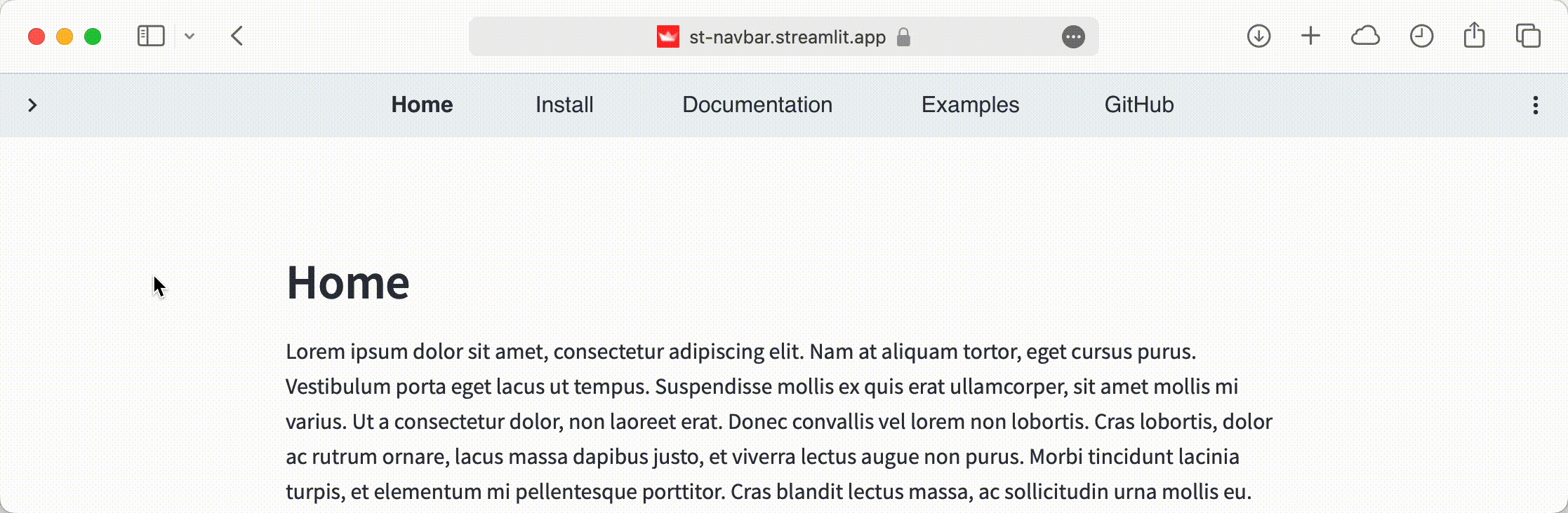
Examples
A basic example:
import streamlit as st
from streamlit_navigation_bar import st_navbar

page = st_navbar(["Home", "Documentation", "Examples", "Community", "About"])
st.write(page)
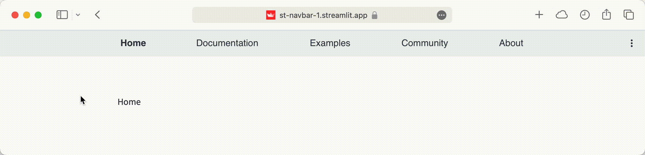

An example styling the navbar with a design similar to Streamlit's widgets:
import streamlit as st
from streamlit_navigation_bar import st_navbar

pages = ["Home", "Library", "Tutorials", "Development", "Download"]
styles = {
	"nav": {
	  "background-color": "#f0f2f6",
	  "height": "56px",
	},
	"span": {
		"color": "#45474d",
		"border": "solid",
		"border-width": "1px",
		"border-color": "#f0f2f6",
		"border-radius": "8px",
		"padding": "9px 12px",
		"margin": "0px 10x",
	},
	"selected": {
		"color": "white",
		"font-weight": "normal",
		"background-color": "#4285f4",
		"border": "solid",
		"border-width": "1px",
		"border-color": "#4285f4",
		"border-radius": "8px",
	},
}

page = st_navbar(pages, styles=styles)
st.write(page)
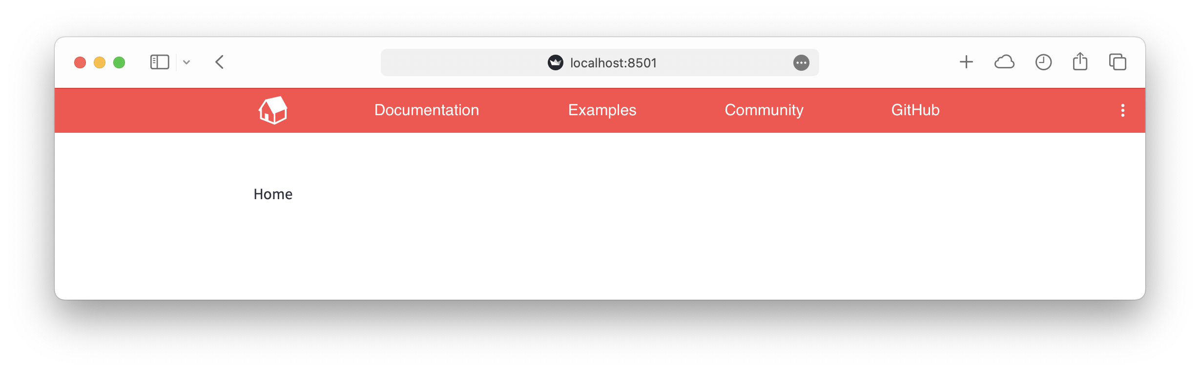
An example using a logo, an external URL, multiple pages with content, among other things:
import streamlit as st
from streamlit_navigation_bar import st_navbar
import pages as pg


st.set_page_config(
    page_title="Streamlit Navigation Bar Example 3",
    initial_sidebar_state="collapsed",
)

pages = ["Install", "User Guide", "API", "Examples", "Community", "GitHub"]
urls = {"GitHub": "https://github.com/gabrieltempass/streamlit-navigation-bar"}
styles = {
	"nav": {
		"background-color": "#7c18c4",
		"justify-content": "left",
	},
	"span": {
		"padding": "14px",
	},
	"selected": {
		"background-color": "white",
		"color": "var(--text-color)",
		"font-weight": "normal",
		"padding": "14px",
	},
}

page = st_navbar(
    pages,
    selected="Home",
    logo_path="cubes.svg",
    urls=urls,
    styles=styles,
)

if page == "Home":
	pg.show_home()
elif page == "Install":
	pg.show_install()
elif page == "User Guide":
	pg.show_user_guide()
elif page == "API":
	pg.show_api()
elif page == "Examples":
	pg.show_examples()
elif page == "Community":
	pg.show_community()

html = {
    "hide_sidebar_button": """
        <style>
            div[data-testid="collapsedControl"] {
                visibility: hidden;
            }
        </style>
    """,
}

st.markdown(html["hide_sidebar_button"], unsafe_allow_html=True)
Requirements
To use the navigation bar component in your Streamlit app, you will need:
- Python 3.7+
- Streamlit 1.30+ (the main problem of using older versions of Streamlit is
that it will cause the
adjust_htmlto not work properly when set toTrue)
Roadmap
The current version of the Streamlit Navigation Bar still has some limitations, that are planned to be addressed in future updates. Those are:
- Be responsive on smaller screens.
- Adjust layout to Streamlit's sidebar.
- Accept other image formats (.png, .jpg).
- Style pseudo-classes (:link, :visited, :hover, :active).
You are welcome to help develop these features and others. Below is a guide on how to quickstart the development.
Development
Ensure you have Python 3.7+, Node.js and npm installed.
- Clone this repository:
git clone git@github.com:gabrieltempass/streamlit-navigation-bar.git
- Go to the
frontenddirectory and initialize and run the component template frontend:
cd streamlit-navigation-bar/streamlit_navigation_bar/frontend
npm install
npm run dev
- From a separate terminal, go to the repository root directory, create a new Python virtual environment, activate it and install Streamlit and the template as an editable package:
cd streamlit-navigation-bar
python3 -m venv venv
. venv/bin/activate
pip install streamlit
pip install -e .
Still from the same separate terminal, run the example Streamlit app:
streamlit run streamlit_navigation_bar/example.py
If all goes well, you should see something like this:
Modify the frontend code at
streamlit_navigation_bar/frontend/src/StNavbar.vue.
Modify the Python code at streamlit_navigation_bar/__init__.py.
References
This Streamlit component is based on:
- The streamlit-component-vue-vite-template repository, that uses Vue 3 to code the frontend and Vite to serve the files locally during development, as well as bundle and compile them for production.
- The streamlit-option-menu component, by @victoryhb.
Release history Release notifications | RSS feed


Download files
Download the file for your platform. If you're not sure which to choose, learn more about installing packages.
Source Distribution
Built Distribution
Filter files by name, interpreter, ABI, and platform.
If you're not sure about the file name format, learn more about wheel file names.
Copy a direct link to the current filters


