Components and Frameworks to give new features to streamlit

Project description
Streamlit Plugins
Components and frameworks to extend Streamlit's capabilities with advanced features and customizations.
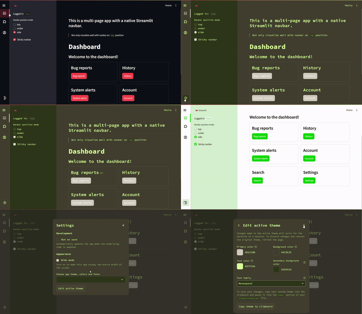
FrameworkMultilit: https://plugins-framework-multilit.streamlit.app/ComponentTheme Changer: https://plugins-component-theme-changer.streamlit.app/ComponentNavbar: https://plugins-navbar.streamlit.app/
Table of Contents
Introduction
Welcome to Streamlit Plugins, a collection of tools designed to enhance your Streamlit apps with features like:
- A customizable Navbar with multiple positioning options (including lateral mode!).
- A Loader for better user feedback.
- Advanced integrations like LabelStudio and SnakeViz.
Features
Frameworks
Multilit (Inherits from Hydralit)
This is a fork of Hydralit with updated compatibility for the latest Streamlit version.
- Improved interface and user experience.
- Respects Streamlit's active theme, with support for user overrides.
- Future plans to integrate native Streamlit multipage functionality.
Key Features:
- Built-in buttons or programmatic page navigation.
Components
Change Theme (As simple button)

Internally it uses the underlying pills component that streamlit uses to render the real pills component. So it has even more flexibility than the native streamlit pills button, and we add some radio button capabilities to it.
Examples: Change Theme with Button
from streamlit_plugins.components.theme_changer import st_theme_changer

st_theme_changer()
If you want to use more than one theme changer in your app, you will have to enable rerun comlpete application in order to update the state of buttons, this is because streamlit is not prepare to rerun other fragments, seperatlly, when the streamlit dev team enable this, we can improve the performance of the component.
Note that if tou rerun the whole app, depending or what tasks are you doing, it can be slow, so use it with caution. We recommend set to
rerun_whole_st=Trueand use only one st_theme_changer in your app.
st_theme_changer(rerun_whole_st=True)

with st.sidebar:
    st_theme_changer(render_mode="pills", rerun_whole_st=True)
The above code only will change between the light/dark themes by default in streamlit. But here is the game changer, on in that case the theme changer, not only you can change between the defaults, YOU CAN DEFINE YOUR OWN THEMES, yes, more than 2. All the properties you can change are defined here. Theme props
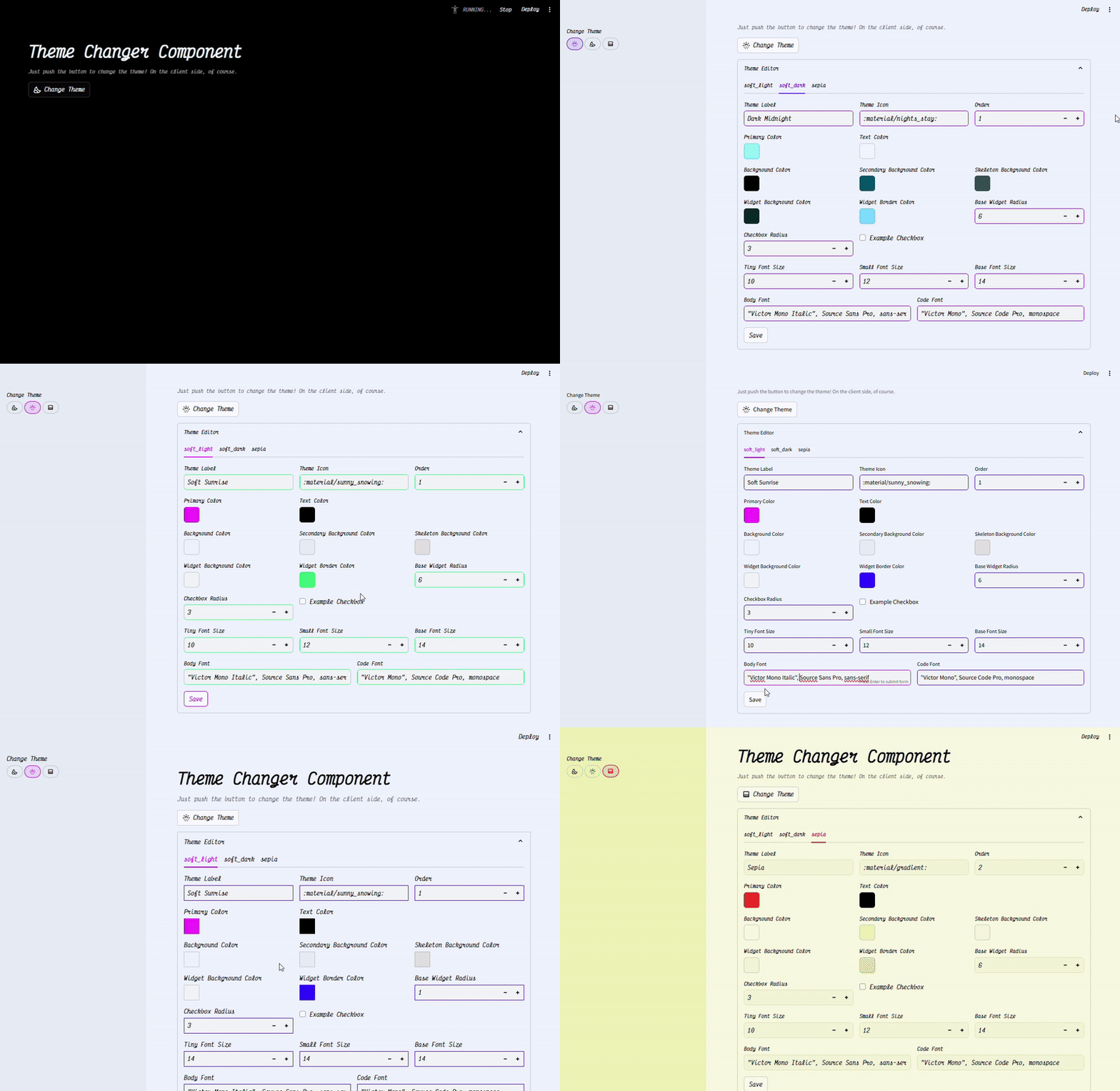
from streamlit_plugins.components.theme_changer import st_theme_changer
from streamlit_plugins.components.theme_changer.entity import ThemeInfo, ThemeInput, ThemeBaseLight, ThemeBaseDark
theme_data = dict(
    soft_light=ThemeInput(
        name="Soft Sunrise",
        icon=":material/sunny_snowing:",
        order=0,
        themeInfo=ThemeInfo(
            base=ThemeBaseLight.base,
            primaryColor="#6100FF",
            backgroundColor="#EFF4FF",
            secondaryBackgroundColor="#E7EEF5",
            textColor="#000000",
            widgetBackgroundColor="#F3F5F7",
            widgetBorderColor="#9000FF",
            skeletonBackgroundColor="#E0E0E0",
            bodyFont=ThemeBaseLight.bodyFont,
            codeFont=ThemeBaseLight.codeFont,
            fontFaces=ThemeBaseLight.fontFaces,
        )
    ),
    soft_dark=ThemeInput(
        name="Dark Midnight",
        icon=":material/nights_stay:",
        order=1,
        themeInfo=ThemeInfo(
            base=ThemeBaseDark.base,
            primaryColor="#7AF8FF",
            backgroundColor="#000000",
            secondaryBackgroundColor="#045367",
            textColor="#f0f8ff",
            widgetBackgroundColor="#092927",
            widgetBorderColor="#75D9FF",
            skeletonBackgroundColor="#365252",
            bodyFont=ThemeBaseDark.bodyFont,
            codeFont=ThemeBaseDark.codeFont,
            fontFaces=ThemeBaseDark.fontFaces,
        )
    ),
    sepia=ThemeInput(
        name="Sepia",
        icon=":material/gradient:",
        order=2,
        themeInfo=ThemeInfo(
            base=ThemeBaseLight.base,
            primaryColor="#FF0004",
            backgroundColor="#F9F9E0",
            secondaryBackgroundColor="#EFEFB4",
            textColor="#000000",
            widgetBackgroundColor="#F5F5D7",
            widgetBorderColor="#E2DEAD",
            skeletonBackgroundColor="#F5F5DC",
            bodyFont=ThemeBaseLight.bodyFont,
            codeFont=ThemeBaseLight.codeFont,
            fontFaces=ThemeBaseLight.fontFaces,
        )
    )
)
st_theme_changer(themes_data=theme_data, render_mode="init", default_init_theme_name="soft_dark")

st_theme_changer(themes_data=theme_data, rerun_whole_st=True)
with st._bottom:
   st_theme_changer(
      themes_data=theme_data, render_mode="pills",
      rerun_whole_st=True, key="first_pills"
   )

with st.sidebar:
    st_theme_changer(
        themes_data=theme_data, render_mode="pills",
        rerun_whole_st=True, key="secondary_pills"
    )
There is another parameter that you can customize, is a sleep parameter, because the time it costs javascript to send the message in other to change the change, maybe in some cases your javascript streamlit page is slowly and the change theme doesn't queue your request to change the theme, so you can customize this sleep in order to wait for the javascript to be ready to change the theme.
# Parameter in seconds
st_theme_changer(timeout_rendering_theme_change=0.3)
Navbar (Sidebar, Topbar, and Under Streamlit Header)
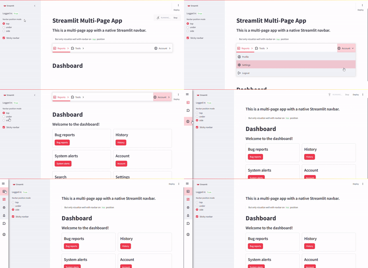
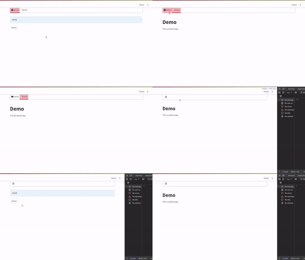
A versatile navbar component with support for:
- Native Streamlit multipage apps.
- Multilit framework.
- Multiple positions: top, under, and side.
Responsive and Customizable:
- Adjust themes and configurations dynamically.
Example: Multipage App with Native Streamlit Navbar
st.set_page_config(layout="wide")
# Example Sidebar
with st.sidebar:
    st.radio("Navbar Position", ["top", "under", "side"])
    st.checkbox("Sticky Navbar")
# Example Navbar Integration
from streamlit_plugins.components.navbar import st_navbar
st_navbar(
    menu_definition=[{"name": "Home", "icon": "🏠", "page": "home.py"}],
    position_mode="top"
)
Loader (Inherit from Hydralit Components)
Enhance user experience with loaders for transitions and long-running tasks.
AnnotatedText (Inspired by SpaCy Annotated Text)
Display annotated text inline with your app for NLP tasks.
LabelStudio (In Development)
Adapter for integrating LabelStudio into Streamlit for NER and annotation tasks.
SnakeViz
Visualize and analyze bottlenecks in your Python code directly within Streamlit.
Usage
Quickstart
- Install the package:
pip install streamlit-plugins
- Import and use components in your Streamlit app.
Example Code
See the examples folder for detailed implementations and usage scenarios.
Roadmap
Framework: Multilit
- Use native streamlit multipage system
- Working URL navigation
- Permanent cookies session
- Access levels to different pages
- Account, Settings and Login system out-of-box
- Custom theme for every page (When change page automatically change theme on client side)
Compontent: Navbar
- Add Navbar with sidebar mode.
- Support for dynamic theme changes.
- Add more CSS customization options.
- Improve documentation and examples.
- Control Race conditions between python back and frontend COI (It will be nice if streamlit supports for custom messages customizations on custom components)
Compontent: Theme Changer
- Client native theme changer
- Persisten browser cache
Compontent: LabelStudio
- Expand LabelStudio integration.
Contributing
We welcome contributions! Please refer to the CONTRIBUTING.md for guidelines on how to get started.
License
This project is licensed under the MIT License. See the LICENSE file for details.
⭐ If you find this project useful, please consider giving it a star!
Release history Release notifications | RSS feed


Download files
Download the file for your platform. If you're not sure which to choose, learn more about installing packages.
Source Distribution
Built Distribution
Filter files by name, interpreter, ABI, and platform.
If you're not sure about the file name format, learn more about wheel file names.
Copy a direct link to the current filters
File details
Details for the file streamlit_plugins-0.7.12.tar.gz.
File metadata
- Download URL: streamlit_plugins-0.7.12.tar.gz
- Upload date:
- Size: 8.8 MB
- Tags: Source
- Uploaded using Trusted Publishing? No
- Uploaded via: twine/6.2.0 CPython/3.14.5
File hashes
| Algorithm | Hash digest | |
|---|---|---|
| SHA256 |
bc995d6a876dcbb86369609bd3ad9a3a693a2f8eb8e5e575a7f27185e44bd0fb
|
|
| MD5 |
494eb24c05755fcb5f2ecac17eb6f86f
|
|
| BLAKE2b-256 |
178e4ab4955cb2a331b02549d136f8d8682a754b824bd995385513d585aa1706
|
File details
Details for the file streamlit_plugins-0.7.12-py3-none-any.whl.
File metadata
- Download URL: streamlit_plugins-0.7.12-py3-none-any.whl
- Upload date:
- Size: 8.9 MB
- Tags: Python 3
- Uploaded using Trusted Publishing? No
- Uploaded via: twine/6.2.0 CPython/3.14.5
File hashes
| Algorithm | Hash digest | |
|---|---|---|
| SHA256 |
3cbd22c0de8c89be1a91d6f4b2aa95e02ec42659bacedb8b0e4c2a2ac4f76cb8
|
|
| MD5 |
37c9091331548ff17ceddc78b9867755
|
|
| BLAKE2b-256 |
b42acfabcc5ad1f1cc4e1e68ac9f6b77556b0ad064bfaeeea812237190961aaa
|