
textual-widgets


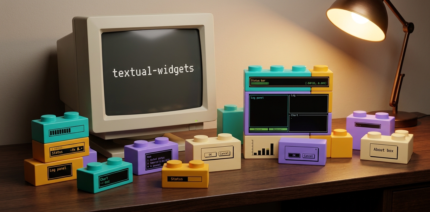







Reusable Textual widgets for terminal user interfaces.
Quick Start
# Linux / macOS
./setup.sh
./run.sh

# Windows (CMD)
setup.bat
run.bat

# Windows (PowerShell)
.\setup.bat
.\run.ps1
setup creates a .venv and installs the package with development and storybook dependencies. run launches the storybook app.
Storybook
python -m textual_widgets.storybook
# or via the installed console script:
textual-widgets-storybook
Interactive showcase app with a sidebar listing every widget — pick one and see a live demo, a code snippet, and a result label that updates as you interact. Bindings: n / p to cycle through stories, Ctrl+P for the theme picker, Ctrl+S to save an SVG screenshot of the current view, q to quit. With the [storybook] extra installed, the retro themes from textual-themes are registered too.
Widgets
DatePicker
Calendar-based date picker with month names, weekend highlighting, and click-to-select.
| Widget | Description |
|---|---|
CalendarGrid |
Pure calendar grid for embedding |
DatePicker |
Grid + month/year navigation |
DatePickerScreen |
Modal dialog |
Features:
- German month names and weekdays (Mon–Sun)
- Weekends colour-highlighted, today underlined, selected date inversed
- Month and year navigation
<><<>>, "Today" shortcut - Click on day returns ISO date
YYYY-MM-DD
from textual_widgets import DatePickerScreen

def action_pick_date(self) -> None:
    self.push_screen(
        DatePickerScreen(initial_date="2024-05-21"),
        callback=self._on_date_selected,
    )

def _on_date_selected(self, selected: str | None) -> None:
    if selected:
        print(f"Picked: {selected}")  # "2024-05-21"
SearchHistoryDropdown / SearchInputWithHistory
Search-history dropdown with substring filtering and match highlighting. SearchInputWithHistory is the prewired variant with an optional permanent icon prefix.
| Widget | Description |
|---|---|
SearchHistoryDropdown |
OptionList with filter + highlighting |
SearchInputWithHistory |
Input + dropdown wired together, optional icon |
Features:
- Live substring filter (case-insensitive) while typing
- Matches highlighted in accent + bold
- Arrow keys / mouse to pick, Enter selects and submits
- Delete removes an entry from the history
- Optional permanent icon prefix (
icon="🔍") — like the Textual command palette
from textual.widgets import Input
from textual_widgets import SearchInputWithHistory

class MyApp(App):
    def compose(self) -> ComposeResult:
        yield SearchInputWithHistory(
            icon="🔍",
            placeholder="Search ...",
            entries=self._history.list_recent(20),
            id="global-search",
        )

    def on_input_submitted(self, event: Input.Submitted) -> None:
        query = event.value.strip()
        if not query:
            return
        self._history.add(query)
        wrapper = self.query_one("#global-search", SearchInputWithHistory)
        wrapper.set_entries(self._history.list_recent(20))
        # ... start search ...
ContextMenu
Reusable context menu modal screen. Items are declared as a list of ContextMenuItem; the widget handles layout, cursor positioning, keyboard navigation, and theme colours.
| Widget | Description |
|---|---|
ContextMenuItem |
Dataclass with id, label, optional icon, shortcut, enabled |
ContextMenuScreen |
Modal dialog with OptionList |
Features:
- Positioned at the mouse cursor (
at=(event.screen_x, event.screen_y)) - Off-screen guard pins the menu to the terminal edge if necessary
- Optional centered fallback for keyboard-triggered menus
- Icons as prefix (emoji or unicode), shortcuts right-aligned in dim (display only)
- Disabled items rendered greyed out, not selectable
- Separators via
ContextMenuItem.separator() - ESC or click outside dismisses with
None
from textual.events import Click
from textual_widgets import ContextMenuItem, ContextMenuScreen

class FolderBrowser(Tree):
    def on_click(self, event: Click) -> None:
        if event.button != 3:  # right-click only
            return
        items = [
            ContextMenuItem("open", "Open", icon="📂", shortcut="Enter"),
            ContextMenuItem("rename", "Rename", icon="✎", shortcut="Ctrl+R"),
            ContextMenuItem.separator(),
            ContextMenuItem("delete", "Delete", icon="✕", shortcut="Del"),
        ]
        self.app.push_screen(
            ContextMenuScreen(items, at=(event.screen_x, event.screen_y)),
            callback=self._on_menu_action,
        )

    def _on_menu_action(self, action_id: str | None) -> None:
        if action_id is None:
            return  # ESC or outside-click
        # ... handle action ...
The shortcut field is display-only — the consumer wires the keypress via Textual Bindings.
HamburgerMenu
Collapsible side menu in the DevExpress / Outlook style. Click the hamburger icon at the top to expand or collapse — width animates smoothly. When collapsed, items show only their icons; tooltips reveal their labels on hover. Group headers visually separate sections, and bottom items dock at the bottom (e.g. for Settings).
| Widget | Description |
|---|---|
HamburgerItem |
Dataclass with id, label, optional icon. Factories HamburgerItem.group(label) and HamburgerItem.separator(). |
HamburgerMenu |
Widget — list of items + optional bottom items. Posts ItemSelected and Toggled messages. |
Features:
- Animated collapse / expand (width animates with
styles.animate) - Click on hamburger icon or call
menu.toggle()programmatically - Group headers via
HamburgerItem.group("Accounts")and separators viaHamburgerItem.separator() - Optional bottom-docked items (Settings, profile, etc.)
selected_idreactive — programmatically highlight the active item- Tooltips on collapsed items reveal labels on hover
- Optional JSON config via
HamburgerMenu.from_json("menu.json")
from textual.containers import Horizontal, Container
from textual_widgets import HamburgerMenu, HamburgerItem

class MyApp(App):
    def compose(self) -> ComposeResult:
        with Horizontal():
            yield HamburgerMenu(
                items=[
                    HamburgerItem("new", "New mail", icon="+"),
                    HamburgerItem.group("Accounts"),
                    HamburgerItem("inbox", "Inbox", icon="📧"),
                    HamburgerItem("sent", "Sent", icon="📤"),
                    HamburgerItem.group("Folders"),
                    HamburgerItem("drafts", "Drafts", icon="📝"),
                ],
                bottom_items=[
                    HamburgerItem("settings", "Settings", icon="⚙"),
                ],
            )
            yield Container(id="main")

    def on_hamburger_menu_item_selected(
        self, event: HamburgerMenu.ItemSelected,
    ) -> None:
        self.notify(f"Selected: {event.item_id}")
JSON config:
{
  "items": [
    {"id": "new", "label": "New mail", "icon": "+"},
    {"group": "Accounts"},
    {"id": "inbox", "label": "Inbox", "icon": "📧"},
    {"separator": true},
    {"id": "sent", "label": "Sent", "icon": "📤"}
  ],
  "bottom_items": [
    {"id": "settings", "label": "Settings", "icon": "⚙"}
  ]
}
yield HamburgerMenu.from_json("menu.json")
The JSON only describes the structure — selection events still need to be wired up in Python (on_hamburger_menu_item_selected), since JSON cannot carry callbacks.
Splitter (VerticalSplitter / HorizontalSplitter)
1-cell-wide / -tall dividers between two panels — drag with the mouse to resize the adjacent panel. Comparable to the splitters in IDEs / VS Code. A centered drag handle (┊ vertical, ┄ horizontal) marks the grab zone visually.
| Widget | Description |
|---|---|
VerticalSplitter |
Vertical line in a Horizontal container — adjusts the width of the left panel |
HorizontalSplitter |
Horizontal line in a Vertical container — adjusts the height of the top panel |
Features:
- Centered drag-handle glyph
- Hover and active drag colour the splitter in
$accent min_size/max_sizeconstraints- Target via
target_idor as the previous DOM sibling Resizedmessage after drag — consumer persists the new size
from textual.containers import Horizontal, Vertical
from textual_widgets import VerticalSplitter, HorizontalSplitter

class MyApp(App):
    def compose(self) -> ComposeResult:
        with Horizontal():
            yield FolderBrowser(id="folder", classes="left-pane")
            yield VerticalSplitter(target_id="folder", min_size=15, max_size=80)
            with Vertical():
                yield FileTable(id="files", classes="top-pane")
                yield HorizontalSplitter(target_id="files", min_size=5)
                yield Lyrics(classes="bottom-pane")

    def on_vertical_splitter_resized(
        self, event: VerticalSplitter.Resized,
    ) -> None:
        self._settings.set_panel_size(event.target_id, event.size)
CSS requirement: the target panel needs a size the splitter can override (a percent or cells default both work; 1fr is too flexible).
AboutScreen
Standardized About dialog as a modal screen — use it instead of hand-rolling one per app. Layout: headline bar, a meta line (version · author · release · license), description, a divider, a quote, an optional clickable URL, and a close button. The dialog width is computed from the longest content line, so the divider sits flush.
| Widget | Description |
|---|---|
AboutScreen |
Modal dialog. App facts come in as constructor arguments |
Quote |
Dataclass for a quote (text, author) |
load_quotes(lang) |
Loads the bundled de/en quote pool |
Features:
- App facts (
version,author,release,license) passed as arguments — never hard-coded in the dialog - Width auto-sized from the longest content line; no fixed dimensions
- Random quote from the bundled de/en pool on each open; override with
quote=(fixed) orquotes=(own list) - Optional clickable project URL (OSC-8, CTRL+click)
- Closes on ESC, the button, or a click outside
from textual_widgets import AboutScreen

from . import __author__, __version__, __year__

def action_show_about(self) -> None:
    self.push_screen(AboutScreen(
        app_name="my-tool",
        version=__version__,        # without the leading "v"
        author=__author__,
        release=__year__,
        description="One-line summary.\nSecond line.",
        lang="en",
        license="Apache 2.0",
        url="https://github.com/me/my-tool",
    ))
UrlInputScreen
Modal dialog that asks for an http/https URL — for apps that need a target URL but were started without one.
| Widget | Description |
|---|---|
UrlInputScreen |
Modal dialog. Returns the entered URL or None on cancel |
Features:
- Validates the input as an
http:///https://URL - Input without a scheme gets
https://prepended automatically - Invalid input shows an inline error and keeps the dialog open
Enteror the OK button submit,Escor Cancel returnNone- Localised texts (de/en), optional custom title, prompt and placeholder
from textual_widgets import UrlInputScreen

def action_enter_url(self) -> None:
    self.push_screen(
        UrlInputScreen(lang="en"),
        callback=self._on_url_entered,
    )

def _on_url_entered(self, url: str | None) -> None:
    if url is None:
        return  # cancelled
    self.start_url = url  # always carries an http/https scheme
HttpStatusScreen
Modal reference dialog listing the common HTTP status codes - grouped and colour-coded by class, with a short factual meaning for each (e.g. to tell a 301 from a 307).
| Widget | Description |
|---|---|
HttpStatusScreen |
Modal reference dialog. Dismisses with None |
Features:
- Curated, practically relevant codes - one colour-coded table per class (2xx success, 3xx redirection, 4xx client error, 5xx server error)
- Each row shows code, a short rating and explanation of the standardised meaning (RFC semantics - not a guessed risk rating)
- Bilingual texts (de/en); an unknown
langfalls back toen - Scrollable; closes via
Esc,q,?or the Close button - Pure look-up dialog - no return value beyond
None
from textual_widgets import HttpStatusScreen

def action_show_http_codes(self) -> None:
    self.push_screen(HttpStatusScreen(lang="en"))
InfoHeader
Bordered header panel that shows label/value pairs in an N-column grid — for consolidating an app's status info into one compact place.
| Widget | Description |
|---|---|
InfoItem |
A label/value pair |
InfoAction |
A clickable action link |
InfoHeader |
Bordered panel rendering the items |
Features:
- Label/value pairs in a configurable N-column grid
- Row-major or column-major fill (
fill="column"keeps a theme in one column) - Per-value colour (
value_style) and right-alignment (value_align) - Navigable items render
< value >and postNavigated - Optional title and action links (action click posts
ActionPressed) - Collapsible — click the title or call
toggle() - Runtime updates via
set_value()/set_items()
from textual_widgets import InfoHeader, InfoItem, InfoAction

yield InfoHeader(
    [
        InfoItem("host", "Host", "example.com"),
        InfoItem("ok", "2xx", "128", value_style="bold green", value_align="right"),
        InfoItem("period", "Period", "May 2026", navigable=True),
    ],
    columns=2,
    title="Crawl",
    actions=[InfoAction("open", "Open report")],
    collapsible=True,
)

# runtime
header.set_value("ok", "200", value_style="bold green")
BaseSettingsScreen
Base class for app settings dialogs — subclass it instead of building one from scratch. It ships a uniform look, a Language tab (de/en with a restart hint), Save/Cancel buttons, and Ctrl+S / Esc bindings. The app overrides two hooks.
| Widget | Description |
|---|---|
BaseSettingsScreen |
ModalScreen base class — dict in, changed dict (or None) out |
Features:
- Takes the current settings
dict, returns the changeddict(orNoneon cancel) — storage stays in the app - Copies the incoming dict, so cancel discards every change
- Language tab is built in for every app
app_tabs()hook adds the app's ownTabPanes;collect_app_settings()hook harvests their values- Posts a
LogMessageon save — routed into theLogPanelviaLogRouter
from textual.widgets import Checkbox, TabPane
from textual_widgets import BaseSettingsScreen

class MySettingsScreen(BaseSettingsScreen):
    def app_tabs(self) -> ComposeResult:           # Hook 1: own tabs
        with TabPane("Crawl", id="settings-tab-crawl"):
            yield Checkbox("Respect robots.txt", value=..., id="set-robots")

    def collect_app_settings(self, settings: dict[str, object]) -> None:
        # Hook 2: write widget values into the result dict
        settings["respect_robots"] = self.query_one("#set-robots", Checkbox).value

class MyApp(App):
    def action_show_settings(self) -> None:
        self.push_screen(
            MySettingsScreen(self._settings_store.load(), lang="en"),
            callback=self._on_settings_closed,
        )

    def _on_settings_closed(self, result: dict[str, object] | None) -> None:
        if result is None:
            return  # cancelled
        self._settings_store.save(result)
LogPanel / LogMessage / LogRouter
Decoupled logging. Any widget posts a LogMessage; it bubbles up to the app, where the LogRouter mixin routes it into the LogPanel. The widget posting the message never references the panel.
| Widget | Description |
|---|---|
LogMessage |
Message class. Constructors LogMessage.info/.success/.warning/.error/.debug |
LogPanel |
RichLog-based panel — timestamps, level colours, plain-text mirror, right-click context menu |
LogRouter |
Mixin for App — catches LogMessage and writes it to the first LogPanel in the DOM |
Features:
- Post a
LogMessagefrom anywhere — no reference to the panel needed - Timestamp + level colour per line (info / success / warning / error / debug)
- Plain-text mirror for copy/export (a
RichLogonly stores rendered strips) - Built-in right-click context menu: copy / export / hide
hide()postsLogPanel.Hiddenso an app can hide a splitter above it too- Direct writing without an event still works:
query_one(LogPanel).write_log(text, level)
from textual.app import App
from textual_widgets import LogMessage, LogPanel, LogRouter

class MyApp(LogRouter, App):          # LogRouter BEFORE App
    def compose(self) -> ComposeResult:
        yield LogPanel(lang="en", export_name="my-tool", id="log")

# Any widget, anywhere — does NOT know the LogPanel:
self.post_message(LogMessage.success("File saved"))
CrashGuard / ErrorScreen
Catches unhandled exceptions instead of letting Textual tear the app down. The CrashGuard mixin shows the ErrorScreen — an apology, the error line, a scrollable copyable traceback, and Copy / Continue / Quit buttons — and lets the user decide.
| Widget | Description |
|---|---|
CrashGuard |
Mixin for App — intercepts unhandled exceptions |
ErrorScreen |
Modal dialog with a copyable error report |
Features:
- Catches exceptions from message handlers, timers and workers (everything goes through
_handle_exception) - Shows a copyable traceback; the user picks Continue (keep working) or Quit
crash_guard_langselects the dialog language (de/en)- Re-entrancy guard: a second error while the dialog is open falls back to the regular crash path
from textual.app import App
from textual_widgets import CrashGuard

class MyApp(CrashGuard, App):         # CrashGuard BEFORE App
    def __init__(self) -> None:
        super().__init__()
        self.crash_guard_lang = "en"  # "de" | "en"
The order CrashGuard, App matters: super()._handle_exception() in the mixin must reach App._handle_exception (the regular crash path, used as a fallback if the error dialog itself fails). Errors raised before app.run() in __main__.py are not caught — wrap those in their own try/except.
Helpers
Terminal Title (set_terminal_title / reset_terminal_title)
Textual does not set the OS terminal title itself — App.TITLE only feeds the in-app Header widget, so the terminal tab keeps showing the shell/profile name. These helpers write the OSC escape sequence directly so the tab text reflects your app.
| Function | Description |
|---|---|
set_terminal_title(title) |
Sets the terminal window/tab title |
reset_terminal_title() |
Clears the title (the shell prompt resets it anyway) |
Notes:
- Writes through
sys.__stdout__(Windows:WriteConsoleW), which bypasses the active code page — raw byte writes would turn UTF-8 into mojibake on a cp1252 console - Works on Windows Terminal, mintty, xterm, GNOME Terminal, Konsole, iTerm2, Terminal.app, Alacritty, kitty, WezTerm
- For a pseudo-"icon" prepend a monochrome text symbol (e.g.
♬) — it inherits the tab's text colour. Colour emoji can't be recoloured. The real tab icon comes from the terminal profile and cannot be changed by an app.
from textual_widgets import reset_terminal_title, set_terminal_title

def main() -> None:
    set_terminal_title("♬ my-app v1.0.0")
    try:
        MyApp().run()
    finally:
        reset_terminal_title()
To update the title at runtime (e.g. per track), call set_terminal_title() from a watch_ handler — OSC title sequences don't draw anything and won't disturb Textual's rendering.
Installation
pip install "textual-widgets @ git+https://github.com/michaelblaess/textual-widgets.git"
With storybook and retro themes:
pip install "textual-widgets[storybook] @ git+https://github.com/michaelblaess/textual-widgets.git"
Or in pyproject.toml:
dependencies = [
    "textual-widgets @ git+https://github.com/michaelblaess/textual-widgets.git@v0.26.0",
]
Dependencies
- Python ≥ 3.12
- textual ≥ 0.40
- rich ≥ 13.0
- (optional, for
[storybook])textual-themes
Used by
- retro-amp — Terminal music player with retro charm. Uses
SearchInputWithHistoryfor global search,ContextMenuScreenfor the visualizer mode switch, and the splitter widgets for the resizable panel layout.
License
Apache License 2.0
1 maintainer

Metadata
1 maintainer
Release files for textual-widgets 0.32.1
For a detailed explanation of source distributions (sdists) and built distributions (wheels), please see the package formats documentation.
Source distribution (sdist)
| File | Size | Uploaded | |
|---|---|---|---|
| textual_widgets-0.32.1.tar.gz | 119.5 kB | Details |
Built distribution (wheel)
| File | Interpreter | ABI | Platform | Reset |
|---|---|---|---|---|
| textual_widgets-0.32.1-py3-none-any.whl | Python 3 | none | any | Details |
Total release size: 226.1 kB
Release files / textual_widgets-0.32.1.tar.gz
| Download URL | textual_widgets-0.32.1.tar.gz |
|---|---|
| Size | 119.5 kB |
| Tags | Source |
|
SHA-256 checksum How to use checksums |
db08c3dad022819bb6ae0927cacdd7b7835d277525eecd729a718990e19bd92f
|
|
BLAKE2b-256 checksum How to use checksums |
9516e59d1080b43801005aced7556fe19bad0522c99cc58ed63af3d8f927f925
|
| Upload date | |
|
Uploaded using Trusted Publishing? What is trusted publishing? |
Yes |
| Uploaded via |
twine/7.0.0 CPython/3.13.14
|
Provenance
Provenance describes where a file came from. On PyPI, provenance is shared via attestations, which provide a verifiable record of the build or publishing details. View details, limitations and caveats.


PyPI Publish Attestation
PyPI verified that this artifact, at this checksum, originated from the publisher listed below.
Signed by GitHub Actions, verified by PyPI on Oct 5, 2026.
Transparency logRelease files / textual_widgets-0.32.1-py3-none-any.whl
| Download URL | textual_widgets-0.32.1-py3-none-any.whl |
|---|---|
| Size | 106.6 kB |
| Tags | Python 3 |
|
SHA-256 checksum How to use checksums |
ec1e5bec84f15b6111bece3c6f7290dff4e195b6f1ad55e0edc96aeabdd4a0da
|
|
BLAKE2b-256 checksum How to use checksums |
f329028da5631ba77ff06323c1e7132273566e543bbf0ac97ce30508921a24ed
|
| Upload date | |
|
Uploaded using Trusted Publishing? What is trusted publishing? |
Yes |
| Uploaded via |
twine/7.0.0 CPython/3.13.14
|
Provenance
Provenance describes where a file came from. On PyPI, provenance is shared via attestations, which provide a verifiable record of the build or publishing details. View details, limitations and caveats.
PyPI Publish Attestation
PyPI verified that this artifact, at this checksum, originated from the publisher listed below.
Signed by GitHub Actions, verified by PyPI on Oct 5, 2026.
Transparency log













