Python port of TheseusPlot for decomposing differences in rate metrics.
Verified details
These details have been verified by PyPIProject links
GitHub Statistics
Maintainers

Project description
TheseusPlot: Visualizing Decomposition of Differences in Rate Metrics


1. Overview
In data analysis, when a metric differs between two groups, we often want to investigate whether a particular subgroup is driving that difference. For example, when you observe a decline in a key metric compared with the previous year, you may want to conduct a more detailed analysis. In such an analysis, you might focus on one attribute, such as gender, and examine whether the decline was driven by male users, female users, or both. However, this type of analysis is challenging when the metric is a rate, because each subgroup’s contribution to the rate difference cannot be simply calculated, unlike in the case of volume metrics.
To address this issue, we propose an approach inspired by the story of the Ship of Theseus. This approach involves gradually replacing the components of one group with those of another, recalculating the metric at each step. The change in the metric at each step can then be interpreted as the contribution of each subgroup to the overall difference.
For instance, suppose the click-through rate (CTR) was 6.2% in 2024 and decreased to 5.2% in 2025. Again, we focus on gender. We replace the male users in the 2024 dataset with the male users from 2025 and recalculate the CTR. As a result, the CTR would drop by 0.8 percentage points, reaching 5.4%. In this case, the contribution of male users to the change in CTR is -0.8 percentage points. Next, we replace the female users from 2024 with those from 2025. The dataset then consists entirely of 2025 data, and CTR drops by 0.2 percentage points, reaching 5.2%. Thus, the contribution of female users is -0.2 percentage points.
When visualized, the results appear as follows:
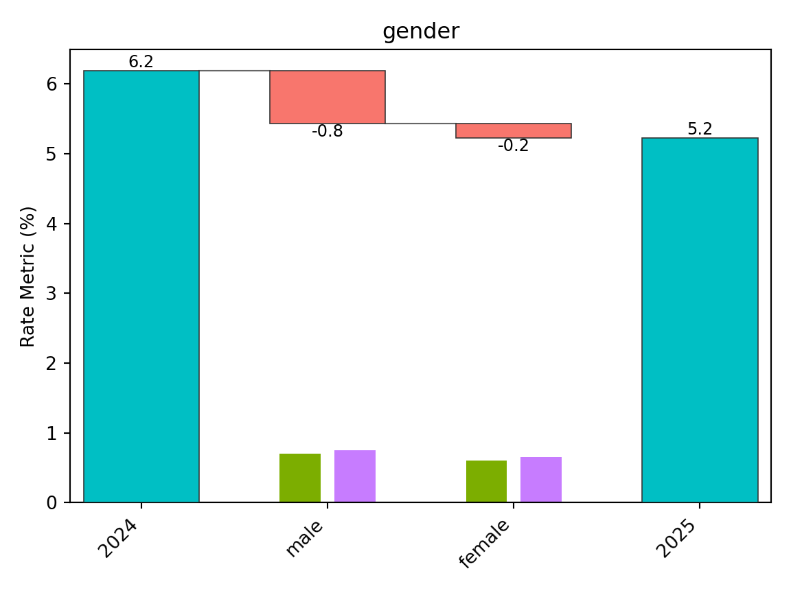
From this plot, we can see that the decline in CTR is primarily driven by male users. We call this visualization the “Theseus Plot.”
The TheseusPlot package is designed to make it easy to generate Theseus Plots for any column that defines subgroups.
2. Installation
You can install the theseusplot package from PyPI with:
python -m pip install theseusplot
You can install the optional dependencies for examples and documentation data with:
python -m pip install "theseusplot[examples]"
You can install the development version from GitHub with:
python -m pip install "git+https://github.com/hoxo-m/TheseusPlot_py.git"
3. Details
3.1 Prepare Data
To create Theseus plots, you need two data frames that share common columns.
We use the 2013 New York City flight data from nycflights13 as a demo dataset. Here, we will define the rate metric as the proportion of flights that arrived on time. In December 2013, the on-time arrival rate dropped substantially compared to November. We investigate the cause using a Theseus plot.
First, we create an on_time column in the data frame to indicate
whether each flight arrived on time. Next, we extract the flights for
November and December into separate data frames to form two comparison
groups. The on-time arrival rate was 83% in November and dropped to 67%
in December.
from nycflights13 import airlines, flights

data = (
    flights.dropna(subset=["arr_delay"])
    .assign(on_time=lambda df: df["arr_delay"] <= 15)
    .merge(airlines, on="carrier")
    .assign(carrier=lambda df: df["name"])
    .loc[
        :,
        [
            "year",
            "month",
            "day",
            "origin",
            "dest",
            "carrier",
            "dep_delay",
            "on_time",
        ],
    ]
)

print(data.head())
#>    year  month  day origin dest                 carrier  dep_delay  on_time
#> 0  2013      1    1    EWR  IAH   United Air Lines Inc.        2.0     True
#> 1  2013      1    1    LGA  IAH   United Air Lines Inc.        4.0    False
#> 2  2013      1    1    JFK  MIA  American Airlines Inc.        2.0    False
#> 3  2013      1    1    JFK  BQN         JetBlue Airways       -1.0     True
#> 4  2013      1    1    LGA  ATL    Delta Air Lines Inc.       -6.0     True

data_nov = data[data["month"] == 11]
data_dec = data[data["month"] == 12]

print(data_nov["on_time"].mean())
#> 0.8264802936487339
print(data_dec["on_time"].mean())
#> 0.6738712065136936
3.2 Basics
Using the two prepared data frames, we first create a ship object. The
ship object is an instance of the Python class ShipOfTheseus,
designed to create Theseus plots.
from theseusplot import create_ship

ship = create_ship(
    data_nov,
    data_dec,
    y="on_time",
    labels=("November", "December"),
)
If labels is omitted, the default labels are "Baseline" and
"Comparison". Plot values are displayed with one decimal place by
default. You can customize the endpoint labels, axis labels, and
displayed precision with labels, x_label, y_label, and digits.
You can create a Theseus plot by passing column names to the plot
method of a ship object. For example, to create a Theseus plot for the
airport of origin:
fig, ax = ship.plot("origin")
fig.show()
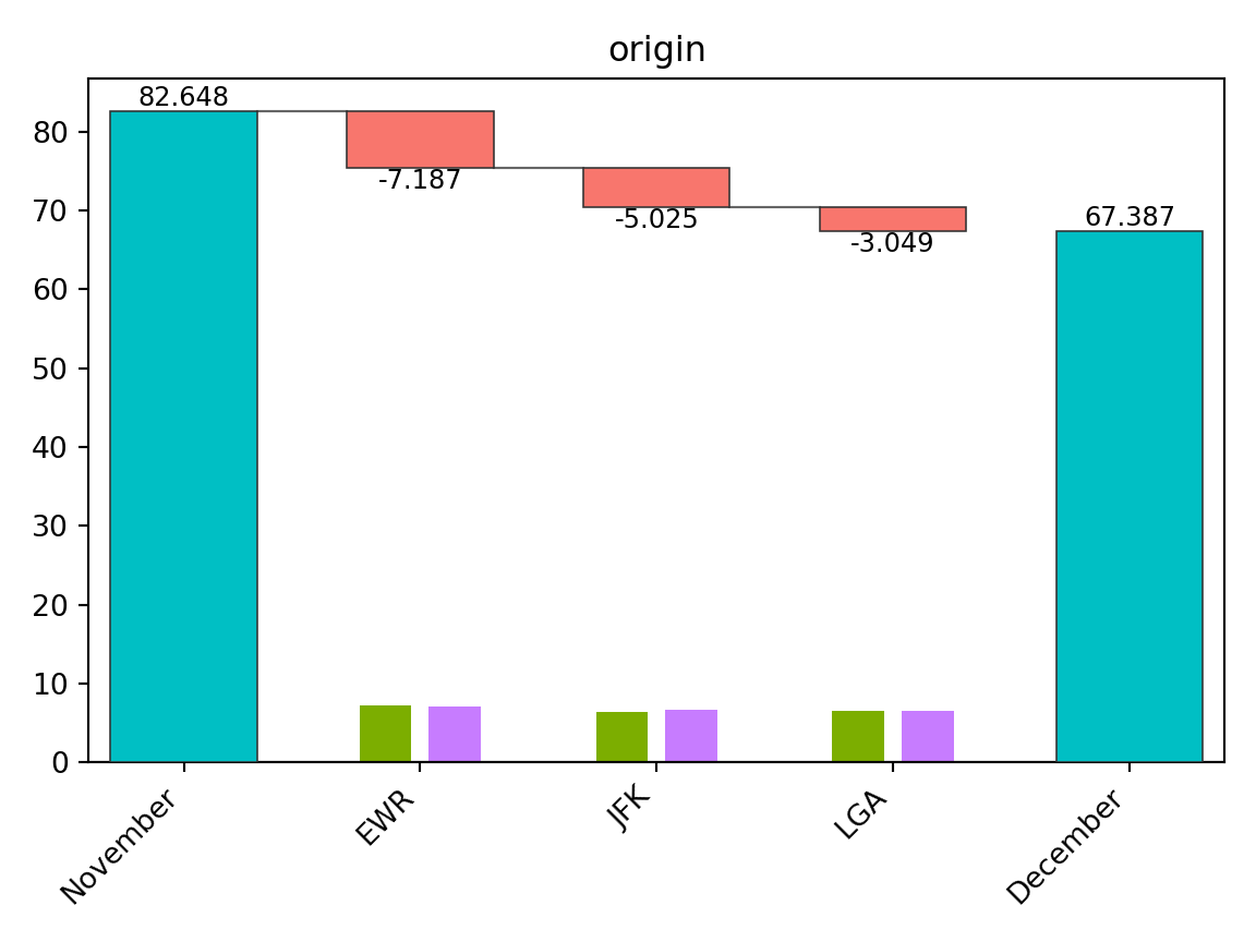
New York City has three major airports, and Newark Liberty International Airport (EWR) accounted for the largest share of the decline in the on-time arrival rate.
Note that the number of flights at each airport matters, as a larger flight volume is expected to have a greater impact. To make this clear, the Theseus plot displays the sample size for each group within each subgroup as a bar chart. From this, we see that the number of flights is similar across airports, allowing for direct comparison of contributions.
In summary, a Theseus plot consists of two components:
- A waterfall plot showing how much each subgroup contributed to the change in the metric.
- A bar chart representing the sample size for each group within each subgroup.
A ship object also provides the table method to inspect the exact
values used in the Theseus plot.
ship.table("origin")
#>   origin   contrib    n1    n2    x1    x2     rate1     rate2
#> 0    EWR -0.071873  9603  9410  7995  5910  0.832552  0.628055
#> 1    JFK -0.050249  8645  8923  7290  6142  0.843262  0.688334
#> 2    LGA -0.030487  8723  8687  7006  6156  0.803164  0.708645
3.3 Flipping the Plot
When there are many subgroups, a Theseus plot can become hard to read. In such cases, you can swap the x- and y-axes for better visualization.
fig, ax = ship.plot_flip("carrier")
fig.show()
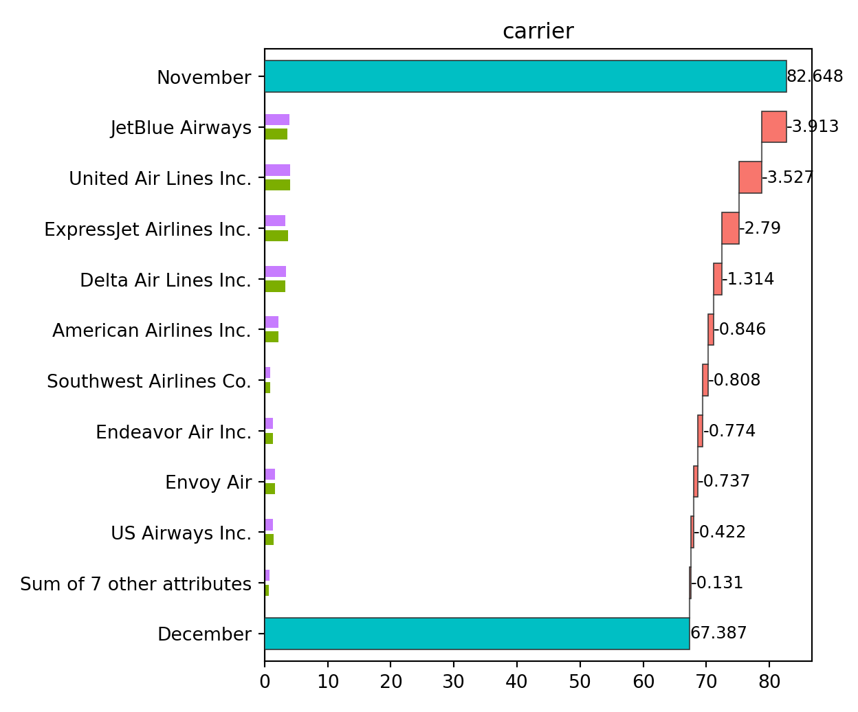
When the number of subgroups is large, those with small contributions
are automatically grouped together. By default, this happens when there
are more than 10 subgroups, but the threshold can be adjusted with the
n argument.
fig, ax = ship.plot_flip("carrier", n=6)
fig.show()
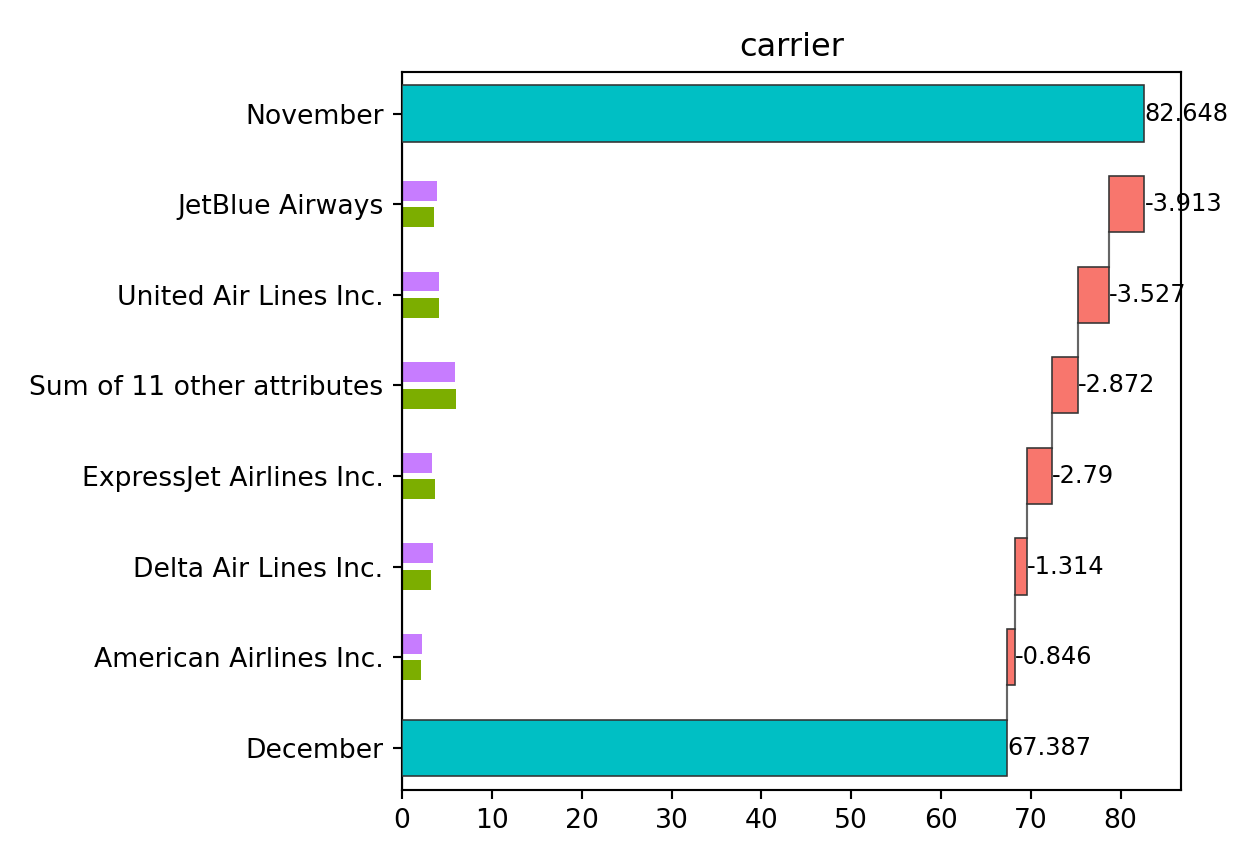
From this plot, JetBlue Airways and United Air Lines appear to have the largest contributions to the decline in on-time arrival rate.
3.4 Automatic Discretization of Continuous Values
Theseus plots are primarily designed for categorical variables. If a continuous column is provided, it is automatically discretized. For example, we can create a Theseus plot for departure delays.
fig, ax = ship.plot_flip("dep_delay")
fig.show()
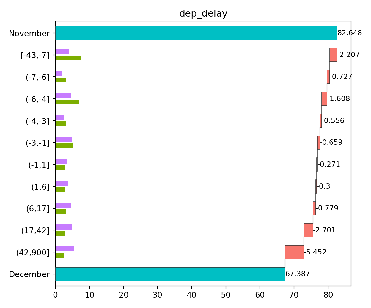
By default, continuous variables are discretized so that each subgroup
has roughly equal sample sizes, with the number of bins set to 10. You
can modify these settings by passing the return value of
continuous_config() to the continuous argument.
from theseusplot import continuous_config

fig, ax = ship.plot_flip("dep_delay", continuous=continuous_config(n=3))
fig.show()
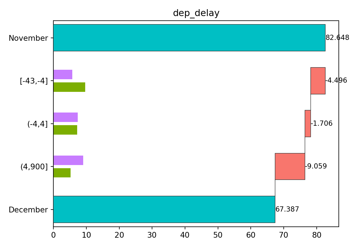
This result shows that both a decrease in on-time departures and an increase in delayed departures contributed to the decline in on-time arrival rate.
3.5 Controlling Category Order with Categorical Columns
By default, string-like columns are ordered by contribution size in
table(), plot(), and plot_flip(). If you want to use a specific
order instead, convert the column to an ordered categorical column. For
categorical columns, TheseusPlot respects the order of the category
levels.
This is useful when the categories have a natural order, such as
"Low", "Medium", and "High", or when you want to define the order
manually.
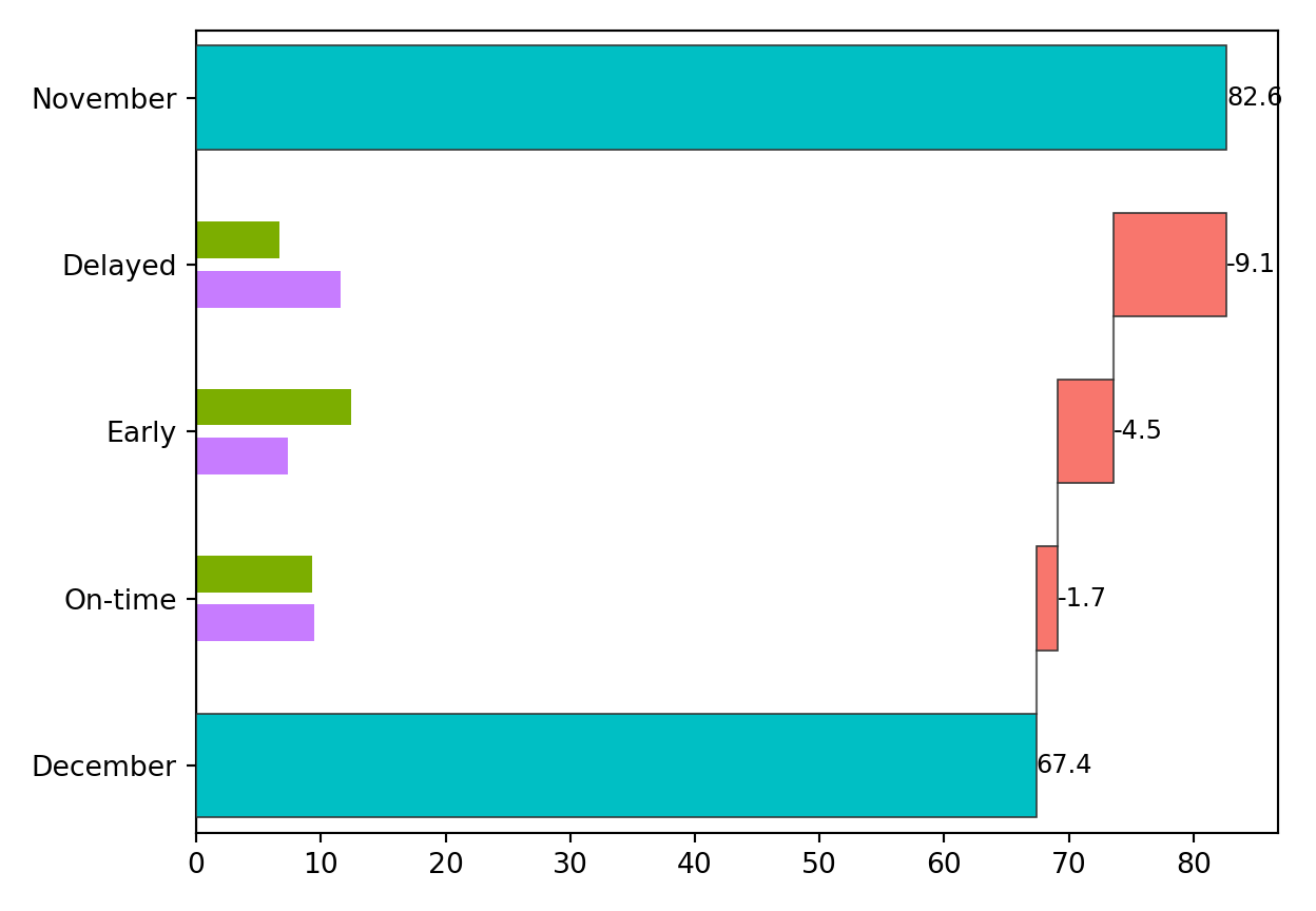
For example, suppose we classify departure delays into three categories:
"Early", "On-time", and "Delayed".
When departure_type is a string column, the categories are ordered by
their contributions.
import numpy as np


def to_departure_type(series):
    return np.select(
        [series <= -4, series <= 4, series > 4],
        ["Early", "On-time", "Delayed"],
        default="Delayed",
    )


data_nov = data_nov.assign(
    departure_type=lambda df: to_departure_type(df["dep_delay"]),
)
data_dec = data_dec.assign(
    departure_type=lambda df: to_departure_type(df["dep_delay"]),
)

ship = create_ship(
    data_nov,
    data_dec,
    y="on_time",
    labels=("November", "December"),
)

fig, ax = ship.plot_flip("departure_type")
fig.show()
To display the categories in a meaningful order, convert
departure_type to an ordered categorical column and specify the
category order.
import pandas as pd
from pandas.api.types import CategoricalDtype


departure_type_order = CategoricalDtype(
    categories=["Early", "On-time", "Delayed"],
    ordered=True,
)


def to_departure_type(series):
    values = np.select(
        [series <= -4, series <= 4, series > 4],
        ["Early", "On-time", "Delayed"],
        default="Delayed",
    )
    return pd.Series(values, index=series.index).astype(departure_type_order)


data_nov = data_nov.assign(
    departure_type=lambda df: to_departure_type(df["dep_delay"]),
)
data_dec = data_dec.assign(
    departure_type=lambda df: to_departure_type(df["dep_delay"]),
)

ship = create_ship(
    data_nov,
    data_dec,
    y="on_time",
    labels=("November", "December"),
)

fig, ax = ship.plot_flip("departure_type")
fig.show()
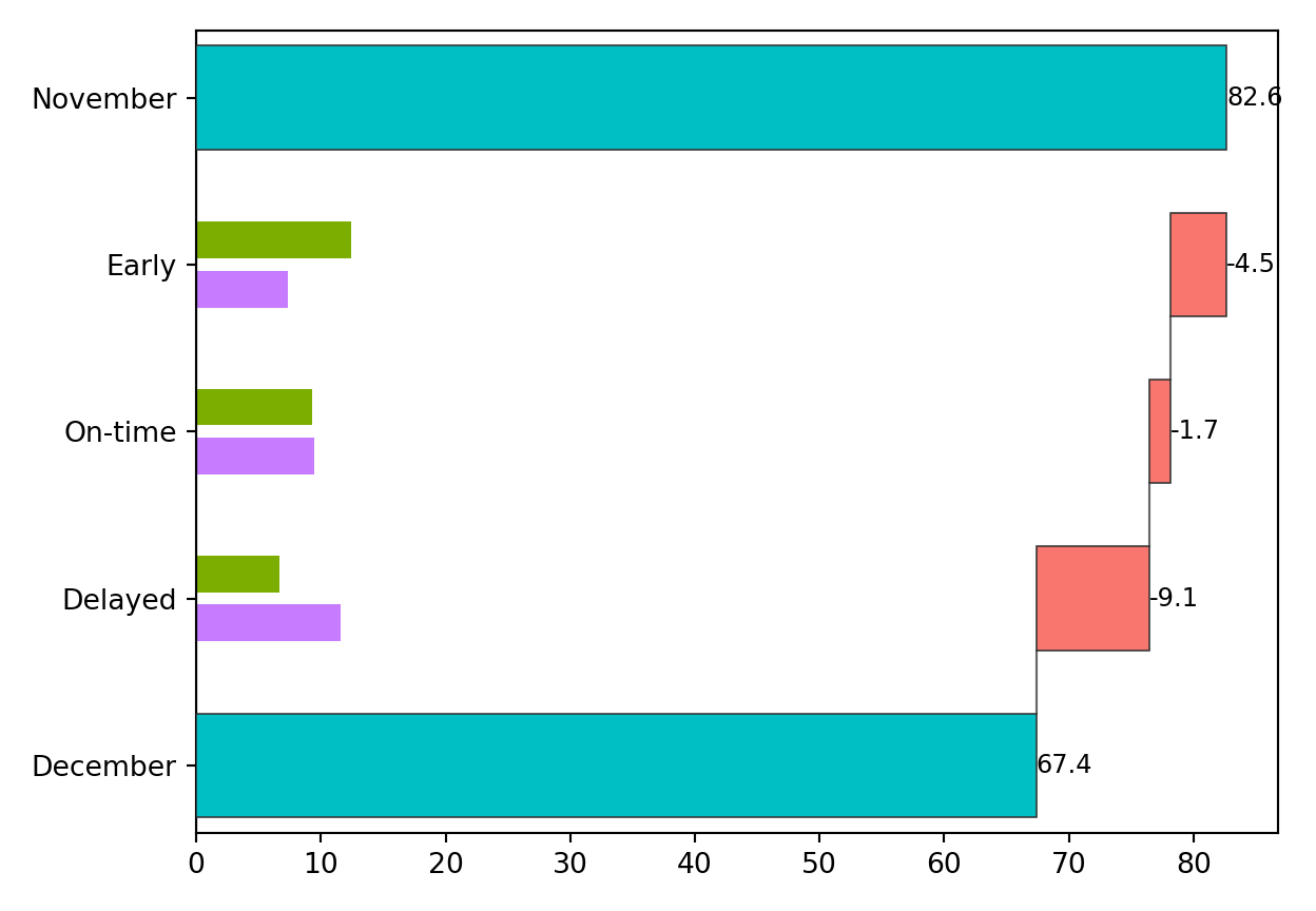
You can change the category levels to display the categories in any order you choose.
Project details
Verified details
These details have been verified by PyPIProject links
GitHub Statistics
Maintainers


Download files
Download the file for your platform. If you're not sure which to choose, learn more about installing packages.
Source Distribution
Built Distribution
Filter files by name, interpreter, ABI, and platform.
If you're not sure about the file name format, learn more about wheel file names.
Copy a direct link to the current filters
File details
Details for the file theseusplot-0.3.0.tar.gz.
File metadata
- Download URL: theseusplot-0.3.0.tar.gz
- Upload date:
- Size: 273.5 kB
- Tags: Source
- Uploaded using Trusted Publishing? Yes
- Uploaded via: twine/6.1.0 CPython/3.13.12
File hashes
| Algorithm | Hash digest | |
|---|---|---|
| SHA256 |
bc7c1ba42ce36b7e742aeda12b5d2c48c7d3255daf970f8fa5e001318e3848c1
|
|
| MD5 |
085bb6d1a33789386916f5207c7074b4
|
|
| BLAKE2b-256 |
c5223e41242644a33aac589cde3addef6f72f4b0290952304b275d8ae136b47a
|
Provenance
The following attestation bundles were made for theseusplot-0.3.0.tar.gz:
Publisher:
publish.yml on hoxo-m/TheseusPlot_py
-
Statement:
-
Statement type:
https://in-toto.io/Statement/v1 -
Predicate type:
https://docs.pypi.org/attestations/publish/v1 -
Subject name:
theseusplot-0.3.0.tar.gz -
Subject digest:
bc7c1ba42ce36b7e742aeda12b5d2c48c7d3255daf970f8fa5e001318e3848c1 - Sigstore transparency entry: 1916947493
- Sigstore integration time:
-
Permalink:
hoxo-m/TheseusPlot_py@a684d495e453228d3543f8542a966c653796b45d -
Branch / Tag:
refs/tags/v0.3.0 - Owner: https://github.com/hoxo-m
-
Access:
public
-
Token Issuer:
https://token.actions.githubusercontent.com -
Runner Environment:
github-hosted -
Publication workflow:
publish.yml@a684d495e453228d3543f8542a966c653796b45d -
Trigger Event:
release
-
Statement type:
File details
Details for the file theseusplot-0.3.0-py3-none-any.whl.
File metadata
- Download URL: theseusplot-0.3.0-py3-none-any.whl
- Upload date:
- Size: 15.5 kB
- Tags: Python 3
- Uploaded using Trusted Publishing? Yes
- Uploaded via: twine/6.1.0 CPython/3.13.12
File hashes
| Algorithm | Hash digest | |
|---|---|---|
| SHA256 |
ba9a0bf815b9c07a47b12bc70cd5c167ba955500b63e9df15314edb1ba9a6940
|
|
| MD5 |
39900bfe1e3f2b74bf488139f6d42956
|
|
| BLAKE2b-256 |
fb4c995896b900ed4c9dd972ac37688c9d13d95b19e832d9bc69ff9b6ffc1e3f
|
Provenance
The following attestation bundles were made for theseusplot-0.3.0-py3-none-any.whl:
Publisher:
publish.yml on hoxo-m/TheseusPlot_py
-
Statement:
-
Statement type:
https://in-toto.io/Statement/v1 -
Predicate type:
https://docs.pypi.org/attestations/publish/v1 -
Subject name:
theseusplot-0.3.0-py3-none-any.whl -
Subject digest:
ba9a0bf815b9c07a47b12bc70cd5c167ba955500b63e9df15314edb1ba9a6940 - Sigstore transparency entry: 1916947631
- Sigstore integration time:
-
Permalink:
hoxo-m/TheseusPlot_py@a684d495e453228d3543f8542a966c653796b45d -
Branch / Tag:
refs/tags/v0.3.0 - Owner: https://github.com/hoxo-m
-
Access:
public
-
Token Issuer:
https://token.actions.githubusercontent.com -
Runner Environment:
github-hosted -
Publication workflow:
publish.yml@a684d495e453228d3543f8542a966c653796b45d -
Trigger Event:
release
-
Statement type:


