An extension to matplotlib for creating graphs in the style of Edward Tufte.

Project description
tufteplotlib
Minimalist plotting for Python, inspired by Edward Tufte’s principles of data visualization.
tufteplotlib is a Python library built on top of matplotlib for generating minimalist, high–data-density graphs in the style proposed by Edward Tufte in The Visual Display of Quantitative Information.
Tufte promotes:
- Maximising the data–ink ratio: remove non-essential lines, marks, and colours.
- Content-driven spines and axes: spines span only the data domain and range, for rapid inspection.
- Minimal scaffolding: grid lines, ticks, and labels are light, precise, and unobtrusive.
- Direct labeling: wherever possible, place labels on the data rather than in legends.
Contents on this Page:
- Examples
- Installation
- Plots
- Contributing
- License
Here is a convenient table summarising the types of plots currently available:
| Comparison | Composition | Distribution | Relationship |
|---|---|---|---|
| Bar | Pareto | Density | Line |
| Barcode | Galaxy | Rug | |
| Column | Histogram | Scatter | |
| Quartile | Stem and Leaf | Sparkline | |
| Time Series |
🔎 Examples
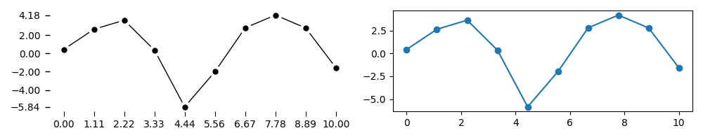
Here is a small gallery of common plots using tufteplotlib on the left, versus default rendering in matplotlib on the right:
💾 Installation
tufteplotlib is available on github and the Python Package Index (PyPI).
To install from PyPI, use:
pip install tufteplotlib
To install from github, use:
pip install git+https://github.com/Woolfrey/software_tufte_plot.git
Or clone the repo and install locally:
git clone https://github.com/Woolfrey/software_tufte_plot.git
cd software_tufte_plot
pip install -e .
To confirm the library is installed correctly, run the following:
pip show tufteplotlib
and you should see something like:
Name: tufteplotlib
Version: 1.1.0
Summary: An extension to matplotlib for creating graphs in the style of Edward Tufte.
Home-page: https://github.com/Woolfrey/software_tufte_plot
Author: Jon Woolfrey
Author-email: jonathan.woolfrey@gmail.com
License: GPLv3
Location: /home/woolfrey/.local/lib/python3.10/site-packages
Requires: matplotlib, numpy, pandas
Required-by:
You can even run commands such as tufte-scatter, tufte-time etc. to execute example code.
📊 Plots
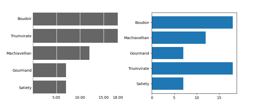
Bar
Compare quantities across nominal categories, with horizontal bars, in descending order.
To see a full example, run tufte-bar in the terminal.
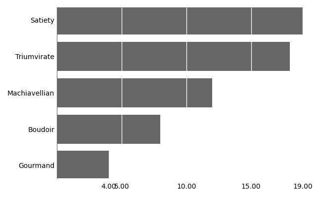
Minimal example:
import numpy as np
from tufteplotlib import bar_chart

categories = ["Satiety", "Triumvirate", "Gourmand", "Machiavellian", "Boudoir"]
values = np.random.randint(3, 20, size=len(categories))

fig, ax = bar_chart(categories, values)
plt.tight_layout()
plt.show()
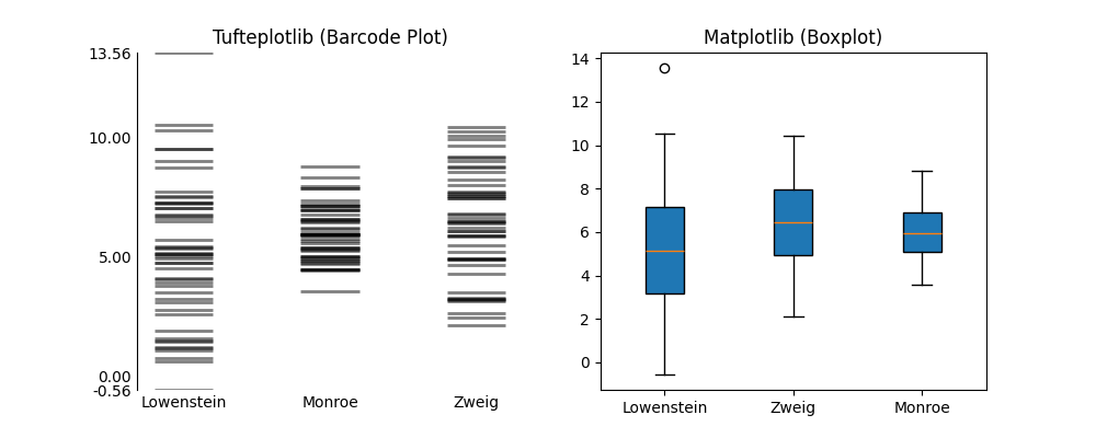
Barcode
Show the distribution of observations across nominal categories.
Run tufte-barcode in the terminal to see an example.
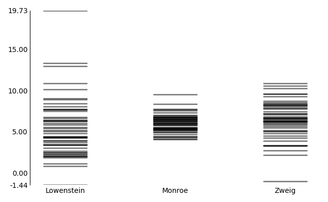
👍 TIP: If the data are dense, consider using the quartile plot instead.
Minimal implementation:
fom tufteplotlib import barcode_plot

params = {"Lowenstein": {"mu": 5, "sigma": 3, "n": 50},
          "Zweig": {"mu": 7, "sigma": 1, "n": 50},
          "Sneed": {"mu": 6, "sigma": 2, "n": 50}}

categories = []
values = []

for cat, p in params.items():
    data = np.random.normal(loc=p["mu"], scale=p["sigma"], size=p["n"])
    categories.extend([cat]*p["n"])
    values.extend(data)

fig, ax = barcode_plot(categories, values)

plt.tight_layout()

plt.show()
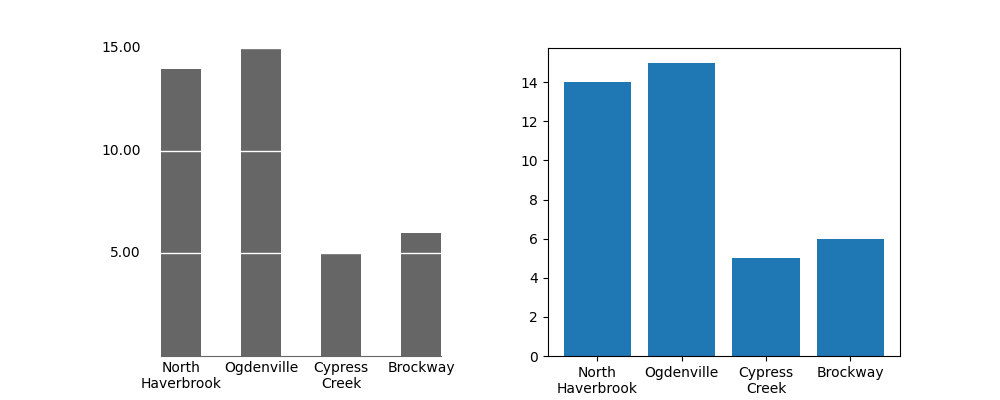
Column
Compare quantities across nominal categories.
Run tufte-column in the terminal to see an example.
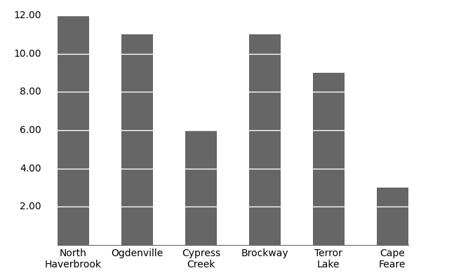
Minimal example:
import numpy as np
import matplotlib.pyplot as plt
from tufteplotlib import column_chart

# Example data
categories = ["North\nHaverbrook", "Ogdenville", "Cypress\nCreek",
              "Brockway", "Terror\nLake", "Cape\nFeare"]
values = np.random.randint(3, 20, size=len(categories))

# Create the Tufte column chart
fig, ax = column_chart(categories, values)

# Optional: adjust layout
plt.tight_layout()

# Show plot
plt.show()
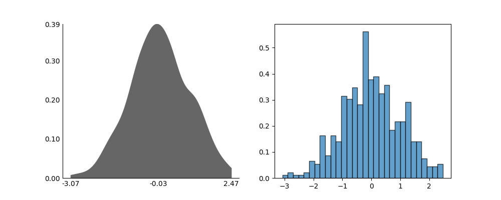
Density
Show the distribution of observations across a 1-dimensional data set.
Run tufte-density in the terminal to see an example.
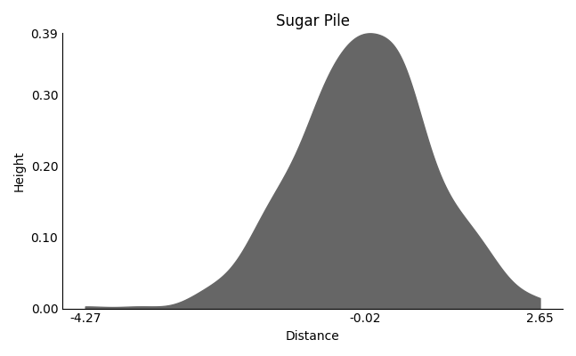
👍 TIP: If the data are sparse, consider using an histogram instead.
Minimal implementation:
import numpy as np
from tufteplotlib import density_plot

data = np.random.normal(loc=0, scale=1, size=500)
fig, ax = density_plot(data)

plt.tight_layout()
plt.show()
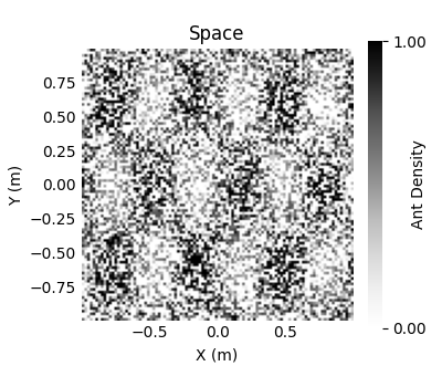
Galaxy
Illustrate the density of data distributed across 2-dimensional coordinates.
Run tufte-galaxy in the terminal to see an example.
Minimal implementation:
import numpy as np
from tufteplotlib import galax_plot

n_points = 10000

x = np.random.uniform(low=-1.0, high=1.0, size=n_points)
y = np.random.uniform(low=-1.0, high=1.0, size=n_points)
z = np.random.uniform(low= 0.0, high=1.0, size=n_points)

# Create plot
ax, im = galaxy_plot(x, y, z)

# Create the colorbar (minimal)
cbar = add_min_max_colorbar(im, ax=ax)

plt.tight_layout()
plt.show()
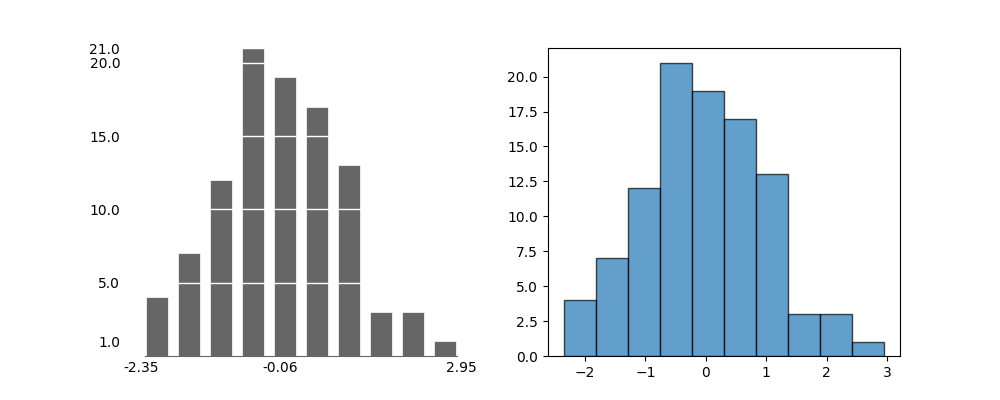
Histogram
Show the distribution of a 1-dimensional data set.
From the terminal use tufte-histogram to see an example.
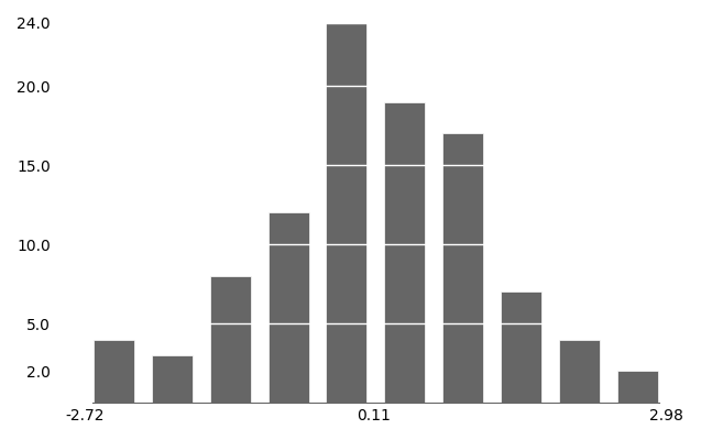
👍 TIP: If the data are dense, consider using the density plot instead.
Minimal implementation:
import numpy as np
from tufteplotlib import histogram_plot

data = np.random.normal(loc=0.0, scale=1.0, size=100)

fig, ax = histogram_plot(data)

plt.tight_layout()
plt.show()
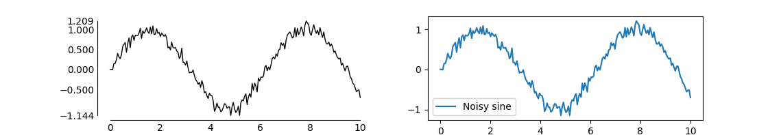
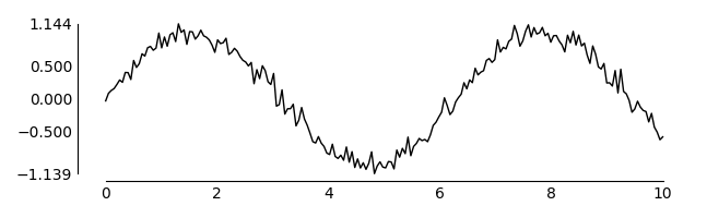
Line
Draw a line using a 2-dimensional data set.
Use tufte-line in the terminal to see an example.
Minimal implementation:
import numpy as np
from tufteplotlib import line_plot

t = np.linspace(0, 10, 200)
y = np.sin(t)
y_noisy = y + np.random.normal(0, 0.1, size=t.shape)

fig, ax = line_plot(t, y_noisy)

plt.tight_layout()
plt.show()
Pareto
Show the individual contribution of nominal categories to a total quantity.
Use tufte-pareto in the terminal to see an example.
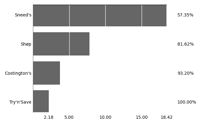
👍 TIP: The pareto rule is a heuristic that states 20% of causes produce 80% of outcomes. This chart be used to illustrate and discern the 20% of causes.
📝 NOTE: The pareto chart is a personal favourite. Tufte never mentioned them in his books. He did, however, criticise the use of pie charts since the mapping between the angle of a slice and its quantity is nonlinear, and hence difficult to discern its true proportions. The pareto chart, in contrast:
- Preserves proportions between categories, and
- Features a cumulative % on the right vertical axis for rapid inspection.
Minimal implementation:
import numpy as np
from tufteplotlib import pareto_chart

categories = ["A", "B", "C", "D", "E"]

np.random.seed()

values = np.random.rand(len(categories)) * 20

fig, ax = pareto_chart(categories, values)

ax[1].set_ylim(-10, 110) # Move the cumulative line plot upward

plt.tight_layout()
plt.show()
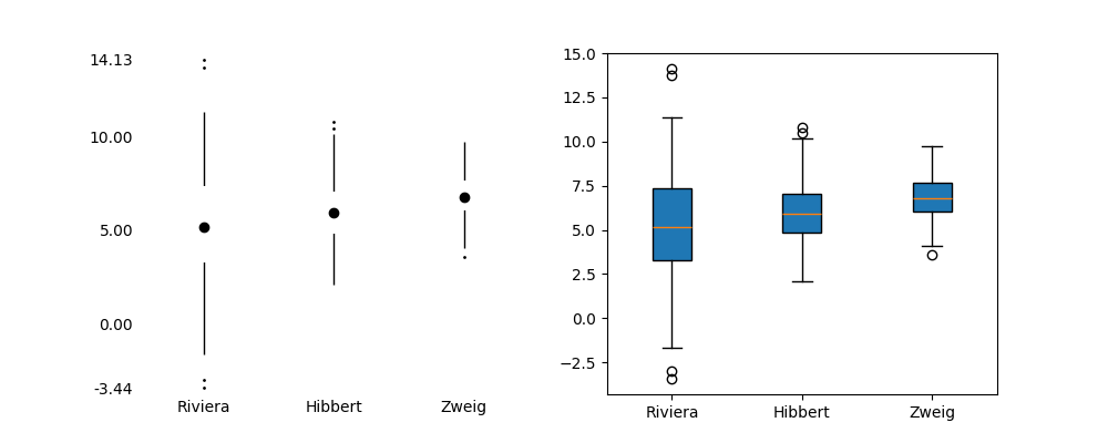
Quartile
Show the distribution of observations across nominal categories.
Use tufte-quartile in the terminal to see an example.
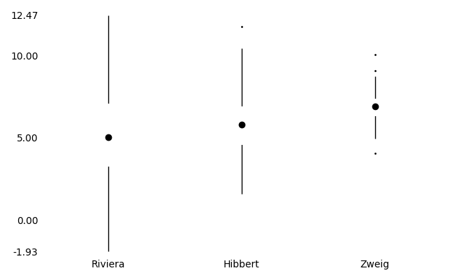
👍 TIP: If the data are sparse, consider using the barcode plot instead.
Minimal implementation:
import numpy as np
from tufteplotlib import quartile_plot

params = {"A": {"mu": 5, "sigma": 3, "n": 100},
          "B": {"mu": 6, "sigma": 2, "n": 100},
          "C": {"mu": 7, "sigma": 1, "n": 100}}

categories = []
values = []

for cat, p in params.items():
    data = np.random.normal(loc=p["mu"], scale=p["sigma"], size=p["n"])
    categories.extend([cat]*p["n"])
    values.extend(data)

fig, ax = quartile_plot(categories, values)

plt.tight_layout()
plt.show()
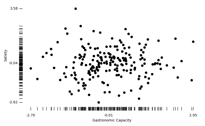
Rug
Plot individual observations in a 2-dimensional dataset, with ticks on the axes to show marginal distributions.
Run tufte-rug in the terminal to see an example.
Minimal implementation:
import numpy as np
from tufteplotlib import rug_plot

x = np.random.normal(loc=0, scale=1, size=200)
y = np.random.normal(loc=0, scale=1, size=200)

fig, ax = rug_plot(x, y)

plt.tight_layout()
plt.show()
Scatter
Plot individual observations from a 2-dimensional data set.
Use tufte-scatter in the terminal to see an example.
Minimal implementation:
import random
from tufteplotlib.datasets import anscombe
from tufteplotlib import scatter_plot

data = anscombe[random.choice(list(anscombe.keys()))]

x, y = data[:, 0], data[:, 1]

fig, ax = scatter_plot(x, y)

plt.tight_layout()
plt.show()
Sparkline
Illustrate the change in a quantity across time.
Use tufte-sparkline to see an example.
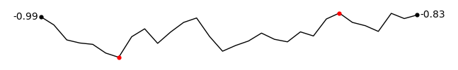
Minimal implementation:
import numpy as np
from tufteplotlib import sparkline

y = np.random.normal(0, 1, 30).cumsum()

fig, ax = sparkline(y)

plt.tight_layout()
plt.show()
Stem and Leaf
Plot an horizontal histogram for a 1-dimensional data set where the 1st significant digit(s) are used as the categories.
Use tufte-stem in the terminal to see an example.
| Stem | Leaves |
|---|---|
| 5 | .03 .10 .13 .89 |
| 6 | .39 .45 .63 .95 |
| 7 | .48 .84 |
| 8 | .11 .14 .19 .59 .69 .72 .99 |
| 9 | .04 .08 .28 .38 .49 .90 |
| 10 | .13 .17 .20 .55 .73 .95 |
| 11 | .32 .78 |
| 12 | .35 .36 .58 .70 .96 .99 |
| 13 | .02 .22 .25 .58 .60 .60 .66 .79 .86 |
| 14 | .43 .78 .85 .96 |
👍 TIP: You can output the plot with different formatting for
Markdown,LaTeX, orCSVready to use!
Minimal implementation:
import numpy as np
from tufteplotlib import stem_and_leaf_plot

data = np.random.randint(5, 15, size=20) + np.random.rand(20)

print(stem_and_leaf_plot(data, output="plain")) # or "Markdown", "LaTeX", "CSV"
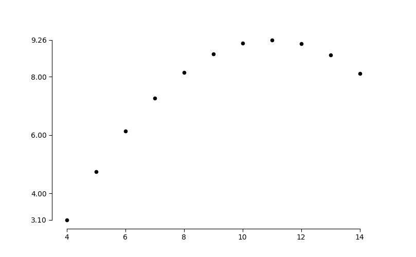
Time
Plot values over time to visualise change and trends.
In the terminal enter tufte-time to see an example.
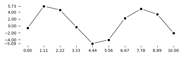
👍 TIP: If the data are dense, consider using the line plot instead.
Minimal implementation:
import numpy as np
from tufteplotlib import time_series

t = np.linspace(0, 10, 10)
y = 5.0 * np.sin(t) + 1.0 * np.random.randn(10)

fig, ax = time_series(t, y)

plt.tight_layout()
plt.show()
🤝 Contributing
📝 NOTE: I am not a software engineer, so contributions to improving
tufteplotlibare welcome!
- Report issues: If you find a bug, unexpected behavior, or have a feature request, open an issue.
- Fork & pull request: Fork the repository, make your changes, and submit a pull request.
- Code style: Please follow the minimalist Tufte style — keep your changes clean and avoid unnecessary visual clutter.
- Documentation: Examples, explanations, and README improvements are highly appreciated.
- Testing: Ensure that your code changes do not break existing functionality. Add small example plots if relevant.
📜 License
tufteplotlib is released under the GNU General Public License v3.0.
You are free to use, modify, and distribute this software under the terms of the GPLv3.
See the included LICENSE file for full details.
Release history Release notifications | RSS feed


Download files
Download the file for your platform. If you're not sure which to choose, learn more about installing packages.
Source Distribution
Built Distribution
Filter files by name, interpreter, ABI, and platform.
If you're not sure about the file name format, learn more about wheel file names.
Copy a direct link to the current filters
File details
Details for the file tufteplotlib-1.1.0.tar.gz.
File metadata
- Download URL: tufteplotlib-1.1.0.tar.gz
- Upload date:
- Size: 35.2 kB
- Tags: Source
- Uploaded using Trusted Publishing? No
- Uploaded via: twine/6.2.0 CPython/3.10.12
File hashes
| Algorithm | Hash digest | |
|---|---|---|
| SHA256 |
3ce97d9df10db36f35a1581c460a801470bc37965863e86132a2bb04639bad4c
|
|
| MD5 |
f006f009271ef1b9bbe18bad80e5fb31
|
|
| BLAKE2b-256 |
b1435494e0a045c395920d1cdfee2386c05881f175c616c4fdbebef0d2a55f60
|
File details
Details for the file tufteplotlib-1.1.0-py3-none-any.whl.
File metadata
- Download URL: tufteplotlib-1.1.0-py3-none-any.whl
- Upload date:
- Size: 41.1 kB
- Tags: Python 3
- Uploaded using Trusted Publishing? No
- Uploaded via: twine/6.2.0 CPython/3.10.12
File hashes
| Algorithm | Hash digest | |
|---|---|---|
| SHA256 |
12865e3185e5ea1a1bafcc9d9bc13aec5d6cb0c2e1c32de147bdb6f553465344
|
|
| MD5 |
99eab9a805afe1a67697ad2ee1bfcbd3
|
|
| BLAKE2b-256 |
bbf4aa98dbd1872b717110bc4329978ed081d0f5a0bb95b306e8e07c12fcfaaf
|


