Opinionated Python data visualization. Publication-quality charts with minimal config.

Project description
vizop
Opinionated data visualization for Python. Publication-quality charts with minimal configuration.


vizop produces clean, presentation-ready charts inspired by the visual style of the NYT and FiveThirtyEight — left-aligned titles, no chartjunk, smart defaults. Built on matplotlib, driven by DataFrames.
Gallery
 Line |
 Bar |
 Scatter |
 Slope |
 Waffle |
 Raincloud |
 Parliament |
 Bump |
Installation
pip install vizop
or with uv:
uv add vizop
Quick Start
import pandas as pd
import vizop

df = pd.DataFrame({
    "month": ["Jan", "Feb", "Mar", "Apr", "May", "Jun",
              "Jul", "Aug", "Sep", "Oct", "Nov", "Dec"],
    "visitors": [1200, 1350, 1800, 2400, 2800, 3200,
                 3500, 3300, 2900, 2100, 1600, 1400],
})

chart = vizop.line(
    df, x="month", y="visitors",
    title="Monthly Website Visitors",
    subtitle="Pageviews peaked in July before seasonal decline",
    source="Internal analytics",
)
chart.show()
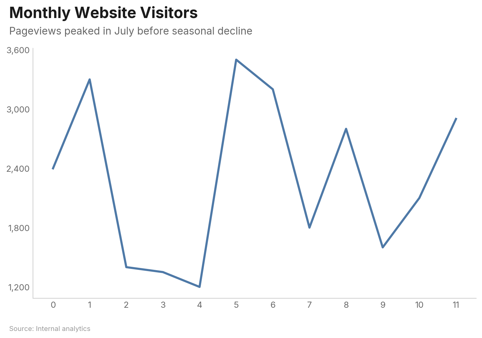
Every chart function returns a Chart object — call .show() to display, .save("file.png") to export, or just let it render inline in Jupyter.
Charts
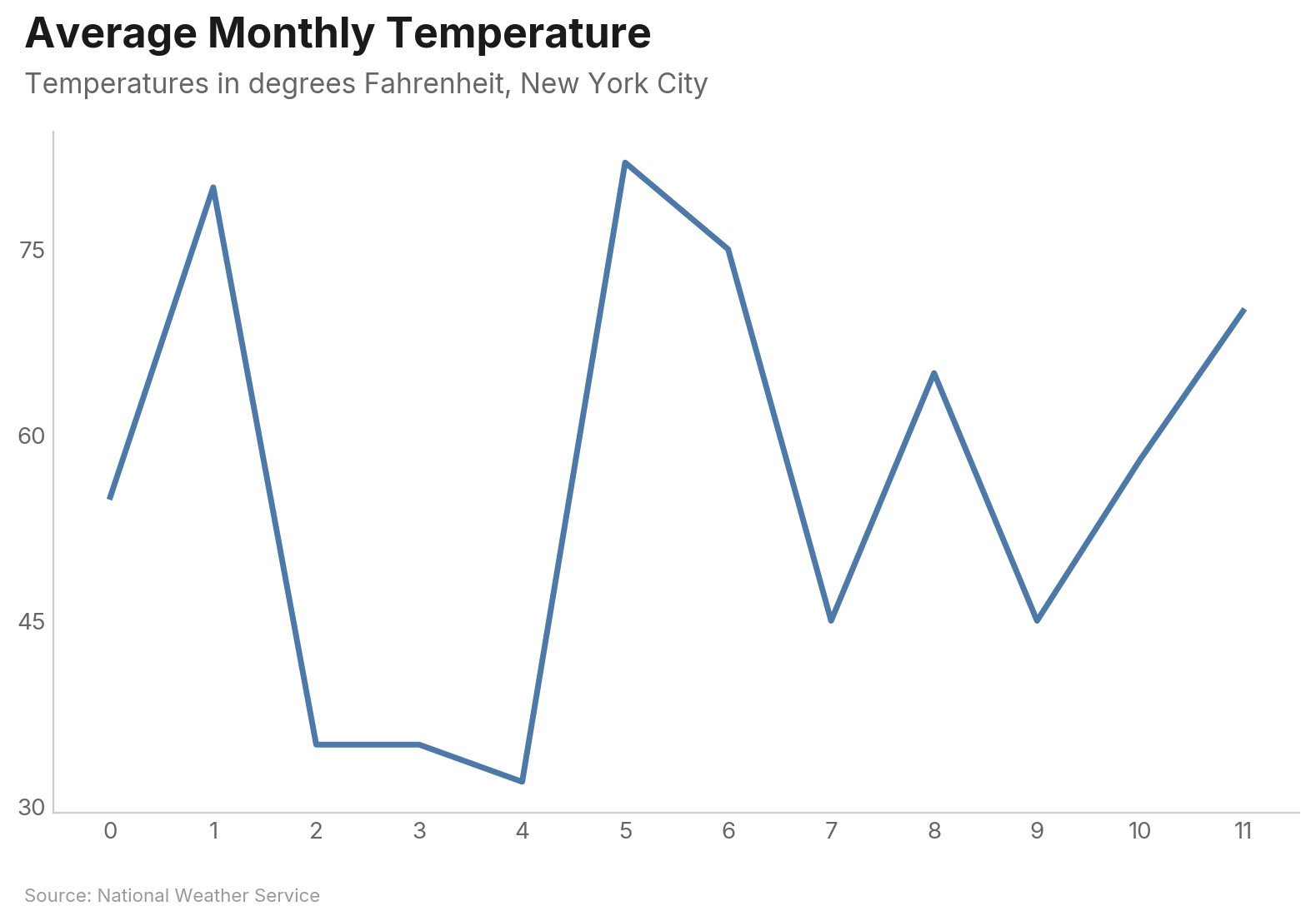
Line Chart
Basic single-series line:
df = pd.DataFrame({
    "month": ["Jan", "Feb", "Mar", "Apr", "May", "Jun",
              "Jul", "Aug", "Sep", "Oct", "Nov", "Dec"],
    "temperature": [32, 35, 45, 55, 65, 75, 82, 80, 70, 58, 45, 35],
})

vizop.line(
    df, x="month", y="temperature",
    title="Average Monthly Temperature",
    subtitle="Temperatures in degrees Fahrenheit, New York City",
    source="National Weather Service",
)
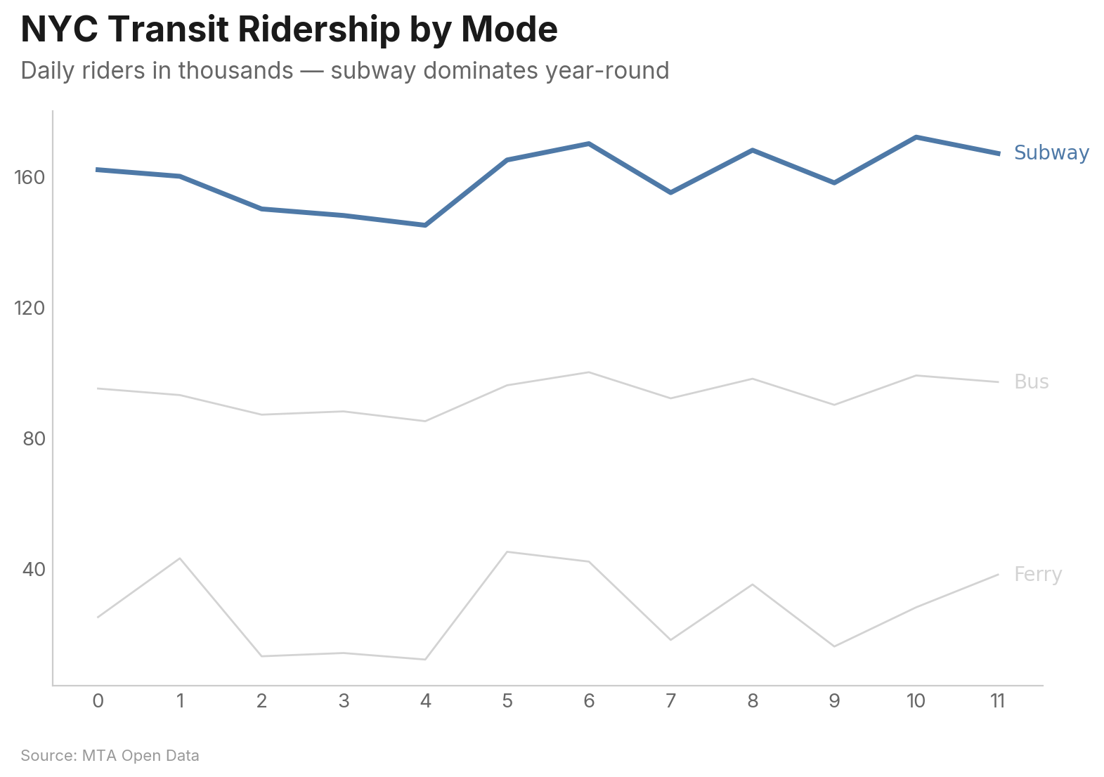
Multi-series with highlight — the highlighted series stays vivid while others are muted. Labels appear at line endpoints instead of a legend box:
vizop.line(
    df, x="month", y="ridership", group="mode",
    highlight="Subway",
    title="NYC Transit Ridership by Mode",
    subtitle="Daily riders in thousands — subway dominates year-round",
    source="MTA Open Data",
)
Key Parameters
| Parameter | Type | Description |
|---|---|---|
x |
str |
Column for the x-axis |
y |
str | list[str] |
Column(s) for y-axis. List for wide-format multi-series |
group |
str |
Column to group by (long format) |
highlight |
str | list[str] |
Series to highlight; others are muted |
show_area |
bool |
Fill area under the line (single-series) |
zero_baseline |
bool |
Force y-axis to start at 0 |
show_last_value |
bool |
Display value at the last data point |
highlight_range |
tuple |
(start, end) x-values to shade |
Bar Chart
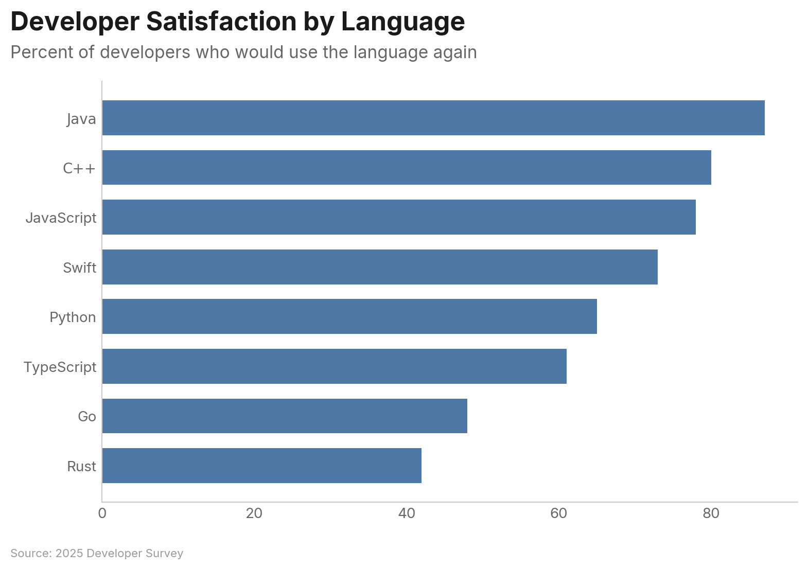
Bars are horizontal and sorted descending by default — the most important value is always at the top:
df = pd.DataFrame({
    "language": ["Python", "JavaScript", "Java", "C++", "TypeScript",
                 "Go", "Rust", "Swift"],
    "satisfaction": [73, 61, 42, 48, 78, 80, 87, 65],
})

vizop.bar(
    df, x="language", y="satisfaction",
    title="Developer Satisfaction by Language",
    subtitle="Percent of developers who would use the language again",
    source="2025 Developer Survey",
)
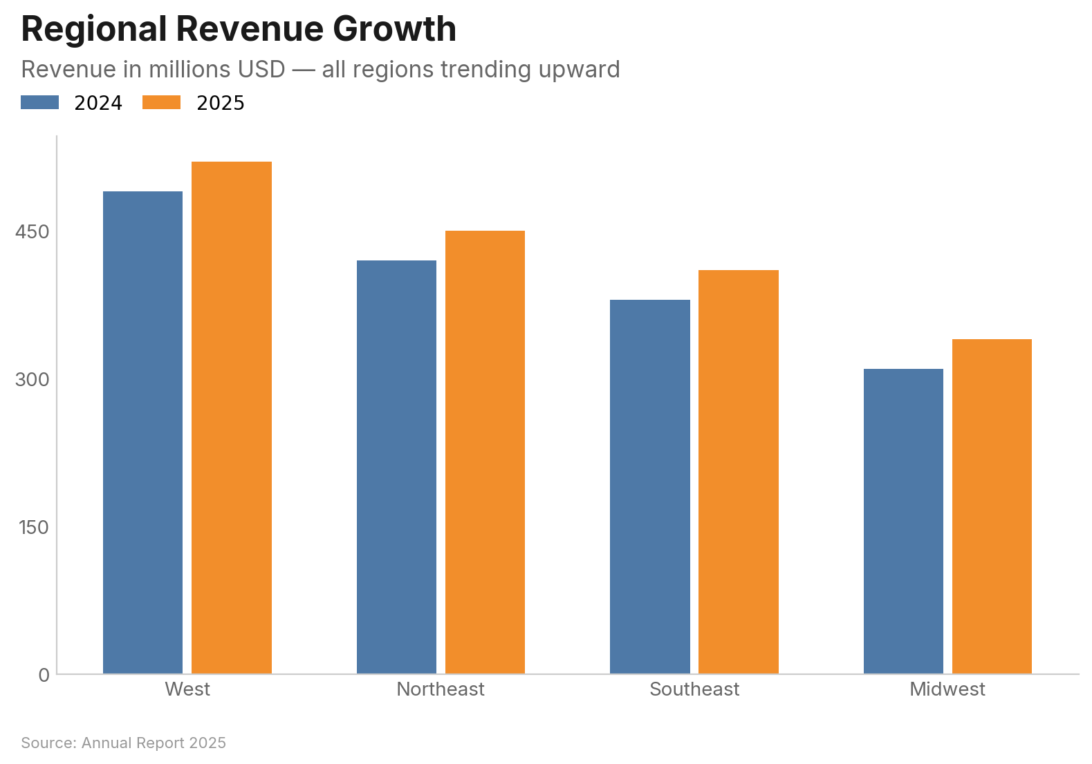
Grouped bars for comparing across categories:
vizop.bar(
    df, x="region", y="revenue", group="year",
    orientation="vertical", mode="grouped",
    title="Regional Revenue Growth",
    subtitle="Revenue in millions USD — all regions trending upward",
    source="Annual Report 2025",
)
Key Parameters
| Parameter | Type | Description |
|---|---|---|
x |
str |
Category column |
y |
str | list[str] |
Value column(s) |
group |
str |
Group column (long format) |
orientation |
str |
"horizontal" (default) or "vertical" |
mode |
str |
"grouped" or "stacked" for multi-series |
sort |
str | None |
"descending" (default), "ascending", or None |
limit |
int |
Show only top N categories |
show_values |
str |
Value labels: "inside", "inside_end", or "outside" |
reference_line |
float |
Draw a dashed reference line at this value |
Scatter Plot
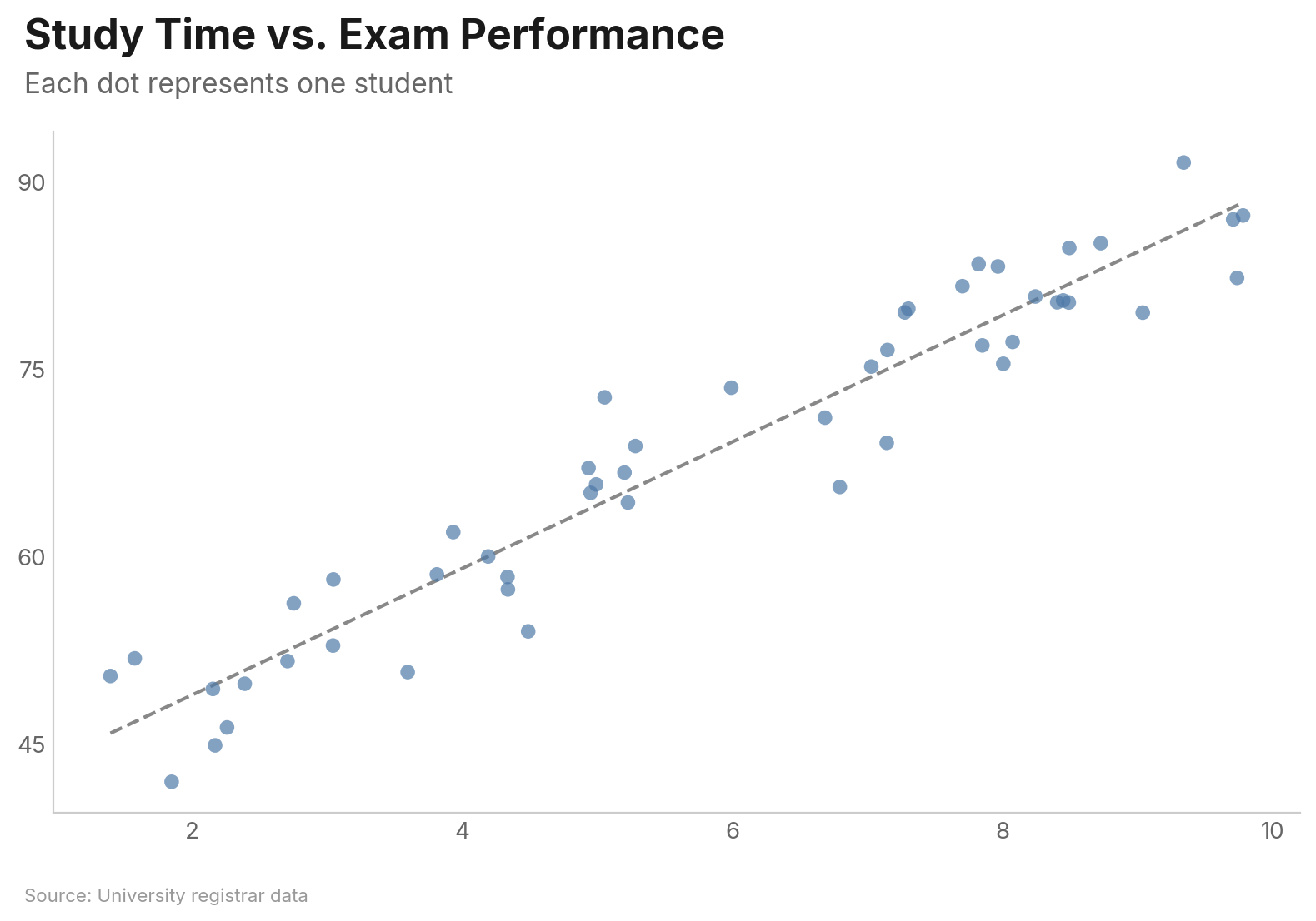
vizop.scatter(
    df, x="study_hours", y="exam_score",
    trend="linear",
    title="Study Time vs. Exam Performance",
    subtitle="Each dot represents one student",
    source="University registrar data",
)
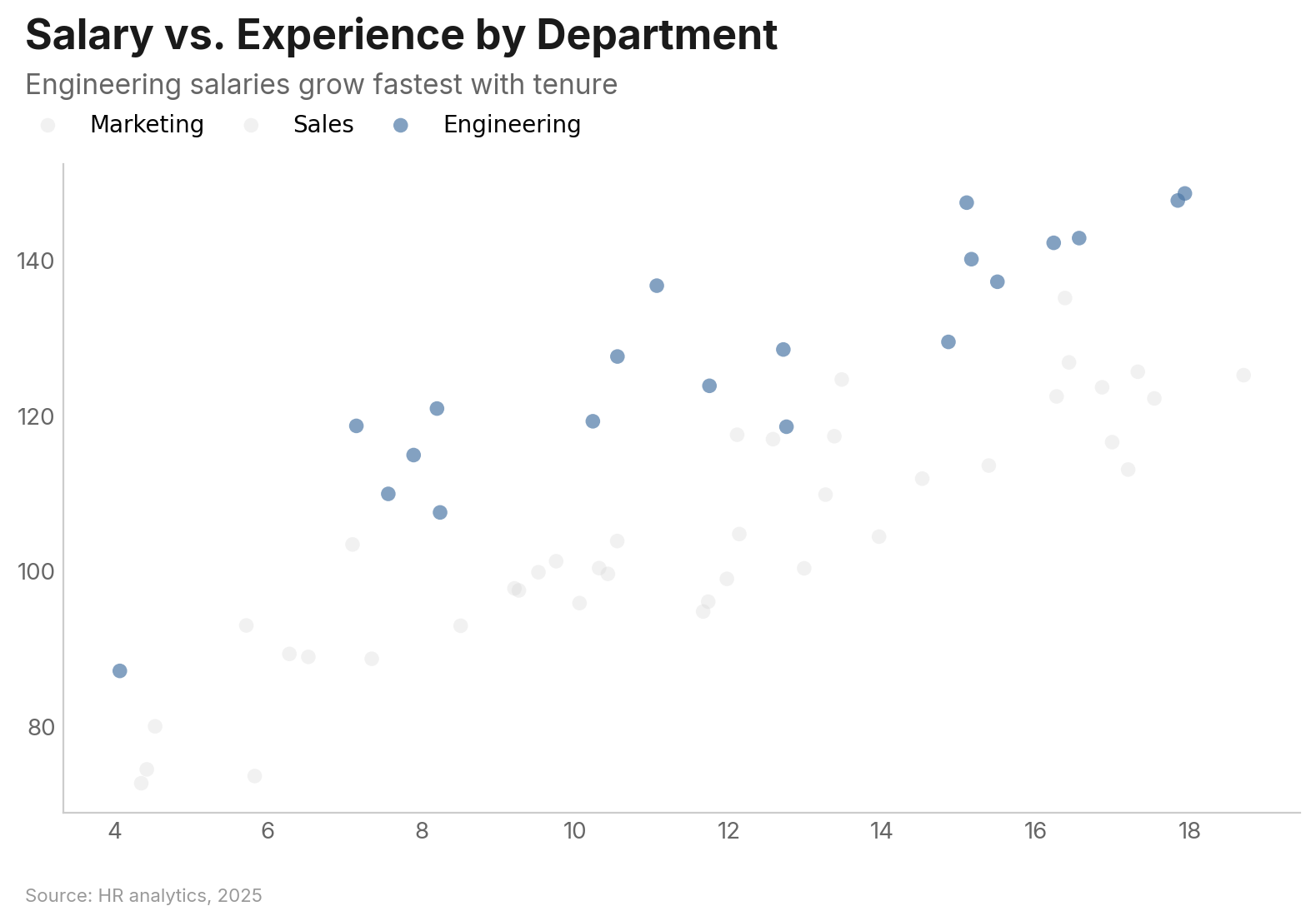
Grouped scatter with highlight:
vizop.scatter(
    df, x="experience", y="salary", group="department",
    highlight="Engineering",
    title="Salary vs. Experience by Department",
    subtitle="Engineering salaries grow fastest with tenure",
    source="HR analytics, 2025",
)
Key Parameters
| Parameter | Type | Description |
|---|---|---|
x |
str |
Column for x-axis |
y |
str |
Column for y-axis |
group |
str |
Column for color-coded groups |
size |
str |
Column for size encoding (bubble chart) |
label |
str |
Column for point labels |
trend |
str |
"linear", "lowess", or None |
opacity |
float |
Point opacity (default 0.7) |
jitter |
bool |
Add random noise to reduce overplotting |
log_x / log_y |
bool |
Logarithmic axis scale |
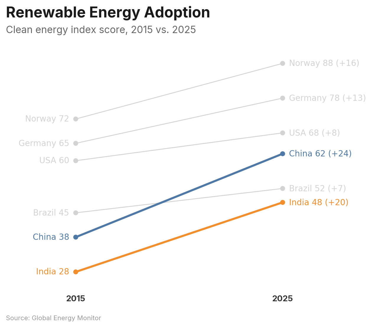
Slope Chart
Compare values between two time points. Supports both wide format (label/left/right) and long format (x/y/group):
df = pd.DataFrame({
    "country": ["Norway", "Germany", "USA", "China", "Brazil", "India"],
    "2015": [72, 65, 60, 38, 45, 28],
    "2025": [88, 78, 68, 62, 52, 48],
})

vizop.slope(
    df, label="country", left="2015", right="2025",
    highlight=["China", "India"],
    show_change=True,
    title="Renewable Energy Adoption",
    subtitle="Clean energy index score, 2015 vs. 2025",
    source="Global Energy Monitor",
)
Key Parameters
| Parameter | Type | Description |
|---|---|---|
label |
str |
Entity name column (wide format) |
left / right |
str |
Value columns for each endpoint (wide format) |
x / y / group |
str |
Long format alternative |
highlight |
str | list[str] |
Entities to highlight |
color_by_direction |
bool | dict |
Color by increase/decrease |
show_change |
bool |
Show delta on right-side labels |
sort |
str |
"ascending", "descending", or None |
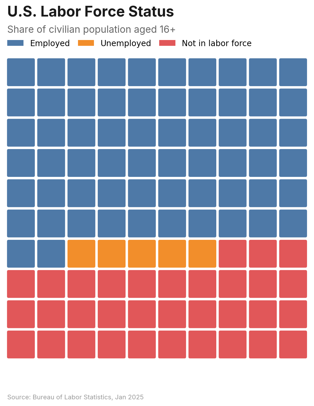
Waffle Chart
Proportional area chart using a grid of cells. Accepts a DataFrame or a simple dict:
vizop.waffle(
    values={"Employed": 62, "Unemployed": 5, "Not in labor force": 33},
    title="U.S. Labor Force Status",
    subtitle="Share of civilian population aged 16+",
    source="Bureau of Labor Statistics, Jan 2025",
)
Key Parameters
| Parameter | Type | Description |
|---|---|---|
values |
dict[str, float] |
Category-to-value mapping (dict mode) |
category / value |
str |
Column names (DataFrame mode) |
style |
str |
"square" (default), "circle", or "icon" |
icon |
str |
Built-in icon name (required when style="icon") |
grid_size |
int |
Cells per row/column (default 10 = 100 cells) |
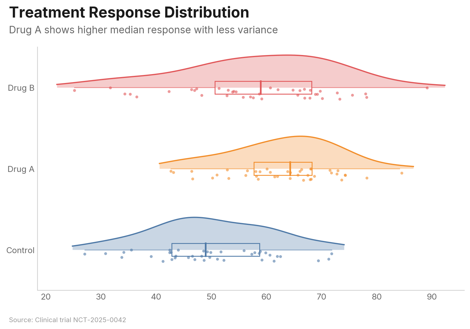
Raincloud Plot
Combines a half-violin density curve, box plot, and jittered strip plot for rich distribution visualization:
vizop.raincloud(
    df, value="score", group="treatment",
    title="Treatment Response Distribution",
    subtitle="Drug A shows higher median response with less variance",
    source="Clinical trial NCT-2025-0042",
)
Key Parameters
| Parameter | Type | Description |
|---|---|---|
value |
str | list[str] |
Value column (long format) or columns (wide format) |
group |
str |
Group column (long format) |
show_density |
bool |
Show half-violin (default True) |
show_box |
bool |
Show box plot (default True) |
show_points |
bool |
Show strip points (default True) |
bandwidth |
float |
KDE bandwidth (default: Scott's rule) |
jitter_width |
float |
Vertical jitter range (default 0.15) |
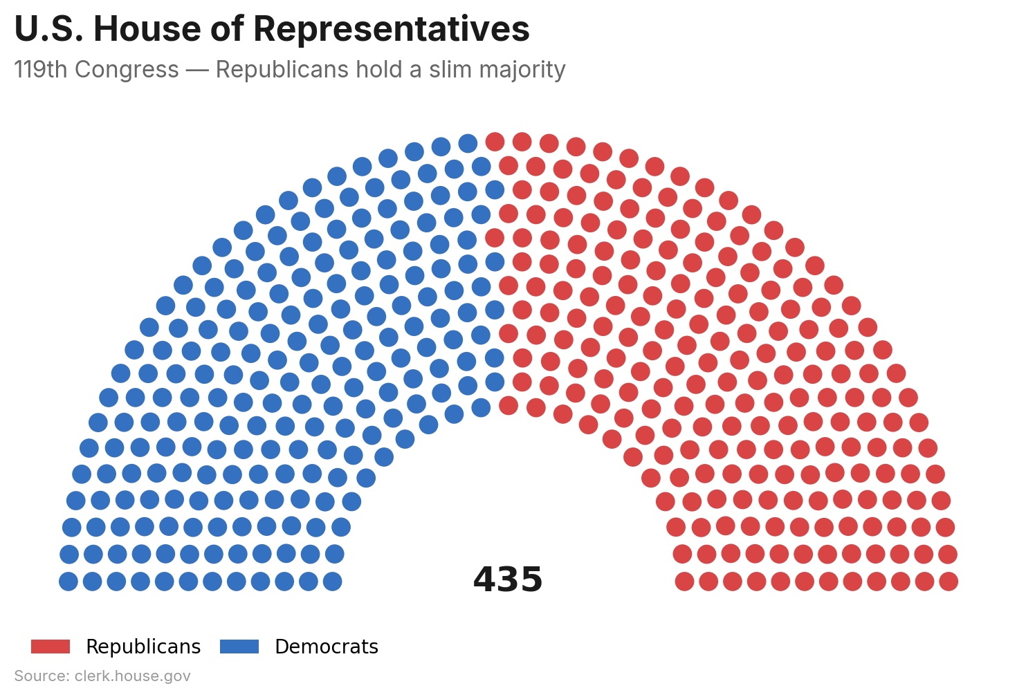
Parliament Chart
Semicircular seat layout for legislative composition. Accepts a DataFrame or dict:
vizop.parliament(
    values={"Democrats": 213, "Republicans": 222},
    color_map={"Democrats": "#3571C1", "Republicans": "#D94444"},
    title="U.S. House of Representatives",
    subtitle="119th Congress — Republicans hold a slim majority",
    source="clerk.house.gov",
)
Key Parameters
| Parameter | Type | Description |
|---|---|---|
values |
dict[str, int] |
Party-to-seats mapping (dict mode) |
party / seats |
str |
Column names (DataFrame mode) |
rows |
int |
Number of arc rows (auto-calculated if None) |
arc_degrees |
float |
Arc span in degrees (default 180) |
majority_line |
bool | int |
Draw majority threshold (True = auto) |
center_label |
str | bool |
Label at arc center (True = total seats) |
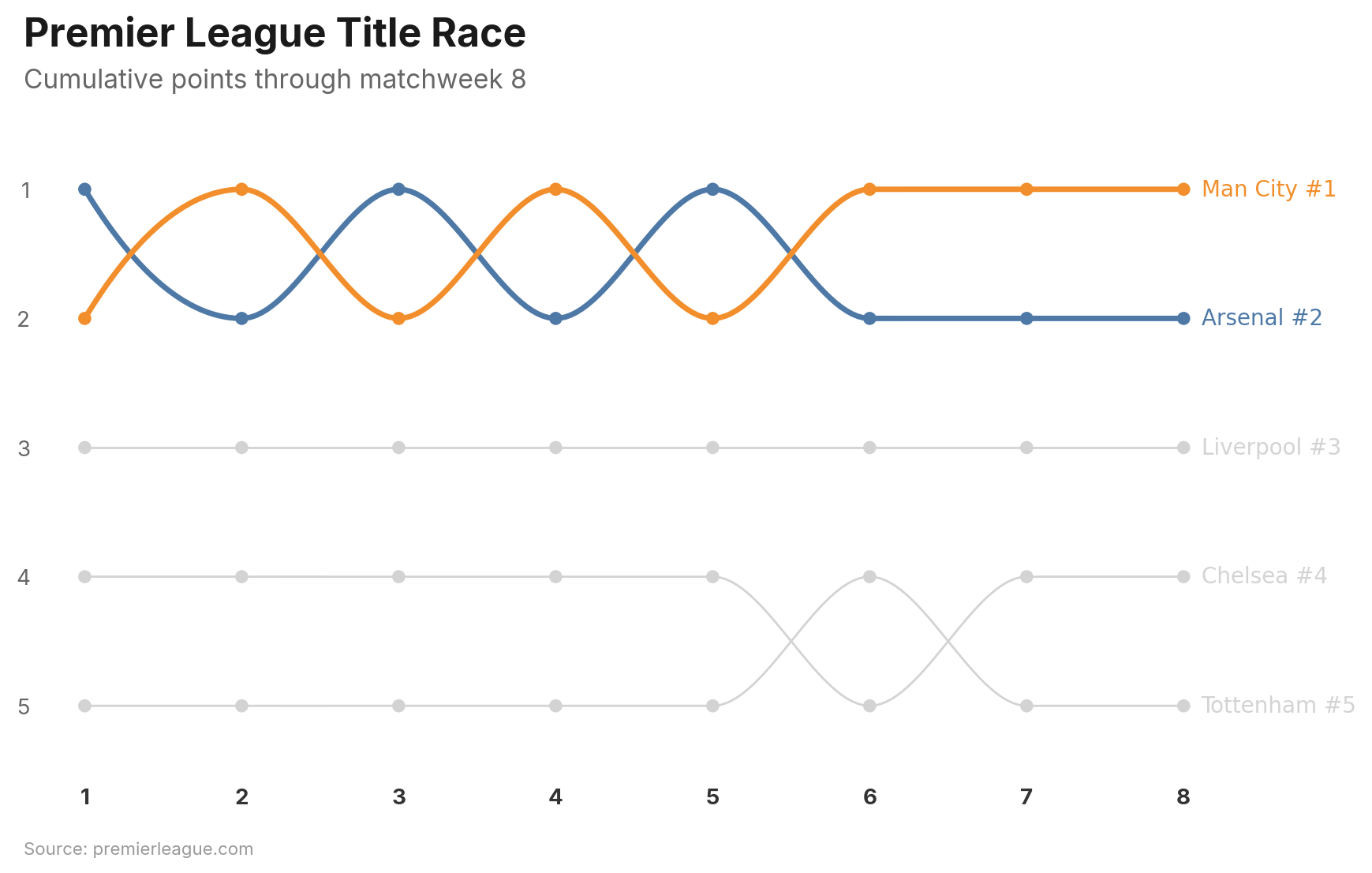
Bump Chart
Rank chart showing how entities change position over time. Values are automatically ranked within each period:
vizop.bump(
    df, x="week", y="points", group="team",
    highlight=["Arsenal", "Man City"],
    title="Premier League Title Race",
    subtitle="Cumulative points through matchweek 8",
    source="premierleague.com",
)
Key Parameters
| Parameter | Type | Description |
|---|---|---|
x |
str |
Time period column (3+ unique values) |
y |
str |
Value column (auto-ranked per period) |
group |
str |
Entity column |
highlight |
str | list[str] |
Entities to highlight |
top_n |
int |
Show only top N by final rank |
show_rank |
bool |
Append rank to endpoint labels (default True) |
rank_order |
str |
"desc" (highest = rank 1) or "asc" |
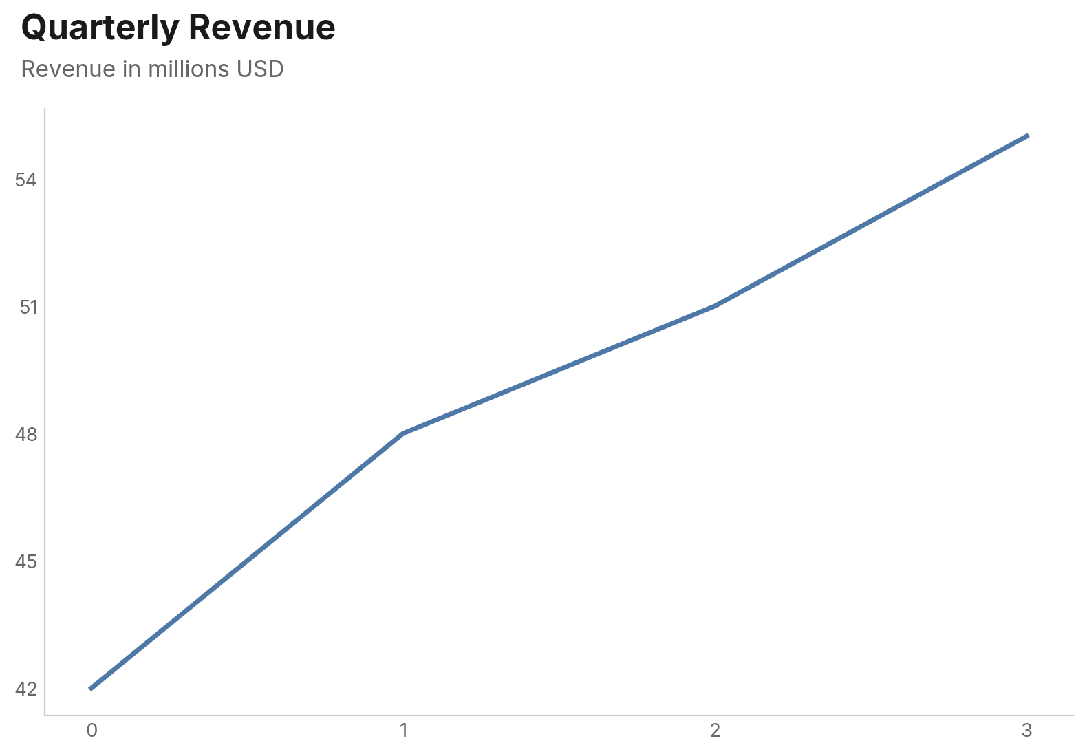
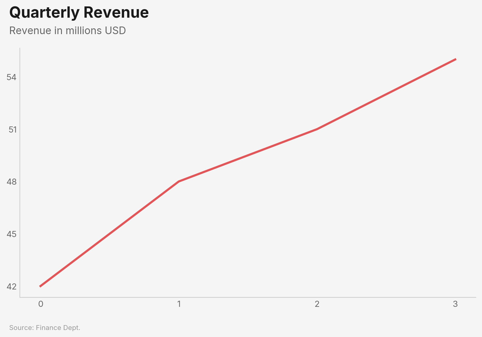
Configuration
Use vizop.configure() to set global defaults. Settings apply to all subsequent charts:
vizop.configure(
    accent_color="#E15759",
    background="light_gray",
    source_label="Finance Dept.",
)
Before (defaults):
After configure:
| Setting | Type | Default | Description |
|---|---|---|---|
accent_color |
str |
"#4E79A7" |
Default color for single-series charts |
font |
str |
"Inter" |
Font family (bundled: Inter, Libre Franklin, Source Sans Pro, IBM Plex Sans) |
background |
str |
"white" |
"white" or "light_gray" |
size |
str |
"standard" |
"standard", "wide", or "tall" |
source_label |
str |
None |
Default source text for all charts |
gridlines |
bool |
False |
Show gridlines by default |
dpi |
int |
300 |
Output resolution for .save() |
The Chart Object
Every chart function returns a Chart object:
chart = vizop.line(df, x="date", y="value", title="My Chart")

chart.show()                    # Display interactively
chart.save("output.png")       # Save to file (default 300 DPI)
chart.save("output.png", dpi=150)  # Custom DPI
chart.to_base64()               # Base64-encoded PNG string
chart.close()                   # Close the matplotlib figure
In Jupyter notebooks, charts render inline automatically — no .show() needed.
Philosophy
vizop is opinionated by design. These defaults exist so you spend time on your data, not your chart settings:
- Titles are left-aligned to the plot edge, matching the natural reading direction of Western text. Centered titles are a vestige of Excel defaults.
- No legend boxes on line charts. Labels appear directly at line endpoints where your eye already lands. Legends force readers to bounce between the legend and the data.
- Bars sort descending by default. The most important value goes at the top. Alphabetical bar order almost never helps the reader.
- Horizontal gridlines only. Vertical gridlines add noise without aiding value estimation. The sole exception is scatter plots, where both axes carry continuous data.
- No top or right spines. They frame the chart like a box but add zero information. Removing them lets the data breathe.
License
MIT — see LICENSE.
Release history Release notifications | RSS feed


Download files
Download the file for your platform. If you're not sure which to choose, learn more about installing packages.
Source Distribution
Built Distribution
Filter files by name, interpreter, ABI, and platform.
If you're not sure about the file name format, learn more about wheel file names.
Copy a direct link to the current filters
File details
Details for the file vizop-0.1.1.tar.gz.
File metadata
- Download URL: vizop-0.1.1.tar.gz
- Upload date:
- Size: 3.0 MB
- Tags: Source
- Uploaded using Trusted Publishing? No
- Uploaded via: uv/0.6.13
File hashes
| Algorithm | Hash digest | |
|---|---|---|
| SHA256 |
90173535963aadc5cc2e0bdf7211eb9b0ab6e7c14a9d3716996f59e01fb62f4d
|
|
| MD5 |
59538fbbaee5418cd52116a7e1658bfd
|
|
| BLAKE2b-256 |
49ea75c7401e0c23dcf4b1dbbd86fd79e6daa63633a251f51a2b8ed48b201876
|
File details
Details for the file vizop-0.1.1-py3-none-any.whl.
File metadata
- Download URL: vizop-0.1.1-py3-none-any.whl
- Upload date:
- Size: 1.8 MB
- Tags: Python 3
- Uploaded using Trusted Publishing? No
- Uploaded via: uv/0.6.13
File hashes
| Algorithm | Hash digest | |
|---|---|---|
| SHA256 |
9540c459a826e0557415a776f103056e9beeee4d71af45f102337e0cf8b586e2
|
|
| MD5 |
2459e06089e4b180f453520ed4af2be6
|
|
| BLAKE2b-256 |
0c840cd290326bb55e057c75d9502e7bfc412da334c6ea32b30acebc3578cb0c
|


