A Python package for chartly multiple plots.

Project description
chartly Package


chartly is a simple plotting tool designed to help users create scientific plots with ease. Whether you want to test a distribution for normality or to plot contours onto a map of the globe, chartly can help you achieve your scientific plot with minimal effort. Chartly also allows users to plot multiple overlays and subplots onto the same figure.
Project Status
Here's the current status of our workflows:
| Workflow | Status |
|---|---|
| Testing Suite |  |
| Deployment Suite |  |
| Sphinx Documentation |  |
| Guard Main Branch |  |
| Code Quality Checker |  |
Components
The chartly's codebase structure is as shown below:
.
├── chartly/
│   ├── base.py
│   ├── chartly.py
│   ├── charts.py
│   └── utilities.py
│   └── tests/
│   │   ├── __init__.py
│   │   └── test_chartly.py
├── docs/
│   ├── __init__.py
│   ├── source/
|   │   ├── conf.py
|   │   ├── index.rst
|   │   ├── Plot.rst
|   │   └── Multiplots.rst
├── requirements/
│   ├── testing.txt
│   ├── staging.txt
│   └── production.txt
├── LICENSE
├── MANIFEST.in
├── README.md
├── requirements.txt
├── setup.py
└── VERSION
Installation
To install chartly, run this command in your command line:
pip install chartly
Example
Scenario: After collecting data from a sample, an investigator wants to visualize the spread of his data, and also determine whether the sample data fits a normal distribution.
Here is how Chartly can help the investigator meet his goals.
from chartly import chartly
import numpy as np
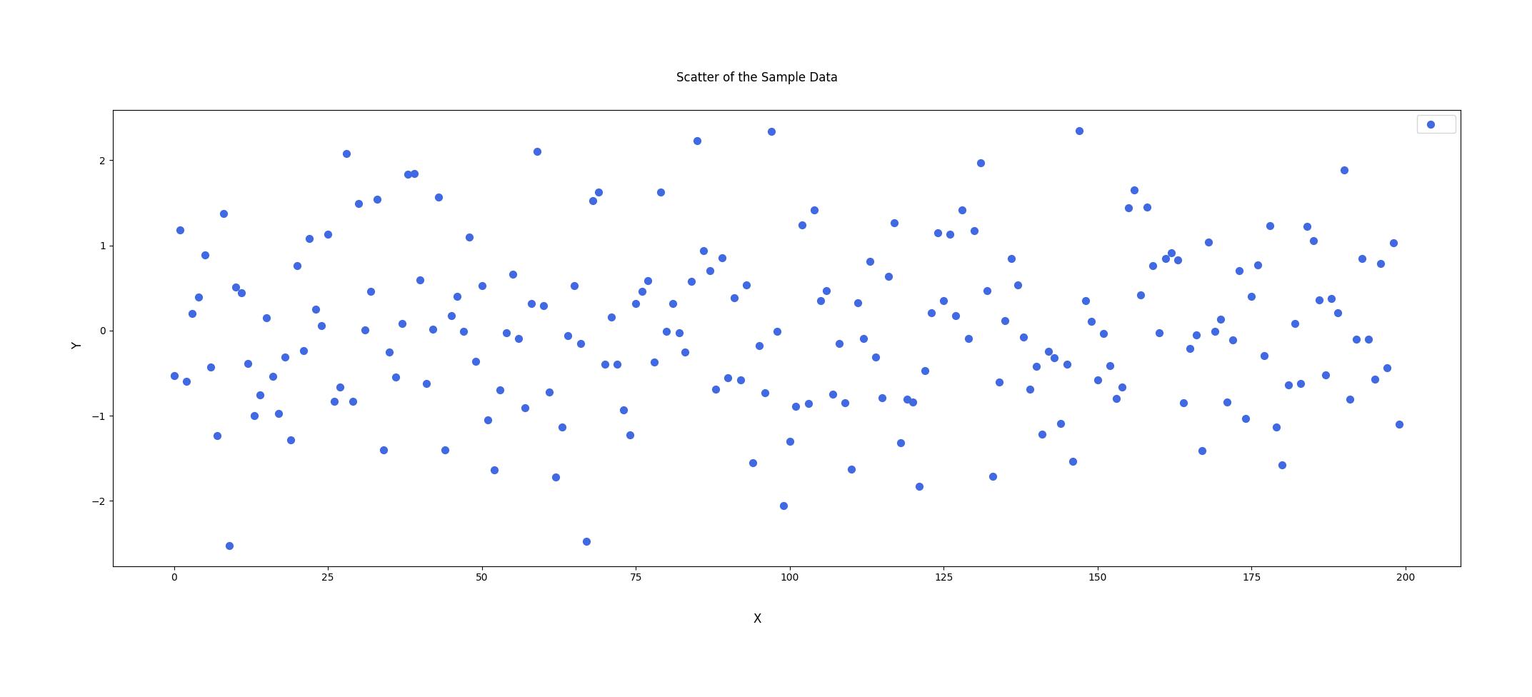
"""Scatter the data"""
# 1.1 Initialize a figure to plot the scatter plot
args = {"super_title": "Scatter of the Sample Data", "super_xlabel": "X", "super_ylabel": "Y"}
chart = chartly.Chart(args)
# 1.2 Define data
x_range = np.arange(200)
sample_data = np.random.randn(200)
# 1.3 Create Subplot and plot scatter plot
customs = {"color": "royalblue", "size": 50, "marker": "o"}
data = [x_range, sample_data]
chart.new_subplot({"plot": "scatter", "data": data, "customs": customs})
# 1.4 Display the figure
chart()
"""Investigate the Distribution of the data using Chartly."""

# 2.1 Define main figure labels
args = {"super_title": "Investigating a Dataset's Distribution", "super_xlabel": "X", "super_ylabel": "Y", "share_axes": False}

# 2.2 initialize a new figure
chart = chartly.Chart(args)

# 2.3 Determine the distribution of the sample data using a dot plot, probability plot and a normal cdf plot.
plots = ["probability_plot", "dotplot", "normal_cdf"]

for plot in plots:
    chart.new_subplot({"plot": plot, "data": sample_data, "axes_labels": {"title": plot}})

# 2.4 Display the figure
chart()
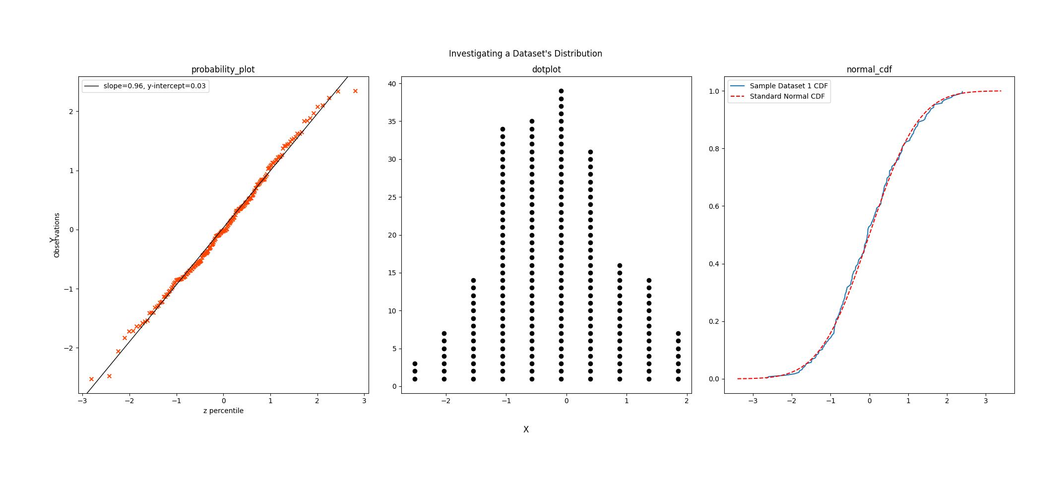
From the normal probability plot, we see that the line of best fit produced fits the data i.e. most of the points lie on or very close to the line. This suggests that the data has a normal distribution. This is supported by the dot plot, where the plot's shape resembles the bell curve shape distincitive to the normal distribution, and the normal CDF plot, where the CDF of the data falls very closely to the CDF we expect of a standard normal distribution.
However, if we look closely, we see that the points on the negative end of the plot are very light, suggesting that the data is negatively skewed. This is confirmed by the density plot, where we see that the more positive end of the distribution is heavier that its more negative end.
Given this, the investigator can conclude that the sample has a negatively skewed normal distribution, with a mean of 0.03 and a standard deviation of 0.96.


Download files
Download the file for your platform. If you're not sure which to choose, learn more about installing packages.
Source Distribution
Built Distribution
Filter files by name, interpreter, ABI, and platform.
If you're not sure about the file name format, learn more about wheel file names.
Copy a direct link to the current filters
File details
Details for the file chartly-1.0.1.tar.gz.
File metadata
- Download URL: chartly-1.0.1.tar.gz
- Upload date:
- Size: 19.8 kB
- Tags: Source
- Uploaded using Trusted Publishing? No
- Uploaded via: twine/6.2.0 CPython/3.12.13
File hashes
| Algorithm | Hash digest | |
|---|---|---|
| SHA256 |
0508649f422a70328924f2878963577a245e7cc1e4a6dc2daf28de00a0d748b5
|
|
| MD5 |
bf08c3a3cf2c2a18f46a98395770a62b
|
|
| BLAKE2b-256 |
eaed8960d5ab95ea12ff4dc9bf545f2a09bfc511181a29ed0856792a2df74b57
|
File details
Details for the file chartly-1.0.1-py3-none-any.whl.
File metadata
- Download URL: chartly-1.0.1-py3-none-any.whl
- Upload date:
- Size: 19.4 kB
- Tags: Python 3
- Uploaded using Trusted Publishing? No
- Uploaded via: twine/6.2.0 CPython/3.12.13
File hashes
| Algorithm | Hash digest | |
|---|---|---|
| SHA256 |
3f22f792b77ff91812e1ab4d9a316cae9b956f30465c112c2a0adebf61849013
|
|
| MD5 |
3bd8e5fc52a2e9bf4025521193eff1cd
|
|
| BLAKE2b-256 |
04cb550240f37ca3172be5f2b16e2a65c6efc05722d92524e13a9fdcf96280a3
|


