A Python library to generate beautiful, clean charts in premium visual styles

Project description
Clean Charts

clean-charts is a lightweight, premium Python library designed to generate beautiful, publication-quality data visualizations inspired by modern editorial styles like The Economist.
Featuring right-aligned axes, custom date boundaries, distinct line colors, smooth spline curves, automatic overlap-avoiding label placement, and dynamic scaling for varying canvas resolutions, clean-charts makes it effortless to create presentation-ready visualizations — both saved to disk and displayed inline in Jupyter notebooks.
Key Features
- Premium Aesthetics: Light cream-gray backgrounds, minimal gridlines, elegant typography, and consistent padding.
- Jupyter Inline Display: When
output_path=None, charts render directly in Jupyter notebooks viaIPython.display. - Time-Series Line Charts (
plot_time_series):- Right-aligned Y-axes.
- Automatically identifies date/time columns and handles multiple value series.
- Smooth PCHIP spline curves through data points (requires
scipy). - Optional data-point markers with configurable style.
- Generates custom color gradients or uses a refined default palette.
- Intelligently spaces dates and years on the X-axis to prevent label overlap.
- Smart inline label placement at line endpoints (
name,value,both, ornone).
- Horizontal Bar Charts (
plot_barh_chart):- Left-aligned categories, top-aligned numeric ticks with custom suffixes.
- Values labeled inside/outside the end of each bar.
- Grouped Horizontal Bar Charts (
plot_grouped_barh_chart):- Multi-series bars per category in stacked vertical lanes.
- Gradient color palette across series, compact legend row above the chart.
- Optional bar labels (
value,name,both,none).
- Stacked Horizontal Bar Charts (
plot_stacked_bar_chart):- Multiple series stacked horizontally to show part-to-whole relationships.
- Optional 100% stacked mode with percentage labels.
- Donut Charts (
plot_donut_chart):- Distinctive highly-stylized donut slices with smart label layout.
- Automatically avoids overlapping labels.
- Responsive Scaling: All text, line-weights, and paddings scale proportionally based on target width and height.
Installation
pip install clean-charts
Quick Start
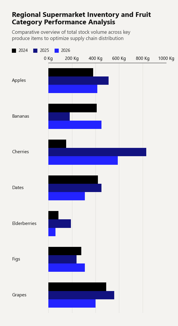
1. Grouped Horizontal Bar Chart
Display multiple numeric series side-by-side for each category, with an automatic color gradient and legend.
import pandas as pd
from clean_charts import plot_grouped_barh_chart

df = pd.DataFrame({
    'Fruit': ['Apples', 'Bananas', 'Cherries', 'Dates', 'Elderberries', 'Figs', 'Grapes'],
    '2024': [380, 410, 150, 420, 85,  280, 490],
    '2025': [510, 180, 830, 450, 190, 240, 560],
    '2026': [415, 450, 590, 310, 60,  310, 400]
})

plot_grouped_barh_chart(
    data = df,
    title="Regional Supermarket Inventory and Fruit Category Performance Analysis",
    subtitle="Comparative overview of total stock volume across key produce items to optimize supply chain distribution",
    bar_padding=0,
    group_padding=0.3,
    value_suffix = ' Kg'
)
Output Example:
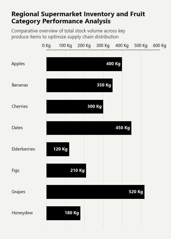
2. Horizontal Bar Chart
Draw a single-series horizontal bar chart with category labels and value annotations. If no data is provided, a built-in survey dataset is used.
import pandas as pd
from clean_charts import plot_barh_chart

df = pd.DataFrame({
    'Category': ['Apples', 'Bananas', 'Cherries', 'Dates', 'Elderberries', 'Figs', 'Grapes', 'Honeydew'],
    'Sales':    [400, 350, 300, 450, 120, 210, 520, 180],
})

plot_barh_chart(
    data=df,
    title="Regional Supermarket Inventory and Fruit Category Performance Analysis",
    subtitle="Comparative overview of total stock volume across key produce items to optimize supply chain distribution",
    value_suffix=' Kg',
)
Output Example:
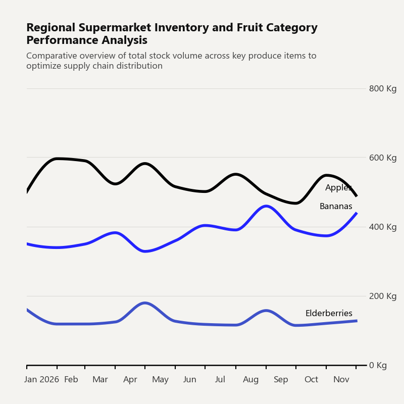
3. Time-Series Line Chart
Call plot_time_series to generate a time-series line chart from a DataFrame. If no data argument is provided, the function uses a built-in sample dataset of monthly automobile sales by type from 2020 to 2025.
import pandas as pd
from clean_charts import plot_time_series

df = pd.DataFrame({
    'Dates':        pd.date_range("2026-01-01", periods=12, freq="MS"),
    'Apples':       [500, 596, 590, 523, 582, 515, 501, 551, 494, 467, 548, 490],
    'Bananas':      [350, 339, 349, 382, 328, 359, 403, 390, 459, 390, 373, 437],
    'Elderberries': [160, 118, 118, 124, 179, 126, 117, 115, 157, 114, 120, 127],
})

plot_time_series(
    data=df,
    aspect_ratio='1:1',
    title="Regional Supermarket Inventory and Fruit Category Performance Analysis",
    subtitle="Comparative overview of total stock volume across key produce items to optimize supply chain distribution",
    label_frequency="month",
    line_labels='name',
    value_suffix=' Kg',
)
Output Example:
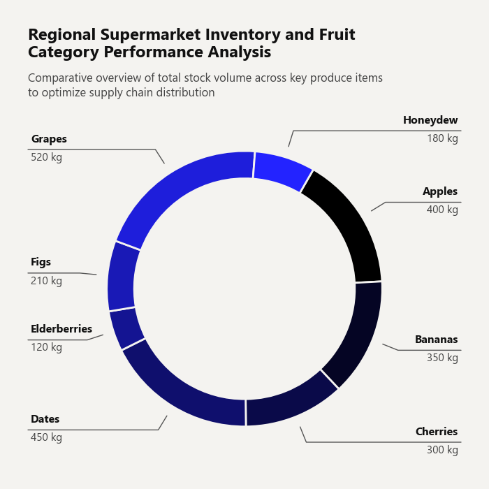
4. Donut Chart
Draw a single-series donut chart with automatic label placement.
import pandas as pd
from clean_charts import plot_donut_chart

df = pd.DataFrame({
    'Category': ['Apples', 'Bananas', 'Cherries', 'Dates', 'Elderberries', 'Figs', 'Grapes', 'Honeydew'],
    'Sales': [400, 350, 300, 450, 120, 210, 520, 180]
})

plot_donut_chart(
    data=df,
    title="Regional Supermarket Inventory and Fruit Category Performance Analysis",
    subtitle="Comparative overview of total stock volume across key produce items to optimize supply chain distribution",
    value_suffix=' kg',
    start_angle=60,
)
Output Example:
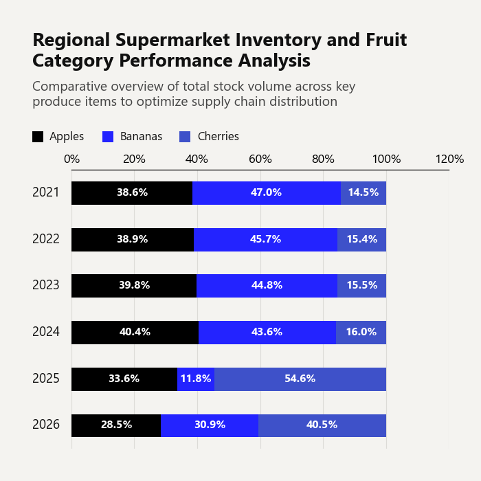
5. Stacked Horizontal Bar Chart
Visualize part-to-whole relationships across categories. Supports raw values or 100% stacked mode.
import pandas as pd
from clean_charts import plot_stacked_bar_chart

df = pd.DataFrame({
    'Year': ['2021', '2022', '2023', '2024', '2025', '2026'],
    'Apples': [320, 340, 360, 380, 510, 415],
    'Bananas': [390, 400, 405, 410, 180, 450],
    'Cherries': [120, 135, 140, 150, 830, 590]
})

plot_stacked_bar_chart(
    data = df,
    title="Regional Supermarket Inventory and Fruit Category Performance Analysis",
    subtitle="Comparative overview of total stock volume across key produce items to optimize supply chain distribution",
    bar_padding=0.5,
    value_suffix=' Kg',
    show_percentages=True,
    bar_labels='value',
    aspect_ratio='1:1',
    scale_text=False
)
Output Example:
Customizing Data & Advanced Usage
Custom Time-Series Data
Supply your own pandas.DataFrame containing a date/time column and one or more value columns. The library automatically parses the datetime column and maps all other numeric columns as lines.
import pandas as pd
from clean_charts import plot_time_series

data = pd.DataFrame({
    "Day": pd.date_range("2026-05-01", periods=10, freq="D"),
    "Active Users": [120, 150, 190, 240, 220, 250, 270, 310, 340, 320],
    "Signups":      [15,  22,  35,  40,  28,  30,  32,  45,  52,  48],
})

plot_time_series(
    data=data,
    output_path="daily_stats.png",
    title="Daily Server Growth",
    subtitle="Active users and registrations in May 2026",
    label_frequency="day",   # "year" | "quarter" | "month" | "week" | "day" | "hour" | "minute" | "second"
    start_color="#006400",   # Dark green gradient start
    end_color="#ffd700",     # Gold gradient end
    smooth=True,             # Smooth PCHIP spline curves (default True)
    markers=True,            # Show circle markers on data points
    line_labels="both",      # Show "Series: value" inline labels
    value_suffix="%",        # Append "%" to Y-axis ticks and inline labels
)
Custom Horizontal Bar Chart Data
Pass a pandas.DataFrame where the first column contains string labels and the second column contains numeric values.
import pandas as pd
from clean_charts import plot_barh_chart

df = pd.DataFrame({
    "Category":    ["Apples", "Bananas", "Cherries", "Dates", "Elderberries", "Figs", "Grapes", "Honeydew"],
    "Sales (tons)":[400,      350,       300,        450,     120,            210,    520,      180],
})

plot_barh_chart(
    data=df,
    output_path="fruit_sales.png",
    title="Fruit Performance Analysis",
    subtitle="Total sales volume by item",
    value_suffix=" t",
    color="#1f77b4",
)
Custom Grouped Bar Chart Data
Pass a DataFrame whose first column contains category labels and each subsequent column represents one series.
import pandas as pd
from clean_charts import plot_grouped_barh_chart

df = pd.DataFrame({
    "Country": ["Germany", "France", "Italy", "Spain", "Poland"],
    "BEV":     [18, 14, 8, 5, 3],
    "PHEV":    [9,  7,  5, 4, 2],
    "Hybrid":  [22, 19, 12, 9, 6],
})

plot_grouped_barh_chart(
    data=df,
    output_path="ev_by_country.png",
    title="EV Adoption by Country",
    subtitle="Share of new car sales by powertrain, %",
    value_suffix="%",
    bar_labels="value",       # "none" | "value" | "name" | "both"
    start_color="#005f73",
    end_color="#94d2bd",
)
API Reference
plot_time_series
| Parameter | Type | Default | Description |
|---|---|---|---|
data |
pd.DataFrame |
None |
DataFrame with a datetime column and value series. If None, uses built-in default data. |
output_path |
str |
None |
File path to save the image. If None, displays inline in Jupyter. |
width |
int |
1000 |
Target image width in pixels. |
height |
int |
562 |
Target image height in pixels. |
aspect_ratio |
str |
None |
Predefined ratio: "square"/"1:1", "landscape"/"2:1", "vertical"/"1:2". Overrides width/height. |
title |
str |
None |
Bold title text, left-aligned. Auto-wraps to 2 lines. |
subtitle |
str |
None |
Subtitle below the title. Auto-wraps to 2 lines. |
start_color |
str |
None |
Hex color for the first series in a gradient. |
end_color |
str |
None |
Hex color for the last series in a gradient. |
label_frequency |
str |
"year" |
X-axis tick frequency: "year", "quarter", "month", "week", "day", "hour", "minute", "second". |
markers |
bool or str |
None |
Data-point markers. False/None = none, True = circles, or any matplotlib marker string (e.g. "s", "D"). |
line_labels |
str |
"name" |
Inline endpoint labels: "name", "value", "both", or "none". |
value_suffix |
str |
"" |
String appended to Y-axis ticks and inline value labels (e.g. "%"). |
smooth |
bool |
True |
Draw smooth PCHIP spline curves. Falls back to straight lines if scipy is not installed. |
scale_text |
bool |
False |
Scale fonts and line weights proportionally to image size. |
plot_barh_chart
| Parameter | Type | Default | Description |
|---|---|---|---|
data |
pd.DataFrame |
None |
DataFrame: column 0 = category strings, column 1 = numeric values. If None, uses built-in survey data. |
output_path |
str |
None |
File path to save the image. If None, displays inline in Jupyter. |
width |
int |
600 |
Target image width in pixels. |
height |
int |
None |
Target image height in pixels. Auto-sized by number of categories if None. |
aspect_ratio |
str |
None |
Predefined ratio: "square"/"1:1", "landscape"/"2:1", "vertical"/"1:2". |
title |
str |
None |
Bold title text. |
subtitle |
str |
None |
Subtitle below the title. |
color |
str |
"#000000" |
Hex color for the bars. |
bar_padding |
float |
0.35 |
Fraction of bar slot left as gap between bars (0.0–1.0). |
value_suffix |
str |
"" |
String appended to value labels and axis ticks (e.g. "%"). |
scale_text |
bool |
True |
Scale fonts proportionally to image size. |
plot_grouped_barh_chart
| Parameter | Type | Default | Description |
|---|---|---|---|
data |
pd.DataFrame |
None |
DataFrame: column 0 = category labels, remaining columns = numeric series. If None, uses built-in example data. |
output_path |
str |
None |
File path to save the image. If None, displays inline in Jupyter. |
width |
int |
600 |
Target image width in pixels. |
height |
int |
None |
Target image height in pixels. Auto-sized when None. |
aspect_ratio |
str |
None |
Predefined ratio: "square"/"1:1", "landscape"/"2:1", "vertical"/"1:2". |
title |
str |
None |
Bold title text. Auto-wraps to 2 lines. |
subtitle |
str |
None |
Subtitle below the title. Auto-wraps to 3 lines. |
start_color |
str |
"#000000" |
Hex color for the first series in the gradient. |
end_color |
str |
"#2323FF" |
Hex color for the last series in the gradient. |
bar_padding |
float |
0 |
Fraction of a single bar slot left as whitespace (0–1). |
group_padding |
float |
0.45 |
Fraction of the group height used as spacing between groups (0–1). |
value_suffix |
str |
"" |
String appended to axis tick labels (e.g. "%"). |
bar_labels |
str |
"none" |
Labels drawn on each bar: "none", "value", "name", or "both". |
scale_text |
bool |
True |
Scale fonts proportionally to image size. |
plot_donut_chart
| Parameter | Type | Default | Description |
|---|---|---|---|
data |
pd.DataFrame |
None |
DataFrame with exactly two columns: category labels and values. |
output_path |
str |
None |
File path to save the image. If None, renders inline in Jupyter. |
width |
int |
600 |
Target image width in pixels. |
height |
int |
600 |
Target image height in pixels. Defaults to width. |
aspect_ratio |
str |
None |
Predefined ratio: "square"/"1:1", "landscape"/"2:1", "vertical"/"1:2". |
title |
str |
None |
Bold title text. Auto-wraps to 2 lines. |
subtitle |
str |
None |
Subtitle below the title. Auto-wraps to 3 lines. |
colors |
list |
DEFAULT_COLORS |
List of hex colors for the slices. |
start_color |
str |
None |
Hex color for the first slice gradient boundary. |
end_color |
str |
None |
Hex color for the last slice gradient boundary. |
donut_radius |
float |
0.4 |
Outer radius of the donut relative to the figure height. |
donut_thickness |
float |
0.15 |
Thickness of the donut ring relative to the figure height. |
value_suffix |
str |
"" |
Suffix appended to value labels (e.g. "%" or " Kg"). |
scale_text |
bool |
True |
Scale fonts and paddings proportionally to image size. |
show_percentages |
bool |
False |
Show percentage of total instead of raw value. |
start_angle |
int |
90 |
Starting angle for the first slice in degrees. |
plot_stacked_bar_chart
| Parameter | Type | Default | Description |
|---|---|---|---|
data |
pd.DataFrame |
None |
DataFrame where column 0 = category strings, columns 1-N = values. |
output_path |
str |
None |
File path to save the image. If None, renders inline in Jupyter. |
width |
int |
600 |
Target image width in pixels. |
height |
int |
None |
Target image height. Auto-sized from categories if None. |
aspect_ratio |
str |
None |
Predefined ratio: "square"/"1:1", "landscape"/"2:1", "vertical"/"1:2". |
title |
str |
None |
Bold title text. Auto-wraps to 2 lines. |
subtitle |
str |
None |
Subtitle below the title. Auto-wraps to 3 lines. |
colors |
list |
DEFAULT_COLORS |
List of hex colors for the series. |
start_color |
str |
None |
Hex color for the first series in the gradient. |
end_color |
str |
None |
Hex color for the last series in the gradient. |
bar_padding |
float |
0.30 |
Fraction of a single bar slot left as whitespace (0–1). |
value_suffix |
str |
"" |
Suffix appended to axis tick labels. |
bar_labels |
str |
"none" |
Labels on each segment: "none", "value", "name", or "both". |
scale_text |
bool |
True |
Scale fonts and paddings proportionally to image size. |
show_percentages |
bool |
False |
Converts chart to 100% stacked bar chart. |
Global Customization
Import and modify the global configuration variables to apply a consistent theme across all charts:
import clean_charts.config as config
from clean_charts import plot_time_series

# Override styling tokens before plotting
config.BACKGROUND_COLOR = "#ffffff"  # Pure white background
config.GRID_COLOR        = "#eaeaea"  # Light gridlines
config.AXIS_COLOR        = "#333333"  # Dark charcoal axes

plot_time_series(
    title="Custom White Theme",
    output_path="white_theme_chart.png"
)
Available Config Variables (clean_charts.config)
| Variable | Default | Description |
|---|---|---|
BACKGROUND_COLOR |
"#f4f3f0" |
Chart background (cream-gray). |
GRID_COLOR |
"#dcdbd7" |
Horizontal/vertical gridline color. |
AXIS_COLOR |
"#000000" |
Axis spine and tick color. |
TITLE_COLOR |
"#111111" |
Title text color. |
SUBTITLE_COLOR |
"#444444" |
Subtitle text color. |
LINE_COLOR |
"#000000" |
Default line/bar color. |
DEFAULT_COLOR |
"#000000" |
Fallback single-bar color. |
DEFAULT_START_COLOR |
"#000000" |
Gradient start for grouped bars. |
DEFAULT_END_COLOR |
"#2323FF" |
Gradient end for grouped bars. |
DEFAULT_COLORS_LIST |
['#000000', '#2323FF', ...] |
Default multi-line color palette. |
Examples & Development
Generate Sample Charts
Run the provided script to generate a set of sample charts showcasing aspect ratios, gradient themes, custom label frequencies, and more:
python generate_sample.py
This produces:
sales_chart_2_1.png— Landscape 2:1 time-seriessales_chart_1_1.png— Square 1:1 time-seriessales_chart_1_2.png— Vertical 1:2 time-seriessales_chart_gradient.png— Gradient color demonstrationsales_chart_daily.png— Day-level label frequencysales_chart_long_title.png— Long title wrapping demo
Running Tests
python -m unittest tests/test_plot.py
Release history Release notifications | RSS feed


Download files
Download the file for your platform. If you're not sure which to choose, learn more about installing packages.
Source Distribution
Built Distribution
Filter files by name, interpreter, ABI, and platform.
If you're not sure about the file name format, learn more about wheel file names.
Copy a direct link to the current filters
File details
Details for the file clean_charts-0.5.0.tar.gz.
File metadata
- Download URL: clean_charts-0.5.0.tar.gz
- Upload date:
- Size: 35.5 kB
- Tags: Source
- Uploaded using Trusted Publishing? No
- Uploaded via: twine/6.2.0 CPython/3.11.9
File hashes
| Algorithm | Hash digest | |
|---|---|---|
| SHA256 |
b80f0a819a4b371768aec91c0dbb1e8af62eadba26499b4853b53c3a207991ab
|
|
| MD5 |
73b8dc13c1875d1a46cb29d53ebd01f8
|
|
| BLAKE2b-256 |
e5fa3bac047a75184ad05327c6a9247ac0316a7babc2f72010d20a589fe88155
|
File details
Details for the file clean_charts-0.5.0-py3-none-any.whl.
File metadata
- Download URL: clean_charts-0.5.0-py3-none-any.whl
- Upload date:
- Size: 31.2 kB
- Tags: Python 3
- Uploaded using Trusted Publishing? No
- Uploaded via: twine/6.2.0 CPython/3.11.9
File hashes
| Algorithm | Hash digest | |
|---|---|---|
| SHA256 |
8088a2b2051116684c7f6f198c6e646e6cc7293769fc656a45740f8b1b2e9198
|
|
| MD5 |
7dda4d511eda4af5c106591f3d95c984
|
|
| BLAKE2b-256 |
d76b5b3c78f0be596ff59716b1e5d64c357216c9189d937d3bf5e45c6eb3c291
|


