A matplotlib-style fluent builder API for Apache ECharts in Python, Jupyter Notebooks, and Streamlit.

Project description

echartsy
Interactive charts in Python — the matplotlib workflow, the ECharts experience.


Build publication-quality interactive charts with a familiar
fig = figure() → fig.bar() → fig.show() workflow.
Works everywhere: Jupyter · Streamlit · standalone scripts
Why echartsy?
- Feels like matplotlib — If you know
plt.figure()/plt.show(), you already know 90% of the API. No JSON wrangling, no JavaScript. - Interactive out of the box — Every chart ships with tooltips, legend toggling, zoom, and a built-in export toolbox. Zero configuration needed.
- One library, three engines — Write once, render in Jupyter notebooks, Streamlit apps, or plain Python scripts that pop open a browser.
- Composable & animated — Layer pies on bar charts, build dual-axis dashboards, or animate any chart across time with
TimelineFigure.
Installation
pip install echartsy
Need extras?
pip install echartsy[jupyter]     # Jupyter Notebook / JupyterLab
pip install echartsy[streamlit]   # Streamlit apps
pip install echartsy[scipy]       # KDE density plots
pip install echartsy[all]         # Everything
Requirements: Python 3.9+ · pandas ≥ 1.5 · numpy ≥ 1.23
Quick Start
import pandas as pd
import echartsy as ec
ec.config(engine="jupyter") # or "python" / "streamlit"
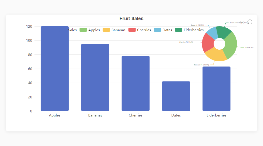
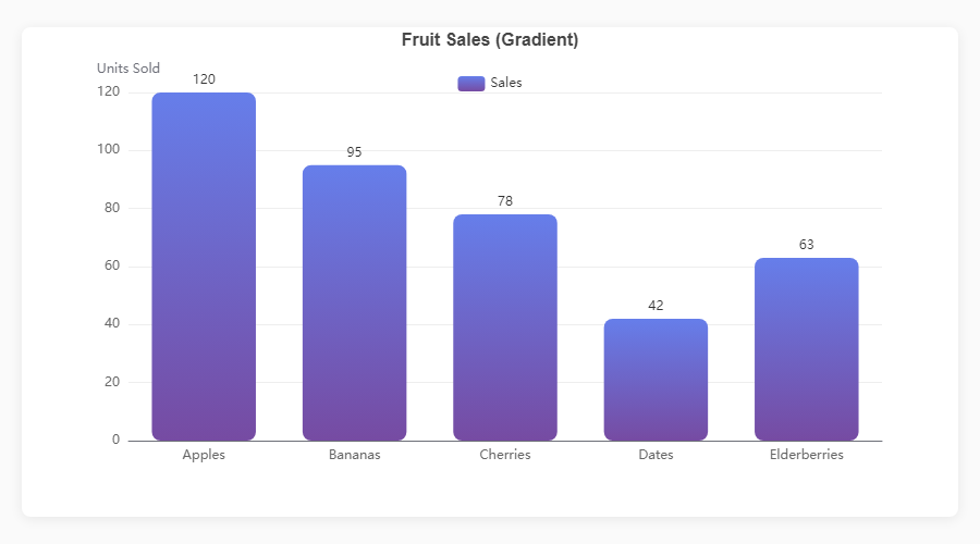
df = pd.DataFrame({
"Fruit": ["Apples", "Bananas", "Cherries", "Dates", "Elderberries"],
"Sales": [120, 95, 78, 42, 63],
})
fig = ec.figure()
fig.bar(df, x="Fruit", y="Sales", gradient=True, labels=True)
fig.title("Fruit Sales")
fig.show()
Three lines from DataFrame to interactive chart.
Gallery
Cartesian Charts
|
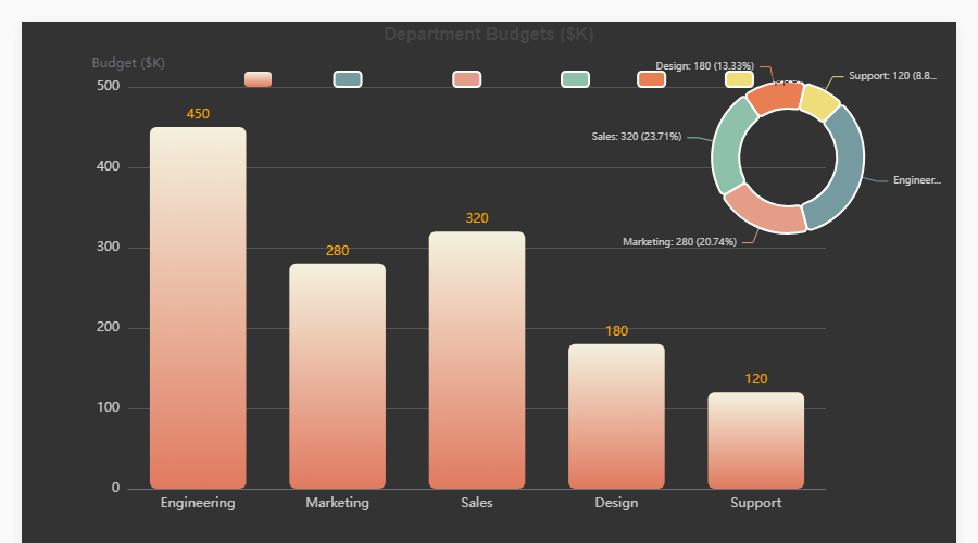
Bar + Pie Overlay fig = ec.figure(height="500px")
fig.bar(df, x="Dept", y="Budget",
gradient=True, labels=True)
fig.pie(df, names="Dept", values="Budget",
center=["82%","25%"],
radius=["18%","28%"])
fig.show()
|
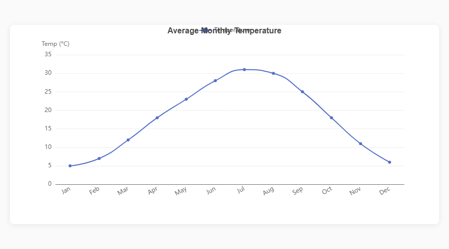
Smooth Line fig = ec.figure()
fig.plot(df, x="Month", y="Sales",
smooth=True, area=True)
fig.show()
|
|
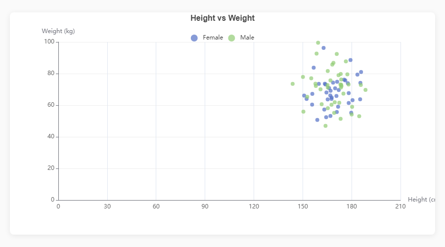
Scatter Plot fig = ec.figure()
fig.scatter(df, x="Height", y="Weight",
color="Gender", size="Age")
fig.show()
|
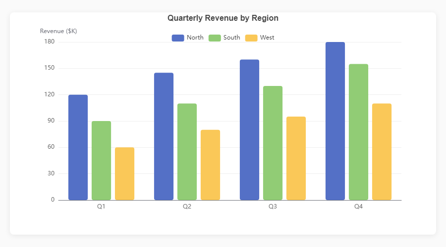
Grouped Bar fig = ec.figure()
fig.bar(df, x="Quarter", y="Revenue",
hue="Region")
fig.show()
|
|
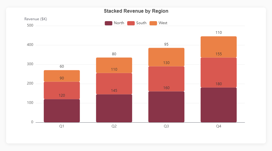
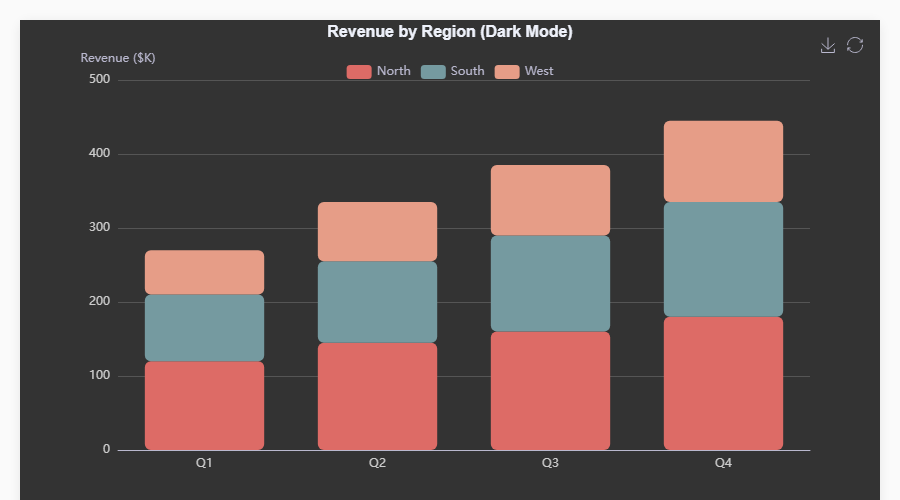
Stacked Bar fig = ec.figure()
fig.bar(df, x="Month", y="Revenue",
hue="Product", stack=True)
fig.show()
|
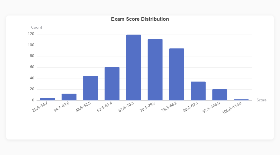
Histogram fig = ec.figure()
fig.hist(df, column="Score", bins=20)
fig.show()
|
|
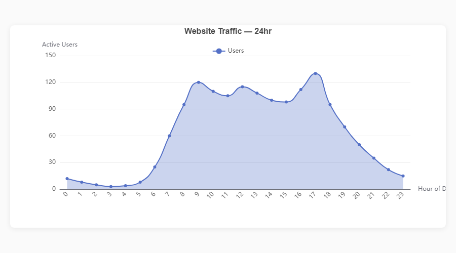
Area Chart fig = ec.figure()
fig.plot(df, x="Month", y="Users",
area=True, smooth=True)
fig.show()
|
Horizontal Bar fig = ec.figure()
fig.bar(df, x="Country", y="Population",
orient="h")
fig.show()
|
|
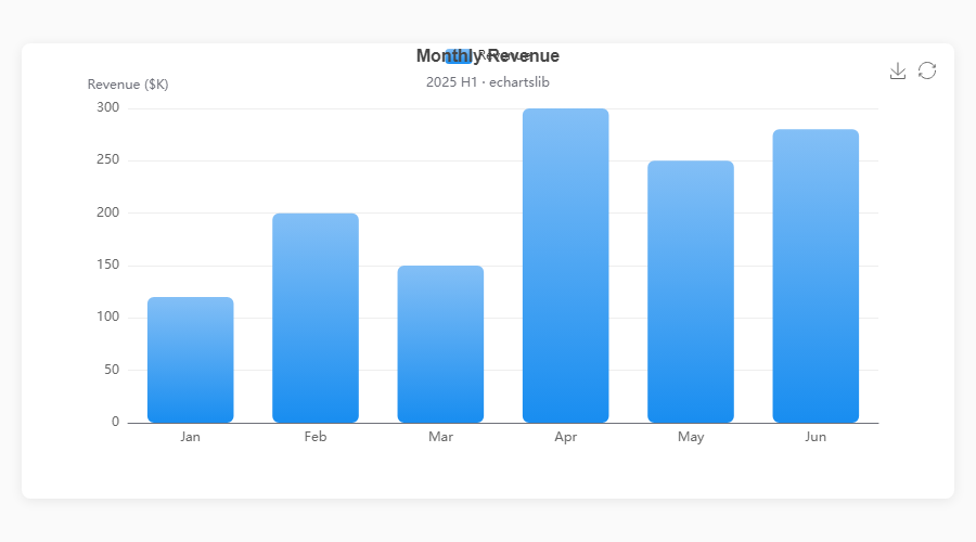
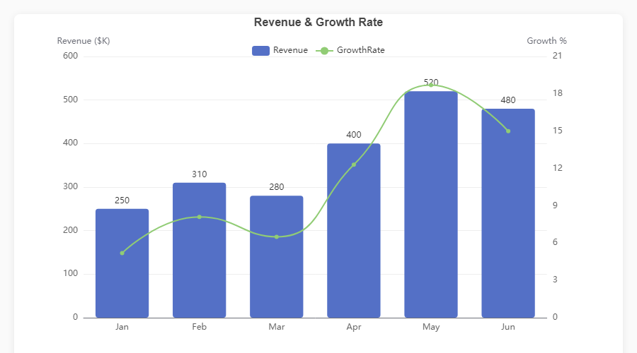
Dual Axis: Bar + Line fig = ec.figure()
fig.bar(df, x="Month", y="Revenue")
fig.plot(df, x="Month", y="Growth",
smooth=True, axis=1)
fig.ylabel("Revenue ($K)")
fig.ylabel_right("Growth %")
fig.show()
|
Gradient Bars fig = ec.figure()
fig.bar(df, x="City", y="Temp",
gradient=True,
gradient_colors=["#83bff6","#188df0"])
fig.show()
|
|
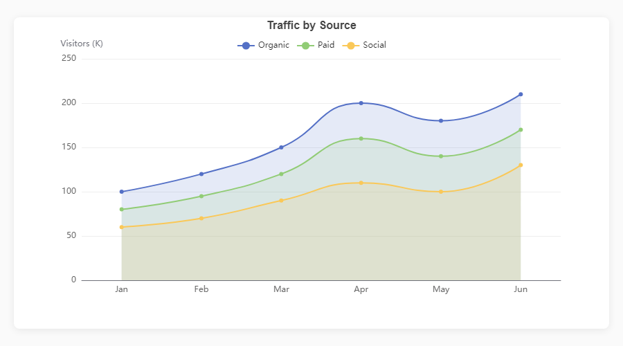
Multi-Line with Area fig = ec.figure()
fig.plot(df, x="Month", y="Value",
hue="Series", smooth=True,
area=True)
fig.show()
|
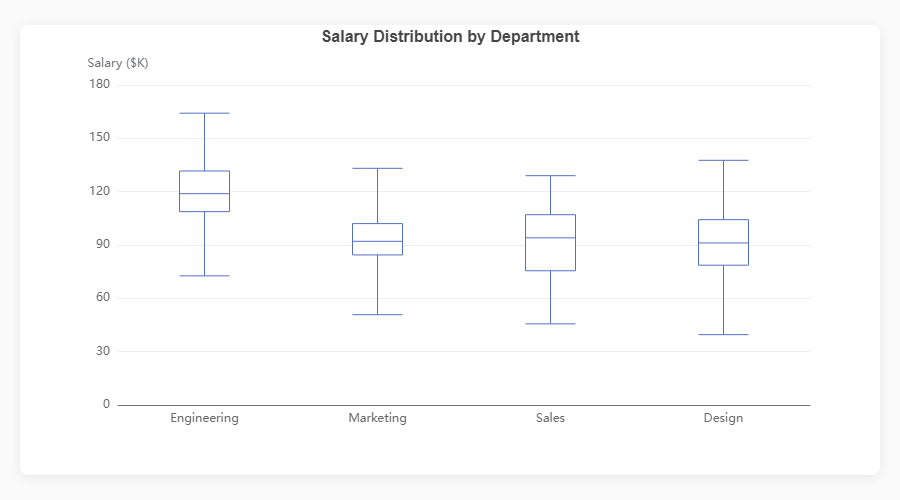
Boxplot fig = ec.figure()
fig.boxplot(df, x="Department", y="Salary")
fig.show()
|
Standalone Charts
|
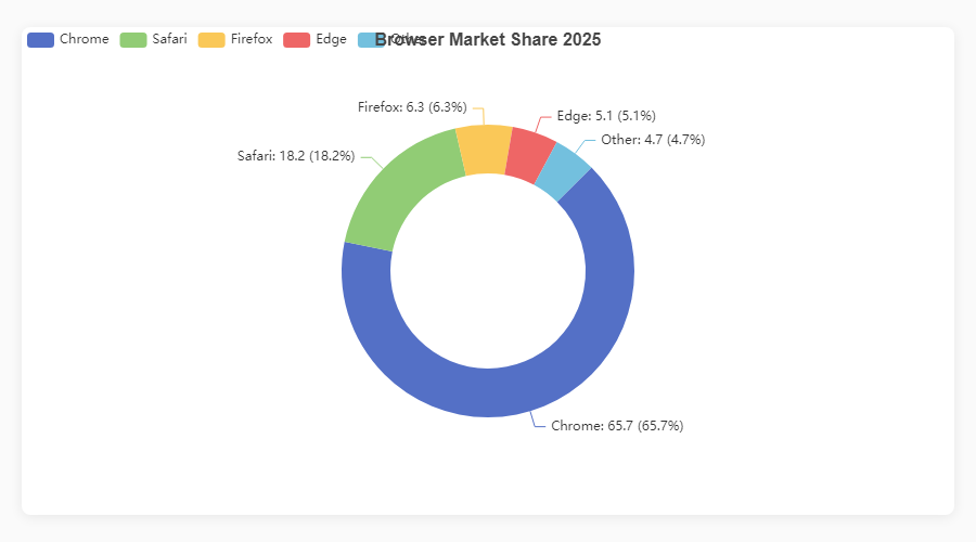
Donut / Pie fig = ec.figure()
fig.pie(df, names="Browser", values="Share",
inner_radius="40%")
fig.show()
|
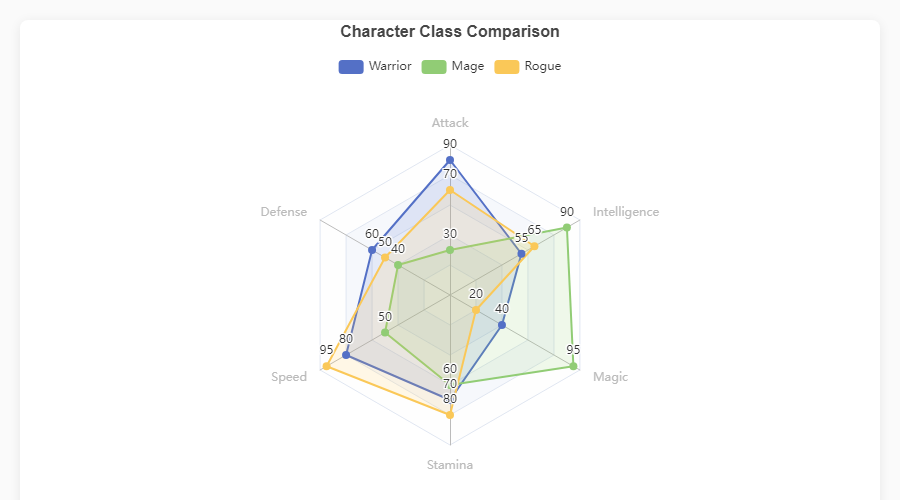
Radar fig = ec.figure()
fig.radar(indicators, data,
series_names=["Warrior","Mage"])
fig.show()
|
|
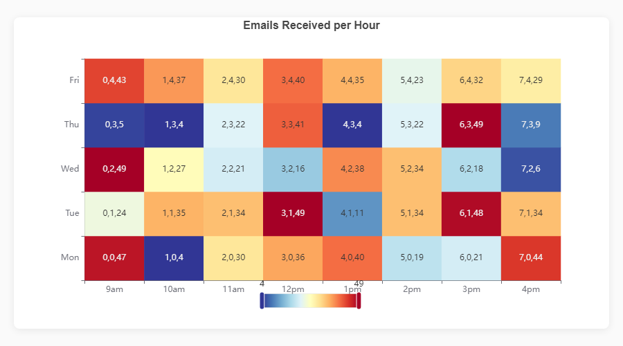
Heatmap fig = ec.figure()
fig.heatmap(df, x="Day", y="Hour",
value="Count")
fig.show()
|
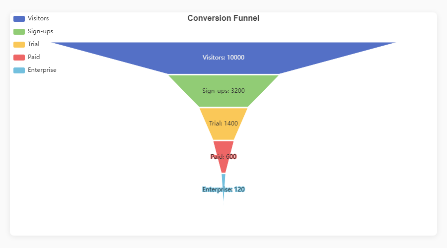
Funnel fig = ec.figure()
fig.funnel(df, names="Stage", values="Count")
fig.show()
|
|
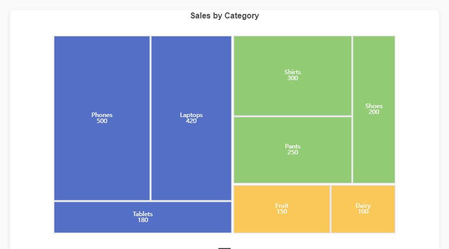
Treemap fig = ec.figure()
fig.treemap(df,
path=["Category","SubCat"],
value="Sales")
fig.show()
|
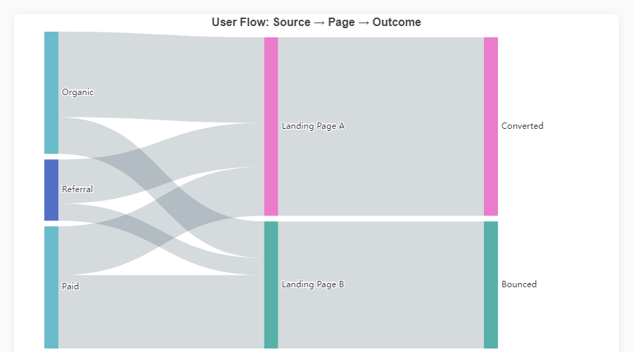
Sankey Diagram fig = ec.figure()
fig.sankey(df,
levels=["Source","Channel","Outcome"],
value="Users")
fig.show()
|
Composite & Dashboard Charts
|
Bar + Pie (Dark) |
Triple Composite |
|
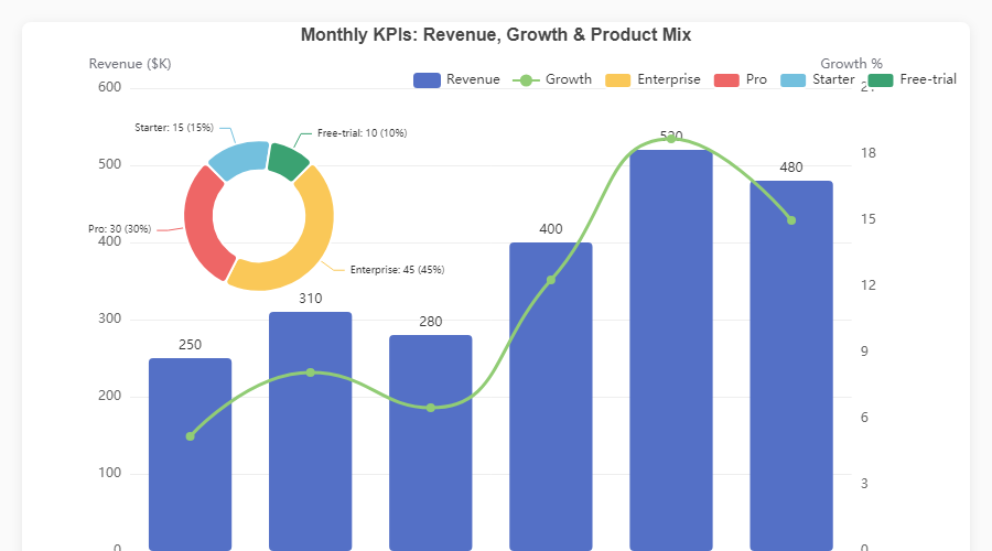
KPI Dashboard |
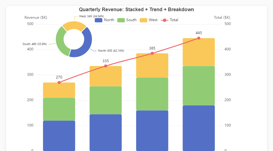
Stacked + Trend + Pie |
|
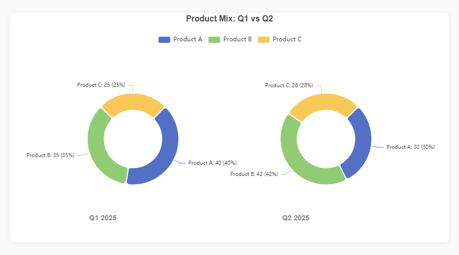
Side-by-Side Pies |
Dark Theme |
Every chart is fully interactive — hover for tooltips, click legend items to toggle series, use the toolbox to export. Open the HTML demos in
assets/for the live experience, or runpython generate_demos.pyyourself.
Supported Chart Types
| Category | Method | Description |
|---|---|---|
| Line | fig.plot() |
Smooth/straight lines, multi-series via hue, optional filled area |
| Bar | fig.bar() |
Vertical/horizontal, grouped (hue), stacked, gradient fills |
| Scatter | fig.scatter() |
Color and size encoding, numeric axes |
| Histogram | fig.hist() |
Auto-binned frequency distribution |
| Boxplot | fig.boxplot() |
Five-number statistical summary |
| KDE | fig.kde() |
Kernel density estimation (requires scipy) |
| Pie / Donut | fig.pie() |
Pie, donut (inner_radius), rose charts, side-by-side multiples |
| Radar | fig.radar() |
Multi-indicator polygon charts |
| Heatmap | fig.heatmap() |
Matrix visualisation with colour mapping |
| Sankey | fig.sankey() |
Multi-level flow diagrams |
| Treemap | fig.treemap() |
Hierarchical area charts |
| Funnel | fig.funnel() |
Stage-based conversion funnels |
Rendering Engines
echartsy writes your chart once; ec.config() controls where it renders.
| Engine | Use case | Install |
|---|---|---|
"python" |
Standalone scripts — opens the default browser | No extra deps |
"jupyter" |
Jupyter Notebook / JupyterLab inline widgets | pip install echartsy[jupyter] |
"streamlit" |
Streamlit applications | pip install echartsy[streamlit] (or just pip install streamlit) |
ec.config(engine="jupyter")
Adaptive Dark Mode
Charts automatically respond to the user's OS or browser prefers-color-scheme setting.
ec.config(engine="jupyter", adaptive="auto")     # auto-detect (default)
ec.config(engine="jupyter", adaptive="dark")     # force dark
ec.config(engine="jupyter", adaptive="light")    # force light
Style Presets & Palettes
Apply a pre-built visual theme in one argument:
fig = ec.figure(style=ec.StylePreset.CLINICAL)         # Clean defaults
fig = ec.figure(style=ec.StylePreset.DASHBOARD_DARK)    # Dark background
fig = ec.figure(style=ec.StylePreset.KPI_REPORT)        # Warm rusty tones
fig = ec.figure(style=ec.StylePreset.MINIMAL)            # Minimal & light
Or set a custom palette at any time:
fig.palette(["#667eea", "#764ba2", "#f093fb", "#f5576c", "#4facfe"])
fig.palette(ec.PALETTE_RUSTY)
fig.palette(ec.PALETTE_CLINICAL)
Build your own StylePreset for full control over fonts, grid lines, tooltip style, and more:
my_style = ec.StylePreset(
    palette=("#264653", "#2a9d8f", "#e9c46a", "#f4a261", "#e76f51"),
    bg="#fefae0",
    font_family="Georgia",
    title_font_size=20,
)
fig = ec.figure(style=my_style)
Emphasis (Hover Highlighting)
Control what happens when users hover over chart elements — highlight, dim, scale, or restyle — using typed Python dataclasses instead of raw dicts.
Every chart method accepts an optional emphasis parameter with a chart-specific type:
| Chart method | Emphasis class | Extra fields |
|---|---|---|
bar(), hist(), boxplot(), heatmap() |
Emphasis |
— |
plot(), kde() |
LineEmphasis |
line_style, area_style, end_label |
scatter() |
ScatterEmphasis |
scale |
pie() |
PieEmphasis |
scale, scale_size, label_line |
radar() |
RadarEmphasis |
line_style, area_style |
sankey() |
SankeyEmphasis |
line_style, focus supports "adjacency" |
funnel() |
FunnelEmphasis |
label_line |
treemap() |
TreemapEmphasis |
label_line, upper_label |
All classes share these common fields: disabled, focus ("none" / "self" / "series"), blur_scope, item_style, and label.
from echartsy import Figure, Emphasis, ItemStyle

# Highlight the hovered series, dim everything else
fig = Figure()
fig.bar(df, x="Month", y="Revenue", hue="Region",
        emphasis=Emphasis(
            focus="series",
            item_style=ItemStyle(shadow_blur=10, shadow_color="rgba(0,0,0,0.3)"),
        ))
fig.show()
from echartsy import Figure, LineEmphasis, LineStyle, LabelStyle

# Bold the hovered line and show value labels
fig = Figure()
fig.plot(df, x="Date", y="Price", hue="Stock",
         emphasis=LineEmphasis(
             focus="series",
             line_style=LineStyle(width=4),
             label=LabelStyle(show=True, formatter="{c}"),
         ))
fig.show()
from echartsy import Figure, PieEmphasis, ItemStyle

# Scale and shadow on hover
fig = Figure()
fig.pie(df, names="Category", values="Amount",
        emphasis=PieEmphasis(
            scale=True, scale_size=15,
            item_style=ItemStyle(shadow_blur=20),
        ))
fig.show()
When emphasis is omitted, each chart keeps its existing default behaviour (backward compatible).
Composite Charts
Overlay pies on cartesian charts, or combine bar + line on dual axes — all on one figure.
fig = ec.figure(height="550px")

# Primary axis: bars
fig.bar(df, x="Month", y="Revenue", labels=True, border_radius=4)

# Secondary axis: trend line
fig.plot(df, x="Month", y="Growth", smooth=True, axis=1, line_width=3)

# Inset pie
fig.pie(df_mix, names="Plan", values="Share",
        center=["25%", "32%"], radius=["15%", "25%"])

fig.ylabel("Revenue ($K)")
fig.ylabel_right("Growth %")
fig.legend(top=40, left=350)
fig.show()
Timeline Animations
Animate any chart across a time dimension with TimelineFigure. It mirrors the Figure API; every series method gains one extra parameter: time_col.
fig = ec.TimelineFigure(height="500px", interval=1.5)
fig.bar(df, x="Country", y="GDP", time_col="Year", labels=True)
fig.title("GDP by Country")
fig.ylabel("GDP (Trillion USD)")
fig.legend(top=30)
fig.show()
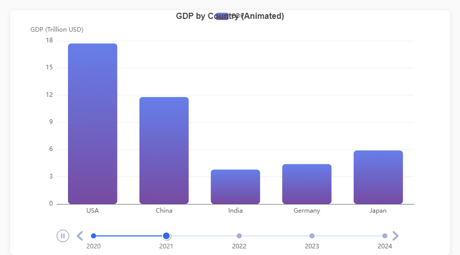
TimelineFigure features:
| Feature | API |
|---|---|
| Playback control | TimelineFigure(interval=2.0, autoplay=True, loop=True) |
| Adjust after creation | fig.playback(interval=1.0, rewind=True) |
| Fixed axis ranges | fig.xlim(0, 5000), fig.ylim(0, 15) — consistent scales across frames |
| Smart frame sorting | Parses years, quarters (Q1 2024), months (Jan 2024), ISO dates, fiscal years |
| Supported series | bar(), plot(), scatter(), pie() |
| Diagnose format | ec.detect_time_format(df["Year"]) |
Chart Configuration Reference
Every Figure and TimelineFigure supports these configuration methods:
# Titles
fig.title("Main Title", subtitle="Sub-title")

# Axes
fig.xlabel("X Label", rotate=30)
fig.ylabel("Y Label")
fig.ylabel_right("Secondary Y")
fig.xlim(0, 100)
fig.ylim(0, 500)

# Layout
fig.legend(orient="vertical", left="right", top=40)
fig.margins(left=100, right=120, top=40)
fig.grid(show=True)

# Interactivity
fig.datazoom(start=0, end=80)
fig.toolbox(download=True, zoom=True)
fig.tooltip(trigger="axis")

# Export
fig.save(name="my_chart", fmt="png", dpi=3)
fig.to_html("my_chart.html")

# Palette
fig.palette(["#5470C6", "#91CC75", "#FAC858"])
Exporting
# Standalone HTML file (fully interactive, no server needed)
fig.to_html("report.html")

# Raw ECharts option dict (for debugging or custom renderers)
option = fig.to_option()
API at a Glance
ec.config(engine, adaptive="auto")
Set the global rendering engine ("python", "jupyter", "streamlit") and theme adaptation mode ("auto", "light", "dark").
ec.figure(**kwargs) / ec.Figure(**kwargs)
Create a chart canvas. Key keyword arguments:
| Parameter | Default | Description |
|---|---|---|
height |
"400px" |
CSS height of the chart container |
width |
None |
CSS width (defaults to full container) |
renderer |
"canvas" |
"canvas" or "svg" |
style |
StylePreset.CLINICAL |
A StylePreset instance |
ec.TimelineFigure(**kwargs) / ec.timeline_figure(**kwargs)
Same as Figure but adds timeline animation. Extra parameters:
| Parameter | Default | Description |
|---|---|---|
interval |
2.0 |
Seconds between animation frames |
autoplay |
True |
Start playing automatically |
loop |
True |
Loop back to the first frame |
ec.StylePreset
Frozen dataclass bundling visual defaults: palette, bg, font_family, title_font_size, axis_label_font_size, grid_line_color, and more.
ec.Emphasis, ec.LineEmphasis, ec.PieEmphasis, ...
Frozen dataclasses configuring hover-highlight behaviour per series. Common fields: disabled, focus, blur_scope, item_style (ItemStyle), label (LabelStyle). Chart-specific subclasses add fields like line_style, area_style, scale, scale_size, and label_line. See the Emphasis section for the full mapping.
Sub-style dataclasses
| Class | Key fields |
|---|---|
ec.ItemStyle |
color, border_color, border_width, border_radius, shadow_blur, shadow_color, opacity |
ec.LabelStyle |
show, position, formatter, font_size, font_weight, color |
ec.LineStyle |
color, width, type ("solid" / "dashed" / "dotted"), shadow_blur, opacity |
ec.AreaStyle |
color, opacity |
ec.LabelLineStyle |
show, length, length2 |
ec.detect_time_format(series)
Diagnostic helper that inspects a pandas Series and reports how well TimelineFigure will parse its values.
Generating Showcase Images
To regenerate the demo screenshots shown above:
# 1. Generate the interactive HTML demos
python generate_demos.py

# 2. Capture PNG screenshots (requires Playwright)
pip install playwright && playwright install chromium
python capture_screenshots.py
What's New in v0.3.0
- Fixed:
xlabel(rotate=...)no longer raisesKeyErrorwhen called afterheatmap()or other methods that reset the x-axis. - Fixed:
_auto_key()collisions — multiple charts with the same height, series count, and mode no longer overwrite each other in Streamlit. - Added:
TimelineFigure.xlim()andTimelineFigure.ylim()— lock axis ranges across animation frames for consistent comparisons. - Changed: Streamlit rendering now uses
st.components.v1.html()with ECharts from CDN instead of thestreamlit-echartsthird-party component. This fixes silent empty renders on modern Streamlit versions and removes the external dependency.
Contributing
Contributions, bug reports, and feature requests are welcome. Please open an issue or submit a pull request on GitHub.
License
MIT — Jigar, 2026
Release history Release notifications | RSS feed


Download files
Download the file for your platform. If you're not sure which to choose, learn more about installing packages.
Source Distribution
Built Distribution
Filter files by name, interpreter, ABI, and platform.
If you're not sure about the file name format, learn more about wheel file names.
Copy a direct link to the current filters
File details
Details for the file echartsy-0.3.1.tar.gz.
File metadata
- Download URL: echartsy-0.3.1.tar.gz
- Upload date:
- Size: 51.7 kB
- Tags: Source
- Uploaded using Trusted Publishing? No
- Uploaded via: twine/6.2.0 CPython/3.12.3
File hashes
| Algorithm | Hash digest | |
|---|---|---|
| SHA256 |
d57fe16a81c00bca038d4cf1a70cc5ce8fa06749be99c8c3801357369127699b
|
|
| MD5 |
1b647ce673a9fb0b75af929c12b943ec
|
|
| BLAKE2b-256 |
89d16c3e89d7339c862d825d4eb9936c3dc4cf780c4d596e6755f73304e24d33
|
File details
Details for the file echartsy-0.3.1-py3-none-any.whl.
File metadata
- Download URL: echartsy-0.3.1-py3-none-any.whl
- Upload date:
- Size: 49.9 kB
- Tags: Python 3
- Uploaded using Trusted Publishing? No
- Uploaded via: twine/6.2.0 CPython/3.12.3
File hashes
| Algorithm | Hash digest | |
|---|---|---|
| SHA256 |
43f19548dd58642b539de1a025500286b8b6d92cd06cd8b37d7228f3a2b1de91
|
|
| MD5 |
7b5168b5fe7f5791598556b9ead3c5ca
|
|
| BLAKE2b-256 |
d9a15e2a926470bcf78869b256e9e819f9d212859d2ab1e8037e095b43812030
|


