A matplotlib-style fluent builder API for Apache ECharts in Python, Jupyter Notebooks, and Streamlit.

Project description

echartsy
Interactive charts in Python — the matplotlib workflow, the ECharts experience.


Build publication-quality interactive charts with a familiar
fig = figure() → fig.bar() → fig.show() workflow.
Works everywhere: Jupyter · Streamlit · standalone scripts
Why echartsy?
| Familiar API | If you know plt.figure() / plt.show(), you already know 90% of the API. No JSON, no JavaScript. |
| Interactive by default | Every chart ships with tooltips, legend toggling, zoom, and an export toolbox. Zero config needed. |
| Three render engines | Write once, render in Jupyter notebooks, Streamlit apps, or standalone browser windows. |
| 19 chart types | From bar charts and waterfall charts to sankey diagrams, sunbursts, gauges, and network graphs. |
| Composable & animated | Layer pies on bar charts, build dual-axis dashboards, use multi-grid subplots, or animate across time with TimelineFigure. |
| Dark mode | Adaptive dark/light theming out of the box, including automatic Streamlit theme detection. |
Installation
pip install echartsy
Optional extras:
pip install echartsy[jupyter]     # Jupyter Notebook / JupyterLab
pip install echartsy[streamlit]   # Streamlit apps
pip install echartsy[scipy]       # KDE density plots
pip install echartsy[all]         # Everything
Requirements: Python 3.9+ · pandas ≥ 1.5 · numpy ≥ 1.23
Quick Start
import pandas as pd
import echartsy as ec
ec.config(engine="jupyter") # or "python" / "streamlit"
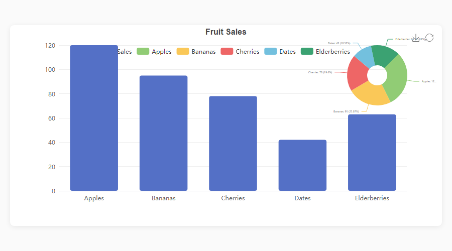
df = pd.DataFrame({
"Fruit": ["Apples", "Bananas", "Cherries", "Dates", "Elderberries"],
"Sales": [120, 95, 78, 42, 63],
})
fig = ec.figure()
fig.bar(df, x="Fruit", y="Sales", gradient=True, labels=True)
fig.title("Fruit Sales")
fig.show()
Three lines from DataFrame to interactive chart.
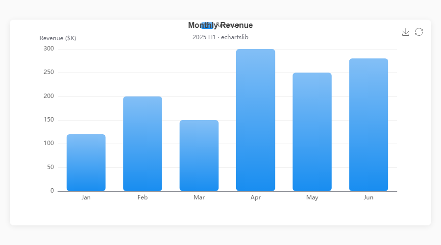
Chart Types
echartsy v0.6.0 supports 19 chart types covering cartesian, standalone, hierarchical, relational, and statistical visualizations.
Cartesian Charts
| Method | Description | Key options |
|---|---|---|
fig.plot() |
Line chart | smooth, area, hue, line_style, area_style, end_label, blur, select, animation, tooltip |
fig.bar() |
Vertical bar | hue, stack, gradient, item_style, label_style, blur, select, animation, tooltip |
fig.barh() |
Horizontal bar | Same as bar(), horizontal orientation |
fig.scatter() |
Scatter plot | color, size, item_style, symbol_rotate, blur, select, animation, tooltip |
fig.hist() |
Histogram | bins, item_style, label_style, animation, tooltip |
fig.boxplot() |
Box plot | item_style, label_style, labels, color, blur, select, animation, tooltip |
fig.kde() |
KDE density | line_style, area_style, labels, connect_nulls, color, animation, tooltip |
fig.waterfall() |
Waterfall chart | total, connector, label_style, item_style, animation, tooltip |
fig.candlestick() |
Candlestick / OHLC | border_width, opacity, label_style, labels, animation, tooltip |
fig.heatmap() |
Matrix heatmap | label_style, item_style, animation, tooltip |
Standalone & Hierarchical Charts
| Method | Description | Key options |
|---|---|---|
fig.pie() |
Pie / donut | inner_radius, min_angle, clockwise, item_style, blur, select, tooltip |
fig.radar() |
Radar / spider | shape, split_number, line_style, color, tooltip |
fig.funnel() |
Funnel | orient, funnel_align, min_size, max_size, item_style, tooltip |
fig.gauge() |
Gauge / meter | detail_formatter, progress, item_style, tooltip |
fig.treemap() |
Treemap | drill_down_icon, node_click, breadcrumb, item_style, tooltip |
fig.sunburst() |
Sunburst | node_click, label_rotate, item_style, tooltip |
Relational & Calendar Charts
| Method | Description | Key options |
|---|---|---|
fig.sankey() |
Sankey diagram | node_align, draggable, item_style, label_style, tooltip |
fig.graph() |
Network graph | repulsion, gravity, edge_label, item_style, line_style, tooltip |
fig.calendar_heatmap() |
Calendar heatmap | split_line_show, day_label_show, item_style, emphasis, tooltip |
Gallery
Cartesian Charts
|
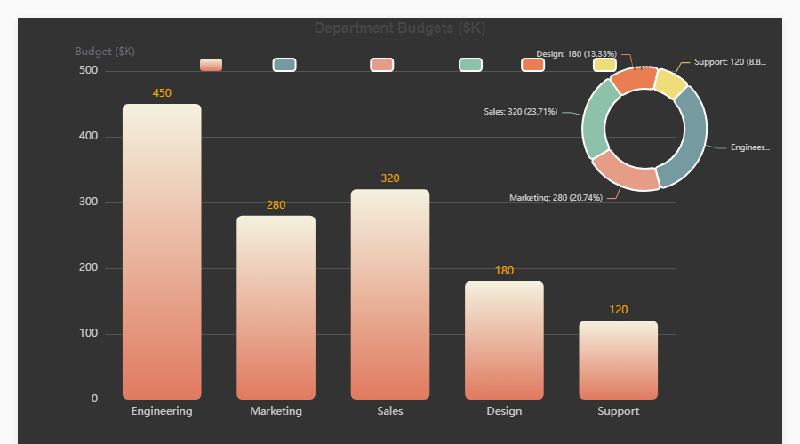
Bar + Pie Overlay fig = ec.figure(height="500px")
fig.bar(df, x="Dept", y="Budget",
gradient=True, labels=True)
fig.pie(df, names="Dept", values="Budget",
center=["82%","25%"],
radius=["18%","28%"])
fig.show()
|
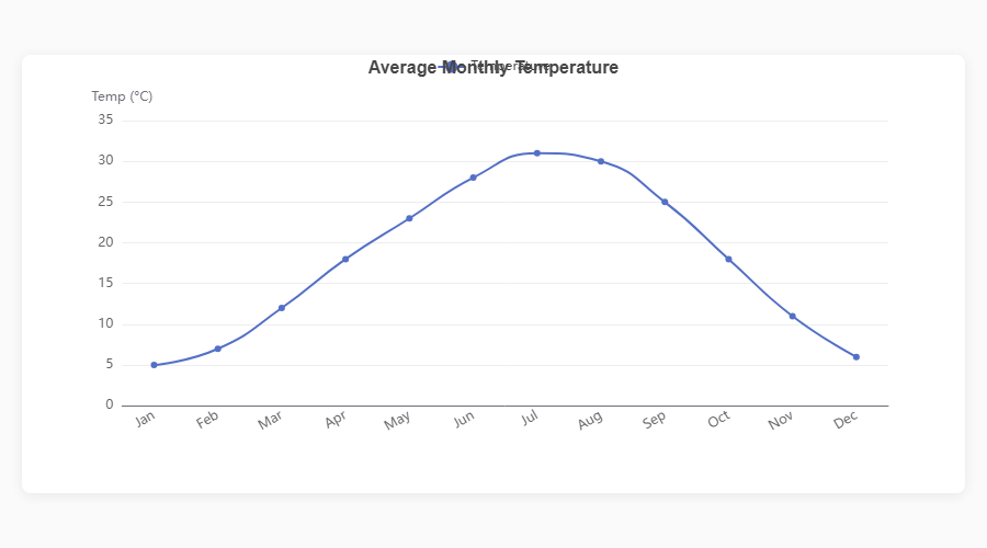
Smooth Line fig = ec.figure()
fig.plot(df, x="Month", y="Sales",
smooth=True, area=True)
fig.show()
|
|
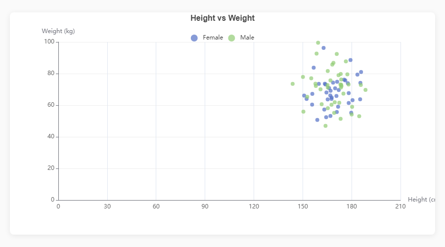
Scatter Plot fig = ec.figure()
fig.scatter(df, x="Height", y="Weight",
color="Gender", size="Age")
fig.show()
|
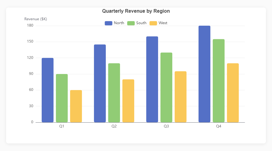
Grouped Bar fig = ec.figure()
fig.bar(df, x="Quarter", y="Revenue",
hue="Region")
fig.show()
|
|
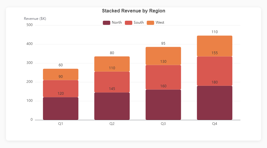
Stacked Bar fig = ec.figure()
fig.bar(df, x="Month", y="Revenue",
hue="Product", stack=True)
fig.show()
|
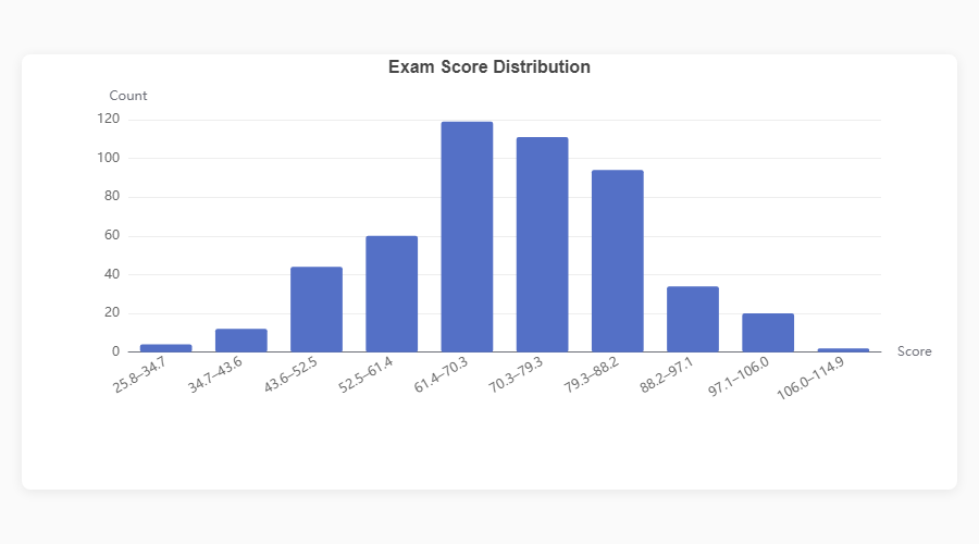
Histogram fig = ec.figure()
fig.hist(df, column="Score", bins=20)
fig.show()
|
|
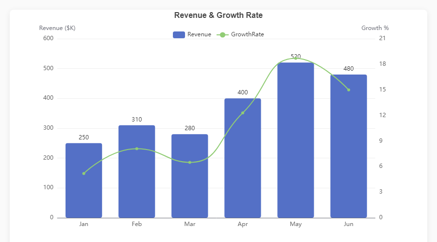
Dual Axis: Bar + Line fig = ec.figure()
fig.bar(df, x="Month", y="Revenue")
fig.plot(df, x="Month", y="Growth",
smooth=True, axis=1)
fig.ylabel("Revenue ($K)")
fig.ylabel_right("Growth %")
fig.show()
|
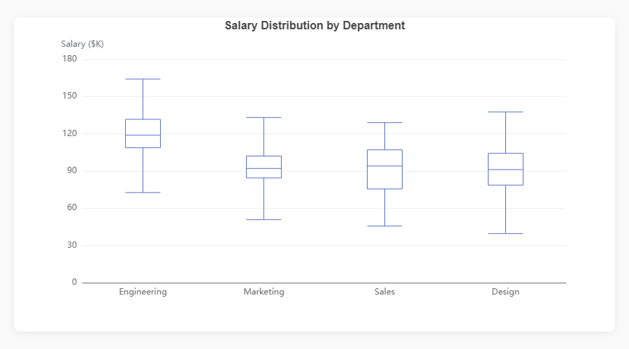
Boxplot fig = ec.figure()
fig.boxplot(df, x="Department", y="Salary")
fig.show()
|
Standalone Charts
|
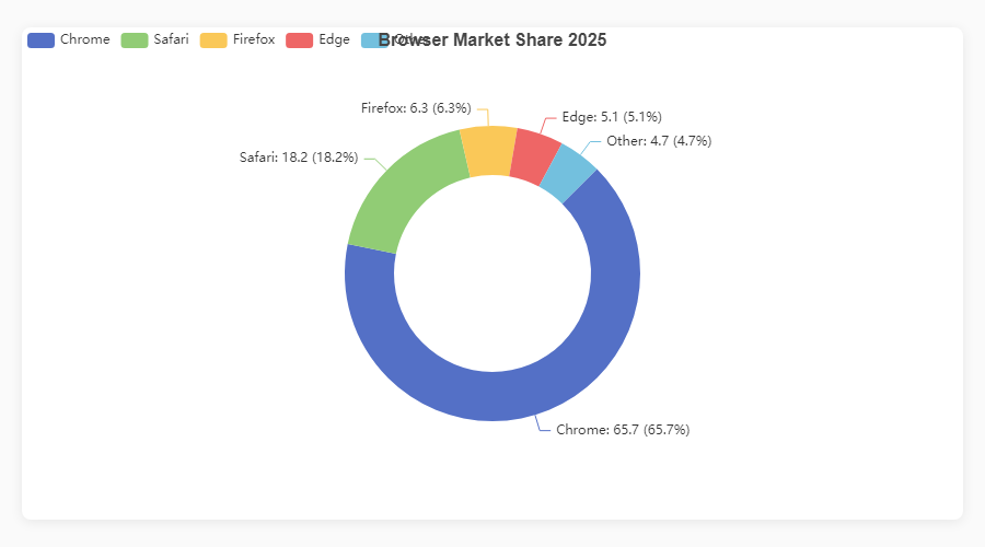
Donut / Pie fig = ec.figure()
fig.pie(df, names="Browser", values="Share",
inner_radius="40%")
fig.show()
|
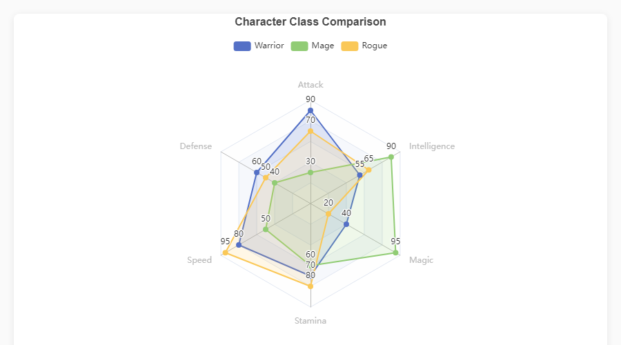
Radar fig = ec.figure()
fig.radar(indicators, data,
series_names=["Warrior","Mage"])
fig.show()
|
|
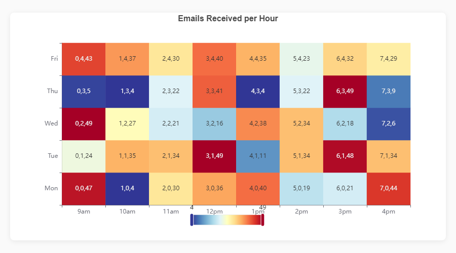
Heatmap fig = ec.figure()
fig.heatmap(df, x="Day", y="Hour",
value="Count")
fig.show()
|
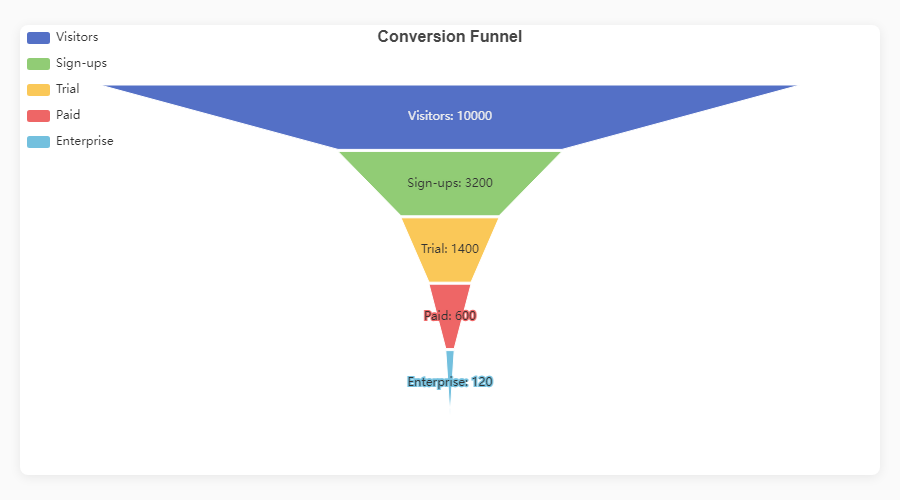
Funnel fig = ec.figure()
fig.funnel(df, names="Stage", values="Count")
fig.show()
|
|
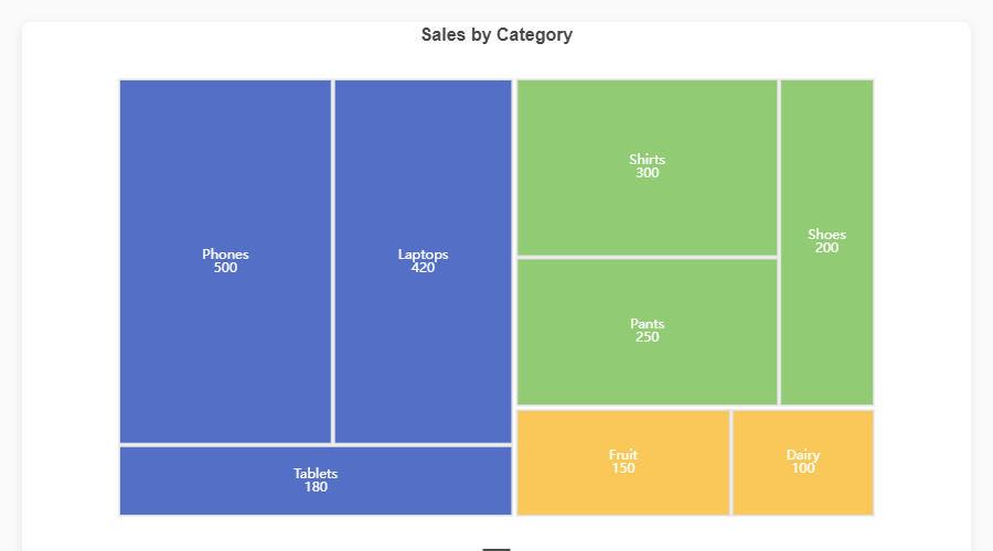
Treemap fig = ec.figure()
fig.treemap(df,
path=["Category","SubCat"],
value="Sales")
fig.show()
|
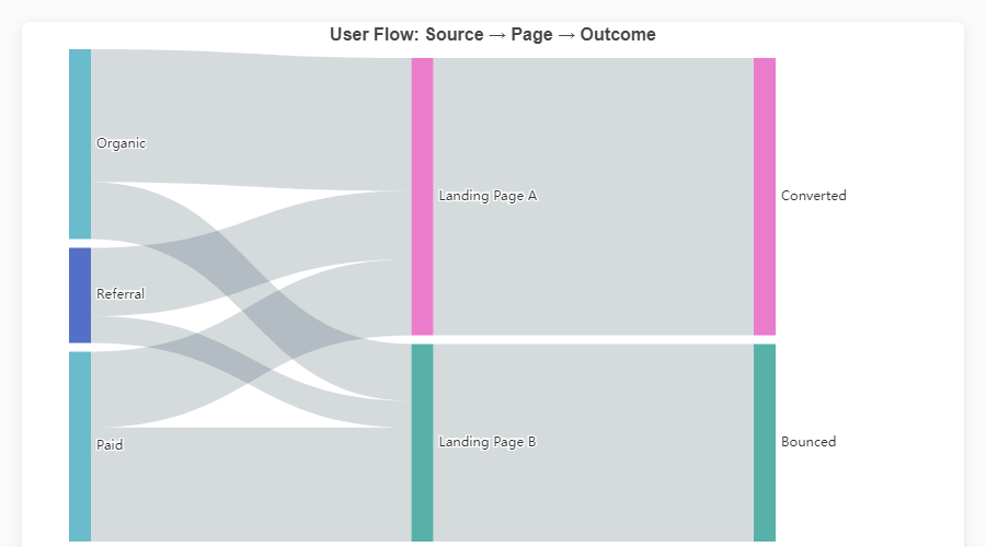
Sankey Diagram fig = ec.figure()
fig.sankey(df,
levels=["Source","Channel","Outcome"],
value="Users")
fig.show()
|
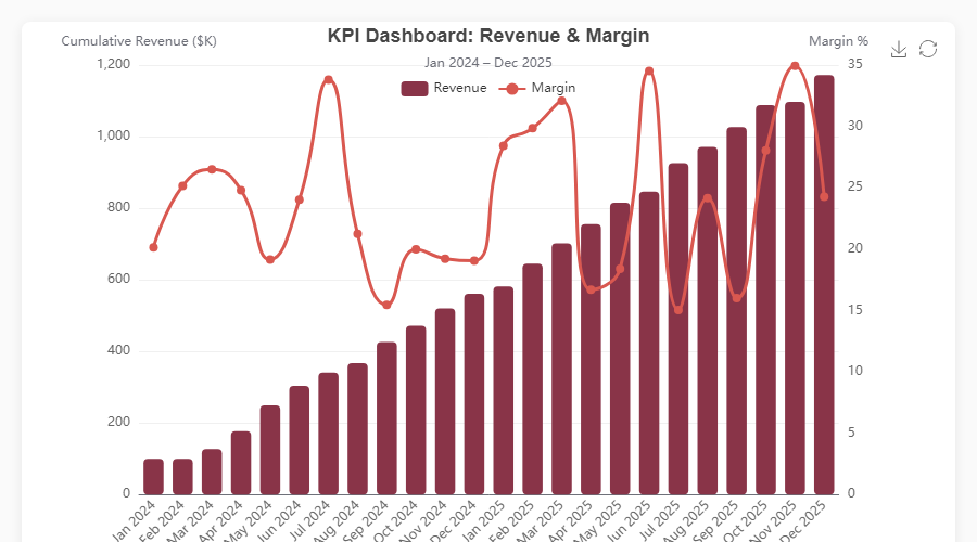
Composite & Dashboard Charts
|
Bar + Pie (Dark) |
Triple Composite |
|
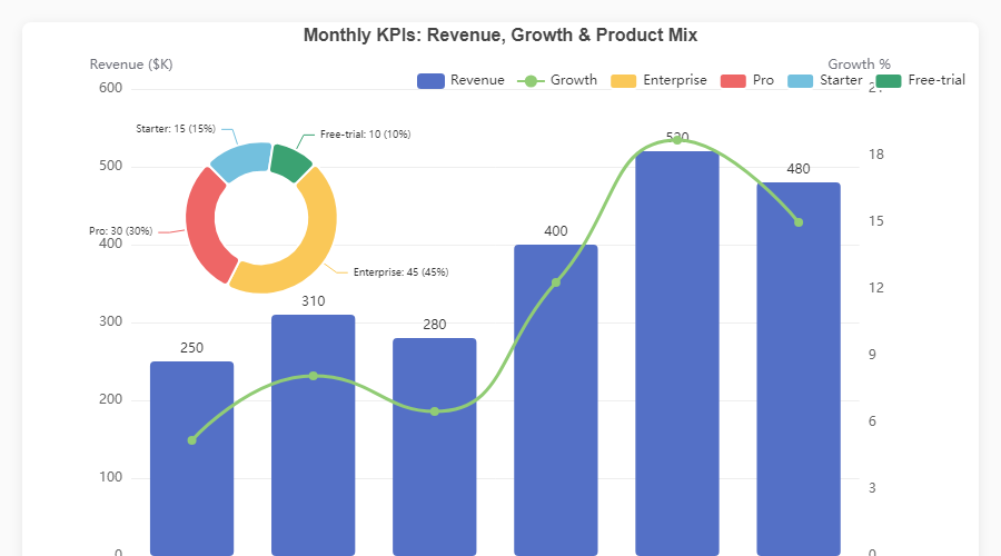
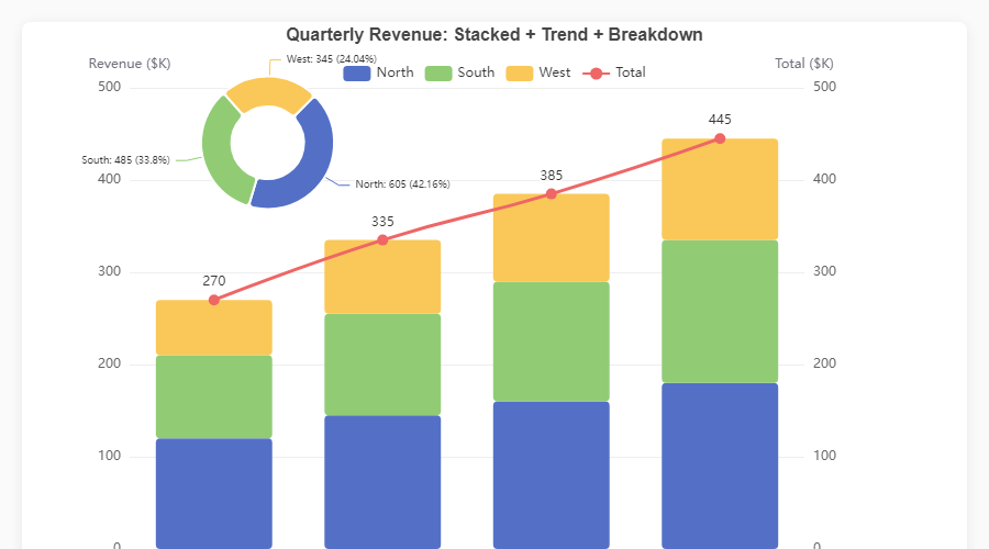
KPI Dashboard |
Stacked + Trend + Pie |
Every chart is fully interactive -- hover for tooltips, click legend items to toggle series, use the toolbox to export. Open the HTML demos in
assets/for the live experience, or runpython generate_demos.pyyourself.
Rendering Engines
Write your chart once; ec.config() controls where it renders.
| Engine | Use case | Install |
|---|---|---|
"python" |
Standalone scripts -- opens the default browser | No extra deps |
"jupyter" |
Jupyter Notebook / JupyterLab inline widgets | pip install echartsy[jupyter] |
"streamlit" |
Streamlit applications | pip install echartsy[streamlit] |
ec.config(engine="jupyter") # or "python" / "streamlit"
Advanced Features
Multi-Grid Subplots
Create vertically stacked chart panels sharing independent axes:
fig = ec.figure(rows=2, height="700px", row_heights=["60%", "40%"])
fig.bar(df, x="Month", y="Revenue", grid=0)
fig.plot(df, x="Month", y="Growth", grid=1, smooth=True)
fig.show()
Timeline Animations
Animate any chart across a time dimension with TimelineFigure:
fig = ec.TimelineFigure(height="500px", interval=1.5)
fig.bar(df, x="Country", y="GDP", time_col="Year", labels=True)
fig.title("GDP by Country")
fig.show()
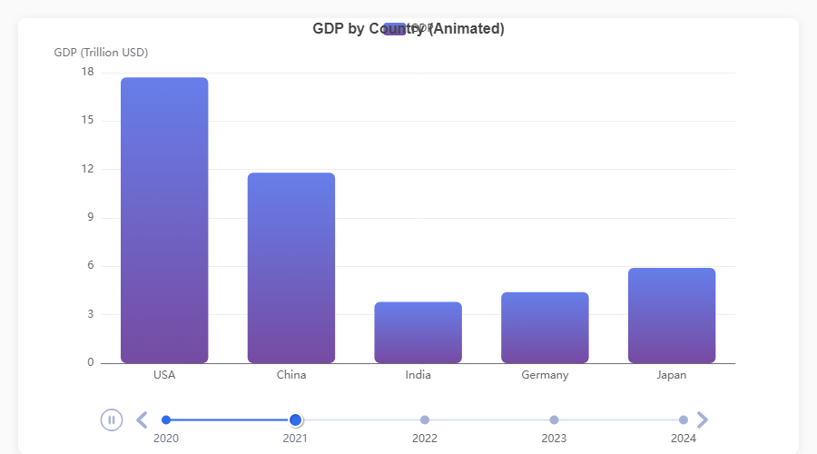
| Feature | API |
|---|---|
| Playback control | TimelineFigure(interval=2.0, autoplay=True, loop=True) |
| Adjust after creation | fig.playback(interval=1.0, rewind=True) |
| Fixed axis ranges | fig.xlim(), fig.ylim() -- consistent scales across frames |
| Smart frame sorting | Parses years, quarters (Q1 2024), months, ISO dates, fiscal years |
| Supported series | bar(), plot(), scatter(), pie(), hist() |
| Diagnose format | ec.detect_time_format(df["Year"]) |
Annotations
Add reference lines, points, and shaded regions to any series:
fig.plot(df, x="Month", y="Sales", smooth=True)
fig.mark_line(y=500, label="Target", color="red", line_dash="dashed")
fig.mark_point(type="max")
fig.mark_area(y_range=[200, 400], color="#ccc", opacity=0.15)
fig.show()
Visual Map
Attach a colour-mapping control for continuous or piecewise data ranges:
fig.heatmap(df, x="Day", y="Hour", value="Count")
fig.visual_map(min_val=0, max_val=100,
               colors=["#313695", "#ffffbf", "#a50026"],
               calculable=True)
fig.show()
Log Scale
Switch any y-axis to logarithmic scale:
fig.yscale("log")          # shorthand
fig.ylim(scale="log")      # equivalent
Emphasis (Hover Highlighting)
Control what happens when users hover over chart elements using typed Python dataclasses:
from echartsy import Emphasis, ItemStyle

fig.bar(df, x="Month", y="Revenue", hue="Region",
        emphasis=Emphasis(
            focus="series",
            item_style=ItemStyle(shadow_blur=10),
        ))
Every chart method accepts an optional emphasis parameter with a chart-specific type:
| Chart method | Emphasis class |
|---|---|
bar(), waterfall(), hist(), boxplot(), heatmap(), candlestick() |
Emphasis |
plot(), kde() |
LineEmphasis |
scatter() |
ScatterEmphasis |
pie() |
PieEmphasis |
radar() |
RadarEmphasis |
sankey() |
SankeyEmphasis |
funnel() |
FunnelEmphasis |
treemap() |
TreemapEmphasis |
graph() |
GraphEmphasis |
Per-Series Style Control
Beyond emphasis, every chart method now accepts typed dataclass parameters for fine-grained visual control:
from echartsy import ItemStyle, LabelStyle, Blur, Select, AnimationConfig, TooltipStyle

fig.bar(df, x="Month", y="Revenue",
        item_style=ItemStyle(border_type="dashed", opacity=0.9),
        label_style=LabelStyle(show=True, rotate=45, font_family="monospace"),
        blur=Blur(item_style=ItemStyle(opacity=0.2)),
        select=Select(item_style=ItemStyle(border_width=3)),
        selected_mode="multiple",
        animation=AnimationConfig(animation_duration=1500, animation_easing="elasticOut"),
        tooltip=TooltipStyle(formatter="{b}: {c}"))
Three-tier control: scalar params (e.g. color="red") → dataclass overrides → **series_kw raw dict.
Adaptive Dark Mode
Charts automatically respond to the user's OS or browser prefers-color-scheme setting:
ec.config(engine="jupyter", adaptive="auto")     # auto-detect (default)
ec.config(engine="jupyter", adaptive="dark")     # force dark
ec.config(engine="streamlit")                    # auto-adapts to Streamlit theme
Style Presets and Palettes
Apply a pre-built visual theme or set custom colour palettes:
fig = ec.figure(style=ec.StylePreset.CLINICAL)
fig = ec.figure(style=ec.StylePreset.DASHBOARD_DARK)
fig = ec.figure(style=ec.StylePreset.KPI_REPORT)
fig = ec.figure(style=ec.StylePreset.MINIMAL)

fig.palette(["#667eea", "#764ba2", "#f093fb", "#f5576c", "#4facfe"])
fig.palette(ec.PALETTE_RUSTY)
Build custom presets for full control over fonts, grid lines, tooltip style, and more:
my_style = ec.StylePreset(
    palette=("#264653", "#2a9d8f", "#e9c46a", "#f4a261", "#e76f51"),
    bg="#fefae0",
    font_family="Georgia",
    title_font_size=20,
)
fig = ec.figure(style=my_style)
Configuration Reference
Every Figure and TimelineFigure supports these configuration methods:
# Titles
fig.title("Main Title", subtitle="Sub-title")

# Axes
fig.xlabel("X Label", rotate=30)
fig.ylabel("Y Label")
fig.ylabel_right("Secondary Y")
fig.xlim(0, 100)
fig.ylim(0, 500)
fig.yscale("log")

# Layout
fig.legend(orient="vertical", left="right", top=40)
fig.margins(left=100, right=120, top=40)
fig.grid(show=True)

# Interactivity
fig.datazoom(start=0, end=80)
fig.toolbox(download=True, zoom=True)
fig.tooltip(trigger="axis", pointer="cross")
fig.axis_pointer(type="shadow", snap=True)
fig.visual_map(min_val=0, max_val=100)

# Export
fig.save(name="my_chart", fmt="png", dpi=3)
fig.to_html("my_chart.html")
option = fig.to_option()       # raw ECharts option dict

# Palette
fig.palette(["#5470C6", "#91CC75", "#FAC858"])
API at a Glance
ec.config(engine, adaptive="auto")
Set the global rendering engine ("python", "jupyter", "streamlit") and theme adaptation mode ("auto", "light", "dark").
ec.figure(**kwargs) / ec.Figure(**kwargs)
Create a chart canvas.
| Parameter | Default | Description |
|---|---|---|
height |
"400px" |
CSS height of the chart container |
width |
None |
CSS width (defaults to full container) |
renderer |
"svg" |
"canvas" or "svg" |
style |
StylePreset.CLINICAL |
A StylePreset instance |
rows |
1 |
Number of vertical grid panels (subplots) |
row_heights |
None |
List of CSS heights per grid panel |
ec.TimelineFigure(**kwargs) / ec.timeline_figure(**kwargs)
Same as Figure but adds timeline animation. Extra parameters:
| Parameter | Default | Description |
|---|---|---|
interval |
2.0 |
Seconds between animation frames |
autoplay |
True |
Start playing automatically |
loop |
True |
Loop back to the first frame |
Sub-style Dataclasses
| Class | Key fields |
|---|---|
ec.ItemStyle |
color, border_color, border_width, border_radius, border_type, shadow_blur, shadow_color, shadow_offset_x, shadow_offset_y, opacity, decal |
ec.LabelStyle |
show, position, formatter, font_size, font_weight, font_family, color, rotate, offset, align |
ec.LineStyle |
color, width, type, shadow_blur, shadow_color, shadow_offset_x, shadow_offset_y, opacity, cap, join |
ec.AreaStyle |
color, opacity, origin, shadow_blur, shadow_color |
ec.LabelLineStyle |
show, length, length2 |
ec.EndLabelStyle |
show, formatter, font_size, font_weight, color |
ec.Blur |
item_style, label, line_style, area_style |
ec.Select |
disabled, item_style, label, line_style, area_style |
ec.TooltipStyle |
show, formatter, value_formatter, background_color, border_color, border_width, text_color, text_size |
ec.AnimationConfig |
animation, animation_duration, animation_easing, animation_delay |
Changelog (Recent)
v0.6.0
- Added: Full parameter expansion across all 19 chart methods and 6 config methods — typed
ItemStyle,LabelStyle,LineStyle,AreaStyle,EndLabelStyle,Blur,Select,TooltipStyle, andAnimationConfigdataclass parameters on every series method. - Added: Per-series
tooltip,blur,select,selected_mode, andanimationsupport for bar, line, scatter, pie, histogram, boxplot, KDE, candlestick, heatmap, waterfall, radar, sankey, treemap, funnel, gauge, sunburst, graph, and calendar heatmap. - Added: Extended config methods —
title()(+8 params),legend()(+11 params),tooltip()(+9 params),toolbox()(+5 params),datazoom()(+6 params),visual_map()(+6 params). - Added: Timeline parity —
TimelineFigure.plot(),.bar(),.scatter(),.pie(),.hist()now accept all new style parameters. - Added: 5 new dataclasses:
EndLabelStyle,Blur,Select,TooltipStyle,AnimationConfig. - Extended:
ItemStyle(+border_type,decal),LabelStyle(+font_family,rotate,offset,align),LineStyle(+shadow_color,shadow_offset_x/y,cap,join),AreaStyle(+origin,shadow_blur,shadow_color). - Added: Three-tier control model: scalar params → dataclass overrides →
**series_kwraw dict.
v0.5.3
- Added:
fig.waterfall()-- finance/accounting waterfall charts with cumulative positive/negative deltas, optional total bar, connector lines, and value labels.
v0.5.1
See Releases for full details.
v0.4.8
- Changed: Default renderer switched from
"canvas"to"svg"-- fixes the broken toolbox download button under canvas/iframe sandbox restrictions.
v0.4.7
- Added:
fig.candlestick()-- native OHLC candlestick charts with dual-axis support and full composability.
v0.4.6
- Added:
Emphasissupport forboxplot(),heatmap(), andfunnel().
v0.4.5
- Fixed: Charts vanishing across
st.tabs()in Streamlit 1.48+.
Support the Project
If echartsy saves you time or you enjoy using it, consider buying me a coffee. It helps keep the project maintained and growing.

Contributing
Contributions, bug reports, and feature requests are welcome. Please open an issue or submit a pull request on GitHub.
License
MIT — Jigar, 2026
Release history Release notifications | RSS feed


Download files
Download the file for your platform. If you're not sure which to choose, learn more about installing packages.
Source Distribution
Built Distribution
Filter files by name, interpreter, ABI, and platform.
If you're not sure about the file name format, learn more about wheel file names.
Copy a direct link to the current filters
File details
Details for the file echartsy-0.6.0.tar.gz.
File metadata
- Download URL: echartsy-0.6.0.tar.gz
- Upload date:
- Size: 84.3 kB
- Tags: Source
- Uploaded using Trusted Publishing? No
- Uploaded via: twine/6.2.0 CPython/3.12.3
File hashes
| Algorithm | Hash digest | |
|---|---|---|
| SHA256 |
6814cc9b6e8d1b76aeda8ad647595bbbef6281e9a13c198d91b4e8e5365534df
|
|
| MD5 |
bf74cb5fc2b5802ec99debbadff1964a
|
|
| BLAKE2b-256 |
69931d02b225d2ebbc430e9d540dc6dc94781c42a7bf04376ab7cab05857c696
|
File details
Details for the file echartsy-0.6.0-py3-none-any.whl.
File metadata
- Download URL: echartsy-0.6.0-py3-none-any.whl
- Upload date:
- Size: 68.9 kB
- Tags: Python 3
- Uploaded using Trusted Publishing? No
- Uploaded via: twine/6.2.0 CPython/3.12.3
File hashes
| Algorithm | Hash digest | |
|---|---|---|
| SHA256 |
741727048eb46ea679e85975a2f8d998d344fe1476ccf57a2c252feb9f999d12
|
|
| MD5 |
eff5a66b3367e8fcf84bd85bf9a547b5
|
|
| BLAKE2b-256 |
b513862feb48c62157778ce53b1583a4c2028fc9a6a5c8e72e06bfcfe9978a7f
|


