A material UI built with flet library

Project description
Fletura
A material UI built with flet library
Installation
A collection of reusable and customizable Flet components to enhance your application development.
Table of Contents
Introduction
This library provides a set of reusable Flet components designed to streamline the development of Flet-based applications. Each component is built with flexibility and ease of use in mind.
Installation
To install the library, use pip:
pip install fletura
Usage
Here is a basic example of how to use fletura
import flet as ft
import fletura as ftr
def main(page):
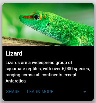
card = ftr.CardMedia(
image_src="https://th.bing.com/th/id/R.5e510c21c45cefceb127a2280c789b72?rik=2ddR7LkLmjAIFA&pid=ImgRaw&r=0",
description="Lizards are a widespread group of squamate reptiles, with over 6,000 species, ranging across all continents except Antarctica",
description_style=TextStyle(color="white"),
actions=[
TextButton("SHARE"),
TextButton("LEARN MORE"),
],
can_expand=True,
long_description="A long description of the cardMedia content",
title_style=TextStyle(color="white"),
),
page.add(card)
ft.app(target=main)
Output:
Components
CardMedia
Cards are surfaces that display content and actions related to a single topic. (inherits from Container)
Props
- image_src (str): Image source
- title (str): The card title.
- title_style (TextStyle): Style to be applied on the card title
- description (str): The main content of the card.
- description_style (TextStyle): Style to be applied on both the card description and the long_description text(if provided)
- long_descriprion (str): Text to be displayed as a long description of the card content(can_expand must be True)
- actions (list): A list of action buttons or any controls for the card.
- can_expand (bool): This is applied only for cards with a long description, it gives the ability to expand
- action_area (bool): If True the entire card will be clickable, and the on_click_action_area event must be handled
- width: The cardMedia width, default value is 300
Examples
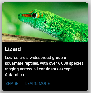
# CardMedia without a long description
CardMedia(
        image_src="https://th.bing.com/th/id/R.5e510c21c45cefceb127a2280c789b72?rik=2ddR7LkLmjAIFA&pid=ImgRaw&r=0",
        description="Lizards are a widespread group of squamate reptiles, with over 6,000 species, ranging across all continents except Antarctica",
        actions=[
            TextButton("SHARE"),
            TextButton("LEARN MORE"),
        ],
        description_style=TextStyle(color="white"),
        title_style=TextStyle(color="white"),
    ),
output:
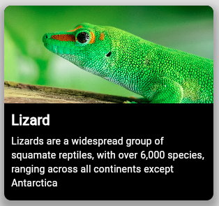
# CardMedia component with action_area activated
CardMedia(
          image_src="https://th.bing.com/th/id/R.5e510c21c45cefceb127a2280c789b72?rik=2ddR7LkLmjAIFA&pid=ImgRaw&r=0",
          description="Lizards are a widespread group of squamate reptiles, with over 6,000 species, ranging across all continents except Antarctica",
          action_area=True,
          actions=[],
          description_style=TextStyle(color="white"),
          title_style=TextStyle(color="white"),
      ),
output:
Dock
The Dock component is a customizable UI element designed to display notifications or status indicators in a visually appealing manner. It consists of an icon and a counter that indicates the number of notifications, items, or messages.
Props
- dock_icon (str): An icon, Mail icon is the default one
- icon_color (str): The icon color
- dock_color (str): color of the container
- count (int): The count to be displayed,
- max_value (int): the maximum value to be displayed,
- position (str): Postion of the top container(top_right, bottom_left, bottom_right) by default "top_left",
Examples:
# Basic Dock component
Dock(position="top_left")
Dock(cupertino_icons.CART, position="center_left", count=105, max_value=99)
Dock(count=15, dock_color="purple500", position="top_left", max_value=9)
Dock(count=105, dock_color="blue", position="top_right", max_value=99)
Dock(count=1005, position="bottom_right", max_value=999)
Output:

Rating
Ratings provide insight regarding others' opinions and experiences, and can allow the user to submit a rating of their own.

Props
- rating_type: (str) "controlled","readonly" or "disabled".
- max_value (int): number of rating icons.
- rating_value (float): Works when "disabled" or "readonly" is selected.
- rating_icon (str): Rating icont, by default it's icons.STAR_OUTLINE_OUTLINED.
- size (str): The size of the rating icons. Possible values: "small", "medium","large" or "extralarge", "large" is the default value.
- color (str): icon border color by default it's "colors.WHITE".
- selection_color (str): the icon_color when selected by default "colors.ORANGE".
- selection_icon (str): the icon when selected, by default it's "icons.STAR".
- half_icon (str): takes in account float rating values Works when "disabled" or "readonly" is selected, by defaulf "icons.STAR_HALF".
- on_hover_color (str): color on hover by default "colors.ORANGE".
Examples:
# Controlled rating
Rating(
    rating_icon=icons.STAR_OUTLINE_OUTLINED,
    selection_icon=icons.STAR,
    max_value=5,
    rating_type=RatingType.CONTROLLED,
    )
# Readonly rating
Rating(
  max_value=5,
  selection_icon=icons.STAR,
  rating_value=2.5,
  rating_type=RatingType.READONLY,
  size="large",
)
# disabled rating
Rating(
  rating_icon=cupertino_icons.HEART,
  selection_icon=cupertino_icons.HEART_FILL,
  half_icon=icons.HEART_BROKEN_OUTLINED,
  max_value=5,
  rating_value=1.5,
  rating_type=RatingType.DISABLED,
),
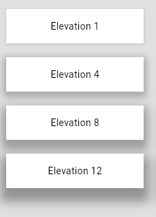
Paper
A component for displaying content on an elevated surface. (inherits from container)
Props
- outlined (bool): "True" if the Paper will be outlined otherwise False,
- elevation (int): Defines how much the Paper will be elevated (0,1,2,3,4,8,12,16 and 24) by default elevation = 1,
Examples
Paper(
      elevation=8,
      width=200,
      height=50,
      bgcolor="white",
      outlined=True,
      content=ft.Text(f"Elevation 8", color="black"),
)
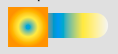
Switch
The Switch component is a customizable switch control for toggling between two states. It provides various customization options for its appearance and behavior, including track and thumb styling, content, colors, and events.
Attributs
- track_width (
int): The width of the switch track. Default is60. - track_height (
int): The height of the switch track. Default is25. - track_style (
dict): A dictionary of styles(Container properties) for the switch track. - active_track_content (
Control): The content to display on the track when the switch is active. Default isNone. - inactive_track_content (
Control): The content to display on the track when the switch is inactive. Default isNone. - thumb_width (
int): The width of the switch thumb. Default is40. - thumb_height (
int): The height of the switch thumb. Default is40. - active_thumb_content (
Control): The content to display on the thumb when the switch is active. Default isNone. - inactive_thumb_content (
Control): The content to display on the thumb when the switch is inactive. Default isNone. - default_thumb_content (
Control): The default content to display on the thumb if no active or inactive content is specified. Default isNone. - thumb_style (
dict): A dictionary of styles(Container properties) for the switch thumb. Default is{"bgcolor": "white", "border_radius": 20}. - active_color (
str): The background color of the track when the switch is active. Default is"green". - inactive_color (
str): The background color of the track when the switch is inactive. Default is"grey". - label (
str): The label to display next to the switch. Default isNone. - label_style (
TextStyle): The style to apply to the label text. Default isNone. - value (
bool): The initial state of the switch. IfTrue, the switch is in the active state. Default isFalse. - on_hover (
HoverEvent): An event handler for when the switch is hovered over. Default isNone. - on_change (
ControlEvent): An event handler for when the switch state changes. Default isNone.
Example of usage
Switch(
    track_width=100,
    thumb_height=40,
    thumb_width=40,
    active_color="green",
    inactive_color="grey",
    inactive_thumb_content=Icon(icons.LIGHT_MODE),
    active_thumb_content=Icon(icons.DARK_MODE),
    value=True,  # Set initial value to True
    on_change=clicked,
    track_style={
        "gradient": LinearGradient(
            colors=["red", "orange", "blue", "yellow", "#f5f5f5"]
        ),
    },
)
Other examples
#Switch with track contents
Switch(
        track_width=100,
        thumb_height=40,
        thumb_width=40,
        active_color="green",
        inactive_color="grey",
        inactive_thumb_content=Icon(icons.LIGHT_MODE),
        active_thumb_content=Icon(icons.DARK_MODE),
        active_track_content=Icon(icons.LIGHT_MODE, size=20),
        inactive_track_content=Icon(icons.DARK_MODE),
        on_change=switch_changed,
        track_style={
            "border": border.all(1, "white"),
        },

    )
# Basic Switch
Switch()
output:

# Small thumb
switch_custom_colors = Switch(
        label="Small thumb",
        thumb_height=20,
        thumb_width=20,
        active_color="blue",
        inactive_color="red",
        on_change=switch_changed,
    )
output:
# Custom Thumb Content
switch_thumb_content = Switch(
        label="Custom Thumb Content",
        active_thumb_content=Icon(icons.CHECK),
        inactive_thumb_content=Icon(icons.CLOSE),
        on_change=switch_changed,
    )
# Custom Track Gradient & squared thumb
switch_gradient_track = Switch(
    label="Gradient Track",
    track_width=100,
    track_style={
        "gradient": LinearGradient(
            colors=["red", "orange", "blue", "yellow", "#f5f5f5"]
        )
    },
    thumb_style={"gradient": RadialGradient(colors=["blue", "yellow", "orange"])},
    on_change=switch_changed,
)
# Track with background Images
Switch(
        label="Track with background Images",
        track_width=100,
        active_track_content=Image(
            src="https://picsum.photos/200/200?3", fit=ImageFit.FIT_WIDTH, width=100
        ),
        inactive_track_content=Image(
            src="https://picsum.photos/200/200?0", fit=ImageFit.FIT_WIDTH, width=100
        ),
        track_height=50,
        thumb_width=60,
        thumb_height=60,
        value=True,
        on_change=switch_changed,
    )
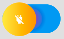
# Switch with almost all customizations
Switch(
        label="Fully Customized",
        track_width=120,
        track_height=60,
        thumb_width=70,
        thumb_height=70,
        active_thumb_content=Icon(icons.POWER, color="white"),
        inactive_thumb_content=Icon(icons.POWER_OFF, color="white"),
        active_color="green",
        inactive_color="red",
        track_style={"gradient": RadialGradient(colors=["purple", "blue"])},
        thumb_style={
            "gradient": LinearGradient(colors=["yellow", "orange"]),
            "border_radius": 40,
        },
        on_change=switch_changed,
    )
Output:
Neumorphic
A set of neumorphic componets
Description of Components
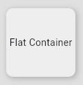
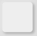
FlatContainer
FlatContainer is a component that represents a flat, slightly elevated container with a grey background. It includes a subtle shadow effect to give it a lifted appearance.
Attributes:
height: Specifies the height of the container.bgcolor: Set tocolors.GREY_200by default.alignment: Centers the content inside the container.border_radius: Set to10by default.shadow: Adds a subtle shadow effect.
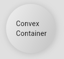
ConvexContainer
ConvexContainer is a component that represents a container with a convex (pressed in) appearance. It uses a gradient background and multiple shadows to create the effect.
Attributes:
height: Specifies the height of the container.elevation: Determines the intensity of the shadow.shadow1_color: The color of the first shadow.shadow2_color: The color of the second shadow.border_radius: Set to10by default.gradient: Applies a gradient background.shadow: Adds multiple shadows to create the convex effect.
FloatingContainer
FloatingContainer is a component that represents a container with a floating appearance, elevated from the background using shadow effects.
Attributes:
height: Specifies the height of the container.border_radius: Set to10by default.bgcolor: The background color of the container.shadow1_color: The color of the first shadow.shadow2_color: The color of the second shadow.shadow_position: Specifies the position of the shadow using theShadowPositionclass.
How to Use
To use these components, you can import them and create instances with the desired attributes. Here's an example of how to use these components in a Flet application:
FlatContainer(height=100)
Output:
ConvexContainer(
  height=100,
  border_radius=50,
  padding=padding.only(20),
  elevation=0.4,
  content=Text("Convex Container", color="black"),
)
Output:
FloatingContainer(
  content=Text("A floating Container"),
  width=200,
  height=100,
  shadow_position=ShadowPosition.TOP_RIGHT
)
Output:
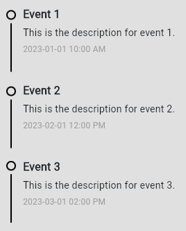
Timeline
The Timeline component is a visually structured UI element designed to display a sequence of events or activities in a chronological order. It provides a clear and organized way to present the timeline of events, making it suitable for various applications like project tracking, historical data visualization, user activity logs, and more.
Define Event Data
First, you need to define the data for each event. Each event can have a title, description, timestamp, and various customizable properties for the dot and separator. Here's a sample event list:
events = [
    {
        "title": "Event 1",
        "description": "This is the description for event 1.",
        "timestamp": "2023-01-01 10:00 AM",
        "dot_props": {
            "border": border.all(2, color="blue"),
        },
        "separator_props": {
            "color": colors.GREEN_500,
            "height": 70,
            "margin": margin.only(top=5),
        },
        "content_position": 25,
    },
    {
        "title": "Event 2",
        "description": "This is the description for event 2.",
        "timestamp": "2023-02-01 12:00 PM",
        "dot_props": {
            "border": border.all(2, color="red"),
        },
        "separator_props": {
            "height": 70,
            "margin": margin.only(top=5),
        },
        "content_position": 25,
    },
    {
        "title": "Event 3",
        "description": "This is the description for event 3.",
        "timestamp": "2023-03-01 02:00 PM",
        "dot_props": {
            "border": border.all(2, color="green"),
        },
        "separator_props": {
            "color": colors.BLUE_200,
            "height": 70,
            "margin": margin.only(top=5),
        },
        "content_position": 20,
    },
]
Create the Timeline Component
Create an instance of the Timeline component and pass the list of events to it. Here’s how you do it:
timeline = Timeline(events)
Add the Timeline to the Page
Finally, add the Timeline component to your Flet page
Explanation of Properties
Event Properties
- title: The title of the event.
- description: A brief description of the event.
- timestamp: The time or date of the event.
- dot_props: Customization properties for the dot, such as border and color.
- separator_props: Customization properties for the separator, such as color and height.
- content_position: Adjusts the vertical spacing of the content.
Customization Options.
Dot Customization (dot_props):
- icon((str): Icon for the dot (if any).
- icon_size: Size of the icon.
- icon_color: Color of the icon.
- dot_size: Size of the dot.
- dot_border_radius: Border radius for the dot.
- (Inherits from Container control)
Separator Customization (separator_props):
- color: Color of the separator.
- width: Width of the separator.
- height: Height of the separator.
Text Styles:
- title_style: Text style for the title.
- description_style: Text style for the description.
- timestamp_style: Text style for the timestamp.
Live demo
Contributing
Contributions are welcome! just PR
License
This project is licensed under the MIT License. See the LICENSE file for details.
Thank you for using the Flet Components Library! If you have any questions or feedback, feel free to open an issue or submit a pull request.


Download files
Download the file for your platform. If you're not sure which to choose, learn more about installing packages.
Source Distribution
Built Distribution
Filter files by name, interpreter, ABI, and platform.
If you're not sure about the file name format, learn more about wheel file names.
Copy a direct link to the current filters
File details
Details for the file fletura-1.0.9.tar.gz.
File metadata
- Download URL: fletura-1.0.9.tar.gz
- Upload date:
- Size: 18.0 kB
- Tags: Source
- Uploaded using Trusted Publishing? No
- Uploaded via: twine/5.0.0 CPython/3.12.1
File hashes
| Algorithm | Hash digest | |
|---|---|---|
| SHA256 |
de12752e5cf17284cf276757cde678fd72b00331d3e48c44a8417229440a4890
|
|
| MD5 |
6bde265a1671e14d48278915900a9106
|
|
| BLAKE2b-256 |
57178927338d47922f219dca0d9828852e0fb25ef9e9567b62e8c29c06e6f053
|
File details
Details for the file fletura-1.0.9-py3-none-any.whl.
File metadata
- Download URL: fletura-1.0.9-py3-none-any.whl
- Upload date:
- Size: 14.8 kB
- Tags: Python 3
- Uploaded using Trusted Publishing? No
- Uploaded via: twine/5.0.0 CPython/3.12.1
File hashes
| Algorithm | Hash digest | |
|---|---|---|
| SHA256 |
cc82391a023823c108072cd431038fafcdcc2f978c13da294338c7b840ffea3e
|
|
| MD5 |
c0e93ace10b7cf19252b1a4e4ceeb75f
|
|
| BLAKE2b-256 |
37744c45aa6a6c8850e11f00d49df2b31c43dc98a88d23bb587e617f4633daf4
|


